Chapter1Univariate Statistics – Case Study Socio-Demographic Reporting
Section1.1Introduction
The 2020 socio-demographic report on the German state North-Rhine Westphalia continues the state’s social reporting since its beginning in 1992. These reports aim to provide the public with information on the social and demographic conditions and dynamics of North Rhine-Westphalia (NRW).
Social indicators refer to demographic conditions and developments (e.g., population figures, the proportion of people with a migration background), the economy (e.g., unemployment rates, GDP), health, education, housing, public finances, and social inequality.
Analyses based on data from the socio-demographic report are politically relevant. Insights from data analyses may provide politicians and public officials with information on social problems that need to be addressed by political measures. It is thus important that interpretations derived from data analyses are accurate. In the following case study, we take a closer look at the data and use methods from univariate statistics. Please note that the analyses and interpretations below are meant to illustrate data analysis techniques and do not reflect any policy advice.
Before we can analyze the data, they must be read in the data analysis program. R uses a lot of so-called "packages" (i.e., software add-ons that facilitate or simplify specific parts of data analysis). For example, the package "readxl" allows us to read data that is stored in an Excel format. As another example, the package "ggplot2" allows us to create print-ready figures. Packages often have a specific syntax to which we refer along the way.
library(readxl) # This command loads the package "readxl". In the markdown document, all required packages are installed in the background using the command "install.packages('packagename')". In the downloadable script files, the installation and activation of the packages is automated.

data_nrw <- read_excel("data/inkar_nrw.xls") # Reads data from Excel format; the directory where the data is to be found can be changed (e.g., "C:/user/documents/folderxyz/inkar_nrw.xls")
After reading the file "inkar_nrw.xlsx", it is stored as an object in R. We can now work with the data. As a first step, we print the first ten rows of the data frame:
# Read a so-called shape file for NRW which contains the polygones (e.g., district boundaries) necessary to build maps and merging with structural data
nrw_shp <- st_read("data/dvg2krs_nw.shp")
## Reading layer `dvg2krs_nw' from data source
##   `C:\Users\ziller\OneDrive - Universitaet Duisburg-Essen\Statistik Bookdown\IntroStats\IS\data\dvg2krs_nw.shp'
##   using driver `ESRI Shapefile'
## Simple feature collection with 53 features and 8 fields
## Geometry type: MULTIPOLYGON
## Dimension:     XY
## Bounding box:  xmin: 280375 ymin: 5577680 xmax: 531791.2 ymax: 5820212
## Projected CRS: ETRS89 / UTM zone 32N
nrw_shp$KN <- as.numeric(as.character(nrw_shp$KN))
nrw_shp <- nrw_shp %>%
  right_join(data_nrw, by = c("KN"))

# Building the map using the "ggplot2" package

ggplot() +
  geom_sf(data = nrw_shp, aes(fill = unemp), color = 'gray', size = 0.1) +
ggtitle("North-Rhine Westphalia, Germany") +
  guides(fill=guide_colorbar(title="Unemployment in %")) +
  scale_fill_gradientn(colours=rev(magma(3)),
                       na.value = "grey100",
                      )
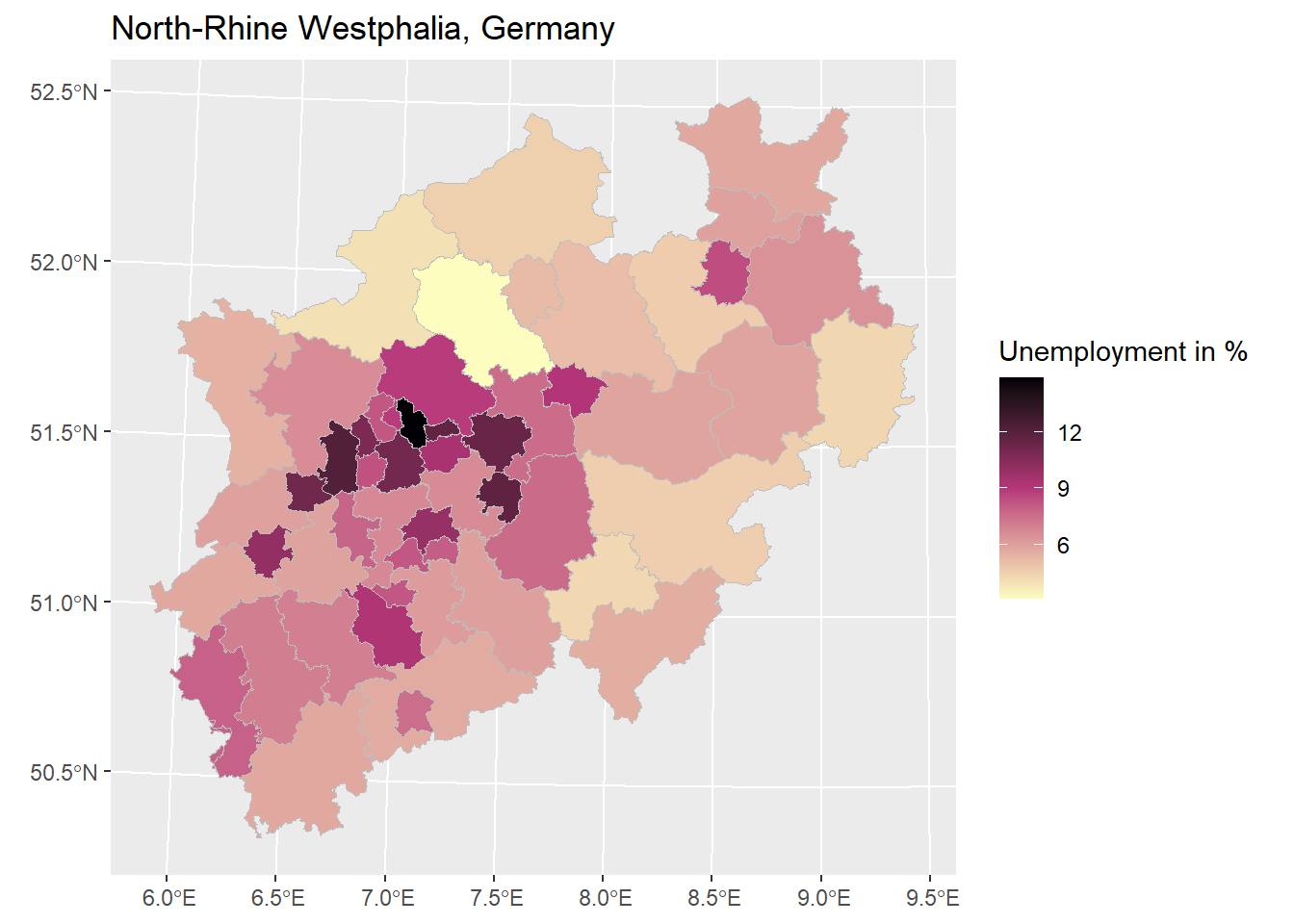
However, insights depend on further (implicit) information ("What are the specifics of the high-unemployment cities in the middle of the map? Which areas are rural, which are urban?").
Section1.4Distributions: First insights into the data structure
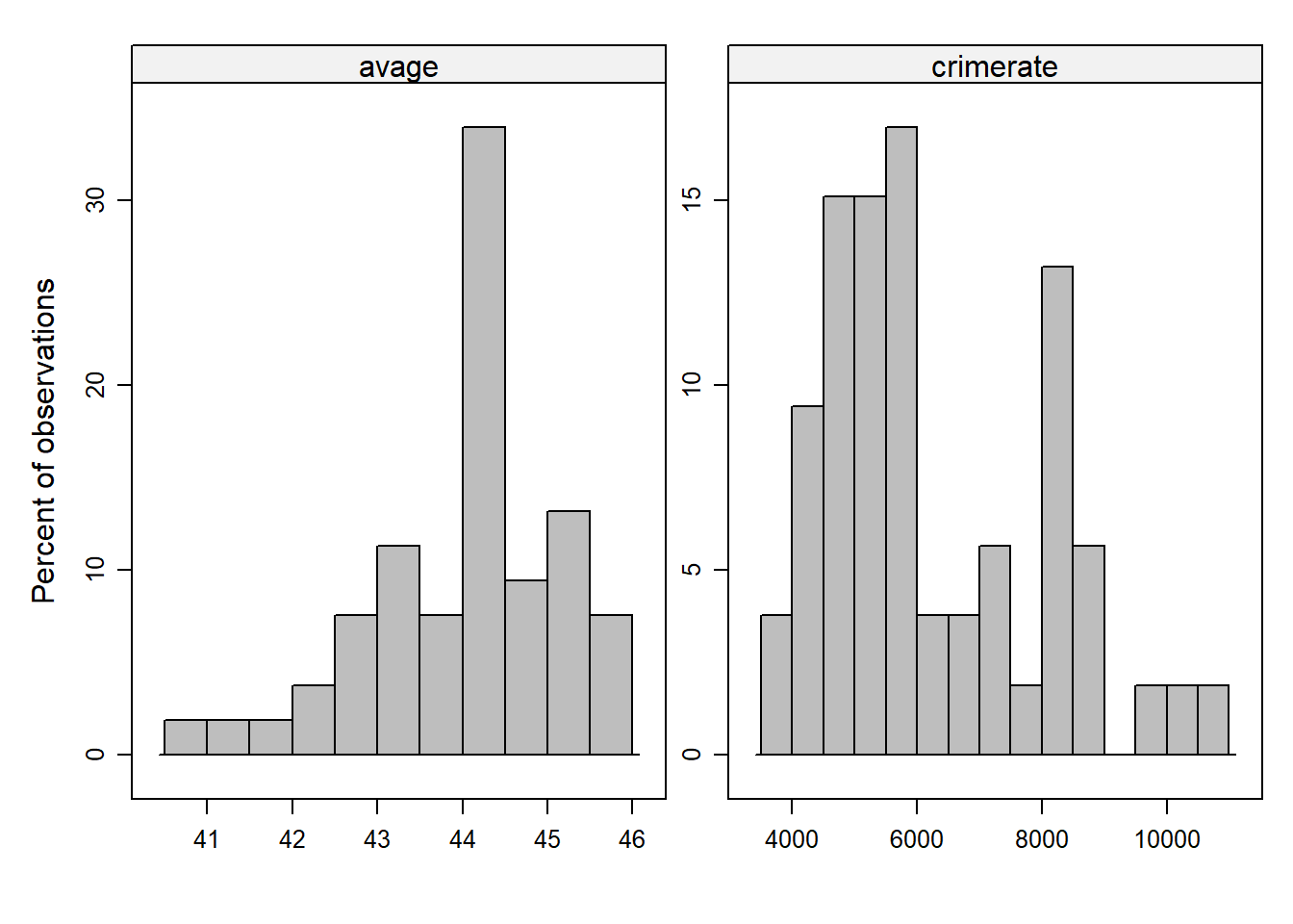
To get an impression about the distribution of the data, histograms can be used (e.g., What are minimum or maximum values? Do observed values are clusterd around the center of the distrubtion or are they widely spread?). Histograms show the frequency of observations across the range of values of a variable. It does not matter how the single observations (i.e., districts in our case) appear in the data set. The histogram ranks observations depending on the values they have on a specific variable. The height of the displayed bars is proportional to the frequency of observations that have corresponding variable values. The width of the bars (also known as bins) represents an interval of values and can be customized (i.e., a few wide bars comprise more observations than many narrow ones).
library(lattice)

data_nrw$popdens <- data_nrw$population/data_nrw$flaeche # This generates the variable for the population density

histogram( ~ popdens + unemp + avage + crimerate,
           breaks = 10,
           type = "percent",
           xlab = "",
           ylab = "Percent of observations",
           layout = c(2,1),
           scales = list(relation="free"),
           col = 'grey',
           data = data_nrw)


## Alternative approach with the "hist"-function
#hist(data_nrw$unemp)
#hist(data_nrw$avage)
#hist(data_nrw$crimerate)
What can be seen: The distribution of the data, including the center(s) where most of the observations are located, patterns of skewness, and outliers.
The mean of a variable is also referred to as a measure of central tendency. It thus represents a good first impression of what is a typical (or expectable) value of a measured characteristic (i.e., a variable). Comparing the mean and the variable value of a specific observation provides information about whether the observation is close to or far from the mean. Besides the arithmetic mean, other measures exist (e.g., the geometric mean), but we do not consider them here.
\(\bar x\) and n refer to given data we are working with (e.g., from a sample), \(\mu\) and N refer to the population we want to make statistical statements about. (Note: This distinction becomes relevant in statistical testing, where we use a random sample to draw inferences about an underlying larger population.)
The average unemployment rate across the observed districts is 7.4 percent. The mean of the population variable is 338,218, which means that about 338,218 people live in a region, on average.
Means can only be calculated for metric or quasi-metric (typically an ordinal variable with five or more categories) variables. area is a nominal variable.
Measures of dispersion, such as the range (i.e., maximum value – minimum value) and the standard deviation, both providing information about how the data is distributed.
Section1.6Measures of dispersion: Variance and standard deviation
Imagine for a moment that we not only have the socio-demographic report of NRW available but also a report from another German state. Comparing county characteristics, such as crime rates, across the two states might result in finding that both have the exact same mean. However, the crime rate in State 1 is much more extremely distributed, with particularly high and low values for some counties. In State 2, in contrast, the crime rate is much more evenly distributed around the mean. Determining the degree of dispersion (or scatteredness) of data is an important piece of information that is useful for several further statistical analyses It might also yield practical relevance, as different patterns of dispersion of crime may lead to different policy measures for combating crime. Let us start with calculating the variance.
(Notation for the sample; If we apply statistical inference and use a random sample, we need to apply a correction in the denominator "n-1" - referred to as Bessel’s correction)
The standard deviation re-transforms the value back to the scale on which the variable is measured, it is therefore easier to interpret and more commonly used.
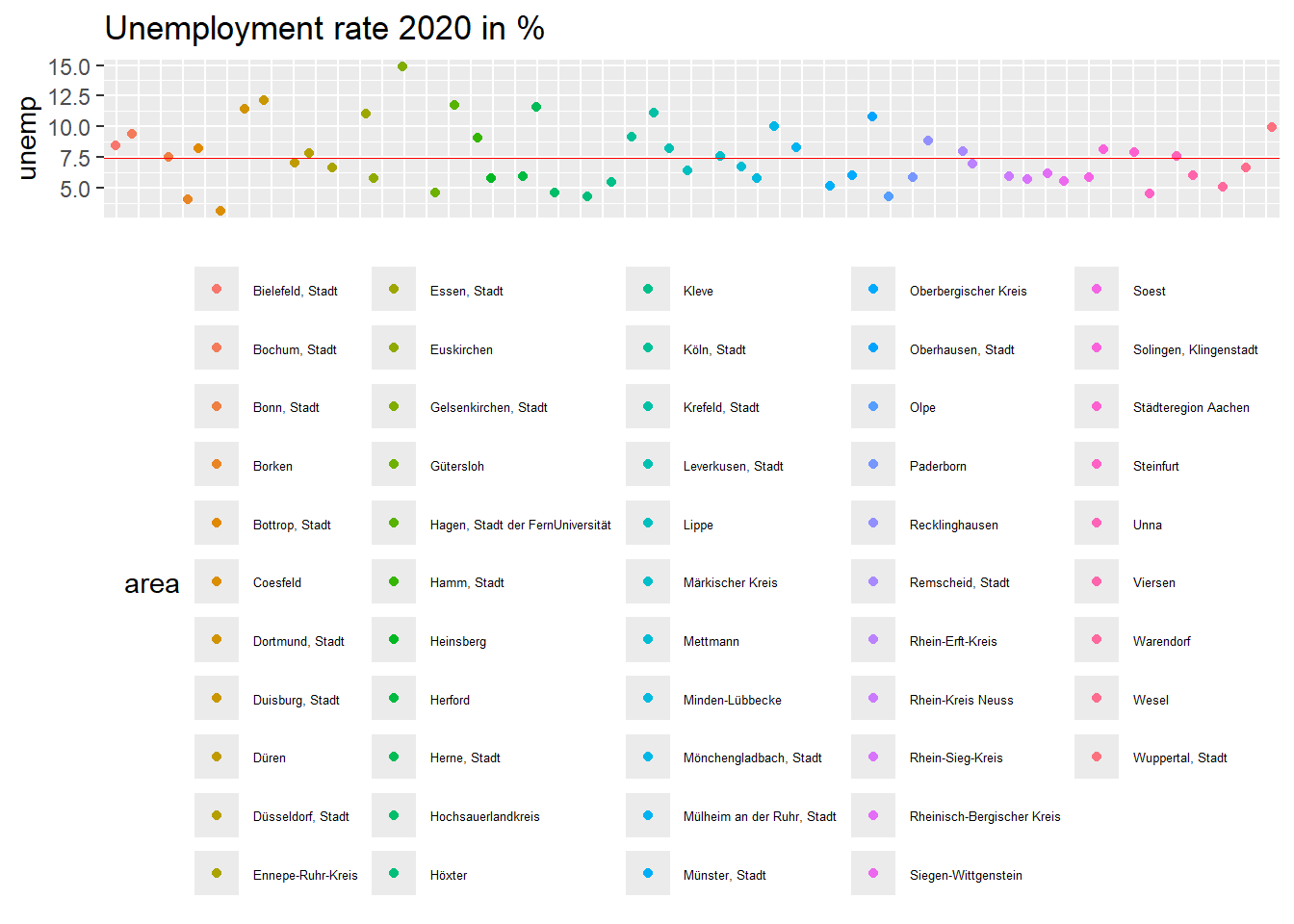
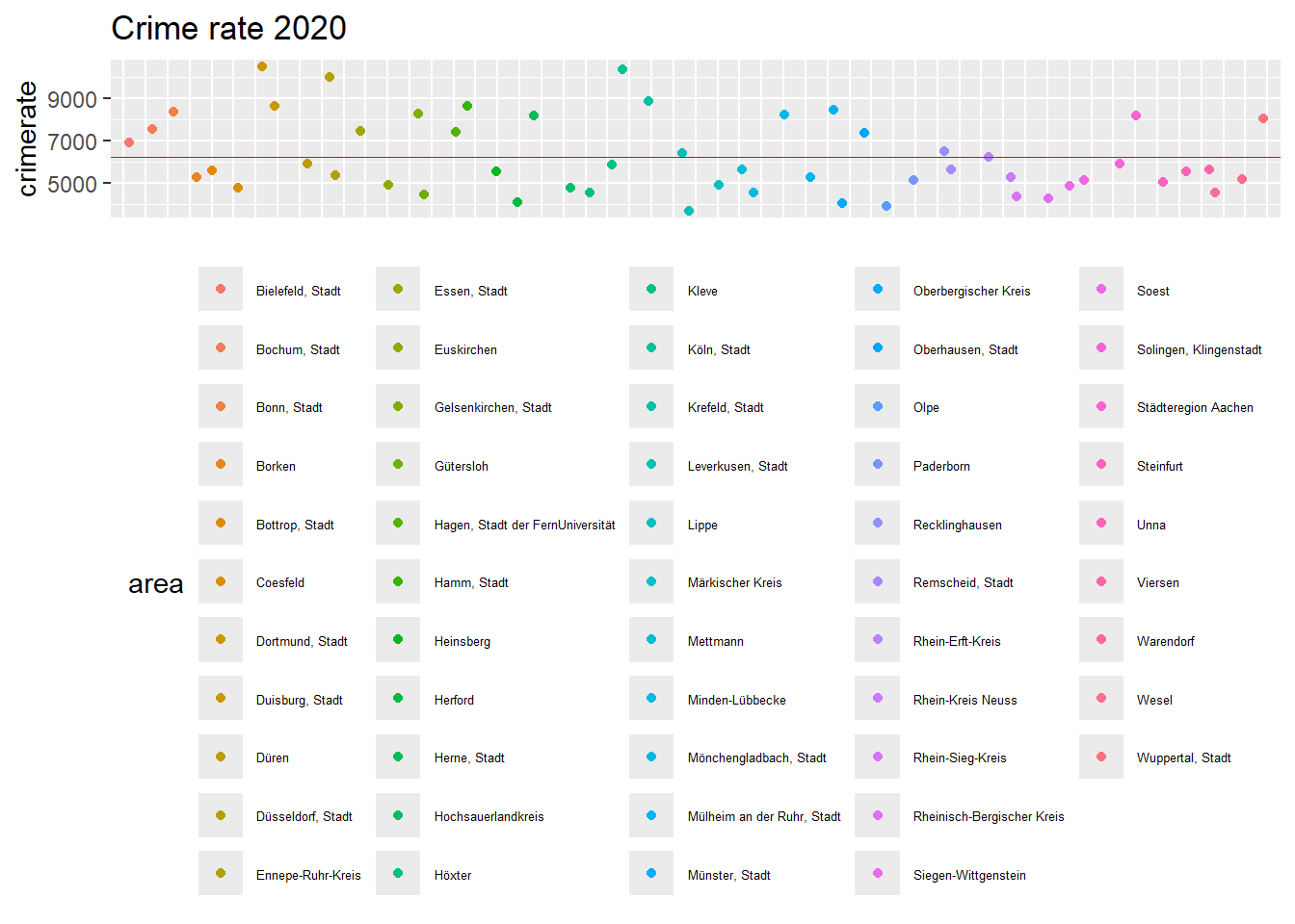
Here you find a graphical representation of the dispersion of the variables unemp and crimerate. Note that the deviations between observations on the x-axis are purely random to increase the readability of the plot (otherwise, all observations would be lined up like a vertical pearl necklace). The red line is the mean value.
Question: Can you spot which district has the highest unemployment rate? Which county has the lowest crime rate? Can we infer from the graphs which of the two variables is more dispersed?
It is quite hard to match the color of the dots with the ones of the legend. Gelsenkirchen has the highest unemployment rate at 14.9%. The district with the lowest crime rate is Lippe.
Because of the different scaling of the variables, it is not possible to infer from this plot which variable is more dispersed. To do so, we would need to calculate the so-called coefficient of variation (see below).
To compare the dispersion of variables measured on different scales, we cannot use the variance or standard deviation (as they are measured on the units of the scale) but employ the coefficient of variation (i.e., standard deviation over the mean times 100). Here, higher values imply a higher dispersion of the data.
Section1.7Position measures: Boxplots and interquartile range
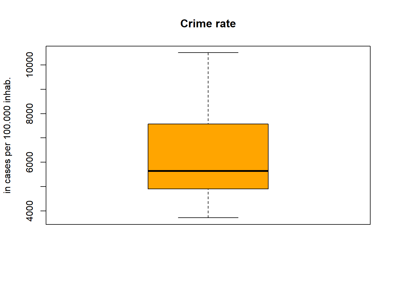
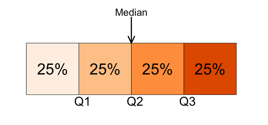
Quartiles divide the ordered data into four parts (Q1 to Q4, where Q4 is the maximum of the observed values), and the median is represented by Q2. Hence, 25% of the observations are below or at Q1, 75% above. Q3-Q1 = interquartile range (IQR), which reflects the range in which the middle 50% of the observations are located.
Boxplots graphically represent the key figures Q1, Q2, Q3. The lower and upper ends of the whiskers are usually the minimum and maximum observed values. To mark observations that are far away from the median (so-called outliers), the maximal width of a whisker is restricted to Q1 - 1.5 x IQR (for the lower whisker) and Q3 + 1.5 x IQR (for the higher upper whisker) respectively. Outliers are represented by points outside of the range of the whisker. The lowest and highest outlier would then mark the minimum/maximum value. For crime rate, the end of the whiskers represent the minimum/maximum value. For unemployment, we find an outlier that represents the maximum of observed values (i.e., Gelsenkirchen with 14.9% unemployment).
Apart from that, the larger the single parts in the boxplot, the greater the dispersion of the data in this area (which can also give an impression of the skewness of the data distribution).
The provided examples illustrate some basic principles of univariate descriptive statistics. Univariate statistics are important to get an overview of the structure of the data, which may also inform more complex statistical methods. In terms of further steps, we could apply the learned methods and ask: Which counties are most plagued by crime? Which counties have the lowest unemployment, and which have the highest? Where are particularly large numbers of people moving to or from? This may inspire additional questions, like: Why are the observed structures the way they are? These questions concern explanatory analyses. In the following, we take an outlook on this and – by doing so – we refer to further topics that are explained in detail in subsequent chapters.
Section1.9Outlook: Does unemployment cause more crime?
To test causal claims like "more unemployment leads to more crime" with observational data (i.e., from surveys or official records) is heroic and rests on various assumptions that need to be fulfilled. The main reason why causal inference with observational (i.e., non-experimental) data is so difficult is that all possible alternative explanations must be eliminated. Otherwise, we cannot be sure whether unemployment is the cause or some other unobserved phenomenon that correlates with unemployment.
Most importantly: All possible alternative explanations must be excluded (e.g., via a randomized experiment or by using control variables in multiple regression).
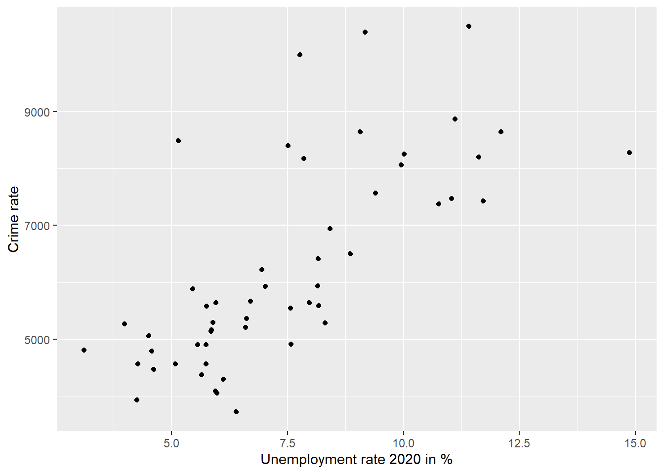
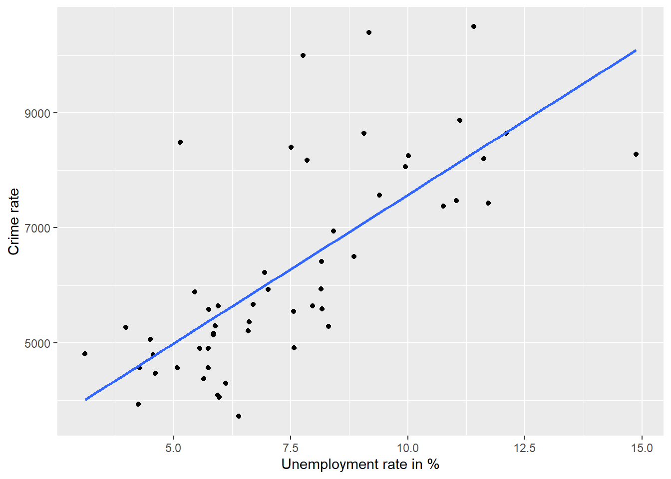
Interpretation: The depicted observations and the fitted line imply a positive correlation. (The higher the unemployment rate, the higher the crime rate.)
Interpretation: In this case, the correlation coefficient is r = 0.72 with a p-value of < 0.001. That means that we find a strong positive correlation. The correlation is also statistically significant (we typically speak of a statistically significant result if the p-value is below 0.05), which means that we can be fairly certain that the result is not due to chance but can be interpreted as systematic.
The correlation showed that there is a positive (and statistically significant) bivariate relationship between unemployment and crime. But is this relationship causal? One way to assess this is to control for alternative explanations using multiple regression. We use population density as an alternative explanation. After all, it may well be that unemployment and crime occur primarily in an urban context. If that was the case, part of the correlation would not be due to unemployment, but to population density, and unemployment would so to say partly “transport” the effect of population density (if not included in the regression model). Let’s take a look at this.
Model 1 includes unemployment as an explanatory variable
Interpretation: If unemployment increases by one percentage point, crime increases by 517 cases per 100,000 inhabitants (Model 1). The relationship is statistically significant. If we now control for population density in Model 2 (and thus hold the influence of population density constant), a one-unit increase in unemployment is associated with an increase of only 215 cases. Population density is also positively associated with crime. Both coefficient estimates are statistically significant at p < 0.01. It thus seems to be a good idea to control for the influence of population density. We might be now much closer to the real effect of unemployment on crime now. However, we do not know this for certain because other alternative explanations are still possible to think of (e.g., the role of age composition or local social policies, as well as alternative explanations at the level of individuals).

.png)
.png)