Chapter 1 One-Variable Statistics: Basics

Section 1.1 Terminology: Individuals/Population/Variables/Samples

Oddly enough, it is often a lack of clarity about who [or what] you are looking at which makes a lie out of statistics. Here are the terms, then, to keep straight:

Definition 1.1.

The units which are the objects of a statistical study are called the individuals in that study, while the collection of all such individuals is called the population of the study.
Note that while the term “individuals” sounds like it is talking about people, the individuals in a study could be things, even abstract things like events.

Example 1.2. Individuals in Election Study.

The individuals in a study about a democratic election might be the voters. But if you are going to make an accurate prediction of who will win the election, it is important to be more precise about what exactly is the population of all of those individuals [voters] that you intend to study: is it all eligible voters, all registered voters, the people who actually voted, etc.

Example 1.3. Individuals in Coin Flip Study.

If you want to study if a coin is “fair” or not, you would flip it repeatedly. The individuals would then be flips of that coin, and the population might be something like all the flips ever done in the past and all that will ever be done in the future. These individuals are quite abstract, and in fact it is impossible ever to get your hands on all of them (the ones in the future, for example).

Example 1.4. Individuals in Homework Study.

Suppose we’re interested in studying whether doing more homework helps students do better in their studies. So shouldn’t the individuals be the students? Well, which students? How about we look only at college students. Which college students? OK, how about students at 4-year colleges and universities in the United States, over the last five years—after all, things might be different in other countries and other historical periods.
Wait, a particular student might sometimes do a lot of homework and sometimes do very little. And what exactly does “do better in their studies” mean? So maybe we should look at each student in each class they take, then we can look at the homework they did for that class and the success they had in it.
Therefore, the individuals in this study would be individual experiences that students in US 4-year colleges and universities had in the last five years, and population of the study would essentially be the collection of all the names on all class rosters of courses in the last five years at all US 4-year colleges and universities.
When doing an actual scientific study, we are usually not interested so much in the individuals themselves, but rather in

Definition 1.5.

A variable in a statistical study is the answer of a question the researcher is asking about each individual. There are two types:
  • A categorical variable is one whose values have a finite number of possibilities.
  • A quantitative variable is one whose values are numbers (so, potentially an infinite number of possibilities).
The variable is something which (as the name says) varies, in the sense that it can have a different value for each individual in the population (although that is not necessary).

Example 1.6. Variable in Election Study.

In Example 1.2, the variable most likely would be who they voted for, a categorical variable with only possible values “Mickey Mouse” or “Daffy Duck” (or whoever the names on the ballot were).

Example 1.7. Variable in Coin Flip Study.

In Example 1.3, the variable most likely would be what face of the coin was facing up after the flip, a categorical variable with values “heads” and “tails.”

Example 1.8. Variables in Homework Study.

There are several variables we might use in Example 1.4. One might be how many homework problems did the student do in that course. Another could be how many hours total did the student spend doing homework over that whole semester, for that course. Both of those would be quantitative variables.
A categorical variable for the same population would be what letter grade did the student get in the course, which has possible values A, A-, B+, …, D-, F.
In many [most?] interesting studies, the population is too large for it to be practical to go observe the values of some interesting variable. Sometimes it is not just impractical, but actually impossible—think of the example we gave of all the flips of the coin, even the ones in the future. So instead, we often work with

Definition 1.9.

A sample is a subset of a population under study.
Often we use the variable \(N\) to indicate the size of a whole population and the variable \(n\) for the size of a sample; as we have said, usually \(n \lt N\text{.}\)
Later we shall discuss how to pick a good sample, and how much we can learn about a population from looking at the values of a variable of interest only for the individuals in a sample. For the rest of this chapter, however, let’s just consider what to do with these sample values.

Section 1.2 Visual Representation of Data, I: Categorical Variables

Suppose we have a population and variable in which we are interested. We get a sample, which could be large or small, and look at the values of our variable for the individuals in that sample. We shall informally refer to this collection of values as a dataset.
In this section, we suppose also that the variable we are looking at is categorical. Then we can summarize the dataset by telling which categorical values did we see for the individuals in the sample, and how often we saw those values.
There are two ways we can make pictures of this information: bar charts and pie charts.

Subsection 1.2.1 Bar Charts I: Frequency Charts

We can take the values which we saw for individuals in the sample along the \(x\)-axis of a graph, and over each such label make a box whose height indicates how many individuals had that value—the frequency of occurrence of that value.
This is called a bar chart. As with all graphs, you should always label all axes. The \(x\)-axis will be labeled with some description of the variable in question, the \(y\)-axis label will always be “frequency” (or some synonym like “count” or “number of times”).
Example 1.10. Frequency Bar Chart for Coin Flips.
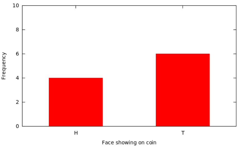
In Example 1.7, suppose we took a sample consisting of the next 10 flips of our coin. Suppose further that 4 of the flips came up heads—write it as “H”—and 6 came up tails, T. Then the corresponding bar chart would show bars for H with height 4 and T with height 6.
Figure 1.11. Frequency bar chart for coin flip results

Subsection 1.2.2 Bar Charts II: Relative Frequency Charts

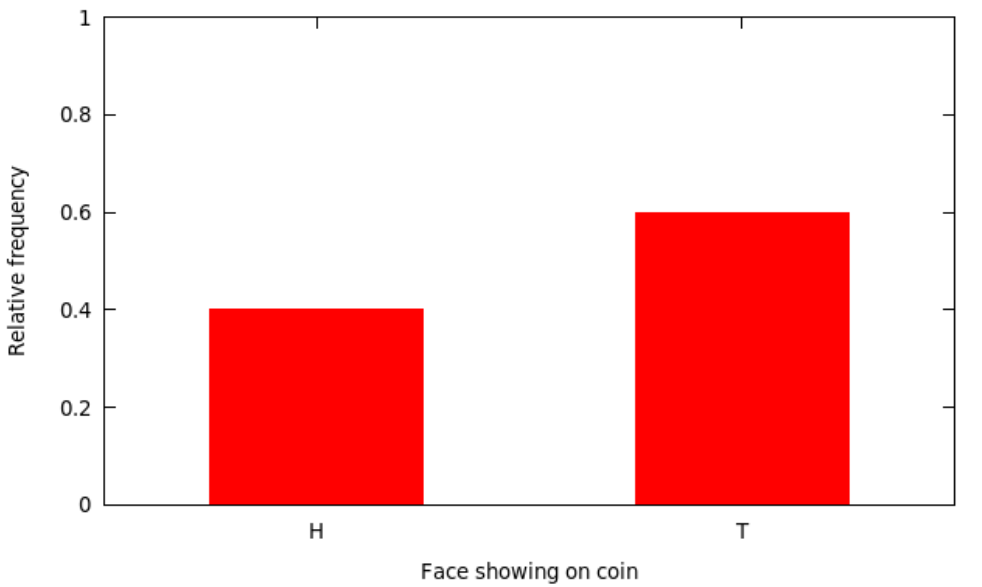
There is a variant of the above kind of bar chart which actually looks nearly the same but changes the labels on the \(y\)-axis. That is, instead of making the height of each bar be how many times each categorical value occurred, we could make it be what fraction of the sample had that categorical value—the relative frequency. This fraction is often displayed as a percentage.
Example 1.12. Relative Frequency Bar Chart for Coin Flips.
The relative frequency version of the above bar chart in Example 1.10 would show bars for H at height 0.4 (or 40%) and T at height 0.6 (or 60%).
Figure 1.13. Relative frequency bar chart for coin flip results

Subsection 1.2.3 Bar Charts III: Cautions

Notice that with bar charts (of either frequency or relative frequency) the variable values along the \(x\)-axis can appear in any order whatsoever. This means that any conclusion you draw from looking at the bar chart must not depend upon that order. For example, it would be foolish to say that the graph in Example 1.10 “shows an increasing trend,” since it would make just as much sense to put the bars in the other order and then “show a decreasing trend”—both are meaningless.
For relative frequency bar charts, in particular, note that the total of the heights of all the bars must be \(1\) (or \(100\%\)). If it is more, something is weird; if it is less, some data has been lost.
Finally, it makes sense for both kinds of bar charts for the \(y\)-axis to run from the logical minimum to maximum. For frequency charts, this means it should go from \(0\) to \(n\) (the sample size). For relative frequency charts, it should go from \(0\) to \(1\) (or \(100\%\)). Skimping on how much of this appropriate \(y\)-axis is used is a common trick to lie with statistics.
Example 1.14. Misleading Bar Chart with Bad Y-Axis.
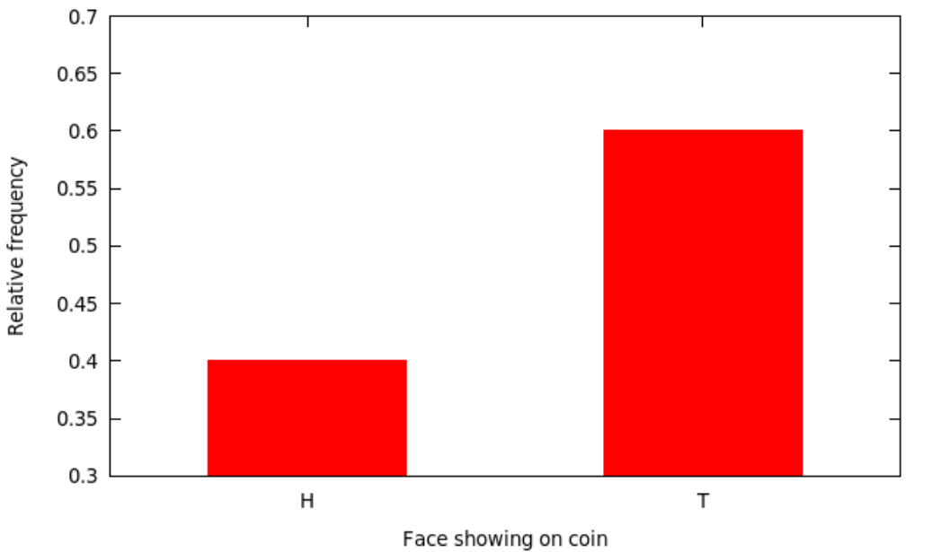
The coin we looked at in Example 1.10 and Example 1.12 could well be a fair coin—it didn’t show exactly half heads and half tails, but it was pretty close. Someone who was trying to claim, deceptively, that the coin was not fair might have shown only a portion of the \(y\)-axis, making the difference appear much more dramatic.
Figure 1.15. Misleading bar chart with restricted y-axis
This is actually, in a strictly technical sense, a correct graph. But, looking at it, one might conclude that T seems to occur more than twice as often as H, so the coin is probably not fair… until a careful examination of the \(y\)-axis shows that even though the bar for T is more than twice as high as the bar for H, that is an artifact of how much of the \(y\)-axis is being shown.
In summary, bar charts actually don’t have all that much use in sophisticated statistics, but are extremely common in the popular press (and on web sites and so on).

Subsection 1.2.4 Pie Charts

Another way to make a picture with categorical data is to use the fractions from a relative frequency bar chart, but not for the heights of bars, instead for the sizes of wedges of a pie.
Example 1.16. Pie Chart for Coin Flips.
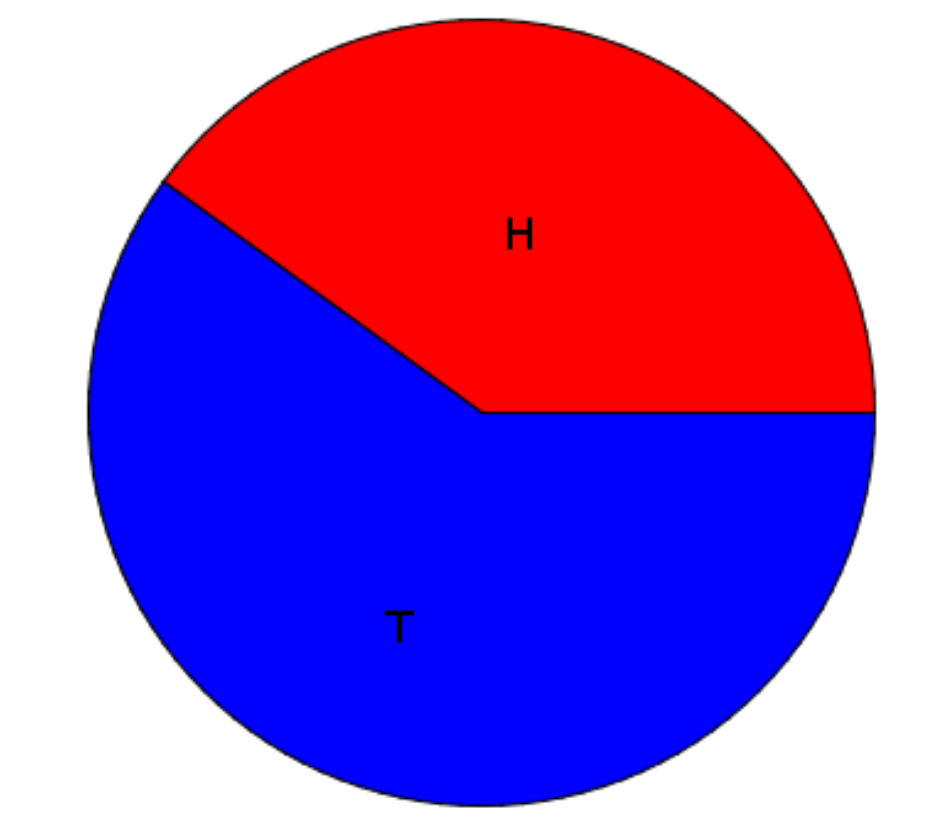
Here’s a pie chart with the relative frequency data from Example 1.12. It would show a pie divided into two wedges: one for H taking up 40% of the pie, and one for T taking up 60%.
Figure 1.17. Pie chart for coin flip results
Pie charts are widely used, but actually they are almost never a good choice. In fact, do an Internet search for the phrase “pie charts are bad” and there will be many hits. Many of the arguments are quite insightful.
When you see a pie chart, it is either an attempt (misguided, though) by someone to be folksy and friendly, or it is a sign that the author is quite unsophisticated with data visualization, or, worst of all, it might be a sign that the author is trying to use mathematical methods in a deceptive way.
In addition, all of the cautions we mentioned above for bar charts of categorical data apply, mostly in exactly the same way, for pie charts.

Section 1.3 Visual Representation of Data, II: Quantitative Variables

Now suppose we have a population and quantitative variable in which we are interested. We get a sample, which could be large or small, and look at the values of our variable for the individuals in that sample. There are two ways we tend to make pictures of datasets like this: stem-and-leaf plots and histograms.

Subsection 1.3.1 Stem-and-leaf Plots

One somewhat old-fashioned way to handle a modest amount of quantitative data produces something between simply a list of all the data values and a graph. It’s not a bad technique to know about in case one has to write down a dataset by hand, but very tedious — and quite unnecessary, if one uses modern electronic tools instead — if the dataset has more than a couple dozen values. The easiest case of this technique is where the data are all whole numbers in the range \(0-99\text{.}\) In that case, one can take off the tens place of each number — call it the stem — and put it on the left side of a vertical bar, and then line up all the ones places — each is a leaf — to the right of that stem. The whole thing is called a stem-and-leaf plot or, sometimes, just a stemplot.
It’s important not to skip any stems which are in the middle of the dataset, even if there are no corresponding leaves. It is also a good idea to allow repeated leaves, if there are repeated numbers in the dataset, so that the length of the row of leaves will give a good representation of how much data is in that general group of data values.
Example 1.18.
Here is a list of the scores of 30 students on a statistics test:
\begin{equation*} \begin{matrix} 86 & 80 & 25 & 77 & 73 & 76 & 88 & 90 & 69 & 93\\ 90 & 83 & 70 & 73 & 73 & 70 & 90 & 83 & 71 & 95\\ 40 & 58 & 68 & 69 & 100 & 78 & 87 & 25 & 92 & 74 \end{matrix} \end{equation*}
As we said, using the tens place (and the hundreds place as well, for the data value \(100\)) as the stem and the ones place as the leaf, we get
Table 1.19. Stem-and-Leaf Plot of Students’ Scores
Stem Leaf
10 0
9 0 0 0 2 3 5
8 0 3 3 6 7 8
7 0 0 1 3 3 3 4 6 7 8
6 8 9 9
5 8
4 0
3
2 5 5
Key: \(1 | 7 = 17\)
One nice feature stem-and-leaf plots have is that they contain all of the data values, they do not lose anything (unlike our next visualization method, for example).

Subsection 1.3.2 [Frequency] Histograms

The most important visual representation of quantitative data is a histogram. Histograms actually look a lot like a stem-and-leaf plot, except turned on its side and with the row of numbers turned into a vertical bar, like a bar graph. The height of each of these bars would be how many
Another way of saying that is that we would be making bars whose heights were determined by how many scores were in each group of ten. Note there is still a question of into which bar a value right on the edge would count: e.g., does the data value \(50\) count in the bar to the left of that number, or the bar to the right? It doesn’t actually matter which side, but it is important to state which choice is being made.
Example 1.20.
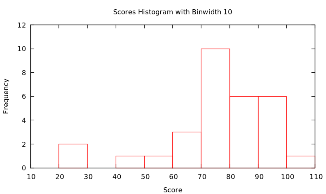
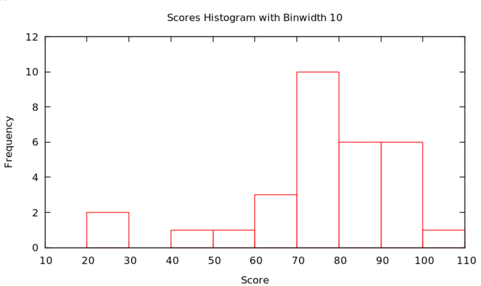
Continuing with the score data in Example Example 1.18 and putting all data values \(x\) satisfying \(20\le x<30\) in the first bar, values \(x\) satisfying \(30\le x<40\) in the second, values \(x\) satisfying \(40\le x<50\) in the third, etc. — that is, put data values on the edges in the bar to the right — we get the figure
Figure 1.21. Histogram of test scores with bins of width 10
Actually, there is no reason that the bars always have to be ten units wide: it is important that they are all the same size and that how they handle the edge cases (whether the left or right bar gets a data value on edge), but they could be any size. We call the successive ranges of the \(x\) coordinates which get put together for each bar bins or classes, and it is up to the statistician to chose whichever bins — where they start and how wide they are — shows the data best.
Typically, the smaller the bin size, the more variation (precision) can be seen in the bars … but sometimes there is so much variation that the result seems to have a lot of random jumps up and down, like static on the radio. On the other hand, using a large bin size makes the picture smoother … but sometimes, it is so smooth that very little information is left. Some of this is shown in the following
Example 1.22.
Continuing with the score data in Example Example 1.18 and now using the bins with \(x\) satisfying \(10\le x<12\text{,}\) then \(12\le x<14\text{,}\) etc., we get the histogram with bins of width 2:
Figure 1.23. Histogram of test scores with bins of width 2
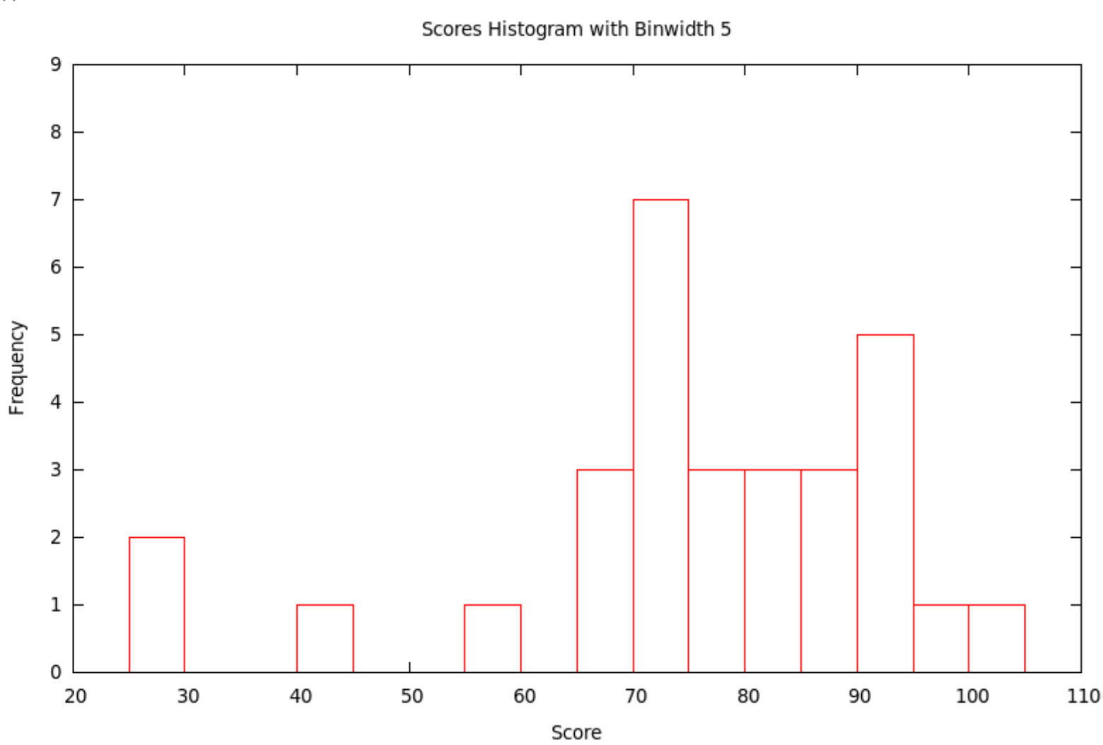
If we use the bins with \(x\) satisfying \(10\le x<15\text{,}\) then \(15\le x<20\text{,}\) etc., we get the histogram with bins of width 5:
Figure 1.24. Histogram of test scores with bins of width 5
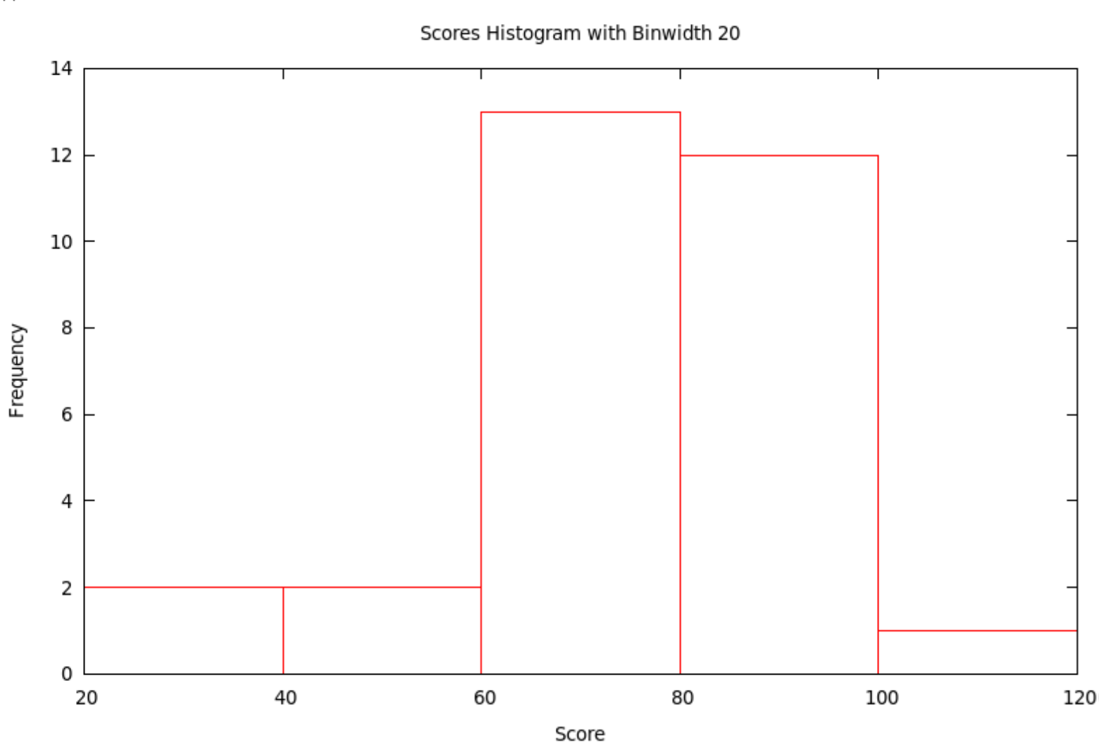
If we use the bins with \(x\) satisfying \(20\le x<40\text{,}\) then \(40\le x<60\text{,}\) etc., we get the histogram with bins of width 20:
Figure 1.25. Histogram of test scores with bins of width 20
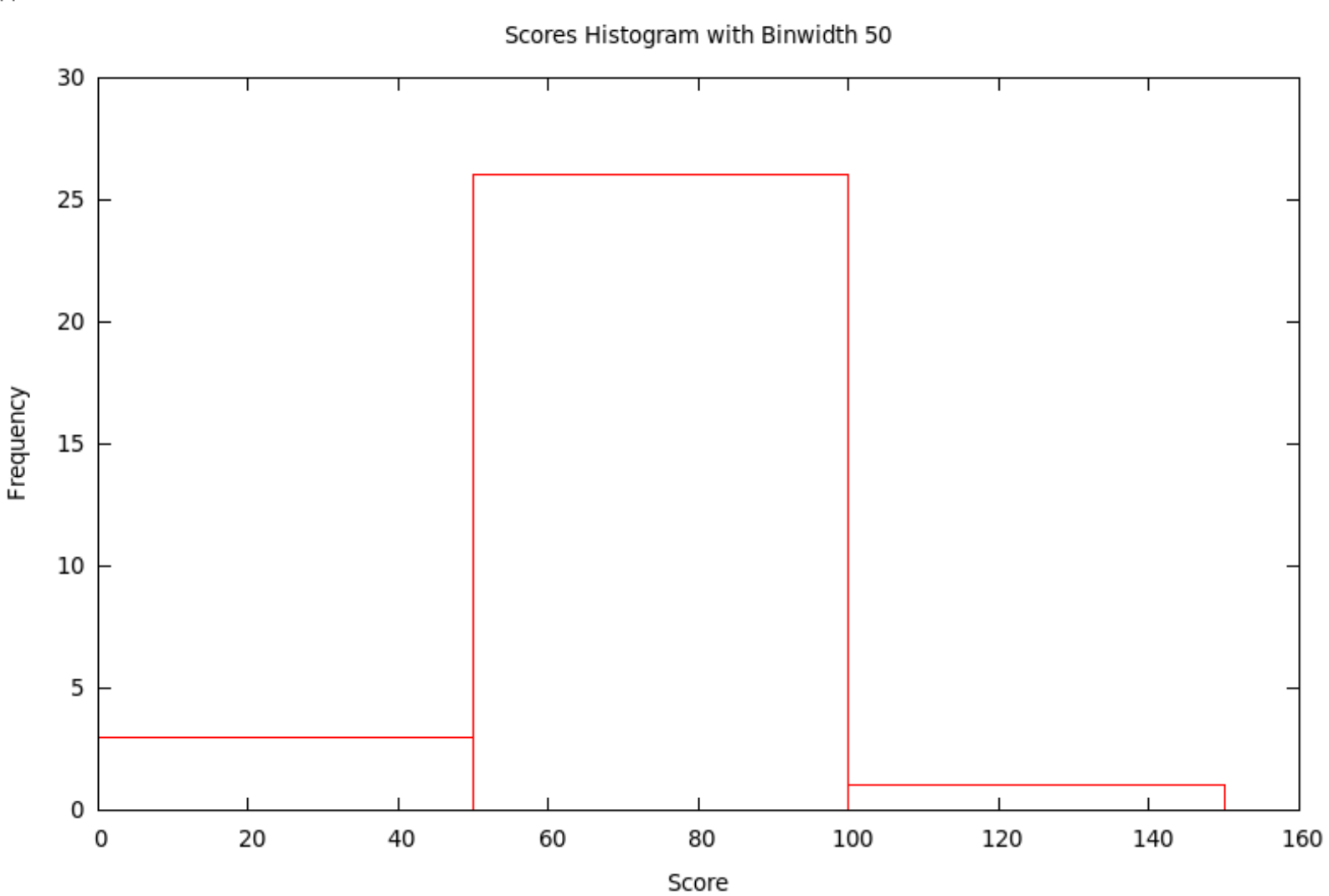
Finally, if we use the bins with \(x\) satisfying \(0\le x<50\text{,}\) then \(50\le x<100\text{,}\) and then \(100\le x<150\text{,}\) we get the histogram with bins of width 50:
Figure 1.26. Histogram of test scores with bins of width 50

Subsection 1.3.3 [Relative Frequency] Histograms

Just as we could have bar charts with absolute (Subsection 1.2.1) or relative (Subsection 1.2.2) frequencies, we can do the same for histograms. Above, in Subsection 1.3.2, we made absolute frequency histograms. If, instead, we divide each of the counts used to determine the heights of the bars by the total sample size, we will get fractions or percents — relative frequencies. We should then change the label on the \(y\)-axis and the tick-marks numbers on the \(y\)-axis, but otherwise the graph will look exactly the same (as it did with relative frequency bar charts compared with absolute frequency bar chars).
Example 1.27.
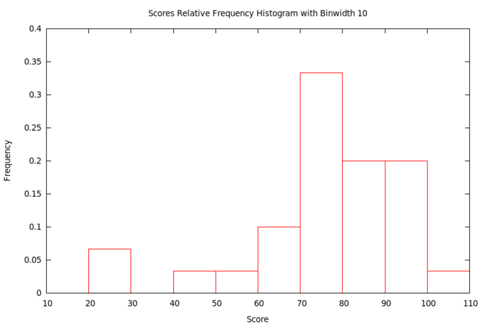
Let’s make the relative frequency histogram corresponding to the absolute frequency histogram in Example Example 1.20, based on the data from Example Example 1.18 — all we have to do is change the numbers used to make heights of the bars in the graph by dividing them by the sample size, 30, and then also change the \(y\)-axis label and tick mark numbers.
Figure 1.28. Relative frequency histogram of test scores with bins of width 10

Subsection 1.3.4 How to Talk About Histograms

Histograms of course tell us what the data values are — the location along the \(x\) value of a bar is the value of the variable — and how many of them have each particular value — the height of the bar tells how many data values are in that bin. This is also given a technical name
Definition 1.29.
Given a variable defined on a population, or at least on a sample, the distribution of that variable is a list of all the values the variable actually takes on and how many times it takes on these values.
The reason we like the visual version of a distribution, its histogram, is that our visual intuition can then help us answer general, qualitative questions about what those data must be telling us. The first questions we usually want to answer quickly about the data are
  • What is the shape of the histogram?
  • Where is its center?
  • How much variability [also called spread] does it show?
When we talk about the general shape of a histogram, we often use the terms
Definition 1.30.
A histogram is symmetric if the left half is (approximately) the mirror image of the right half.
We say a histogram is skewed left if the tail on the left side is longer than on the right. In other words, left skew is when the left half of the histogram — half in the sense that the total of the bars in this left part is half of the size of the dataset — extends farther to the left than the right does to the right. Conversely, the histogram is skewed right if the right half extends farther to the right than the left does to the left.
If the shape of the histogram has one significant peak, then we say it is unimodal, while if it has several such, we say it is multimodal.
It is often easy to point to where the center of a distribution looks like it lies, but it is hard to be precise. It is particularly difficult if the histogram is “noisy,” maybe multimodal. Similarly, looking at a histogram, it is often easy to say it is “quite spread out” or “very concentrated in the center,” but it is then hard to go beyond this general sense.
Precision in our discussion of the center and spread of a dataset will only be possible in the next section, when we work with numerical measures of these features.

Section 1.4 Numerical Descriptions of Data, I: Measures of the Center

Oddly enough, there are several measures of central tendency, as ways to define the middle of a dataset are called. There is different work to be done to calculate each of them, and they have different uses, strengths, and weaknesses.
For this whole section we will assume we have collected \(n\) numerical values, the values of our quantitative variable for the sample we were able to study. When we write formulæ with these values, we can’t give them variable names that look like \(a, b, c, \dots\text{,}\) because we don’t know where to stop (and what would we do if \(n\) were more than 26?). Instead, we’ll use the variables \(x_1, x_2, \dots, x_n\) to represent the data values.
One more very convenient bit of notation, once we have started writing an unknown number (\(n\)) of numbers \(x_1, x_2, \dots, x_n\text{,}\) is a way of writing their sum:

Definition 1.31.

If we have \(n\) numbers which we write \(x_1, \dots, x_n\text{,}\) then we use the shorthand summation notation \(\sum x_i\) to represent the sum \(\sum x_i = x_1 + \dots + x_n\text{.}\)
 1 
Sometimes you will see this written instead \(\sum_{i=1}^n x_i\text{.}\) Think of the “\(\sum_{i=1}^n{}\)” as a little computer program which with \(i=1\text{,}\) increases it one step at a time until it gets all the way to \(i=n\text{,}\) and adds up whatever is to the right. So, for example, \(\sum_{i=1}^3 2i\) would be \((2*1)+(2*2)+(2*3)\text{,}\) and so has the value \(12\text{.}\)

Example 1.32.

If our dataset were \(\{1, 2, 17, -3.1415, 3/4\}\text{,}\) then \(n\) would be 5 and the variables \(x_1, \dots, x_5\) would be defined with values \(x_1=1\text{,}\) \(x_2=2\text{,}\) \(x_3=17\text{,}\) \(x_4=-3.1415\text{,}\) and \(x_5=3/4\text{.}\)
In addition
 2 
no pun intended
, we would have \(\sum x_i = x_1+x_2+x_3+x_4+x_5=1+2+17-3.1415+ 3/4=17.6085\text{.}\)

Subsection 1.4.1 Mode

Let’s first discuss probably the simplest measure of central tendency, and in fact one which was foreshadowed by terms like “unimodal.”
Definition 1.33.
A mode of a dataset \(x_1, \dots, x_n\) of \(n\) numbers is one of the values \(x_i\) which occurs at least as often in the dataset as any other value.
It would be nice to say this in a simpler way, something like “the mode is the value which occurs the most often in the dataset,” but there may not be a single such number.
Example 1.34.
Continuing with the data from Example 1.18, it is easy to see, looking at the stem-and-leaf plot, that both 73 and 90 are modes.
Note that in some of the histograms we made using these data and different bin widths, the bins containing 73 and 90 were of the same height, while in others they were of different heights. This is an example of how it can be quite hard to see on a histogram where the mode is… or where the modes are.

Subsection 1.4.2 Mean

The next measure of central tendency, and certainly the one heard most often in the press, is simply the average. However, in statistics, this is given a different name.
Definition 1.35.
The mean of a dataset \(x_1, \dots, x_n\) of \(n\) numbers is given by the formula \(\left(\sum x_i\right)/n\text{.}\)
If the data come from a sample, we use the notation \(\overline{x}\) for the sample mean.
If \(\{x_1, \dots, x_n\}\) is all of the data from an entire population, we use the notation \(\mu_X\) [this is the Greek letter “mu,” pronounced “mew,” to rhyme with “new.”] for the population mean.
Example 1.36.
Since we’ve already computed the sum of the data in Example 1.32 to be \(17.6085\) and there were \(5\) values in the dataset, the mean is \(\overline{x}=17.6085/5 = 3.5217\).
Example 1.37.
Again using the data from Example 1.18, we can calculate the mean \(\overline{x}=\left(\sum x_i\right)/n =2246/30=74.8667\).
Notice that the mean in the two examples above was not one of the data values. This is true quite often. What that means is that the phrase “the average whatever,” as in “the average American family has \(X\)” or “the average student does \(Y\text{,}\)” is not talking about any particular family, and we should not expect any particular family or student to have or do that thing. Someone with a statistical education should mentally edit every phrase like that they hear to be instead something like “the mean of the variable \(X\) on the population of all American families is ...,” or “the mean of the variable \(Y\) on the population of all students is ...,” or whatever.

Subsection 1.4.3 Median

Our third measure of central tendency is not the result of arithmetic, but instead of putting the data values in increasing order.
Definition 1.38.
Imagine that we have put the values of a dataset \(\{x_1, \dots, x_n\}\) of \(n\) numbers in increasing (or at least non-decreasing) order, so that \(x_1\le x_2\le \dots \le x_n\text{.}\) Then if \(n\) is odd, the median of the dataset is the middle value, \(x_{(n+1)/2}\text{,}\) while if \(n\) is even, the median is the mean of the two middle numbers, \(\frac{x_{n/2}+x_{(n/2)+1}}{2}\text{.}\)
Example 1.39.
Working with the data in Example 1.32, we must first put them in order, as \(\{-3.1415, 3/4, 1, 2, 17\}\text{,}\) so the median of this dataset is the middle value, \(1\text{.}\)
Example 1.40.
Now let us find the median of the data from Example 1.18. Fortunately, in that example, we made a stem-and-leaf plot and even put the leaves in order, so that starting at the bottom and going along the rows of leaves and then up to the next row, will give us all the values in order! Since there are 30 values, we count up to the \(15^{th}\) and \(16^{th}\) values, being 76 and 77, and from this we find that the median of the dataset is \(\frac{76+77}{2}=76.5\text{.}\)

Subsection 1.4.4 Strengths and Weaknesses of These Measures of Central Tendency

The weakest of the three measures above is the mode. Yes, it is nice to know which value happened most often in a dataset (or which values all happened equally often and more often then all other values). But this often does not necessarily tell us much about the over-all structure of the data.
Example 1.41.
Suppose we had the data
\begin{equation*} \begin{matrix} 86 & 80 & 25 & 77 & 73 & 76 & 100 & 90 & 67 & 93\\ 94 & 83 & 72 & 75 & 79 & 70 & 91 & 82 & 71 & 95\\ 40 & 58 & 68 & 69 & 100 & 78 & 87 & 25 & 92 & 74 \end{matrix} \end{equation*}
with corresponding stem-and-leaf plot
Table 1.42. Stem-and-Leaf Plot
Stem Leaf
10 0
9 0 1 2 3 4 5
8 0 2 3 6 7 8
7 0 1 2 3 4 5 6 7 8 9
6 7 8 9
5 8
4 0
3
2 5 5
This would have a histogram with bins of width 10 that looks exactly like the one in Example 1.20 — so the center of the histogram would seem, visually, still to be around the bar over the 80s — but now there is a unique mode of 25.
What this example shows is that a small change in some of the data values, small enough not to change the histogram at all, can change the mode(s) drastically. It also shows that the location of the mode says very little about the data in general or its shape, the mode is based entirely on a possibly accidental coincidence of some values in the dataset, no matter if those values are in the “center” of the histogram or not.
The mean has a similar problem: a small change in the data, in the sense of adding only one new data value, but one which is very far away from the others, can change the mean quite a bit. Here is an example.
Example 1.43.
Suppose we take the data from Example 1.18 but change only one value — such as by changing the 100 to a 1000, perhaps by a simple typo of the data entry. Then if we calculate the mean, we get \(\overline{x}=\left(\sum x_i\right)/n =3146/30=104.8667\), which is quite different from the mean of original dataset.
A data value which seems to be quite different from all (or the great majority of) the rest is called an outlier
 3 
This is a very informal definition of an outlier. Below we will have an extremely precise one.
What we have just seen is that the mean is very sensitive to outliers. This is a serious defect, although otherwise it is easy to compute, to work with, and to prove theorems about.
Finally, the median is somewhat tedious to compute, because the first step is to put all the data values in order, which can be very time-consuming. But, once that is done, throwing in an outlier tends to move the median only a little bit. Here is an example.
Example 1.44.
If we do as in Example 1.43 and change the data value of 100 in the dataset of Example 1.18 to 1000, but leave all of the other data values unchanged, it does not change the median at all since the 1000 is the new largest value, and that does not change the two middle values at all.
If instead we take the data of Example 1.18 and simply add another value, 1000, without taking away the 100, that does change the median: there are now an odd number of data values, so the median is the middle one after they are put in order, which is 78. So the median has changed by only half a point, from 77.5 to 78. And this would even be true if the value we were adding to the dataset were 1000000 and not just 1000!
In other words, the median is very insensitive to outliers. Since, in practice, it is very easy for datasets to have a few random, bad values (typos, mechanical errors, etc.), which are often outliers, it is usually smarter to use the median than the mean.
As one final point, note that as we mentioned in Subsection 1.4.2, the word “average,” the unsophisticated version of “mean,” is often incorrectly used as a modifier of the individuals in some population being studied (as in “the average American ...”), rather than as a modifier of the variable in the study (“the average income...”), indicating a fundamental misunderstanding of what the mean means. If you look a little harder at this misunderstanding, though, perhaps it is based on the idea that we are looking for the center, the “typical” value of the variable.
The mode might seem like a good way — it’s the most frequently occurring value. But we have seen how that is somewhat flawed.
The mean might also seem like a good way — it’s the “average,” literally. But we’ve also seen problems with the mean.
In fact, the median is probably closest to the intuitive idea of “the center of the data.” It is, after all, a value with the property that both above and below that value lie half of the data values.
One last example to underline this idea:
Example 1.45.
The period of economic difficulty for world markets in the late 2000s and early 2010s is sometimes called the Great Recession. Suppose a politician says that we have come out of that time of troubles, and gives as proof the fact that the average family income has increased from the low value it had during the Great Recession back to the values it had before then, and perhaps is even higher than it was in 2005.
It is possible that in fact people are better off, as the increase in this average — mean — seems to imply. But it is also possible that while the mean income has gone up, the median income is still low. This would happen if the histogram of incomes recently still has most of the tall bars down where the variable (family income) is low, but has a few, very high outliers. In short, if the super-rich have gotten even super-richer, that will make the mean (average) go up, even if most of the population has experienced stagnant or decreasing wages — but the median will tell what is happening to most of the population.
So when a politician uses the evidence of the average (mean) as suggested here, it is possible they are trying to hide from the public the reality of what is happening to the rich and the not-so-rich. It is also possible that this politician is simply poorly educated in statistics and doesn’t realize what is going on. You be the judge ... but pay attention so you know what to ask about.
The last thing we need to say about the strengths and weaknesses of our different measures of central tendency is a way to use the weaknesses of the mean and median to our advantage. That is, since the mean is sensitive to outliers, and pulled in the direction of those outliers, while the median is not, we can use the difference between the two to tell us which way a histogram is skewed.
Fact: If the mean of a dataset is larger than the median, then histograms of that dataset will be right-skewed. Similarly, if the mean is less than the median, histograms will be left-skewed.

Section 1.5 Numerical Descriptions of Data, II: Measures of Spread

Subsection 1.5.1 Range

The simplest—and least useful—measure of the spread of some data is literally how much space on the \(x\)-axis the histogram takes up. To define this, first a bit of convenient notation:
Definition 1.46.
Suppose \(x_1, \dots, x_n\) is some quantitative dataset. We shall write \(x_{min}\) for the smallest and \(x_{max}\) for the largest values in the dataset.
With this, we can define our first measure of spread
Definition 1.47.
Suppose \(x_1, \dots, x_n\) is some quantitative dataset. The range of this data is the number \(x_{max}-x_{min}\text{.}\)
Example 1.48.
Using again the statistics test scores data from Example 1.18, we can read off from the stem-and-leaf plot that \(x_{min}=25\) and \(x_{max}=100\text{,}\) so the range is \(75(=100-25)\text{.}\)
Example 1.49.
Working now with the made-up data in Example 1.32, which was put into increasing order in Example 1.39, we can see that \(x_{min}=-3.1415\) and \(x_{max}=17\text{,}\) so the range is \(20.1415(=17-(-3.1415))\text{.}\)
The thing to notice here is that since the idea of outliers is that they are outside of the normal behavior of the dataset, if there are any outliers they will definitely be what value gets called \(x_{min}\) or \(x_{max}\) (or both). So the range is supremely sensitive to outliers: if there are any outliers, the range will be determined exactly by them, and not by what the typical data is doing.

Subsection 1.5.2 Quartiles and the \(IQR\)

Let’s try to find a substitute for the range which is not so sensitive to outliers. We want to see how far apart not the maximum and minimum of the whole dataset are, but instead how far apart are the typical larger values in the dataset and the typical smaller values. How can we measure these typical larger and smaller? One way is to define these in terms of the typical—central—value of the upper half of the data and the typical value of the lower half of the data. Here is the definition we shall use for that concept:
Definition 1.50.
Imagine that we have put the values of a dataset \(\{x_1, \dots, x_n\}\) of \(n\) numbers in increasing (or at least non-decreasing) order, so that \(x_1\le x_2\le \dots \le x_n\text{.}\) If \(n\) is odd, call the lower half data all the values \(\{x_1, \dots, x_{(n-1)/2}\}\) and the upper half data all the values \(\{x_{(n+3)/2}, \dots, x_n\}\text{;}\) if \(n\) is even, the lower half data will be the values \(\{x_1, \dots, x_{n/2}\}\) and the upper half data all the values \(\{x_{(n/2)+1}, \dots, x_n\}\text{.}\)
Then the first quartile, written \(Q_1\), is the median of the lower half data, and the third quartile, written \(Q_3\), is the median of the upper half data.
Note that the first quartile is halfway through the lower half of the data. In other words, it is a value such that one quarter of the data is smaller. Similarly, the third quartile is halfway through the upper half of the data, so it is a value such that three quarters of the data is small. Hence the names “first” and “third quartiles.”
We can build a outlier-insensitive measure of spread out of the quartiles.
Definition 1.51.
Given a quantitative dataset, its inter-quartile range or \(IQR\) is defined by \(IQR=Q_3-Q_1\text{.}\)
Example 1.52.
Yet again working with the statistics test scores data from Example 1.18, we can count off the lower and upper half datasets from the stem-and-leaf plot, being respectively
\begin{equation*} \text{Lower}=\{25, 25, 40, 58, 68, 69, 69, 70, 70, 71, 73, 73, 73, 74, 76\} \end{equation*}
and
\begin{equation*} \text{Upper} = \{77, 78, 80, 83, 83, 86, 87, 88, 90, 90, 90, 92, 93, 95, 100\}\ . \end{equation*}
It follows that, for these data, \(Q_1=70\) and \(Q_3=88\text{,}\) so \(IQR=18(=88-70)\text{.}\)
Example 1.53.
Working again with the made-up data in Example 1.32, which was put into increasing order in Example 1.39, we can see that the lower half data is \(\{-3.1415, .75\}\text{,}\) the upper half is \(\{2, 17\}\text{,}\) \(Q_1=-1.19575(=\frac{-3.1415+.75}{2})\text{,}\) \(Q_3=9.5(=\frac{2+17}{2})\text{,}\) and \(IQR=10.69575(=9.5-(-1.19575))\text{.}\)

Subsection 1.5.3 Variance and Standard Deviation

We’ve seen a crude measure of spread, like the crude measure “mode” of central tendency. We’ve also seen a better measure of spread, the \(IQR\), which is insensitive to outliers like the median (and built out of medians). It seems that, to fill out the parallel triple of measures, there should be a measure of spread which is similar to the mean. Let’s try to build one.
Suppose the data is sample data. Then how far a particular data value \(x_i\) is from the sample mean \(\overline{x}\) is just \(x_i-\overline{x}\text{.}\) So the mean displacement from the mean, the mean of \(x_i-\overline{x}\text{,}\) should be a good measure of variability, shouldn’t it?
Unfortunately, it turns out that the mean of \(x_i-\overline{x}\) is always 0. This is because when \(x_i>\overline{x}\text{,}\) \(x_i-\overline{x}\) is positive, while when \(x_i<\overline{x}\text{,}\) \(x_i-\overline{x}\) is negative, and it turns out that the positives always exactly cancel the negatives (see if you can prove this algebraically, it’s not hard).
We therefore need to make the numbers \(x_i-\overline{x}\) positive before taking their mean. One way to do this is to square them all. Then we take something which is almost the mean of these squared numbers to get another measure of spread or variability:
Definition 1.54.
Given sample data \(x_1, \dots, x_n\) from a sample of size \(n\text{,}\) the sample variance is defined as
\begin{equation*} S_x^2 = \frac{\sum \left(x_i-\overline{x}\right)^2}{n-1} . \end{equation*}
Out of this, we then define the sample standard deviation
\begin{equation*} S_x = \sqrt{S_x^2} = \sqrt{\frac{\sum \left(x_i-\overline{x}\right)^2}{n-1}} . \end{equation*}
Why do we take the square root in that sample standard deviation? The answer is that the measure we build should have the property that if all the numbers are made twice as big, then the measure of spread should also be twice as big. Or, for example, if we first started working with data measured in feet and then at some point decided to work in inches, the numbers would all be 12 times as big, and it would make sense if the measure of spread were also 12 times as big.
The variance does not have this property: if the data are all doubled, the variance increases by a factor of 4. Or if the data are all multiplied by 12, the variance is multiplied by a factor of 144.
If we take the square root of the variance, though, we get back to the nice property of doubling data doubles the measure of spread, etc. For this reason, while we have defined the variance on its own and some calculators, computers, and on-line tools will tell the variance whenever you ask them to computer 1-variable statistics, we will in this class only consider the variance a stepping stone on the way to the real measure of spread of data, the standard deviation.
One last thing we should define in this section. For technical reasons that we shall not go into now, the definition of standard deviation is slightly different if we are working with population data and not sample data:
Definition 1.55.
Given data \(x_1, \dots, x_n\) from an entire population of size \(n\text{,}\) the population variance is defined as
\begin{equation*} \sigma_X^2 = \frac{\sum \left(x_i-\mu_X\right)^2}{n} . \end{equation*}
Out of this, we then define the population standard deviation
\begin{equation*} \sigma_X = \sqrt{\sigma_X^2} = \sqrt{\frac{\sum \left(x_i-\mu_X\right)^2}{n}} . \end{equation*}
[This letter \(\sigma\) is the lower-case Greek letter sigma, whose upper case \(\Sigma\) you’ve seen elsewhere.]
Now for some examples. Notice that to calculate these values, we shall always use an electronic tool like a calculator or a spreadsheet that has a built-in variance and standard deviation program—experience shows that it is nearly impossible to get all the calculations entered correctly into a non-statistical calculator, so we shall not even try.
Example 1.56.
For the statistics test scores data from Example 1.18, entering them into a spreadsheet and using VAR.S and STDEV.S for the sample variance and standard deviation and VAR.P and STDEV.P for population variance and population standard deviation, we get
\begin{align*} S_x^2 \amp = 331.98\\ S_x \amp = 18.22\\ \sigma_X^2 \amp = 330.92\\ \sigma_X \amp = 17.91 \end{align*}
Example 1.57.
Similarly, for the data in Example 1.32, we find in the same way that
\begin{align*} S_x^2 \amp = 60.60\\ S_x \amp = 7.78\\ \sigma_X^2 \amp = 48.48\\ \sigma_X \amp = 6.96 \end{align*}

Subsection 1.5.4 Strengths and Weaknesses of These Measures of Spread

We have already said that the range is extremely sensitive to outliers.
The \(IQR\text{,}\) however, is built up out of medians, used in different ways, so the \(IQR\) is insensitive to outliers.
The variance, both sample and population, is built using a process quite like a mean, and in fact also has the mean itself in the defining formula. Since the standard deviation in both cases is simply the square root of the variance, it follows that the sample and population variances and standard deviations are all sensitive to outliers.
This differing sensitivity and insensitivity to outliers is the main difference between the different measures of spread that we have discussed in this section.
One other weakness, in a certain sense, of the \(IQR\) is that there are several different definitions in use of the quartiles, based upon whether the median value is included or not when dividing up the data. These are called, for example, QUARTILE.INC and QUARTILE.EXC on some spreadsheets. It can then be confusing which one to use.

Subsection 1.5.5 A Formal Definition of Outliers—the \(1.5\,IQR\) Rule

So far, we have said that outliers are simply data that are atypical. We need a precise definition that can be carefully checked. What we will use is a formula (well, actually two formulæ) that describe that idea of an outlier being far away from the rest of data.
Actually, since outliers should be far away either in being significantly bigger than the rest of the data or in being significantly smaller, we should take a value on the upper side of the rest of the data, and another on the lower side, as the starting points for this far away. We can’t pick the \(x_{max}\) and \(x_{min}\) as those starting points, since they will be the outliers themselves, as we have noticed. So we will use our earlier idea of a value which is typical for the larger part of the data, the quartile \(Q_3\), and \(Q_1\) for the corresponding lower part of the data.
Now we need to decide how far is far enough away from those quartiles to count as an outlier. If the data already has a lot of variation, then a new data value would have to be quite far in order for us to be sure that it is not out there just because of the variation already in the data. So our measure of far enough should be in terms of a measure of spread of the data.
Looking at the last section, we see that only the \(IQR\) is a measure of spread which is insensitive to outliers—and we definitely don’t want to use a measure which is sensitive to the outliers, one which would have been affected by the very outliers we are trying to define.
All this goes together in the following
Definition 1.58. The \(1.5\,IQR\) Rule for Outliers.
Starting with a quantitative dataset whose first and third quartiles are \(Q_1\) and \(Q_3\) and whose inter-quartile range is \(IQR\text{,}\) a data value \(x\) is [officially, from now on] called an outlier if \(x<Q_1-1.5\,IQR\) or \(x>Q_3+1.5\,IQR\text{.}\)
Notice this means that \(x\) is not an outlier if it satisfies \(Q_1-1.5\,IQR\le x\le Q_3+1.5\,IQR\text{.}\)
Example 1.59.
Let’s see if there were any outliers in the test score dataset from Example 1.18. We found the quartiles and \(IQR\) in Example 1.52, so from the \(1.5\,IQR\) Rule, a data value \(x\) will be an outlier if
\begin{equation*} x<Q_1-1.5\,IQR=70-1.5\cdot18=43 \end{equation*}
or if
\begin{equation*} x>Q_3+1.5\,IQR=88+1.5\cdot18=115\ . \end{equation*}
Looking at the stemplot in Example 1.18, we conclude that the data values \(25\text{,}\) \(25\text{,}\) and \(40\) are the outliers in this dataset.
Example 1.60.
Applying the same method to the data in Example 1.32, using the quartiles and \(IQR\) from Example 1.53, the condition for an outlier \(x\) is
\begin{equation*} x<Q_1-1.5\,IQR=-1.19575-1.5\cdot10.69575=-17.239375 \end{equation*}
or
\begin{equation*} x>Q_3+1.5\,IQR=9.5+1.5\cdot10.69575=25.543625\ . \end{equation*}
Since none of the data values satisfy either of these conditions, there are no outliers in this dataset.

Subsection 1.5.6 The Five-Number Summary and Boxplots

We have seen that numerical summaries of quantitative data can be very useful for quickly understanding (some things about) the data. It is therefore convenient for a nice package of several of these
Definition 1.61.
Given a quantitative dataset \(\{x_1, \dots, x_n\}\text{,}\) the five-number summary
 4 
Which might write 5N\(\Sigma\)ary for short.
of this data is the set of values
\begin{equation*} \left\{x_{min},\ \ Q_1,\ \ \text{median},\ \ Q_3,\ \ x_{max}\right\} \end{equation*}
Example 1.62.
Why not write down the five-number summary for the same test score data we saw in Example 1.18? We’ve already done most of the work, such as calculating the min and max in Example 1.48, the quartiles in Example 1.52, and the median in Example 1.40, so the five-number summary is
\begin{align*} x_{min}\amp=25\\ Q_1\amp=70\\ \text{median}\amp=76.5\\ Q_3\amp=88\\ x_{max}\amp=100 \end{align*}
Example 1.63.
And, for completeness, the five number summary for the made-up data in Example 1.32 is
\begin{align*} x_{min}\amp=-3.1415\\ Q_1\amp=-1.19575\\ \text{median}\amp=1\\ Q_3\amp=9.5\\ x_{max}\amp=17 \end{align*}
where we got the min and max from Example 1.49, the median from Example 1.39, and the quartiles from Example 1.53.
As we have seen already several times, it is nice to have a both a numeric and a graphical/visual version of everything. The graphical equivalent of the five-number summary is
Definition 1.64.
Given some quantitative data, a boxplot [sometimes box-and-whisker plot] is a graphical depiction of the five-number summary, as follows:
  • an axis is drawn, labelled with the variable of the study
  • tick marks and numbers are put on the axis, enough to allow the following visual features to be located numerically
  • a rectangle (the box) is drawn parallel to the axis, stretching from values \(Q_1\) to \(Q_3\) on the axis
  • an additional line is drawn, parallel to the sides of the box, at the axis coordinate of the median of the data
  • lines are drawn parallel to the axis from the middle of the sides of the box (at the locations \(Q_1\) and \(Q_3\)) out to the axis coordinates \(x_{min}\) and \(x_{max}\), where these whiskers terminate in “T”s.
Example 1.65.
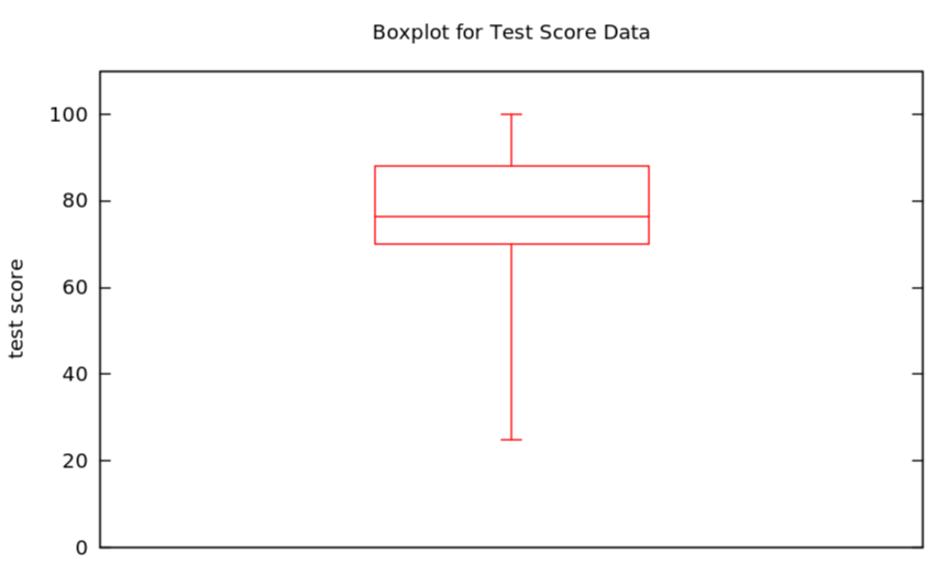
A boxplot for the test score data we started using in Example 1.18 is easy to make after we found the corresponding five-number summary in Example 1.62:
Figure 1.66. Boxplot of test score data
Sometimes it is nice to make a version of the boxplot which is less sensitive to outliers. Since the endpoints of the whiskers are the only parts of the boxplot which are sensitive in this way, they are all we have to change:
Definition 1.67.
Given some quantitative data, a boxplot showing outliers [sometimes box-and-whisker plot showing outliers] is minor modification of the regular boxplot, as follows
  • the whiskers only extend as far as the largest and smallest non-outlier data values
  • dots are put along the lines of the whiskers at the axis coordinates of any outliers in the dataset
Example 1.68.
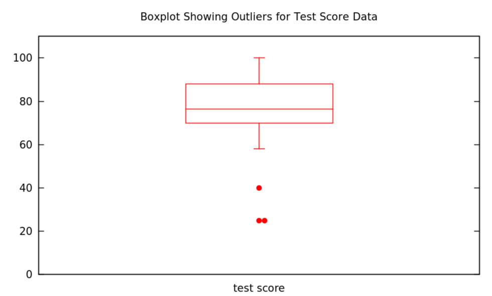
A boxplot showing outliers for the test score data we started using in Example 1.18 is only a small modification of the one we just made in Example 1.65
Figure 1.69. Boxplot showing outliers for test score data

Section 1.6 Exercises

Checkpoint 1.70.

A product development manager at the campus bookstore wants to make sure that the backpacks being sold there are strong enough to carry the heavy books students carry around campus. The manager decides she will collect some data on how heavy are the bags/packs/suitcases students are carrying around at the moment, by stopping the next 100 people she meets at the center of campus and measuring.
What are the individuals in this study? What is the population? Is there a sample — what is it? What is the variable? What kind of variable is this?

Checkpoint 1.71.

During a blood drive on campus, 300 donated blood. Of these, 136 had blood of type \(O\text{,}\) 120 had blood of type \(A\text{,}\) 32 of type \(B\text{,}\) and the rest of type \(AB\text{.}\)
Answer the same questions as in the previous exercise for this new situation.
Now make at least two visual representations of these data.

Checkpoint 1.72.

Go to the Wikipedia page for “Heights of Presidents and Presidential Candidates of the United States” and look only at the heights of the presidents themselves, in centimeters (cm).
Make a histogram with these data using bins of width 5. Explain how you are handling the edge cases in your histogram.

Checkpoint 1.73.

Suppose you go to the supermarket every week for a year and buy a bag of flour, packaged by a major national flour brand, which is labelled as weighing \(1kg\text{.}\) You take the bag home and weigh it on an extremely accurate scale that measures to the nearest \({1/100}^{th}\) of a gram. After the 52 weeks of the year of flour buying, you make a histogram of the accurate weights of the bags. What do you think that histogram will look like? Will it be symmetric or skewed left or right (which one?), where will its center be, will it show a lot of variation/spread or only a little? Explain why you think each of the things you say.
What about if you buy a \(1kg\) loaf of bread from the local artisanal bakery — what would the histogram of the accurate weights of those loaves look like (same questions as for histogram of weights of the bags of flour)?
If you said that those histograms were symmetric, can you think of a measurement you would make in a grocery store or bakery which would be skewed; and if you said the histograms for flour and loaf weights were skewed, can you think of one which would be symmetric? (Explain why, always, of course.) [If you think one of the two above histograms was skewed and one was symmetric (with explanation), you don’t need to come up with another one here.]

Checkpoint 1.74.

Twenty sacks of grain weigh a total of \(1003kg\text{.}\) What is the mean weight per sack?
Can you determine the median weight per sack from the given information? If so, explain how. If not, give two examples of datasets with the same total weight be different medians.

Checkpoint 1.75.

For the dataset \(\{6, -2, 6, 14, -3, 0, 1, 4, 3, 2, 5\}\text{,}\) which we will call \(DS_1\text{,}\) find the mode(s), mean, and median.
Define \(DS_2\) by adding \(3\) to each number in \(DS_1\text{.}\) What are the mode(s), mean, and median of \(DS_2\text{?}\)
Now define \(DS_3\) by subtracting \(6\) from each number in \(DS_1\text{.}\) What are the mode(s), mean, and median of \(DS_3\text{?}\)
Next, define \(DS_4\) by multiplying every number in \(DS_1\) by 2. What are the mode(s), mean, and median of \(DS_4\text{?}\)
Looking at your answers to the above calculations, how do you think the mode(s), mean, and median of datasets must change when you add, subtract, multiply or divide all the numbers by the same constant? Make a specific conjecture!

Checkpoint 1.76.

There is a very hard mathematics competition in which college students in the US and Canada can participate called the William Lowell Putnam Mathematical Competition. It consists of a six-hour long test with twelve problems, graded 0 to 10 on each problem, so the total score could be anything from 0 to 120.
The median score last year on the Putnam exam was 0 (as it often is, actually). What does this tell you about the scores of the students who took it? Be as precise as you can. Can you tell what fraction (percentage) of students had a certain score or scores? Can you figure out what the quartiles must be?

Checkpoint 1.77.

Find the range, \(IQR\), and standard deviation of the following sample dataset:
\begin{equation*} DS_1 = \{0, 0, 0, 0, 0, .5, 1, 1, 1, 1, 1\}\quad . \end{equation*}
Now find the range, \(IQR\), and standard deviation of the following sample data:
\begin{equation*} DS_2 = \{0, .5, 1, 1, 1, 1, 1, 1, 1, 1, 1\}\quad . \end{equation*}
Next find the range, \(IQR\), and standard deviation of the following sample data:
\begin{equation*} DS_3 = \{0, 0, 0, 0, 0, 0, 0, 0, 0, .5, 1\}\quad . \end{equation*}
Finally, find the range, \(IQR\), and standard deviation of sample data \(DS_4\text{,}\) consisting of 98 0s, one .5, and one 1 (so like \(DS_3\) except with 0 occurring 98 times instead of 9 time).
Checkpoint 1.78.

What must be true about a dataset if its range is 0? Give the most interesting example of a dataset with range of 0 and the property you just described that you can think of.
What must be true about a dataset if its \(IQR\) is 0? Give the most interesting example of a dataset with \(IQR\) of 0 and the property you just described that you can think of.
What must be true about a dataset if its standard deviation is 0? Give the most interesting example of a dataset with standard deviation of 0 and the property you just described that you can think of.

Checkpoint 1.79.

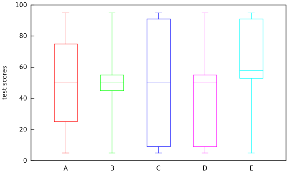
Here are some boxplots of test scores, out of 100, on a standardized test given in five different classes — the same test, different classes. For each of these plots, \(A - E\text{,}\) describe qualitatively (in the sense of §1.4.2) but in as much detail as you can, what must have been the histogram for the data behind this boxplot. Also sketch a possible such histogram, for each case.
Figure 1.80. Boxplot showing test scores for classes A through E