Chapter 2 Bi-variate Statistics: Basics

Section 2.1 Terminology: Explanatory/Response or Independent/Dependent

All of the discussion so far has been for studies which have a single variable. We may collect the values of this variable for a large population, or at least the largest sample we can afford to examine, and we may display the resulting data in a variety of graphical ways, and summarize it in a variety of numerical ways. But in the end all this work can only show a single characteristic of the individuals. If, instead, we want to study a relationship, we need to collect two (at least) variables and develop methods of descriptive statistics which show the relationships between the values of these variables.
Relationships in data require at least two variables. While more complex relationships can involve more, in this chapter we will start the project of understanding bivariate data, data where we make two observations for each individual, where we have exactly two variables.
If there is a relationship between the two variables we are studying, the most that we could hope for would be that that relationship is due to the fact that one of the variables causes the other. In this situation, we have special names for these variables

Definition 2.1.

In a situation with bivariate data, if one variable can take on any value without (significant) constraint it is called the independent variable, while the second variable, whose value is (at least partially) controlled by the first, is called the dependent variable.
Since the value of the dependent variable depends upon the value of the independent variable, we could also say that it is explained by the independent variable. Therefore the independent variable is also called the explanatory variable and the dependent variable is then called the response variable
Whenever we have bivariate data and we have made a choice of which variable will be the independent and which the dependent, we write \(x\) for the independent and \(y\) for the dependent variable.
Example 2.2.

Suppose we have a large warehouse of many different boxes of products ready to ship to clients. Perhaps we have packed all the products in boxes which are perfect cubes, because they are stronger and it is easier to stack them efficiently. We could do a study where
  • the individuals would be the boxes of product;
  • the population would be all the boxes in our warehouse;
  • the independent variable would be, for a particular box, the length of its side in cm;
  • the dependent variable would be, for a particular box, the cost to the customer of buying that item, in US dollars.
We might think that the size determines the cost, at least approximately, because the larger boxes contain larger products into which went more raw materials and more labor, so the items would be more expensive. So, at least roughly, the size may be anything, it is a free or independent choice, while the cost is (approximately) determined by the size, so the cost is dependent. Otherwise said, the size explains and the cost is the response. Hence the choice of those variables.

Example 2.3.

Suppose we have exactly the same scenario as above, but now we want to make the different choice where
  • the dependent variable would be, for a particular box, the volume of that box.
There is one quite important difference between the two examples above: in one case (the cost), knowing the length of the side of a box gives us a hint about how much it costs (bigger boxes cost more, smaller boxes cost less) but this knowledge is imperfect (sometimes a big box is cheap, sometimes a small box is expensive); while in the other case (the volume), knowing the length of the side of the box perfectly tells us the volume. In fact, there is a simple geometric formula that the volume \(V\) of a cube of side length \(s\) is given by \(V=s^3\text{.}\)
This motivates a last preliminary definition

Definition 2.4.

We say that the relationship between two variables is deterministic if knowing the value of one variable completely determines the value of the other. If, instead, knowing one value does not completely determine the other, we say the variables have a non-deterministic relationship.

Section 2.2 Scatterplots

When we have bivariate data, the first thing we should always do is draw a graph of this data, to get some feeling about what the data is showing us and what statistical methods it makes sense to try to use. The way to do this is as follows

Definition 2.5.

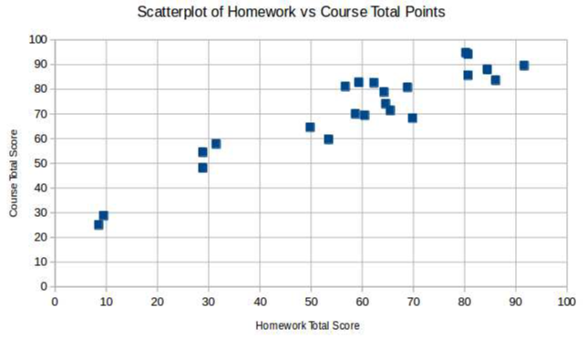
Given bivariate quantitative data, we make the scatterplot of this data as follows: Draw an \(x\)- and a \(y\)-axis, and label them with descriptions of the independent and dependent variables, respectively. Then, for each individual in the dataset, put a dot on the graph at location \((x,y)\text{,}\) if \(x\) is the value of that individual’s independent variable and \(y\) the value of its dependent variable.
After making a scatterplot, we usually describe it qualitatively in three respects:

Definition 2.6.

If the cloud of data points in a scatterplot generally lies near some curve, we say that the scatterplot has [approximately] that shape.
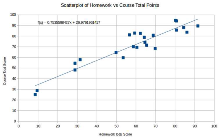
A common shape we tend to find in scatterplots is that it is linear
If there is no visible shape, we say the scatterplot is amorphous, or has no clear shape.

Definition 2.7.

When a scatterplot has some visible shape β€” so that we do not describe it as amorphous β€” how close the cloud of data points is to that curve is called the strength of that association. In this context, a strong [linear, e.g.,] association means that the dots are close to the named curve [line, e.g.,], while a weak association means that the points do not lie particularly close to any of the named curves [line, e.g.,].

Definition 2.8.

In case a scatterplot has a fairly strong linear association, the direction of the association described whether the line is increasing or decreasing. We say the association is positive if the line is increasing and negative if it is decreasing.
[Note that the words positive and negative here can be thought of as describing the slope of the line which we are saying is the underlying relationship in the scatterplot.]

Section 2.3 Correlation

As before (in Β§Β§SectionΒ 1.4 and SectionΒ 1.5), when we moved from describing histograms with words (like symmetric) to describing them with numbers (like the mean), we now will build a numeric measure of the strength and direction of a linear association in a scatterplot.

Definition 2.9.

Given bivariate quantitative data \(\{(x_1,y_1), \dots , (x_n,y_n)\}\) the [Pearson] correlation coefficient of this dataset is
\begin{equation*} r=\frac{1}{n-1}\sum \frac{(x_i-\overline{x})}{s_x}\frac{(y_i-\overline{y})}{s_y} \end{equation*}
where \(s_x\) and \(s_y\) are the standard deviations of the \(x\) and \(y\text{,}\) respectively, datasets by themselves.

Fact.

For any bivariate quantitative dataset \(\{(x_1,y_1), \dots ,(x_n,y_n)\}\) with correlation coefficient \(r\text{,}\) we have
  1. \(-1\le r\le 1\) is always true;
  2. if \(|r|\) is near \(1\) β€” meaning that \(r\) is near \(\pm 1\) β€” then the linear association between \(x\) and \(y\) is strong
  3. if \(r\) is near \(0\) β€” meaning that \(r\) is positive or negative, but near \(0\) β€” then the linear association between \(x\) and \(y\) is weak
  4. if \(r>0\) then the linear association between \(x\) and \(y\) is positive, while if \(r<0\) then the linear association between \(x\) and \(y\) is negative
  5. \(r\) is the same no matter what units are used for the variables \(x\) and \(y\) β€” meaning that if we change the units in either variable, \(r\) will not change
  6. \(r\) is the same no matter which variable is being used as the explanatory and which as the response variable β€” meaning that if we switch the roles of the \(x\) and the \(y\) in our dataset, \(r\) will not change.
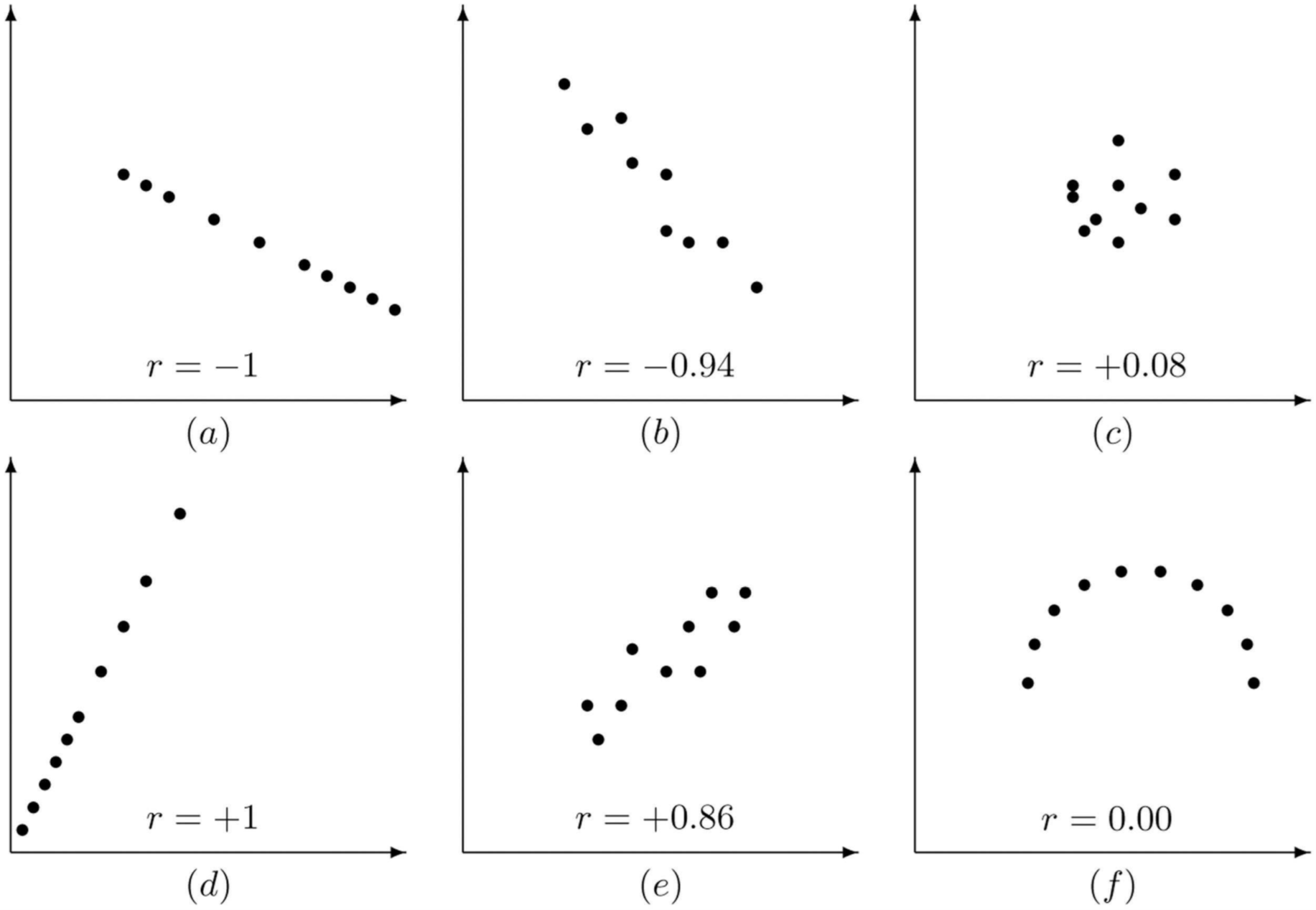
It is also nice to have some examples of correlation coefficients, such as
Figure 2.10. Scatterplot example with positive correlation
Figure 2.11. Scatterplot example with negative correlation
Figure 2.12. Scatterplot example with weak correlation
Figure 2.13. Scatterplot example with no correlation
Many electronic tools which compute the correlation coefficient \(r\) of a dataset also report its square, \(r^2\text{.}\) The reason is explained in the following

Fact.

If \(r\) is the correlation coefficient between two variables \(x\) and \(y\) in some quantitative dataset, then its square \(r^2\) is the fraction (often described as a percentage) of the variation of \(y\) which is associated with variation in \(x\text{.}\)

Example 2.14.

If the square of the correlation coefficient between the independent variable how many hours a week a student studies statistics and the dependent variable how many points the student gets on the statistics final exam is \(.64\text{,}\) then 64% of the variation in scores for that class is cause by variation in how much the students study. The remaining 36% of the variation in scores is due to other random factors like whether a student was coming down with a cold on the day of the final, or happened to sleep poorly the night before the final because of neighbors having a party, or some other issues different just from studying time.

Section 2.4 Exercises

Checkpoint 2.15.

Suppose you pick 50 random adults across the United States in January 2017 and measure how tall they are. For each of them, you also get accurate information about how tall their (biological) parents are. Now, using as your individuals these 50 adults and as the two variables their heights and the average of their parents’ heights, make a sketch of what you think the resulting scatterplot would look like. Explain why you made the choice you did of one variable to be the explanatory and the other the response variable. Tell what are the shape, strength, and direction you see in this scatterplot, if it shows a deterministic or non-deterministic association, and why you think those conclusions would be true if you were to do this exercise with real data.
Is there any time or place other than right now in the United States where you think the data you would collect as above would result in a scatterplot that would look fairly different in some significant way? Explain!

Checkpoint 2.16.

It actually turns out that it is not true that the more a person works, the more they produce … at least not always. Data on workers in a wide variety of industries show that working more hours produces more of that business’s product for a while, but then after too many hours of work, keeping on working makes for almost no additional production.
Describe how you might collect data to investigate this relationship, by telling what individuals, population, sample, and variables you would use. Then, assuming the truth of the above statement about what other research in this area has found, make an example of a scatterplot that you think might result from your suggested data collection.

Checkpoint 2.17.

Make a scatterplot of the dataset consisting of the following pairs of measurements:
\begin{equation*} \left\{(8,16), (9,9), (10,4), (11,1), (12,0), (13,1), (14,4), (15,9), (16,16)\right\} . \end{equation*}
You can do this quite easily by hand (there are only nine points!). Feel free to use an electronic device to make the plot for you, if you have one you know how to use, but copy the resulting picture into the homework you hand in, either by hand or cut-and-paste into an electronic version.
Describe the scatterplot, telling what are the shape, strength, and direction. What do you think would be the correlation coefficient of this dataset? As always, explain all of your reasoning!