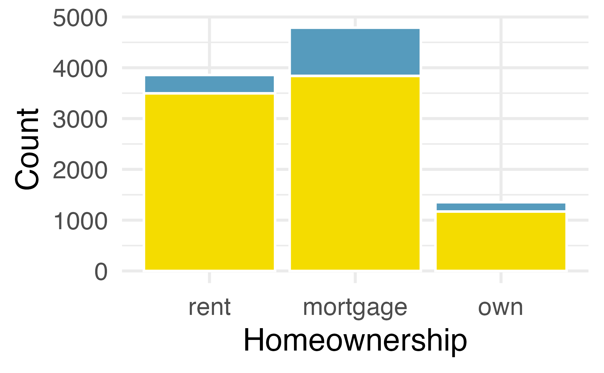
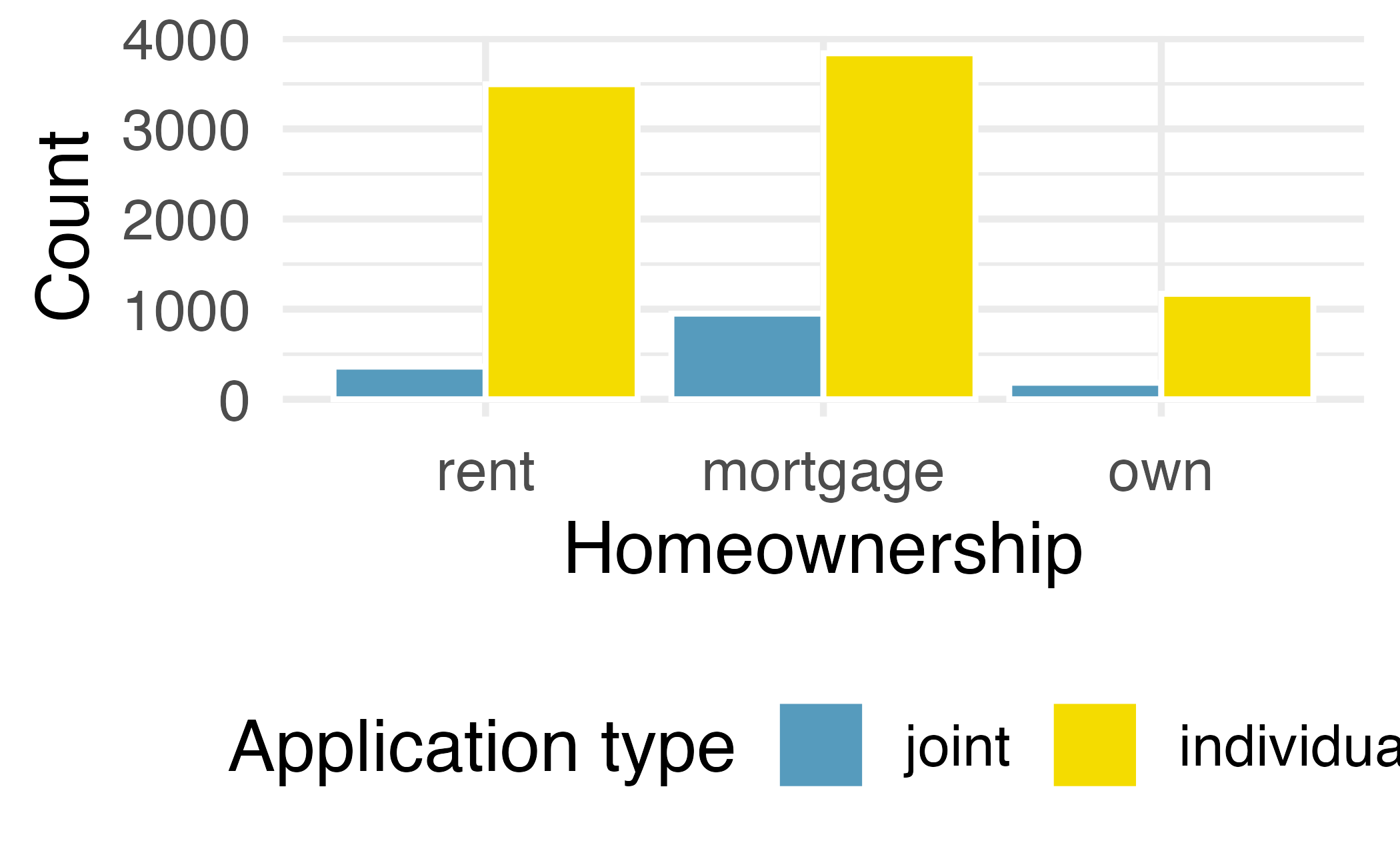
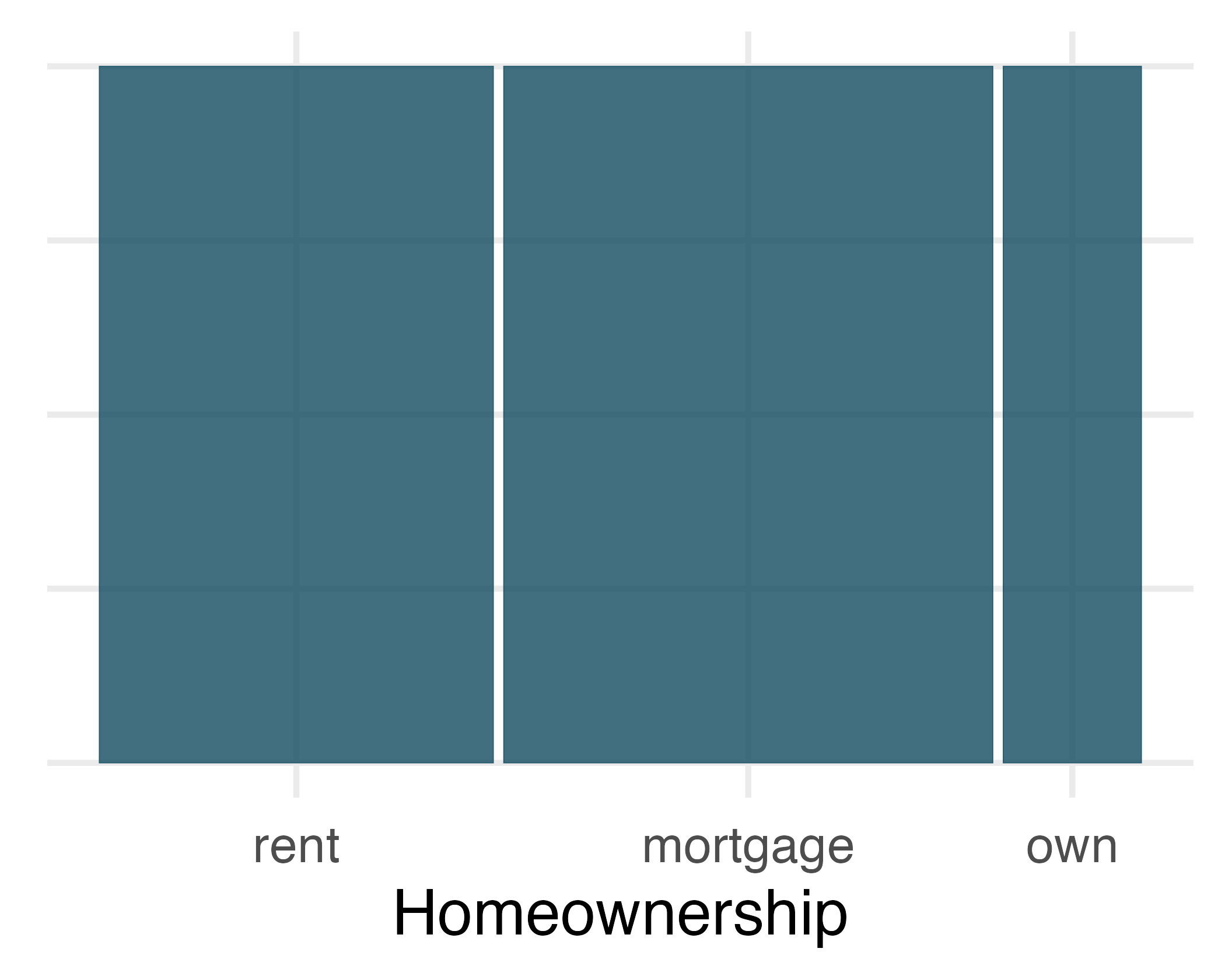
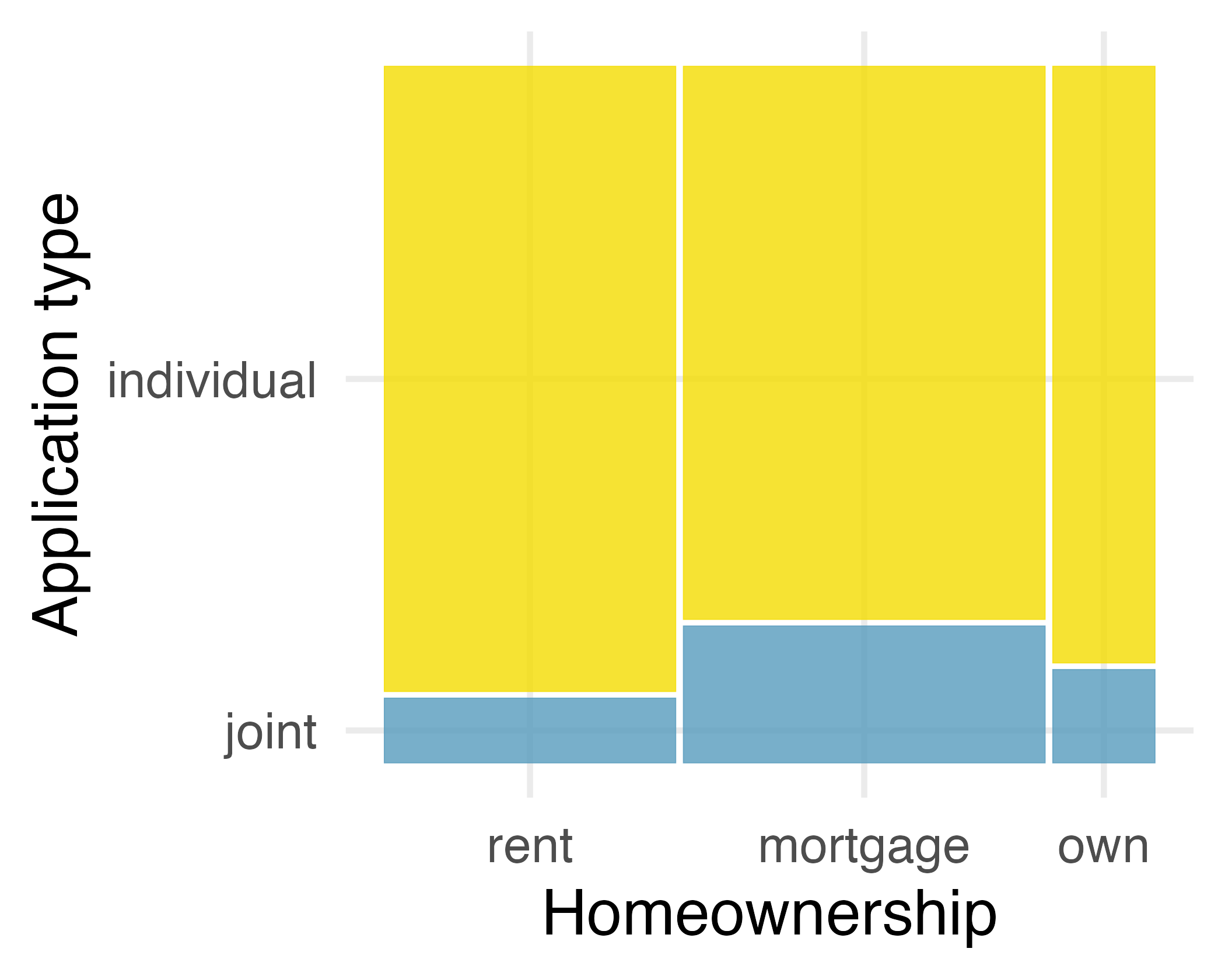
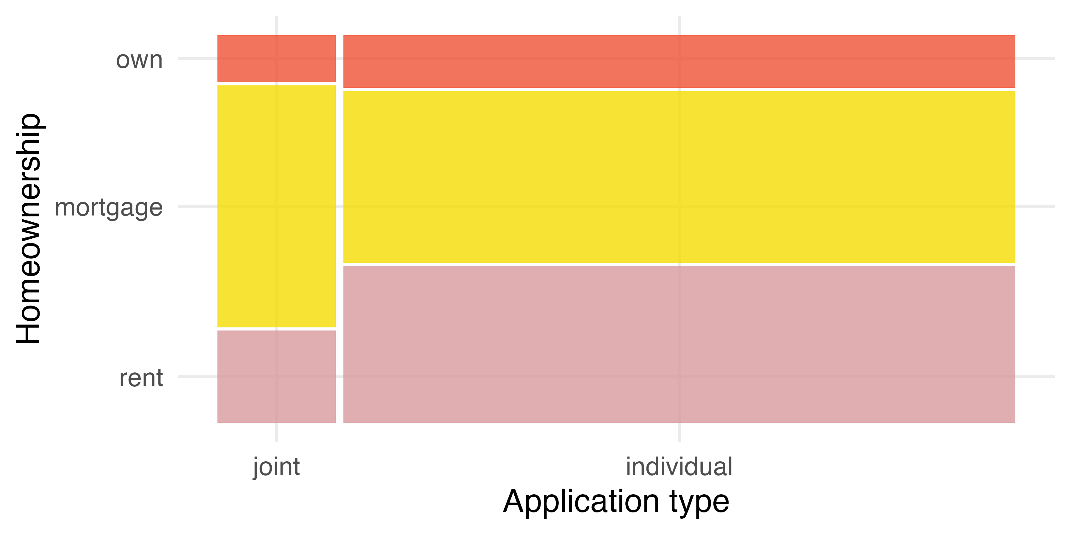
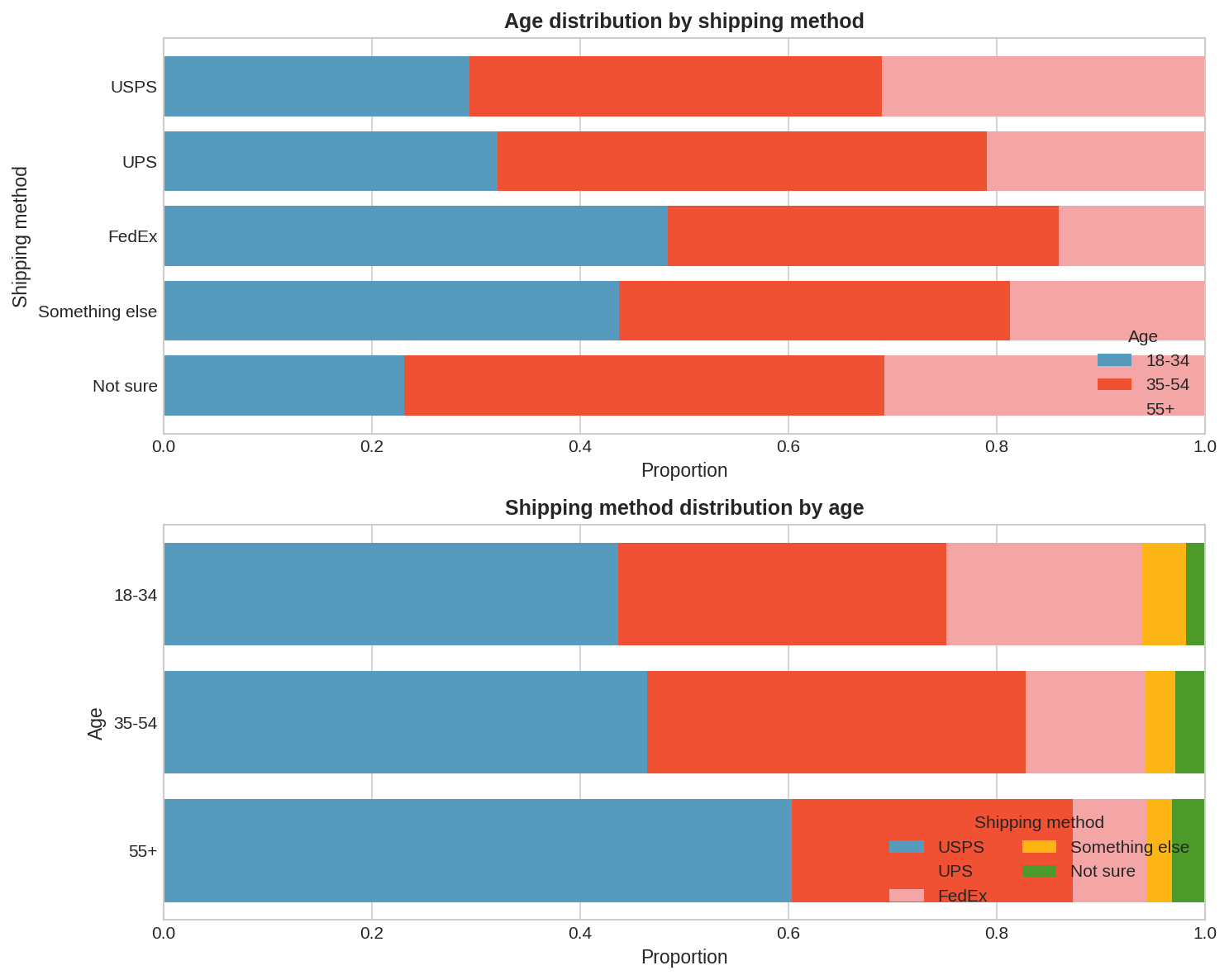
The stacked bar plot is most useful when it’s reasonable to assign one variable as the explanatory variable (here
homeownership) and the other variable as the response (here
application_type) since we are effectively grouping by one variable first and then breaking it down by the others.
Dodged bar plots are more agnostic in their display about which variable, if any, represents the explanatory and which the response variable. It is also easy to discern the number of cases in each of the six different group combinations. However, one downside is that it tends to require more horizontal space; the narrowness of Plot B compared to the other two in
Figure 4.5 makes the plot feel a bit cramped. Additionally, when two groups are of very different sizes, as we see in the group
own relative to either of the other two groups, it is difficult to discern if there is an association between the variables.
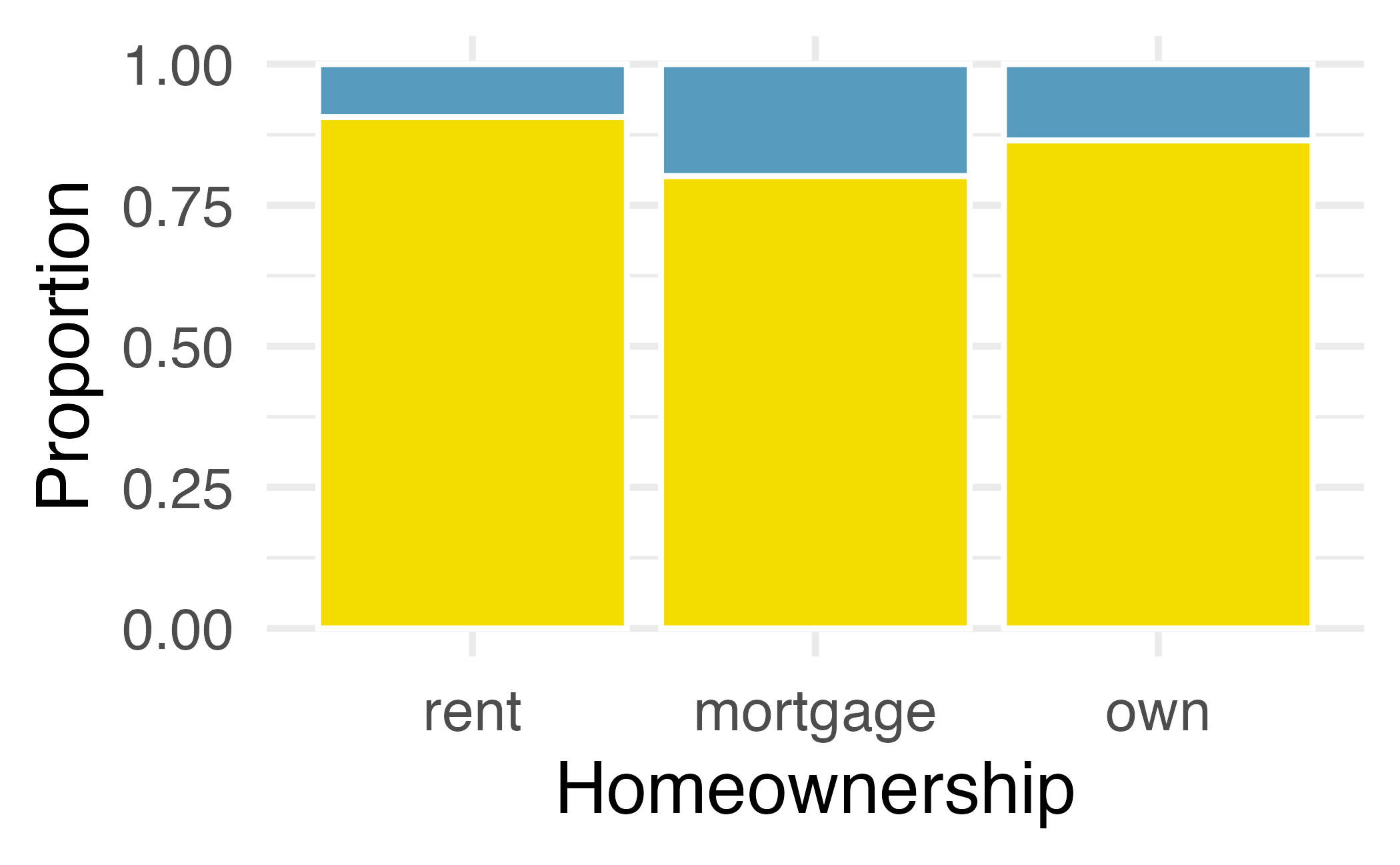
The standardized stacked bar plot is helpful if the primary variable in the stacked bar plot is relatively imbalanced, e.g., the category has only a third of the observations in the category, making the simple stacked bar plot less useful for checking for an association. The major downside of the standardized version is that we lose all sense of how many cases each of the bars represents.