Section 11.16 Step-by-step plots with low-level plotting functions
For R graphics, there are two types of plotting functions: high-level plotting functions create new plots, and low-level functions add elements to existing plots. You may see Chapter 12 ("Graphical procedures") of the R manual An Introduction to R for more information.
By default, knitr does not show the intermediate plots when a series of low-level plotting functions are used to modify a previous plot. Only the last plot on which all low-level plotting changes have been made is shown.
It can be useful to show the intermediate plots, especially for teaching purposes. You can set the chunk option
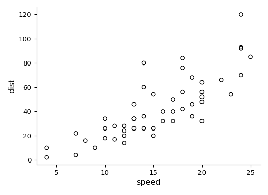
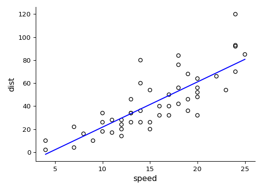
fig.keep = 'low' to keep low-level plotting changes. For example, Figure 11.16.1 and Figure 11.16.2 are from a single code chunk with the chunk option fig.keep = 'low', although they appear to be from two code chunks. We also assigned different figure captions to them with the chunk option fig.cap = c('A scatterplot ...', 'Adding a regression line...').
par(mar = c(4, 4, .1, .1))
plot(cars)
fit = lm(dist ~ speed, data = cars)
abline(fit)
If you want to keep modifying a plot in a different code chunk, please see Section 14.5.
