Section 1.4 Graphing Quantitative Variables
Having considered qualitative variables, we now turn our attention to some of the common types of graphs that are used to depict quantitative variables, beginning with histograms.
Subsection 1.4.1 Histograms
A histogram is a graphical method for displaying the shape of a distribution. It is particularly useful when there are a large number of observations. We begin with an example consisting of the scores of 642 students on a psychology test. The test consists of 197 items, each graded as “correct” or “incorrect.” The students’ scores ranged from 46 to 167.
The first step is to create a frequency table. Unfortunately, a simple frequency table would be too big, containing over 100 rows. To simplify the table, we group scores together as shown in Table 1.4.1.
| Interval’s Lower Limit | Interval’s Upper Limit | Class Frequency |
|---|---|---|
| 39.5 | 49.5 | 3 |
| 49.5 | 59.5 | 10 |
| 59.5 | 69.5 | 53 |
| 69.5 | 79.5 | 107 |
| 79.5 | 89.5 | 147 |
| 89.5 | 99.5 | 130 |
| 99.5 | 109.5 | 78 |
| 109.5 | 119.5 | 48 |
| 119.5 | 129.5 | 25 |
| 129.5 | 139.5 | 18 |
| 139.5 | 149.5 | 13 |
| 149.5 | 159.5 | 7 |
| 159.5 | 169.5 | 3 |
To create this table, the range of scores was broken into intervals, called class intervals or simply “bins.” The first interval is from 39.5 to 49.5, the second from 49.5 to 59.5, etc. Next, the number of scores falling into each interval was counted to obtain the class frequencies. There are three scores in the first interval, 10 in the second, etc.
Class intervals of width 10 provide enough detail about the distribution to be revealing without making the graph too “choppy.” More information on choosing the widths of class intervals is presented later in this section. Placing the limits of the class intervals midway between two numbers (e.g., 49.5) ensures that every score will fall in an interval rather than on the boundary between intervals.
In a histogram, the class frequencies are represented by bars. The height of each bar corresponds to its class frequency. A histogram of these data is shown in Figure 1.4.2.
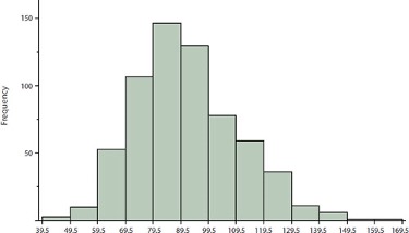
The histogram makes it plain that most of the scores are in the middle of the distribution, with fewer scores in the extremes. You can also see that the distribution is not symmetric: the scores extend to the right farther than they do to the left. The distribution is therefore said to be skewed.
In our example, the observations are whole numbers. Histograms can also be used when the scores are measured on a more continuous scale such as the length of time (in milliseconds) required to perform a task. In this case, there is no need to worry about fence-sitters since they are improbable. (It would be quite a coincidence for a task to require exactly 7 seconds, measured to the nearest thousandth of a second.) We are therefore free to choose whole numbers as boundaries for our class intervals, for example, 4000, 5000, etc. The class frequency is then the number of observations that are greater than or equal to the lower bound, and strictly less than the upper bound. For example, one interval might hold times from 4000 to 4999 milliseconds. Using whole numbers as boundaries avoids a cluttered appearance, and is the practice of many computer programs that create histograms. Note also that some computer programs label the middle of each interval rather than the end points.
Histograms can be based on relative frequencies instead of actual frequencies. Histograms based on relative frequencies show the proportion of scores in each interval rather than the number of scores. In this case, the Y-axis runs from 0 to 1 (or somewhere in between if there are no extreme proportions). You can change a histogram based on frequencies to one based on relative frequencies by (a) dividing each class frequency by the total number of observations, and then (b) plotting the quotients on the Y-axis (labeled as proportion).
There is more to be said about the widths of the class intervals, sometimes called bin widths. Your choice of bin width determines the number of class intervals. This decision, along with the choice of starting point for the first interval, affects the shape of the histogram. There are some “rules of thumb” that can help you choose an appropriate width. (But keep in mind that none of the rules is perfect.) We prefer the Rice rule, which is to set the number of intervals to twice the cube root of the number of observations. In the case of 1000 observations, the Rice rule yields 20 intervals. For the psychology test example used above, the Rice rule recommends 17. The best advice is to experiment with different choices of width, and to choose a histogram according to how well it communicates the shape of the distribution.
Subsection 1.4.2 Box Plots
Box plots are useful for making comparisons and identifying outliers, meaning unusually large or small values for a variable. We will explain box plots with the help of data from an in-class experiment. As part of the “Stroop Interference Case Study,” students in introductory statistics were presented with a page containing 30 colored rectangles. Their task was to name the colors as quickly as possible. Their times (in seconds) were recorded. We’ll compare the scores for the 16 men and 31 women who participated in the experiment by making separate box plots for each gender. Such a display is said to involve parallel box plots.
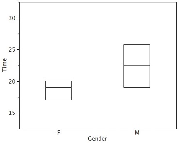
There are several steps in constructing a box plot. The first relies on the 25\(^\text{th}\text{,}\) 50\(^\text{th}\text{,}\) and 75\(^\text{th}\) percentiles in the distribution of scores. Figure 1.4.3 shows how these three statistics are used. For each gender, we draw a box extending from the 25\(^\text{th}\) percentile to the 75\(^\text{th}\) percentile. The 50\(^\text{th}\) percentile is drawn inside the box. Therefore, the bottom of each box is the 25th percentile, the top is the 75th percentile, and the line in the middle is the 50th percentile. The data for the women in our sample are shown in Table 1.4.4.
| 14 | 15 | 16 | 16 | 17 | 17 | 17 | 17 |
| 17 | 18 | 18 | 18 | 18 | 18 | 18 | 19 |
| 19 | 19 | 20 | 20 | 20 | 20 | 20 | 20 |
| 21 | 21 | 22 | 23 | 24 | 24 | 29 |
For these data, the 25th percentile is 17, the 50th percentile is 19, and the 75th percentile is 20. For the men (whose data are not shown), the 25th percentile is 19, the 50th percentile is 22.5, and the 75th percentile is 25.5.
Before proceeding, the terminology in Table 1.4.5 is helpful.
| Name | Formula | Value |
|---|---|---|
| Upper Hinge | 75th Percentile | 20 |
| Lower Hinge | 25th Percentile | 17 |
| H-Spread | Upper Hinge - Lower Hinge | 3 |
| Step | 1.5 x H-Spread | 4.5 |
| Upper Inner Fence | Upper Hinge + 1 Step | 24.5 |
| Lower Inner Fence | Lower Hinge - 1 Step | 12.5 |
| Upper Outer Fence | Upper Hinge + 2 Steps | 29 |
| Lower Outer Fence | Lower Hinge - 2 Steps | 8 |
| Upper Adjacent | Largest value below Upper Inner Fence | 24 |
| Lower Adjacent | Smallest value above Lower Inner Fence | 14 |
| Outside Value | A value beyond an Inner Fence but not beyond an Outer Fence | 29 |
| Far Out Value | A value beyond an Outer Fence | None |
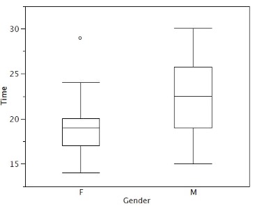
Continuing with the box plots, we put “whiskers” above and below each box to give additional information about the spread of the data. Whiskers are vertical lines that end in a horizontal stroke. Whiskers are drawn from the upper and lower hinges to the upper and lower adjacent values (24 and 14 for the women’s data).
Although we don’t draw whiskers all the way to outside or far out values, we still wish to represent them in our box plots. This is achieved by adding additional marks beyond the whiskers. Specifically, outside values are indicated by small “o’s” and far out values are indicated by asterisks (*). In our data, there are no far out values and just one outside value. This outside value of 29 is for the women and is shown in Figure 1.4.6.
There is one more mark to include in box plots (although sometimes it is omitted). We indicate the mean score for a group by inserting a plus sign. Figure 1.4.7 shows the result of adding means to our box plots.
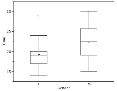
Figure 1.4.7 provides a revealing summary of the data. Since half the scores in a distribution are between the hinges (recall that the hinges are the 25th and 75th percentiles), we see that half the women’s times are between 17 and 20 seconds, whereas half the men’s times are between 19 and 25.5. We also see that women generally named the colors faster than the men did, although one woman was slower than almost all of the men. Figure 1.4.8 shows the box plot for the women’s data with detailed labels.
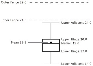
Box plots provide basic information about a distribution. For example, a distribution with a positive skew would have a longer whisker in the positive direction than in the negative direction. A larger mean than median would also indicate a positive skew. Box plots are good at portraying extreme values and are especially good at showing differences between distributions. However, many of the details of a distribution are not revealed in a box plot, and to examine these details one should create a histogram.
Subsection 1.4.3 Variations on box plots
Statistical analysis programs may offer options on how box plots are created. For example, the box plots in Figure 1.4.9 are constructed from our data but differ from the previous box plots in several ways.
-
It does not mark outliers.
-
The means are indicated by green lines rather than plus signs.
-
The mean of all scores is indicated by a gray line.
-
Individual scores are represented by dots. Since the scores have been rounded to the nearest second, any given dot might represent more than one score.
-
The box for the women is wider than the box for the men because the widths of the boxes are proportional to the number of subjects of each gender (31 women and 16 men).
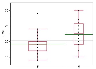
Each dot in Figure 1.4.9 represents a group of subjects with the same score (rounded to the nearest second). An alternative graphing technique is to “jitter” the points. This means spreading out different dots at the same horizontal position, one dot for each subject. The exact horizontal position of a dot is determined randomly (under the constraint that different dots don’t overlap exactly). Spreading out the dots helps you to see multiple occurrences of a given score. However, depending on the dot size and the screen resolution, some points may be obscured even if the points are jittered. Figure 1.4.10 shows what jittering looks like.
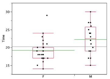
Different styles of box plots are best for different situations, and there are no firm rules for which to use. When exploring your data, you should try several ways of visualizing them. Which graphs you include in your report should depend on how well different graphs reveal the aspects of the data you consider most important.
Subsection 1.4.4 Bar Charts for Quantitative Variables
In the section on qualitative variables, we saw how bar charts could be used to illustrate the frequencies of different categories. For example, one bar chart showed how many purchasers of iMac computers were previous Macintosh users, previous Windows users, and new computer purchasers.
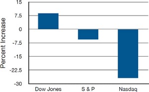
In this section, we show how bar charts can be used to present other kinds of quantitative information, not just frequency counts. The bar chart in Figure 1.4.11 shows the percent increases in the Dow Jones, Standard and Poor 500 (S & P), and Nasdaq stock indexes from May 24\(^\text{th}\) 2000 to May 24\(^\text{th}\) 2001. Notice that both the S & P and the Nasdaq had “negative increases” which means that they decreased in value. In this bar chart, the Y-axis is not frequency but rather the signed quantity percentage increase.
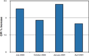
Bar charts are particularly effective for showing change over time. Figure 1.4.12, for example, shows the percent increase in the Consumer Price Index (CPI) over four three-month periods. The fluctuation in inflation is apparent in the graph.
Bar charts are often used to compare the means of different experimental conditions. Figure 1.4.13 shows the mean time it took one of us (DL) to move the mouse to either a small target or a large target. On average, more time was required for small targets than for large ones.
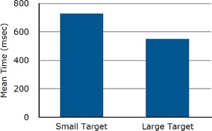
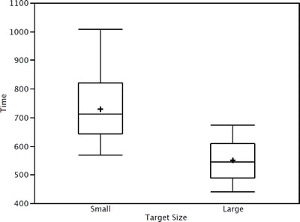
Although bar charts can display means, we do not recommend them for this purpose. Box plots should be used instead since they provide more information than bar charts without taking up more space. For example, a box plot of the mouse-movement data is shown in Figure 1.4.14. You can see that Figure 1.4.14 reveals more about the distribution of movement times than does Figure 1.4.13.
The section on qualitative variables presented earlier in this chapter discussed the use of bar charts for comparing distributions. Some common graphical mistakes were also noted. The earlier discussion applies equally well to the use of bar charts to display quantitative variables.

