Section 5.1 Various Types of Distributions 1
This section is adapted from David M. Lane and Heidi Ziemer. "Distributions." Online Statistics Education: A Multimedia Course of Study. https://onlinestatbook.com/2/introduction/distributions.html
1
This section is adapted from David M. Lane and Heidi Ziemer. "Distributions." Online Statistics Education: A Multimedia Course of Study. https://onlinestatbook.com/2/introduction/distributions.html
Subsection 5.1.1 Distributions of Qualitative or Discrete Variables
I recently purchased a bag of Plain M&M’s. The M&M’s were in six different colors. A quick count showed that there were 55 M&M’s: 17 brown, 18 red, 7 yellow, 7 green, 2 blue, and 4 orange. These counts are shown below in Table 5.1.1.
| Color | Frequency |
|---|---|
| Brown | 17 |
| Red | 18 |
| Yellow | 7 |
| Green | 7 |
| Blue | 2 |
| Orange | 4 |
This table is called a frequency table and it describes the distribution of M&M color frequencies. Not surprisingly, this kind of distribution is called a frequency distribution. Often a frequency distribution is shown graphically as in Figure 5.1.2.
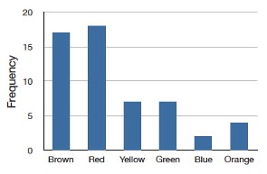
The distribution shown in Figure 5.1.2 concerns just my one bag of M&M’s. You might be wondering about the distribution of colors for all M&M’s. The manufacturer of M&M’s provides some information about this matter, but they do not tell us exactly how many M&M’s of each color they have ever produced. Instead, they report proportions rather than frequencies. Figure 5.1.3 shows these proportions. Since every M&M is one of the six familiar colors, the six proportions shown in the figure add to one. We call Figure 5.1.3 a probability distribution because if you choose an M&M at random, the probability of getting, say, a brown M&M is equal to the proportion of M&M’s that are brown (0.30).
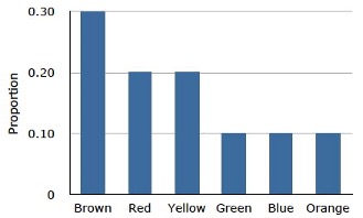
Notice that the distributions in Figure 5.1.2 and Figure 5.1.3 are not identical. Figure 5.1.2 portrays the distribution in a sample of 55 M&M’s. Figure 5.1.3 shows the proportions for all M&M’s. Chance factors involving the machines used by the manufacturer introduce random variation into the different bags produced. Some bags will have a distribution of colors that is close to Figure 5.1.3; others will be further away.
Subsection 5.1.2 Continuous Variables
The variable “color of M&M” is a qualitative variable, and its distribution is called discrete because there are a finite number of values the variable can take on. Let us now extend the concept of a distribution to continuous variables.
The data shown in Table 5.1.4 are the times it took David Lane (the author of much of the material appearing in this book) to move the cursor over a small target in a series of 20 trials. The times are sorted from shortest to longest. The variable “time to respond” is a continuous variable. With time measured accurately (to many decimal places), no two response times would be expected to be the same. Measuring time in milliseconds (thousandths of a second) is often precise enough to approximate a continuous variable in psychology. As you can see in Table 5.1.4, measuring David Lane’s responses this way produced times no two of which were the same. As a result, a frequency distribution would be uninformative: it would consist of the 20 times in the experiment, each with a frequency of 1.
| 568 | 577 | 581 | 640 | 641 |
| 645 | 657 | 673 | 696 | 703 |
| 720 | 728 | 729 | 777 | 808 |
| 824 | 825 | 865 | 875 | 1007 |
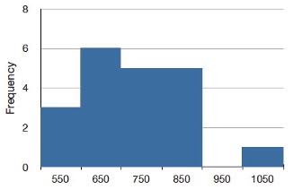
The solution to this problem is to create a grouped frequency distribution, as we saw when learning about histograms in Chapter 1. In a grouped frequency distribution, scores falling within various ranges are tabulated. Table 5.1.5 shows a grouped frequency distribution for these 20 times.
| Range | Frequency |
|---|---|
| 500-600 | 3 |
| 600-700 | 6 |
| 700-800 | 5 |
| 800-900 | 5 |
| 900-1000 | 0 |
| 1000-1100 | 1 |
Subsection 5.1.3 Probability Densities
The histogram in Figure 5.1.6 portrays just David Lane’s 20 times in the one experiment. To represent the probability associated with an arbitrary movement (which can take any positive amount of time), we must represent all these potential times at once. For this purpose, we plot the distribution for the continuous variable of time. Distributions for continuous variables are called continuous distributions. They also carry the fancier name probability density. Some probability densities have particular importance in statistics. A very important one is shaped like a bell, and called the normal distribution. Many naturally-occurring phenomena can be approximated surprisingly well by this distribution. It will serve to illustrate some features of all continuous distributions.
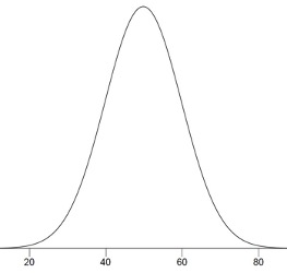
An example of a normal distribution is shown in Figure 5.1.7. Do you see the “bell”? The normal distribution doesn’t represent a real bell, however, since the left and right tips extend indefinitely (we can’t draw them any further so they look like they’ve stopped in our diagram). The Y-axis in the normal distribution represents the “density of probability.” Intuitively, it shows the chance of obtaining values near corresponding points on the X-axis. In Figure 5.1.7, for example, the probability of an observation with value near 40 is about half of the probability of an observation with value near 50.
Although this text does not discuss the concept of probability density in detail, you should keep the following ideas in mind about the curve that describes a continuous distribution (like the normal distribution). First, the area under the curve equals 1. Second, the probability of any exact value of X is 0. Finally, the area under the curve and bounded between two given points on the X-axis is the probability that a number chosen at random will fall between the two points. Let us illustrate with David Lane’s hand movements. First, the probability that his movement takes some amount of time is one! (We exclude the possibility of him never finishing his gesture.) Second, the probability that his movement takes exactly 598.956432342346576 milliseconds is essentially zero. (We can make the probability as close as we like to zero by making the time measurement more and more precise.) Finally, suppose that the probability of David Lane’s movement taking between 600 and 700 milliseconds is one tenth. Then the continuous distribution for David Lane’s possible times would have a shape that places 10% of the area below the curve in the region bounded by 600 and 700 on the X-axis.
Subsection 5.1.4 Shapes of Distributions
As we’ve already seen when graphing different data, distributions have different shapes; they don’t all look like the normal distribution in Figure 5.1.7. For example, the normal probability density is higher in the middle compared to its two tails. Other distributions need not have this feature. There is even variation among the distributions that we call “normal.” For example, some normal distributions are more spread out than the one shown in Figure 5.1.7 (their tails begin to hit the X-axis further from the middle of the curve – for example, at 10 and 90 if drawn in place of Figure 5.1.7). Others are less spread out (their tails might approach the X-axis at 30 and 70). We’ll learn more about the details of the normal distribution later in this chapter.
The distribution shown in Figure 5.1.7 is symmetric; if you folded it in the middle, the two sides would match perfectly. Figure 5.1.8 shows the discrete distribution of scores on a psychology test. This distribution is not symmetric: the tail in the positive direction extends further than the tail in the negative direction. A distribution with the longer tail extending in the positive direction is said to have a positive skew. It is also described as “skewed to the right.”
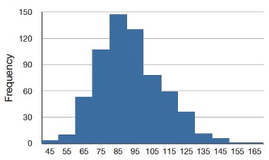
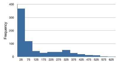
Figure 5.1.9 shows the salaries of major league baseball players in 1974 (in thousands of dollars). This distribution has an extreme positive skew.
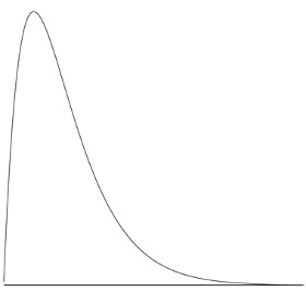
A continuous distribution with a positive skew is shown in Figure 5.1.10.
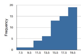
Although less common, some distributions have a negative skew. Figure 5.1.11 shows the scores on a 20-point problem on a statistics exam. Since the tail of the distribution extends to the left, this distribution is skewed to the left.
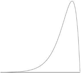
A continuous distribution with a negative skew is shown in Figure 5.1.12.
The distributions shown so far all have one distinct high point or peak. The distribution in Figure 5.1.13 has two distinct peaks. A distribution with two peaks is called a bimodal distribution.