Chapter 5 Dashboards
R Markdown is customizable and extensible. In Chapter 3 and Chapter 4, we have introduced basic document and presentation formats in the
rmarkdown package, and explained how to customize them. From this chapter on, we will show several more existing extension packages that bring different styles, layouts, and applications to the R Markdown ecosystem. In this chapter, we introduce dashboards based on the flexdashboard package [15].
Dashboards are particularly common in business-style reports. They can be used to highlight brief and key summaries of a report. The layout of a dashboard is often grid-based, with components arranged in boxes of various sizes.
With the
flexdashboard package, you can
-
Use R Markdown to publish a group of related data visualizations as a dashboard.
-
Embed a wide variety of components including HTML widgets, R graphics, tabular data, gauges, value boxes, and text annotations.
-
Specify row or column-based layouts (components are intelligently re-sized to fill the browser and adapted for display on mobile devices).
-
Create story boards for presenting sequences of visualizations and related commentary.
-
Optionally use Shiny to drive visualizations dynamically.
To author a dashboard, you create an R Markdown document with the
flexdashboard::flex_dashboard output format. You can also create a document from within RStudio using the File → New File → R Markdown dialog, and choosing a "Flex Dashboard" template.
If you are not using RStudio, you can create a new
flexdashboard R Markdown file from the R console:
rmarkdown::draft(
  "dashboard.Rmd", template = "flex_dashboard",
  package = "flexdashboard"
)
The full documentation of
flexdashboard is at https://rmarkdown.rstudio.com/flexdashboard/. We will only cover some basic features and usage in this chapter. Dashboards have many features in common with Section 3.1, such as figure options (Subsection 3.1.5), appearance and style (Subsection 4.1.3), MathJax equations (Subsection 3.1.8),header and before/after body inclusions (Subsubsection 3.1.10.2), and Pandoc arguments (Subsubsection 3.1.10.5) and so on. We also recommend that you take a look at the R help page ?flexdashboard::flex_dashboard to learn about more features and options.
Section 5.1 Layout
The overall rule about the dashboard layout is that a first-level section generates a page, a second-level section generates a column (or a row), and a third-level section generates a box (that contains one or more dashboard components). Below is a quick example:
---
title: "Get Started"
output: flexdashboard::flex_dashboard
---

```{r setup, include=FALSE}
library(flexdashboard)
```

Column 1
--------------------------------------------------

### Chart A

```{r}
```

Column 2
--------------------------------------------------

### Chart B

```{r}
```

### Chart C

```{r}
```
Note that a series of dashes under a line of text is the alternative Markdown syntax for the second-level section header, i.e.,
Column 1
--------------------------------------------------
is equivalent to
## Column 1
We used a series of dashes just to make the second-level sections stand out in the source document. By default, the second-level sections generate columns on a dashboard, and the third level sections will be stacked vertically inside columns. You do not have to have columns on a dashboard: when all you have are the third-level sections in the source document, they will be stacked vertically as one column in the output.
The text of the second-level headers will not be displayed in the output. The second-level headers are for the sole purpose of layout, so the actual content of the headers does not matter at all. By contrast, the first-level and third-level headers will be displayed as titles.
Figure 5.1 shows the output of the above example, in which you can see two columns, with the first column containing "Chart A", and the second column containing "Chart B" and "Chart C". We did not really include any R code in the code chunks, so all boxes are empty. In these code chunks, you may write arbitrary R code that generates R plots, HTML widgets, and various other components to be introduced in Section 5.2.
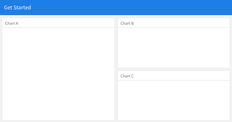
A quick example of the dashboard layout.
Subsection 5.1.1 Row-based layouts
You may change the column-oriented layout to the row-oriented layout through the
orientation option, e.g.,
output:
  flexdashboard::flex_dashboard:
    orientation: rows
That means the second-level sections will be rows, and the third-level sections will be arranged as columns within rows.
Subsection 5.1.2 Attributes on sections
The second-level section headers may have attributes on them, e.g., you can set the width of a column to 350:
A narrow column {data-width=350}
--------------------------------
For the row-oriented layout, you can set the
data-height attribute for rows. The {.tabset} attribute can be applied on a column so that the third-level sections will be arranged in tabs, e.g.,
Two tabs {.tabset}
------------------

### Tab A

### Tab B
Subsection 5.1.3 Multiple pages
When you have multiple first-level sections in the document, they will be displayed as separate pages on the dashboard. Below is an example, and Figure 5.2 shows the output. Note that a series of equal signs is the alternative Markdown syntax for the first-level section headers (you can use a single pound sign
#, too).
---
title: "Multiple Pages"
output: flexdashboard::flex_dashboard
---

Visualizations {data-icon="fa-signal"}
=====================================

### Chart 1

```{r}
```

### Chart 2

```{r}
```

Tables {data-icon="fa-table"}
=====================================

### Table 1

```{r}
```

### Table 2

```{r}
```
Page titles are displayed as a navigation menu at the top of the dashboard. In this example, we applied icons to page titles through the
data-icon attribute. You can find other available icons from https://fontawesome.com.
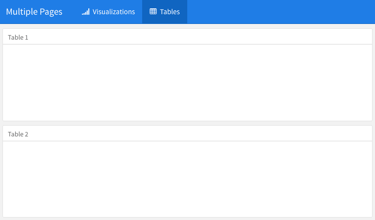
Multiple pages on a dashboard.
Subsection 5.1.4 Story boards
Besides the column and row-based layouts, you may present a series of visualizations and related commentary through the "storyboard" layout. To enable this layout, you use the option
storyboard. Below is an example, and Figure 5.3 shows the output, in which you can see left/right navigation buttons at the top to help you go through all visualizations and associated commentaries one by one.
---
title: "Storyboard Commentary"
output:
  flexdashboard::flex_dashboard:
    storyboard: true
---

### A nice scatterplot here

```{r}
plot(cars, pch = 20)
grid()
```

---

Some commentary about Frame 1.

### A beautiful histogram on this board

```{r}
hist(faithful$eruptions, col = 'gray', border = 'white', main = '')
```

---

Some commentary about Frame 2.
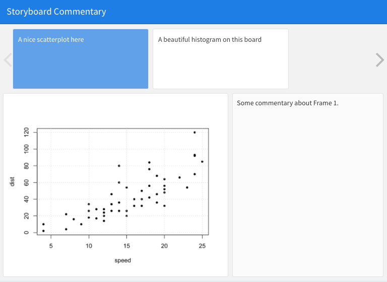
An example story board.
Section 5.2 Components
A wide variety of components can be included in a dashboard layout, including:
-
Interactive JavaScript data visualizations based on HTML widgets.
-
R graphical output including base, lattice, and grid graphics.
-
Tabular data (with optional sorting, filtering, and paging).
-
Value boxes for highlighting important summary data.
-
Gauges for displaying values on a meter within a specified range.
-
Text annotations of various kinds.
-
A navigation bar to provide more links related to the dashboard.
The first three components work in most R Markdown documents regardless of output formats. Only the latter four are specific to dashboards, and we briefly introduce them in this section.
Subsection 5.2.1 Value boxes
Sometimes you want to include one or more simple values within a dashboard. You can use the
valueBox() function in the flexdashboard package to display single values along with a title and an optional icon. For example, here are three side-by-side sections, each displaying a single value (see Figure 5.4 for the output):
---
title: "Dashboard Value Boxes"
output:
  flexdashboard::flex_dashboard:
    orientation: rows
---

```{r setup, include=FALSE}
library(flexdashboard)
# these computing functions are only toy examples
computeArticles = function(...) return(45)
computeComments = function(...) return(126)
computeSpam = function(...) return(15)
```

### Articles per Day

```{r}
articles = computeArticles()
valueBox(articles, icon = "fa-pencil")
```

### Comments per Day

```{r}
comments = computeComments()
valueBox(comments, icon = "fa-comments")
```

### Spam per Day

```{r}
spam = computeSpam()
valueBox(
  spam, icon = "fa-trash",
  color = ifelse(spam > 10, "warning", "primary")
)
```
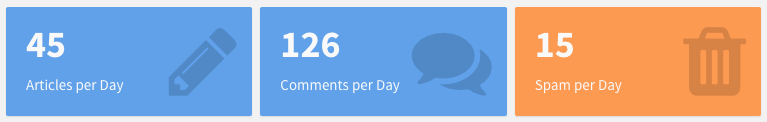
Three value boxes side by side on a dashboard.
The
valueBox() function is called to emit a value and specify an icon.
The third code chunk ("Spam per Day") makes the background color of the value box dynamic using the
color parameter. Available colors include "primary", "info", "success", "warning", and "danger" (the default is "primary"). You can also specify any valid CSS color (e.g., "#ffffff", "rgb(100, 100, 100)", etc.).
Subsection 5.2.2 Gauges
Gauges display values on a meter within a specified range. For example, here is a set of three gauges (see Figure 5.5 for the output):
---
title: "Dashboard Gauges"
output:
  flexdashboard::flex_dashboard:
    orientation: rows
---

```{r setup, include=FALSE}
library(flexdashboard)
```

### Contact Rate

```{r}
gauge(91, min = 0, max = 100, symbol = '%', gaugeSectors(
  success = c(80, 100), warning = c(40, 79), danger = c(0, 39)
))
```

### Average Rating

```{r}
gauge(37.4, min = 0, max = 50, gaugeSectors(
  success = c(41, 50), warning = c(21, 40), danger = c(0, 20)
))
```

### Cancellations

```{r}
gauge(7, min = 0, max = 10, gaugeSectors(
  success = c(0, 2), warning = c(3, 6), danger = c(7, 10)
))
```
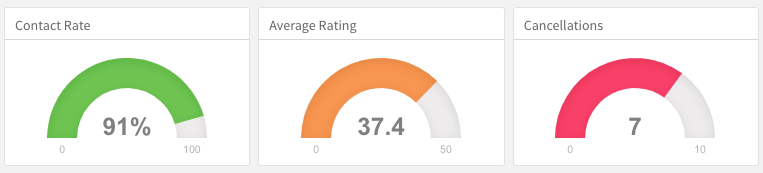
Three gauges side by side on a dashboard.
There are a few things to note about this example:
-
The
gauge()function is used to output a gauge. It has three required arguments:value,min, andmax(these can be any numeric values). -
You can specify an optional
symbolto be displayed alongside the value (in the example"%"is used to denote a percentage). -
You can specify a set of custom color "sectors" using the
gaugeSectors()function. By default, the current theme’s "success" color (typically green) is used for the gauge color. Thesectorsoption enables you to specify a set of three value ranges (success,warning, anddanger), which cause the gauge’s color to change based on its value.
Subsection 5.2.3 Text annotations
If you need to include additional narrative or explanation within your dashboard, you can do so in the following ways:
-
You can include content at the top of the page before dashboard sections are introduced.
-
You can define dashboard sections that do not include a chart but rather include arbitrary content (text, images, and equations, etc.).
For example, the following dashboard includes some content at the top and a dashboard section that contains only text (see Figure 5.6 for the output):
---
title: "Text Annotations"
output:
  flexdashboard::flex_dashboard:
    orientation: rows
---

Monthly deaths from bronchitis, emphysema and asthma in the
UK, 1974–1979 (Source: P. J. Diggle, 1990, Time Series: A
Biostatistical Introduction. Oxford, table A.3)

```{r setup, include=FALSE}
library(dygraphs)
```

Row {data-height=600}
-------------------------------------

### All Lung Deaths

```{r}
dygraph(ldeaths)
```

Row {data-height=400}
-------------------------------------

### Male Deaths

```{r}
dygraph(mdeaths)
```

> Monthly deaths from lung disease in the UK, 1974–1979

### About dygraphs

This example makes use of the dygraphs R package. The dygraphs
package provides rich facilities for charting time-series data
in R. You can use dygraphs at the R console, within R Markdown
documents, and within Shiny applications.
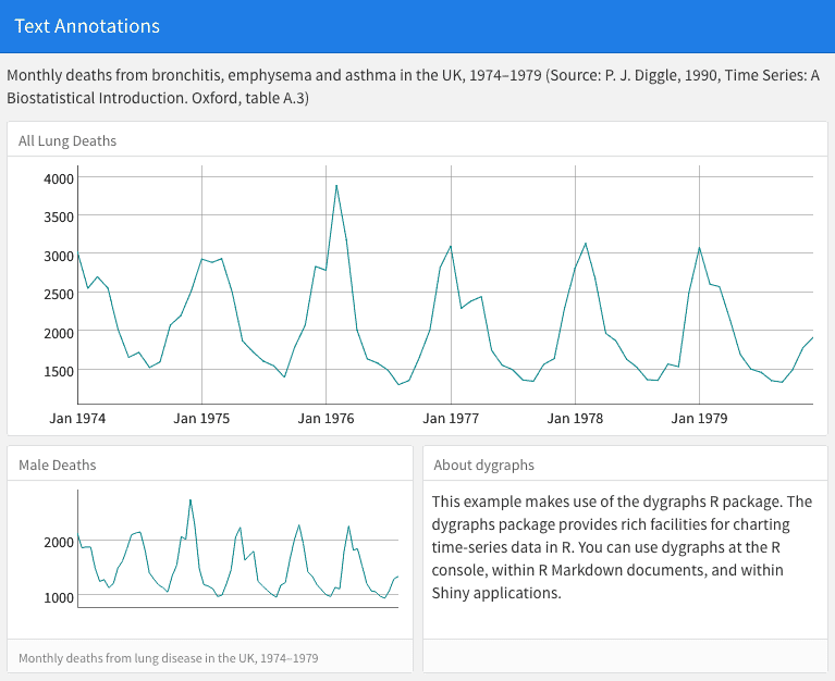
Text annotations on a dashboard.
Each component within a dashboard includes optional title and notes sections. The title is simply the text after the third-level (
###) section heading. The notes are any text prefaced with > after the code chunk that yields the component’s output (see the second component of the above example).
You can exclude the title entirely by applying the
.no-title attribute to a section heading.
Subsection 5.2.4 Navigation bar
By default, the dashboard navigation bar includes the document’s
title, author, and date. When a dashboard has multiple pages (Subsection 5.1.3), links to the various pages are also included on the left side of the navigation bar. You can also add social links to the dashboard.
In addition, you can add custom links to the navigation bar using the
navbar option. For example, the following options add an "About" link to the navigation bar:
---
title: "Navigation Bar"
output:
  flexdashboard::flex_dashboard:
    navbar:
      - { title: "About", href: "https://example.com/about" }
---
Navigation bar items must include either a
title or icon field (or both). You should also include a href as the navigation target. The align field is optional (it can be "left" or "right" and defaults to "right").
You can include links to social sharing services via the
social option. For example, the following dashboard includes Twitter and Facebook links as well as a drop-down menu with a more complete list of services:
---
title: "Social Links"
output:
  flexdashboard::flex_dashboard:
    social: [ "twitter", "facebook", "menu" ]
---
The
social option can include any number of the following services: "facebook", "twitter", "google-plus", "linkedin", and "pinterest". You can also specify "menu" to provide a generic sharing drop-down menu that includes all of the services.
Section 5.3 Shiny
By adding Shiny to a dashboard, you can let viewers change underlying parameters and see the results immediately, or let dashboards update themselves incrementally as their underlying data changes (see functions
reactiveFileReader() and reactivePoll() in the shiny package). This is done by adding runtime: shiny to a standard dashboard document, and then adding one or more input controls and/or reactive expressions that dynamically drive the appearance of the components within the dashboard.
Using Shiny with
flexdashboard turns a static R Markdown report into an interactive document. It is important to note that interactive documents need to be deployed to a Shiny Server to be shared broadly (whereas static R Markdown documents are standalone web pages that can be attached to emails or served from any standard web server).
Note that the
shinydashboard package (https://rstudio.github.io/shinydashboard/) provides another way to create dashboards with Shiny.
Subsection 5.3.1 Getting started
The steps required to add Shiny components to a dashboard are:
-
Add
runtime: shinyto the options declared at the top of the document (YAML metadata). -
Add the
{.sidebar}attribute to the first column of the dashboard to make it a host for Shiny input controls (note that this step is not strictly required, but this will generate a typical layout for Shiny-based dashboards). -
Add Shiny inputs and outputs as appropriate.
-
When including plots, be sure to wrap them in a call to
renderPlot(). This is important not only for dynamically responding to changes, but also to ensure that they are automatically re-sized when their container changes.
Subsection 5.3.2 A Shiny dashboard example
Here is a simple example of a dashboard that uses Shiny (see Figure 5.7 for the output):
---
title: "Old Faithful Eruptions"
output: flexdashboard::flex_dashboard
runtime: shiny
---

```{r global, include=FALSE}
# load data in 'global' chunk so it can be shared
# by all users of the dashboard
library(datasets)
data(faithful)
```

Column {.sidebar}
--------------------------------------------------

Waiting time between eruptions and the duration of the eruption
for the Old Faithful geyser in Yellowstone National Park,
Wyoming, USA.

```{r}
selectInput(
  "n_breaks", label = "Number of bins:",
  choices = c(10, 20, 35, 50), selected = 20
)

sliderInput(
  "bw_adjust", label = "Bandwidth adjustment:",
  min = 0.2, max = 2, value = 1, step = 0.2
)
```

Column
--------------------------------------------------

### Geyser Eruption Duration

```{r}
renderPlot({
  erpt = faithful$eruptions
  hist(
    erpt, probability = TRUE, breaks = as.integer(input$n_breaks),
    xlab = "Duration (minutes)", main = "Geyser Eruption Duration",
    col = 'gray', border = 'white'
  )

  dens = density(erpt, adjust = input$bw_adjust)
  lines(dens, col = "blue", lwd = 2)
})
```
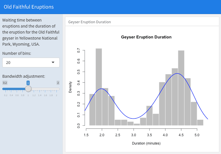
An interactive dashboard based on Shiny.
The first column includes the
{.sidebar} attribute and two Shiny input controls; the second column includes the Shiny code required to render the chart based on the inputs.
One important thing to note about this example is the chunk labeled
global at the top of the document. The global chunk has special behavior within flexdashboard: it is executed only once within the global environment, so that its results (e.g., data frames read from disk) can be accessed by all users of a multi-user dashboard. Loading your data within a global chunk will result in substantially better startup performance for your users, and hence is highly recommended.
Subsection 5.3.3 Input sidebar
You add an input sidebar to a flexdashboard by adding the
{.sidebar} attribute to a column, which indicates that it should be laid out flush to the left with a default width of 250 pixels and a special background color. Sidebars always appear on the left no matter where they are defined within the flow of the document.
If you are creating a dashboard with multiple pages, you may want to use a single sidebar that applies across all pages. In this case, you should define the sidebar using a first-level Markdown header.
Subsection 5.3.4 Learning more
Below are some good resources for learning more about Shiny and creating interactive documents:
-
The official Shiny website (
http://shiny.rstudio.com) includes extensive articles, tutorials, and examples to help you learn more about Shiny. -
The article "Introduction to Interactive Documents" (
http://shiny.rstudio.com/articles/interactive-docs.html) on the Shiny website is a great guide for getting started with Shiny and R Markdown. -
For deploying interactive documents, you may consider Shiny Server or RStudio Connect:
https://www.rstudio.com/products/shiny/shiny-server/.
