Section 12.3 Comparing Arrival Probabilities
We can look at the same kind of data in terms of the probability of arrival within a certain amount of time. Because rpois() generates delay times directly (rather than us having to calculate them from neighboring arrival times), we will need a slightly different function than the ArrivalProbabilities() that we wrote and used in the previous chapter. We’ll call this function “DelayProbability” (the code is at the end of this chapter):
DelayProbability(rpois(100,10),1,20)
[1] 0.00 0.00 0.00 0.03 0.06 0.09 0.21 0.33 0.48 0.61 0.73 0.82 0.92
[14] 0.96 0.97 0.98 0.99 1.00 1.00 1.00
At the heart of that command is the rpois() function, requesting 100 points with a mean of 10. The other two parameters are the increment, in this case one second, and the maximum delay time, in this case 20 seconds. The output from this function is a sorted list of cumulative probabilities for the times ranging from 1 second to 20 seconds. Of course, what we would really like to do is compare these probabilities to those we would get if the average delay was three seconds instead of ten seconds. We’re going to use two cool tricks for creating this next plot. First, we will use the points() command to add points to an existing plot. Second, we will use the col= parameter to specify two different colors for the points that we plot. Here’s the code that creates a plot and then adds more points to it:
plot(DelayProbability(rpois(100,10),1,20), col=2)
points(DelayProbability(rpois(100,3),1,20), col=3)
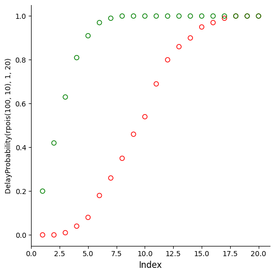
Again, the heart of each of these lines of code is the rpois() function that is generating random Poisson arrival delays for us. Our parameters for increment (1 second) and maximum (20 seconds) are the same for both lines. The first line uses col=2, which gives us red points, and the second gives us col=3, which yields green points:
This plot clearly shows that the green points have a “steeper” profile. We are more likely to have earlier arrivals for the 3-second delay data than we are for the 10-second data. If these were real tweets, the green tweets would be piling in much faster than the red tweets. Here’s a reminder on how to read this plot: Look at a value on the X-axis, for example “5.” Then look where the dot is and trace leftward to the Y-axis. For the red dot, the probability value at time (x) equal 4 is about 0.10. So for the red data there is about a 10% chance that the next event will occur within five time units (we’ve been calling them seconds, but they could really be anything, as long as you use the units consistently throughout the whole example). For the green data there is about a 85% chance that the next event will occur within four time units. The fact that the green curve rises more steeply than the red curve means that for these two samples only the green stuff is arriving much more often than the red stuff.
These reason we emphasized the point “for these samples only” is that we know from prior chapters that every sample of data you collect varies by at least a little bit and sometimes by quite a lot. A sample is just a snapshot, after all, and things can and do change from sample to sample. We can illustrate this by running and plotting multiple samples, much as we did in the earlier chapter:
plot(DelayProbability(rpois(100,10),1,20))
for (i in 1:15) {points(DelayProbability(rpois(100,10),1,20))}
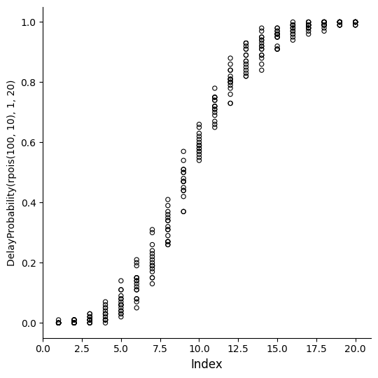
This is the first time we have used the “for loop” in R, so let’s walk through it. A “for loop” is one of the basic constructions that computer scientists use to “iterate” or repeatedly run a chunk of code. In R, a for loop runs the code that is between the curly braces a certain number of times. The number of times R runs the code depends on the expression inside the parentheses that immediately follow the “for.”
In the example above, the expression “i in 1:15” creates a new data object, called i, and then puts the number 1 in it. Then, the for loop keeps adding one to the value of i, until i reaches 15. Each time that it does this, it runs the code between the curly braces. The expression “in 1:15” tells R to start with one and count up to 15. The data object i, which is just a plain old integer, could also have been used within the curly braces if we had needed it, but it doesn’t have to be used within the curly braces if it is not needed. In this case we didn’t need it. The code inside the curly braces just runs a new random sample of 100 Poisson points with a hoped for mean of 10.
When you consider the two command lines on the previous page together you can see that we initiate a plot() on the first line of code, using similar parameters to before (random poisson numbers with a mean of 10, fed into our probability calculator, which goes in increments of 1 second up to 20 seconds). In the second line we add more points to the same plot, by running exactly 15 additional copies of the same code. Using rpois() ensures that we have new random numbers each time:
Now instead of just one smooth curve we have a bunch of curves, and that these curves vary quite a lot. In fact, if we take the example of 10 seconds (on the X-axis), we can see that in one case the probability of a new event in 10 seconds could be as low as 0.50, while in another case the probability is as high as about 0.70.
This shows why we can’t just rely on one sample for making our judgments. We need to know something about the uncertainty that surrounds a given sample. Fortunately, R gives us additional tools to help us figure this situation out. First of all, even though we had loads of fun programming the DelayProbability() function, there is a quicker way to get information about what we ideally expect from a Poisson distribution. The function ppois() gives us the theoretical probability of observing a certain delay time, given a particular mean. For example:
ppois(3, lambda=10)
[1] 0.01033605
So you can read this as: There is a 1% chance of observing a delay of 3 or less in a Poisson distribution with mean equal to 10. Note that in statistical terminology, “lambda” is the term used for the mean of a Poisson distribution. We’ve provided the named parameter “lambda=10” in the example above just to make sure that R does not get confused about what parameter we are controlling when we say “10.” The ppois() function does have other parameters that we have not used here. Now, using a for loop, we could get a list of several of these theoretical probabilities:
plot(1,20,xlim=c(0,20),ylim=c(0,1))
for (i in 1:20) {points(i,ppois(i,lambda=10)) }
We are using a little code trick in the first command line above by creating a nearly empty set of axes with the plot() function, and then filling in the points in the second line using the points() function. This gives the following plot:
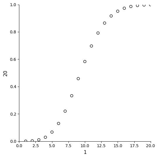
You may notice that this plot looks a lot like the ones earlier in this chapter as well as somewhat similar to the probability plot in the previous chapter. When we say the “theoretical distribution” we are talking about the ideal Poisson distribution that would be generated by the complex equation that Mr. Poisson invented a couple of centuries ago. Another way to think about it is, instead just having a small sample of points, which we know has a lot of randomness in it, what if we had a truly humongous sample with zillions of data points? The curve in the plot above is just about what we would observe for a truly humongous sample (where most of the biases up or down cancel themselves out because the large number of points).
So this is the ideal, based on the mathematical theory of the Poisson distribution, or what we would be likely to observe if we created a really large sample. We know that real samples, of reasonable amounts of data, like 100 points or 1000 points or even 10,000 points, will not hit the ideal exactly, because some samples will come out a little higher and others a little lower.
We also know, from the histograms and output earlier in the chapter, that we can look at the mean of a sample, or the count of events less than or equal to the mean, or the arrival probabilities in the graph on this page, and in each case we are looking at different versions of the same information. Check out these five commands:
mean(rpois(100000,10))
[1] 10.01009
var(rpois(100000,10))
[1] 10.02214
sum(rpois(100000,10)<=10)/100000
[1] 0.58638
ppois(10,lambda=10)
[1] 0.58303
qpois(0.58303,lambda=10)
[1] 10
In the first command, we confirm that for a very large random sample of n=100,000 with a desired mean of 10, the actual mean of the random sample is almost exactly 10. Likewise, for another large random sample with a desired mean of 10, the variance is 10. In the next command, we use the inequality test and the sum() function again to learn that the probability of observing a value of 10 or less in a very large sample is about 0.59 (note that the sum() function yielded 58,638 and we divided by 100,000 to get the reported value of 0.58638). Likewise, when we ask for the theoretical distribution with ppois() of observing 10 or less in a sample with a mean of 10, we get a probability of 0.58303, which is darned close to the empirical result from the previous command. Finally, if we ask qpois() what is the threshold value for a probability of 0.58303 is in a Poisson sample with mean of 10, we get back the answer: 10. You may see that qpois() does the reverse of what ppois() does. For fun, try this formula on the R command line:
qpois(ppois(10, lambda=10), lambda=10)

