Section 16.1 Shapefiles and Mapping Packages
Let’s look at the new stuff first. The Internet is full of shapefiles that contain mapping data. Shapefiles are a partially proprietary, partially open format supported by a California software company called ESRI. Shapefile is actually an umbrella term that covers several different file types. Because the R community has provided some packages to help deal with shapefiles, we don’t need to much information about the details. The most important thing to know is that shapefiles contain points, polygons, and “polylines.” Everyone knows what a point and a polygon are, but a polyline is a term used by computer scientist to refer to a multi-segment line. In many graphics applications it is much easier to approximate a curved line with many tiny connected straight lines than it is to draw a truly curved line. If you think of a road or a river on a map, you will have a good idea of a polyline.
The U.S. Census bureau publishes shapefiles at various levels of detail for every part of the country. Search for the term “shapefile” at “site:census.gov” and you will find several pages with listings of different shapefiles. For this exercise, we are using a relatively low detail map of the whole U.S. We downloaded a “zip” file. Unzip this (usually just by double-clicking on it) and you will find several files inside it. The file ending in “shp” is the main shapefile. Another file that will be useful to us ends in “dbf” - this contains labels and other information.
To get started, we will need two new R packages called PBSmapping and maptools. PBSmapping refers not to public broadcasting, but rather to the Pacific Biology Station, whose researchers and technologists kindly bundled up a wide range of the R processing tools that they use to manage map data. The maptools package was developed by Nicholas J. Lewin-Koh (University of Singapore) and others to provide additional tools and some “wrappers” to make PBSmapping functions easier to use. In this chapter we only scratch the surface of the available tools: there could be a whole book just dedicated to R mapping functions alone.
Before we read in the data we grabbed from the Census Bureau, let’s set the working directory in R-Studio so that we don’t have to type it out on the command line. Click on the Tools menu and then choose “Set Working Directory.” Use the dialog box to designate the folder where you have unzipped the shape data. After that, these commands will load the shape data into R and show us what we have:
usShape <- importShapefile( "gz_2010_us_040_00_500k",readDBF=TRUE)
summary(usShape)
PolySet
Records         : 90696
Contours      : 574
Holes       : 0
Events        : NA
On boundary : NA
Ranges
X             : [-179.14734, 179.77847]
Y             : [17.884813, 71.3525606439998]
Attributes
Projection    : LL
Zone          : NULL
Extra columns   :
plotPolys(usShape)
This last command gives us a simple plot of the 90,696 shapes that our shapefile contains. Here is the plot:
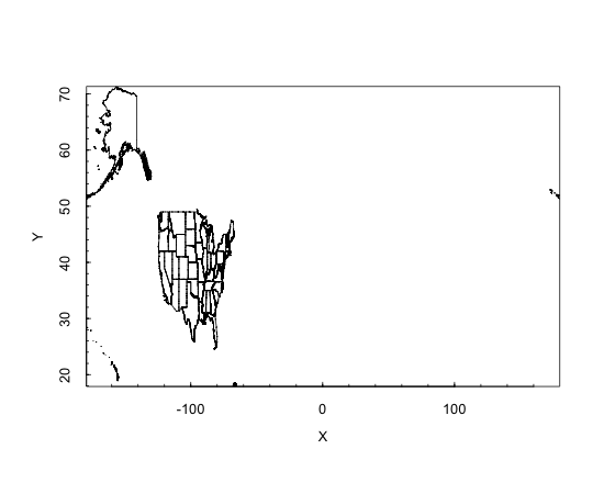
plotPolys(usShape), showing all states including Alaska and Hawaii.This is funny looking! The ranges output from the summary() command gives us a hint as to why. The longitude of the elements in our map range from -179 to nearly 180: this covers pretty much the whole of the planet. The reason is that the map contains shapes for Hawaii and Alaska. Both states have far western longitudes, but the Aleutian peninsula in Alaska extends so far that it crosses over the longitude line where -180 and 180 meet in the Pacific Ocean. As a result, the continental U.S. is super squashed. We can specify a more limited area of the map to consider by using the xlim and ylim parameters. The following command:
plotPolys(usShape, xlim=c(-130,-60),ylim=c(20,50))
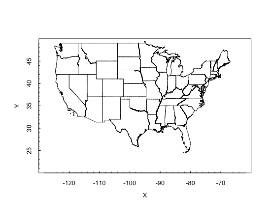
plotPolys(usShape, xlim=c(-130,-60), ylim=c(20,50)), showing state boundaries in their typical proportions....gives a plot that shows the continental U.S. more in its typical proportions.
So now we have some map data stored away and ready to use. The PBSmapping package gives us the capability of adding points to an existing map. For now, let’s demonstrate this with a made up point somewhere in Texas:
X <- -100
Y <- 30
EID <- 1
pointData <- data.frame(EID,X,Y)
eventData <- as.EventData(               pointData,projection=NA)
addPoints(eventData,col="red",cex=.5)
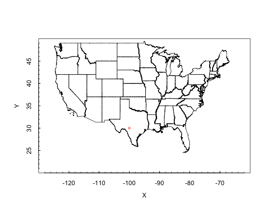
addPoints().You have to look carefully, but in southern Texas there is now a little red dot. We began by manually creating a single point - specified by X (longitude), Y (latitude), and EID (an identification number) - and sticking it into a dataframe. Then we converted the data in that dataframe into an EventData object. This is a custom class of object specified by the PBSmapping package. The final command above adds the EventData to the plot.
The idea of EventData is a little confusing, but if you remember that this package was developed by biologists at the Pacific Biology Station to map sightings of fish and other natural phenomena it makes more sense. In their lingo, an event was some observation of interest that occurred at a particular day, time, and location. The “event id” or EID <- 1 that we stuck in the data frame was just saying that this was the first point in our list that we wanted to plot. For us it is not an event so much as a location of something we wanted to see on the map.
Also note that the “projection=NA” parameter in the
as.EventData() coercion is just letting the mapping software know that we don’t want our point to be transformed according to a mapping projection. If you remember from your Geography class, a projection is a mapping technique to make a curved object like the Earth seem sensible on a flat map. In this example, we’ve already flattened out the U.S., so there is no need to transform the points.

