Section 12.5 Comparing Real Twitter Data
At this point we have all of the knowledge and tools we need to compare two sets of arrival rates. Let’s grab a couple of sets of tweets and extract the information we need. First, we will use the function we created in the last chapter to grab the first set of tweets:
tweetDF <- TweetFrame(“#ladygaga”,500)
Next, we need to sort the tweets by arrival time, That is, of course, unless you accepted the Chapter Challenge in the previous chapter and built the sorting into your TweetFrame() function.
sortweetDF<-tweetDF[order(as.integer( +
tweetDF$created)), ]
Now, we’ll extract a vector of the time differences. In the previous chapter the use of the diff() function occurred within the ArrivalProbability() function that we developed. Here we will use it directly and save the result in a vector:
eventDelays<- +
as.integer(diff(sortweetDF$created))
Now we can calculate a few of the things we need in order to get a picture of the arrival delays for Lady Gaga’s tweets:
mean(eventDelays)
[1] 30.53707
sum(eventDelays<=31)
[1] 333
So, for Lady Gaga tweets, the mean arrival delay for the next tweet is just short of 31 seconds. Another way of looking at that same statistic is that 333 out of 500 tweets (0.666, about two thirds) arrived within 31 seconds of the previous tweet. We can also ask poisson.test() to show us the confidence interval around that value:
poisson.test(333,500)$conf.int
[1] 0.5963808 0.7415144
attr(,"conf.level")
[1] 0.95
So, this result suggests that for 95% of the Lady Gaga samples of tweets that we might pull from the Twitter system, the proportion arriving in 31 seconds or less would fall in this confidence band. In other words, we’re not very likely to see a sample with a proportion under 59.6% or over 74.1%. That’s a pretty wide band, so we do not have a lot of exactitude here.
Now let’s get the same data for Oprah:
tweetDF <- TweetFrame("#oprah",500)
sortweetDF<-tweetDF[order(as.integer(tweetDF$created)), ]
eventDelays<- as.integer(diff(sortweetDF$created))
mean(eventDelays)
[1] 423.01
Hmm, I guess we know who is boss here! Now let’s finish the job:
sum(eventDelays<=31)
[1] 73
poisson.test(73,500)$conf.int
[1] 0.1144407 0.1835731
attr(,"conf.level")
[1] 0.95
The sum() function, above, calculates that only 73 out of Oprah’s sample of 500 tweets arrive in an interval of 31 or less. We use 31, the mean of the Lady Gaga sample, because we need to have a common basis of comparison. So for Oprah, the proportion of events that occur in the 31 second timeframe is, 73/500 = 0.146, or about 14.6%. That’s a lot lower than the 66.6% of Lady Gaga tweets, for sure, but we need to look at the confidence interval around that value. So the poisson.test() function just above for Oprah reports that the 95% confidence interval runs from about 11.4% to 18.4%. Note that this confidence interval does not overlap at all with the confidence interval for Lady Gaga, so we have a very strong sense that these two rates are statistically quite distinctive - in other words, this is a difference that was not caused by the random influences that sampling always creates. We can make a bar graph to summarize these differences. We’ll use the barplot2() function, which is in a package called gplots(). If you created the EnsurePackage() function a couple of chapters ago, you can use that. Otherwise make sure to load gplots manually:
EnsurePackage("gplots")
barplot2(c(0.666,0.146),
         ci.l=c(0.596,0.114),
         ci.u=c(0.742,0.184),
         plot.ci=TRUE,
         names.arg=c("Gaga","Oprah"))
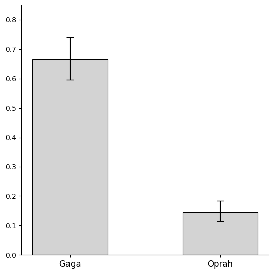
This is not a particularly efficient way to use the barplots() function, because we are supplying our data by typing it in, using the c() function to create short vectors of values on the command line. On the first line,, we supply a list of the means from the two samples, expressed as proportions. On the next two lines we first provide the lower limits of the confidence intervals and then the upper limits. The plot.ci=TRUE parameter asks barplot2() to put confidence interval whiskers on each bar. The final line provides labels to put underneath the bars. Here’s what we get:
This is not an especially attractive bar plot, but it does represent the information we wanted to display accurately. And with the assistance of this plot, it is easy to see both the substantial difference between the two bars and the fact that the confidence intervals do not overlap.
For one final confirmation of our results, we can ask the poisson.text() function to evaluate our two samples together. This code provides the same information to poisson.test() as before, but now provides the event counts as short lists describing the two samples, with 333 events (under 31 seconds) for Lady Gaga and 73 events for Oprah, in both cases out of 500 events:
poisson.test(c(333,73),c(500,500))
Comparison of Poisson rates
data:  c(333, 73) time base: c(500, 500)
count1 = 333, expected count1 = 203, p-value < 2.2e-16
alternative hypothesis: true rate ratio is not equal to 1
95 percent confidence interval:
3.531401 5.960511
sample estimates:
rate ratio
4.561644
Let’s walk through this output line by line. Right after the command, we get a brief confirmation from the function that we’re comparing two event rates in this test rather than just evaluating a single rate: “Comparison of Poisson rates.” The next line confirms the data we provided. The next line, that begins with “count1 = 333” confirms the basis of of the comparison and then shows a “pooled” count that is the weighted average of 333 and 73. The p-value on that same line represents the position of a probability tail for “false positives.” Together with the information on the next line, “alternative hypothesis,” this constitutes what statisticians call a “null hypothesis significance test.” Although this is widely used in academic research, it contains less useful information than confidence intervals and we will ignore it for now.
The next line, “95% confidence interval,” is a label for the most important information, which is on the line that follows. The values of 3.53 and 5.96 represent the upper and lower limits of the 95% confidence interval around the observed rate ratio of 4.56 (reported on the final line). So, for 95% of samples that we might draw from twitter, the ratio of the Gaga/Oprah rates might be as low as 3.53 and as high as 5.96. So we can be pretty sure (95% confidence) that Lady Gaga gets tweets at least 3.5 times as fast as Oprah. Because the confidence interval does not include 1, which would be the same thing as saying that the two rates are identical, we can be pretty certain that the observed rate ratio of 4.56 is not a statistical fluke.
For this comparison, we chose two topics that had very distinctive event rates. As the bar chart on the previous page attests, there was a substantial difference between the two samples in the rates of arrival of new tweets. The statistical test confirmed this for us, and although the ability to calculate and visualize the confidence intervals was helpful, we probably could have guessed that such a large difference over a total of 1000 tweets was not a result due to sampling error.
With other topics and other comparisons, however, the results will not be as clear cut. After completing the chapter challenge on the next page, we compared the “#obama” hashtag to the “#romney” hashtag. Over samples of 250 tweets each, Obama had 159 events at or under the mean, while Romney had only 128, for a ratio of 1.24 in Obama’s favor. The confidence interval told a different story, however: the lower bound of the confidence interval was 0.978, very close to, but slightly below one. This signifies that we can’t rule out the possibility that the two rates are, in fact, equal and that the slightly higher rate (1.24 to 1) that we observed for Obama in this one sample might have come about due to sampling error. When a confidence interval overlaps the point where we consider something to be a “null result” (in this case a ratio of 1:1) we have to take seriously the possibility that peculiarities of the sample(s) we drew created the observed difference, and that a new set of samples might show the opposite of what we found this time.

