Section 11.7 Tweet Arrival Times and the Poisson Distribution
Let’s start to play with the
tweetDF dataset that we created before. First, as a matter of convenience, let’s learn the attach() function. The attach() function saves us some typing by giving one particular dataframe priority over any others that have the same variable names. Normally, if we wanted to access the variables in our dataframe, we would have to use the $ notation, like this:
tweetDF$created
But if we run
attach(tweetDF) first, we can then refer to created directly, without having to type the tweetDF$ before it:
> attach(tweetDF)

> head(created,4)
[1] "2012-04-05 14:10:01 UTC" "2012-04-05 14:09:21 UTC"
[3] "2012-04-05 14:08:15 UTC" "2012-04-05 14:07:12 UTC"
Let’s visualize the creation time of the 500 tweets in our dataset. When working with time codes, the
hist() function requires us to specify the approximate number of categories we want to see in the histogram:
hist(created, breaks=15, freq=TRUE)
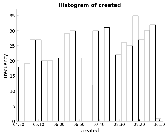
This command yields a histogram. If we look along the x-axis (the horizontal), this string of tweets starts at about 4:20 AM and goes until about 10:10 AM, a span of roughly six hours. There are 22 different bars so each bar represents about 16 minutes — for casual purposes we’ll call it a quarter of an hour. It looks like there are something like 20 tweets per bar, so we are looking at roughly 80 tweets per hour with the hashtag “#climate.” This is obviously a pretty popular topic. This distribution does not really have a discernible shape, although it seems like there might be a bit of a growth trend as time goes on, particularly starting at about 7:40 AM.
Take note of something very important about these data: It doesn’t make much sense to work with a measure of central tendency. Remember a couple of chapters ago when we were looking at the number of people who resided in different U.S. states? In that case it made sense to say that if State A had one million people and State B had three million people, then the average of these two states was two million people. When you’re working with time stamps, it doesn’t make a whole lot of sense to say that one tweet arrived at 7 AM and another arrived at 9 AM so the average is 8 AM. Fortunately, there’s a whole area of statistics concerned with “arrival” times and similar phenomena, dating back to a famous study by Ladislaus von Bortkiewicz of horsemen who died after being kicked by their horses. von Bortkiewicz studied each of 14 cavalry corps over a period of 20 years, noting when horsemen died each year. The distribution of the “arrival” of kick-deaths turns out to have many similarities to other arrival time data, such as the arrival of buses or subway cars at a station, the arrival of customers at a cash register, or the occurrence of telephone calls at a particular exchange. All of these kinds of events fit what is known as a “Poisson Distribution” (named after Simeon Denis Poisson, who published it about half a century before von Bortkiewicz found a use for it). Let’s find out if the arrival times of tweets comprise a Poisson distribution.
Right now we have the actual times when the tweets were posted, coded as a POSIX date and time variable. Another way to think about these data is to think of each new tweet as arriving a certain amount of time after the previous tweet. To figure that out, we’re going to have to “look back” a row in order to subtract the creation time of the previous tweet from the creation time of the current tweet. In order to be able to make this calculation, we have to make sure that our data are sorted in ascending order of arrival — in other words the earliest one first and the latest one last. To accomplish this, we will use the
order() function together with R’s built-in square bracket notation.
As mentioned briefly in the previous chapter, in R, square brackets allow “indexing” into a list, vector, or data frame. For example,
myList[3] would give us the third element of myList. Keeping in mind that a dataframe is a rectangular structure, really a two dimensional structure, we can address any element of a dataframe with both a row and column designator: myFrame[4,1] would give the fourth row and the first column. A shorthand for taking the whole column of a dataframe is to leave the row index empty: myFrame[ , 6] would give every row in the sixth column. Likewise, a shorthand for taking a whole row of a dataframe is to leave the column index empty: myFrame[10, ] would give every column in the tenth row. We can also supply a list of rows instead of just one row, like this: myFrame[ c(1,3,5), ] would return rows 1, 3, 5 (including the data for all columns, because we left the column index blank). We can use this feature to reorder the rows, using the order() function. We tell order() which variable we want to sort on, and it will give back a list of row indices in the order we requested. Putting it all together yields this command:
tweetDF[order(as.integer(created)), ]
Working our way from the inside to the outside of the expression above, we want to sort in the order that the tweets were created. We first coerce the variable
created to integer — it will then truly be expressed in the number of seconds since 1970 — just in case there are operating system differences in how POSIX dates are sorted. We wrap this inside the order() function. The order() function will provide a list of row indices that reflects the time ordering we want. We use the square brackets notation to address the rows in tweetDF, taking all of the columns by leaving the index after the comma empty.
We have a choice of what to do with the dataframe that is returned from this command. We could assign it back to
tweetDF, which would overwrite our original dataframe with the sorted version. Or we could create a new sorted dataframe and leave the original data alone, like so:
sortweetDF <- tweetDF[order(as.integer(created)), ]
If you choose this method, make sure to
detach() tweetDF and attach() sortweetDF so that later commands will work smoothly with the sorted dataframe:
> detach(tweetDF)

> attach(sortweetDF)
Another option, which seems better than creating a new dataframe, would be to build the sorting into the
TweetFrame() function that we developed at the beginning of the chapter. Let’s leave that to the chapter challenge. For now, we can keep working with sortweetDF.
Technically, what we have with our
created variable now is a time series, and because statisticians like to have convenient methods for dealing with time series, R has a built-in function, called diff(), that allows us to easily calculate the difference in seconds between each pair of neighboring values. Try it:
diff(created)
You should get a list of time differences, in seconds, between neighboring tweets. The list will show quite a wide range of intervals, perhaps as long as several minutes, but with many intervals near or at zero. You might notice that there are only 499 values and not 500: This is because you cannot calculate a time difference for the very first tweet, because we have no data on the prior tweet. Let’s visualize these data and see what we’ve got:
hist(as.integer(diff(created)))
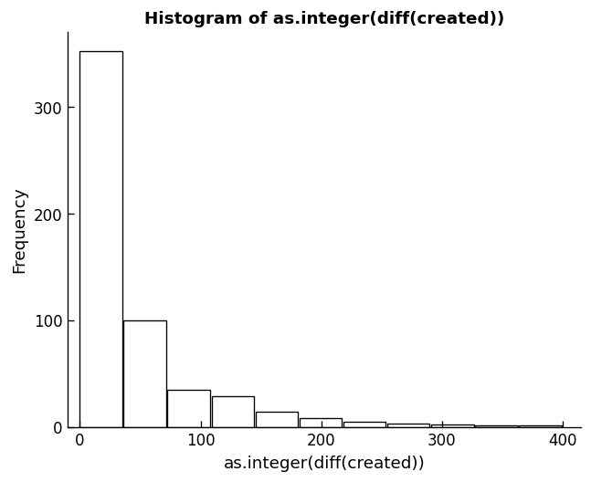
As with earlier commands, we use
as.integer() to coerce the time differences into plain numbers, otherwise hist() does not know how to handle the time differences. This histogram shows that the majority of tweets in this group come within 50 seconds or less of the previous tweets. A much smaller number of tweets arrive within somewhere between 50 and 100 seconds, and so on down the line. This is typical of a Poisson arrival time distribution. Unlike the raw arrival time data, we could calculate a mean on the time differences:
> mean(as.integer(diff(created)))
[1] 41.12826
We have to be careful though, in using measures of central tendency on this positively skewed distribution, that the value we get from the
mean() is a sensible representation of central tendency. Remembering back to the previous chapter, and our discussion of the statistical mode (the most frequently occurring value), we learn that the mean and the mode are very different:
> library("modeest")

> mfv(as.integer(diff(created)))
[1] 0
We use the
library() function to make sure that the add-on package with the mfv() function is ready to use. The results of the mfv() function show that the most commonly occurring time interval between neighboring tweets is zero!
Likewise the median shows that half of the tweets have arrival times of under half a minute:
> median(as.integer(diff(created)))
[1] 28
In the next chapter we will delve more deeply into what it means when a set of data are shaped like a Poisson distribution and what that implies about making use of the mean.
One last way of looking at these data before we close this chapter. If we choose a time interval, such as 10 seconds, or 30 seconds, or 60 seconds, we can ask the question of how many of our tweet arrivals occurred within that time interval. Here’s code that counts the number of arrivals that occur within certain time intervals:
> sum((as.integer(diff(created)))<60)
[1] 375

> sum((as.integer(diff(created)))<30)
[1] 257

> sum((as.integer(diff(created)))<10)
[1] 145
You could also think of these as ratios, for example 145/500 = 0.29. And where we have a ratio, we often can think about it as a probability: There is a 29% probability that the next tweet will arrive in 10 seconds or less. You could make a function to create a whole list of these probabilities. Some sample code for such a function appears at the end of the chapter. Some new scripting skills that we have not yet covered (for example, the “for loop”) appear in this function, but try making sense out of it to stretch your brain. Output from this function created the plot that appears below.
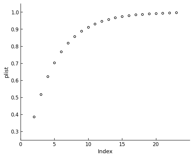
This is a classic Poisson distribution of arrival probabilities. The x-axis contains 10 second intervals (so by the time you see the number 5 on the x-axis, we are already up to 50 seconds). This is called a cumulative probability plot and you read it by talking about the probability that the next tweet will arrive in the amount of time indicated on the x-axis or less. For example, the number five on the x-axis corresponds to about a 60% probability on the y-axis, so there is a 60% probability that the next tweet will arrive in 50 seconds or less. Remember that this estimate applies only to the data in this sample!
In the next chapter we will reexamine sampling in the context of Poisson and learn how to compare two Poisson distributions to find out which hashtag is more popular.
Let’s recap what we learned from this chapter. First, we have begun to use the project features of R-studio to establish a clean environment for each R project that we build. Second, we used the source code window of R-studio to build two or three very useful functions, ones that we will reuse in future chapters. Third, we practiced the skill of installing packages to extend the capabilities of R. Specifically, we loaded Jeff Gentry’s twitteR package and the other three packages it depends upon. Fourth, we put the twitteR package to work to obtain our own fresh data right from the web. Fifth, we started to condition that data, for example by creating a sorted list of tweet arrival times. And finally, we started to analyze and visualize those data, by conjecturing that this sample of arrival times fitted the classic Poisson distribution.

