Section 7.4 Working with the U.S. State Population Data
This is a pretty boring example, though, and not very useful for the rest of the chapter, so here’s the next step up in looking at data. We will use the Windows or Mac clipboard to cut and paste a larger data set into R. Go to the U.S. Census website where they have stored population data: http://www.census.gov/popest/data/national/totals/2011/index.html
Assuming you have a spreadsheet program available, click on the XLS link for “Annual Estimates of the Resident Population for the United States.” When the spreadsheet is open, select the population estimates for the fifty states. The first few looked like this in the 2011 data:
.Alabama    4,779,736
.Alaska       710,231
.Arizona    6,392,017
.Arkansas   2,915,918
To make use of the next R command, make sure to choose just the numbers and not the text. Before you copy the numbers, take out the commas by switching the cell type to “General.” This can usually be accomplished under the Format menu, but you might also have a toolbar button to do the job. Copy the numbers to the clipboard with ctrl+C (Windows) or command+C (Mac). On a Windows machine use the following command:
read.DIF("clipboard",transpose=TRUE)
On a Mac, this command does the same thing:
read.table(pipe("pbpaste"))
It is very annoying that there are two different commands for the two types of computers, but this is an inevitable side effect of the different ways that the designers at Microsoft and Apple set up the clipboard, plus the fact that R was designed to work across many platforms. Anyway, you should have found that the long string of population numbers appeared on the R output. The numbers are not much use to us just streamed to the output, so let’s assign the numbers to a new vector.
Windows, using
read.DIF():
USstatePops <- read.DIF("clipboard",transpose=TRUE)
USstatePops
Or Mac, using
read.table():
USstatePops <- read.table(pipe("pbpaste"))
USstatePops
   V1
1 4779736
2 710231
3 6392017
...
Only the first three observations are shown in order to save space on the page. Your output R should show the whole list. Note that the only thing new here over and above what we have done with R in previous chapters is the use of the
read.DIF() or read.table() functions to get a bigger set of data that we don’t have to type ourselves. Functions like read.table() are quite important as we move forward with using R because they provide the usual way of getting data stored in external files into R’s storage areas for use in data analysis. If you had trouble getting this to work, you can cut and paste the commands at the end of the chapter under “If All Else Fails” to get the same data going in your copy of R.
Note that we have used the left pointing assignment arrow (“<-”) to take the results of the
read.DIF() or read.table() function and place it in a data object. This would be a great moment to practice your skills from the previous chapter by using the str() and summary() functions on our new data object called USstatePops. Did you notice anything interesting from the results of these functions? One thing you might have noticed is that there are 51 observations instead of 50. Can you guess why? If not, go back and look at your original data from the spreadsheet or the U.S. Census site. The other thing you may have noticed is that USstatePops is a dataframe, and not a plain vector of numbers. You can actually see this in the output above: In the second command line where we request that R reveal what is stored in USstatePops, it responds with a column topped by the designation “V1”. Because we did not give R any information about the numbers it read in from the clipboard, it called them “V1”, short for Variable One, by default. So anytime we want to refer to our list of population numbers we actually have to use the name USstatePops$V1. If this sounds unfamiliar, take another look at the previous “Rows and Columns” chapter for more information on addressing the columns in a dataframe.
Now we’re ready to have some fun with a good sized list of numbers. Here are the basic descriptive statistics on the population of the states:
mean(USstatePops$V1)
median(USstatePops$V1)
var(USstatePops$V1)
sd(USstatePops$V1)
[1] 6053834
[1] 4339367
[1] 4.656676e+13
[1] 6823984
Some great summary information there, but wait, a couple things have gone awry:
The
mode() function has returned the data type of our vector of numbers instead of the statistical mode. This is weird but true: the basic R package does not have a statistical mode function! This is partly due to the fact that the mode is only useful in a very limited set of situations, but we will find out in later packages how add-on packages can be used to get new functions in R including one that calculates the statistical mode.
The variance is reported as
4.656676e+13. This is the first time that we have seen the use of scientific notation in R. If you haven’t seen this notation before, the way you interpret it is to imagine 4.656676 multiplied by 10,000,000,000,000 (also known as 10 raised to the 13th power). You can see that this is ten trillion, a huge and unwieldy number, and that is why scientific notation is used. If you would prefer not to type all of that into a calculator, another trick to see what number you are dealing with is just to move the decimal point 13 digits to the right.
Other than these two issues, we now know that the average population of a U.S. state is 6,053,834 with a standard deviation of 6,823,984. You may be wondering, though, what does it mean to have a standard deviation of almost seven million? The mean and standard deviation are OK, and they certainly are mighty precise, but for most of us, it would make much more sense to have a picture that shows the central tendency and the dispersion of a large set of numbers. So here we go. Run this command:
hist(USstatePops$V1)
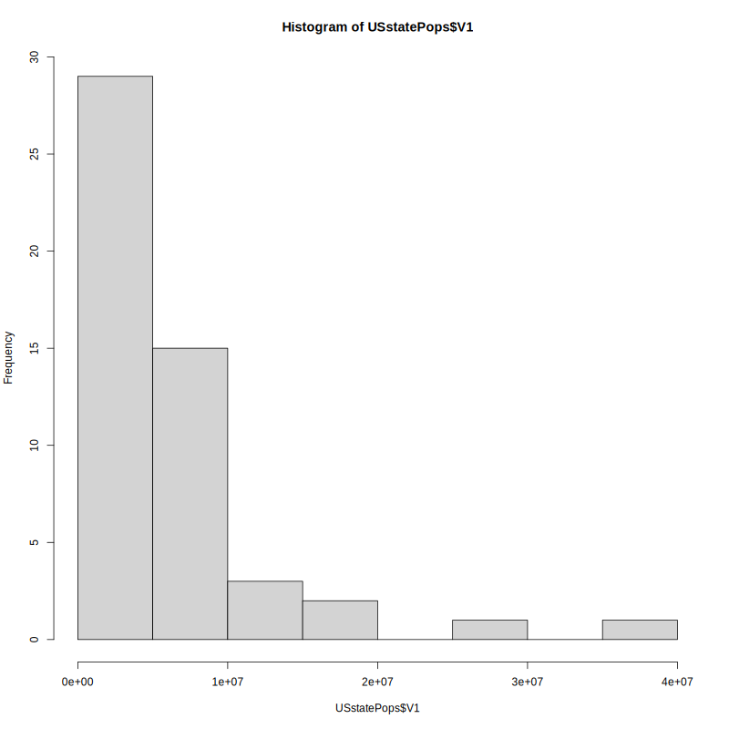
A histogram is a specialized type of bar graph designed to show “frequencies.” Frequencies means how often a particular value or range of values occurs in a dataset. This histogram shows a very interesting picture. There are nearly 30 states with populations under five million, another 10 states with populations under 10 million, and then a very small number of states with populations greater than 10 million. Having said all that, how do we glean this kind of information from the graph? First, look along the Y-axis (the vertical axis on the left) for an indication of how often the data occur. The tallest bar is just to the right of this and it is nearly up to the 30 mark. To know what this tall bar represents, look along the X-axis (the horizontal axis at the bottom) and see that there is a tick mark for every two bars. We see scientific notation under each tick mark. The first tick mark is 1e+07, which translates to 10,000,000. So each new bar (or an empty space where a bar would go) goes up by five million in population. With these points in mind it should now be easy to see that there are nearly 30 states with populations under five million.
If you think about presidential elections, or the locations of schools and businesses, or how a single U.S. state might compare with other countries in the world, it is interesting to know that there are two really giant states and then lots of much smaller states. Once you have some practice reading histograms, all of the knowledge is available at a glance.
On the other hand there is something unsatisfying about this diagram. With over forty of the states clustered into the first couple of bars, there might be some more details hiding in there that we would like to know about. This concern translates into the number of bars shown in the histogram. There are eight shown here, so why did R pick eight?
The answer is that the
hist() function has an algorithm or recipe for deciding on the number of categories/bars to use by default. The number of observations and the spread of the data and the amount of empty space there would be are all taken into account. Fortunately it is possible and easy to ask R to use more or fewer categories/bars with the “breaks” parameter, like this:
hist(USstatePops$V1, breaks=20)
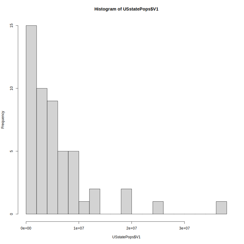
This gives us five bars per tick mark or about two million for each bar. So the new histogram above shows very much the same pattern as before: 15 states with populations under two million. The pattern that you see here is referred to as a distribution. This is a distribution that starts off tall on the left and swoops downward quickly as it moves to the right. You might call this a “reverse-J” distribution because it looks a little like the shape a J makes, although flipped around vertically. More technically this could be referred to as a geometric distribution. We don’t have to worry about why it is called that at this stage, but we can speculate on why the distribution looks the way it does. First, you can’t have a state with no people in it, or worse yet negative population. It just doesn’t make any sense. So a state has to have at least a few people in it, and if you look through U.S. history every state began as a colony or a territory that had at least a few people in it. On the other hand, what does it take to grow really large in population? You need a lot of land, first of all, and then a good reason for lots of people to move there or lots of people to be born there. So there are lots of limits to growth: Rhode Island is too small to have a bazillion people in it and Alaska, although it has tons of land, is too cold for lots of people to want to move there. So all states probably started small and grew, but it is really difficult to grow really huge. As a result we have a distribution where most of the cases are clustered near the bottom of the scale and just a few push up higher and higher. But as you go higher, there are fewer and fewer states that can get that big, and by the time you are out at the end, just shy of 40 million people, there’s only one state that has managed to get that big. By the way, do you know or can you guess what that humongous state is?
There are lots of other distribution shapes. The most common one that almost everyone has heard of is sometimes called the “bell” curve because it is shaped like a bell. The technical name for this is the normal distribution. The term “normal” was first introduced by Carl Friedrich Gauss (1777–1855), who supposedly called it that in a belief that it was the most typical distribution of data that one might find in natural phenomena. The following histogram depicts the typical bell shape of the normal distribution.
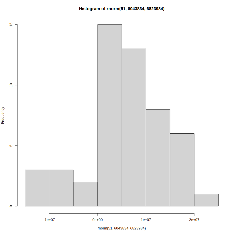
If you are curious, you might be wondering how R generated the histogram above, and, if you are alert, you might notice that the histogram that appears above has the word “rnorm” in a couple of places. Here’s another of the cool features in R: it is incredibly easy to generate “fake” data to work with when solving problems or giving demonstrations. The data in this histogram were generated by R’s
rnorm() function, which generates a random data set that fits the normal distribution (more closely if you generate a lot of data, less closely if you only have a little). Some further explanation of the rnorm() command will make sense if you remember that the state population data we were using had a mean of 6,053,834 and a standard deviation of 6,823,984. The command used to generate this histogram was:
hist(rnorm(51, 6043834, 6823984))
There are two very important new concepts introduced here. The first is a nested function call: The
hist() function that generates the graph “surrounds” the rnorm() function that generates the new fake data. (Pay close attention to the parentheses!) The inside function, rnorm(), is run by R first, with the results of that sent directly and immediately into the hist() function.
The other important thing is the “arguments” that were “passed” to the
rnorm() function. We actually already ran into arguments a little while ago with the read.DIF() and read.table() functions but we did not talk about them then. “Argument” is a term used by computer scientists to refer to some extra information that is sent to a function to help it know how to do its job. In this case we passed three arguments to rnorm() that it was expecting in this order: the number of observations to generate in the fake dataset, the mean of the distribution, and the standard deviation of the distribution. The rnorm() function used these three numbers to generate 51 random data points that, roughly speaking, fit the normal distribution. So the data shown in the histogram above are an approximation of what the distribution of state populations might look like if, instead of being reverse-J-shaped (geometric distribution), they were normally distributed.
The normal distribution is used extensively through applied statistics as a tool for making comparisons. For example, look at the rightmost bar in the previous histogram. The label just to the right of that bar is 3e+07, or 30,000,000. We already know from our real state population data that there is only one actual state with a population in excess of 30 million (if you didn’t look it up, it is California). So if all of a sudden, someone mentioned to you that he or she lived in a state, other than California, that had 30 million people, you would automatically think to yourself, “Wow, that’s unusual and I’m not sure I believe it.” And the reason that you found it hard to believe was that you had a distribution to compare it to. Not only did that distribution have a characteristic shape (for example, J-shaped, or bell shaped, or some other shape), it also had a center point, which was the mean, and a “spread,” which in this case was the standard deviation. Armed with those three pieces of information—the type/shape of distribution, an anchoring point, and a spread (also known as the amount of variability)—you have a powerful tool for making comparisons.
In the next chapter we will conduct some of these comparisons to see what we can infer about the ways things are in general, based on just a subset of available data, or what statisticians call a sample.

