Section 5.5 Visualizing Relationships
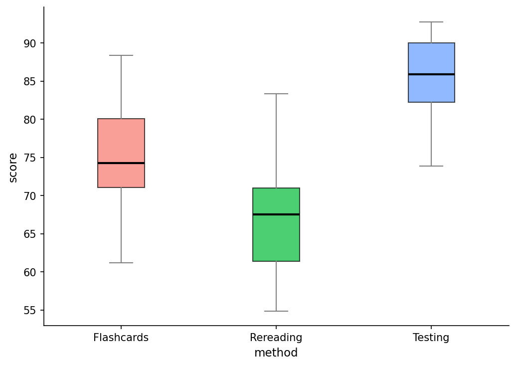
When we have categorical and numeric data, there are two visualizations that are extremely relevant when visualizing our data: boxplots and bar charts (see Subsubsection 3.4.3.1 for a quick review on bar charts).
ggplot(memory, aes(x = method, y = score, fill = method)) +
  geom_boxplot(alpha = 0.7) +
  labs(
    title = "Memory Test Scores by Study Technique",
    x = "Study Technique",
    y = "Memory Test Score"
  ) +
  theme_minimal()
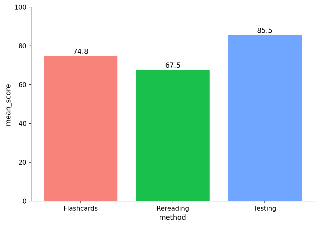
memory |>
  group_by(method) |>
  summarize(mean_score = mean(score)) |>
  ggplot(aes(x = method, y = mean_score, fill = method)) +
  geom_col() +
  geom_text(aes(label = round(mean_score, 1)), vjust = -0.5) + # adds the means to bars
  labs(
    title = "Average Memory Score by Study Technique (ANOVA Means)",
    x = "Study Technique",
    y = "Average Score"
  ) +
  theme_minimal()