
Section 9.10 ROC Curve + AUC

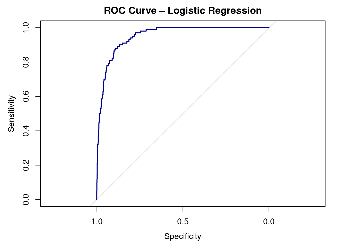
As always, we want to visualize our data. To do this, we can create a special visualization, an ROC CURVE, utilizing the pROC package.
library(pROC)

roc_obj <- roc(test_data$default, test_data$pred_prob, levels = c("No", "Yes"))
plot(roc_obj, col = "darkblue", lwd = 2,
     main = "ROC Curve – Logistic Regression")
A ROC curve plot with specificity on the x-axis (from 1.0 to 0.0) and sensitivity on the y-axis (from 0.0 to 1.0). A dark blue curve hugs the top-left corner, indicating strong model performance. A gray diagonal reference line represents random guessing.
Figure 9.10.1. Receiver Operating Characteristic (ROC) curve for the logistic regression model predicting credit card default. The curve plots sensitivity against 1 βˆ’ specificity across all possible classification thresholds. Curves closer to the top-left corner indicate better classification performance. The area under the curve (AUC) summarizes the model’s ability to distinguish between defaulters and non-defaulters.
auc(roc_obj)
Area under the curve: 0.9529
Interpretation:

