Section 9.5 Visualize Relationships
We are going to make three different visualizations:
-
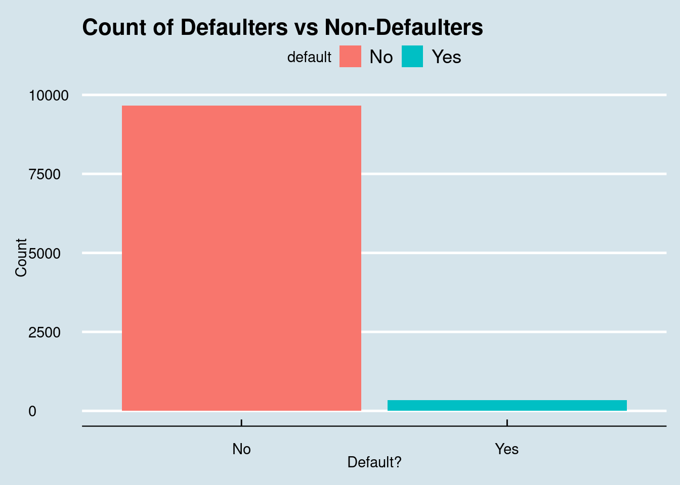
A bar plot of defaults
-
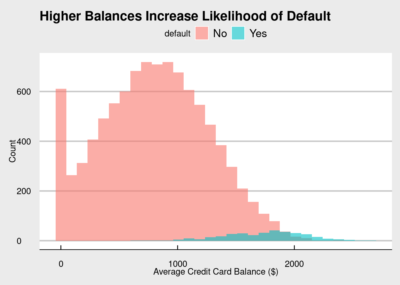
A histogram of balances split by default, and then
-
A scatterplot of balance and income
For fun, we will be utilizing some themes from the
ggthemes package. When recreating these on your own, of course feel free to play around and change the themes. As I always say, R puts the r in Artist!
library(ggthemes)

# Default distribution
ggplot(cc_data, aes(x = default, fill = default)) +
  geom_bar() +
  labs(title = "Count of Defaulters vs Non-Defaulters", y = "Count", x = "Default?") +
  theme_economist()
For a quick review on histograms, see Subsubsection 3.4.4.1.
# Balance by default
ggplot(cc_data, aes(x = balance, fill = default)) +
  geom_histogram(position = "identity", alpha = 0.6, bins = 30) +
  labs(title = "Higher Balances Increase Likelihood of Default",
       x = "Average Credit Card Balance ($)", y = "Count") +
  theme_economist_white()
# Balance vs. Income
ggplot(cc_data, aes(x = balance, y = income, color = default)) +
  geom_point(alpha = 0.6) +
  geom_smooth(method = "lm", se = FALSE, color = "black", linetype = "dashed") +
  labs(title = "Customers Who Default Tend to Have Higher Balances",
       subtitle = "Each point represents a customer",
       x = "Average Credit Card Balance ($)",
       y = "Annual Income ($)",
       color = "Default") +
  theme_minimal(base_size = 13) +
  theme(plot.title = element_text(face = "bold"))
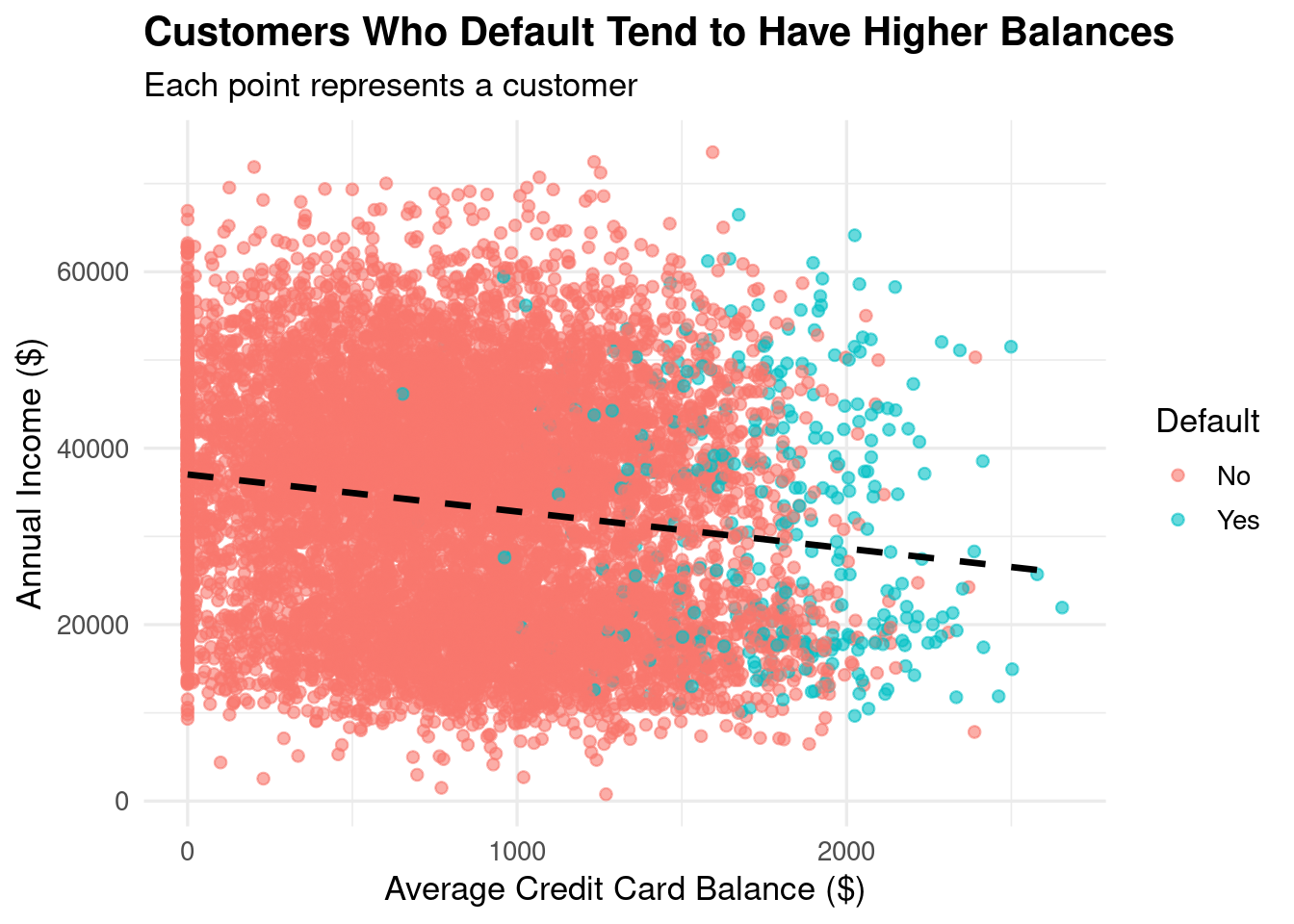
The visualizations look great! In terms of insights, we see (again) that most people do not default on their credit cards, most balances are around the 800 range for non-defaulters and higher for the defaulters, and that as balance increases, income decreases.
With a basic understanding of our data, it is now time to do something really fun - split our data!

