ggplot2 framework.
plot = data + aesthetics + geometry
ggplot2 also comes with prepacked data that can be utilized.
kable(head(mpg), caption = "A base R dataset: Fuel economy data from 1999 to 2008 for 38 popular models of cars.")
Table: A base R dataset: Fuel economy data from 1999 to 2008 for 38 popular models of cars.

|manufacturer |model | displ| year| cyl|trans      |drv | cty| hwy|fl |class   |
|:------------|:-----|-----:|----:|---:|:----------|:---|---:|---:|:--|:-------|
|audi         |a4    |   1.8| 1999|   4|auto(l5)   |f   |  18|  29|p  |compact |
|audi         |a4    |   1.8| 1999|   4|manual(m5) |f   |  21|  29|p  |compact |
|audi         |a4    |   2.0| 2008|   4|manual(m6) |f   |  20|  31|p  |compact |
|audi         |a4    |   2.0| 2008|   4|auto(av)   |f   |  21|  30|p  |compact |
|audi         |a4    |   2.8| 1999|   6|auto(l5)   |f   |  16|  26|p  |compact |
|audi         |a4    |   2.8| 1999|   6|manual(m5) |f   |  18|  26|p  |compact |
kable(head(economics), caption = "A base R dataset: US Economic Time Series.")
Table: A base R dataset: US Economic Time Series.

|date       |   pce|    pop| psavert| uempmed| unemploy|
|:----------|-----:|------:|-------:|-------:|--------:|
|1967-07-01 | 506.7| 198712|    12.6|     4.5|     2944|
|1967-08-01 | 509.8| 198911|    12.6|     4.7|     2945|
|1967-09-01 | 515.6| 199113|    11.9|     4.6|     2958|
|1967-10-01 | 512.2| 199311|    12.9|     4.9|     3143|
|1967-11-01 | 517.4| 199498|    12.8|     4.7|     3066|
|1967-12-01 | 525.1| 199657|    11.8|     4.8|     3018|
kable(head(diamonds), caption = "A base R dataset: Prices of over 50,000 round cut diamonds.")
Table: A base R dataset: Prices of over 50,000 round cut diamonds.

| carat|cut       |color |clarity | depth| table| price|    x|    y|    z|
|-----:|:---------|:-----|:-------|-----:|-----:|-----:|----:|----:|----:|
|  0.23|Ideal     |E     |SI2     |  61.5|    55|   326| 3.95| 3.98| 2.43|
|  0.21|Premium   |E     |SI1     |  59.8|    61|   326| 3.89| 3.84| 2.31|
|  0.23|Good      |E     |VS1     |  56.9|    65|   327| 4.05| 4.07| 2.31|
|  0.29|Premium   |I     |VS2     |  62.4|    58|   334| 4.20| 4.23| 2.63|
|  0.31|Good      |J     |SI2     |  63.3|    58|   335| 4.34| 4.35| 2.75|
|  0.24|Very Good |J     |VVS2    |  62.8|    57|   336| 3.94| 3.96| 2.48|
kable(head(mtcars), caption = "A base R dataset: Motor Trend Car Road Tests.")
Table: A base R dataset: Motor Trend Car Road Tests.

|                  |  mpg| cyl| disp|  hp| drat|    wt|  qsec| vs| am| gear| carb|
|:-----------------|----:|---:|----:|---:|----:|-----:|-----:|--:|--:|----:|----:|
|Mazda RX4         | 21.0|   6|  160| 110| 3.90| 2.620| 16.46|  0|  1|    4|    4|
|Mazda RX4 Wag     | 21.0|   6|  160| 110| 3.90| 2.875| 17.02|  0|  1|    4|    4|
|Datsun 710        | 22.8|   4|  108|  93| 3.85| 2.320| 18.61|  1|  1|    4|    1|
|Hornet 4 Drive    | 21.4|   6|  258| 110| 3.08| 3.215| 19.44|  1|  0|    3|    1|
|Hornet Sportabout | 18.7|   8|  360| 175| 3.15| 3.440| 17.02|  0|  0|    3|    2|
|Valiant           | 18.1|   6|  225| 105| 2.76| 3.460| 20.22|  1|  0|    3|    1|
ggplot2 is part of the tidyverse package. So, you can either load ggplot2 or tidyverse if you want to visualize using ggplot2. Because ggplot2 is part of the tidyverse, everything you learned in Section 2.1 about pipelines and data manipulation carries directly into visualizations.
ggplot2, there are unlimited possibilities on what you can manipulate/influence. This may be daunting, but always remember that all plots work on the same framework.
ggplot2 aesthetics is shortened to aes.
ggplot(data = mpg, aes(x = cty, y = hwy)) +
  geom_point()
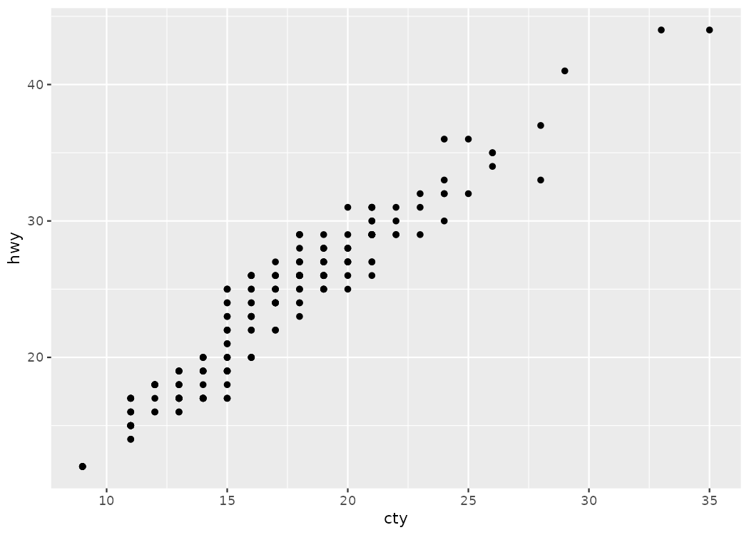
geom_point(), which creates points on the graph.
ggplot2). It is encouraged to experiment with the code, change numbers, remove things, and compare and contrast the differences between the experimented visuals.
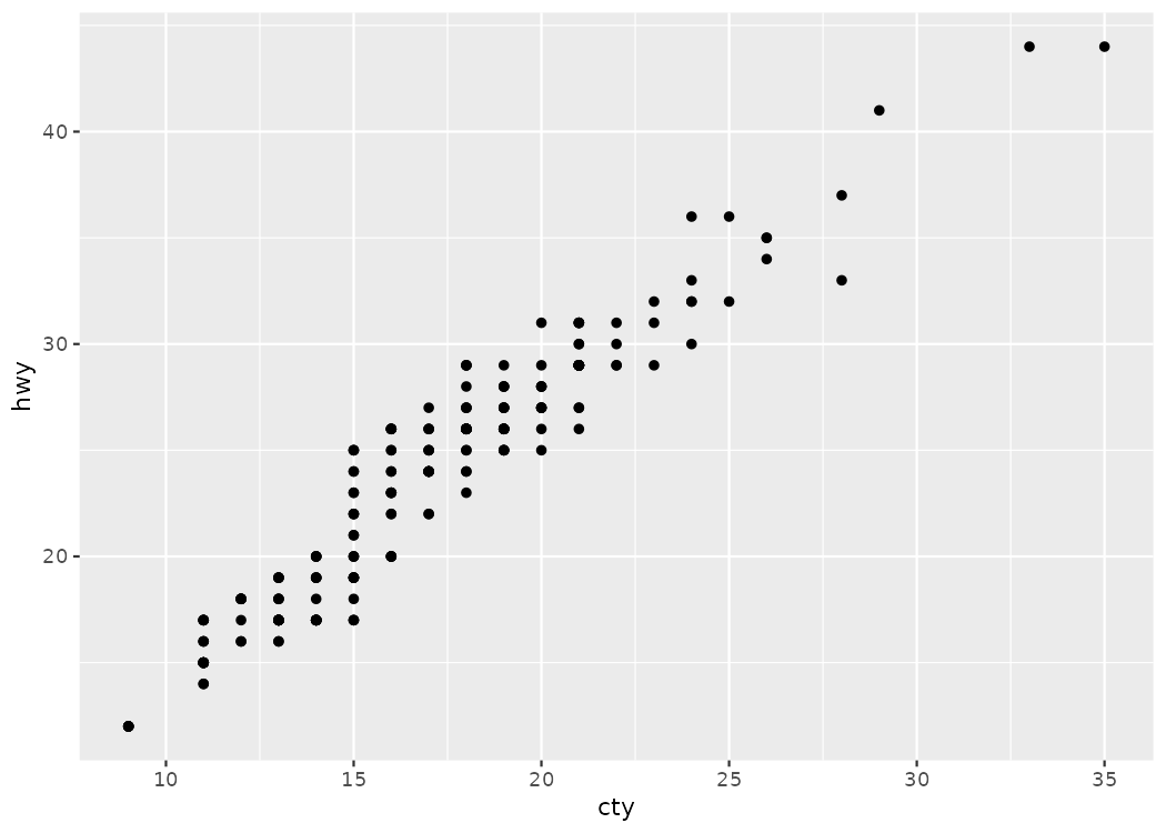
geom_point().
ggplot(data = mpg, aes(x = cty, y = hwy)) +
  geom_point()
geom_smooth() command.
# Line of Best Fit
ggplot(mpg, aes(x = cty, y = hwy)) +
  geom_point() +
  geom_smooth(method = "lm") # lm stands for "linear model"
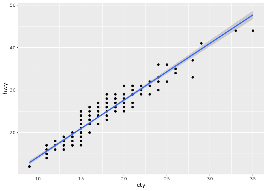
geom_smooth, which is another layer of our visualization, we needed to add another + sign. It is used quite literally in ggplot2.
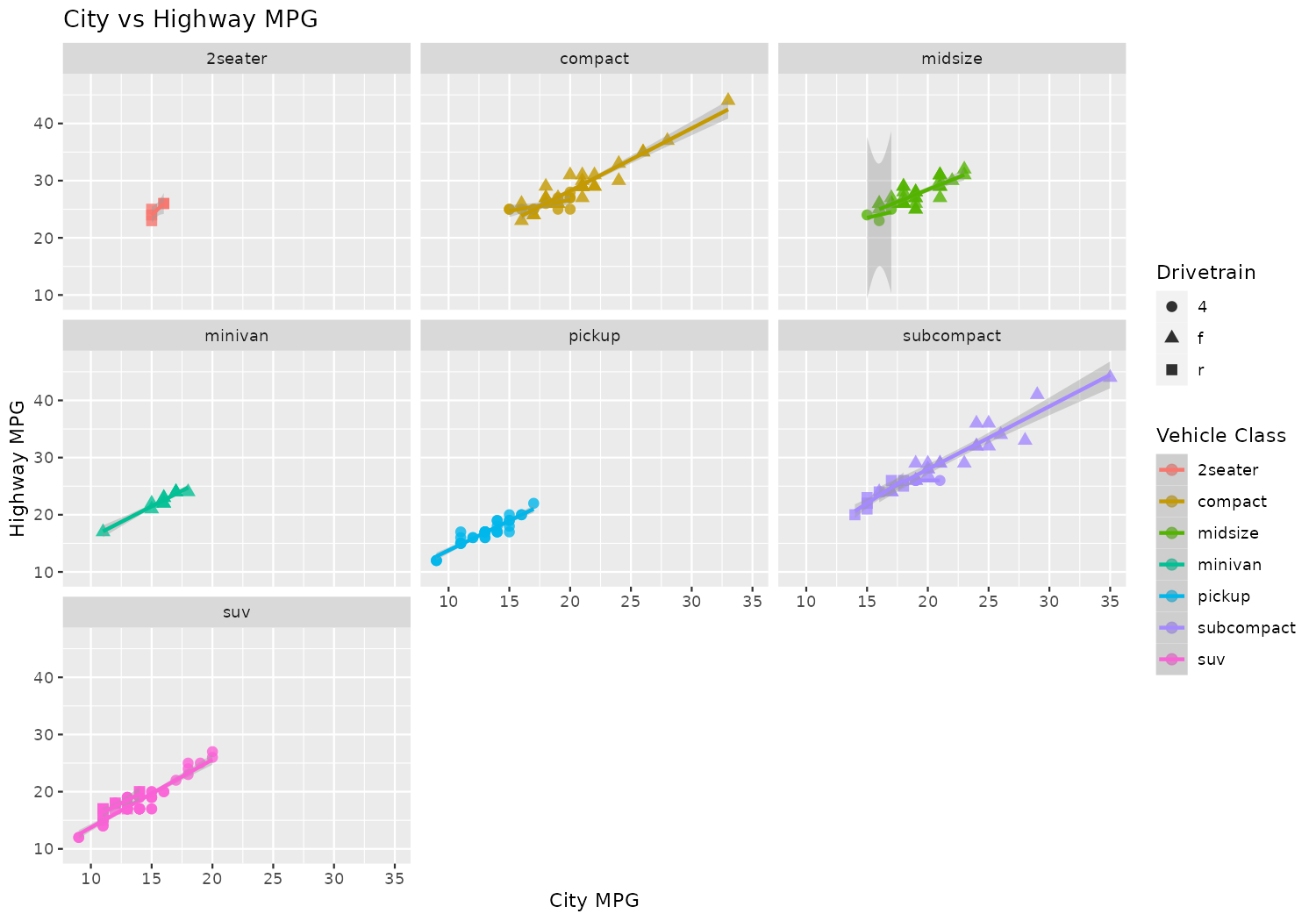
ggplot(data = mpg, aes(x = cty, y = hwy, color = class, shape = drv)) +
  geom_point(alpha = 0.8, size = 2.5) + # opacity and size
  labs(
    title = "City vs Highway MPG",      # adds a title to the plot
    x = "City MPG",                     # adds a x-axis label to the plot
    y = "Highway MPG",                  # adds a y-axis label to the plot
    color = "Vehicle Class",            # adds a color label to the plot
    shape = "Drivetrain"                # adds a shape label to the plot
  ) +
  facet_wrap(~ class) +                 # breaks the graph into individual graphs
  geom_smooth(method = "lm", se = TRUE) # adds a line of best fit
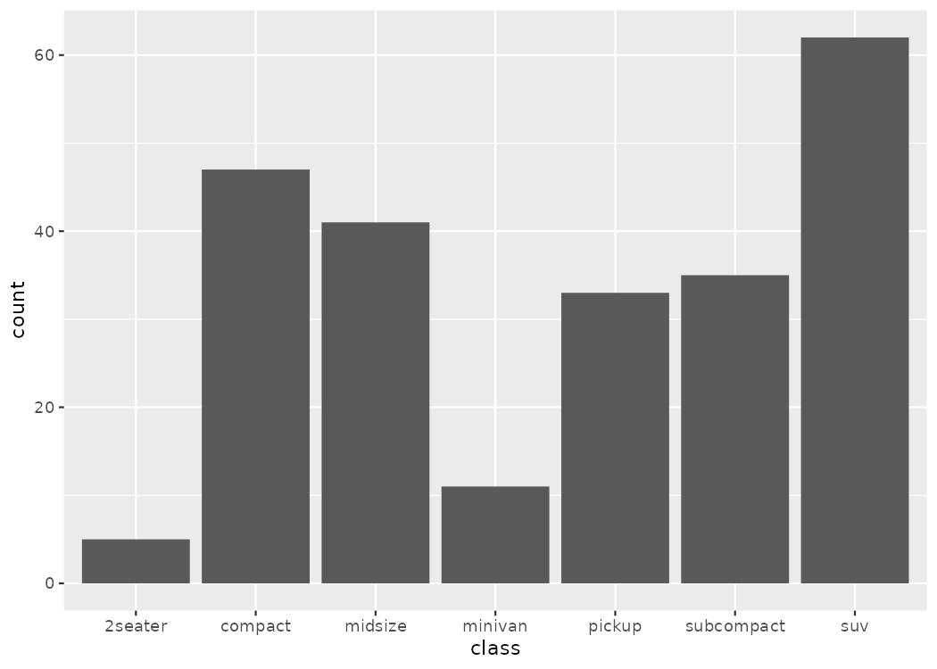
geom_bar().
# BASIC (counts by class) - geom_bar() counts rows automatically
ggplot(mpg, aes(x = class)) +
  geom_bar()
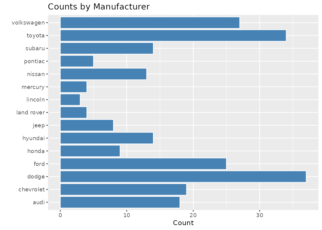
coord_flip() command.
ggplot(mpg, aes(x = manufacturer)) +
  geom_bar(fill = "steelblue", color = "white") +
  coord_flip() +
  labs(title = "Counts by Manufacturer", x = "", y = "Count")
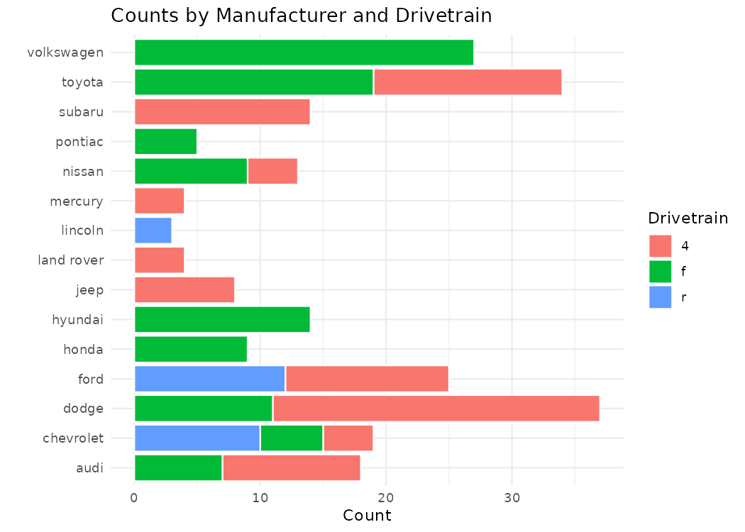
position = "stack" and ggplot does the rest.
# What if we want a stacked bar chart (default with fill)?
ggplot(mpg, aes(x = manufacturer, fill = drv)) +
  geom_bar(position = "stack", color = "white") +
  coord_flip() +
  labs(
    title = "Counts by Manufacturer and Drivetrain",
    x = "",
    y = "Count",
    fill = "Drivetrain"
  ) +
  theme_minimal()
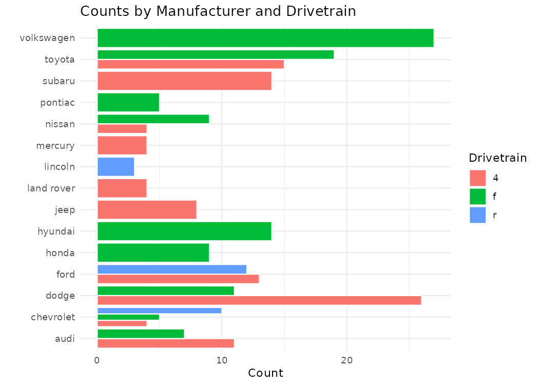
position = "dodge" to create your visual.
#What if we want a grouped bar chart
ggplot(mpg, aes(x = manufacturer, fill = drv)) +
  geom_bar(position = "dodge", color = "white") +
  coord_flip() +
  labs(
    title = "Counts by Manufacturer and Drivetrain",
    x = "",
    y = "Count",
    fill = "Drivetrain"
  ) +
  theme_minimal()
# USING PRE-SUMMARIZED VALUES - geom_col() requires explicit values
class_counts <- mpg |>
  count(class)  # counts rows by class

kable(class_counts, caption = "Pre-summarized values")
Table: Pre-summarized values

|class      |  n|
|:----------|--:|
|2seater    |  5|
|compact    | 47|
|midsize    | 41|
|minivan    | 11|
|pickup     | 33|
|subcompact | 35|
|suv        | 62|
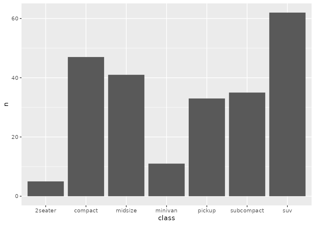
geom_col() to create a column chart.
ggplot(class_counts, aes(x = class, y = n)) +
  geom_col()
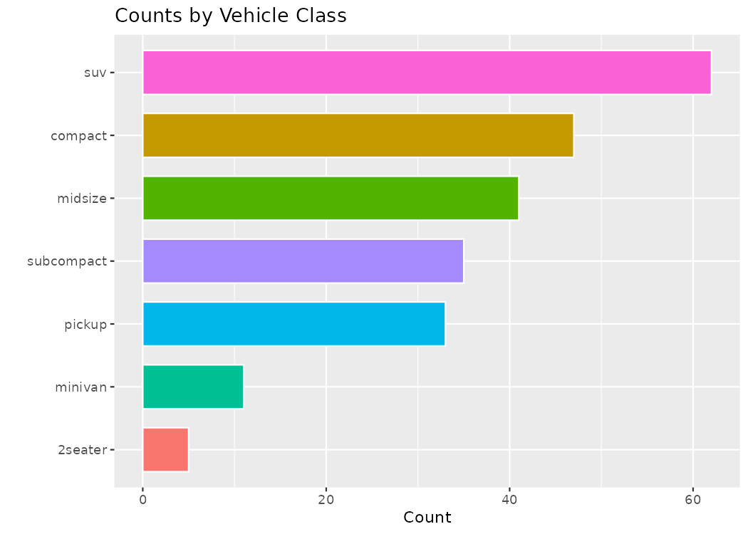
reorder command to reorder the columns into ascending or descending order based on their n values.
legend.position to a particular spot (or remove it entirely) from the visualization.
# PLUS AESTHETICS (polished)
ggplot(class_counts, aes(x = reorder(class, n), y = n, fill = class)) +
  geom_col(width = 0.7, color = "white") +   # width = bar thickness, color = border
  coord_flip() +                             # flip for readability
  labs(title = "Counts by Vehicle Class", x = "", y = "Count") +
  theme(legend.position = "none")
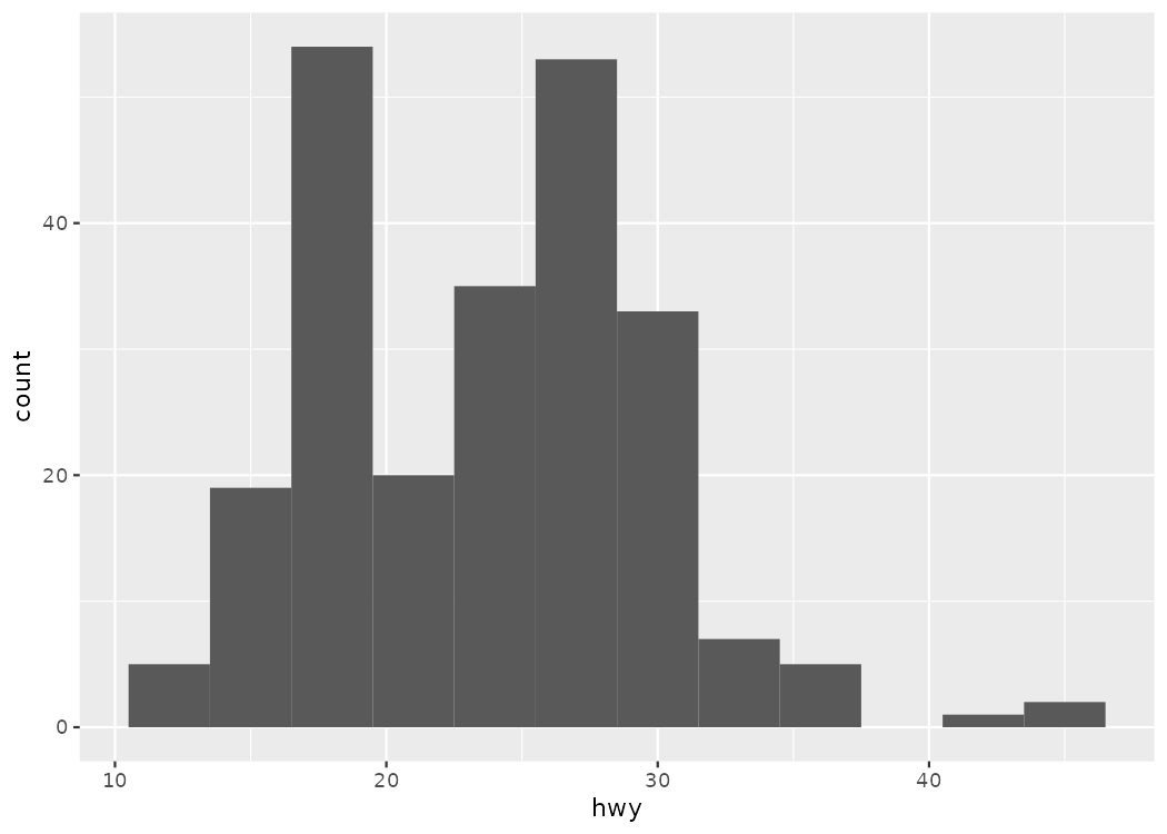
geom_histogram().
# BASIC
ggplot(mpg, aes(x = hwy)) +
  geom_histogram(binwidth = 3)
binwidth to change the width of the bins
boundary to set the separation between the bins
# STYLED (bin edges + colors)
ggplot(mpg, aes(hwy)) +
  geom_histogram(binwidth = 5, boundary = 0,
                 fill = "red", color = "orange") +
  labs(title = "Highway MPG Distribution", x = "Highway MPG", y = "Frequency")
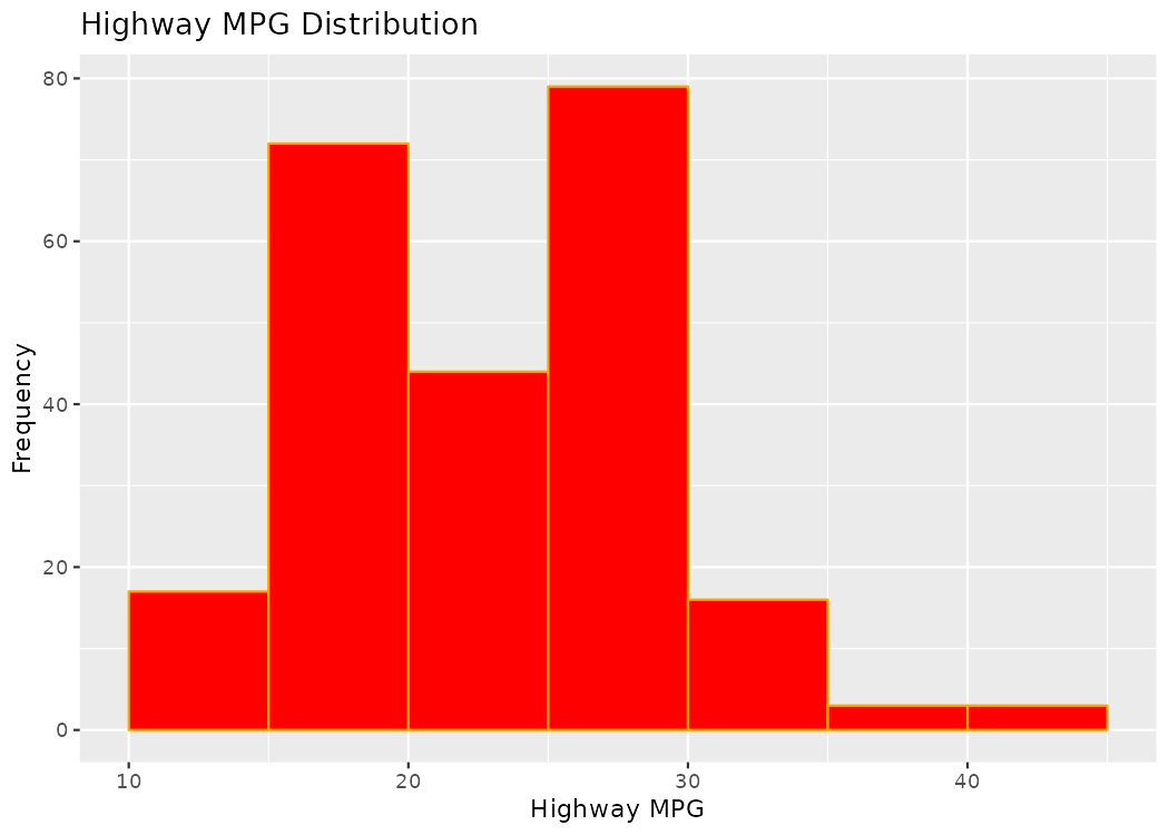
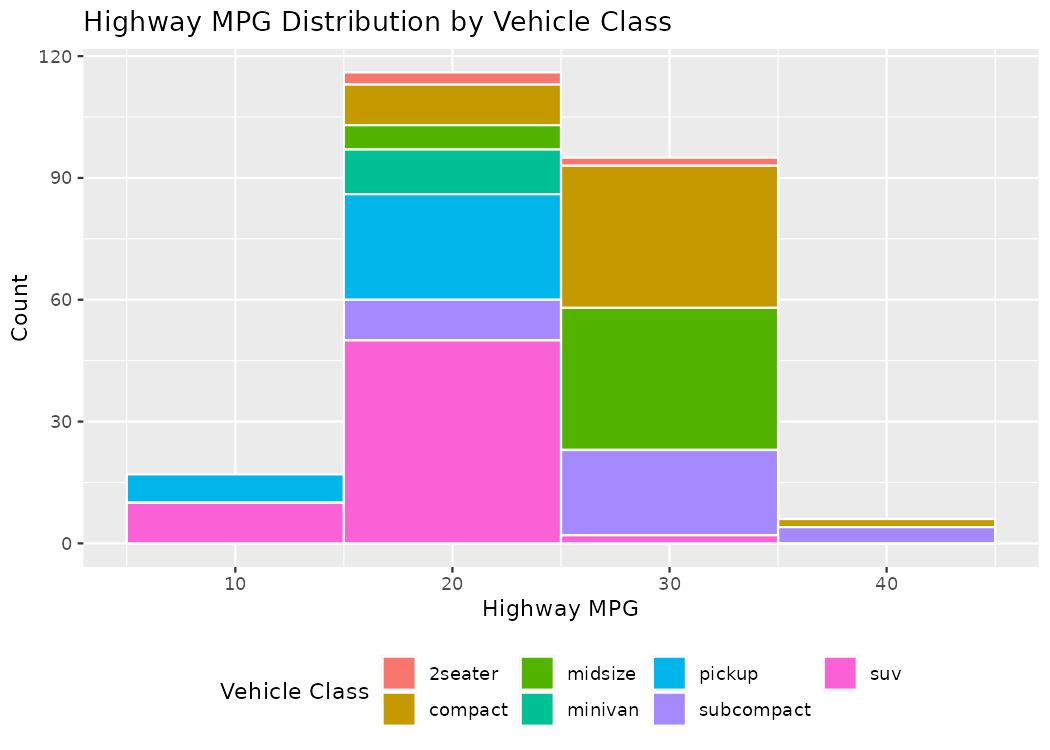
fill command.
# MAPPED FILL (stacked by class)
ggplot(mpg, aes(hwy, fill = class)) +
  geom_histogram(binwidth = 10, color = "white") +
  labs(title = "Highway MPG Distribution by Vehicle Class",
       x = "Highway MPG", y = "Count", fill = "Vehicle Class") +
  theme(legend.position = "bottom")
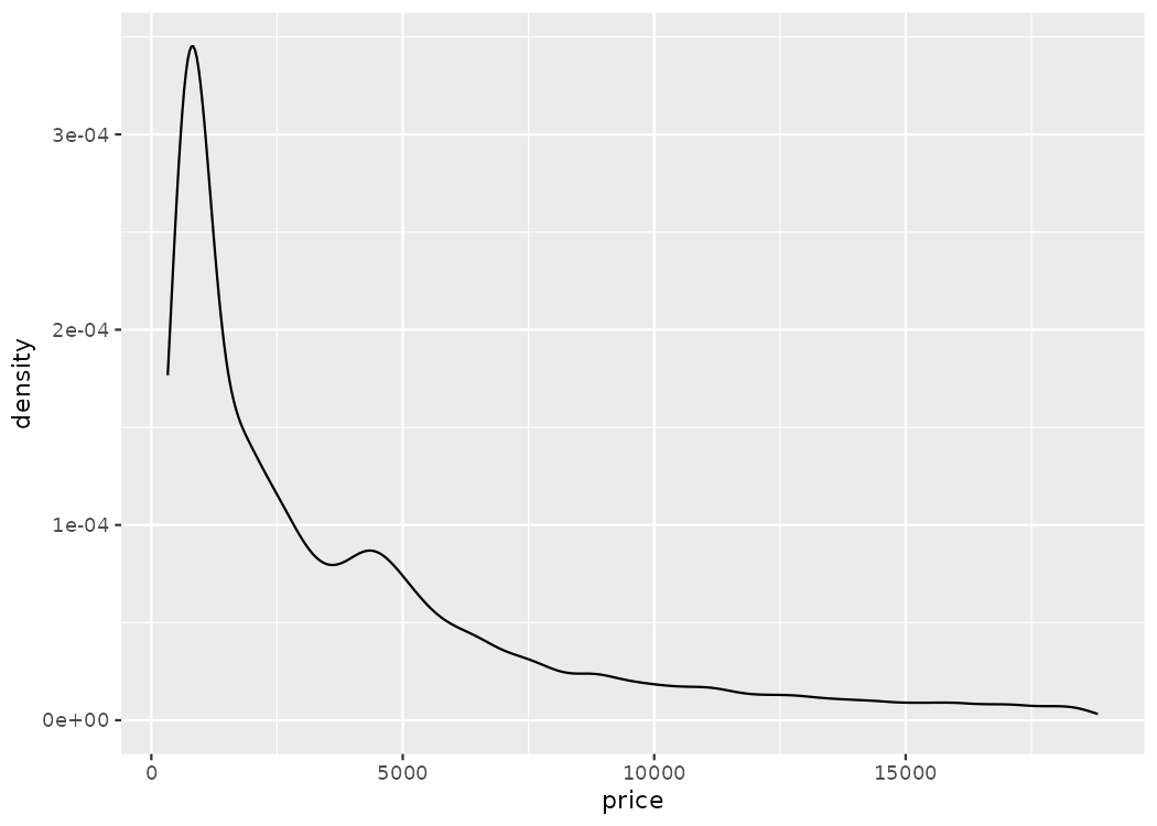
geom_density().
# BASIC
ggplot(diamonds, aes(x = price)) +
  geom_density()
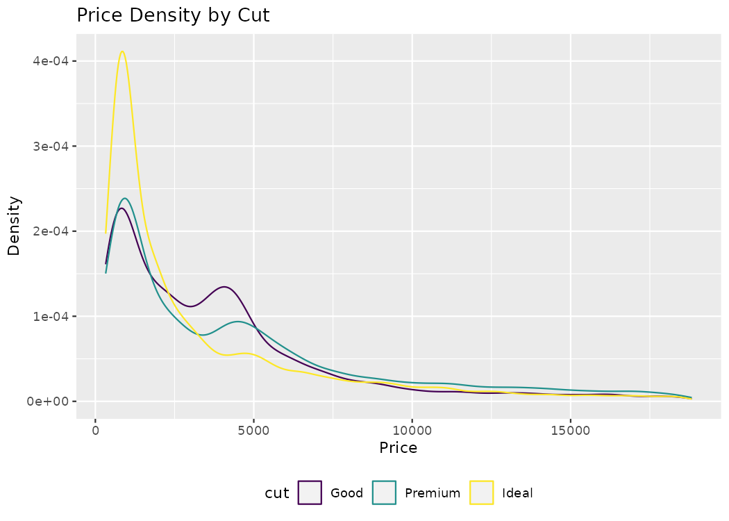
color inside the aesthetics, this will create a grouped density plot, showing three different lines for each of the three different cuts.
# GROUPED
ggplot(diamonds |> filter(cut %in% c("Good", "Ideal", "Premium")),
       aes(price, color = cut)) +
  geom_density() +
  labs(title = "Price Density by Cut", x = "Price", y = "Density") +
  theme(legend.position = "bottom")
geom_boxplot().
# BASIC
ggplot(mpg, aes(x = class, y = hwy)) +
  geom_boxplot() +
  labs(title = "Highway MPG by Vehicle Class", x = "Vehicle Class", y = "Highway MPG")
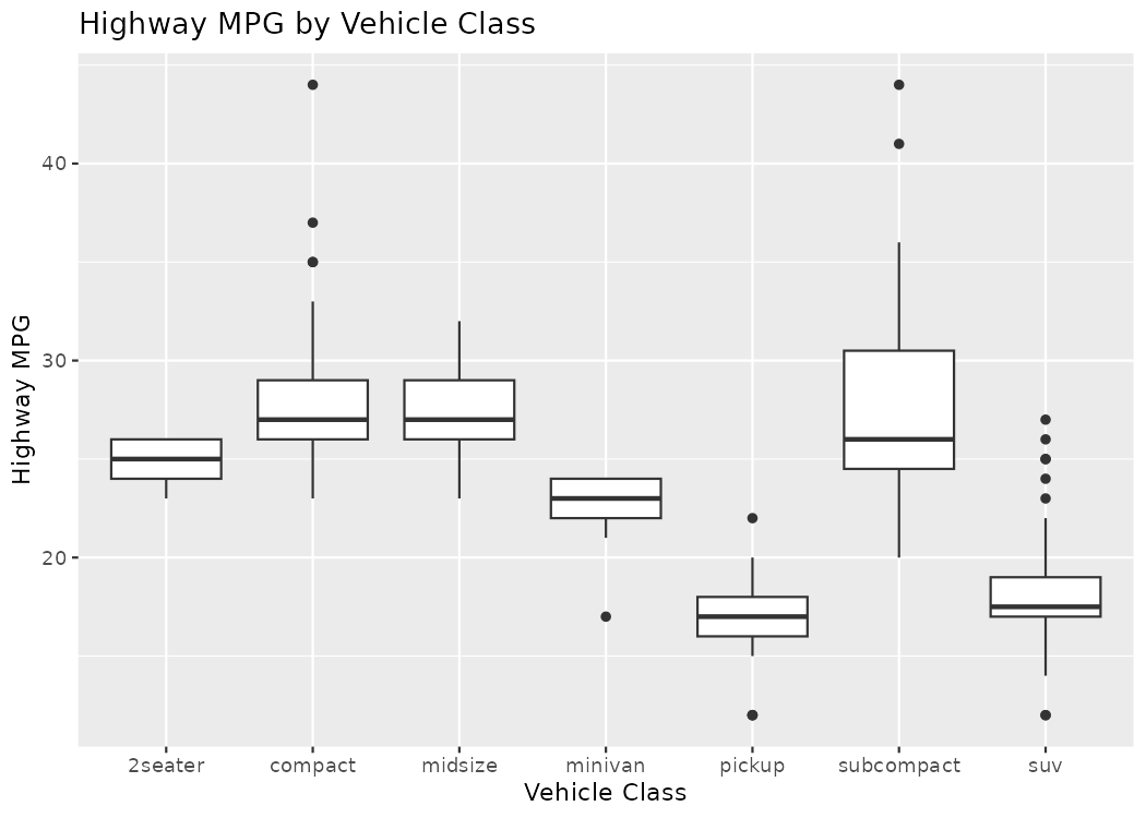
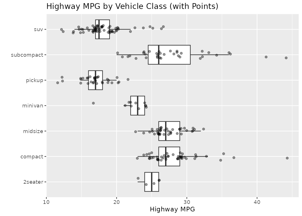
geom_jitter() command.
# WITH JITTERED POINTS OVERLAID
ggplot(mpg, aes(class, hwy)) +
  geom_boxplot(outlier.shape = NA) +
  geom_jitter(width = 0.15, alpha = 0.4, size = 1.5) +
  coord_flip() +
  labs(title = "Highway MPG by Vehicle Class (with Points)",
       x = "", y = "Highway MPG")
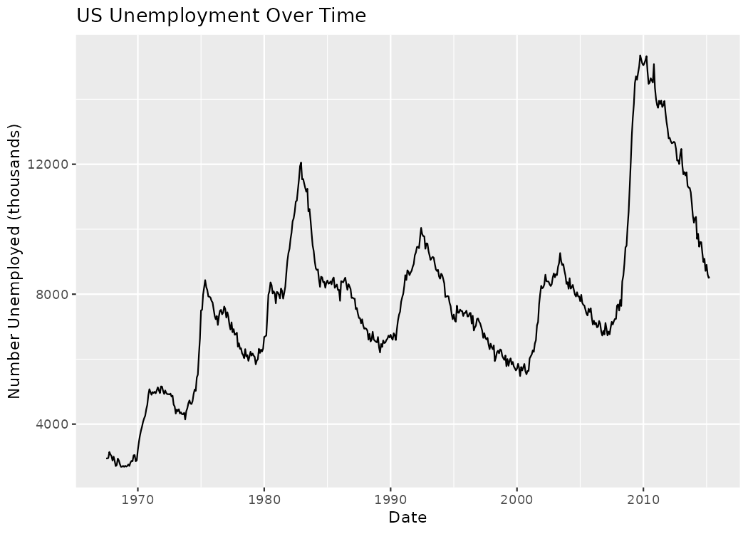
geom_line().
# BASIC: unemployment over time
ggplot(economics, aes(x = date, y = unemploy)) +
  geom_line() +
  labs(title = "US Unemployment Over Time",
       x = "Date", y = "Number Unemployed (thousands)")
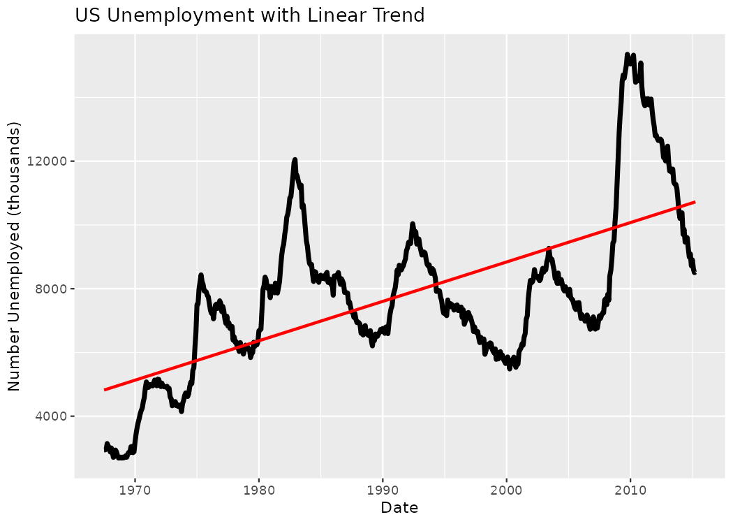
# PLUS: LM vs LOESS contrast
ggplot(economics, aes(date, unemploy)) +
  geom_line(linewidth = 1.6) +
  geom_smooth(method = "lm", se = FALSE, color = "red") +
  labs(title = "US Unemployment with Linear Trend",
       x = "Date", y = "Number Unemployed (thousands)")
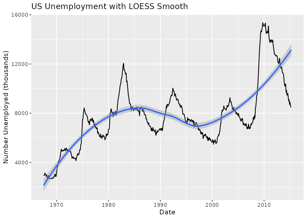
ggplot(economics, aes(date, unemploy)) +
  geom_line(linewidth = 0.6) +
  geom_smooth(method = "loess", se = TRUE) +  # loess = flexible smoothing; se = confidence band
  labs(title = "US Unemployment with LOESS Smooth",
       x = "Date", y = "Number Unemployed (thousands)")
geom_text() command.
# BASIC: label extreme points
mpg_extremes <- mpg |> slice_max(order_by = hwy, n = 5)
mpg_extremes
# A tibble: 6 × 11
  manufacturer model      displ  year   cyl trans      drv     cty   hwy fl    class
  <chr>        <chr>      <dbl> <int> <int> <chr>      <chr> <int> <int> <chr> <chr>
1 honda        civic        1.8  2008     4 auto(l5)   f        25    36 r     subcompact
2 honda        civic        1.8  2008     4 auto(l5)   f        24    36 c     subcompact
3 toyota       corolla      1.8  2008     4 manual(m5) f        28    37 r     compact
4 volkswagen   jetta        1.9  1999     4 manual(m5) f        33    44 d     compact
5 volkswagen   new beetle   1.9  1999     4 manual(m5) f        35    44 d     subcompact
6 volkswagen   new beetle   1.9  1999     4 auto(l4)   f        29    41 d     subcompact
ggplot(mpg, aes(displ, hwy)) +
  geom_point() +
  geom_text(data = mpg_extremes, aes(label = model), nudge_y = 1, size = 3) +
  labs(title = "Top Highway MPG Models Labeled",
       x = "Engine Displacement (L)", y = "Highway MPG")
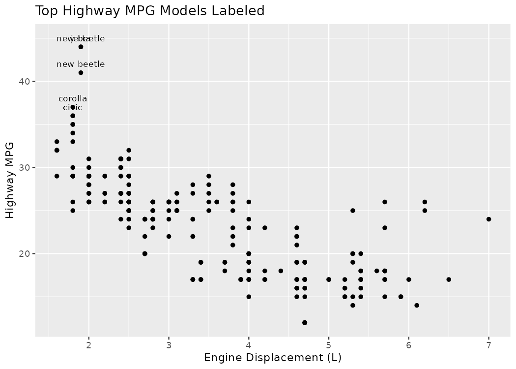
slice_max(), pairs that with geom_text() and labels only the extreme data points. Now, viewers can read from the plot which model of cars have the best highway miles per gallon.
# Compute mean & standard error for hwy by class
summ_hwy <- mpg |>
  group_by(class) |>
  summarize(
    mean_hwy = mean(hwy, na.rm = TRUE),
    se_hwy   = sd(hwy, na.rm = TRUE) / sqrt(n()))

summ_hwy
# A tibble: 7 × 3
  class      mean_hwy se_hwy
  <chr>         <dbl>  <dbl>
1 2seater        24.8  0.583
2 compact        28.3  0.552
3 midsize        27.3  0.334
4 minivan        22.4  0.622
5 pickup         16.9  0.396
6 subcompact     28.1  0.909
7 suv            18.1  0.378
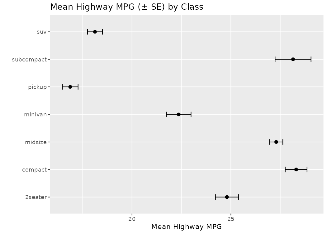
geom_errorbar() command to add error bars to your plot.
# Points + error bars (plot error bars first so points sit on top)
ggplot(summ_hwy, aes(class, mean_hwy)) +
  geom_errorbar(aes(ymin = mean_hwy - se_hwy, ymax = mean_hwy + se_hwy), width = 0.2) +
  geom_point(size = 2) +
  coord_flip() +
  labs(title = "Mean Highway MPG (± SE) by Class", x = "", y = "Mean Highway MPG")
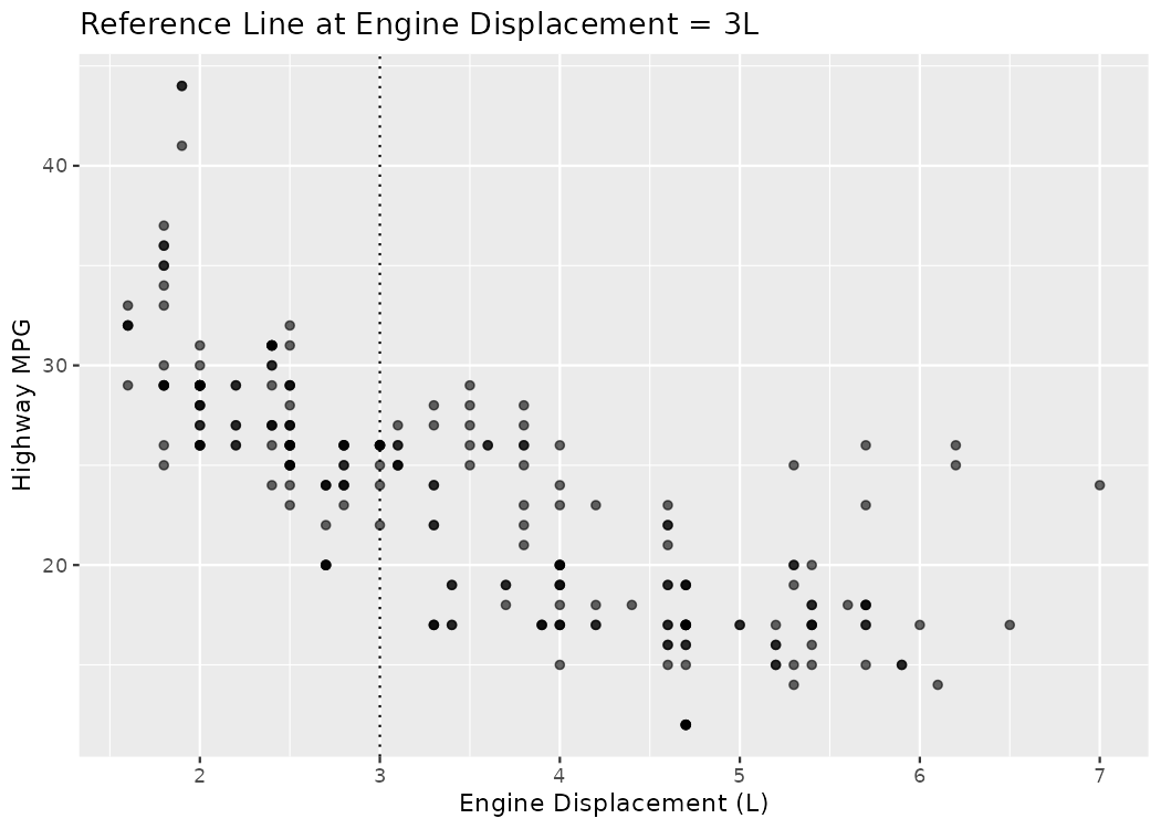
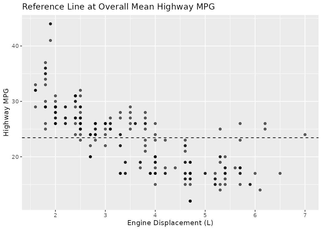
geom_hline() or the geom_vline() commands to create horizontal or vertical reference lines, respectively.
# Horizontal line at overall mean
overall_mean <- mean(mpg$hwy, na.rm = TRUE)

ggplot(mpg, aes(displ, hwy)) +
  geom_point(alpha = 0.6) +
  geom_hline(yintercept = overall_mean, linetype = "dashed") +
  labs(title = "Reference Line at Overall Mean Highway MPG",
       x = "Engine Displacement (L)", y = "Highway MPG")
# Vertical line at displ = 3
ggplot(mpg, aes(displ, hwy)) +
  geom_point(alpha = 0.6) +
  geom_vline(xintercept = 3, linetype = "dotted") +
  labs(title = "Reference Line at Engine Displacement = 3L",
       x = "Engine Displacement (L)", y = "Highway MPG")