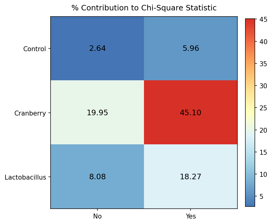
You already know that visualizations really help paint the picture, and chi-square contributions are not exempt. For this, the pheatmap package ([D.1.18]) comes in handy with the pheatmap() function..
library(pheatmap)

# Create heatmap for percentage contributions
pheatmap(percent_contributions,
         display_numbers = TRUE,
         cluster_rows = FALSE,
         cluster_cols = FALSE,
         main = "% Contribution to Chi-Square Statistic")
Figure6.8.1.Heatmap showing the percentage contribution of each cell to the overall chi-square statistic. Darker shading indicates cells contributing more strongly to the chi-square value. The Cranberry/Yes cell contributes approximately 45% of the statistic.
When looking at chi-square contributions,cranberry had the largest contribution, with about 65% of the test statistic being accounted for by cranberry.