Section 8.5 Visualizing Relationships
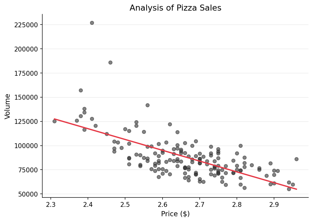
As emphasized in every chapter, it is imperative that we first graph our data to see what it looks like before we run any statistical analyses. Visuals really help us understand our data. Is our data linear? Can we see any patterns? Let’s find out!
For regression models, we use scatterplots. For a scatterplot, all we need are two numerical variables.
# Now, let us graph our data using ggplot
# As always with ggplot, we have our data, our aesthetics, and our geometry.

pizza_plot <- ggplot(pizza_sales, aes(x = price, y = volume)) +
  geom_point(size = 3)  +
  geom_smooth(method = "lm", se = FALSE) + # this adds a "line of best fit"
  theme_minimal() +
  labs(
    title = "Analysis of Pizza Sales",
    subtitle = "You know the rule, one bite...",
    x = "Price ($)", y = "Volume"
  )

pizza_plot
If we wanted to use another package instead of ggplot, we could also use the library
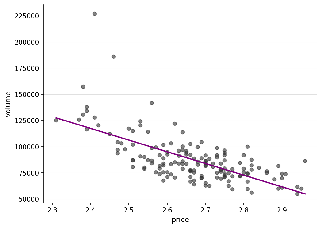
ggformula, which has gf_point().
library(ggformula)
pizza_plot_ggformula <- gf_point(volume ~ price, data = pizza_sales) |> gf_lm(color ="purple")

pizza_plot_ggformula
Here is a side by side comparison of what they look like. Very similar indeed.
library(patchwork)

pizza_plot + pizza_plot_ggformula
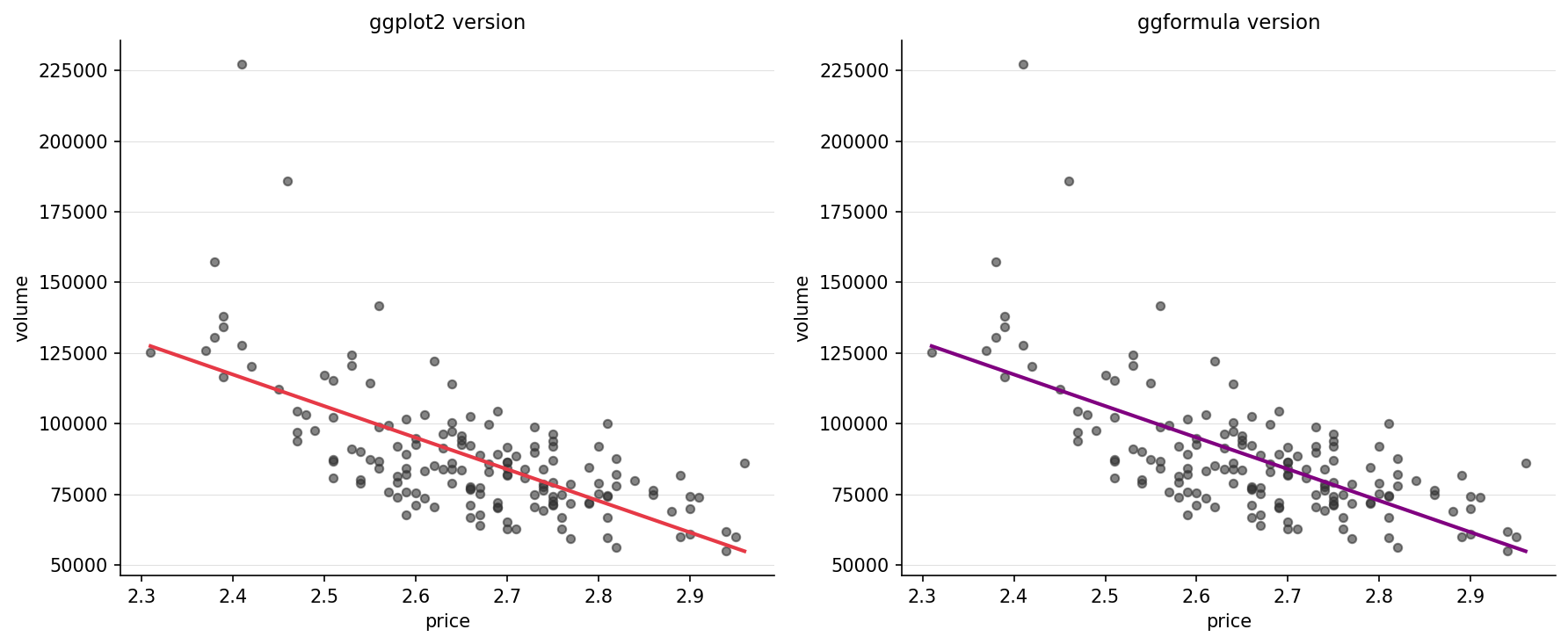
Our data is already telling us a lot. From both of our graphics, we can see that as price is going up, volume is going down, indicating a negative correlation. Our line also seems pretty straight, indicating what seems to be a moderately strong correlation.

