Rule of Thumb:.
Think of standardized residuals like z-scores: values greater than +2 or less than -2 are the ’statistically interesting’ parts of your table that are driving your p-value.
chisq.test(contingency_table)
Pearson's Chi-squared test

data:  contingency_table
X-squared = 7.7759, df = 2, p-value = 0.02049
chi_square_test <- chisq.test(contingency_table)

# All the parts of the chi square can be called.
chi_square_test$statistic

chi_square_test$parameter

chi_square_test$p.value

chi_square_test$method

chi_square_test$data.name

# What our data already is
chi_square_test$observed

# What our data would look like if there was no relationship
chi_square_test$expected

# Difference between observed and expected
# Positive is more than expected
# Negative is less than expected
# Bigger number = bigger difference
# Represent how many standard deviations
chi_square_test$residuals

# Standard Residuals
# More like an actual z-score
chi_square_test$stdres
X-squared
  7.77592
df
 2
[1] 0.0204871
[1] "Pearson's Chi-squared test"
[1] "contingency_table"
               Infection
Treatment       No Yes
  Control       32  18
  Cranberry     42   8
  Lactobacillus 30  20
               Infection
Treatment             No      Yes
  Control       34.66667 15.33333
  Cranberry     34.66667 15.33333
  Lactobacillus 34.66667 15.33333
               Infection
Treatment               No        Yes
  Control       -0.4529108  0.6810052
  Cranberry      1.2455047 -1.8727644
  Lactobacillus -0.7925939  1.1917591
               Infection
Treatment              No       Yes
  Control       -1.001671  1.001671
  Cranberry      2.754595 -2.754595
  Lactobacillus -1.752924  1.752924
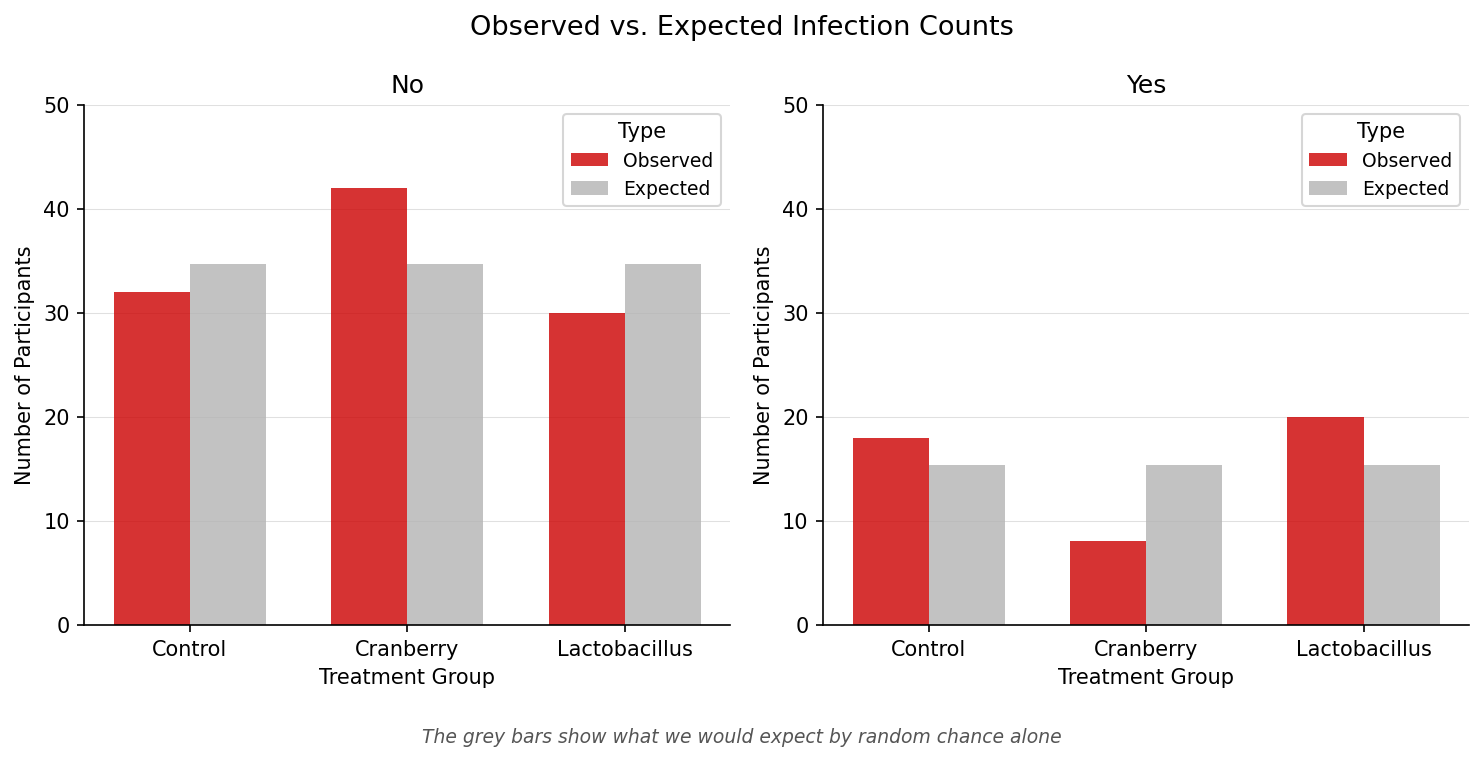
# 1. Extract observed and expected counts from our test object
obs_exp_data <- data.frame(
  Treatment = rep(rownames(chi_square_test$observed), 2),
  Infection = rep(colnames(chi_square_test$observed), each = 3),
  Observed = as.vector(chi_square_test$observed),
  Expected = as.vector(chi_square_test$expected)
)

# 2. Pivot the data to a 'long' format for ggplot
plot_data <- obs_exp_data |>
  pivot_longer(cols = c(Observed, Expected),
               names_to = "Type",
               values_to = "Counts")

# 3. Create the plot
ggplot(plot_data, aes(x = Treatment, y = Counts, fill = Type)) +
  geom_bar(stat = "identity", position = "dodge", alpha = 0.8) +
  facet_wrap(~Infection) +
  scale_fill_manual(values = c("Expected" = "grey70", "Observed" = "#CC0000")) +
  labs(
    title = "Observed vs. Expected Infection Counts",
    subtitle = "The grey bars show what we would expect by random chance alone",
    x = "Treatment Group",
    y = "Number of Participants"
  ) +
  theme_minimal()