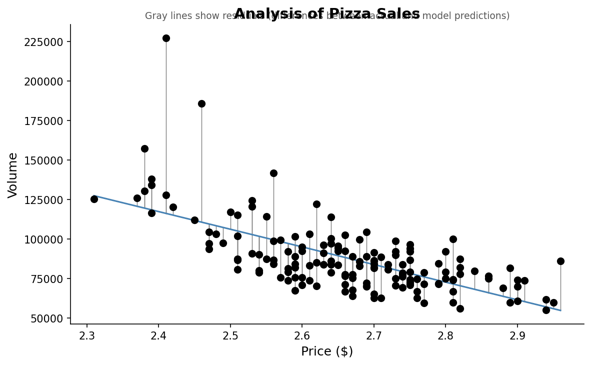
To answer this question, we need to figure out the predicted values and then their residuals (the difference between the actual vs the predicted value).
To visually see the difference between the actual values and the predicted values, we can create a similar scatterplot as before, but add lines connecting our line of best fit and our points.
# What if we want to see actual vs predicted on our plot?
pizza_plot_residuals <- ggplot(pizza_sales, aes(x = price, y = volume)) +
  geom_point(size = 3)  +
  geom_smooth(method = "lm", se = FALSE) +
  geom_segment(aes(xend = price, yend = predicted), color = "gray", linewidth = 0.7) +
  theme_minimal() +
  labs(
    title = "Analysis of Pizza Sales",
    subtitle = "Gray lines show residuals (differences between actual and model predictions)",
    x = "Price ($)", y = "Volume"
  )

pizza_plot_residuals
Figure8.8.1.Scatterplot of pizza price and sales volume with residual lines connecting observed values to model predictions. Each gray line represents a residual, illustrating the difference between actual sales and values predicted by the linear regression model.
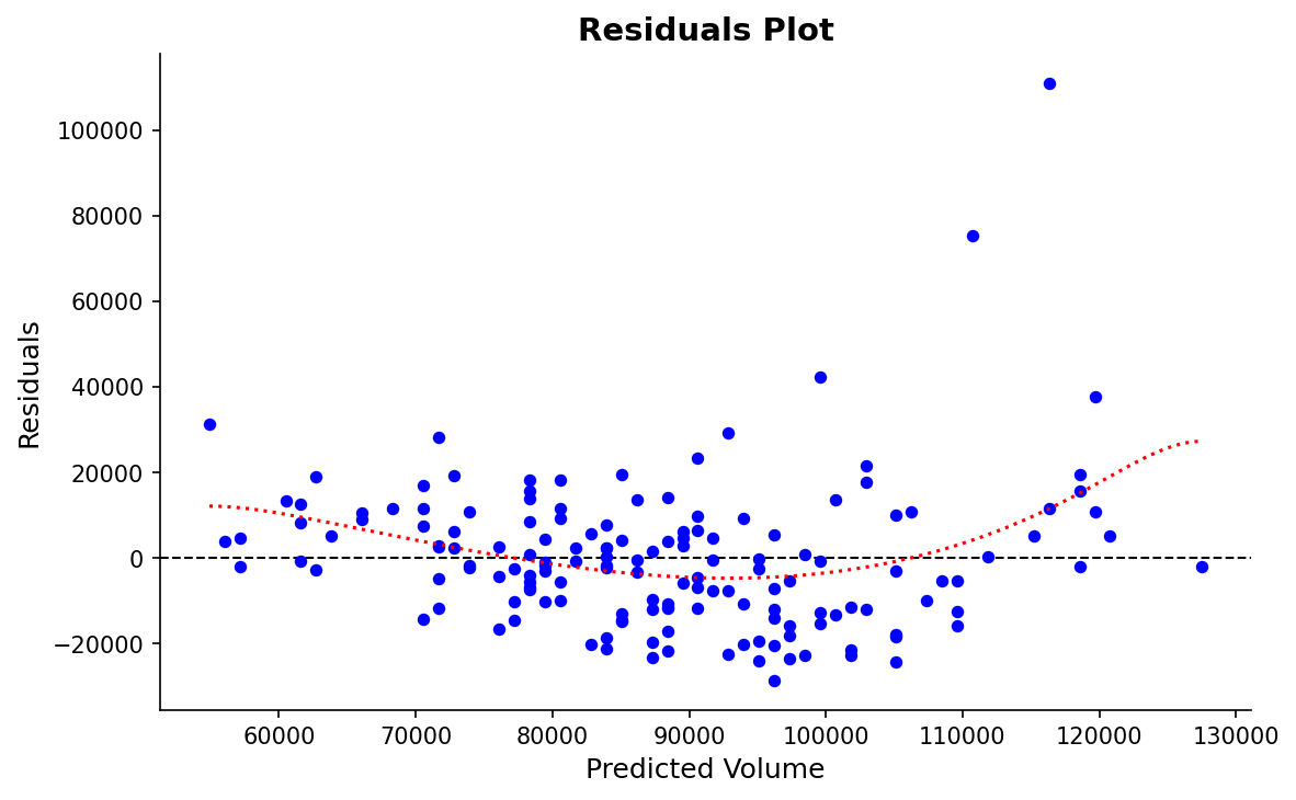
With our residuals, we want them to be random. Visually, that means that the residual values should be scattered on an x-y plane without a pattern. To see this, we can graph the residuals themselves.
# Let us graph our residuals to make sure they are random
ggplot(pizza_sales, aes(x = predicted, y = residuals)) +
  geom_point(color = "blue") +
  geom_hline(yintercept = 0, linetype = "dashed") +
  geom_smooth(se = FALSE, color = "red", linetype = "dotted")+
  labs(
    title = "Residuals Plot",
    x = "Predicted Volume",
    y = "Residuals"
  )
Figure8.8.2.Residuals plotted against predicted sales volume from the linear regression model. Random scatter around the horizontal zero line indicates homoscedasticity, while systematic patterns would suggest violations of regression assumptions.
The red line in the graph above has a slight curve, showing that our model is less accurate at the extremes (low and high prices). Thankfully, this pattern isn’t very pronounced.
This does not invalidate our model, and for right now, we do not need to change it. It is just showing us that it is not perfect, and not all prices predict equally well. In reality, this might happen if higher-priced pizzas are sold less frequently, giving us fewer data points and more variability.