Whoever said a picture is worth 1,000 words severely understated how many words a picture is actually worth. When working with data, there is a strong argument to make that nothing is more important than visuals.
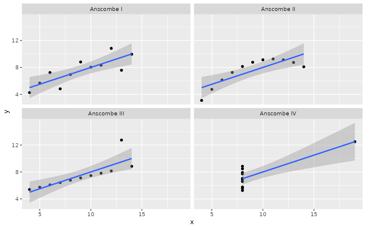
Quick history lesson. In 1973 (before the invention of R), a statistician named Francis Anscombe created four unique datasets, which all had identical summary statistics.
library(tidyverse)
library(quartets)
library(knitr)

anscombe_quartet |>
  group_by(dataset) |>
  summarise(mean_x = mean(x),
            variance_x = var(x),
            mean_y = mean(y),
            variance_y = var(y),
            correlation = cor(x, y)) |>
  kable(digits = 2,caption = "A breakdown of summary statistics from the four individual datasets Anscombe created.")
Table: A breakdown of summary statistics from the four individual datasets Anscombe created.

|dataset     | mean_x| variance_x| mean_y| variance_y| correlation|
|:-----------|------:|----------:|------:|----------:|-----------:|
|Anscombe I  |      9|         11|    7.5|       4.13|        0.82|
|Anscombe II |      9|         11|    7.5|       4.13|        0.82|
|Anscombe III|      9|         11|    7.5|       4.12|        0.82|
|Anscombe IV |      9|         11|    7.5|       4.12|        0.82|
As the table above shows, all four of the different datasets show the same means, variances, and correlations (more on that in chapter 6). With just these summary statistics, you’d likely think “eh, all the data is the same, these datasets are basically identical.”
With our visualization, we are introduced to an entirely different way of seeing our data. The table showed that the summary statistics were identical, but here we can see:
This chapter is meant less to be a lesson, and more to be a reference page to come to when you need to make graphs. You do not need to remember every plotting option shown here. This chapter is designed to be returned to whenever you need a reminder or example.