Now that we have our data all together, in both wide and long format, we are ready to start comparing means. First things first: we need to calculate the means!
Using the mean function, we can simply calculate the mean/s of our data. Just know that mean and average mean (pun intended) the same thing and are interchangeable words.
# Calculating the individual means of the teams scores, we can use our wide format
yankees_average_score <- mean(baseball_data$Yankees_Score)

# Note, we are saving this as a variable so it can be called anytime, but you could just run mean(baseball_data$Yankees_Score)
yankees_average_score

mets_average_score <- mean(baseball_data$Mets_Score)
# If we want to round our numbers, we can use the code below
# mets_average_score<- round(mean(baseball_data$Mets_Score),0)
mets_average_score

# Calculating the means of all the scores, we can use our long format
overall_average <- mean(baseball_data_long$Score)

overall_average
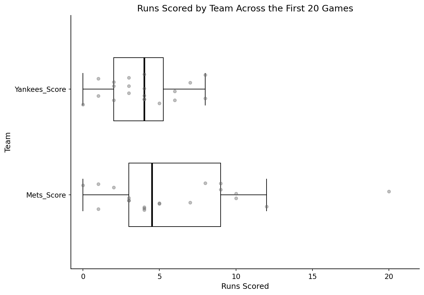
Right now, we can see that the Mets average runs scored is higher than both the Yankees and overall average scores. While we see that there is a difference, we do not know if this difference is significant or not. This is where a t.test comes into play.
Before running a t-test, it’s often helpful to visualize the data to see how much the two groups overlap. An excellent way to do this is to create a boxplot, first introduced in Subsection 3.4.5.
library(ggplot2)
ggplot(baseball_data_long, aes(Team, Score)) +
  geom_boxplot(outlier.shape = NA) +
  geom_jitter(width = 0.15, alpha = 0.4, size = 1.5) +
  coord_flip()+
  labs(
  title = "Runs Scored by Team Across the First 20 Games",
  x = "Team",
  y = "Runs Scored"
  ) +
  theme_classic()
Figure4.5.1.Distribution of runs scored by the New York Yankees and New York Mets across the first 20 games of the 2025 season. Boxplots summarize the central tendency and spread of scores for each team, while individual points represent runs scored in each game.
There has already been a lot of work done with our data, and through both visualizations and summary statistics, we have an idea of where our groups differ. The next step of comparing two means is to dive even deeper: statistics.
A t-test compares the difference between two group means relative to the variability in the data. Depending on your data, you will either be running a Paired or Unpaired t.test:
Paired t-test: use when measurements come in matched pairs (same participant twice, same game for both teams).
# Unpaired t.test
baseball_t_test <- t.test(baseball_data$Yankees_Score, baseball_data$Mets_Score, paired = F)
# From a structural standpoint, if we needed to run a paired t.test, all we would need to do is change "paired = F" to "paired = T"

baseball_t_test
Welch Two Sample t-test

data:  baseball_data$Yankees_Score and baseball_data$Mets_Score
t = -1.823, df = 27.274, p-value = 0.07928
alternative hypothesis: true difference in means is not equal to 0
95 percent confidence interval:
 -4.568735  0.268735
sample estimates:
mean of x mean of y
     3.85      6.00
If you are working with long data, you cal use the formula:.
The output when we call baseball_t_test tells us something extremely important: p-value. When looking at a p-value, we are looking to see if it is above or below the 0.05 mark.
If p < 0.05: reject the null hypothesis (evidence of a difference)
So, while the two averages are not the same, our p-value is 0.07928, which is above the 0.05 threshold. This means that there is not a statistical difference between the average runs scored in the first 20 games between the Yankees and Mets. Even though the Mets scored more runs on average, this difference was not statistically significant, reminding us that magnitude and statistical significance are not the same thing. In real research, this distinction matters. Decisions should not be made on differences in averages alone.