Before we start running any statistical analyses, we always want to begin by graphing our data, providing us with a visual understanding of what story our data is telling us. With correlations, we want to focus on scatterplots. As a reminder, a scatterplot needs two numerical values.
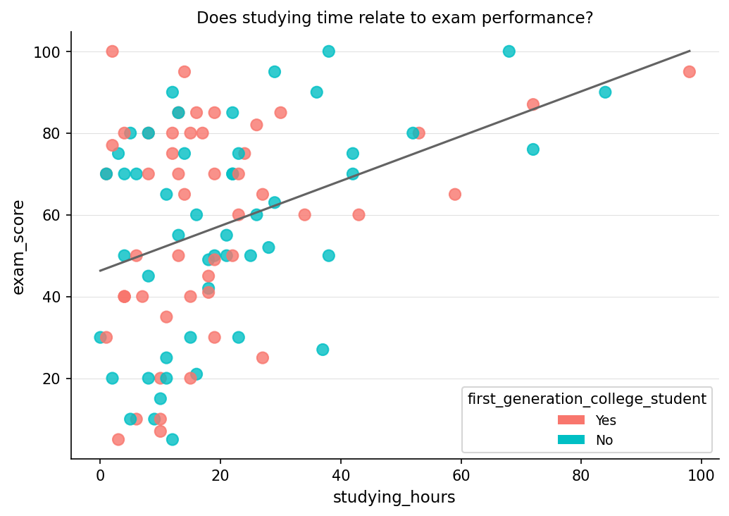
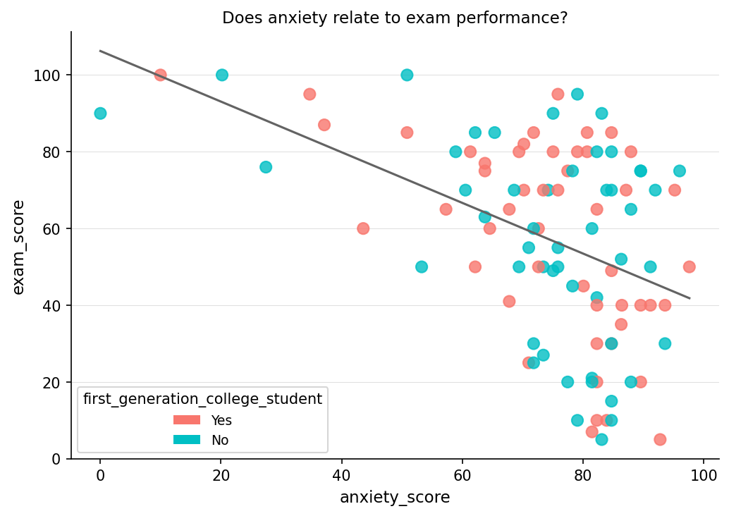
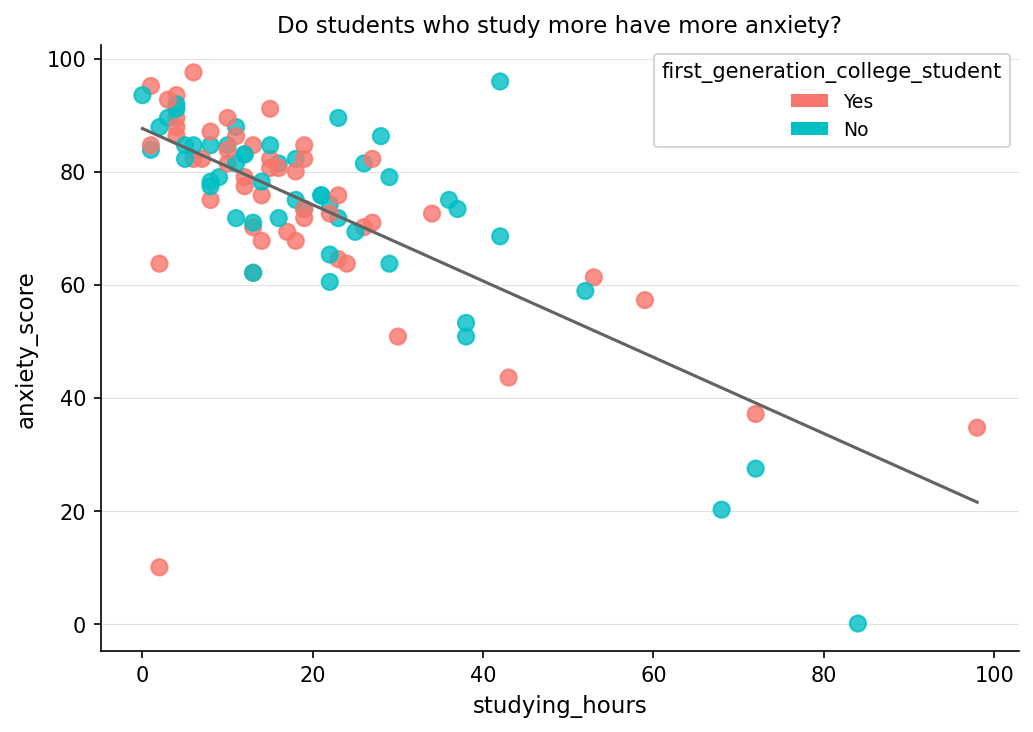
Since we are trying to better understand exam data, let’s create three scatterplots: one showing the relationship between studying and exam scores, one between anxiety and exam scores, and one between studying and anxiety. If you haven’t already, take some time to review scatterplots in Section Subsection 3.4.2.
p1 <- ggplot(examData, aes(x = studying_hours, y = exam_score)) +
  geom_point(aes(color = first_generation_college_student), size = 3, alpha = 0.8) +
  geom_smooth(method = "lm", se = FALSE) +
  theme_minimal() +
  labs(
    title = "Studying Time vs Exam Performance",
    subtitle = "Do students who study more score higher?",
    x = "Studying Time (hours)", y = "Exam Score (%)"
  )

p1
Figure7.4.1.Scatterplot showing the relationship between studying time and exam performance, with points colored by if they’re a first generation college student and a fitted linear trend line. The upward trend suggests a positive linear association, indicating that students who spend more time studying tend to achieve higher exam scores. This visualization motivates the use of a correlation coefficient to quantify the strength of the relationship.
p2 <- ggplot(examData, aes(x = anxiety_score, y = exam_score)) +
  geom_point(aes(color = first_generation_college_student), size = 3, alpha = 0.8) +
  geom_smooth(method = "lm", se = FALSE) +
  theme_minimal() +
  labs(
    title = "Exam Anxiety vs Exam Performance",
    subtitle = "Does anxiety relate to exam performance?",
    x = "Exam Anxiety (0–100)", y = "Exam Score (%)"
  )

p2
Figure7.4.2.Scatterplot illustrating the relationship between exam anxiety and exam performance, with a fitted linear trend line. The downward trend indicates a negative linear association, suggesting that higher anxiety levels are associated with lower exam scores. This visualization supports the use of correlation to formally assess the direction and strength of the relationship.
p3 <- ggplot(examData, aes(x = studying_hours, y = anxiety_score)) +
  geom_point(aes(color = first_generation_college_student), size = 3, alpha = 0.8) +
  geom_smooth(method = "lm", se = FALSE) +
  theme_minimal() +
  labs(
    title = "Studying vs Exam Anxiety",
    subtitle = "Do students who study more have more anxiety?",
    x = "Studying Time (hours)", y = "Exam Anxiety (0–100)"
  )

p3
Figure7.4.3.Scatterplot displaying the relationship between studying time and exam anxiety, with points colored by if they’re a first generation college student and a fitted linear trend line. The negative linear pattern suggests that increased study time is associated with lower anxiety levels, providing visual evidence of a linear relationship prior to computing a correlation coefficient.
One of the main reasons why we visualize our data is to see if it is linear. We are only going to be talking about linear relationships in this chapter.
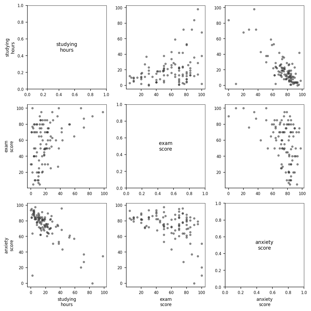
For today, we are focusing on studying time, anxiety scores, and exam scores. If we did not want to manually create 3 different scatterplots, we could utilize the pairs command.
Figure7.4.4.Scatterplot matrix displaying pairwise relationships among studying time, exam performance, and exam anxiety. Each panel shows the relationship between two variables, allowing for simultaneous assessment of direction, strength, and linearity prior to formal correlation analysis.
This creates a scatterplot for all of the columns we specify. It may take a while to get used to reading this, but the way to read these is where the names would intersect is the scatterplot that represents those two variables. For example, the exam vs studying scatterplot would be the top middle scatterplot.
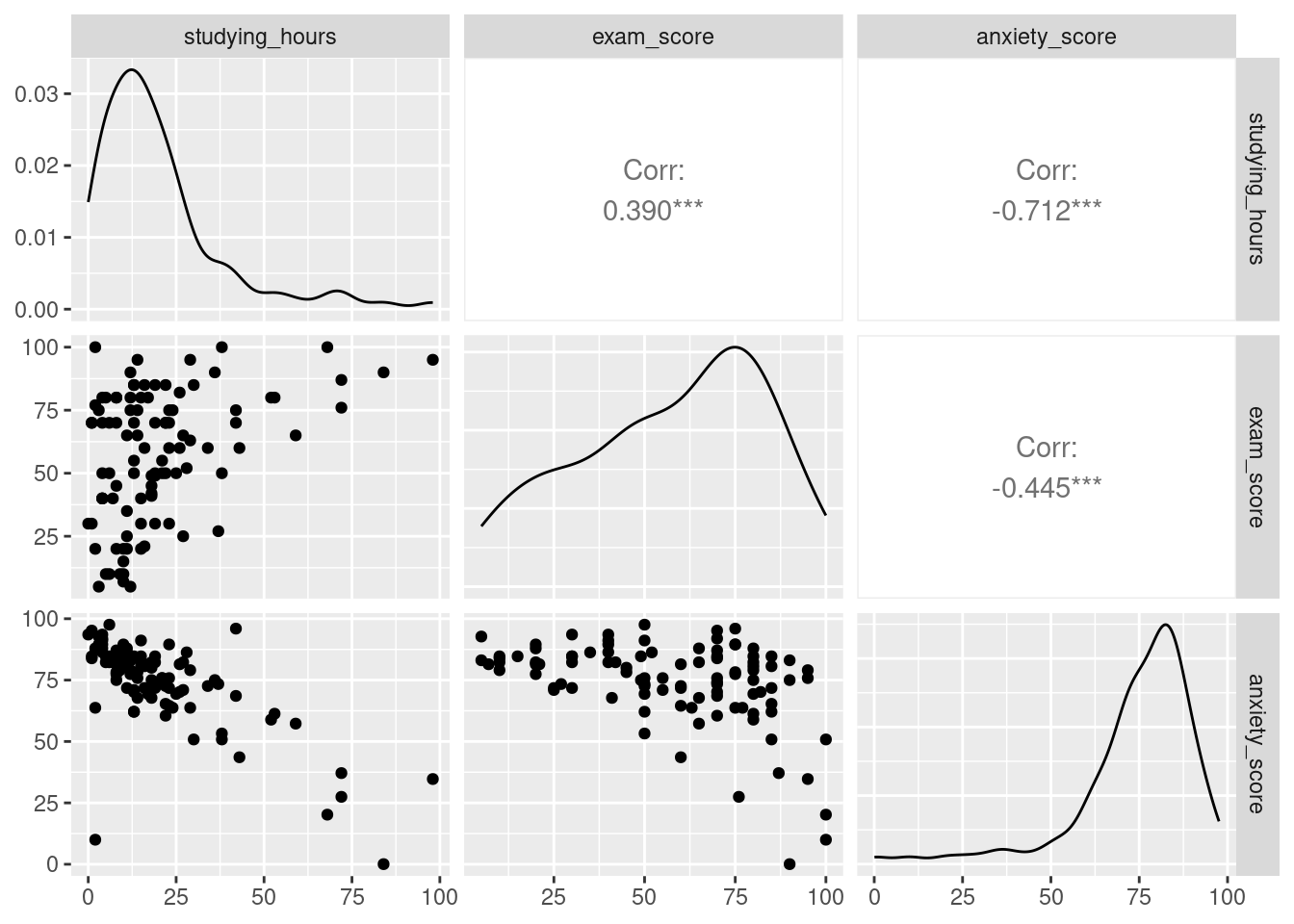
Figure7.4.5.Enhanced scatterplot matrix displaying pairwise relationships among studying time, exam performance, and exam anxiety. The diagonal panels show variable distributions, while off-diagonal panels display scatterplots and correlation coefficients. This visualization allows for simultaneous assessment of linearity, direction, strength of association, and distributional properties prior to formal correlation analysis.
This not only creates the three scatterplots, but also creates a histogram in the form of a line, and spoiler, the correlation coefficient for all combinations!