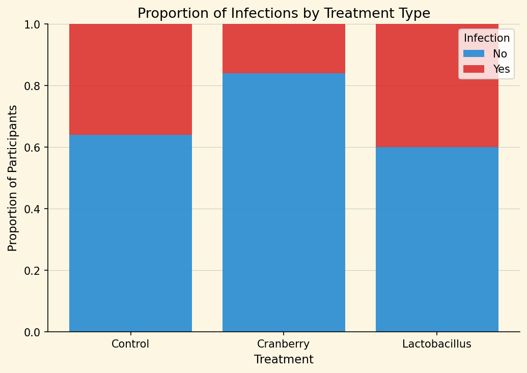
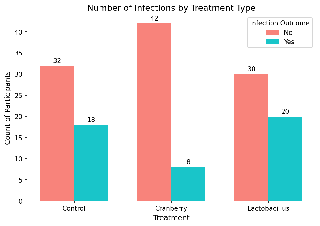
With purely categorical data, the visualization most commonly recommended would be a bar chart. With a bar chart, a viewer can interpret differences between the variables. There are two main options, a stacked or grouped bar chart. The main difference from a coding perspective is what we enter inside the geom_bar command.
If you’d like to enhance the aesthetic of your plots, consider using the ggthemes package ([D.1.9]). It provides a variety of alternative themes that can quickly change the look and feel of your graphics.
The examples below use theme_solarized() and theme_classic(), but many additional options are available. Explore and experiment — just be sure your styling choices support clarity and suit your audience.
# We can use the library ggthemes to add some flavor to our plots
library(ggthemes)

# Creating a stacked bar chart
stacked <- ggplot(infection, aes(x = Treatment, fill = Infection)) +
  geom_bar(position = "fill") +   # "fill" stacks to 100% height
  labs(
    title = "Proportion of Infections by Treatment Type",
    y = "Proportion of Participants",
    x = "Treatment"
  ) +
  theme_solarized()
Figure6.5.1.Stacked bar chart showing the proportion of participants who were infected or not infected within each treatment group. Each bar represents a treatment, with segments indicating the relative frequency of infection outcomes.
# Creating a grouped bar chart
grouped <- ggplot(infection, aes(x = Treatment, fill = Infection)) +
  geom_bar(position = "dodge") +
  geom_text(
    stat = "count",                          # use counts from geom_bar
    aes(label = after_stat(count)),          # label each bar with its count
    position = position_dodge(width = 0.9),  # place correctly over side-by-side bars
    vjust = -0.3,                            # move labels slightly above bars
    size = 4
  ) +
  labs(
    title = "Number of Infections by Treatment Type",
    x = "Treatment",
    y = "Count of Participants",
    fill = "Infection Outcome"
  ) +
  theme_classic()
Figure6.5.2.Grouped bar chart displaying the raw counts of infected and not infected participants for each treatment type. Bars are shown side by side to facilitate direct comparison of observed frequencies across treatment groups.
# We can put them side by side to compare what they look like
library(patchwork)

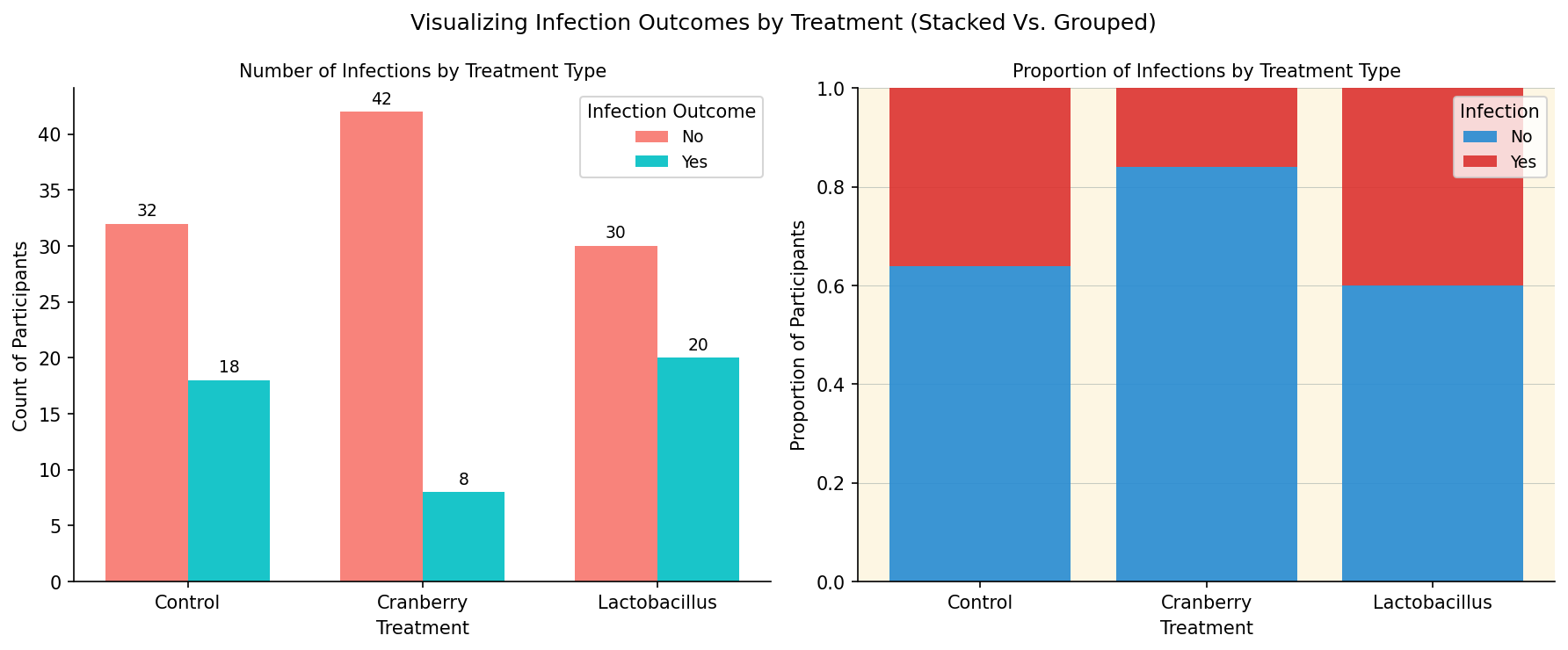
grouped + stacked + plot_annotation(title = "Visualizing Infection Outcomes by Treatment (Stacked Vs. Grouped")
Figure6.5.3.Side-by-side comparison of stacked and grouped bar charts visualizing infection outcomes by treatment type. The grouped chart highlights raw counts while the stacked chart emphasizes proportional differences.