Section 16.3 Case Studies
Let us apply the methods that were introduced throughout the book to two examples of data analysis. Both examples are taken from the case studies of the Rice Virtual Lab in Statistics and can be found in their Case Studies section. The analysis of these case studies may involve any of the tools that were described in the second part of the book (and some from the first part). It may be useful to read again Chapter 9–Chapter 15 before reading the case studies.
Subsection 16.3.1 Physicians’ Reactions to the Size of a Patient
Overweight and obesity is common in many of the developed countries. In some cultures, obese individuals face discrimination in employment, education, and relationship contexts. The current research, conducted by Mikki Hebl and Jingping Xu, examines physicians’ attitude toward overweight and obese patients in comparison to their attitude toward patients who are not overweight.
1
Hebl, M. and Xu, J. (2001). Weighing the care: Physicians’ reactions to the size of a patient. International Journal of Obesity, 25, 1246-1252.
The experiment included a total of 122 primary care physicians affiliated with one of three major hospitals in the Texas Medical Center of Houston. These physicians were sent a packet containing a medical chart similar to the one they view upon seeing a patient. This chart portrayed a patient who was displaying symptoms of a migraine headache but was otherwise healthy. Two variables (the gender and the weight of the patient) were manipulated across six different versions of the medical charts. The weight of the patient, described in terms of Body Mass Index (BMI), was average (BMI = 23), overweight (BMI = 30), or obese (BMI = 36). Physicians were randomly assigned to receive one of the six charts, and were asked to look over the chart carefully and complete two medical forms. The first form asked physicians which of 42 tests they would recommend giving to the patient. The second form asked physicians to indicate how much time they believed they would spend with the patient, and to describe the reactions that they would have toward this patient.
In this presentation, only the question on how much time the physicians believed they would spend with the patient is analyzed. Although three patient weight conditions were used in the study (average, overweight, and obese) only the average and overweight conditions will be analyzed. Therefore, there are two levels of patient weight (average and overweight) and one dependent variable (time spent).
The data for the given collection of responses from 72 primary care physicians is stored in the file . We start by reading the content of the file into a data frame by the name
discriminate.csv2
The file can be found on the internet at
http://pluto.huji.ac.il/~msby/StatThink/Datasets/discriminate.csv.
patient and presenting the summary of the variables:
patient <- read.csv("_data/discriminate.csv")
summary(patient)
##     weight        time
##  BMI=23:33   Min.   : 5.00
##  BMI=30:38   1st Qu.:20.00
##              Median :30.00
##              Mean   :27.82
##              3rd Qu.:30.00
##              Max.   :60.00
Observe that of the 72 “patients”, 38 are overweight and 33 have an average weight. The time spent with the patient, as predicted by physicians, is distributed between 5 minutes and 1 hour, with an average of 27.82 minutes and a median of 30 minutes.
It is a good practice to have a look at the data before doing the analysis. In this examination one should see that the numbers make sense and one should identify special features of the data. Even in this very simple example we may want to have a look at the histogram of the variable
time:
hist(patient$time)
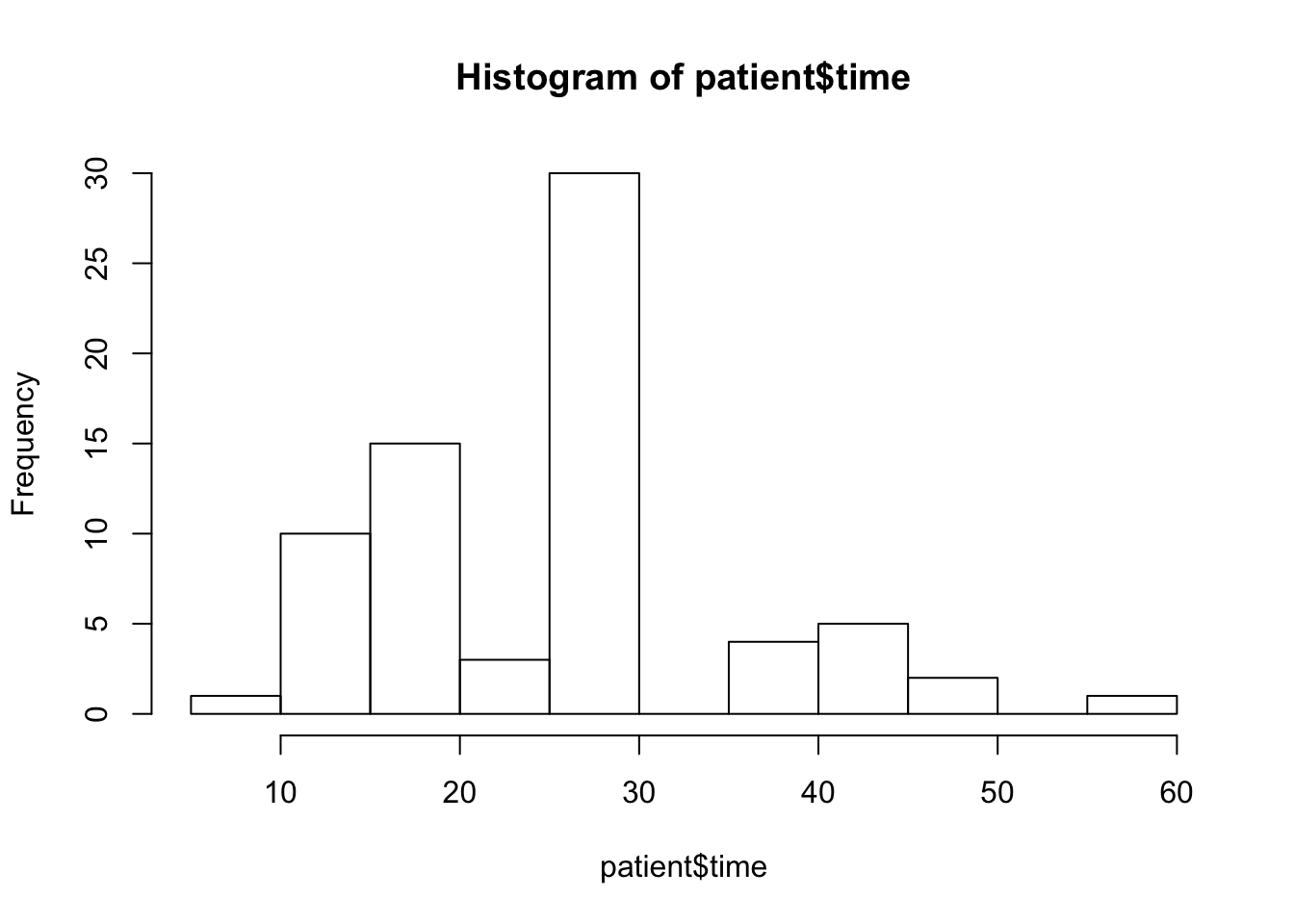
A feature in this plot that catches attention is the fact that there is a high concentration of values in the interval between 25 and 30. Together with the fact that the median is equal to 30, one may suspect that, as a matter of fact, a large number of the values are actually equal to 30. Indeed, let us produce a table of the response:
table(patient$time)
##
##  5 15 20 25 30 40 45 50 60
##  1 10 15  3 30  4  5  2  1
Notice that 30 of the 72 physicians marked
30 as the time they expect to spend with the patient. This is the middle value in the range, and may just be the default value one marks if one just needs to complete a form and do not really place much importance to the question that was asked.
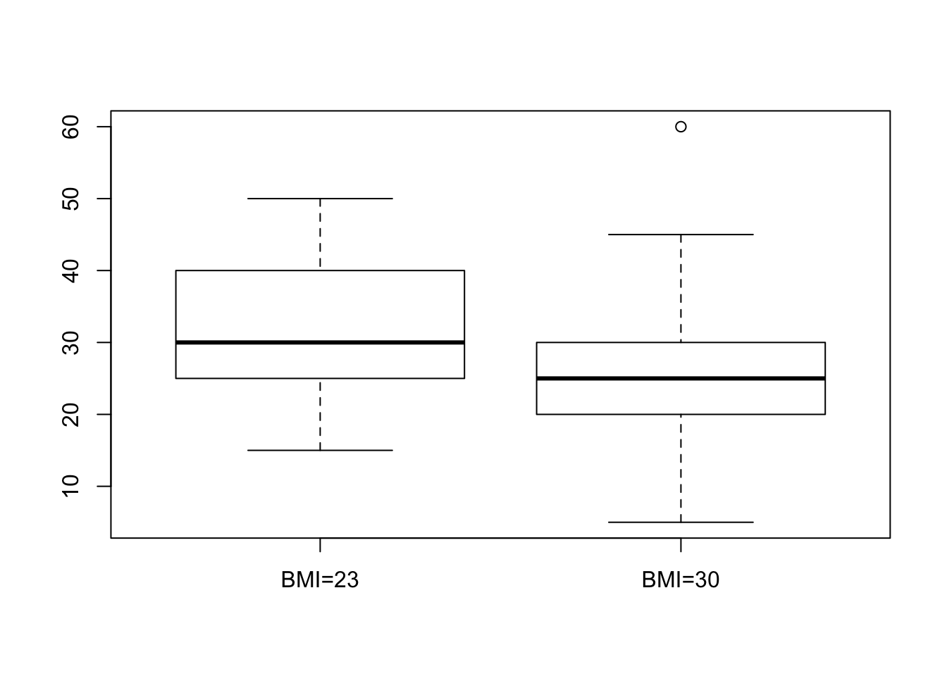
The goal of the analysis is to examine the relation between overweight and the Doctor’s response. The explanatory variable is a factor with two levels. The response is numeric. A natural tool to use in order to test this hypothesis is the \(t\)-test, which is implemented with the function
t.test.
First we plot the relation between the response and the explanatory variable and then we apply the test:
boxplot(time~weight,data=patient)
t.test(time~weight,data=patient)
##
##  Welch Two Sample t-test
##
## data:  time by weight
## t = 2.8516, df = 67.174, p-value = 0.005774
## alternative hypothesis: true difference in means is not equal to 0
## 95 percent confidence interval:
##   1.988532 11.265056
## sample estimates:
## mean in group BMI=23 mean in group BMI=30
##             31.36364             24.73684
Nothing seems problematic in the box plot. The two distributions, as they are reflected in the box plots, look fairly symmetric.
When we consider the report that is produced by the function
t.test we may observe that the \(p\)-value is equal to 0.005774. This \(p\)-value is computed in testing the null hypothesis that the expectation of the response for both types of patients are equal against the two sided alternative. Since the \(p\)-value is less than 0.05 we do reject the null hypothesis.
The estimated value of the difference between the expectation of the response for a patient with BMI=23 and a patient with BMI=30 is \(31.36364 -24.73684 \approx 6.63\) minutes. The confidence interval is (approximately) equal to \([1.99, 11.27]\text{.}\) Hence, it looks as if the physicians expect to spend more time with the average weight patients.
After analyzing the effect of the explanatory variable on the expectation of the response one may want to examine the presence, or lack thereof, of such effect on the variance of the response. Towards that end, one may use the function
var.test:
var.test(time~weight,data=patient)
##
##  F test to compare two variances
##
## data:  time by weight
## F = 1.0443, num df = 32, denom df = 37, p-value = 0.8931
## alternative hypothesis: true ratio of variances is not equal to 1
## 95 percent confidence interval:
##  0.5333405 2.0797269
## sample estimates:
## ratio of variances
##           1.044316
In this test we do not reject the null hypothesis that the two variances of the response are equal since the \(p\)-value is larger than \(0.05\text{.}\) The sample variances are almost equal to each other (their ratio is \(1.044316\)), with a confidence interval for the ratio that essentially ranges between 1/2 and 2.
The production of \(p\)-values and confidence intervals is just one aspect in the analysis of data. Another aspect, which typically is much more time consuming and requires experience and healthy skepticism is the examination of the assumptions that are used in order to produce the \(p\)-values and the confidence intervals. A clear violation of the assumptions may warn the statistician that perhaps the computed nominal quantities do not represent the actual statistical properties of the tools that were applied.
In this case, we have noticed the high concentration of the response at the value
30. What is the situation when we split the sample between the two levels of the explanatory variable? Let us apply the function table once more, this time with the explanatory variable included:
table(patient$time,patient$weight)
##
##      BMI=23 BMI=30
##   5       0      1
##   15      2      8
##   20      6      9
##   25      1      2
##   30     14     16
##   40      4      0
##   45      4      1
##   50      2      0
##   60      0      1
Not surprisingly, there is still high concentration at that level
30. But one can see that only 2 of the responses of the BMI=30 group are above that value in comparison to a much more symmetric distribution of responses for the other group.
The simulations of the significance level of the one-sample \(t\)-test for an Exponential response that were conducted in an earlier exercise may cast some doubt on how trustworthy are nominal \(p\)-values of the \(t\)-test when the measurements are skewed. The skewness of the response for the group
BMI=30 is a reason to worry.
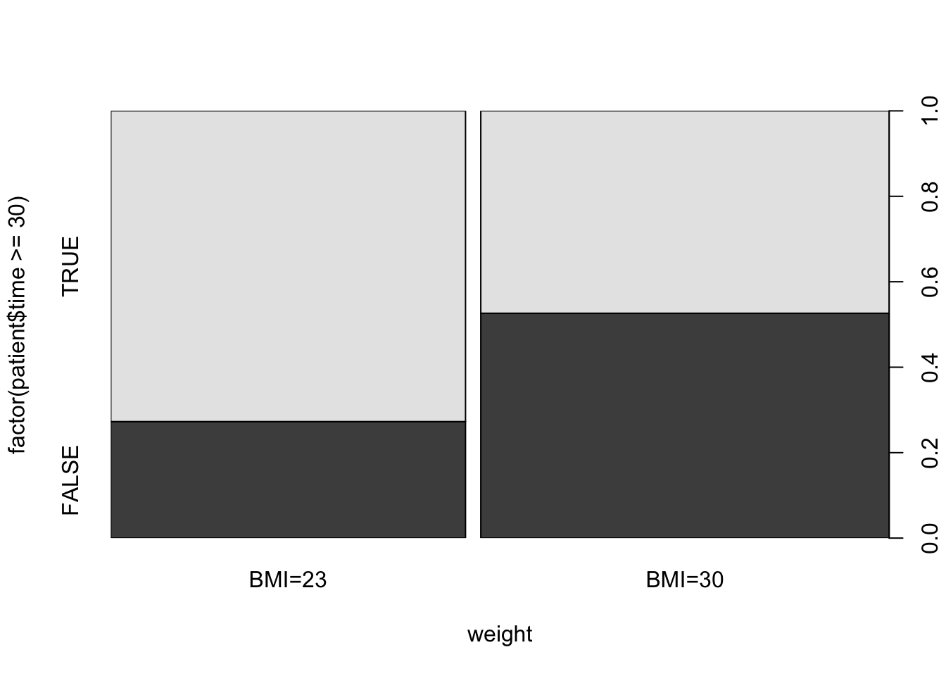
We may consider a different test, which is more robust, in order to validate the significance of our findings. For example, we may turn the response into a factor by setting a level for values larger or equal to
30 and a different level for values less than 30. The relation between the new response and the explanatory variable can be examined with the function prop.test. We first plot and then test:
plot(factor(patient$time>=30)~weight,data=patient)
prop.test(table(patient$time>=30,patient$weight))
##
##  2-sample test for equality of proportions with continuity
##  correction
##
## data:  table(patient$time >= 30, patient$weight)
## X-squared = 3.7098, df = 1, p-value = 0.05409
## alternative hypothesis: two.sided
## 95 percent confidence interval:
##  -0.515508798 -0.006658689
## sample estimates:
##    prop 1    prop 2
## 0.3103448 0.5714286
The mosaic plot presents the relation between the explanatory variable and the new factor. The level
TRUE is associated with a value of the predicted time spent with the patient being 30 minutes or more. The level FALSE is associated with a prediction of less than 30 minutes.
The computed \(p\)-value is equal to \(0.05409\text{,}\) that almost reaches the significance level of 5%. Notice that the probabilities that are being estimated by the function are the probabilities of the level
3
One may propose splinting the response into two groups, with one group being associated with values of
time strictly larger than 30 minutes and the other with values less or equal to 30. The resulting \(p\)-value from the expression prop.test(table(patient$time>30,patient$weight)) is \(0.01276\text{.}\) However, the number of subjects in one of the cells of the table is equal only to 2, which is problematic in the context of the Normal approximation that is used by this test.
FALSE. Overall, one may see the outcome of this test as supporting evidence for the conclusion of the \(t\)-test. However, the \(p\)-value provided by the \(t\)-test may over emphasize the evidence in the data for a significant difference in the physician attitude towards overweight patients.
Subsection 16.3.2 Physical Strength and Job Performance
The next case study involves an attempt to develop a measure of physical ability that is easy and quick to administer, does not risk injury, and is related to how well a person performs the actual job. The current example is based on study by Blakely et al., published in the journal Personnel Psychology.
4
Blakley, B.A., Quiñones, M.A., Crawford, M.S., and Jago, I.A. (1994). The validity of isometric strength tests. Personnel Psychology, 47, 247-274.
There are a number of very important jobs that require, in addition to cognitive skills, a significant amount of strength to be able to perform at a high level. Construction worker, electrician and auto mechanic, all require strength in order to carry out critical components of their job. An interesting applied problem is how to select the best candidates from amongst a group of applicants for physically demanding jobs in a safe and a cost effective way.
The data presented in this case study, and may be used for the development of a method for selection among candidates, were collected from 147 individuals working in physically demanding jobs. Two measures of strength were gathered from each participant. These included grip and arm strength. A piece of equipment known as the Jackson Evaluation System (JES) was used to collect the strength data. The JES can be configured to measure the strength of a number of muscle groups. In this study, grip strength and arm strength were measured. The outcomes of these measurements were summarized in two scores of physical strength called
grip and arm.
Two separate measures of job performance are presented in this case study. First, the supervisors for each of the participants were asked to rate how well their employee(s) perform on the physical aspects of their jobs. This measure is summarized in the variable
ratings. Second, simulations of physically demanding work tasks were developed. The summary score of these simulations are given in the variable sims. Higher values of either measure of performance indicate better performance.
The data for the 4 variables and 147 observations is stored in . We start by reading the content of the file into a data frame by the name
job.csv5
The file can be found on the internet at
http://pluto.huji.ac.il/~msby/StatThink/Datasets/job.csv.
job, presenting a summary of the variables, and their histograms:
job <- read.csv("_data/job.csv")
summary(job)
par(mfrow=c(2,2)) # we'll plot a 2x2 grid
hist(job$grip)
hist(job$arm)
hist(job$ratings)
hist(job$sims)
##       grip            arm            ratings           sims
##  Min.   : 29.0   Min.   : 19.00   Min.   :21.60   Min.   :-4.1700
##  1st Qu.: 94.0   1st Qu.: 64.50   1st Qu.:34.80   1st Qu.:-0.9650
##  Median :111.0   Median : 81.50   Median :41.30   Median : 0.1600
##  Mean   :110.2   Mean   : 78.75   Mean   :41.01   Mean   : 0.2018
##  3rd Qu.:124.5   3rd Qu.: 94.00   3rd Qu.:47.70   3rd Qu.: 1.0700
##  Max.   :189.0   Max.   :132.00   Max.   :57.20   Max.   : 5.1700
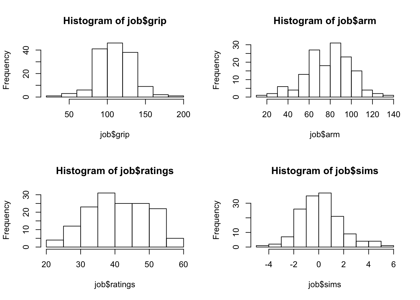
All variables are numeric. Examination of the 4 summaries and histograms does not produce interesting findings. All variables are, more or less, symmetric with the distribution of the variable
ratings tending perhaps to be more uniform then the other three.
The main analyses of interest are attempts to relate the two measures of physical strength
grip and arm with the two measures of job performance, ratings and sims. A natural tool to consider in this context is a linear regression analysis that relates a measure of physical strength as an explanatory variable to a measure of job performance as a response.
par(mfrow=c(2,2)) # we'll plot a 2x2 grid

plot(sims~grip,data=job)
sims.grip <- lm(sims~grip,data=job)
abline(sims.grip)

plot(sims~arm,data=job)
sims.arm <- lm(sims~arm,data=job)
abline(sims.arm)

score <- -5.434 + 0.024*job$grip+ 0.037*job$arm
plot(sims~score,data=job)
sims.score <- lm(sims~score,data=job)
abline(sims.score)

plot(grip~arm,data=job)
Let us consider the variable
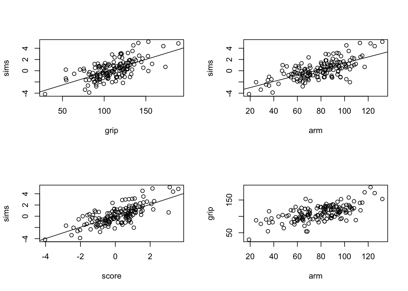
sims as a response. The first step is to plot a scatter plot of the response and explanatory variable, for both explanatory variables. To the scatter plot we add the line of regression. In order to add the regression line we fit the regression model with the function lm and then apply the function abline to the fitted model. The plot for the relation between the response and the variable grip is produced by the code:
plot(sims~grip,data=job)
sims.grip <- lm(sims~grip,data=job)
abline(sims.grip)
The plot that is produced by this code is presented on the upper-left panel of Figure 16.3.5.
The plot for the relation between the response and the variable
arm is produced by this code:
plot(sims~arm,data=job)
sims.arm <- lm(sims~arm,data=job)
abline(sims.arm)
The plot that is produced by the last code is presented on the upper-right panel of Figure 16.3.5.
Both plots show similar characteristics. There is an overall linear trend in the relation between the explanatory variable and the response. The value of the response increases with the increase in the value of the explanatory variable (a positive slope). The regression line seems to follow, more or less, the trend that is demonstrated by the scatter plot.
A more detailed analysis of the regression model is possible by the application of the function
summary to the fitted model. First the case where the explanatory variable is grip:
summary(sims.grip)
##
## Call:
## lm(formula = sims ~ grip, data = job)
##
## Residuals:
##     Min      1Q  Median      3Q     Max
## -2.9295 -0.8708 -0.1219  0.8039  3.3494
##
## Coefficients:
##              Estimate Std. Error t value Pr(> |t|)
## (Intercept) -4.809675   0.511141   -9.41   < 2e-16 ***
## grip         0.045463   0.004535   10.03   < 2e-16 ***
## ---
## Signif. codes:  0 '***' 0.001 '**' 0.01 '*' 0.05 '.' 0.1 ' ' 1
##
## Residual standard error: 1.295 on 145 degrees of freedom
## Multiple R-squared:  0.4094, Adjusted R-squared:  0.4053
## F-statistic: 100.5 on 1 and 145 DF,  p-value: < 2.2e-16
Examination of the report reveals a clear statistical significance for the effect of the explanatory variable on the distribution of response. The value of R-squared, the ratio of the variance of the response explained by the regression is \(0.4094\text{.}\) The square root of this quantity, \(\sqrt{0.4094} \approx 0.64\text{,}\) is the proportion of the standard deviation of the response that is explained by the explanatory variable. Hence, about 64% of the variability in the response can be attributed to the measure of the strength of the grip.
For the variable
arm we get:
summary(sims.arm)
##
## Call:
## lm(formula = sims ~ arm, data = job)
##
## Residuals:
##     Min      1Q  Median      3Q     Max
## -3.6467 -0.7502 -0.0285  0.6875  3.0770
##
## Coefficients:
##              Estimate Std. Error t value Pr(> |t|)
## (Intercept) -4.095160   0.391745  -10.45   < 2e-16 ***
## arm          0.054563   0.004806   11.35   < 2e-16 ***
## ---
## Signif. codes:  0 '***' 0.001 '**' 0.01 '*' 0.05 '.' 0.1 ' ' 1
##
## Residual standard error: 1.226 on 145 degrees of freedom
## Multiple R-squared:  0.4706, Adjusted R-squared:  0.467
## F-statistic: 128.9 on 1 and 145 DF,  p-value: < 2.2e-16
This variable is also statistically significant. The value of R-squared is \(0.4706\text{.}\) The proportion of the standard deviation that is explained by the strength of the arm is \(\sqrt{0.4706} \approx 0.69\text{,}\) which is slightly higher than the proportion explained by the grip.
Overall, the explanatory variables do a fine job in the reduction of the variability of the response takes the form:
sims and may be used as substitutes of the response in order to select among candidates. A better prediction of the response based on the values of the explanatory variables can be obtained by combining the information in both variables. The production of such combination is not discussed in this book, though it is similar in principle to the methods of linear regression that are presented in Chapter 14. The produced score6
The score is produced by the application of the function
lm to both variables as explanatory variables. The code expression that can be used is lm(sims ~ grip + arm, data=job).
\begin{equation*}
\mbox{\texttt{score}} = -5.434 + 0.024\cdot \mbox{\texttt{grip}}+ 0.037\cdot \mbox{\texttt{arm}}\;.
\end{equation*}
We use this combined score as an explanatory variable. First we form the score and plot the relation between it and the response:
score <- -5.434 + 0.024*job$grip+ 0.037*job$arm
plot(sims~score,data=job)
sims.score <- lm(sims~score,data=job)
abline(sims.score)
##
## Call:
## lm(formula = sims ~ score, data = job)
##
## Residuals:
##     Min      1Q  Median      3Q     Max
## -3.1890 -0.7390 -0.0698  0.7411  2.8636
##
## Coefficients:
##             Estimate Std. Error t value Pr(> |t|)
## (Intercept)  0.07479    0.09452   0.791     0.43
## score        1.01291    0.07730  13.104   < 2e-16 ***
## ---
## Signif. codes:  0 '***' 0.001 '**' 0.01 '*' 0.05 '.' 0.1 ' ' 1
##
## Residual standard error: 1.14 on 145 degrees of freedom
## Multiple R-squared:  0.5422, Adjusted R-squared:  0.539
## F-statistic: 171.7 on 1 and 145 DF,  p-value: < 2.2e-16
The scatter plot that includes the regression line can be found at the lower-left panel of Figure 16.3.5. Indeed, the linear trend is more pronounced for this scatter plot and the regression line a better description of the relation between the response and the explanatory variable. A summary of the regression model produces the report:
summary(sims.score)
Indeed, the score is highly significant. More important, the R-squared coefficient that is associated with the score is \(0.5422\text{,}\) which corresponds to a proportion of the standard deviation that is explained by the model of \(\sqrt{0.5422} \approx 0.74\text{.}\) Thus, almost 3/4 of the variability is accounted for by the score, so the score is a reasonable means of guessing what the results of the simulations will be. This guess is based only on the results of the simple tests of strength that is conducted with the JES device.
Before putting the final seal on the results let us examine the assumptions of the statistical model. First, with respect to the two explanatory variables. Does each of them really measure a different property or do they actually measure the same phenomena? In order to examine this question let us look at the scatter plot that describes the relation between the two explanatory variables. This plot is produced using the code:
plot(grip~arm,data=job)
It is presented in the lower-right panel of Figure 16.3.5. Indeed, one may see that the two measurements of strength are not independent of each other but tend to produce an increasing linear trend. Hence, it should not be surprising that the relation of each of them with the response produces essentially the same goodness of fit. The computed score gives a slightly improved fit, but still, it basically reflects either of the original explanatory variables.
In light of this observation, one may want to consider other measures of strength that represents features of the strength not captured by these two variable. Namely, measures that show less joint trend than the two considered.
Another element that should be examined are the probabilistic assumptions that underly the regression model. We described the regression model only in terms of the functional relation between the explanatory variable and the expectation of the response. In the case of linear regression, for example, this relation was given in terms of a linear equation. However, another part of the model corresponds to the distribution of the measurements about the line of regression. The assumption that led to the computation of the reported \(p\)-values is that this distribution is Normal.
A method that can be used in order to investigate the validity of the Normal assumption is to analyze the residuals from the regression line. Recall that these residuals are computed as the difference between the observed value of the response and its estimated expectation, namely the fitted regression line. The residuals can be computed via the application of the function
residuals to the fitted regression model.
Specifically, let us look at the residuals from the regression line that uses the score that is combined from the grip and arm measurements of strength. One may plot a histogram of the residuals:
par(mfrow=c(2,1))

hist(residuals(sims.score))

qqnorm(residuals(sims.score))
qqline(residuals(sims.score))
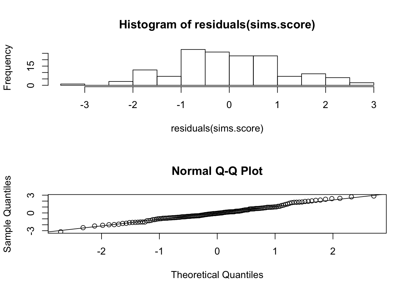
The produced histogram is represented on the upper panel. The histogram portrays a symmetric distribution that may result from Normally distributed observations. A better method to compare the distribution of the residuals to the Normal distribution is to use the Quantile-Quantile plot. This plot can be found on the lower panel. We do not discuss here the method by which this plot is produced. However, we do say that any deviation of the points from a straight line is indication of violation of the assumption of Normality. In the current case, the points seem to be on a single line, which is consistent with the assumptions of the regression model.
7
Generally speaking, the plot is composed of the empirical percentiles of the residuals, plotted against the theoretical percentiles of the standard Normal distribution. The current plot is produced by the expression
qqnorm(residuals(sims.score)).
The next task should be an analysis of the relations between the explanatory variables and the other response
ratings. In principle one may use the same steps that were presented for the investigation of the relations between the explanatory variables and the response sims. But of course, the conclusion may differ. We leave this part of the investigation as an exercise to the students.

