Section 3.2 Displaying Data
Once you have collected data, what will you do with it? Data can be described and presented in many different formats. For example, suppose you are interested in buying a house in a particular area. You may have no clue about the house prices, so you may ask your real estate agent to give you a sample data set of prices. Looking at all the prices in the sample is often overwhelming. A better way may be to look at the median price and the variation of prices. The median and variation are just two ways that you will learn to describe data. Your agent might also provide you with a graph of the data.
A statistical graph is a tool that helps you learn about the shape of the distribution of a sample. The graph can be a more effective way of presenting data than a mass of numbers because we can see where data clusters and where there are only a few data values. Newspapers and the Internet use graphs to show trends and to enable readers to compare facts and figures quickly.
Statisticians often start the analysis by graphing the data in order to get an overall picture of it. Afterwards, more formal tools may be applied.
In the previous chapters we used the bar plot, where bars that indicate the frequencies in the data of values are placed over these values. In this chapter our emphasis will be on histograms and box plots, which are other types of plots. Some of the other types of graphs that are frequently used, but will not be discussed in this book, are the stem-and-leaf plot, the frequency polygon (a type of broken line graph) and the pie charts. The types of plots that will be discussed and the types that will not are all tightly linked to the notion of frequency of the data that was introduced in Chapter 2 and intend to give a graphical representation of this notion.
Subsection 3.2.1 Histograms
The histogram is a frequently used method for displaying the distribution of continuous numerical data. An advantage of a histogram is that it can readily display large data sets. A rule of thumb is to use a histogram when the data set consists of 100 values or more.
One may produce a histogram in
R by the application of the function “hist” to a sequence of numerical data. Let us read into R the data frame “ex.1” that contains data on the sex and height and create a histogram of the heights:
ex.1 <- read.csv("_data/ex1.csv")
hist(ex.1$height)
The data set, which is the content of the CSV file “
ex1.csv”, was used in Chapter 2 in order to demonstrate the reading of data that is stored in a external file into R. The first line of the above script reads in the data from “ex1.csv” into a data frame object named “ex.1” that maintains the data internally in R. The second line of the script produces the histogram. We will discuss below the code associated with this second line.
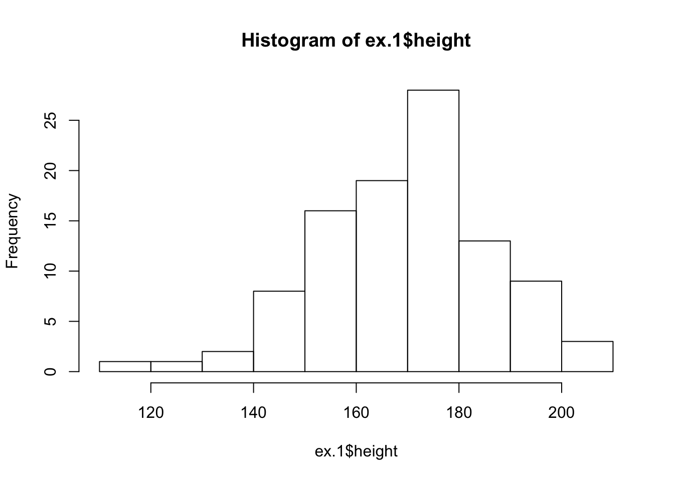
A histogram consists of contiguous boxes. It has both a horizontal axis and a vertical axis. The horizontal axis is labeled with what the data represents (the height, in this example). The vertical axis presents frequencies and is labeled “Frequency”. By the examination of the histogram one can appreciate the shape of the data, the center, and the spread of the data.
The histogram is constructed by dividing the range of the data (the x-axis) into equal intervals, which are the bases for the boxes. The height of each box represents the count of the number of observations that fall within the interval. For example, consider the box with the base between 160 and 170. There is a total of 19 subjects with height larger that 160 but no more than 170 (that is, \(160 < \texttt{height} \leq 170\)). Consequently, the height of that box is 19.
1
In some books an histogram is introduced as a form of a density. In densities the area of the box represents the frequency or the relative frequency. In the current example the height would have been 19/10 = 1.9 if the area of the box would have represented the frequency and it would have been (19/100)/10 = 0.019 if the area of the box would have represented the relative frequency. However, in this book we follow the default of
R in which the height represents the frequency.
The input to the function “
hist” should be a sequence of numerical values. In principle, one may use the function “c” to produce a sequence of data and apply the histogram plotting function to the output of the sequence producing function. However, in the current case we have already the data stored in the data frame “ex.1”, all we need to learn is how to extract that data so it can be used as input to the function “hist” that plots the histogram.
Notice the structure of the input that we have used in order to construct the histogram of the variable “
height” in the “ex.1” data frame. One may address the variable “variable.name” in the data frame “dataframe.name” using the format: “dataframe.name$variable.name”. Indeed, when we type the expression “ex.1$height” we get as an output the values of the variable “height” from the given data frame:
ex.1$height
##   [1] 182 168 172 154 174 176 193 156 157 186 143 182 194 187 171 178 157
##  [18] 156 172 157 171 164 142 140 202 176 165 176 175 170 169 153 169 158
##  [35] 208 185 157 147 160 173 164 182 175 165 194 178 178 186 165 180 174
##  [52] 169 173 199 163 160 172 177 165 205 193 158 180 167 165 183 171 191
##  [69] 191 152 148 176 155 156 177 180 186 167 174 171 148 153 136 199 161
##  [86] 150 181 166 147 168 188 170 189 117 174 187 141 195 129 172
This is a numeric sequence and can serve as the input to a function that expects a numeric sequence as input, a function such as “
hist”. (But also other functions, for example, “sum” and “cumsum”.)
There are 100 observations in the variable “
ex.1$height”. So many observations cannot be displayed on the screen on one line. Consequently, the sequence of the data is wrapped and displayed over several lines. Notice that the square brackets on the left hand side of each line indicate the position in the sequence of the first value on that line. Hence, the number on the first line is “[1]”. The number on the second line is “[16]”, since the second line starts with the 16th observation in the display given in the book. Notice, that numbers in the square brackets on your R Console window may be different, depending on the setting of the display on your computer.
Subsection 3.2.2 Box Plots
The box plot, or box-whisker plot, gives a good graphical overall impression of the concentration of the data. It also shows how far from most of the data the extreme values are. In principle, the box plot is constructed from five values: the smallest value, the first quartile, the median, the third quartile, and the largest value. The median, the first quartile, and the third quartile will be discussed here, and then once more in the next section.
The median, a number, is a way of measuring the “center” of the data. You can think of the median as the “middle value,” although it does not actually have to be one of the observed values. It is a number that separates ordered data into halves. Half the values are the same size or smaller than the median and half the values are the same size or larger than it. For example, consider the following data that contains 14 values:
\begin{equation*}
1,\; 11.5,\; 6,\; 7.2,\; 4,\; 8,\; 9,\; 10,\; 6.8,\; 8.3,\; 2,\; 2,\; 10,\; 1
\end{equation*}
Ordered, from smallest to largest, we get:
\begin{equation*}
1,\; 1,\; 2,\; 2,\; 4,\; 6,\; 6.8,\; 7.2,\; 8,\; 8.3,\; 9,\; 10,\; 10,\; 11.5
\end{equation*}
The median is between the 7th value, 6.8, and the 8th value 7.2. To find the median, add the two values together and divide by 2:
\begin{equation*}
\frac{6.8+7.2}{2} = 7
\end{equation*}
The median is 7. Half of the values are smaller than 7 and half of the values are larger than 7.
Quartiles are numbers that separate the data into quarters. Quartiles may or may not be part of the data. To find the quartiles, first find the median or second quartile. The first quartile is the middle value of the lower half of the data and the third quartile is the middle value of the upper half of the data. For illustration consider the same data set from above:
\begin{equation*}
1,\; 1,\; 2,\; 2,\; 4,\; 6,\; 6.8,\; 7.2,\; 8,\; 8.3,\; 9,\; 10,\; 10,\; 11.5
\end{equation*}
The median or second quartile is 7. The lower half of the data is:
\begin{equation*}
1,\; 1,\; 2,\; 2,\; 4,\; 6,\; 6.8
\end{equation*}
The middle value of the lower half is 2. The number 2, which is part of the data in this case, is the first quartile which is denoted Q1. One-fourth of the values are the same or less than 2 and three-fourths of the values are more than 2.
The upper half of the data is:
\begin{equation*}
7.2,\; 8,\; 8.3,\; 9,\; 10,\; 10,\; 11.5
\end{equation*}
The middle value of the upper half is 9. The number 9 is the third quartile which is denoted Q3. Three-fourths of the values are less than 9 and one-fourth of the values are more than 9.
2
The actual computation in
R of the first quartile and the third quartile may vary slightly from the description given here, depending on the exact structure of the data.
Outliers are values that do not fit with the rest of the data and lie outside of the normal range. Data points with values that are much too large or much too small in comparison to the vast majority of the observations will be identified as outliers. In the context of the construction of a box plot we identify potential outliers with the help of the inter-quartile range (IQR). The inter-quartile range is the distance between the third quartile (Q3) and the first quartile (Q1), i.e., \(\mbox{IQR} = \mbox{Q3} - \mbox{Q1}\text{.}\) A data point that is larger than the third quartile plus 1.5 times the inter-quartile range will be marked as a potential outlier. Likewise, a data point smaller than the first quartile minus 1.5 times the inter-quartile range will also be so marked. Outliers may have a substantial effect on the outcome of statistical analysis, therefore it is important that one is alerted to the presence of outliers.
In the running example we obtained an inter-quartile range of size 9-2=7. The upper threshold for defining an outlier is \(9+1.5 \times 7 = 19.5\) and the lower threshold is \(2-1.5 \times 7 = -8.5\text{.}\) All data points are within the two thresholds, hence there are no outliers in this data.
In the construction of a box plot one uses a vertical rectangular box and two vertical “whiskers” that extend from the ends of the box to the smallest and largest data values that are not outliers. Outlier values, if any exist, are marked as points above or blow the endpoints of the whiskers. The smallest and largest non-outlier data values label the endpoints of the axis. The first quartile marks one end of the box and the third quartile marks the other end of the box. The central 50% of the data fall within the box.
One may produce a box plot with the aid of the function “
boxplot”. The input to the function is a sequence of numerical values and the output is a plot. As an example, let us produce the box plot of the 14 data points that were used as an illustration:
boxplot(c(1,11.5,6,7.2,4,8,9,10,6.8,8.3,2,2,10,1))
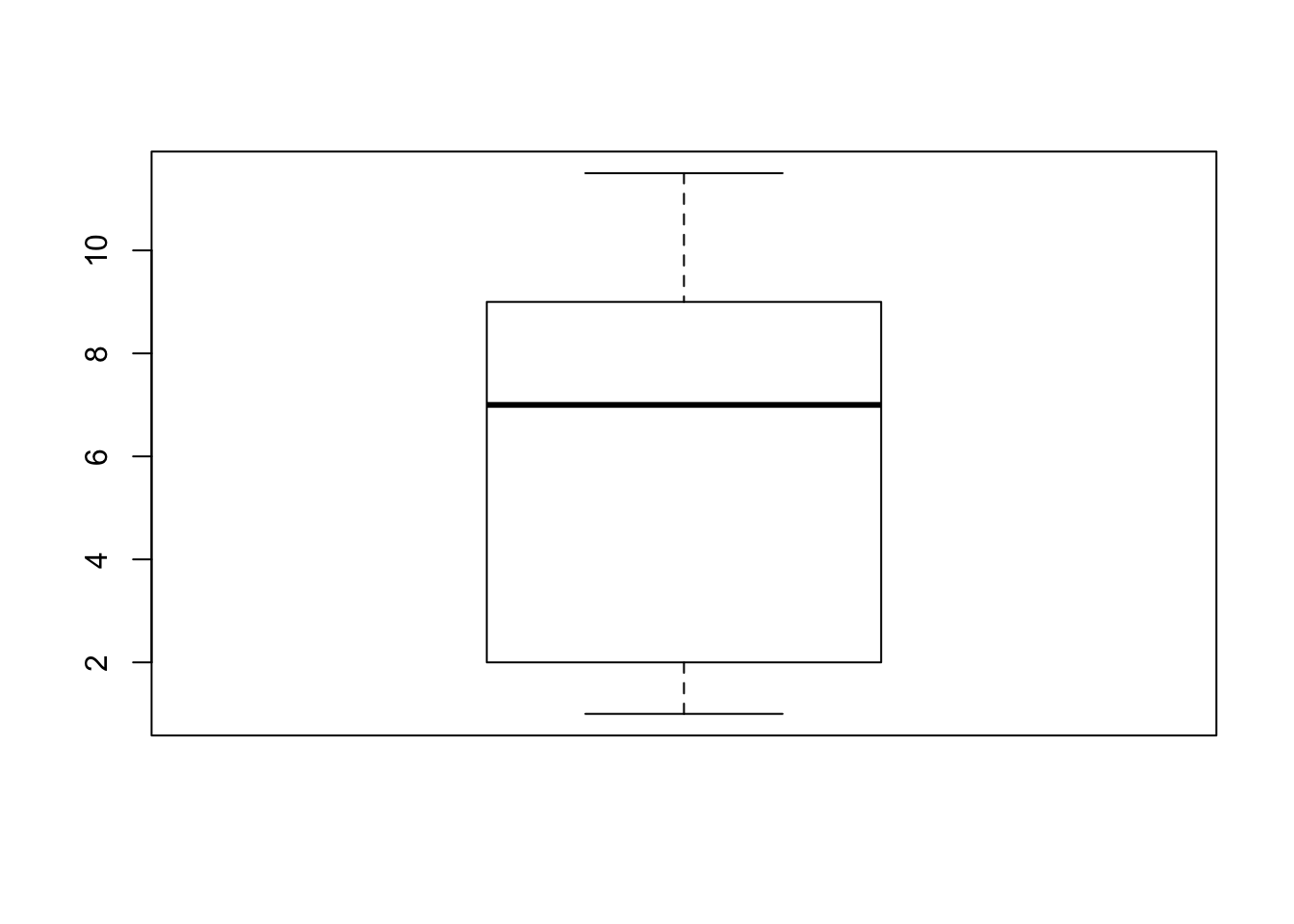
Observe that the end points of the whiskers are 1, for the minimal value, and 11.5 for the largest value. The end values of the box are 9 for the third quartile and 2 for the first quartile. The median 7 is marked inside the box.
Next, let us examine the box plot for the height data:
boxplot(ex.1$height)
In order to assess the plot let us compute quartiles of the variable:
summary(ex.1$height)
##    Min. 1st Qu.  Median    Mean 3rd Qu.    Max.
##   117.0   158.0   171.0   170.1   180.2   208.0
The function “
summary”, when applied to a numerical sequence, produce the minimal and maximal entries, as well the first, second and third quartiles (the second is the Median). It also computes the average of the numbers (the Mean), which will be discussed in the next section.
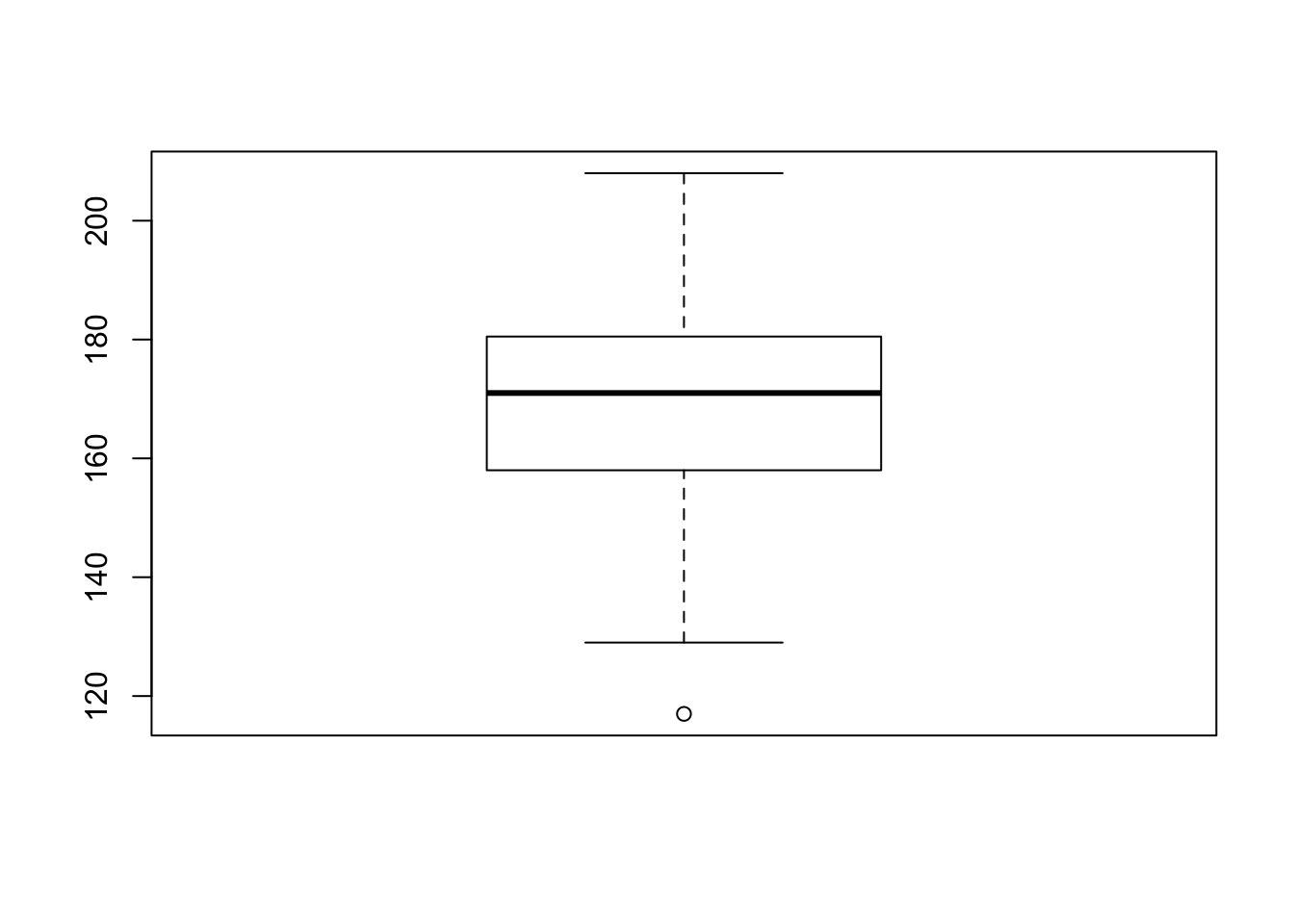
Let us compare the results with the box plot for the height data. Observe that the median 171 coincides with the thick horizontal line inside the box and that the lower end of the box coincides with first quartile 158.0 and the upper end with 180.2, which is the third quartile. The inter-quartile range is \(180.2 - 158.0 = 22.2\text{.}\) The upper threshold is \(180.2 + 1.5 \times 22.2 = 213.5\text{.}\) This threshold is larger than the largest observation (208.0). Hence, the largest observation is not an outlier and it marks the end of the upper whisker. The lower threshold is \(158.0 - 1.5 \times 22.2 = 124.7\text{.}\) The minimal observation (117.0) is less than this threshold. Hence it is an outlier and it is marked as a point below the end of the lower whisker. The second smallest observation is 129. It lies above the lower threshold and it marks the end point of the lower whisker.

