Section 14.2 Points and Lines
In this section we consider the graphical representation of the response and the explanatory variables on the same plot. The data associated with both variables is plotted as points in a two-dimensional plane. Linear equations can be represented as lines on the same two-dimensional plane. This section prepares the background for the discussion of the linear regression model. The actual model of linear regression is introduced in the next section.
Subsection 14.2.1 The Scatter Plot
Consider two numeric variables. A scatter plot can be used in order to display the data in these two variables. The scatter plot is a graph in which each observation is represented as a point. Examination of the scatter plot may reveal relations between the two variables.
Consider an example. A marine biologist measured the length (in millimeters) and the weight (in grams) of 10 fish that were collected in one of her expeditions. The results are summarized in a data frame that is presented in Table 14.2.1. Notice that the data frame contains 10 observations. The variable \(x\) corresponds to the length of the fish and the variable \(y\) corresponds to the weight.
| Observation | \(x\) | \(y\) |
|---|---|---|
| 1 | 4.5 | 9.5 |
| 2 | 3.7 | 8.2 |
| 3 | 1.8 | 4.9 |
| 4 | 1.3 | 6.7 |
| 5 | 3.2 | 12.9 |
| 6 | 3.8 | 14.1 |
| 7 | 2.5 | 5.6 |
| 8 | 4.5 | 8.0 |
| 9 | 4.1 | 12.6 |
| 10 | 1.1 | 7.2 |
Let us display this data in a scatter plot. Towards that end, let us read the length data into an object by the name “
x” and the weight data into an object by the name “y”. Finally, let us apply the function “plot” to the formula that relates the response “y” to the explanatory variable “x”:
x <- c(4.5,3.7,1.8,1.3,3.2,3.8,2.5,4.5,4.1,1.1)
y <- c(9.5,8.2,4.9,6.7,12.9,14.1,5.6,8.0,12.6,7.2)
plot(y~x)
The scatter plot that is produced by the last expression is presented in Figure 14.2.2.
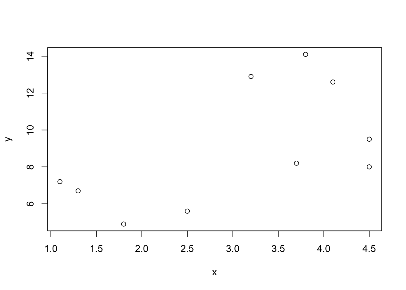
A scatter plot is a graph that displays jointly the data of two numerical variables. The variables (“
x” and “y” in this case) are represented by the \(x\)-axis and the \(y\)-axis, respectively. The \(x\)-axis is associated with the explanatory variable and the \(y\)-axis is associated with the response.
Each observation is represented by a point. The \(x\)-value of the point corresponds to the value of the explanatory variable for the observation and the \(y\)-value corresponds to the value of the response. For example, the first observation is represented by the point \((x=4.5,y=9.5)\text{.}\) The two rightmost points have an \(x\) value of 4.5. The higher of the two has a \(y\) value of 9.5 and is therefore point associated with the first observation. The lower of the two has a \(y\) value of 8.0, and is thus associated with the 8th observation. Altogether there are 10 points in the plot, corresponding to the 10 observations in the data frame.
Let us consider another example of a scatter plot. The file “
cars.csv” contains data regarding characteristics of cars. Among the variables in this data frame are the variables “horsepower” and the variable “engine.size”. Both variables are numeric.
The variable “
engine.size” describes the volume, in cubic inches, that is swept by all the pistons inside the cylinders. The variable “horsepower” measures the power of the engine in units of horsepower. Let us examine the relation between these two variables with a scatter plot:
cars <- read.csv("_data/cars.csv")
plot(horsepower ~ engine.size, data=cars)
In the first line of code we read the data from the file into an
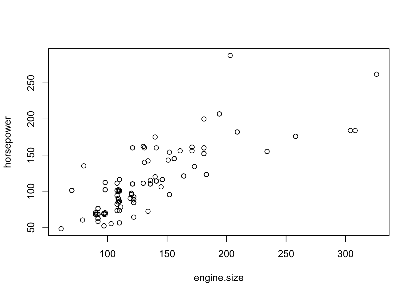
R data frame that is given the name “cars”. In the second line we produce the scatter plot with “horsepower” as the response and “engine.size” as the explanatory variable. Both variables are taken from the data frame “cars”. The plot that is produced by the last expression is presented in Figure 14.2.3.
Consider the expression
plot(horsepower~engine.size, data=cars). Both the response variable and the explanatory variables that are given in this expression do not exist in the computer’s memory as independent objects, but only as variables within the object “cars”. In some cases, however, one may refer to these variables directly within the function, provided that the argument data=data.frame.name is added to the function. This argument informs the function in which data frame the variables can be found, where data.frame.name is the name of the data frame. In the current example, the variables are located in the data frame “cars”.
Examine the scatter plot in Figure 14.2.3. One may see that the values of the response (
horsepower) tend to increase with the increase in the values of the explanatory variable (engine.size). Overall, the increase tends to follow a linear trend, a straight line, although the data points are not located exactly on a single line. The role of linear regression, which will be discussed in the subsequent sections, is to describe and assess this linear trend.
Subsection 14.2.2 Linear Equation
Linear regression describes linear trends in the relation between a response and an explanatory variable. Linear trends may be specified with the aid of linear equations. In this subsection we discuss the relation between a linear equation and a linear trend (a straight line).
A linear equation is an equation of the form:
\begin{equation*}
y = a + b \cdot x\;,
\end{equation*}
where \(y\) and \(x\) are variables and \(a\) and \(b\) are the coefficients of the equation. The coefficient \(a\) is called the intercept and the coefficient \(b\) is called the slope.
A linear equation can be used in order to plot a line on a graph. With each value on the \(x\)-axis one may associate a value on the \(y\)-axis: the value that satisfies the linear equation. The collection of all such pairs of points, all possible \(x\) values and their associated \(y\) values, produces a straight line in the two-dimensional plane.
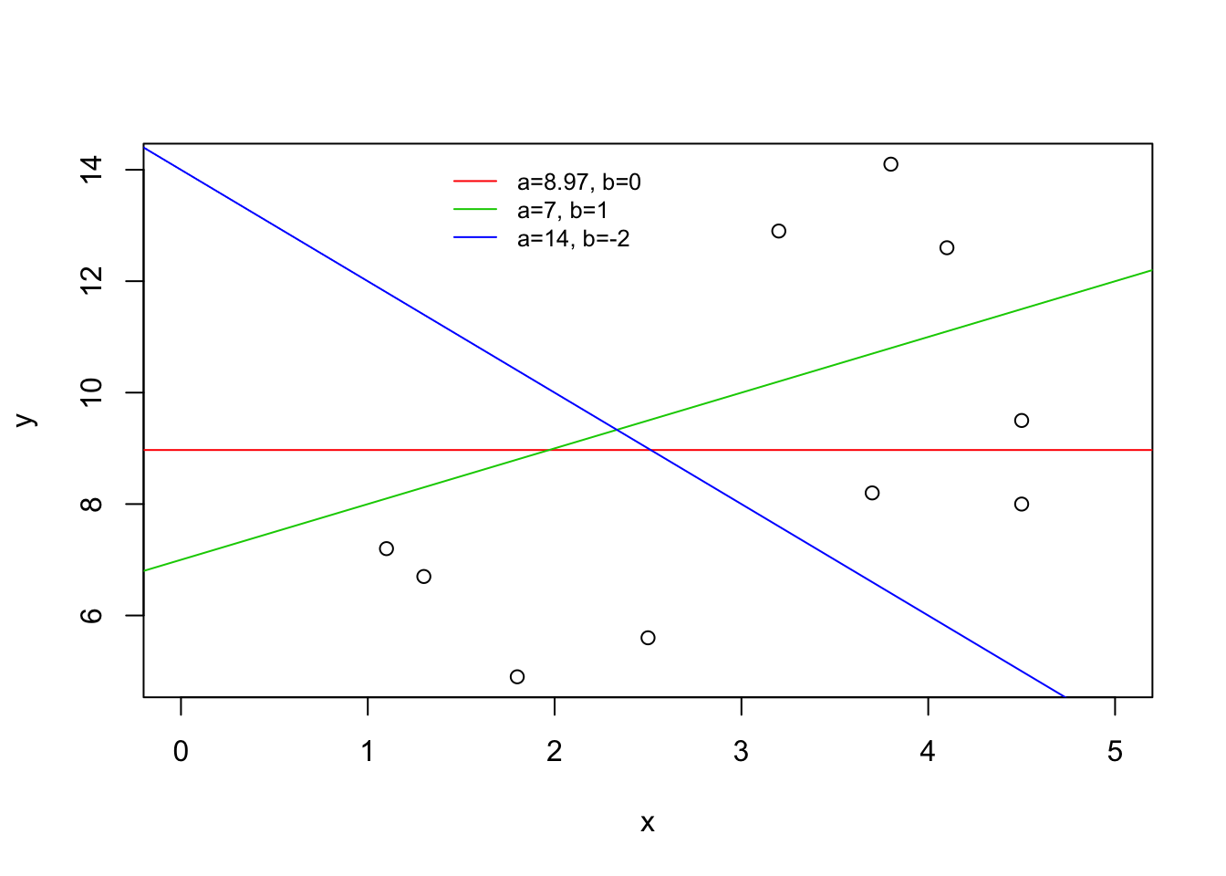
As an illustration consider the three lines in Figure 14.2.4. The green line is produced via the equation \(y = 7 + x\text{,}\) the intercept of the line is 7 and the slope is 1. The blue is a result of the equation \(y = 14 - 2 x\text{.}\) For this line the intercept is 14 and the slope is -2. Finally, the red line is produced by the equation \(y = 8.97\text{.}\) The intercept of the line is 8.97 and the slope is equal to 0.
The intercept describes the value of \(y\) when the line crosses the \(y\)-axis. Equivalently, it is the result of the application of the linear equation for the value \(x=0\text{.}\) Observe in Figure 14.2.4 that the green line crosses the \(y\)-axis at the level \(y=7\text{.}\) Likewise, the blue line crosses the \(y\)-axis at the level \(y=14\text{.}\) The red line stays constantly at the level \(y=8.97\text{,}\) and this is also the level at which it crosses the \(y\)-axis.
The slope is the change in the value of \(y\) for each unit change in the value of \(x\text{.}\) Consider the green line. When \(x=0\) the value of \(y\) is \(y=7\text{.}\) When \(x\) changes to \(x=1\) then the value of \(y\) changes to \(y=8\text{.}\) A change of one unit in \(x\) corresponds to an increase in one unit in \(y\text{.}\) Indeed, the slope for this line is \(b=1\text{.}\) As for the blue line, when \(x\) changes from 0 to 1 the value of \(y\) changes from \(y=14\) to \(y=12\text{;}\) a decrease of two units. This decrease is associated with the slope \(b=-2\text{.}\) Lastly, for the constant red line there is no change in the value of \(y\) when \(x\) changes its value from \(x=0\) to \(x=1\text{.}\) Therefore, the slope is \(b=0\text{.}\) A positive slope is associated with an increasing line, a negative slope is associated with a decreasing line and a zero slope is associated with a constant line.
Lines can be considered in the context of scatter plots. Figure 14.2.4 contains the scatter plot of the data on the relation between the length of fish and their weight. A regression line is the line that best describes the linear trend of the relation between the explanatory variable and the response. Neither of the lines in the figure is the regression line, although the green line is a better description of the trend than the blue line. The regression line is the best description of the linear trend.
The red line is a fixed line that is constructed at a level equal to the average value of the variable \(y\text{.}\) This line partly reflects the information in the data. The regression line, which we fit in the next section, reflects more of the information by including a description of the trend in the data.
1
Run the expression
mean(y) to obtain \(\bar y = 8.97\) as the value of the sample average.
Lastly, let us see how one can add lines to a plot in
R. Functions to produce plots in R can be divided into two categories: high level and low level plotting functions. High level functions produce an entire plot, including the axes and the labels of the plot. The plotting functions that we encountered in the past such as “plot”, “hist”, “boxplot” and the like are all high level plotting functions. Low level functions, on the other hand, add features to an existing plot.
An example of a low level plotting function is the function “:
abline”. This function adds a straight line to an existing plot. The first argument to the function is the intercept of the line and the second argument is the slope of the line. Other arguments may be used in order to specify the characteristics of the line. For example, the argument col=color.name may be used in order to change the color of the line from its default black color. A plot that is very similar to plot in Figure 14.2.4 may be produced with the following code2
The actual plot in Figure 14.2.4 is produced by a slightly modified code. First an empty plot is produced with the expression
plot(c(0,5),c(5,15),type=n,xlab=x,ylab=y) and then the points are added with the expression points(y~x). The lines are added as in the text. Finally, a legend is added with the function legend.
plot(y~x)
abline(7,1,col="green")
abline(14,-2,col="blue")
abline(mean(y),0,col="red")
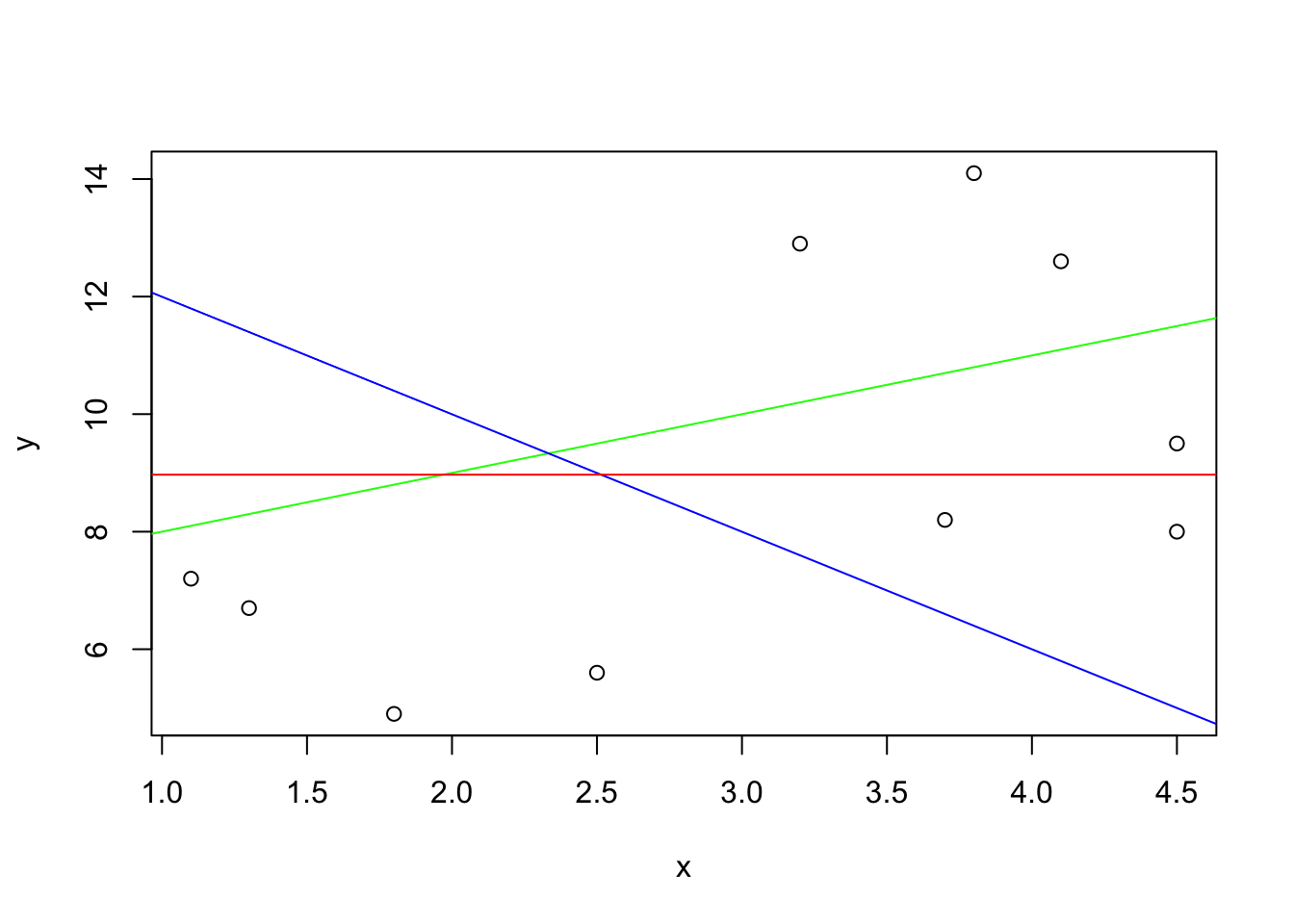
Initially, the scatter plot is created and the lines are added to the plot one after the other. Observe that color of the first line that is added is green, it has an intercept of 7 and a slope of 1. The second line is blue, with an intercept of 14 and a negative slope of -2. The last line is red, and its constant value is the average of the variable \(y\text{.}\)
In the next section we discuss the computation of the regression line, the line that describes the linear trend in the data. This line will be added to scatter plots with the aid of the function “
abline”.

