Introductory Statistics

Section 2.4 Chapter 2 Review Exercises

Exercises Chapter Review

1. Make-up exam.

In a class of 25 students, 24 of them took an exam in class and 1 student took a make-up exam the following day. The professor graded the first batch of 24 exams and found an average score of 74 points with a standard deviation of 8.9 points. The student who took the make-up the following day scored 64 points on the exam.
  1. Does the new student’s score increase or decrease the average score?
  2. What is the new average?
  3. Does the new student’s score increase or decrease the standard deviation of the scores?

2. Infant mortality.

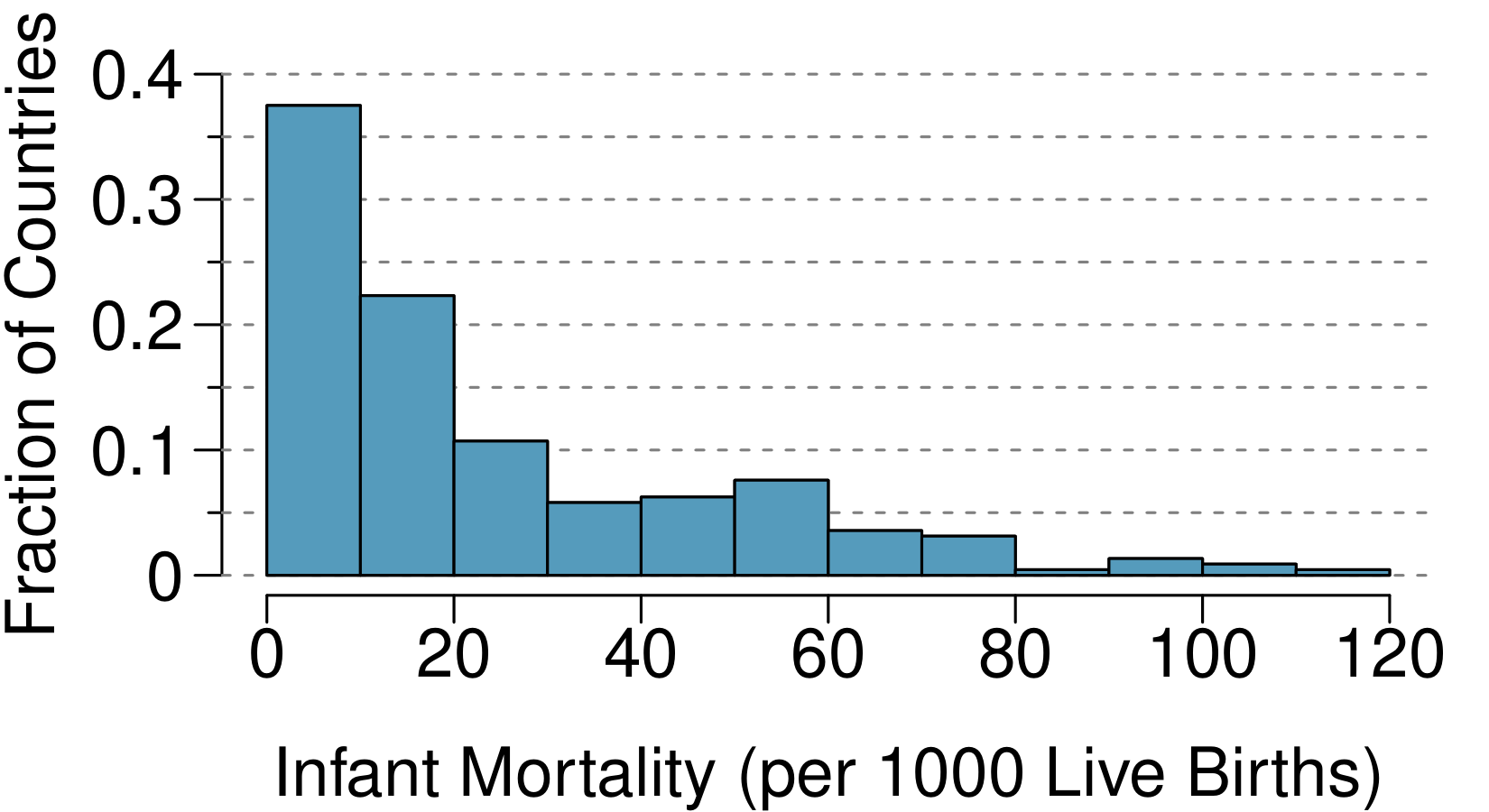
The infant mortality rate is defined as the number of infant deaths per 1,000 live births. This rate is often used as an indicator of the level of health in a country. The relative frequency histogram below shows the distribution of estimated infant death rates for 224 countries for which such data were available in 2014.
  1. Estimate Q1, the median, and Q3 from the histogram.
  2. Would you expect the mean of this data set to be smaller or larger than the median? Explain your reasoning.
A histogram is shown for the variable "Infant Mortality (per 1000 live births)" with axis range of 0 to 120. The histogram vertical axis is for "Fraction of Countries" and runs from 0 to 0.4. The bins are as follows: the 0 to 10 bin has a height of 0.38, 10 to 20 has a height of 0.22, 20 to 30 a height of 0.11, 30 to 40 a height of 0.06, 40 to 50 a height of 0.07, 50 to 60 a height of 0.08, 60 to 70 a height of 0.04, 70 to 80 a height of 0.03, 80 to 90 a height of 0.01, 90 to 100 a height of 0.02, and 100 to 110 a height of 0.01.
Figure 2.4.1. Infant mortality rates

3. TV watchers.

Students in an AP Statistics class were asked how many hours of television they watch per week (including online streaming). This sample yielded an average of 4.71 hours, with a standard deviation of 4.18 hours. Is the distribution of number of hours students watch television weekly symmetric? If not, what shape would you expect this distribution to have? Explain your reasoning.

4. A new statistic.

The statistic \(\frac{\bar{x}}{\text{median}}\) can be used as a measure of skewness. Suppose we have a distribution where all observations are greater than 0, \(x_i > 0\text{.}\) What is the expected shape of the distribution under the following conditions? Explain your reasoning.
  1. \(\displaystyle \frac{\bar{x}}{\text{median}} = 1\)
  2. \(\displaystyle \frac{\bar{x}}{\text{median}} \lt 1\)
  3. \(\displaystyle \frac{\bar{x}}{\text{median}} \gt 1\)

5. Oscar winners.

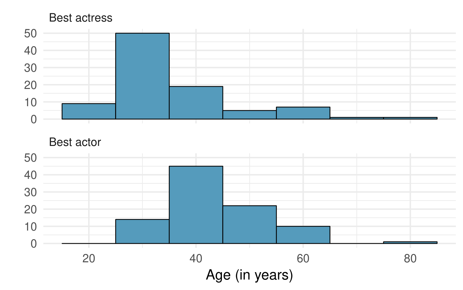
The first Oscar awards for best actor and best actress were given out in 1929. The histograms below show the age distribution for all of the best actor and best actress winners from 1929 to 2018. Summary statistics for these distributions are also provided. Compare the distributions of ages of best actor and actress winners.
Two histograms are shown, one for "Best Actress" and a second for "Best Actor", where values for the histogram range from 15 to 85. The heights of the bins for the Best Actress histogram are as follows: the bin of 15 to 25 has a height of 9, the 25 to 35 bin has a height of 50, 35 to 45 a height of 19, 45 to 55 a height of 6, 55 to 65 a height of 8, 65 to 75 a height of 1, and 75 to 85 a height of 1. The heights of the bins for the Best Actor histogram are as follows: the bin of 15 to 25 has a height of 0, the 25 to 35 bin has a height of 14, 35 to 45 a height of 45, 45 to 55 a height of 23, 55 to 65 a height of 11, 65 to 75 a height of 0, and 75 to 85 a height of 1.
Figure 2.4.2. Oscar winners by age
Best Actress
Mean 36.2
SD 11.9
n 92
Best Actor
Mean 43.8
SD 8.83
n 92

6. Exam scores.

The average on a history exam (scored out of 100 points) was 85, with a standard deviation of 15. Is the distribution of the scores on this exam symmetric? If not, what shape would you expect this distribution to have? Explain your reasoning.

7. Stats scores.

Below are the final exam scores of twenty introductory statistics students.
57, 66, 69, 71, 72, 73, 74, 77, 78, 78, 79, 79, 81, 81, 82, 83, 83, 88, 89, 94
Create a box plot of the distribution of these scores. The five number summary provided below may be useful.
Min Q1 Q2 (Median) Q3 Max
57 72.5 78.5 82.5 94

8. Marathon winners.

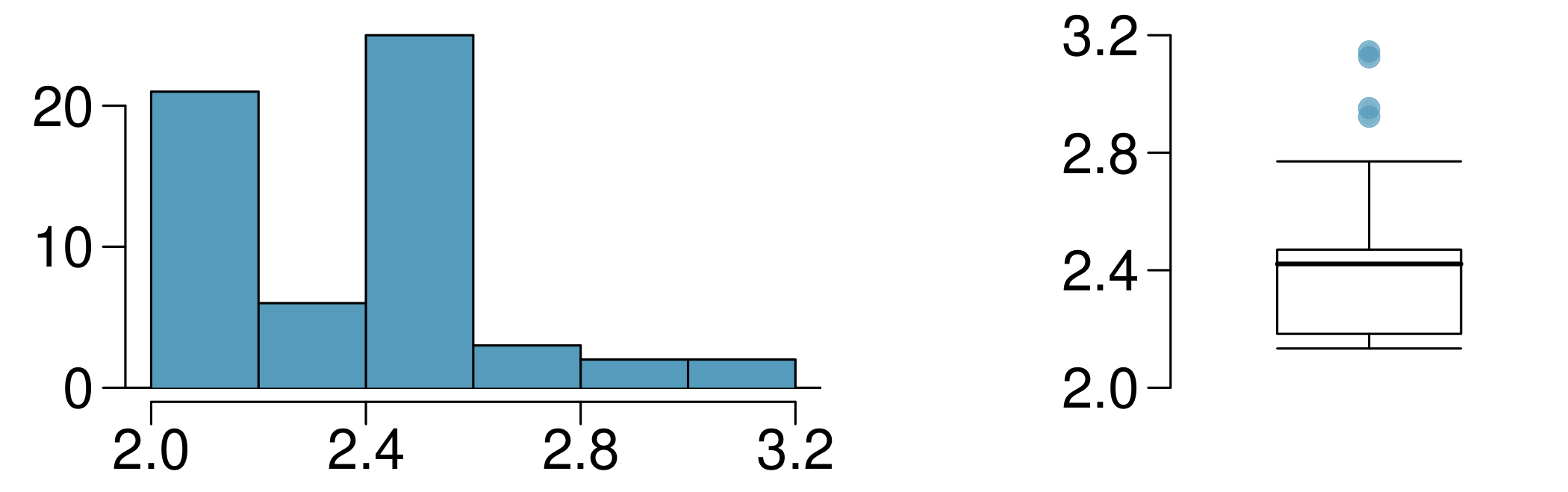
The histogram and box plots below show the distribution of finishing times in hours for male and female winners of the New York Marathon between 1970 and 1999.
Two plots are shown, one that is a histogram and one that is a box plot, where the range of data for each is from 2.0 to 3.2. The bins for the histogram are as follows: the 2.0 to 2.2 bin has a height of 21, bin 2.2 to 2.4 a height of 6, 2.4 to 2.6 a height of 25, 2.6 to 2.8 a height of 3, 2.8 to 3.0 a height of 2, and 3.0 to 3.2 a height of 2. The box plot shows the box spanning 2.2 to 2.5, with the median line centered at 2.4. The whiskers extend from about 2.15 to 2.75. There are four points marked beyond the upper whisker at 2.9, 3.0, 3.10, and 3.15.
Figure 2.4.3. Marathon finishing times histogram and box plot
  1. What features of the distribution are apparent in the histogram and not the box plot? What features are apparent in the box plot but not in the histogram?
  2. What may be the reason for the bimodal distribution? Explain.
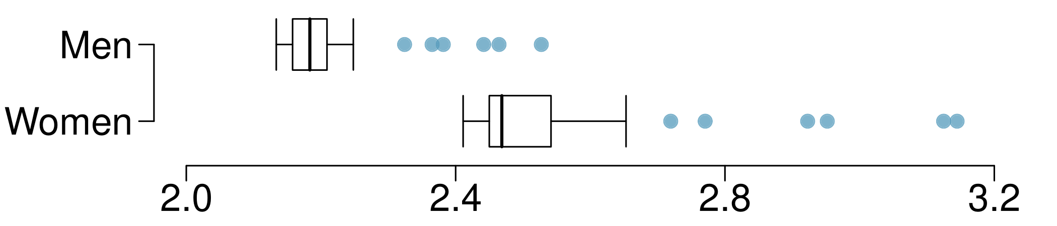
  3. Compare the distribution of marathon times for men and women based on the box plot shown below.
    A side-by-side box plot is shown for marathon run times, one box plot for men and one for women. The axis for the run times spans from 2.0 to 3.2. All values described as follows are estimates. For the men box plot, the box spans 2.16 to 2.22 with the median line at 2.19. The whiskers span to 2.12 up to 2.27. There are 6 points above the upper whisker at 2.32, 2.36, 2.38, 2.44, 2.46, and 2.50. For the women box plot, the box spans from 2.44 to 2.52, with a median value of 2.46. The whiskers span from 2.41 to 2.57. There are 6 points above the upper whisker: 2.72, 2.78, 2.9, 2.92, 3.12, and 3.15.
    Figure 2.4.4. Marathon times by gender
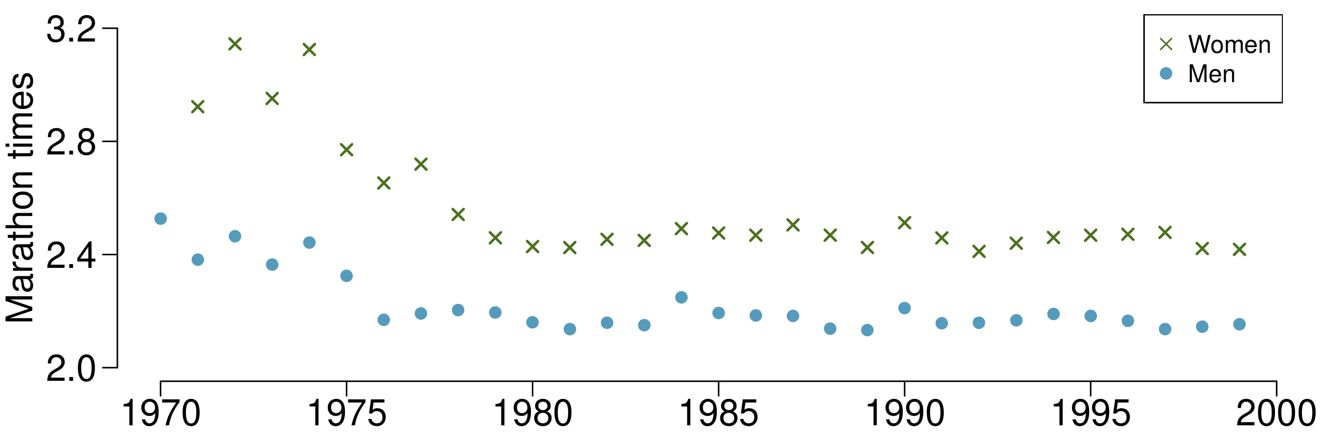
  4. The time series plot shown below is another way to look at these data. Describe what is visible in this plot but not in the others.
    A time series plot is shown, which in this case gives the appearance of a scatterplot. The horizontal variable is for year, which runs from 1970 to 2000, and the vertical variable is "Marathon times", which runs from 2.0 to 3.2 hours. There are two colors of points, one for men and one for women, and there is one point for men and one for women for each year. The points start at about 2.5 for men in 1970 and 2.9 for women in 1971. The points bounce around for a few years and then decline in 1975 or 1976 to 2.2 for men and 2.7 for women. The values for women decrease for a few more years to about 2.5. For the remainder of the years, the values fluctuate up or down 0.1 hours from year to year but are stable until 1999, which is the last year of data provided.
    Figure 2.4.5. Marathon times over time