Introductory Statistics

Section 8.2 Least squares regression

Fitting linear models by eye is open to criticism since it is based on an individual’s preference. In this section, we use least squares regression as a more rigorous approach.

Subsection 8.2.1 Gift aid for freshman at Elmhurst College

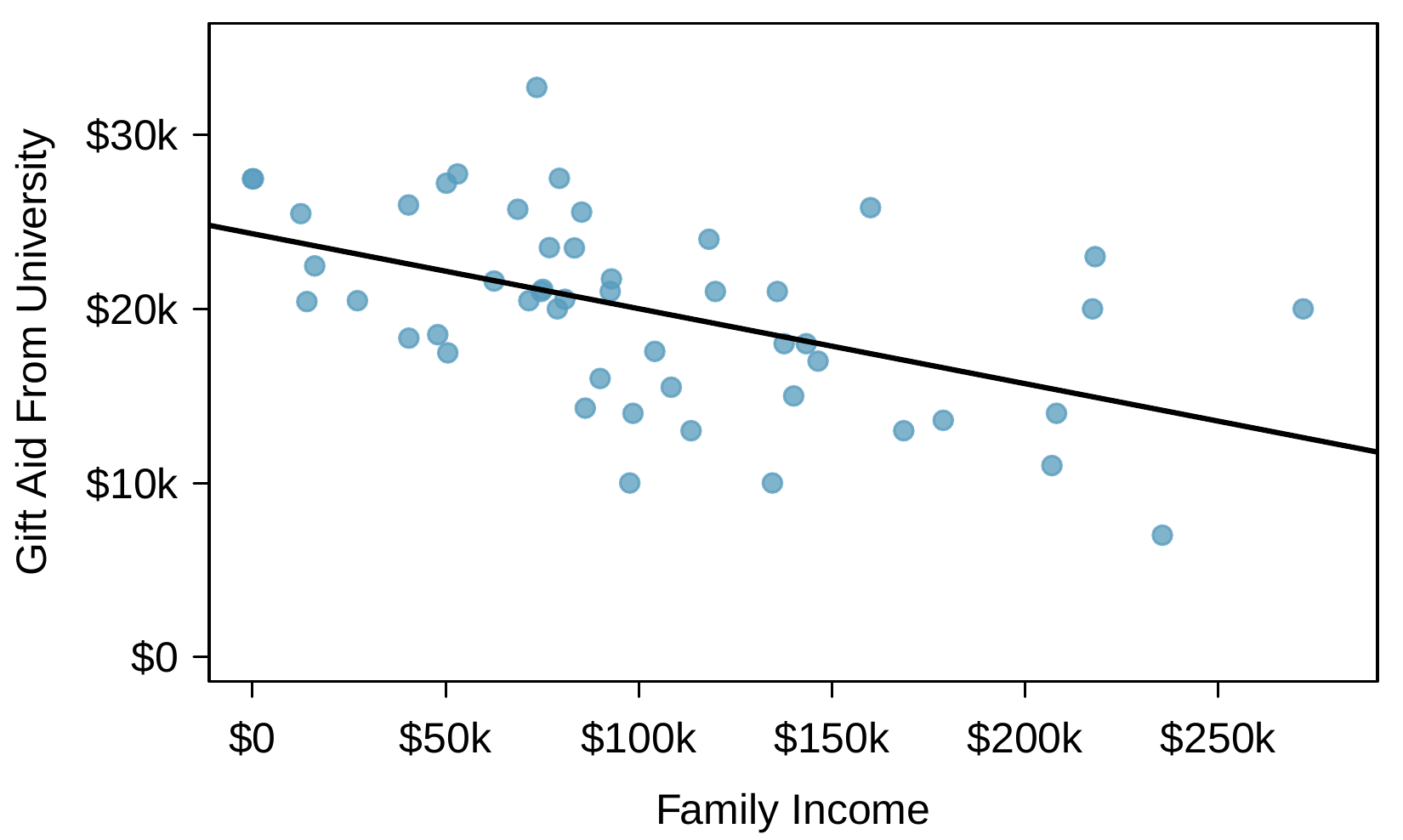
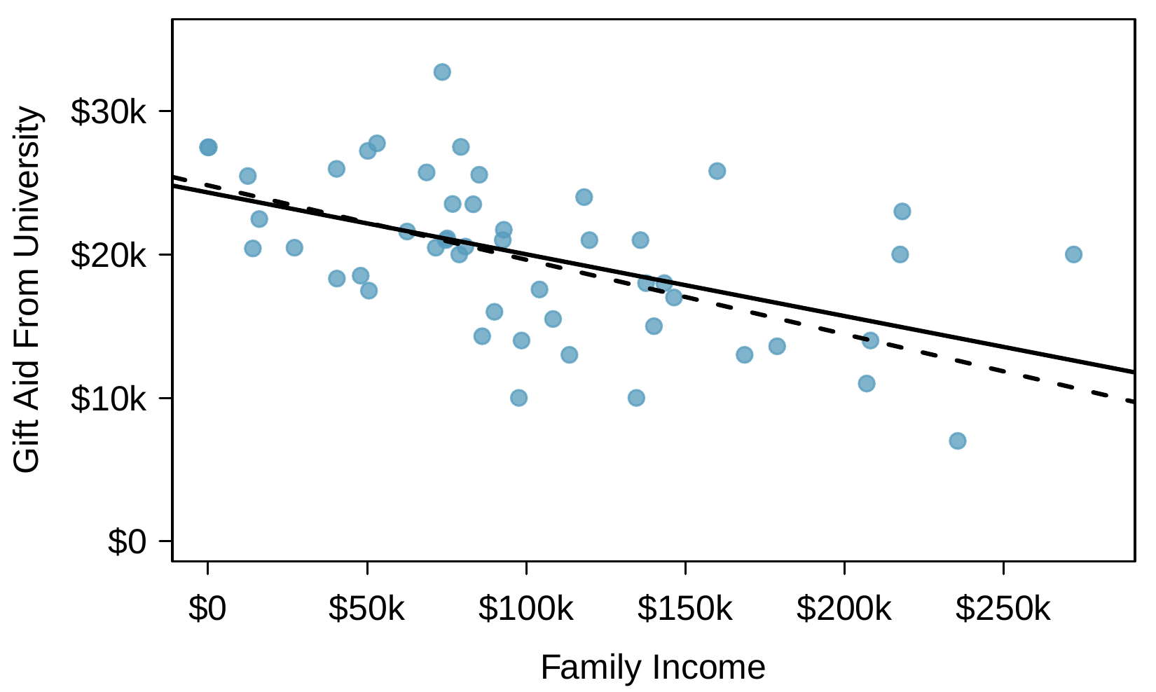
This section considers family income and gift aid data from a random sample of fifty students in the freshman class of Elmhurst College in Illinois. Gift aid is financial aid that does not need to be paid back, as opposed to a loan. A scatterplot of the data is shown in Figure 8.2.1 along with two linear fits. The lines follow a negative trend in the data; students who have higher family incomes tended to have lower gift aid from the university.
A scatterplot is shown for a random sample of 50 freshman students from Elmhurst College. The horizontal axis is for "family income" and has values ranging from $0 to about $300,000. The vertical axis is for "gift aid" and has values ranging from $0 to about $35,000. Two lines are fit to the data showing a slight downward trend. One of those lines is a solid line representing what is called the "least squares line". About 10 observations are shown where family income is between $0 and $50,000, and gift aid for these values is roughly between $17,000 and $28,000. About 20 observations are shown where family income is between $50,000 and $100,000, and gift aid for these values is roughly between $10,000 and $33,000. About 10 observations are shown where family income is between $100,000 and $150,000, and gift aid for these values is roughly between $9,000 and $25,000. Three observations are shown where family income is between $150,000 and $200,000, and gift aid for these values are $25,000, $12,000, and $13,000. Six more observations are shown where family income is larger than $200,000, and gift aid for these values ranges from about $7,000 to $22,000. The data in this graph will be frequently discussed throughout this section and referred to as the "Elmhurst data".
Figure 8.2.1. Gift aid and family income for a random sample of 50 freshman students from Elmhurst College. Two lines are fit to the data, the solid line being the least squares line.

Checkpoint 8.2.2.

Is the correlation positive or negative in Figure 8.2.1?
Solution.
Larger family incomes are associated with lower amounts of aid, so the correlation will be negative. Using a computer, the correlation can be computed: -0.499.
Subsection 8.2.2 An objective measure for finding the best line

We begin by thinking about what we mean by “best”. Mathematically, we want a line that has small residuals. The first option that may come to mind is to minimize the sum of the residual magnitudes:
\begin{equation*} |e_1| + |e_2| + \dots + |e_n| \end{equation*}
which we could accomplish with a computer program. The resulting dashed line shown in Figure 8.2.1 demonstrates this fit can be quite reasonable. However, a more common practice is to choose the line that minimizes the sum of the squared residuals:
\begin{equation*} e_{1}^2 + e_{2}^2 + \dots + e_{n}^2 \end{equation*}
The line that minimizes this least squares criterion is represented as the solid line in Figure 8.2.1. This is commonly called the least squares line. The following are three possible reasons to choose this option instead of trying to minimize the sum of residual magnitudes without any squaring:
  1. It is the most commonly used method.
  2. Computing the least squares line is widely supported in statistical software.
  3. In many applications, a residual twice as large as another residual is more than twice as bad. For example, being off by 4 is usually more than twice as bad as being off by 2. Squaring the residuals accounts for this discrepancy.
The first two reasons are largely for tradition and convenience; the last reason explains why the least squares criterion is typically most helpful.
 1 
There are applications where the sum of residual magnitudes may be more useful, and there are plenty of other criteria we might consider. However, this book only applies the least squares criterion.

Subsection 8.2.3 Conditions for the least squares line

When fitting a least squares line, we generally require
Linearity
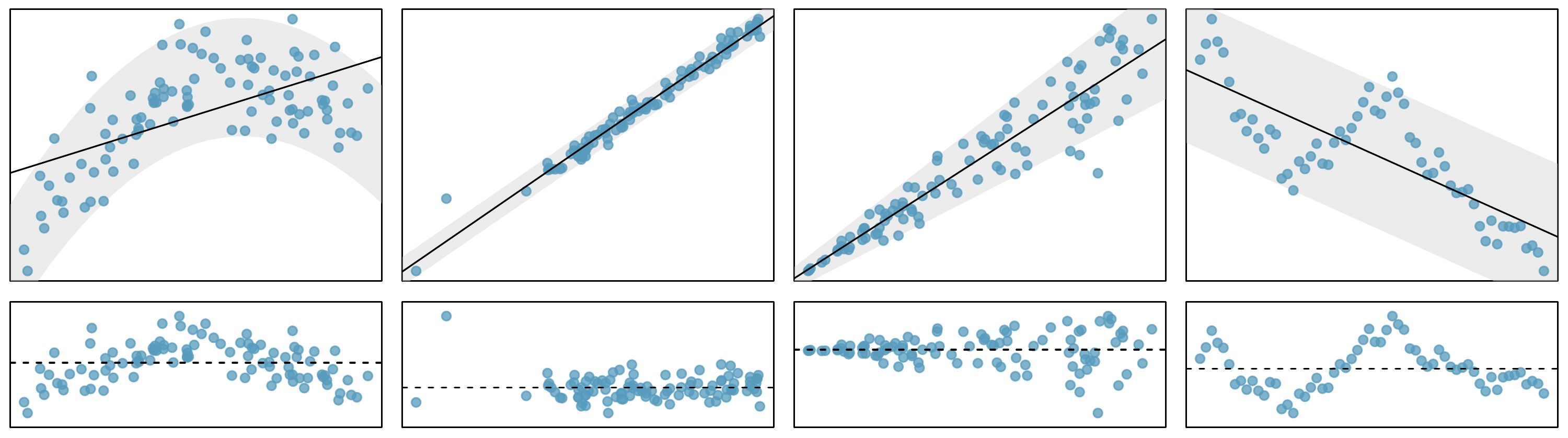
The data should show a linear trend. If there is a nonlinear trend (e.g. left panel of Figure 8.2.3), an advanced regression method from another book or later course should be applied.
Nearly normal residuals
Generally, the residuals must be nearly normal. When this condition is found to be unreasonable, it is usually because of outliers or concerns about influential points, which we’ll talk about more in Section 8.3. An example of a residual that would be a potential concern is shown in Figure 8.2.3, where one observation is clearly much further from the regression line than the others.
Constant variability
The variability of points around the least squares line remains roughly constant. An example of non-constant variability is shown in the third panel of Figure 8.2.3, which represents the most common pattern observed when this condition fails: the variability of \(y\) is larger when \(x\) is larger.
Independent observations
Be cautious about applying regression to time series data, which are sequential observations in time such as a stock price each day. Such data may have an underlying structure that should be considered in a model and analysis. An example of a data set where successive observations are not independent is shown in the fourth panel of Figure 8.2.3. There are also other instances where correlations within the data are important, which is further discussed in Chapter 9.
Four scatterplots are shown, each with their own residual plot. These four examples show when methods in this chapter are insufficient to apply to the data. In the first set, a scatterplot with arch-shaped data is shown with a straight line fit to the data, which poorly fits the curved nature of the data; this is meant to highlight an example where "linearity" fails. In the second set, a set of data with a line fit is shown, where the data tightly pack around the line, except one point in particular that is far from the line and represents the case where there are "extreme outliers" in the data. The third set shows a case where a straight line fits the data, but the variability around the line changes, where observations tend to be quite close to the line on the left, but when looking further right, the observations tend to be increasingly far from the line, indicating "changing variability" in the residuals over different regions of the plot. The fourth set provides another case of what is called "time series" data, which is a context where "successive observations are correlated".
Figure 8.2.3. Four examples showing when the methods in this chapter are insufficient to apply to the data. First panel: linearity fails. Second panel: there are outliers, most especially one point that is very far away from the line. Third panel: the variability of the errors is related to the value of \(x\text{.}\) Fourth panel: a time series data set is shown, where successive observations are highly correlated.

Checkpoint 8.2.4.

Should we have concerns about applying least squares regression to the Elmhurst data in Figure 8.2.1?
Solution.
The trend appears to be linear, the data fall around the line with no obvious outliers, the variance is roughly constant. These are also not time series observations. Least squares regression can be applied to these data.

Subsection 8.2.4 Finding the least squares line

For the Elmhurst data, we could write the equation of the least squares regression line as
\begin{equation*} \widehat{\text{aid}} = \beta_0 + \beta_{1}\times \text{family\_income} \end{equation*}
Here the equation is set up to predict gift aid based on a student’s family income, which would be useful to students considering Elmhurst. These two values, \(\beta_0\) and \(\beta_1\text{,}\) are the parameters of the regression line.
As in Chapters 4, 5, and 6, the parameters are estimated using observed data. In practice, this estimation is done using a computer in the same way that other estimates, like a sample mean, can be estimated using a computer or calculator. However, we can also find the parameter estimates by applying two properties of the least squares line:
  • The slope of the least squares line can be estimated by
    \begin{equation*} b_1 = \frac{s_y}{s_x} R \end{equation*}
    where \(R\) is the correlation between the two variables, and \(s_x\) and \(s_y\) are the sample standard deviations of the explanatory variable and response, respectively.
  • If \(\bar{x}\) is the sample mean of the explanatory variable and \(\bar{y}\) is the sample mean of the vertical variable, then the point \((\bar{x}, \bar{y})\) is on the least squares line.
    Figure 8.2.5 shows the sample means for the family income and gift aid as $101,780 and $19,940, respectively. We could plot the point (101.8, 19.94) on Figure 8.2.1 to verify it falls on the least squares line (the solid line).
Next, we formally find the point estimates \(b_0\) and \(b_1\) of the parameters \(\beta_0\) and \(\beta_1\text{.}\)
Family Income (\(x\)) Gift Aid (\(y\))
mean \(\bar{x} = \$101,780\) \(\bar{y} = \$19,940\)
sd \(s_x = \$63,200\) \(s_y = \$5,460\)
\(R = -0.499\)
Figure 8.2.5. Summary statistics for family income and gift aid.

Checkpoint 8.2.6.

Using the summary statistics in Figure 8.2.5, compute the slope for the regression line of gift aid against family income.
Solution.
Compute the slope using the summary statistics from Figure 8.2.5:
\begin{align*} b_1 \amp = \frac{s_y}{s_x} R\\ \amp = \frac{5,460}{63,200}(-0.499)\\ \amp = -0.0431 \end{align*}
You might recall the point-slope form of a line from math class, which we can use to find the model fit, including the estimate of \(b_0\text{.}\) Given the slope of a line and a point on the line, \((x_0, y_0)\text{,}\) the equation for the line can be written as
\begin{equation*} y - y_0 = \text{slope}\times (x - x_0) \end{equation*}

Identifying the least squares line from summary statistics.

To identify the least squares line from summary statistics:
  • Estimate the slope parameter, \(b_1 = (s_y / s_x) R\text{.}\)
  • Noting that the point \((\bar{x}, \bar{y})\) is on the least squares line, use \(x_0 = \bar{x}\) and \(y_0 = \bar{y}\) with the point-slope equation: \(y - \bar{y} = b_1 (x - \bar{x})\text{.}\)
  • Simplify the equation, which would reveal that \(b_0 = \bar{y} - b_1 \bar{x}\text{.}\)

Example 8.2.7.

Using the point (101780, 19940) from the sample means and the slope estimate \(b_1 = -0.0431\) from Checkpoint 8.2.6, find the least-squares line for predicting aid based on family income.
Solution.
Apply the point-slope equation using (101.78, 19.94) and the slope \(b_1 = -0.0431\text{:}\)
\begin{align*} y - y_0 \amp = b_1 (x - x_0)\\ y - 19,940 \amp = -0.0431(x - 101,780) \end{align*}
Expanding the right side and then adding 19,940 to each side, the equation simplifies:
\begin{equation*} \widehat{\text{aid}} = 24,327 - 0.0431 \times \text{family\_income} \end{equation*}
Here we have replaced \(y\) with \(\widehat{\text{aid}}\) and \(x\) with family_income to put the equation in context. The final equation should always include a “hat” on the variable being predicted, whether it is a generic “\(y\)” or a named variable like “\(\text{aid}\)”.
A computer is usually used to compute the least squares line, and a summary table generated using software for the Elmhurst regression line is shown in Figure 8.2.8. The first column of numbers provides estimates for \({b}_0\) and \({b}_1\text{,}\) respectively. These results match those from Example 8.2.7 (with some minor rounding error).
Estimate Std. Error t value Pr(\(>\)\(|\)t\(|\))
(Intercept) 24319.3 1291.5 18.83 \(\lt\)0.0001
family_income -0.0431 0.0108 -3.98 0.0002
Figure 8.2.8. Summary of least squares fit for the Elmhurst data. Compare the parameter estimates in the first column to the results of Example 8.2.7.

Example 8.2.9.

Examine the second, third, and fourth columns in Figure 8.2.8. Can you guess what they represent? (If you have not reviewed any inference chapter yet, skip this example.)
Solution.
We’ll describe the meaning of the columns using the second row, which corresponds to \(\beta_1\text{.}\) The first column provides the point estimate for \(\beta_1\text{,}\) as we calculated in an earlier example: \(b_1 = -0.0431\text{.}\) The second column is a standard error for this point estimate: \(SE_{b_1} = 0.0108\text{.}\) The third column is a \(t\)-test statistic for the null hypothesis that \(\beta_1 = 0\text{:}\) \(T = -3.98\text{.}\) The last column is the p-value for the \(t\)-test statistic for the null hypothesis \(\beta_1 = 0\) and a two-sided alternative hypothesis: 0.0002. We will get into more of these details in Section 8.4.

Example 8.2.10.

Suppose a high school senior is considering Elmhurst College. Can she simply use the linear equation that we have estimated to calculate her financial aid from the university?
Solution.
She may use it as an estimate, though some qualifiers on this approach are important. First, the data all come from one freshman class, and the way aid is determined by the university may change from year to year. Second, the equation will provide an imperfect estimate. While the linear equation is good at capturing the trend in the data, no individual student’s aid will be perfectly predicted.

Subsection 8.2.5 Interpreting regression model parameter estimates

Interpreting parameters in a regression model is often one of the most important steps in the analysis.

Example 8.2.11.

The intercept and slope estimates for the Elmhurst data are \(b_0 = 24,319\) and \(b_1 = -0.0431\text{.}\) What do these numbers really mean?
Solution.
Interpreting the slope parameter is helpful in almost any application. For each additional $1,000 of family income, we would expect a student to receive a net difference of \(\$1,000\times (-0.0431) = -\$43.10\) in aid on average, i.e. $43.10 less. Note that a higher family income corresponds to less aid because the coefficient of family income is negative in the model. We must be cautious in this interpretation: while there is a real association, we cannot interpret a causal connection between the variables because these data are observational. That is, increasing a student’s family income may not cause the student’s aid to drop. (It would be reasonable to contact the college and ask if the relationship is causal, i.e. if Elmhurst College’s aid decisions are partially based on students’ family income.)
The estimated intercept \(b_0 = 24,319\) describes the average aid if a student’s family had no income. The meaning of the intercept is relevant to this application since the family income for some students at Elmhurst is $0. In other applications, the intercept may have little or no practical value if there are no observations where \(x\) is near zero.

Interpreting parameters estimated by least squares.

The slope describes the estimated difference in the \(y\) variable if the explanatory variable \(x\) for a case happened to be one unit larger. The intercept describes the average outcome of \(y\) if \(x=0\) and the linear model is valid all the way to \(x=0\text{,}\) which in many applications is not the case.

Subsection 8.2.6 Extrapolation is treacherous

When those blizzards hit the East Coast this winter, it proved to my satisfaction that global warming was a fraud. That snow was freezing cold. But in an alarming trend, temperatures this spring have risen. Consider this: On February 6th it was 10 degrees. Today it hit almost 80. At this rate, by August it will be 220 degrees. So clearly folks the climate debate rages on.
―Stephen Colbert, April 6th, 2010
 2 
www.cc.com/video-clips/l4nkoq
Linear models can be used to approximate the relationship between two variables. However, these models have real limitations. Linear regression is simply a modeling framework. The truth is almost always much more complex than our simple line. For example, we do not know how the data outside of our limited window will behave.

Example 8.2.12.

Use the model \(\widehat{\text{aid}} = 24,319 - 0.0431 \times \text{family\_income}\) to estimate the aid of another freshman student whose family had income of $1 million.
Solution.
We want to calculate the aid for \(\text{family\_income} = 1,000,000\text{:}\)
\begin{align*} 24,319 - 0.0431\times \text{family\_income} \amp = 24,319 - 0.0431\times 1,000,000\\ \amp = -18,781 \end{align*}
The model predicts this student will have -$18,781 in aid (!). However, Elmhurst College does not offer negative aid where they select some students to pay extra on top of tuition to attend.
Applying a model estimate to values outside of the realm of the original data is called extrapolation. Generally, a linear model is only an approximation of the real relationship between two variables. If we extrapolate, we are making an unreliable bet that the approximate linear relationship will be valid in places where it has not been analyzed.

Subsection 8.2.7 Using \(R^2\) to describe the strength of a fit

We evaluated the strength of the linear relationship between two variables earlier using the correlation, \(R\text{.}\) However, it is more common to explain the strength of a linear fit using \(R^2\text{,}\) called R-squared. If provided with a linear model, we might like to describe how closely the data cluster around the linear fit.
A scatterplot of the Elmhurst data is shown for gift aid and family income with the least squares regression line overlaid against the data, which has a slight downward trend.
Figure 8.2.13. Gift aid and family income for a random sample of 50 freshman students from Elmhurst College, shown with the least squares regression line.
The \(R^2\) of a linear model describes the amount of variation in the response that is explained by the least squares line. For example, consider the Elmhurst data, shown in Figure 8.2.13. The variance of the response variable, aid received, is about \(s_{\text{aid}}^2 \approx 29.8\) million. However, if we apply our least squares line, then this model reduces our uncertainty in predicting aid using a student’s family income. The variability in the residuals describes how much variation remains after using the model: \(s_{_{RES}}^2 \approx 22.4\) million. In short, there was a reduction of
\begin{align*} \frac{s_{\text{aid}}^2 - s_{_{RES}}^2}{s_{\text{aid}}^2} \amp = \frac{29,800,000 - 22,400,000}{29,800,000}\\ \amp = \frac{7,500,000}{29,800,000}\\ \amp = 0.25 \end{align*}
or about 25% in the data’s variation by using information about family income for predicting aid using a linear model. This corresponds exactly to the R-squared value:
\begin{align*} R \amp = -0.499 \amp R^2 \amp = 0.25 \end{align*}

Checkpoint 8.2.14.

If a linear model has a very strong negative relationship with a correlation of -0.97, how much of the variation in the response is explained by the explanatory variable?
Solution.
About \(R^2 = (-0.97)^2 = 0.94\) or 94% of the variation is explained by the linear model.

Subsection 8.2.8 Categorical predictors with two levels

Categorical variables are also useful in predicting outcomes. Here we consider a categorical predictor with two levels (recall that a level is the same as a category). We’ll consider Ebay auctions for a video game, Mario Kart for the Nintendo Wii, where both the total price of the auction and the condition of the game were recorded. Here we want to predict total price based on game condition, which takes values used and new. A plot of the auction data is shown in Figure 8.2.15.
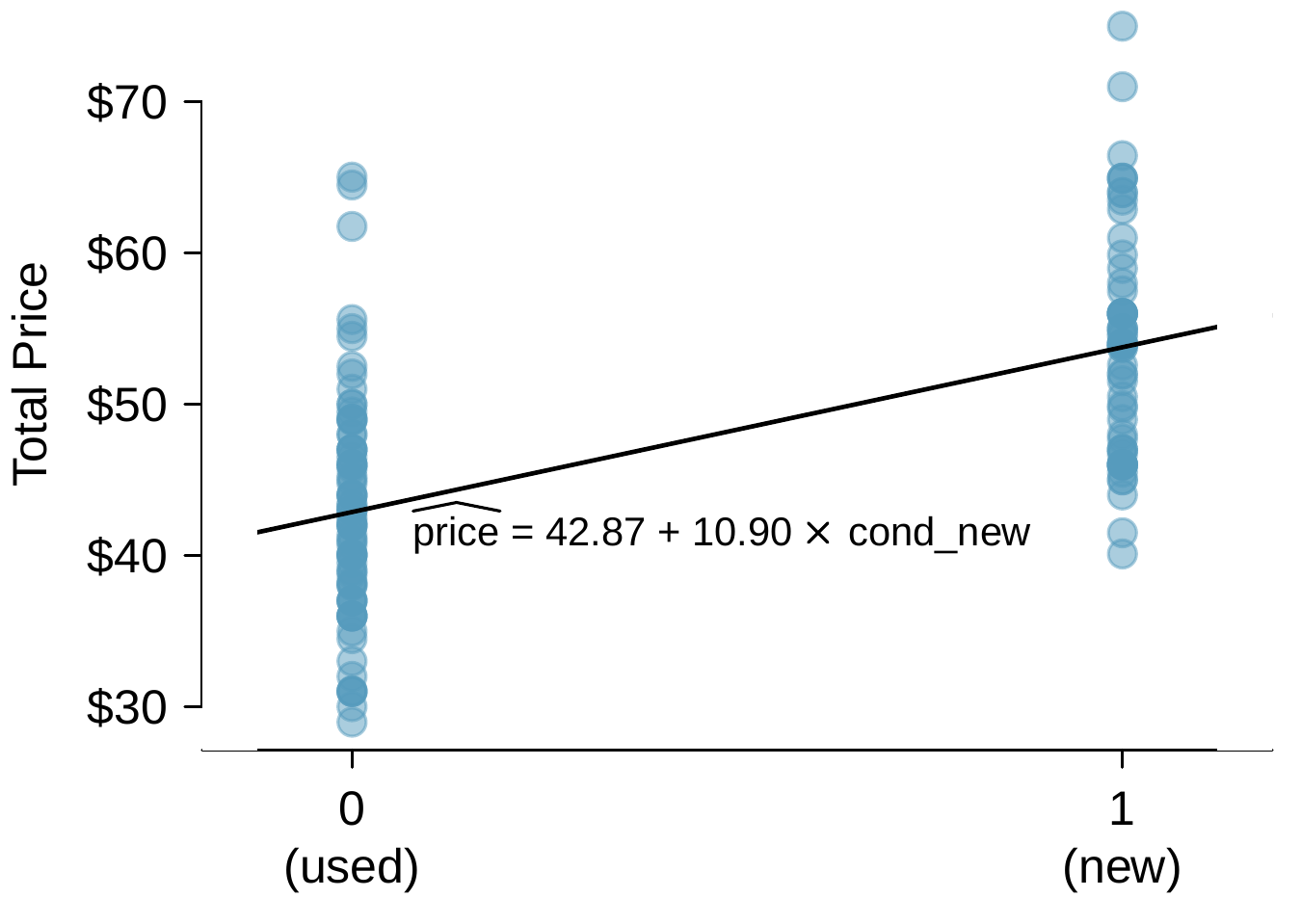
A scatterplot is shown for total auction prices for the video game "Mario Kart", broken down by condition on the horizontal axis. The prices are divided into "used" and "new" condition groups. All used games are shown with an x-value of 0 on the left, and all new games are shown with an x-value of 1 on the right of the plot. The used games on the left show a lower average price of about $43, and new games on the right show a higher average price of about $54. The least squares regression line is also shown for this scatterplot, which shows an upward trend and has a formula of "price equals 42.87 plus 10.90 times cond-subscript-new.
Figure 8.2.15. Total auction prices for the video game Mario Kart, divided into used (\(x=0\)) and new (\(x=1\)) condition games. The least squares regression line is also shown.
To incorporate the game condition variable into a regression equation, we must convert the categories into a numerical form. We will do so using an indicator variable called cond_new, which takes value 1 when the game is new and 0 when the game is used. Using this indicator variable, the linear model may be written as
\begin{equation*} \widehat{\text{price}} = \beta_0 + \beta_1 \times \text{cond\_new} \end{equation*}
The parameter estimates are given in Figure 8.2.16, and the model equation can be summarized as
\begin{equation*} \widehat{\text{price}} = 42.87 + 10.90 \times \text{cond\_new} \end{equation*}
For categorical predictors with just two levels, the linearity assumption will always be satisfied. However, we must evaluate whether the residuals in each group are approximately normal and have approximately equal variance. As can be seen in Figure 8.2.15, both of these conditions are reasonably satisfied by the auction data.
Estimate Std. Error t value Pr(\(>\)\(|\)t\(|\))
(Intercept) 42.87 0.81 52.67 \(\lt\)0.0001
cond_new 10.90 1.26 8.66 \(\lt\)0.0001
Figure 8.2.16. Least squares regression summary for the final auction price against the condition of the game.

Example 8.2.17.

Interpret the two parameters estimated in the model for the price of Mario Kart in eBay auctions.
Solution.
The intercept is the estimated price when cond_new takes value 0, i.e. when the game is in used condition. That is, the average selling price of a used version of the game is $42.87.
The slope indicates that, on average, new games sell for about $10.90 more than used games.

Interpreting model estimates for categorical predictors.

The estimated intercept is the value of the response variable for the first category (i.e. the category corresponding to an indicator value of 0). The estimated slope is the average change in the response variable between the two categories.
We’ll elaborate further on this topic in Chapter 9, where we examine the influence of many predictor variables simultaneously using multiple regression.

Exercises 8.2.9 Exercises

1. Units of regression..

Consider a regression predicting weight (kg) from height (cm) for a sample of adult males. What are the units of the correlation coefficient, the intercept, and the slope?

2. Which is higher?

Determine if I or II is higher or if they are equal. Explain your reasoning. For a regression line, the uncertainty associated with the slope estimate, \(b_1\text{,}\) is higher when
  1. there is a lot of scatter around the regression line or
  2. there is very little scatter around the regression line

3. Over-under, Part I..

Suppose we fit a regression line to predict the shelf life of an apple based on its weight. For a particular apple, we predict the shelf life to be 4.6 days. The apple’s residual is -0.6 days. Did we over or under estimate the shelf-life of the apple? Explain your reasoning.

4. Over-under, Part II..

Suppose we fit a regression line to predict the number of incidents of skin cancer per 1,000 people from the number of sunny days in a year. For a particular year, we predict the incidence of skin cancer to be 1.5 per 1,000 people, and the residual for this year is 0.5. Did we over or under estimate the incidence of skin cancer? Explain your reasoning.

5. Tourism spending..

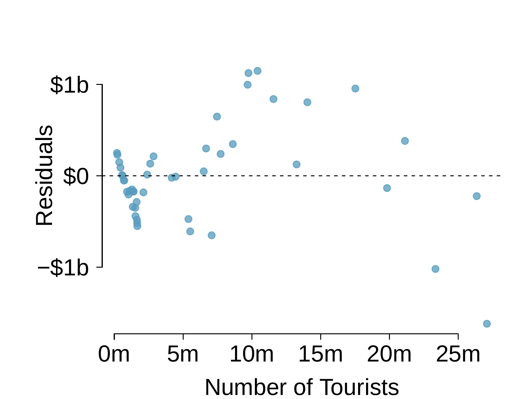
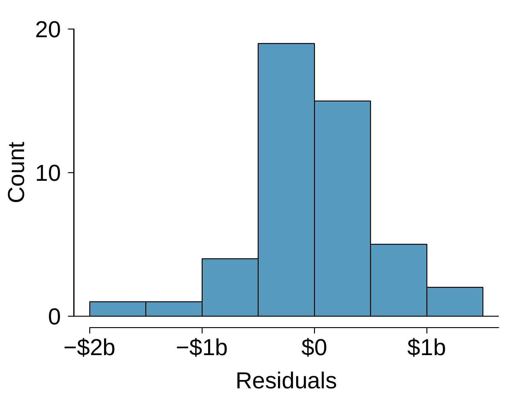
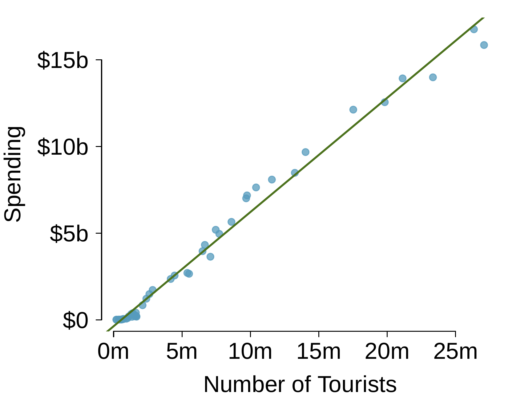
The Association of Turkish Travel Agencies reports the number of foreign tourists visiting Turkey and tourist spending by year. Three plots are provided: scatterplot showing the relationship between these two variables along with the least squares fit, residuals plot, and histogram of residuals.
A scatterplot with a least squares regression line is fit based on about 50 points. The horizontal axis represents "Number of tourists" and has values ranging from about 0 to about 27 million. The vertical axis represents "Spending, in US dollars", with values ranging from about $0 to about $17 billion. There are many points shown with the number of tourists between 0 and 5 million, which has spending between about $0 and $3 billion, where even on this small scale a roughly linear trend is evident. The linear trend continues on across the plot and is quite strong -- where residuals generally do not deviate from the least square line by more than very roughly $1 billion. The data are also more sparse for larger values in the plot. There is one region in the center of the plot where about 10 points in a row lie above the regression line. Also consider the next two plots before answering any questions for this exercise.
A residual plot is shown. The horizontal axis represents "Number of tourists" and has values ranging from about 0 to about 27 million. Residuals are shown on the vertical axis and have values ranging from about -$1.5 billion to about $1.2 billion. The points on the far left between 0 and 3 million tourists shows a "v" pattern. There are about 15 points with number of tourists between 3 million and 10 million, which shows an slight upward trend from about -$700 million to $1.2 billion. There about 10 points with number of tourists greater than 10 million up to about 27 million, and these show a slight downward trend from about $1 billion to -$1.5 billion.
A histogram is shown for the residuals, which shows a roughly bell-shaped distribution centered at 0 and a standard deviation of about $500 million.
  1. Describe the relationship between number of tourists and spending.
  2. What are the explanatory and response variables?
  3. Why might we want to fit a regression line to these data?
  4. Do the data meet the conditions required for fitting a least squares line? In addition to the scatterplot, use the residual plot and histogram to answer this question.

6. Nutrition at Starbucks, Part I..

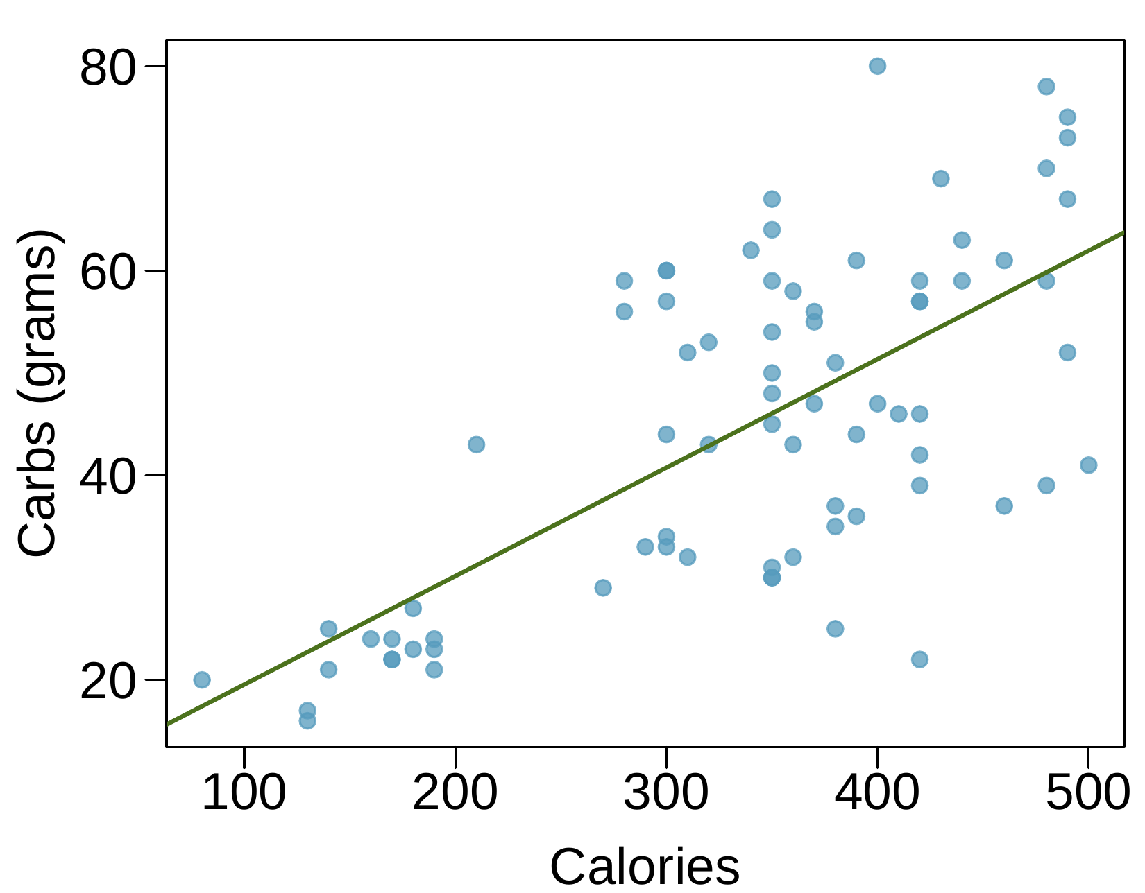
The scatterplot below shows the relationship between the number of calories and amount of carbohydrates (in grams) Starbucks food menu items contain. Since Starbucks only lists the number of calories on the display items, we are interested in predicting the amount of carbs a menu item has based on its calorie content.
A scatterplot is shown with about 75 points and an overlaid regression line that trends upward. The horizontal axis represents "Calories" and has values ranging from about 100 to 500. The vertical axis represents "Carbs, in grams" and has values ranging from about 20 to 80. About 15 points are shown with fewer than 200 calories, and these have between about 18 and 25 grams of carbs. About 30 points are shown with 200 to 400 calories, and these mostly have between 30 and 60 grams of carbs. About 20 points are shown with more than 400 calories, and these mostly have between 35 and 80 grams of carbs.
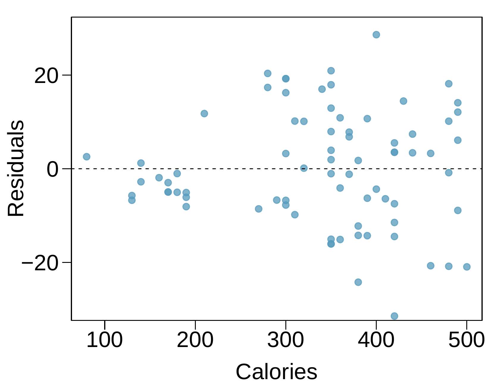
A residual plot is shown with about 75 points. The horizontal axis represents "Calories" and has values ranging from about 100 to 500. The vertical axis represents "Residuals" and has values ranging from about -30 to 30. About 15 points are shown with fewer than 200 calories, and these have residuals roughly between -7 and positive 2. About 30 points are shown with 200 to 400 calories, and these residuals largely range from about -15 to positive 15. About 20 points are shown with more than 400 calories, and the residuals for these points mostly range between -20 and positive 20.
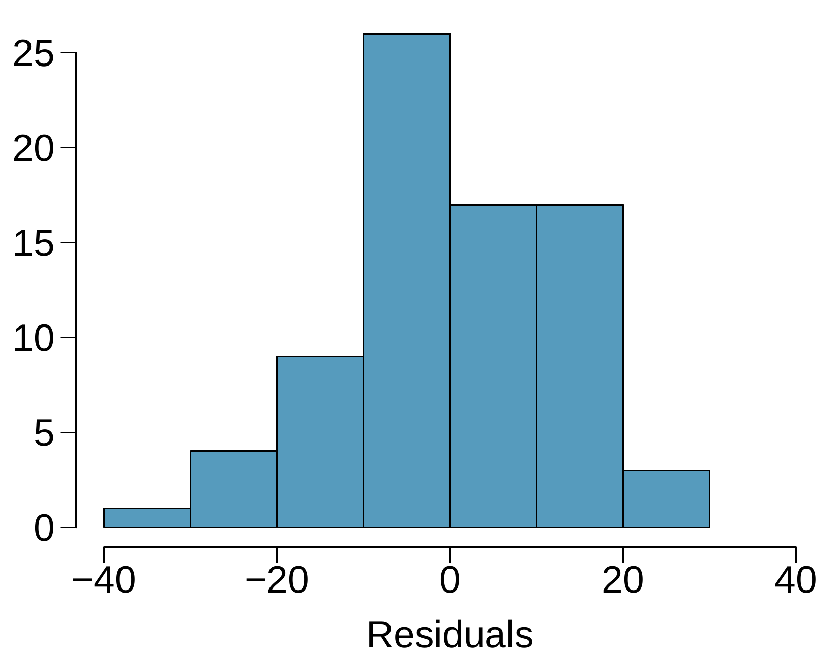
A histogram is shown for the residuals, which shows a roughly bell-shaped distribution centered at 0 and a standard deviation of about 10.
  1. Describe the relationship between number of calories and amount of carbohydrates (in grams) that Starbucks food menu items contain.
  2. In this scenario, what are the explanatory and response variables?
  3. Why might we want to fit a regression line to these data?
  4. Do these data meet the conditions required for fitting a least squares line?

7. The Coast Starlight, Part II..

An earlier exercise introduces data on the Coast Starlight Amtrak train that runs from Seattle to Los Angeles. The mean travel time from one stop to the next on the Coast Starlight is 129 minutes, with a standard deviation of 113 minutes. The mean distance traveled from one stop to the next is 108 miles with a standard deviation of 99 miles. The correlation between travel time and distance is 0.636.
  1. Write the equation of the regression line for predicting travel time.
  2. Interpret the slope and the intercept in this context.
  3. Calculate \(R^2\) of the regression line for predicting travel time from distance traveled for the Coast Starlight, and interpret \(R^2\) in the context of the application.
  4. The distance between Santa Barbara and Los Angeles is 103 miles. Use the model to estimate the time it takes for the Starlight to travel between these two cities.
  5. It actually takes the Coast Starlight about 168 minutes to travel from Santa Barbara to Los Angeles. Calculate the residual and explain the meaning of this residual value.
  6. Suppose Amtrak is considering adding a stop to the Coast Starlight 500 miles away from Los Angeles. Would it be appropriate to use this linear model to predict the travel time from Los Angeles to this point?

8. Body measurements, Part III..

An earlier exercise introduces data on shoulder girth and height of a group of individuals. The mean shoulder girth is 107.20 cm with a standard deviation of 10.37 cm. The mean height is 171.14 cm with a standard deviation of 9.41 cm. The correlation between height and shoulder girth is 0.67.
  1. Write the equation of the regression line for predicting height.
  2. Interpret the slope and the intercept in this context.
  3. Calculate \(R^2\) of the regression line for predicting height from shoulder girth, and interpret it in the context of the application.
  4. A randomly selected student from your class has a shoulder girth of 100 cm. Predict the height of this student using the model.
  5. The student from part (d) is 160 cm tall. Calculate the residual, and explain what this residual means.
  6. A one-year-old has a shoulder girth of 56 cm. Would it be appropriate to use this linear model to predict the height of this child?

9. Murders and poverty, Part I..

The following regression output is for predicting annual murders per million from percentage living in poverty in a random sample of 20 metropolitan areas.
Estimate Std. Error t value Pr(\(>\)\(|\)t\(|\))
(Intercept) -29.901 7.789 -3.839 0.001
poverty% 2.559 0.390 6.562 0.000
\(s = 5.512 \quad R^2 = 70.52\% \quad R^2_{\text{adj}} = 68.89\%\)
  1. Write out the linear model.
  2. Interpret the intercept.
  3. Interpret the slope.
  4. Interpret \(R^2\text{.}\)
  5. Calculate the correlation coefficient.
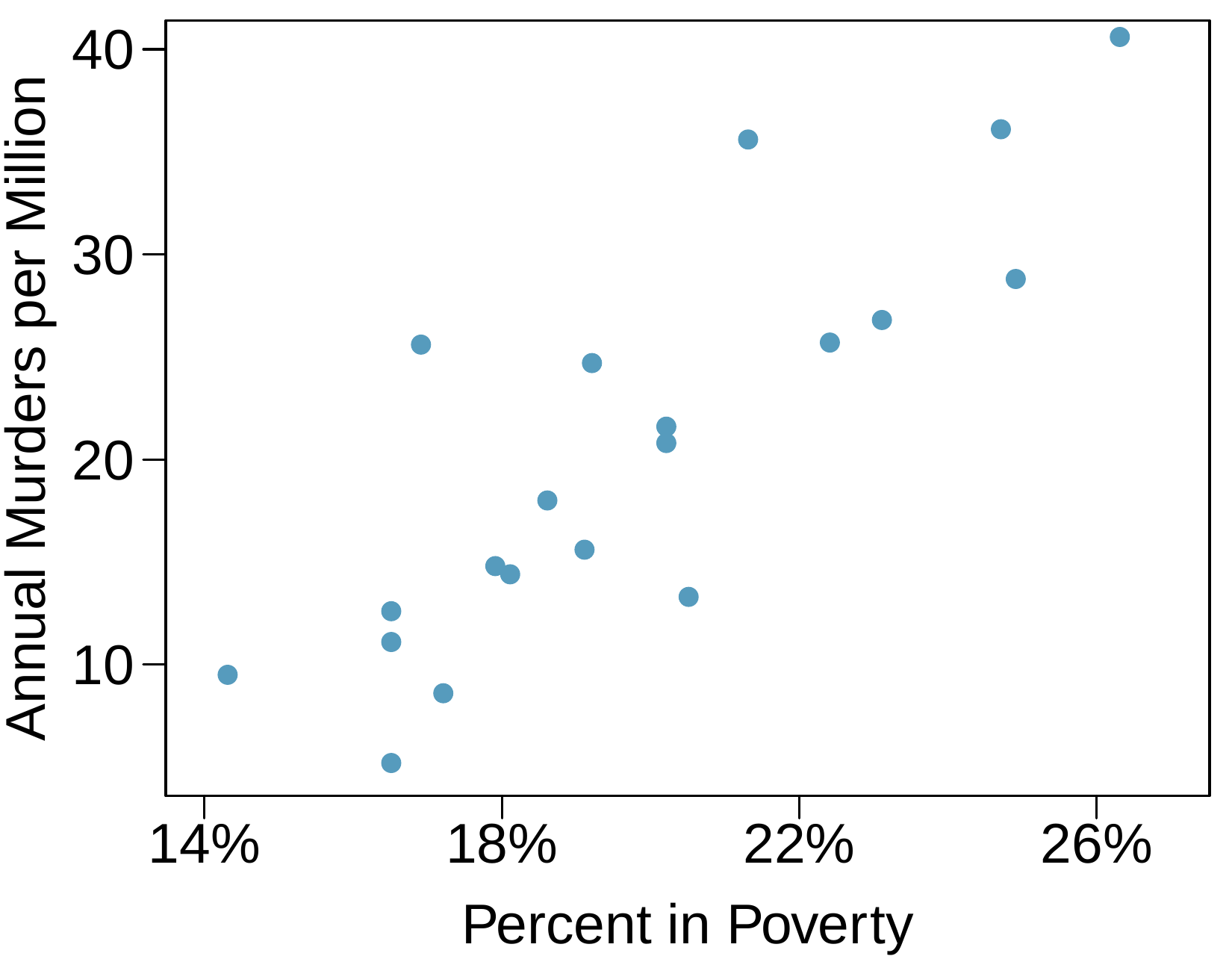
A scatterplot is shown with 20 points. The horizontal axis is "Percent in Poverty" and has values ranging from 14% to 26%. The vertical axis is "Annual Murders per Million" with values ranging from about 5 to 40. There are 6 points with poverty below 18%, and the Murder Rate for these values ranges from 5 to 13, with one exception of a point at about 17% with a murder rate of about 25. There are 9 points with a poverty rate of 18% to 22%, and the murder rate for these points largely range from 14 to 25, with one exception of a point at about 21% poverty and a murder rate of 35. There are 5 points where poverty is larger than 22%, and these have murder rates ranging from 25 to 40.

10. Cats, Part I..

The following regression output is for predicting the heart weight (in g) of cats from their body weight (in kg). The coefficients are estimated using a dataset of 144 domestic cats.
Estimate Std. Error t value Pr(\(>\)\(|\)t\(|\))
(Intercept) -0.357 0.692 -0.515 0.607
body wt 4.034 0.250 16.119 0.000
\(s = 1.452 \quad R^2 = 64.66\% \quad R^2_{\text{adj}} = 64.41\%\)
  1. Write out the linear model.
  2. Interpret the intercept.
  3. Interpret the slope.
  4. Interpret \(R^2\text{.}\)
  5. Calculate the correlation coefficient.
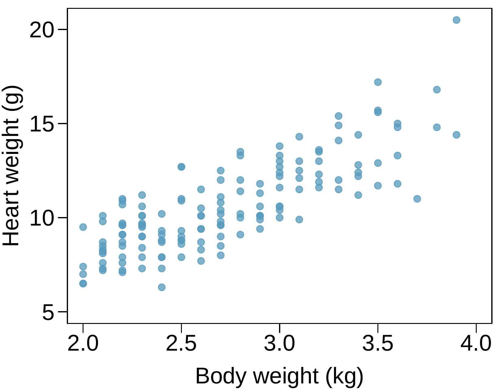
A scatterplot is shown with about 150 points. The horizontal axis is "Body weight, in kilograms" and has values ranging from 2 to 4. The vertical axis is "Heart weight, in grams" with values ranging from about 5 to 20. About 25% of the data has a body weight below 2.5 kilograms, and these have heart weights mostly ranging from 7 to 11 grams. About 35% of the data has body weights between 2.5 and 3 kilograms, and the heart weight for these values mostly ranges from 8 to 12 grams. About 30% of the data has body weights between 3 and 3.5 kilograms, and the heart weight for these values mostly ranges from 11 to 15 grams. About 10% of the data has body weights above 3.5 kilograms, and the heart weight for these values mostly ranges from 12 to 17 grams.