Introductory Statistics

Section 8.3 Types of outliers in linear regression

In this section, we identify criteria for determining which outliers are important and influential. Outliers in regression are observations that fall far from the cloud of points. These points are especially important because they can have a strong influence on the least squares line.

Example 8.3.1.

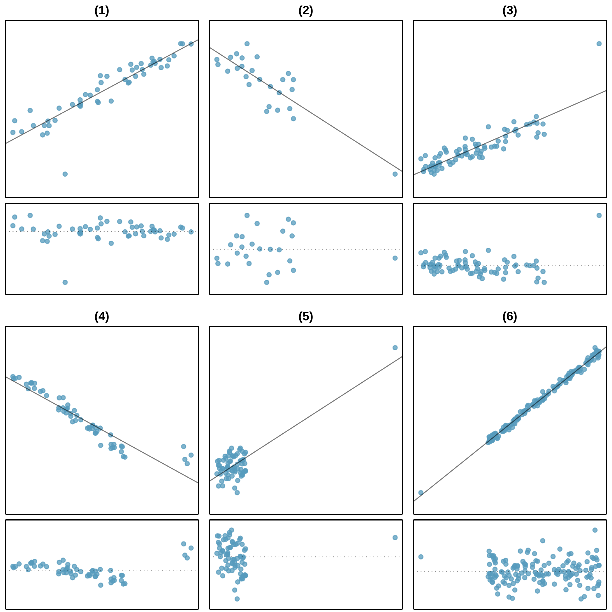
There are six plots shown in Figureย 8.3.2 along with the least squares line and residual plots. For each scatterplot and residual plot pair, identify the outliers and note how they influence the least squares line. Recall that an outlier is any point that doesnโ€™t appear to belong with the vast majority of the other points.
Solution.
  1. There is one outlier far from the other points, though it only appears to slightly influence the line.
  2. There is one outlier on the right, though it is quite close to the least squares line, which suggests it wasnโ€™t very influential.
  3. There is one point far away from the cloud, and this outlier appears to pull the least squares line up on the right; examine how the line around the primary cloud doesnโ€™t appear to fit very well.
  4. There is a primary cloud and then a small secondary cloud of four outliers. The secondary cloud appears to be influencing the line somewhat strongly, making the least square line fit poorly almost everywhere. There might be an interesting explanation for the dual clouds, which is something that could be investigated.
  5. There is no obvious trend in the main cloud of points and the outlier on the right appears to largely control the slope of the least squares line.
  6. There is one outlier far from the cloud. However, it falls quite close to the least squares line and does not appear to be very influential.
Six scatterplots, each with a least squares line and residual plot. All data sets have at least one outlier. (1) A clear positive upward trend is evident in the points with a regression line overlaying these points, but one point is shown deviating substantially from the line about one-third of the way from the left side of the plot and far below the other points. (2) A slight downward trend is evident in the points on the left half of the plot with a regression line overlaying these points and extending to a single point on the far right of the plot that is also very close to the regression line. (3) A positive upward trend is evident for points shown on the left two-thirds of the plot with a regression line overlaying these points, but a single point is shown on the far right and lying substantially above the line. This one point appears to be "pulling" the regression line up on the right, making the line fit the rest of the data less well. (4) Most of the data is shown in the left two-thirds of the plot with a clear downward, linear trend. A cluster of 4 points is shown on the far right but deviating notably above the trend of the other points. The regression line fit to the data shows it largely "trying" to fit the bulk of the data on the left but being "pulled" upward on the right towards the cluster of points deviating from the linear trend. (5) A large cluster of points is shown on the far bottom-left, and there is no apparent trend in this large cluster. A single point is shown on the far upper-right. A regression line is fit to the data with a line extending from the cluster on the bottom-left and trending upwards near the single point on the upper right. (6) A clear downward trend is evident in the points on the right two-thirds of the plot with a regression line overlaying these points and extending to a single point on the far left of the plot that is also very close to the regression line.
Figure 8.3.2. Six plots, each with a least squares line and residual plot. All data sets have at least one outlier.
Examine the residual plots in Figureย 8.3.2. You will probably find that there is some trend in the main clouds of (3) and (4). In these cases, the outliers influenced the slope of the least squares lines. In (5), data with no clear trend were assigned a line with a large trend simply due to one outlier (!).

Leverage.

Points that fall horizontally away from the center of the cloud tend to pull harder on the line, so we call them points with high leverage.
Points that fall horizontally far from the line are points of high leverage; these points can strongly influence the slope of the least squares line. If one of these high leverage points does appear to actually invoke its influence on the slope of the lineโ€”as in cases (3), (4), and (5) of Exampleย 8.3.1โ€”then we call it an influential point. Usually we can say a point is influential if, had we fitted the line without it, the influential point would have been unusually far from the least squares line.
It is tempting to remove outliers. Donโ€™t do this without a very good reason. Models that ignore exceptional (and interesting) cases often perform poorly. For instance, if a financial firm ignored the largest market swingsโ€”the โ€œoutliersโ€โ€”they would soon go bankrupt by making poorly thought-out investments.

Exercises Section Exercises

1. Outliers, Part I.

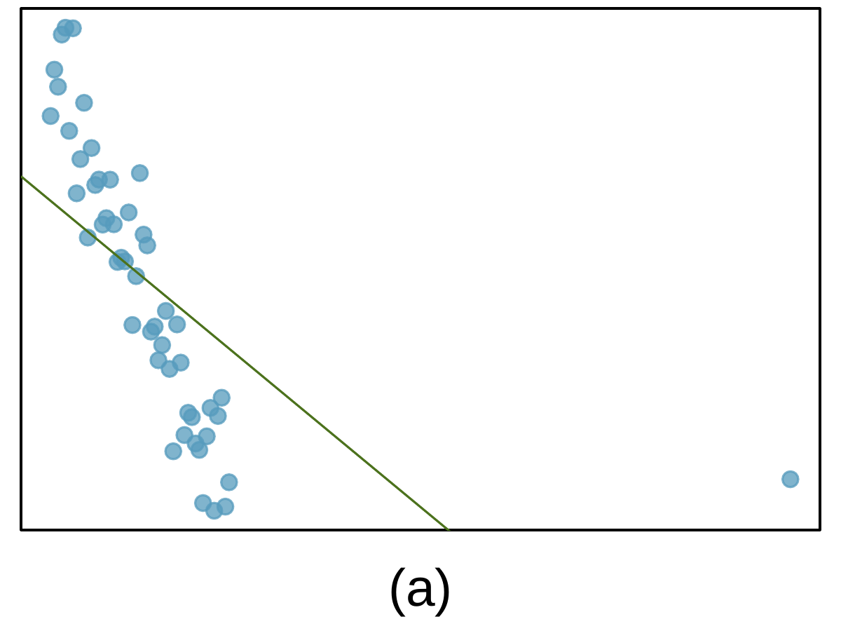
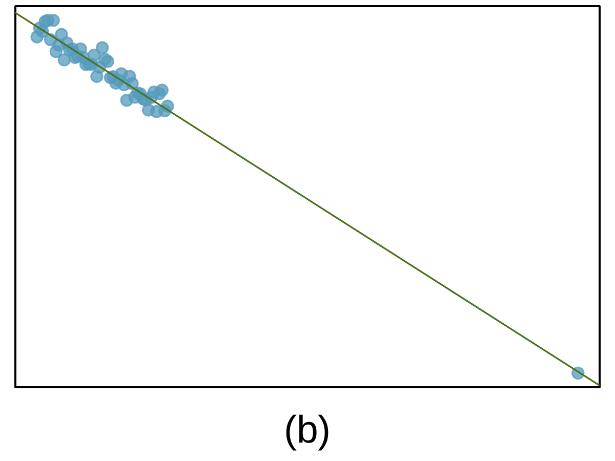
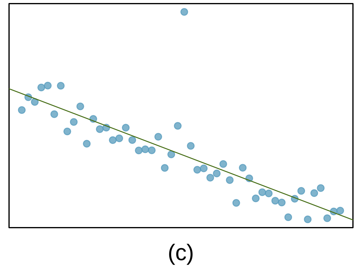
Identify the outliers in the scatterplots shown below, and determine what type of outliers they are. Explain your reasoning.
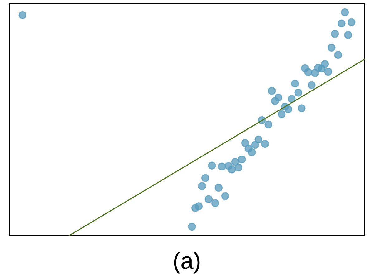
Most of the data is shown in the left third of the plot with a clear downward, linear trend extending from from the upper-left corner of the plot and to the bottom of the plot only a third of the way from the left side of the plot. A single point is shown on the bottom-right of the plot. A regression line is fit to the data, but it does not fit the bulk of the data well: On the furthest left portion, the line is below the points, crosses over the trend of the bulk of the data, then lies above the remainder of the bulk of the data. If it were shown fully, it would extend well below the single point on the bottom-right.
A clear downward trend is evident in the points on the left third of the plot with a regression line overlaying these points and extending to a single point on the far bottom right of the plot that is also almost exactly on the regression line.
A downward trend is evident in the bulk of the points with an overlaid regression line. A single point is shown far above the regression line at the center-top of the plot.

2. Outliers, Part II.

Identify the outliers in the scatterplots shown below and determine what type of outliers they are. Explain your reasoning.
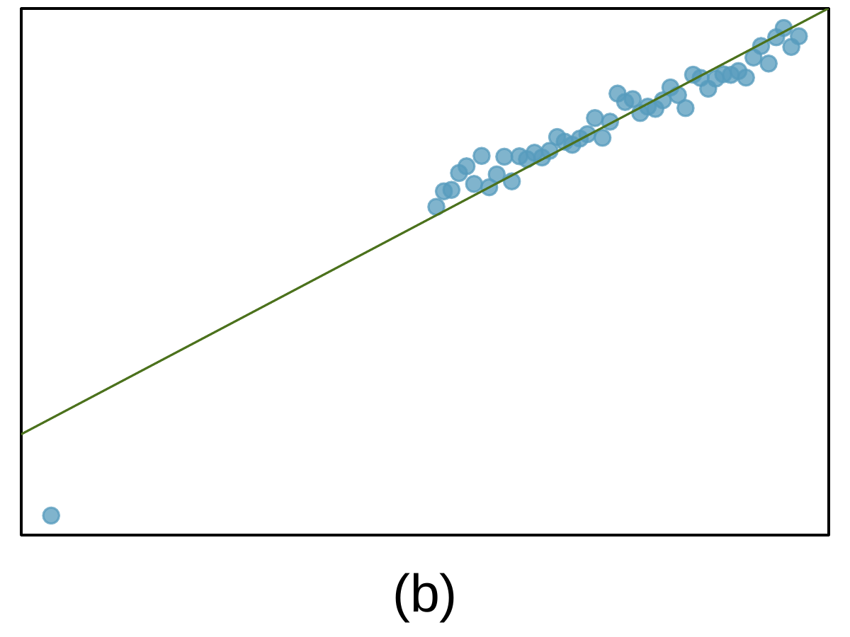
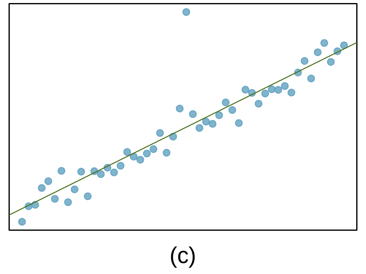
Most of the data is shown in the right half of the plot with a clear upward, linear trend extending from from the bottom-center and extending to the upper-right corner of the plot. A single point is shown on the upper-left of the plot. A regression line is fit to the data, but it does not fit the bulk of the data well: Focusing first on the bulk of points at the bottom center of the plot, the regression line is well above these points, crosses over the trend of the bulk of the data about 25% from the right of the plot, then lies below the remainder of the bulk of the data in the upper-right. If it were shown fully, the regression line would extend well below the single point on the upper-left.
A clear upward trend is evident in the points on the right half of the plot with a regression line approximately overlaying these points and extending towards a single point on the far bottom left of the plot, but the regression line is notably higher than this single point, which would have by far the largest residual (in absolute value) of all other points shown in the plot. Close inspection of the regression line fit over the bulk of points, it appears to be partially misfitting that data, "pulled" down on the left side.
An upper trend is evident in the bulk of the points with an overlaid regression line. A single point is shown far above the regression line at the center-top of the plot.

3. Urban homeowners, Part I.

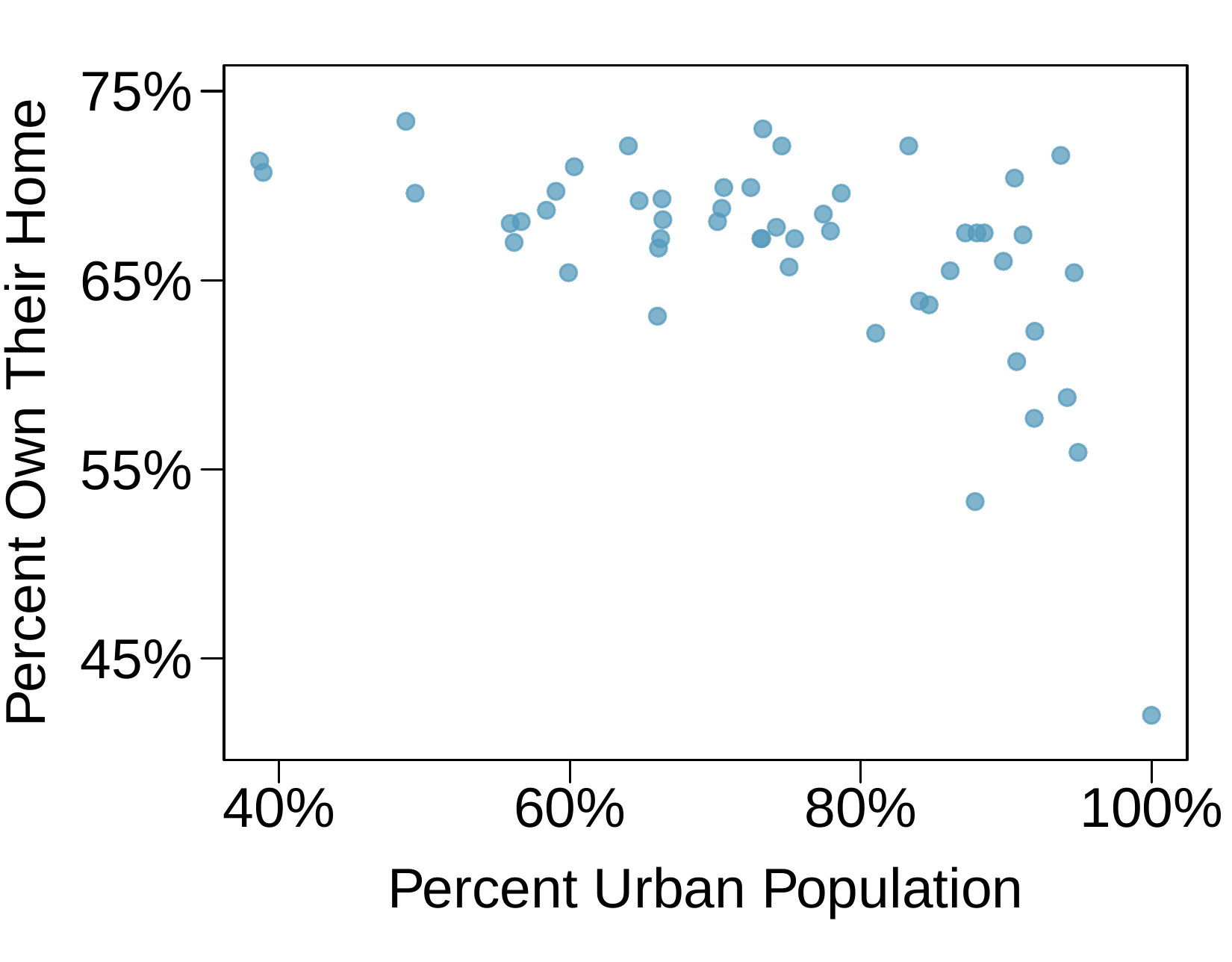
The scatterplot below shows the percent of families who own their home vs. the percent of the population living in urban areas. There are 52 observations, each corresponding to a state in the US. Puerto Rico and District of Columbia are also included.
  1. Describe the relationship between the percent of families who own their home and the percent of the population living in urban areas.
  2. The outlier at the bottom right corner is District of Columbia, where 100% of the population is considered urban. What type of an outlier is this observation?
A scatterplot is shown with about 50 points. The horizontal axis is for "Percent Urban Population" and has values ranging from 40% to 100%. The vertical axis is for "Percent Own Their Home" with values ranging from about 40% to about 75%. About 10 points have Urban Population with values smaller than 60%, and these have Homeownership rates between 65% and 75%, with most of those points above 70%. About 20 points have Urban Population with values between 60% and 70%, and these have Homeownership rates between 62% and 75%. About 20 points have Urban Population with values greater than 70%, and these have Homeownership rates between 55% and 73%, with one exception of a point with 100% urban population that has a homeownership rate of about 43%.

4. Crawling babies, Part II.

Exerciseย 8.1.5.12 introduces data on the average monthly temperature during the month babies first try to crawl (about 6 months after birth) and the average first crawling age for babies born in a given month. A scatterplot of these two variables reveals a potential outlying month when the average temperature is about 53ยฐF and average crawling age is about 28.5 weeks. Does this point have high leverage? Is it an influential point?