Effective organization and description of data is a first step in most analyses. This section introduces the data matrix for organizing data as well as some terminology about different forms of data that will be used throughout this book.
Subsection1.2.1Observations, variables, and data matrices
Table 1.2.1 displays rows 1, 2, 3, and 50 of a data set for 50 randomly sampled loans offered through Lending Club, which is a peer-to-peer lending company. These observations will be referred to as the loan50 data set.
Each row in the table represents a single loan. The formal name for a row is a case or observational unit. The columns represent characteristics, called variables, for each of the loans. For example, the first row represents a loan of $22,000 with an interest rate of 10.90%, where the borrower is based in New Jersey (NJ) and has an income of $59,000.
In practice, it is especially important to ask clarifying questions to ensure important aspects of the data are understood. For instance, it is always important to be sure we know what each variable means and the units of measurement. Descriptions of the loan50 variables are given in Table 1.2.3.
Interest rate on the loan, in an annual percentage.
term
The length of the loan, which is always set as a whole number of months.
grade
Loan grade, which takes values A through G and represents the quality of the loan and its likelihood of being repaid.
state
US state where the borrower resides.
total_income
Borrower’s total income, including any second income, in US dollars.
homeownership
Indicates whether the person owns, owns but has a mortgage, or rents.
The data in Table 1.2.1 represent a data matrix, which is a convenient and common way to organize data, especially if collecting data in a spreadsheet. Each row of a data matrix corresponds to a unique case (observational unit), and each column corresponds to a variable.
When recording data, use a data matrix unless you have a very good reason to use a different structure. This structure allows new cases to be added as rows or new variables as new columns.
The grades for assignments, quizzes, and exams in a course are often recorded in a gradebook that takes the form of a data matrix. How might you organize grade data using a data matrix?
There are multiple strategies that can be followed. One common strategy is to have each student represented by a row, and then add a column for each assignment, quiz, or exam. Under this setup, it is easy to review a single line to understand a student’s grade history. There should also be columns to include student information, such as one column to list student names.
We consider data for 3,142 counties in the United States. The data includes each county’s name, the state where it resides, its population in 2017, how its population changed from 2010 to 2017, poverty rate, and six additional characteristics. How might the county data described above be organized in a data matrix?
Each county may be viewed as a case, and there are eleven pieces of information recorded for each case. A table with 3,142 rows and 11 columns could hold these data, where each row represents a county and each column represents a particular piece of information.
The data described in Guided Practice about the county data represents the county data set, which is shown as a data matrix in Table 1.2.6 and with variable descriptions in Table 1.2.7.
State where the county resides, or the District of Columbia.
pop
Population in 2017.
pop_change
Percent change in the population from 2010 to 2017. For example, the value 1.48 in the first row means the population for this county increased by 1.48% from 2010 to 2017.
poverty
Percent of the population in poverty.
homeownership
Percent of the population that lives in their own home or lives with the owner, e.g. children living with parents who own the home.
multi_unit
Percent of living units that are in multi-unit structures, e.g. apartments.
unemp_rate
Unemployment rate as a percent.
metro
Whether the county contains a metropolitan area.
median_edu
Median education level, which can take a value among below_hs, hs_diploma, some_college, and bachelors.
median_hh_income
Median household income for the county, where a household’s income equals the total income of its occupants who are 15 years or older.
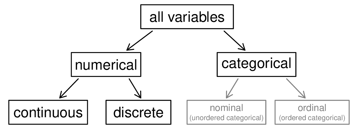
Examine the unemp_rate, pop, state, and median_edu variables in the county data set. Each of these variables is inherently different from the other three, yet some share certain characteristics.
First consider unemp_rate, which is said to be a numerical variable since it can take a wide range of numerical values, and it is sensible to add, subtract, or take averages with those values. On the other hand, we would not classify a variable reporting telephone area codes as numerical since the average, sum, and difference of area codes doesn’t have any clear meaning.
The pop variable is also numerical, although it seems to be a little different than unemp_rate. This variable of the population count can only take whole non-negative numbers (0, 1, 2, …). For this reason, the population variable is said to be discrete since it can only take numerical values with jumps. On the other hand, the unemployment rate variable is said to be continuous.
The variable state can take up to 51 values after accounting for Washington, DC: AL, AK, …, and WY. Because the responses themselves are categories, state is called a categorical variable, and the possible values are called the variable’s levels.
Finally, consider the median_edu variable, which describes the median education level of county residents and takes values below_hs, hs_diploma, some_college, or bachelors in each county. This variable seems to be a hybrid: it is a categorical variable but the levels have a natural ordering. A variable with these properties is called an ordinal variable, while a regular categorical variable without this type of special ordering is called a nominal variable. To simplify analyses, any ordinal variable in this book will be treated as a nominal (unordered) categorical variable.
Data were collected about students in a statistics course. Three variables were recorded for each student: number of siblings, student height, and whether the student had previously taken a statistics course. Classify each of the variables as continuous numerical, discrete numerical, or categorical.
The number of siblings and student height represent numerical variables. Because the number of siblings is a count, it is discrete. Height varies continuously, so it is a continuous numerical variable. The last variable classifies students into two categories—those who have and those who have not taken a statistics course—which makes this variable categorical.
An experiment is evaluating the effectiveness of a new drug in treating migraines. A group variable is used to indicate the experiment group for each patient: treatment or control. The num_migraines variable represents the number of migraines the patient experienced during a 3-month period. Classify each variable as either numerical or categorical.
The group variable can take just one of two group names, making it categorical. The num_migraines variable describes a count of the number of migraines, which is an outcome where basic arithmetic is sensible, which means this is numerical outcome; more specifically, since it represents a count, num_migraines is a discrete numerical variable.
Many analyses are motivated by a researcher looking for a relationship between two or more variables. A social scientist may like to answer some of the following questions:
If homeownership is lower than the national average in one county, will the percent of multi-unit structures in that county tend to be above or below the national average?
To answer these questions, data must be collected, such as the county data set. Examining summary statistics could provide insights for each of the three questions about counties. Additionally, graphs can be used to visually explore data.
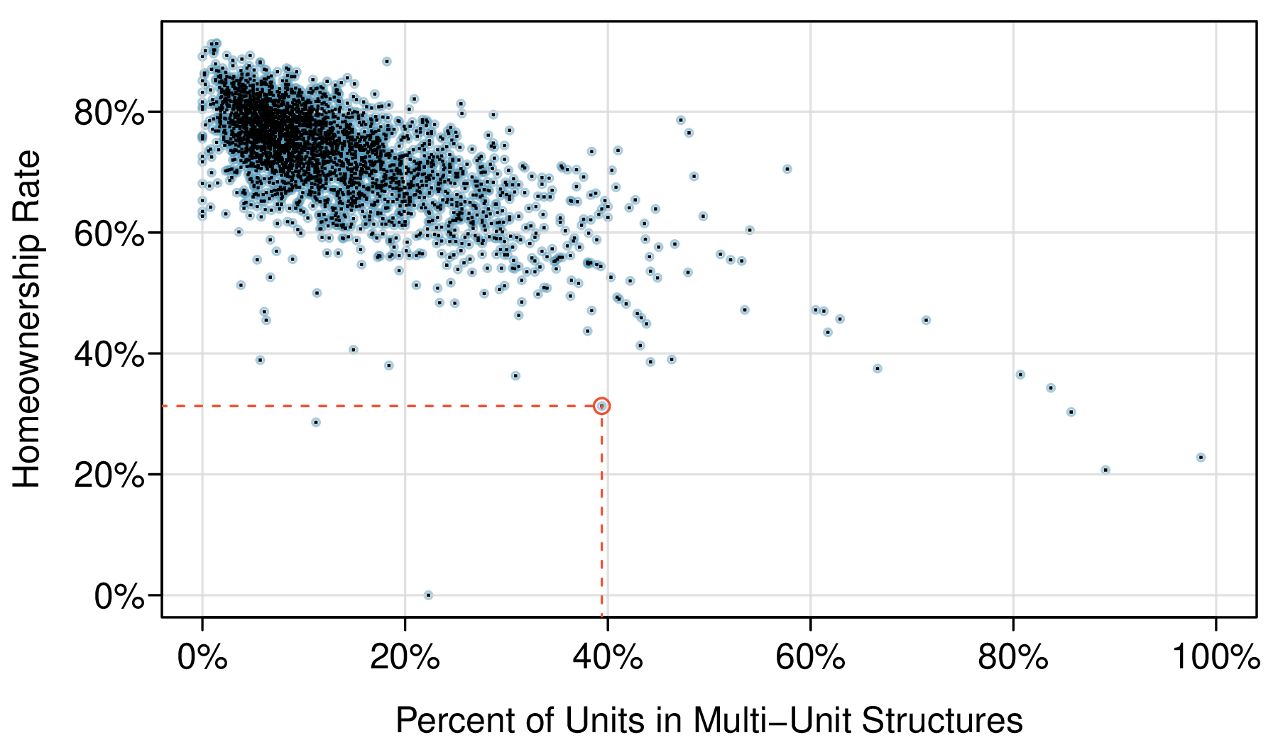
Scatterplots are one type of graph used to study the relationship between two numerical variables. Figure 1.2.11 compares the variables homeownership and multi_unit, which is the percent of units in multi-unit structures (e.g. apartments, condos). Each point on the plot represents a single county. For instance, the highlighted dot corresponds to County 413 in the county data set: Chattahoochee County, Georgia, which has 39.4% of units in multi-unit structures and a homeownership rate of 31.3%. The scatterplot suggests a relationship between the two variables: counties with a higher rate of multi-units tend to have lower homeownership rates. We might brainstorm as to why this relationship exists and investigate each idea to determine which are the most reasonable explanations.
Figure1.2.11.A scatterplot of homeownership versus the percent of units that are in multi-unit structures for US counties. The highlighted dot represents Chattahoochee County, Georgia, which has a multi-unit rate of 39.4% and a homeownership rate of 31.3%.
The multi-unit and homeownership rates are said to be associated because the plot shows a discernible pattern. When two variables show some connection with one another, they are called associated variables. Associated variables can also be called dependent variables and vice-versa.
Examine the variables in the loan50 data set. Create two questions about possible relationships between variables in loan50 that are of interest to you.
Two example questions: (1) What is the relationship between loan amount and total income? (2) If someone’s income is above the average, will their interest rate tend to be above or below the average?
Example1.2.13.Examining relationship between population change and income.
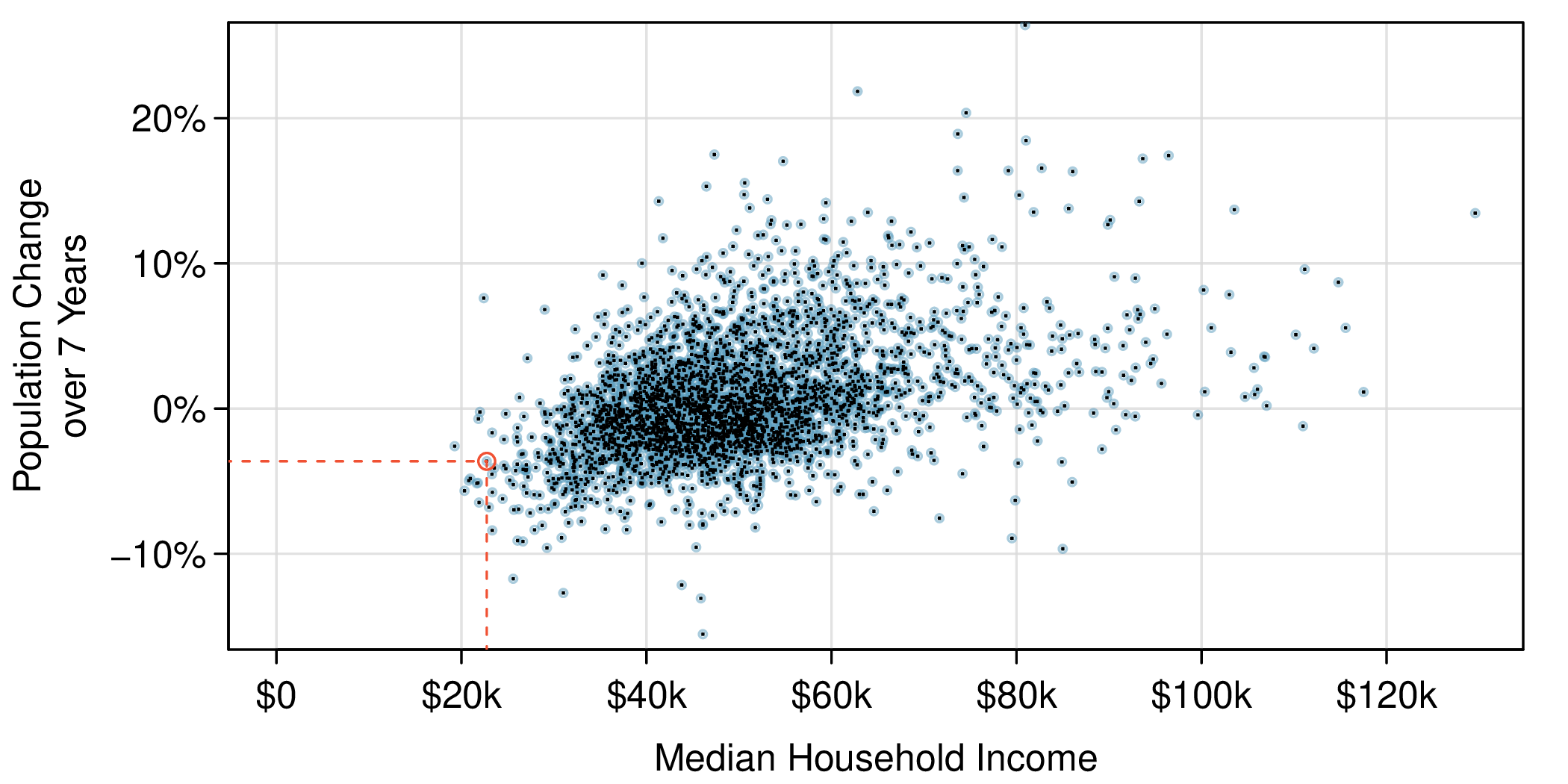
This example examines the relationship between a county’s population change from 2010 to 2017 and median household income, which is visualized as a scatterplot in Figure 1.2.14. Are these variables associated?
The larger the median household income for a county, the higher the population growth observed for the county. While this trend isn’t true for every county, the trend in the plot is evident. Since there is some relationship between the variables, they are associated.
Figure1.2.14.A scatterplot showing pop_change against median_hh_income. Owsley County of Kentucky is highlighted, which lost 3.63% of its population from 2010 to 2017 and had median household income of $22,736.
Because there is a downward trend in Figure 1.2.11 — counties with more units in multi-unit structures are associated with lower homeownership — these variables are said to be negatively associated. A positive association is shown in the relationship between the median_hh_income and pop_change in Figure 1.2.14, where counties with higher median household income tend to have higher rates of population growth.
If two variables are not associated, then they are said to be independent. That is, two variables are independent if there is no evident relationship between the two.
When we ask questions about the relationship between two variables, we sometimes also want to determine if the change in one variable causes a change in the other. Consider the following rephrasing of an earlier question about the county data set:
In this question, we are asking whether one variable affects another. If this is our underlying belief, then median household income is the explanatory variable and the population change is the response variable in the hypothesized relationship. 1
Sometimes the explanatory variable is called the independent variable and the response variable is called the dependent variable. However, this becomes confusing since a pair of variables might be independent or dependent, so we avoid this language.
Bear in mind that the act of labeling the variables in this way does nothing to ensure that a causal relationship exists. A formal evaluation to check whether one variable causes a change in another requires an experiment.
Researchers perform an observational study when they collect data in a way that does not directly interfere with how the data arise. For instance, researchers may collect information via surveys, review medical records, or follow a cohort of many similar individuals to study why certain diseases might develop. In each of these situations, researchers merely observe the data that arise. In general, observational studies can provide evidence of a naturally occurring association between variables, but they cannot by themselves show a causal connection.
When researchers want to investigate the possibility of a causal connection, they conduct an experiment. Usually there will be both an explanatory and a response variable. For instance, we may suspect administering a drug will reduce mortality in heart attack patients over the following year. To check if there really is a causal connection between the explanatory variable and the response, researchers will collect a sample of individuals and split them into groups. The individuals in each group are assigned a treatment. When individuals are randomly assigned to a group, the experiment is called a randomized experiment. For example, each heart attack patient in the drug trial could be randomly assigned, perhaps by flipping a coin, into one of two groups: the first group receives a placebo (fake treatment) and the second group receives the drug. See the case study in Section 1.1 for another example of an experiment, though that study did not employ a placebo.
1.Air pollution and birth outcomes, study components.
Researchers collected data to examine the relationship between air pollutants and preterm births in Southern California. During the study air pollution levels were measured by air quality monitoring stations. Length of gestation data were collected on 143,196 births between the years 1989 and 1993, and air pollution exposure during gestation was calculated for each birth. The analysis suggested that increased ambient PM10 and, to a lesser degree, CO concentrations may be associated with the occurrence of preterm births.
What are the variables in the study? Identify each variable as numerical or categorical. If numerical, state whether the variable is discrete or continuous. If categorical, state whether the variable is ordinal.
The Buteyko method is a shallow breathing technique developed by Konstantin Buteyko, a Russian doctor, in 1952. Anecdotal evidence suggests that the Buteyko method can reduce asthma symptoms and improve quality of life. In a scientific study to determine the effectiveness of this method, researchers recruited 600 asthma patients aged 18-69 who relied on medication for asthma treatment. These patients were randomly split into two research groups: one practiced the Buteyko method and the other did not. Patients were scored on quality of life, activity, asthma symptoms, and medication reduction on a scale from 0 to 10. On average, the participants in the Buteyko group experienced a significant reduction in asthma symptoms and an improvement in quality of life.
What are the variables in the study? Identify each variable as numerical or categorical. If numerical, state whether the variable is discrete or continuous. If categorical, state whether the variable is ordinal.
Researchers studying the relationship between honesty, age and self-control conducted an experiment on 160 children between the ages of 5 and 15. Participants reported their age, sex, and whether they were an only child or not. The researchers asked each child to toss a fair coin in private and to record the outcome (white or black) on a paper sheet, and said they would only reward children who report white. The study found differences in cheating rates based on instructions and characteristics.
In a study of the relationship between socio-economic class and unethical behavior, 129 University of California undergraduates at Berkeley were asked to identify themselves as having low or high social-class by comparing themselves to others with the most (least) money, most (least) education, and most (least) respected jobs. They were also presented with a jar of individually wrapped candies and informed that the candies were for children in a nearby laboratory, but that they could take some if they wanted. After completing some unrelated tasks, participants reported the number of candies they had taken. It was found that those who were identified as upper-class took more candy than others.
The study found that students who were identified as upper-class took more candy than others. How many variables were recorded for each subject in the study in order to conclude these findings? State the variables and their types.
A randomized controlled study assigned migraine patients to acupuncture designed for migraines (treatment) or placebo acupuncture (control). Twenty-four hours later, patients reported whether they were pain free. Identify the explanatory and response variables.
A study on acute sinusitis compared a 10-day antibiotic course (treatment) to a placebo (control), then asked patients if they experienced improvement in symptoms. Identify the explanatory and response variables.
A data set contains sepal length and width, and petal length and width from three species of iris flowers (setosa, versicolor, virginica), with 50 flowers from each species.
A survey was conducted to study the smoking habits of UK residents. A portion of the data matrix is shown with variables: sex, age, marital status, gross income, smoking status, and cigarettes per day on weekends and weekdays.
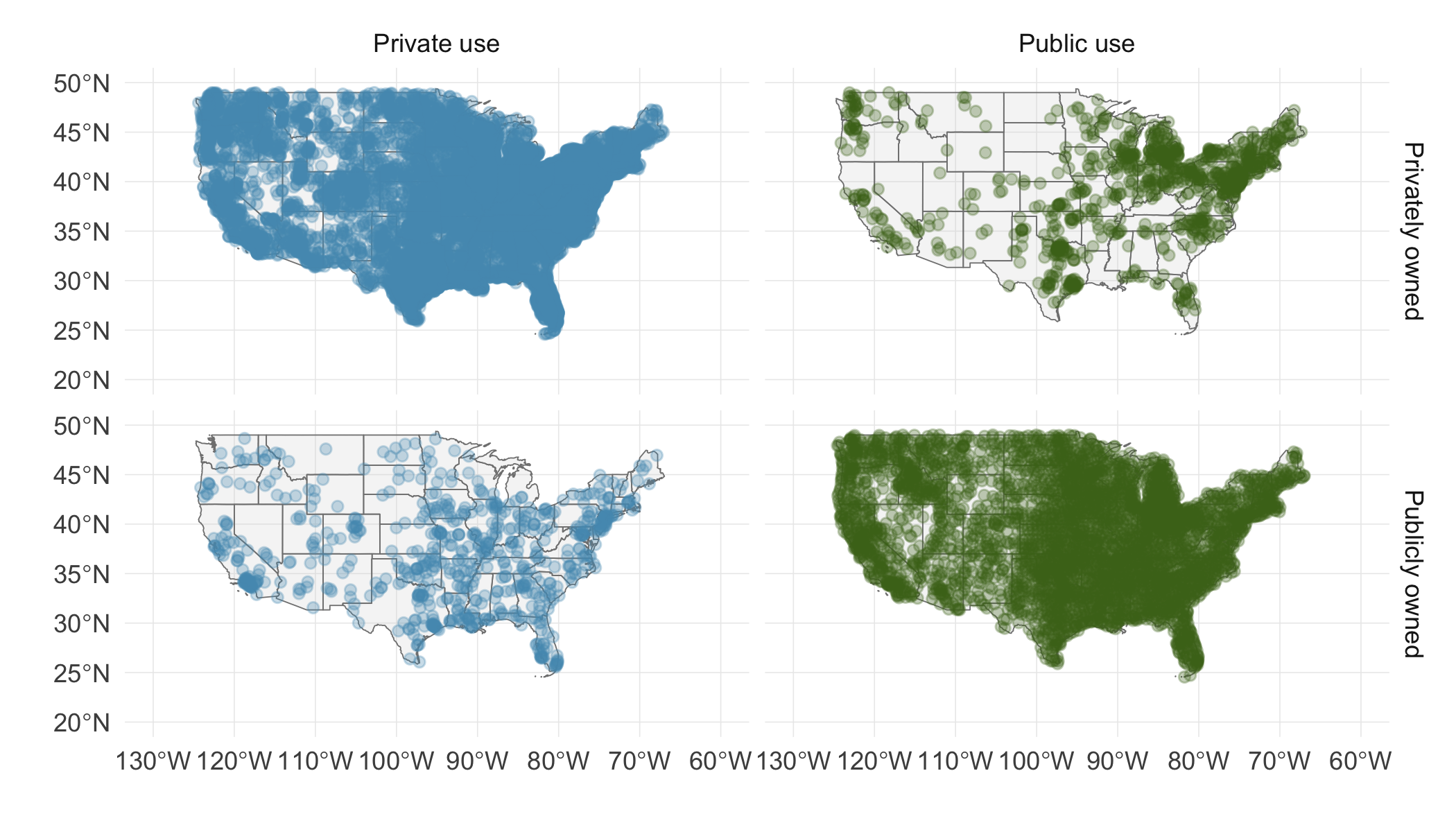
A visualization shows the geographical distribution of airports in the contiguous United States, by ownership and usage type. Each observation is an airport.
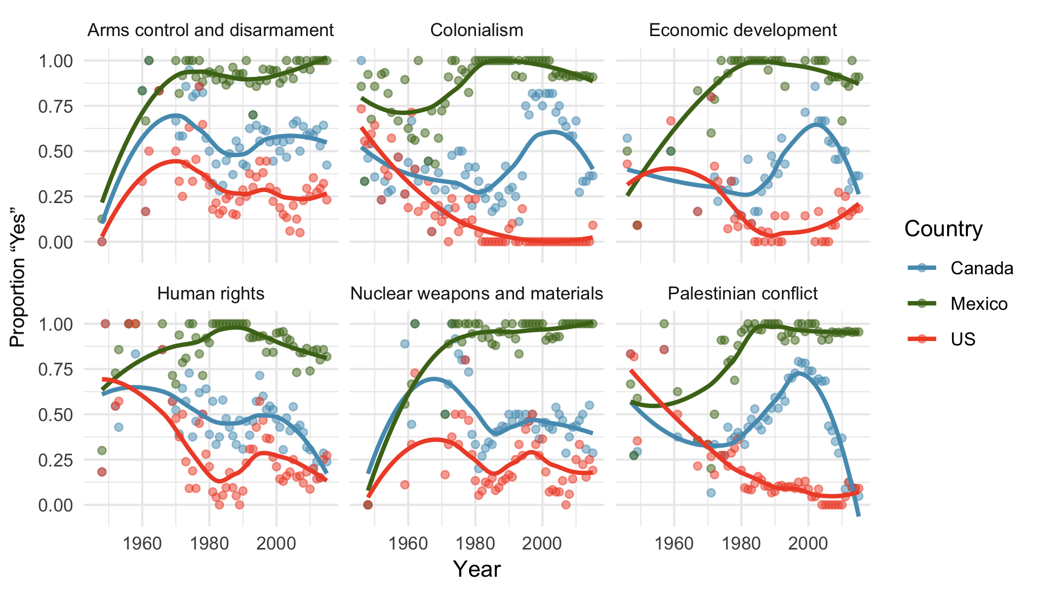
A visualization shows voting patterns in the United States, Canada, and Mexico in the UN General Assembly from 1946 to 2015, displaying the percentage of roll calls voting yes for various issues. Each observation is a country/year pair.