Introductory Statistics

Section 8.1 Fitting a line, residuals, and correlation

It’s helpful to think deeply about the line fitting process. In this section, we define the form of a linear model, explore criteria for what makes a good fit, and introduce a new statistic called correlation.

Subsection 8.1.1 Fitting a line to data

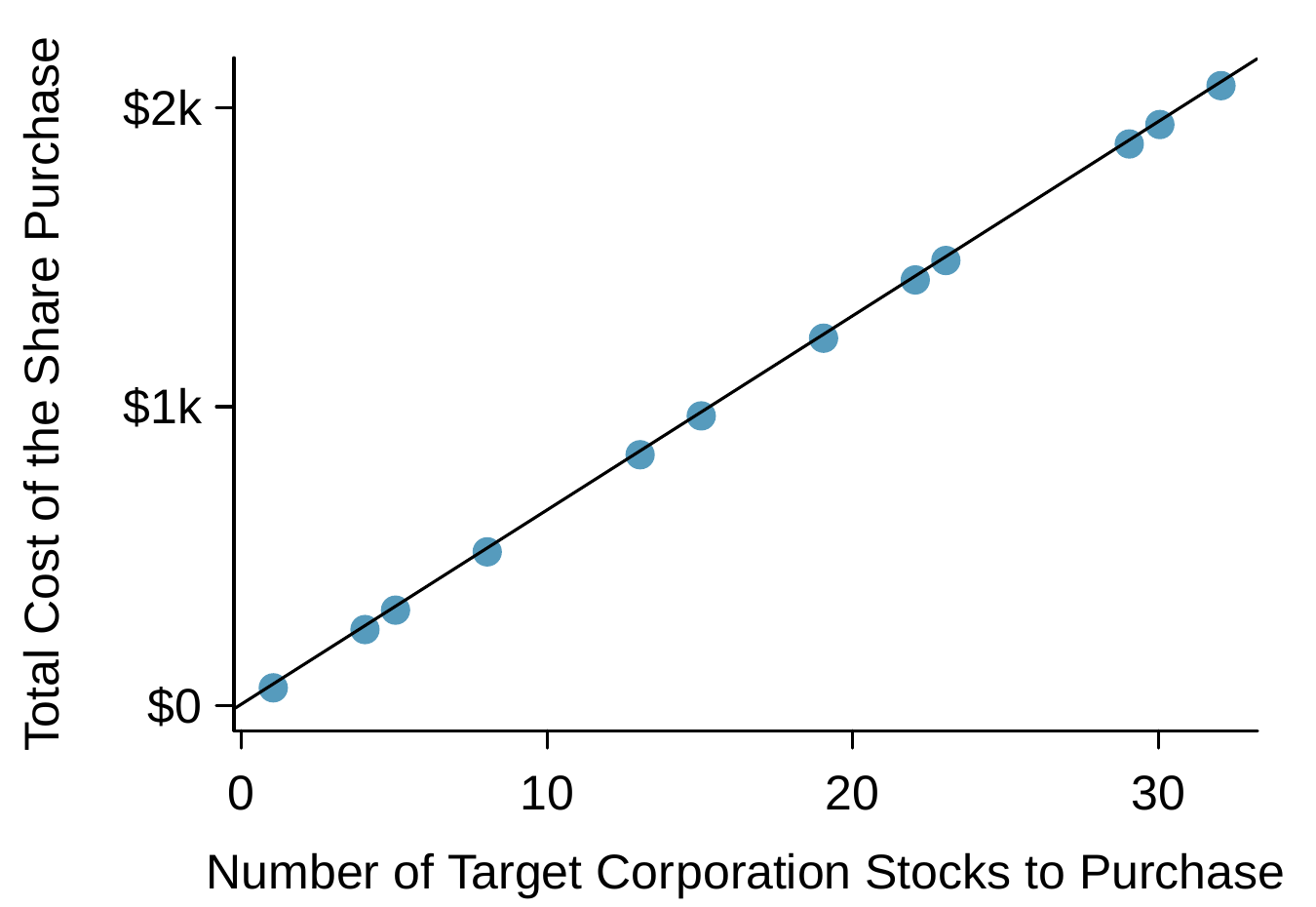
FigureΒ 8.1.1 shows two variables whose relationship can be modeled perfectly with a straight line. The equation for the line is
\begin{equation*} y = 5 + 64.96 x \end{equation*}
Consider what a perfect linear relationship means: we know the exact value of \(y\) just by knowing the value of \(x\text{.}\) This is unrealistic in almost any natural process. For example, if we took family income (\(x\)), this value would provide some useful information about how much financial support a college may offer a prospective student (\(y\)). However, the prediction would be far from perfect, since other factors play a role in financial support beyond a family’s finances.
A scatterplot with a straight line fit to the data are shown for the date December 28th, 2018. The horizontal axis is "Number of Target Corporation Stocks to Purchase" and the vertical axis is "Total Cost of the Shares Purchase". Twelve data points are shown that all fall exactly on a straight line with an equation of y equals 5 plus 64.96 times x. Because the cost is computed using a linear formula, this explains why the linear fit is perfect.
Figure 8.1.1. Requests from twelve separate buyers were simultaneously placed with a trading company to purchase Target Corporation stock (ticker TGT, December 28th, 2018), and the total cost of the shares were reported. Because the cost is computed using a linear formula, the linear fit is perfect.
Linear regression is the statistical method for fitting a line to data where the relationship between two variables, \(x\) and \(y\text{,}\) can be modeled by a straight line with some error:
\begin{equation*} y = \beta_0 + \beta_1 x + \varepsilon \end{equation*}
The values \(\beta_0\) and \(\beta_1\) represent the model’s parameters (\(\beta\) is the Greek letter beta), and the error is represented by \(\varepsilon\) (the Greek letter epsilon). The parameters are estimated using data, and we write their point estimates as \(b_0\) and \(b_1\text{.}\) When we use \(x\) to predict \(y\text{,}\) we usually call \(x\) the explanatory variable or predictor variable, and we call \(y\) the response; we also often drop the \(\varepsilon\) term when writing down the model since our main focus is often on the prediction of the average outcome.
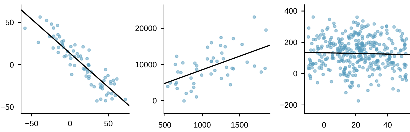
It is rare for all of the data to fall perfectly on a straight line. Instead, it’s more common for data to appear as a cloud of points, such as those examples shown in FigureΒ 8.1.2. In each case, the data fall around a straight line, even if none of the observations fall exactly on the line. The first plot shows a relatively strong downward linear trend, where the remaining variability in the data around the line is minor relative to the strength of the relationship between \(x\) and \(y\text{.}\) The second plot shows an upward trend that, while evident, is not as strong as the first. The last plot shows a very weak downward trend in the data, so slight we can hardly notice it. In each of these examples, we will have some uncertainty regarding our estimates of the model parameters, \(\beta_0\) and \(\beta_1\text{.}\) For instance, we might wonder, should we move the line up or down a little, or should we tilt it more or less? As we move forward in this chapter, we will learn about criteria for line-fitting, and we will also learn about the uncertainty associated with estimates of model parameters.
Three scatterplots are shown. The first has data ranging from -50 to positive 50 on both the horizontal and vertical axes. The data start in the upper left corner of the plot and then move steadily down to the right corner. The second plot has the horizontal axis running from 500 to about 2,000 and the vertical axis from about 0 to 25,000. At the left side of the plot, the data are in the lower half of the plot, and the points generally are steadily higher as we move right, where most points near the right end of the plot are in the upper region of the plot. A upwards trending line has been fit to these points. The last plot runs from about -10 to positive 50 on the horizontal axis and about -200 to positive 400 on the vertical axis. The points are scattered broadly across the range, with only the slightest downward trend evident in the data. A trend line has been fit to this data, though it is nearly flat.
Figure 8.1.2. Three data sets where a linear model may be useful even though the data do not all fall exactly on the line.
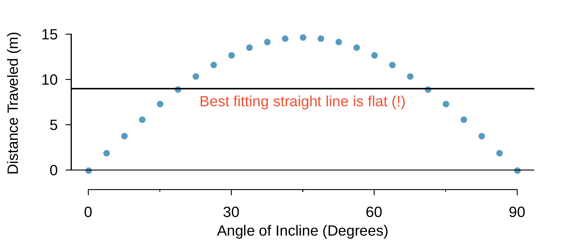
There are also cases where fitting a straight line to the data, even if there is a clear relationship between the variables, is not helpful. One such case is shown in FigureΒ 8.1.3 where there is a very clear relationship between the variables even though the trend is not linear. We discuss nonlinear trends in this chapter and the next, but details of fitting nonlinear models are saved for a later course.
A linear model is not useful in a nonlinear set of data shown in this plot. The data are from an introductory physics experiment, where a ball is shot at many angles of inclination between 0 degrees and 90 degrees (represented by the horizontal axis), and the measured horizontal distance traveled by the ball before it hits the ground is shown in meters. The first point, at an angle of inclination of 0 hits the ground at 0 meters traveled. As the angle is increased, the ball travels further before it hits the ground until reaching a peak at 45 degrees angle of inclination, at which point it decreases again until we reach an angle of 90 degrees, at which point the ball again does not travel any horizontal distance before it hits the ground. For the data shown, the best fitting straight line is shown and is flat. This is a good example of why a straight line fit to data where there is curvature is often not useful.
Figure 8.1.3. A linear model is not useful in this nonlinear case. These data are from an introductory physics experiment.

Subsection 8.1.2 Using linear regression to predict possum head lengths

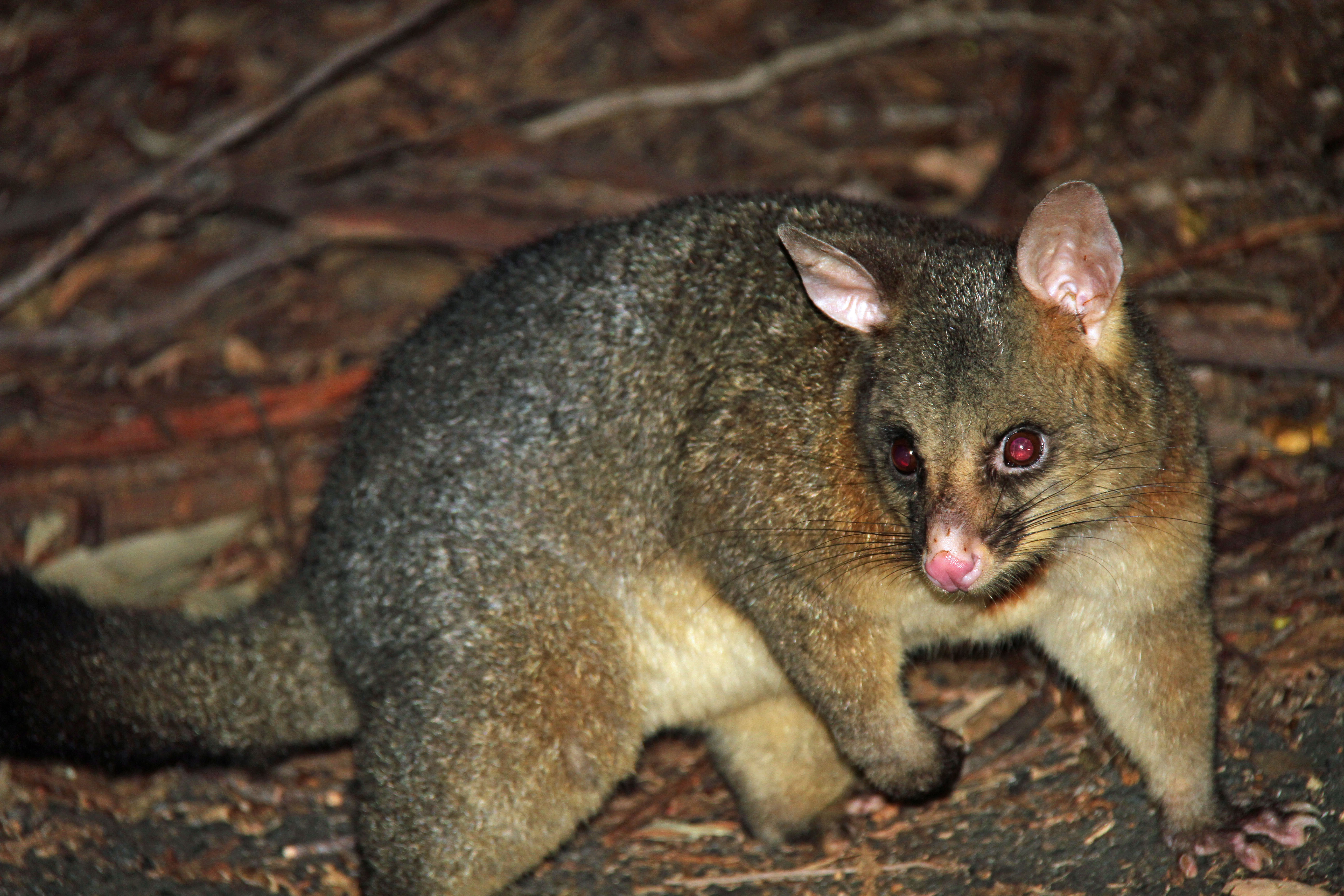
Brushtail possums are a marsupial that lives in Australia, and a photo of one is shown in FigureΒ 8.1.4. Researchers captured 104 of these animals and took body measurements before releasing the animals back into the wild. We consider two of these measurements: the total length of each possum, from head to tail, and the length of each possum’s head.
A common brushtail possum of Australia is shown. It has a brown fur coat with some gray sprinkled in along with a face and ears that somewhat resemble a house cat. The possum also has a big bushy tail.
Figure 8.1.4. The common brushtail possum of Australia. Photo by Greg Schechter (https://flic.kr/p/9BAFbR). CC BY 2.0 license.
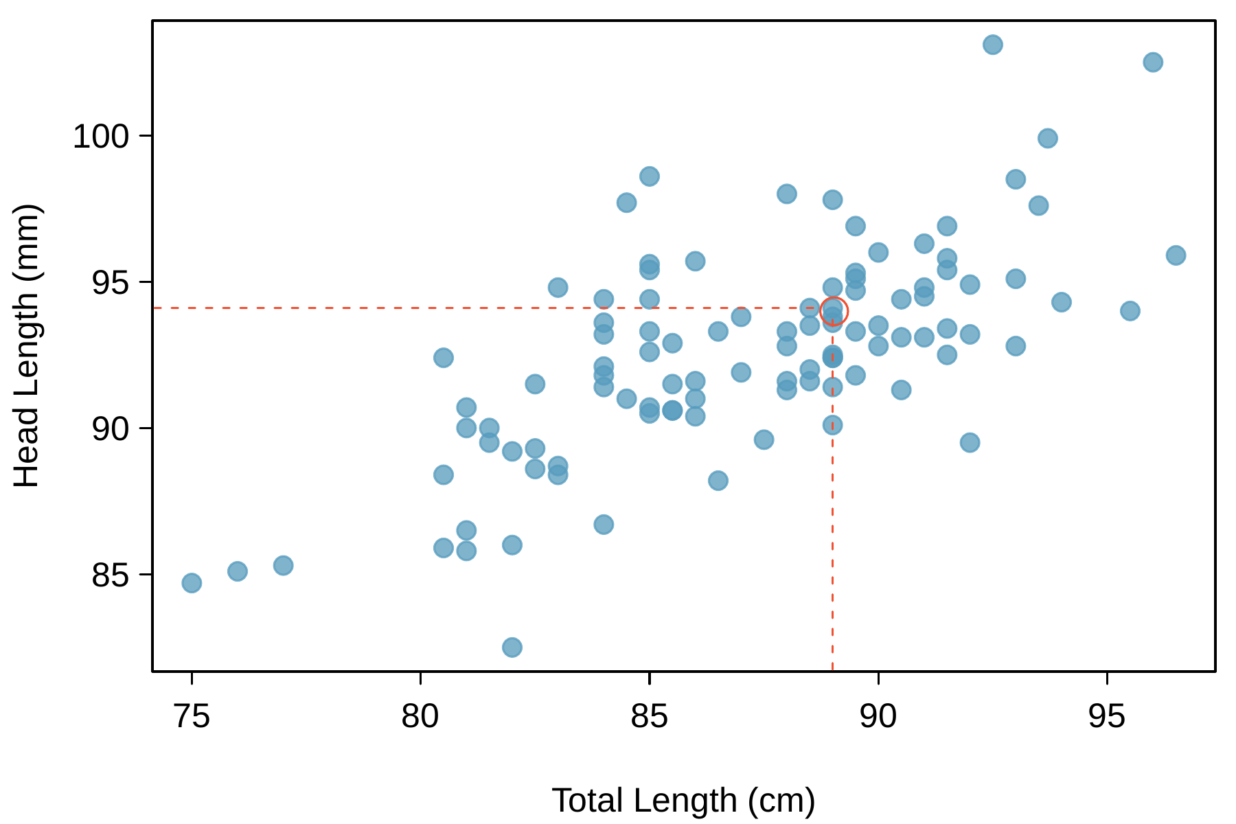
FigureΒ 8.1.5 shows a scatterplot for the head length and total length of the possums. Each point represents a single possum from the data. The head and total length variables are associated: possums with an above average total length also tend to have above average head lengths. While the relationship is not perfectly linear, it could be helpful to partially explain the connection between these variables with a straight line.
A scatterplot showing head length against total length for 104 brushtail possums, where the horizontal axis for total length runs from 75 centimeters to about 97 centimeters (2.5 to 3.3 feet) and the vertical axis for head length runs from about 82 millimeters up to about 104 millimeters (3 to 4 inches). For possums with a total length between 75 to 80 centimeters, there are three points shown, each with head lengths of about 85 millimeters. For possums with total length from 80 to 85 centimeters, most head lengths range from about 85 millimeters to 95 millimeters. For possums with total lengths from 85 to 90 centimeters, head lengths mostly lie between 90 millimeters and 97 millimeters. For possums with total lengths larger than 90 centimeters, the head lengths are mostly between 93 millimeters and 100 millimeters. The trend is evidently upward and approximately linear. A point representing a possum with head length 94.1mm and total length 89cm is highlighted (although not relevant for any other purpose than giving an example or reminder for how a point is read in a scatterplot).
Figure 8.1.5. A scatterplot showing head length against total length for 104 brushtail possums. A point representing a possum with head length 94.1mm and total length 89cm is highlighted.
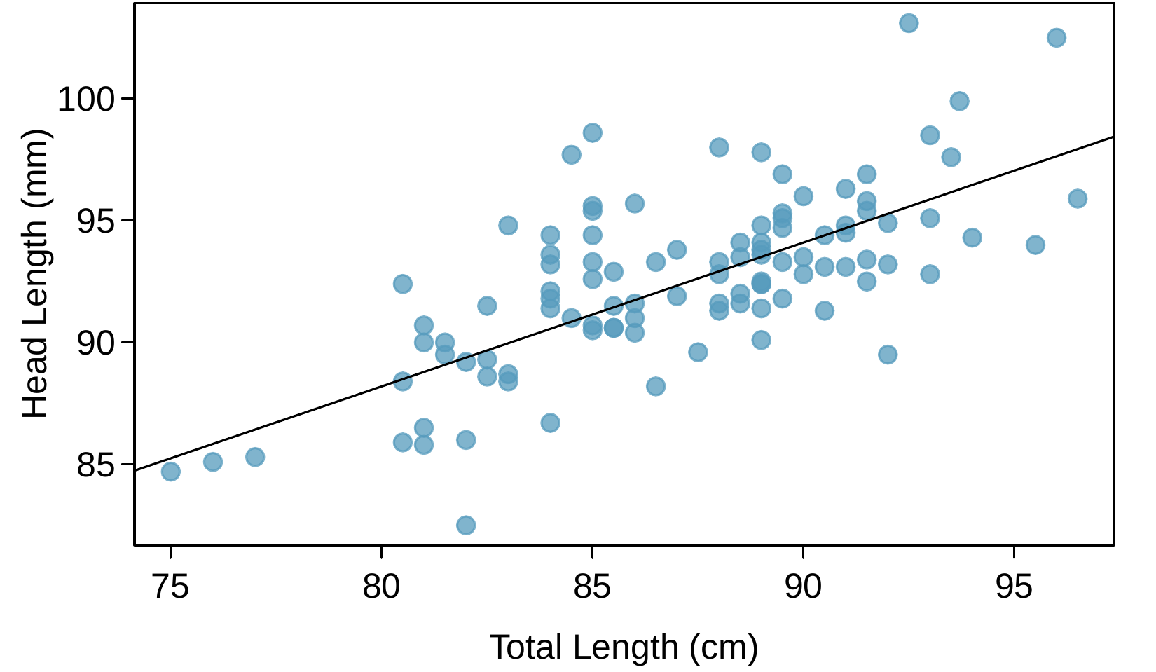
We want to describe the relationship between the head length and total length variables in the possum data set using a line. In this example, we will use the total length as the predictor variable, \(x\text{,}\) to predict a possum’s head length, \(y\text{.}\) We could fit the linear relationship by eye, as in FigureΒ 8.1.6. The equation for this line is
\begin{equation*} \hat{y} = 41 + 0.59x \end{equation*}
A "hat" on \(y\) is used to signify that this is an estimate. We can use this line to discuss properties of possums. For instance, the equation predicts a possum with a total length of 80 cm will have a head length of
\begin{align*} \hat{y} \amp = 41 + 0.59 \times 80\\ \amp = 88.2 \end{align*}
The estimate may be viewed as an average: the equation predicts that possums with a total length of 80 cm will have an average head length of 88.2 mm. Absent further information about an 80 cm possum, the prediction for head length that uses the average is a reasonable estimate.
The same scatterplot showing head length against total length for 104 brushtail possums is shown. A linear trend line has been added with an equation of y-hat equals 41 plus 0.59 times x, which shows the clear upward trajectory of the data. Additionally, three points are highlighted. The first is labeled with an "X" and is at approximately (77, 85) and lies about 1 unit below the trend line. A second point labeled with a "plus sign" is at about (85, 98) and appears to be about 7 units above the trend line. The last point highlighted is a "triangle" and is located at about (95, 93) and is about 3 units below the trend line.
Figure 8.1.6. A reasonable linear model was fit to represent the relationship between head length and total length.

Example 8.1.7.

What other variables might help us predict the head length of a possum besides its length?
Solution.
Perhaps the relationship would be a little different for male possums than female possums, or perhaps it would differ for possums from one region of Australia versus another region. In ChapterΒ 9, we’ll learn about how we can include more than one predictor. Before we get there, we first need to better understand how to best build a simple linear model with one predictor.
Subsection 8.1.3 Residuals

Residuals are the leftover variation in the data after accounting for the model fit:
\begin{equation*} \text{Data} = \text{Fit} + \text{Residual} \end{equation*}
Each observation will have a residual, and three of the residuals for the linear model we fit for the possum data is shown in FigureΒ 8.1.6. If an observation is above the regression line, then its residual, the vertical distance from the observation to the line, is positive. Observations below the line have negative residuals. One goal in picking the right linear model is for these residuals to be as small as possible.
Let’s look closer at the three residuals featured in FigureΒ 8.1.6. The observation marked by an "\(\times\)" has a small, negative residual of about -1; the observation marked by "\(+\)" has a large residual of about +7; and the observation marked by "\(\triangle\)" has a moderate residual of about -4. The size of a residual is usually discussed in terms of its absolute value. For example, the residual for "\(\triangle\)" is larger than that of "\(\times\)" because \(|-4|\) is larger than \(|-1|\text{.}\)

Residual: difference between observed and expected.

The residual of the \(i^{\text{th}}\) observation \((x_i, y_i)\) is the difference of the observed response (\(y_i\)) and the response we would predict based on the model fit (\(\hat{y}_i\)):
\begin{equation*} e_i = y_i - \hat{y}_i \end{equation*}
We typically identify \(\hat{y}_i\) by plugging \(x_i\) into the model.

Example 8.1.8.

The linear fit shown in FigureΒ 8.1.6 is given as \(\hat{y} = 41 + 0.59x\text{.}\) Based on this line, formally compute the residual of the observation \((77.0, 85.3)\text{.}\) This observation is denoted by "\(\times\)" in FigureΒ 8.1.6. Check it against the earlier visual estimate, -1.
Solution.
We first compute the predicted value of point "\(\times\)" based on the model:
\begin{equation*} \hat{y}_{\times} = 41 + 0.59x_{\times} = 41 + 0.59 \times 77.0 = 86.4 \end{equation*}
Next we compute the difference of the actual head length and the predicted head length:
\begin{equation*} e_{\times} = y_{\times} - \hat{y}_{\times} = 85.3 - 86.4 = -1.1 \end{equation*}
The model’s error is \(e_{\times} = -1.1\) mm, which is very close to the visual estimate of -1 mm. The negative residual indicates that the linear model overpredicted head length for this particular possum.

Checkpoint 8.1.9.

If a model underestimates an observation, will the residual be positive or negative? What about if it overestimates the observation?
Solution.
If a model underestimates an observation, then the model estimate is below the actual. The residual, which is the actual observation value minus the model estimate, must then be positive. The opposite is true when the model overestimates the observation: the residual is negative.

Checkpoint 8.1.10.

Compute the residuals for the "\(+\)" observation \((85.0, 98.6)\) and the "\(\triangle\)" observation \((95.5, 94.0)\) in the figure using the linear relationship \(\hat{y} = 41 + 0.59x\text{.}\)
Solution.
(\(+\)) First compute the predicted value based on the model:
\begin{equation*} \hat{y}_{+} = 41 + 0.59x_{+} = 41 + 0.59 \times 85.0 = 91.15 \end{equation*}
Then the residual is given by
\begin{equation*} e_{+} = y_{+} - \hat{y}_{+} = 98.6 - 91.15 = 7.45 \end{equation*}
This was close to the earlier estimate of 7.
(\(\triangle\)) \(\hat{y}_{\triangle} = 41 + 0.59x_{\triangle} = 97.3\text{.}\) \(e_{\triangle} = y_{\triangle} - \hat{y}_{\triangle} = -3.3\text{,}\) close to the estimate of -4.
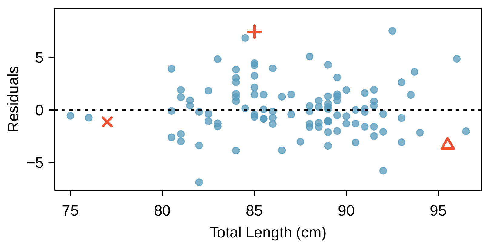
Residuals are helpful in evaluating how well a linear model fits a data set. We often display them in a residual plot such as the one shown in FigureΒ 8.1.11 for the regression line in FigureΒ 8.1.6. The residuals are plotted at their original horizontal locations but with the vertical coordinate as the residual. For instance, the point \((85.0, 98.6)_{+}\) had a residual of 7.45, so in the residual plot it is placed at \((85.0, 7.45)\text{.}\) Creating a residual plot is sort of like tipping the scatterplot over so the regression line is horizontal.
A residual plot for the trend line fit to the brushtail possum data is shown. Here, the horizontal axis is the same -- representing "total length", it spans 75 to 97 -- while the vertical axis represents "Residuals" and spans from about -7 to positive 8. There is no evident trend in the residuals. Three points are specifically highlighted to reflect the three points discussed in the last figure. The first is labeled with an "X" with a total length of 77 and a residual of about -1. The second is labeled with a "plus sign" and has a total length of 85 and a residual of about 7. The last point highlighted is a "triangle" with a total length of about 95 and a residual of about -3. Note that the location of the residuals above and below the trend line reflects exactly with whether the residual is positive or negative, respectively.
Figure 8.1.11. Residual plot for the model in FigureΒ 8.1.6.

Example 8.1.12.

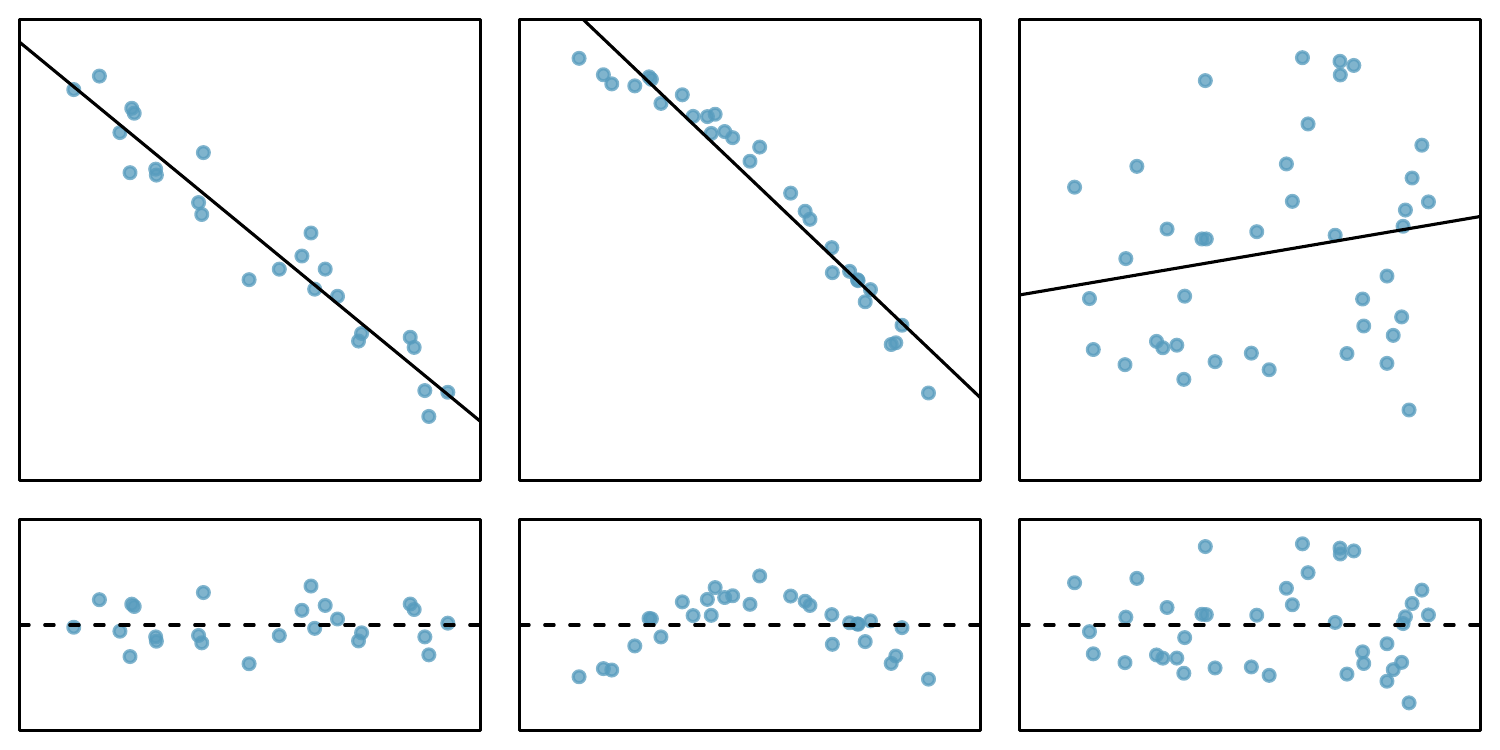
One purpose of residual plots is to identify characteristics or patterns still apparent in data after fitting a model. FigureΒ 8.1.13 shows three scatterplots with linear models in the first row and residual plots in the second row. Can you identify any patterns remaining in the residuals?
Solution.
In the first data set (first column), the residuals show no obvious patterns. The residuals appear to be scattered randomly around the dashed line that represents 0.
The second data set shows a pattern in the residuals. There is some curvature in the scatterplot, which is more obvious in the residual plot. We should not use a straight line to model these data. Instead, a more advanced technique should be used.
The last plot shows very little upwards trend, and the residuals also show no obvious patterns. It is reasonable to try to fit a linear model to the data. However, it is unclear whether there is statistically significant evidence that the slope parameter is different from zero. The point estimate of the slope parameter, labeled \(b_1\text{,}\) is not zero, but we might wonder if this could just be due to chance. We will address this sort of scenario in SectionΒ 8.4.
Sample data with their best fitting lines (top row of three plots) and their corresponding residual plots (bottom row of three plots). The upper left plot shows a scatterplot where the data trend downwards steadily with a straight line fit to the data, which appears to fit well everywhere. The bottom left plot is the residual plot of this first scatterplot, and it likewise shows no pattern in the residuals when looking left to right. The upper middle plot shows data with a downward trend, but the data’s trend is more steep on the right side of the plot, so the overall shape of the data is that it trends downward and curves downward. A straight, downward-trending line has also been fit to this data, but it doesn’t fit as well. The data are below this downward trending line initially, but it is above the line in the middle, and finally on the right it is once again below the linear trend line. The residual plot for this scatterplot is shown in the lower middle plot, and the curvature in the residuals is more evident than what was visible in the scatterplot: the residuals have negative values on the left and trend upwards until peaking with positive residuals in the middle, and then trending back down and having negative residual values again on the right. The last scatterplot in the upper right shows data with very little trend, but a slightly-upward trending straight line has been fit to the data. The corresponding residual plot, shown as the bottom right plot, also shows data with no evident trend or pattern, where observations appear relatively randomly scattered above and below 0 (in the vertical).
Figure 8.1.13. Sample data with their best fitting lines (top row) and their corresponding residual plots (bottom row).

Subsection 8.1.4 Describing linear relationships with correlation

We’ve seen plots with strong linear relationships and others with very weak linear relationships. It would be useful if we could quantify the strength of these linear relationships with a statistic.

Correlation: strength of a linear relationship.

Correlation, which always takes values between -1 and 1, describes the strength of the linear relationship between two variables. We denote the correlation by \(R\text{.}\)
We can compute the correlation using a formula, just as we did with the sample mean and standard deviation. This formula is rather complex,
 1 
Formally, we can compute the correlation for observations \((x_1, y_1)\text{,}\) \((x_2, y_2)\text{,}\) …, \((x_n, y_n)\) using the formula
\begin{equation*} R = \frac{1}{n-1} \sum_{i=1}^{n} \frac{x_i - \bar{x}}{s_x} \cdot \frac{y_i - \bar{y}}{s_y} \end{equation*}
where \(\bar{x}\text{,}\) \(\bar{y}\text{,}\) \(s_x\text{,}\) and \(s_y\) are the sample means and standard deviations for each variable.
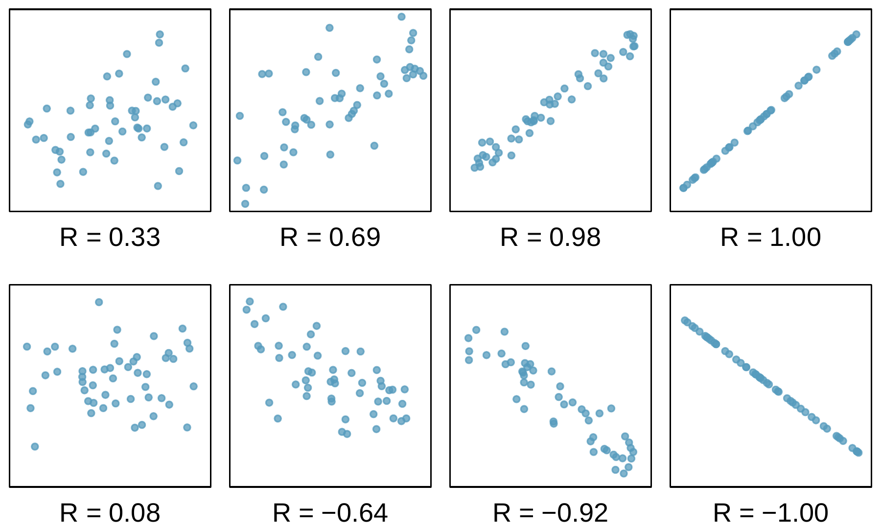
and like with other statistics, we generally perform the calculations on a computer or calculator. FigureΒ 8.1.14 shows eight plots and their corresponding correlations. Only when the relationship is perfectly linear is the correlation either -1 or 1. If the relationship is strong and positive, the correlation will be near +1. If it is strong and negative, it will be near -1. If there is no apparent linear relationship between the variables, then the correlation will be near zero.
Eight scatterplots are shown, each with their correlation noted. Each scatterplot appears to represent about 50 points. The first has a correlation of R equals 0.33, and there is a slight upward trend evident in the data -- if a trend line were drawn for this data, much of the data would fall relatively far from the line. The second plot has a correlation of R equals 0.69, and a clearer upward trend is evident, but it is still pretty volatile with many points deviating far from where the trend line would be. The third plot has a correlation of 0.98, and the data show a very clear upward trend, where if a trend line were drawn, the data would be (relatively) quite close to this line. The fourth plot shows a correlation of R equals 1.00, and here the points appear exactly on a line with an upward trajectory. The fifth plot shows data with a correlation of R equals 0.08, where no trend is visually evident in the data. The sixth plot has a correlation of R equals -0.64, and a downward trend is evident in the data, but the individual observations would in many cases be pretty distant from any trend line fit to the data (on a relative basis). The seventh plot has a correlation of R equals -0.92 and shows data with a clear downward trend, where the data would deviate just a modest amount from a trend line fit to the data. The last plot shows a correlation of R equals -1, where the observations would fit exactly on a line trending downwards.
Figure 8.1.14. Sample scatterplots and their correlations. The first row shows variables with a positive relationship, represented by the trend up and to the right. The second row shows one plot with an approximately neutral trend and three plots with a negative trend.
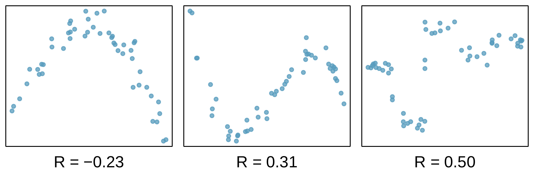
The correlation is intended to quantify the strength of a linear trend. Nonlinear trends, even when strong, sometimes produce correlations that do not reflect the strength of the relationship; see three such examples in FigureΒ 8.1.15.
Three scatterplots are shown. In each case, there is a strong relationship between the variables. However, because the relationship is nonlinear, the correlation is relatively weak. The first plot shows data that trends upwards on the left before peaking and then trending downward on the right -- the correlation of the data in this plot is R equals -0.23. The second plot shows data with a sharp downward trend on the left before reaching a trough and rising then sharply upward before reaching a peak and then trending sharply downwards again -- the correlation of the data in this plot is R equals 0.31. The third plot shows data that without a trend on the far left, followed by a steep drop, a trough, and then a steep rise to a peak, and then another drop and then finally a slight increase at the end -- the correlation of the data in this plot is R equals 0.50.
Figure 8.1.15. Sample scatterplots and their correlations. In each case, there is a strong relationship between the variables. However, because the relationship is nonlinear, the correlation is relatively weak.

Checkpoint 8.1.16.

No straight line is a good fit for the data sets represented in FigureΒ 8.1.15. Try drawing nonlinear curves on each plot. Once you create a curve for each, describe what is important in your fit.
Solution.
We’ll leave it to you to draw the lines. In general, the lines you draw should be close to most points and reflect overall trends in the data.

Exercises 8.1.5 Section 8.1 Exercises

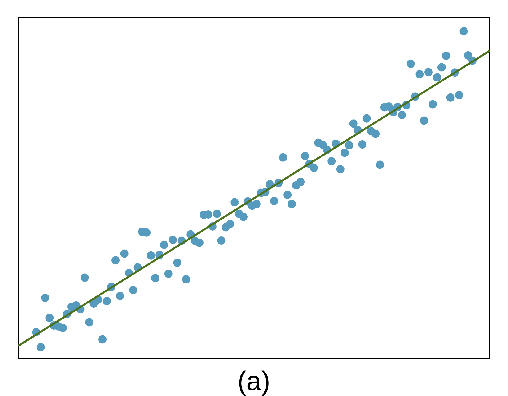
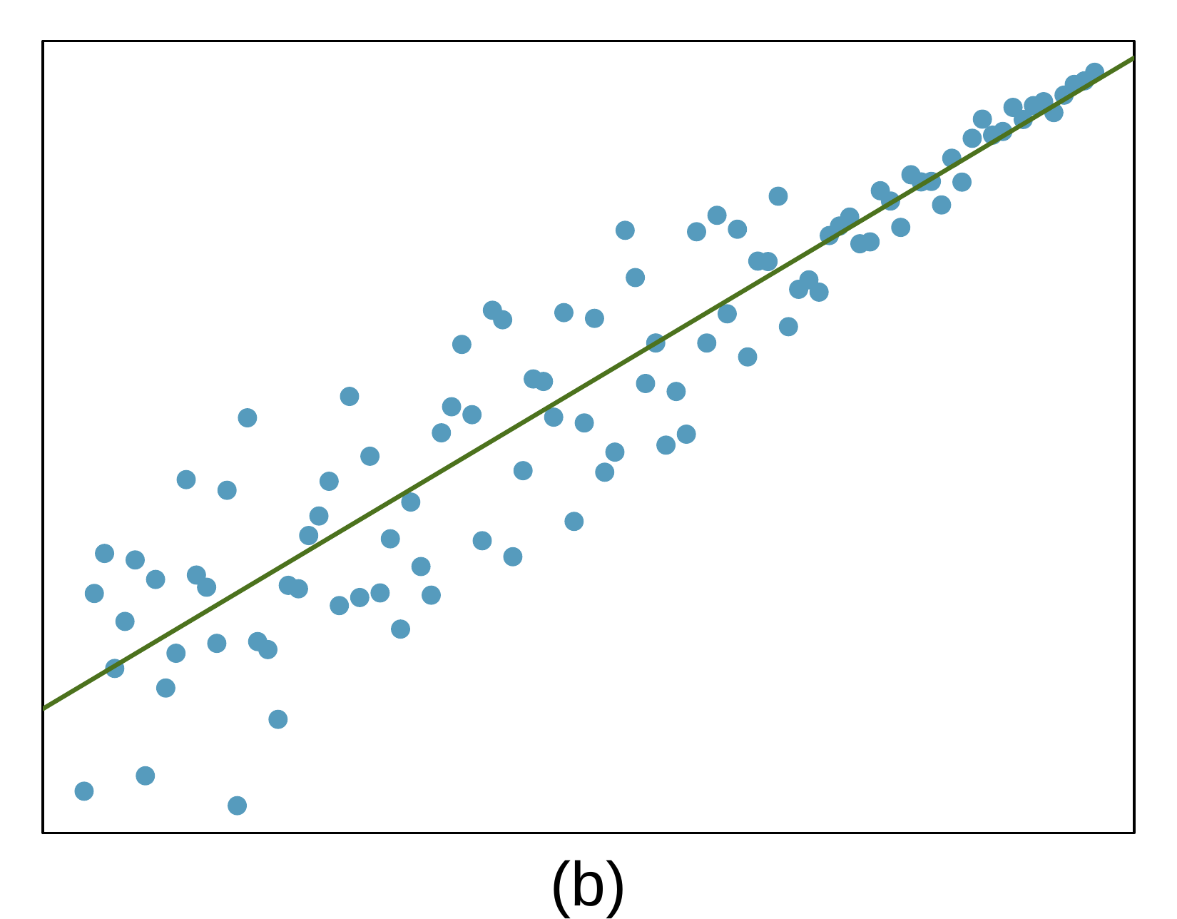
1. Visualize the residuals.

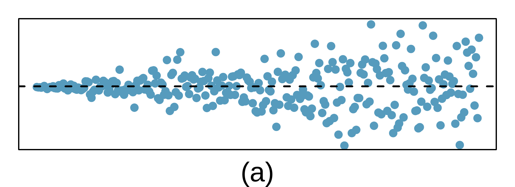
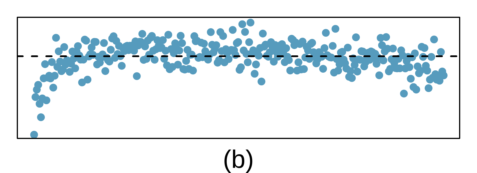
The scatterplots shown below each have a superimposed regression line. If we were to construct a residual plot (residuals versus \(x\)) for each, describe what those plots would look like.
A scatterplot is shown, where the data have a steady upward trend throughout. The observations above and below the line appear random and have stable variability moving from left to right.
A scatterplot is shown, where the data have a steady upward trend throughout. The observations above and below the line appear random. If looking at the leftmost region of data, the observations are more broadly scattered around the line, while when moving further right the variability of the points around the line gets notably smaller by a factor of at least 5 (if using standard deviation).

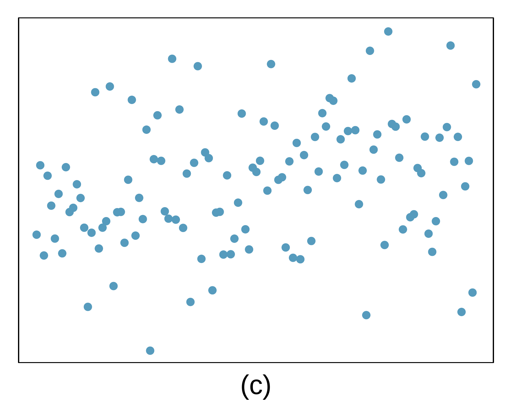
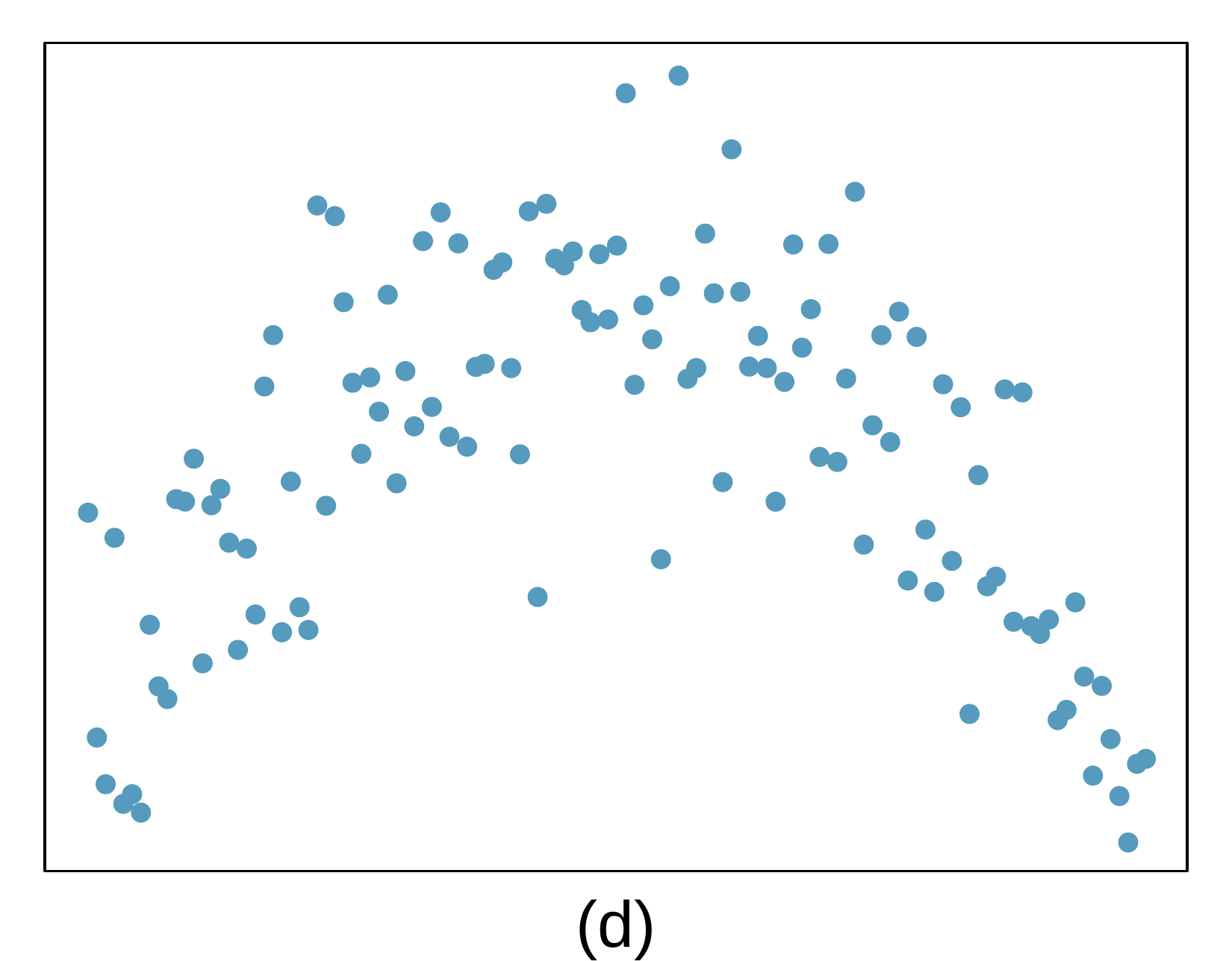
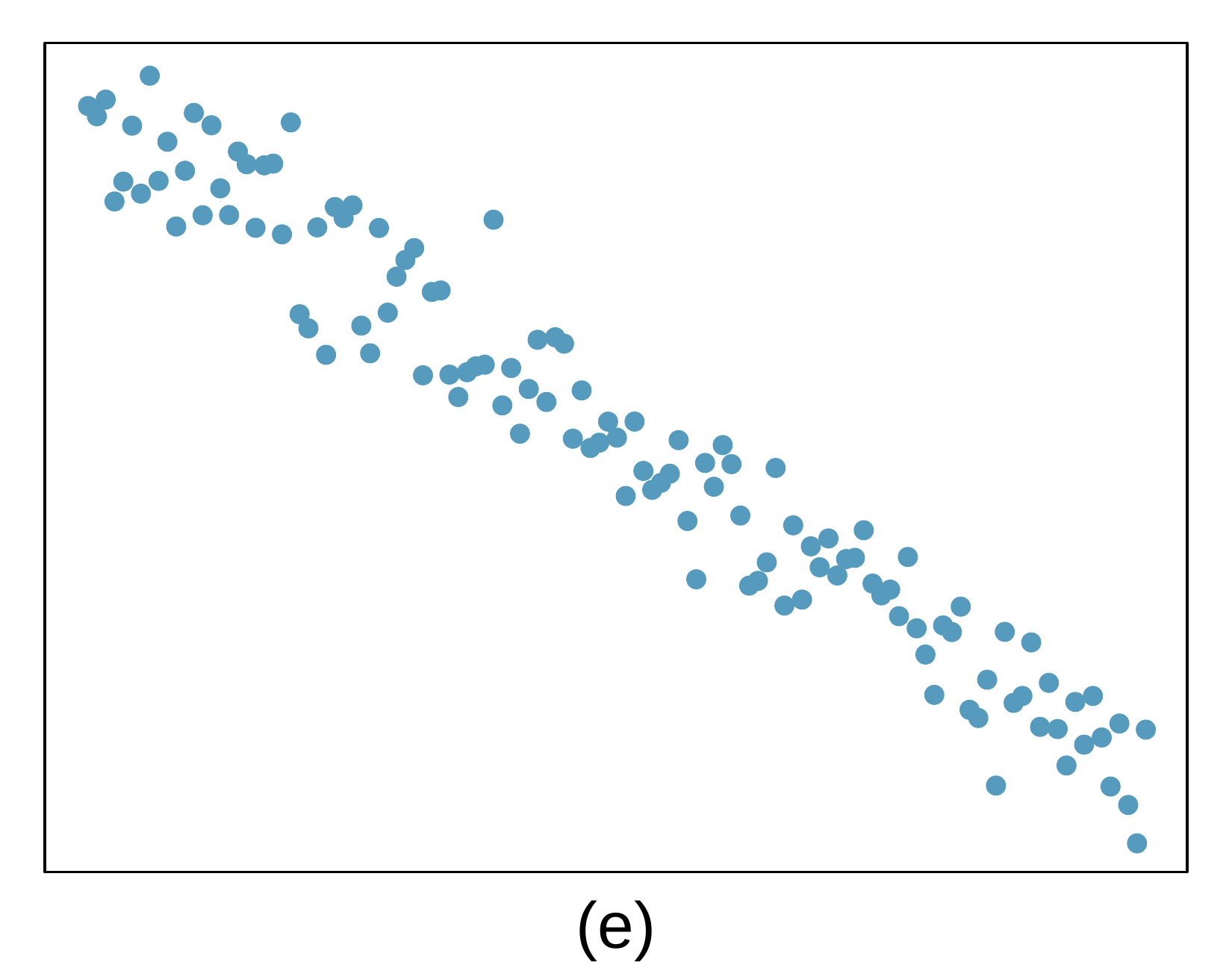
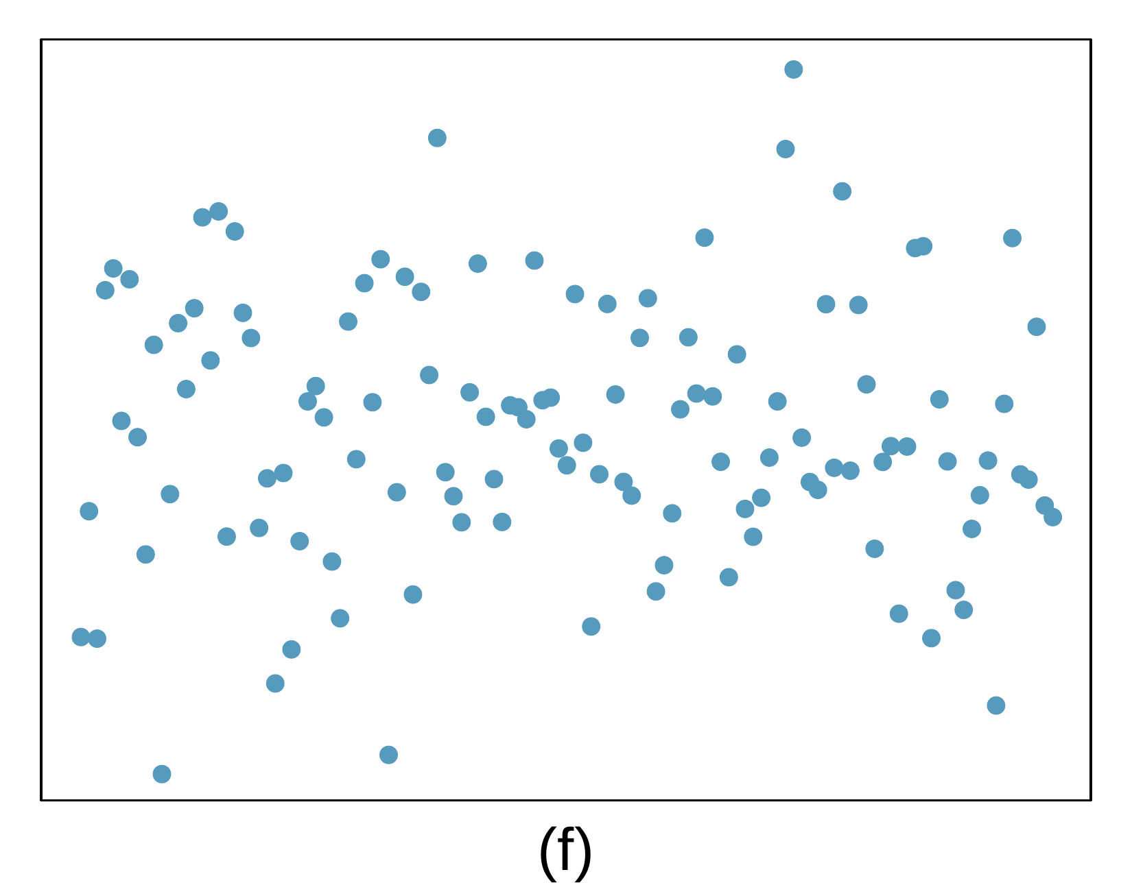
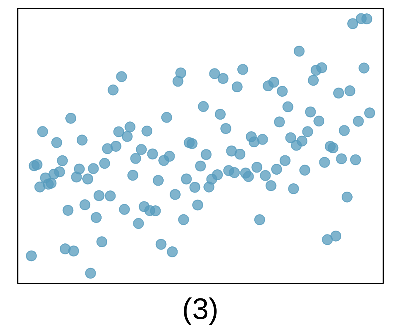
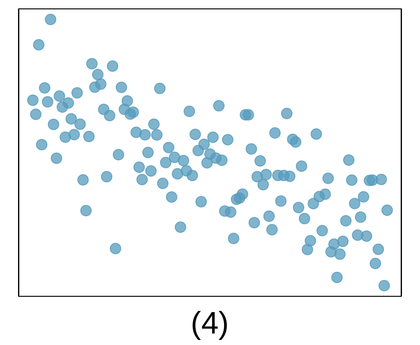
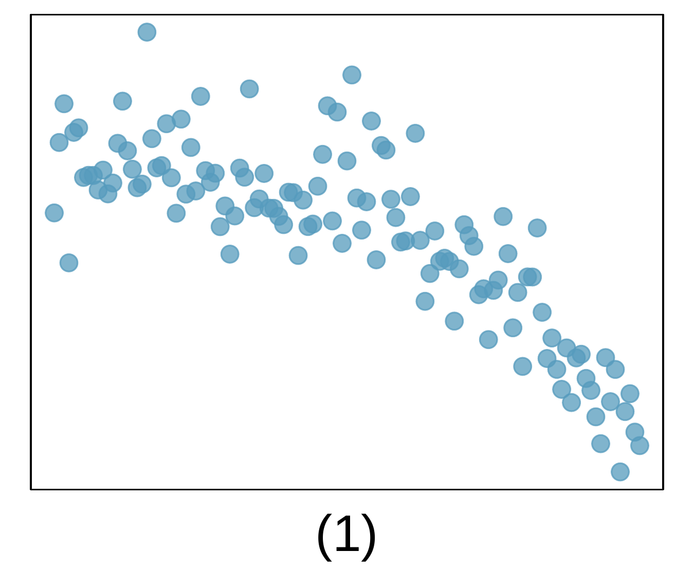
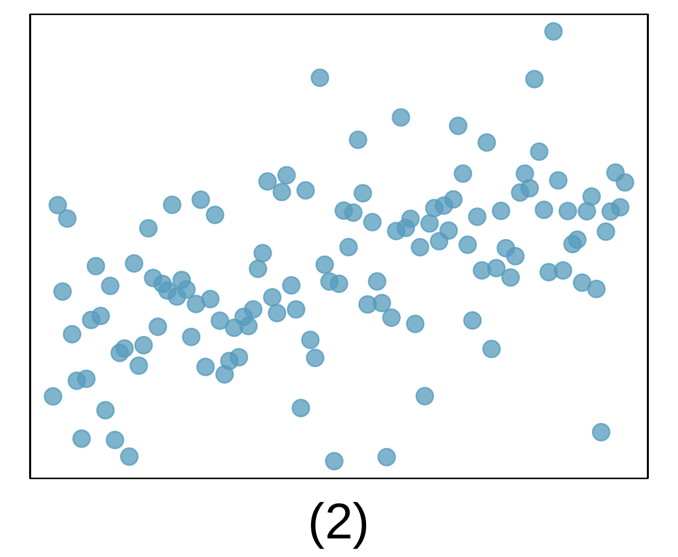
3. Identify relationships, Part I.

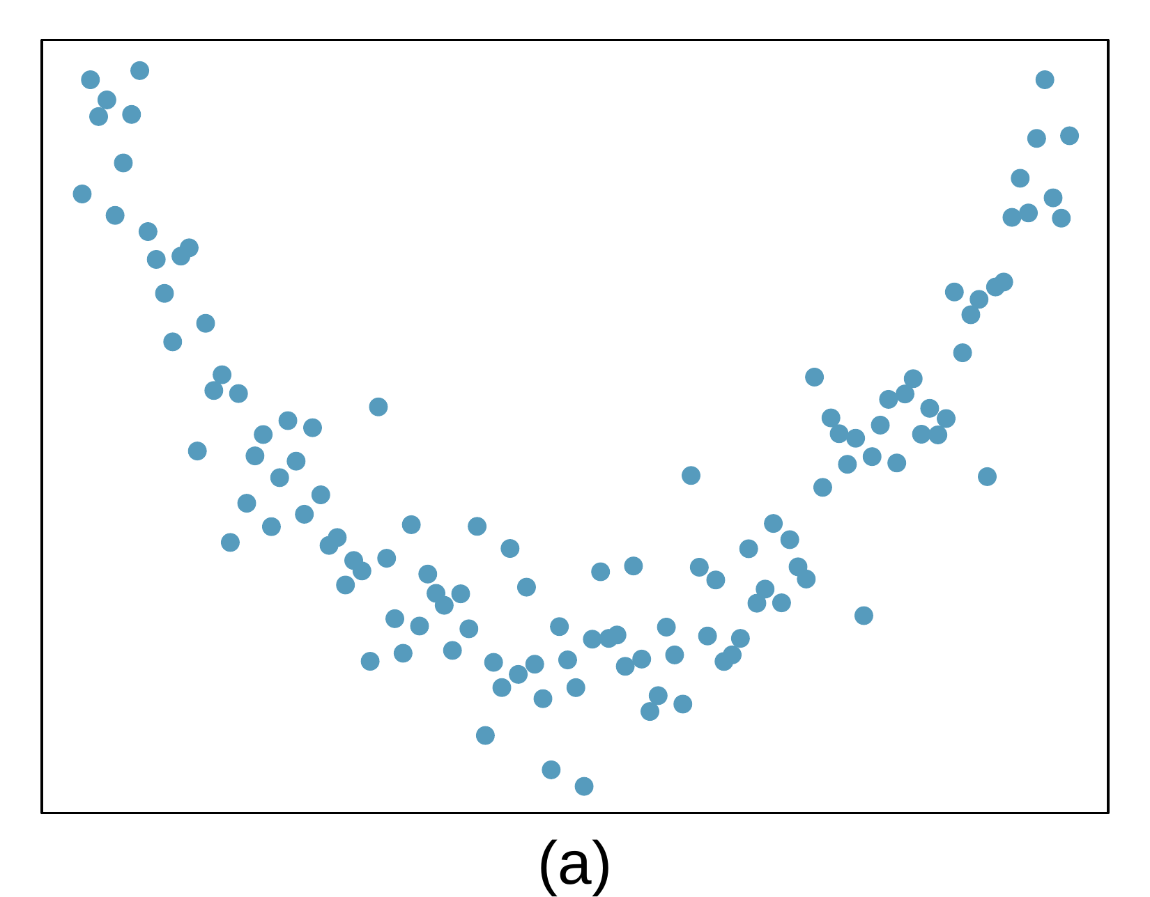
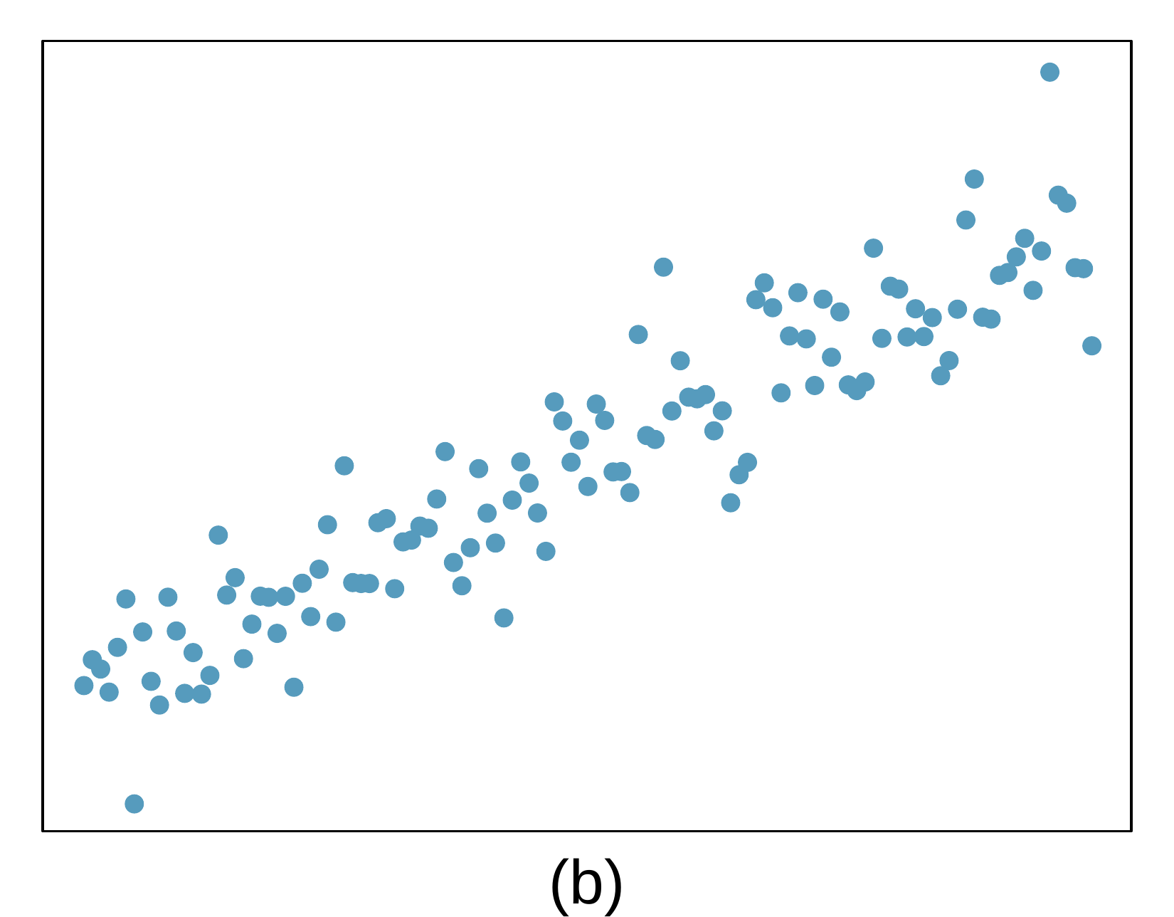
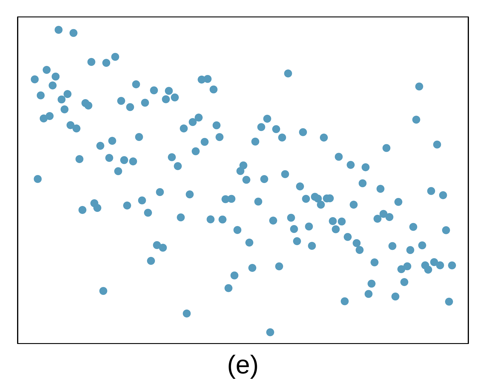
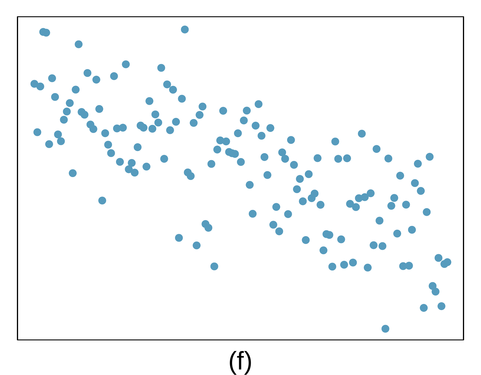
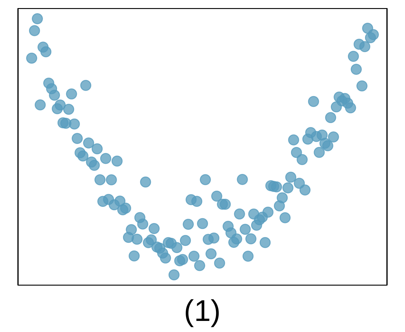
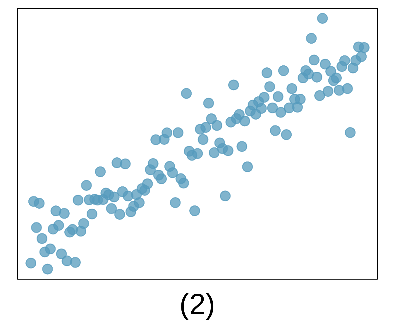
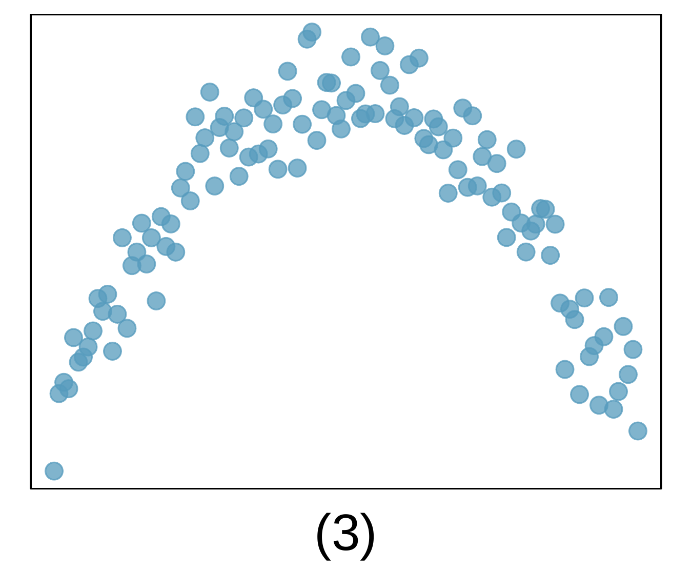
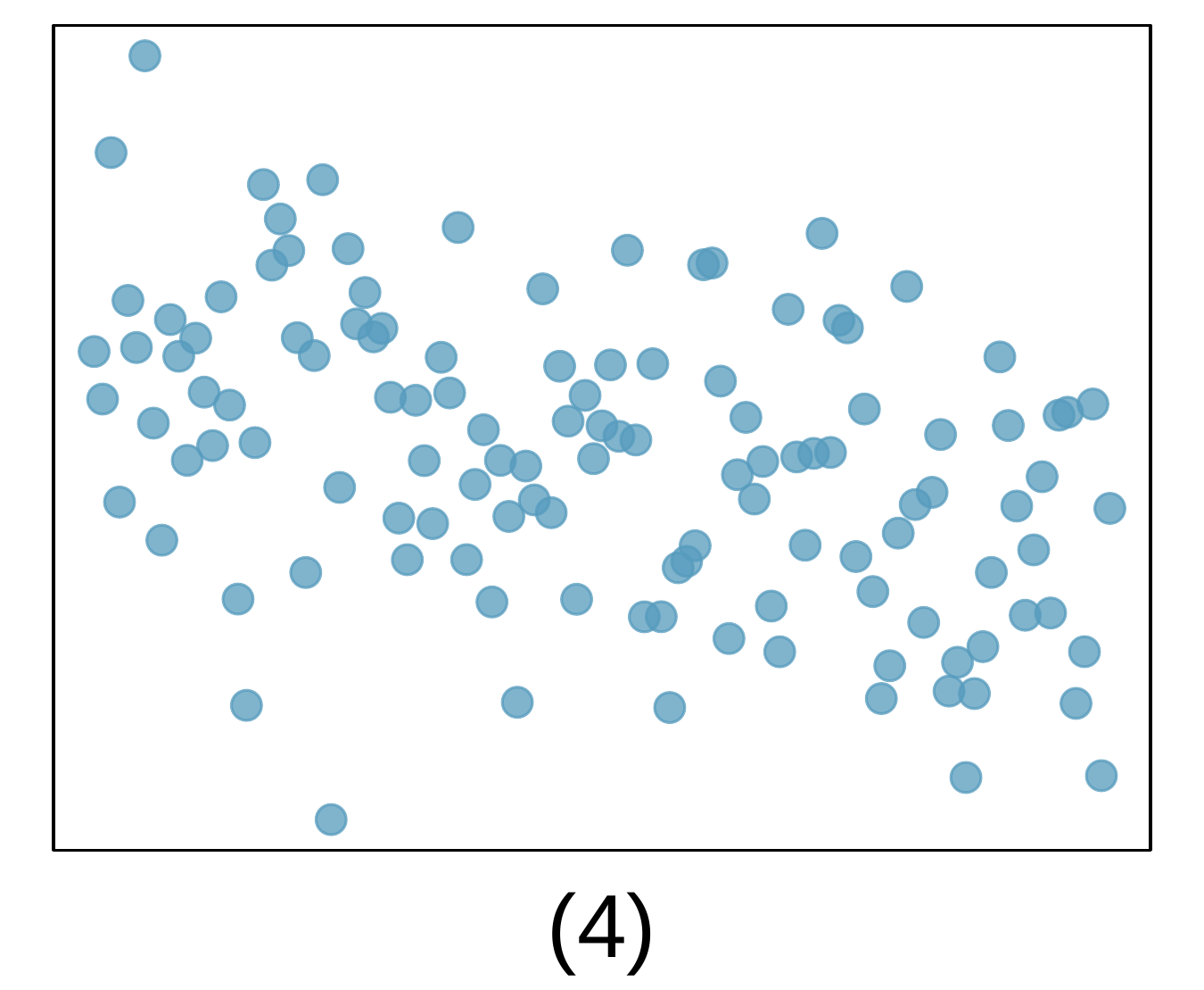
For each of the six plots, identify the strength of the relationship (e.g. weak, moderate, or strong) in the data and whether fitting a linear model would be reasonable.
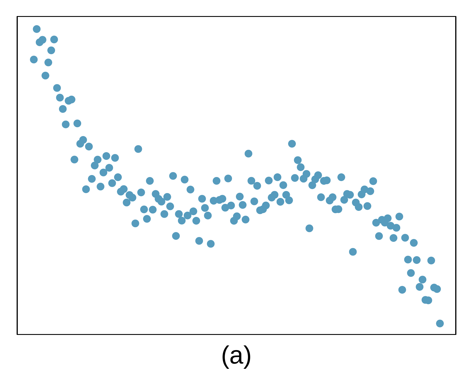
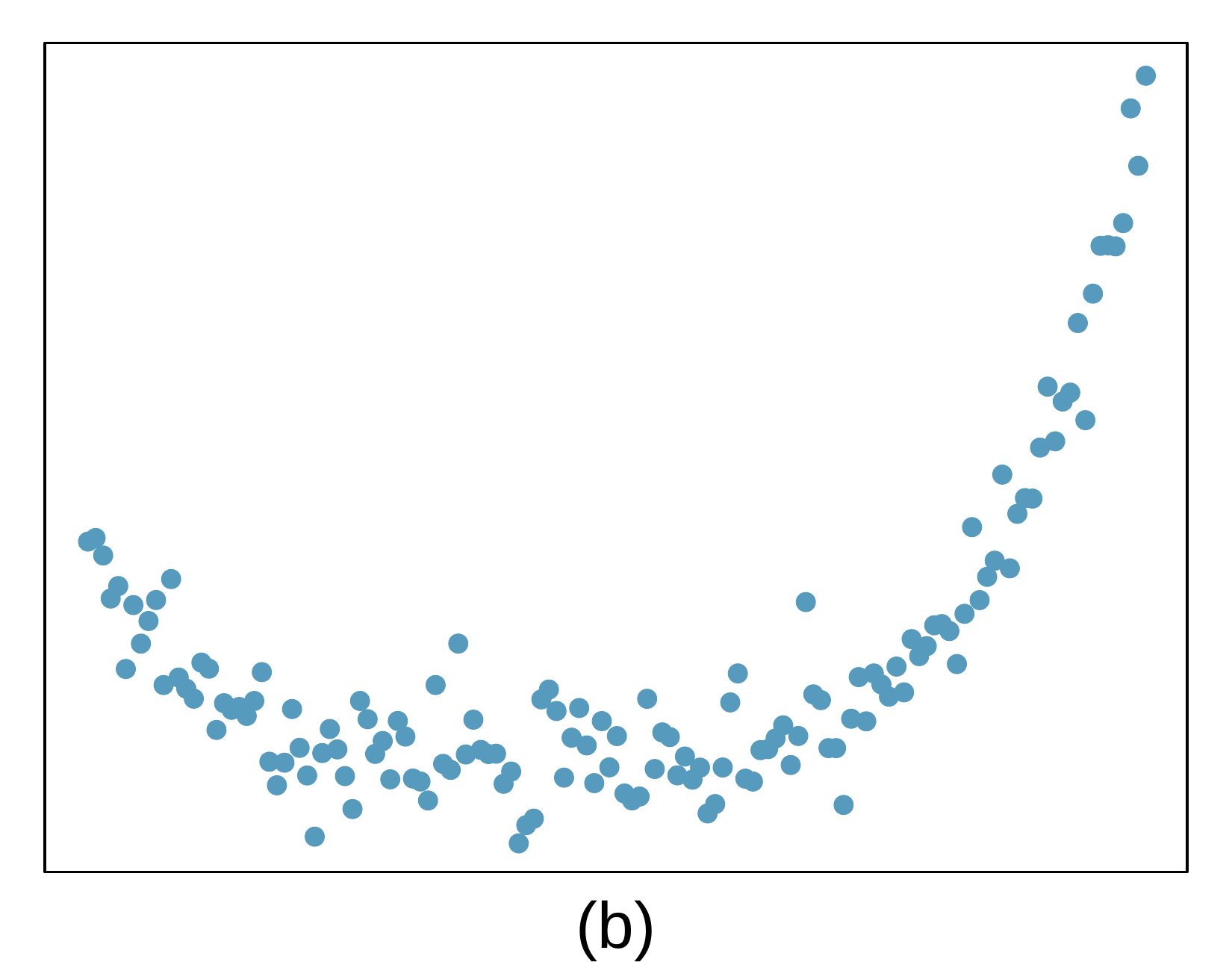
A scatterplot is shown. The observations start in the upper left corner of the plot, trend sharply downwards before tapering off and stabilizing at about the middle of the plot, before steadily and then faster rising again to the upper right corner of the plot. The trend is approximately symmetric from left-to-right.
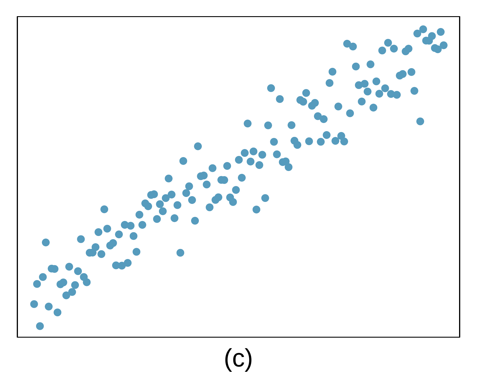
A scatterplot is shown. The points start on the lower left corner, only spanning about 20% of the vertical region of the plot, and have a steady upwards trend to the upper right corner of the plot. The vertical variability of the points around the trend is relatively stable across the plot.
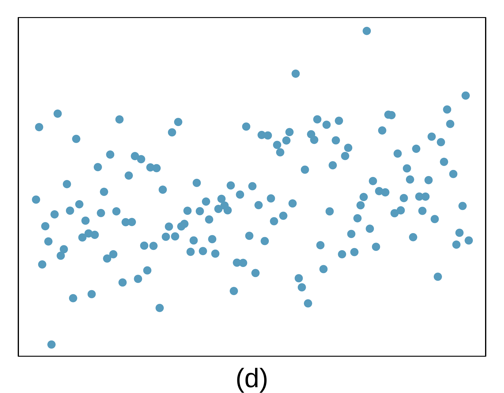
A scatterplot is shown. On the left side of the plot, the points appear randomly scattered across the full range of the plot, and this property holds across the entire plot. No trend is evident.
A scatterplot is shown. On the left side of the plot, the observations are concentrated in the bottom half of the plot but rise steadily. The trend peaks near the center of the plot, where nearly all the points in the (horizontal) center region of the scatterplot are concentrated in the upper half of the scatterplot. On the right side of the plot, the points show a trend downwards, with points concentrated in the lower quarter of the scatterplot for the rightmost handful of points.
A scatterplot is shown. The points start on the upper left corner, only spanning about 20% of the vertical region of the plot, and have a steady downwards trend to the bottom right corner of the plot. The vertical variability of the points around the trend is relatively stable across the plot.
A scatterplot is shown. On the left side of the plot, the points appear randomly scattered across the full range of the plot, and this property holds across the entire plot. No trend is evident or at least obvious.

4. Identify relationships, Part II.

For each of the six plots, identify the strength of the relationship (e.g. weak, moderate, or strong) in the data and whether fitting a linear model would be reasonable.
A scatterplot is shown. On the left side of the plot, the observations are concentrated in the upper corner of the plot, with a sharp trend downwards, before stabilizing, then rising slightly at halfway through the plot, reaching a peak, and then declining again, with a sharp decline on the right-most portion of the plot to the bottom-right corner of the plot.
A scatterplot is shown. On the left side of the plot, the observations are concentrated around a region about 30% of the way up from the bottom-left corner of the plot, there is a slight downward trend that reaches the bottom area of the plot for about the center half of the plot, then the points rise gradually and then sharply in the last 25-30% of the plot.
A scatterplot is shown. Points in the leftmost region of the plot are concentrated in the lower-left corner, ranging from the bottom up to about 25% of the way up the plot. The points follow a steady upward trend to the top-right corner of the plot and show consistent vertical variability around the trend throughout.
A scatterplot is shown. The points appear randomly scattered across the left, middle, and right portion of the plot. There might be a very slight upward trend.
A scatterplot is shown. The points appear randomly scattered across the left, middle, and right portion of the plot. There is a very slight downward trend.
A scatterplot is shown. The points on the leftmost side are concentrated in the upper half of the plot, and the data trend steadily downwards and with consistent variability to the bottom right portion of the plot.

5. Exams and grades.

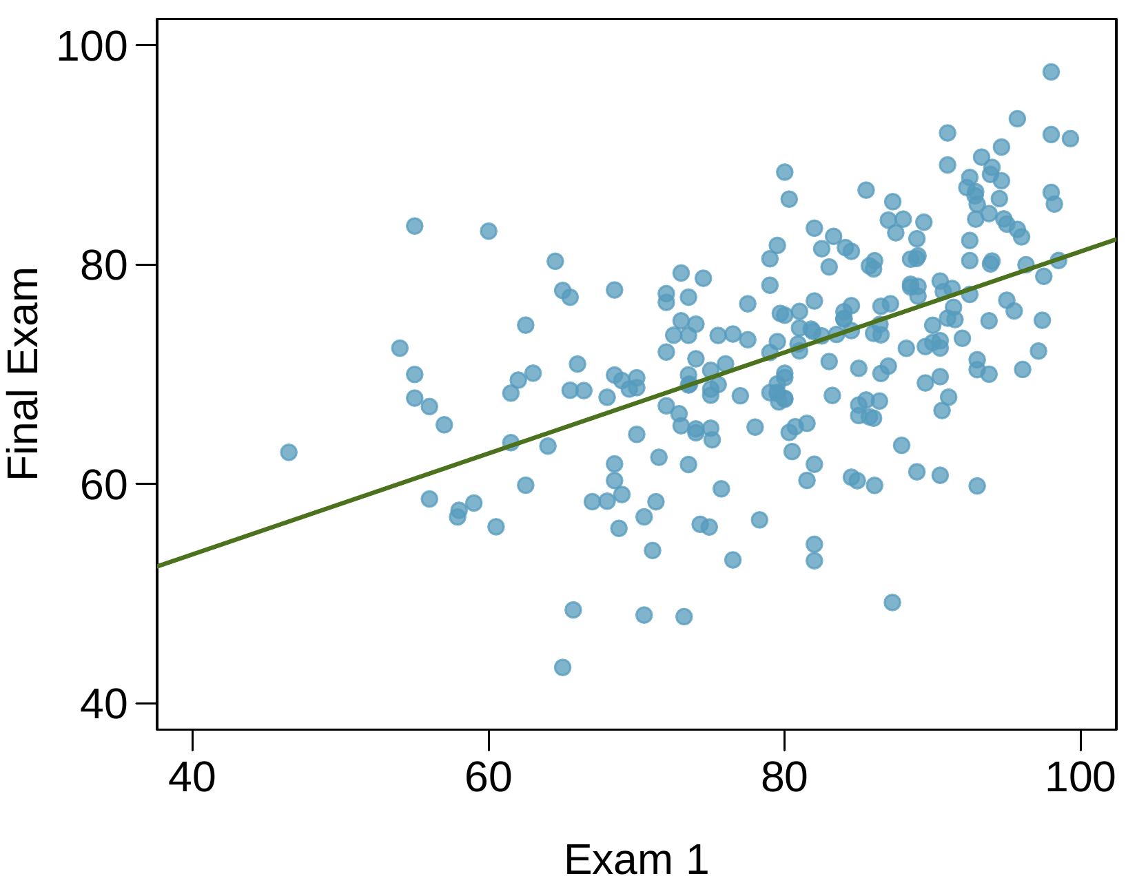
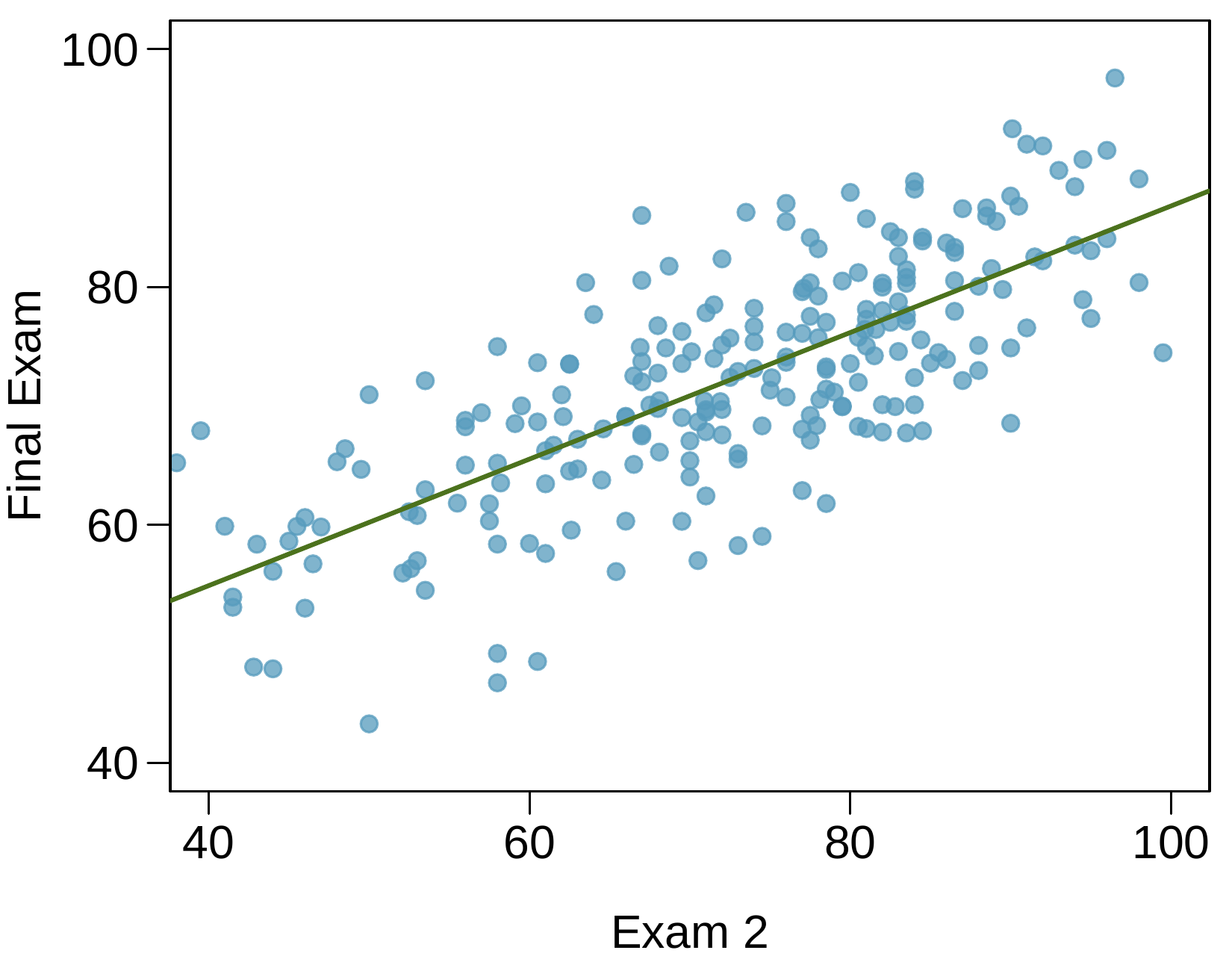
The two scatterplots below show the relationship between final and mid-semester exam grades recorded during several years for a Statistics course at a university.
A scatter plot with 100 points is shown with an upward trending line fit to the data. Exam 1 scores are on the horizontal axis and range from 40 to 100. Final Exam scores are on the vertical axis and also range from 40 to 100. Only about ten Exam 1 scores are below 60, and these have Final Exam scores between about 55 and 85. Exam 1 scores between 60 and 80 represent about 50% of the points shown and have Final Exam scores mostly between 50 and 85. For the points where Midterm 1 scores are larger than 80, Final Exam scores mostly lie between 65 and 90, where a slightly upward trend is evident.
A scatter plot with 100 points is shown with an upward trending line fit to the data. Exam 2 scores are on the horizontal axis and range from 40 to 100. Final Exam scores are on the vertical axis and also range from 40 to 100. Midterm 2 scores are roughly uniformly distributed across the full range. For Exam 2 scores below 60, these mostly have Final Exam scores between about 45 and 70. Exam 2 scores between 60 and 80 have Final Exam scores mostly between 55 and 80. For the points where Midterm 2 scores are larger than 80, Final Exam scores mostly lie between 70 and 90.
  1. Based on these graphs, which of the two exams has the strongest correlation with the final exam grade? Explain.
  2. Can you think of a reason why the correlation between the exam you chose in part (a) and the final exam is higher?

6. Husbands and wives, Part I.

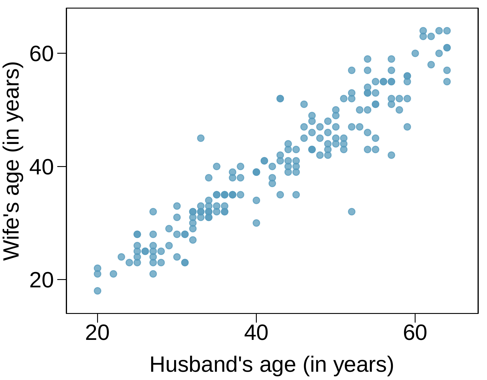
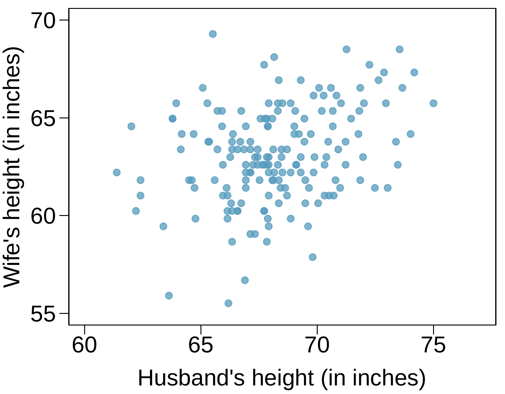
The Great Britain Office of Population Census and Surveys once collected data on a random sample of 170 married couples in Britain, recording the age (in years) and heights (converted here to inches) of the husbands and wives. The scatterplot on the left shows the wife’s age plotted against her husband’s age, and the plot on the right shows wife’s height plotted against husband’s height.
A scatterplot is shown. The horizontal axis represents "Husband’s Age (in years)" with values ranging from about 20 to 65. The vertical axis represents "Wife’s Age (in years)" with values ranging from about 18 to 65. When husband age is between 20 and 30, wife age mostly ranges from 18 to about 30. When husband age is between 30 and 40, wife age mostly ranges from 23 to about 40. When husband age is between 40 and 50, wife age mostly ranges from 35 to about 50. When husband age is between 50 and 60, wife age mostly ranges from 45 to about 60. When husband age is larger than 60, wife age mostly ranges from 55 to about 65.
A scatterplot is shown. The horizontal axis represents "Husband’s Height (in inches)" with values ranging from about 60 to 75. The vertical axis represents "Wife’s Height (in inches)" with values ranging from about 55 to 70. When husband height is between 60 and 65, wife height mostly ranges from about 58 to 65 inches, though there are only about 10 points in this range, which is about 5% of the data. When husband height is between 65 and 70, wife height mostly ranges from 57 to 68 inches. When husband height is larger than 70 inches, wife height mostly ranges from 61 to about 74 inches.
  1. Describe the relationship between husbands’ and wives’ ages.
  2. Describe the relationship between husbands’ and wives’ heights.
  3. Which plot shows a stronger correlation? Explain your reasoning.
  4. Data on heights were originally collected in centimeters, and then converted to inches. Does this conversion affect the correlation between husbands’ and wives’ heights?

9. Speed and height.

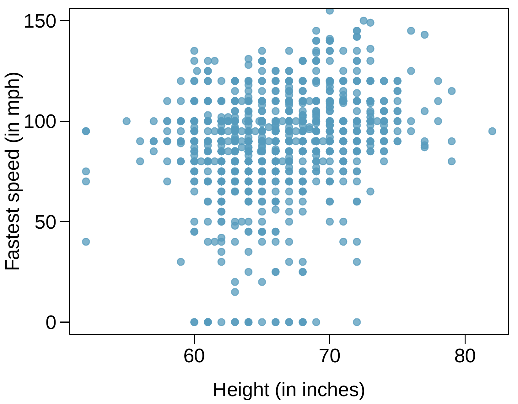
1,302 UCLA students were asked to fill out a survey where they were asked about their height, fastest speed they have ever driven, and gender. The scatterplot on the left displays the relationship between height and fastest speed, and the scatterplot on the right displays the breakdown by gender in this relationship.

A scatterplot is shown. The horizontal axis represents "Height (in inches)" with values ranging from about 50 to 80. The vertical axis represents "Fastest Speed (in mph)" and has values ranging from 0 to 150. First, it is worth noting that there several points along the bottom of the plot with a fastest speed of 0 mph. The remainder of the description will concentrate on the other points. A small portion of the points are shown with heights below 60 inches, and these have fastest speeds mostly ranging from about 70 to 110 mph. For points shown with heights between 60 and 70, fastest speeds mostly ranged from about 30 to 120 mph. For points shown with heights of 70 or more, fastest speeds mostly ranged from about 50 to 140 mph. There were no points corresponding to heights greater than 75 that had fastest speeds slower than about 75 mph, which left a sort of gap in the lower right portion of the scatterplot.
A scatterplot is shown, where points are colored to differentiate between males and females. The horizontal axis represents "Height (in inches)" with values ranging from about 50 to 80. The vertical axis represents "Fastest Speed (in mph)" and has values ranging from 0 to 150. Female heights are largely 70 inches or smaller, while Male heights are largely 65 inches and taller. When focusing exclusively on Females, no upward trend is evident, with about 95% of observations having Fastest Speed between about 30 mph and 120 mph. When focusing exclusively on Males, no upward trend is evident there either, with about 95% of observations having Fastest Speed between about 50 mph and 140 mph. In contrast, if we ignore the male/female differentiation, there is a slight upward trend in the points.
  1. Describe the relationship between height and fastest speed.
  2. Why do you think these variables are positively associated?
  3. What role does gender play in the relationship between height and fastest driving speed?

10. Guess the correlation.

Eduardo and Rosie are both collecting data on number of rainy days in a year and the total rainfall for the year. Eduardo records rainfall in inches and Rosie in centimeters. How will their correlation coefficients compare?

11. The Coast Starlight, Part I.

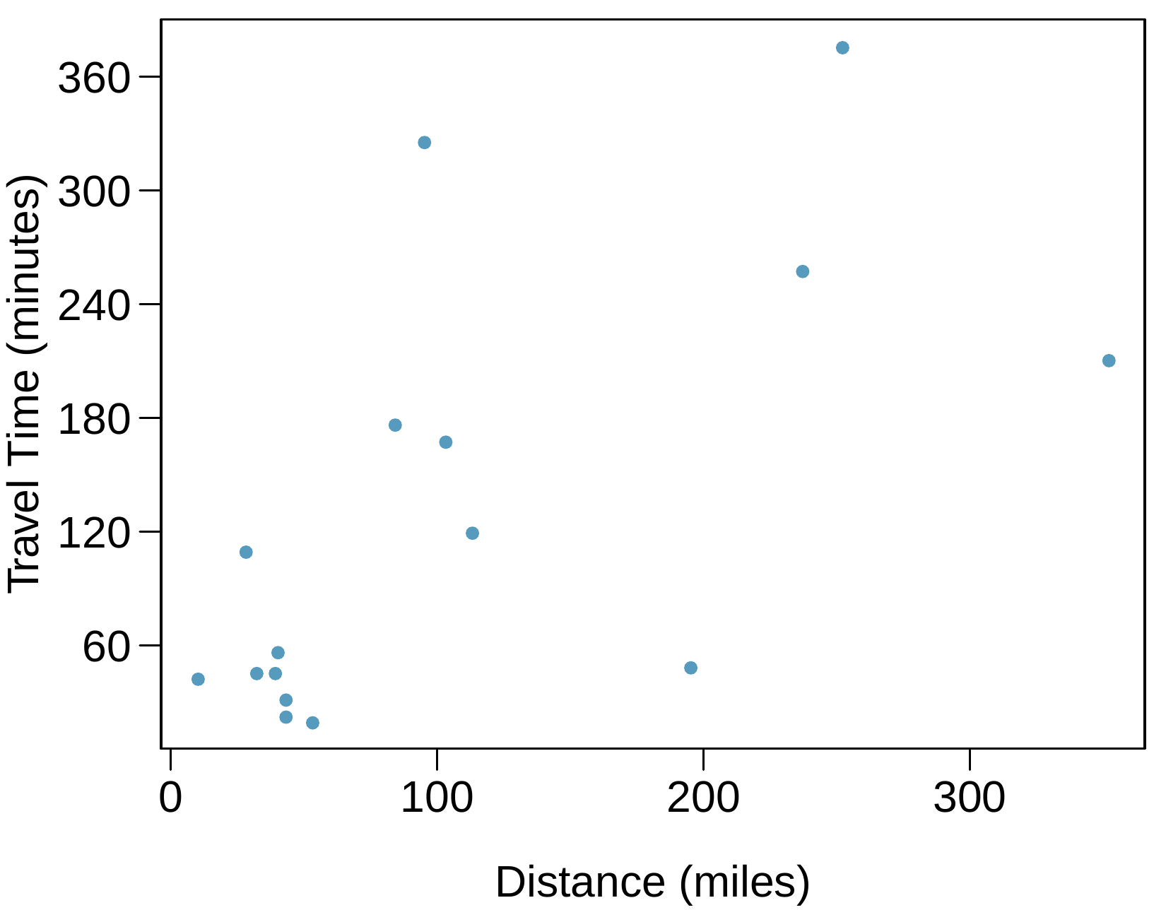
The Coast Starlight Amtrak train runs from Seattle to Los Angeles. The scatterplot below displays the distance between each stop (in miles) and the amount of time it takes to travel from one stop to another (in minutes).
  1. Describe the relationship between distance and travel time.
  2. How would the relationship change if travel time was instead measured in hours, and distance was instead measured in kilometers?
  3. The correlation between travel time (in miles) and distance (in minutes) is \(r = 0.636\text{.}\) Suppose we had instead measured travel time in hours and measured distance in kilometers (km). What would be the correlation in these different units?
A scatterplot is shown with about 15 points. The horizontal axis represents "Distance (miles)" with values ranging from just over 0 to about 350. The vertical axis represents "Travel Time (in minutes)" and has values ranging from about 20 to 380. The point with the smallest distance -- about 10 miles -- shows a travel time of about 40 minutes. Next, there is a cluster of 6 points with distances between 40 and 60 miles and travel times ranging from about 20 to 60 minutes. The remainder of the points are scattered pretty broadly but may show a slightly upward trend. A few points that highlight the widely varying nature of the data are located at the following approximate locations: (190 miles, 60 minutes), (240 miles, 250 minutes), (250 miles, 380 minutes), and (350 miles, 200 minutes).

12. Crawling babies, Part I.

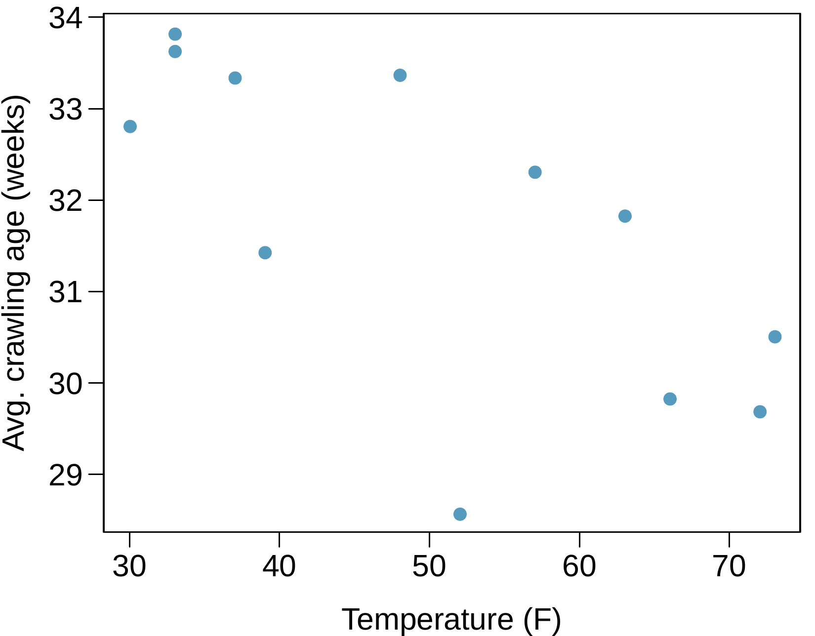
A study conducted at the University of Denver investigated whether babies take longer to learn to crawl in cold months, when they are often bundled in clothes that restrict their movement, than in warmer months. Infants born during the study year were split into twelve groups, one for each birth month. We consider the average crawling age of babies in each group against the average temperature when the babies are six months old (that’s when babies often begin trying to crawl). Temperature is measured in degrees Fahrenheit (\(^\circ\)F) and age is measured in weeks.
  1. Describe the relationship between temperature and crawling age.
  2. How would the relationship change if temperature was measured in degrees Celsius (\(^\circ\)C) and age was measured in months?
  3. The correlation between temperature in \(^\circ\)F and age in weeks was \(r = -0.70\text{.}\) If we converted the temperature to \(^\circ\)C and age to months, what would the correlation be?
A scatterplot is shown with a dozen points. The horizontal axis is "Temperature (F)" with values ranging from 30 to 75. The vertical axis is "Average Crawling Age (weeks)" with values ranging from 28.5 to 34. For those points with temperatures from 30 to 40, average crawling ages range from 31.5 to 34. For the single point with temperatures between 40 to 50, average crawling age was about 33.5. For the two points with temperature between 50 and 60, average crawling age was 28.5 and 32.5. For the last 4 points with temperature above 60, average crawling ages were 32, 30, 30, and 30.5.

13. Body measurements, Part I.

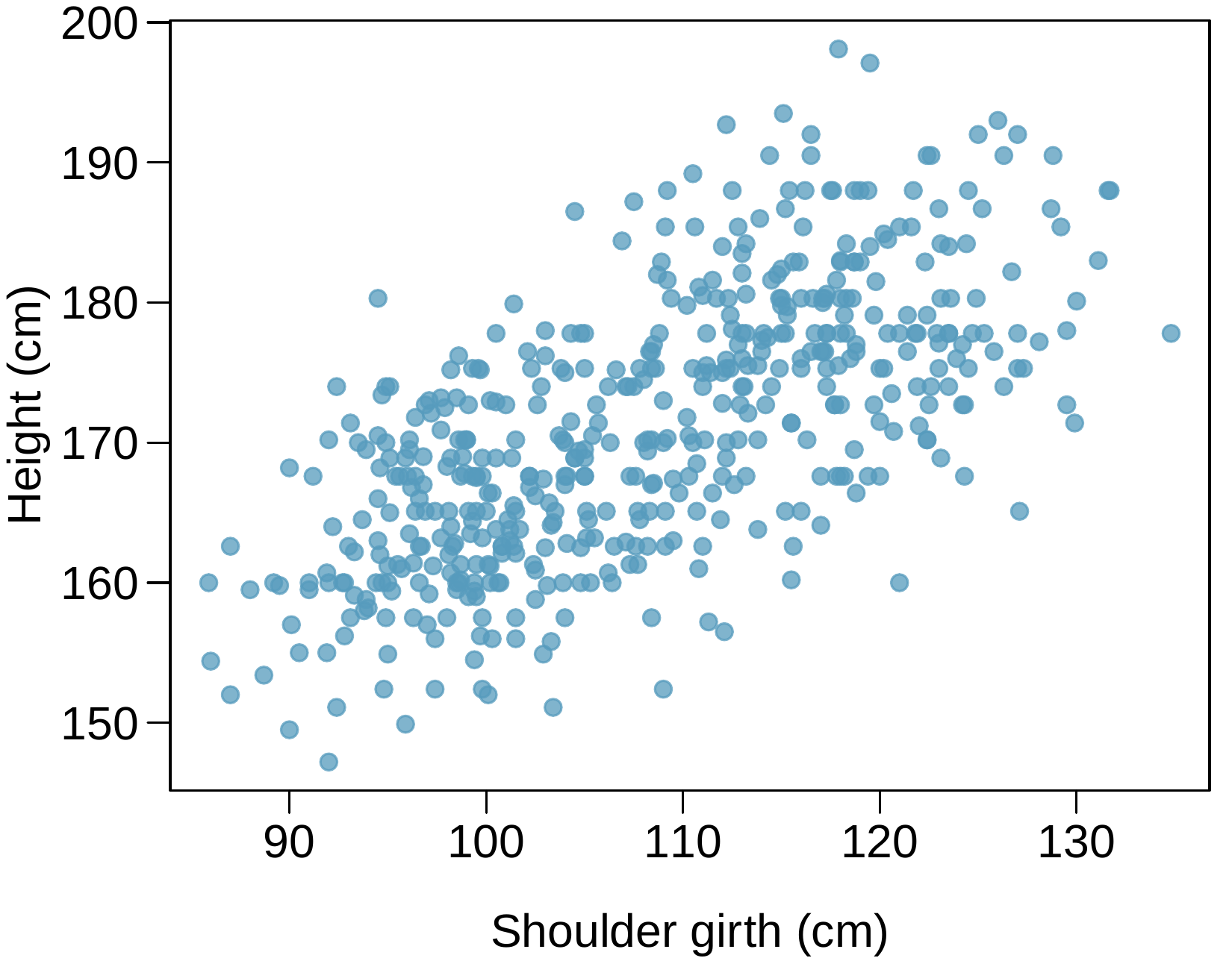
Researchers studying anthropometry collected body girth measurements and skeletal diameter measurements, as well as age, weight, height and gender for 507 physically active individuals. The scatterplot below shows the relationship between height and shoulder girth (over deltoid muscles), both measured in centimeters.
  1. Describe the relationship between shoulder girth and height.
  2. How would the relationship change if shoulder girth was measured in inches while the units of height remained in centimeters?
A scatter plot with several hundred points is shown. The horizontal axis represents "Shoulder Girth (cm)" with values ranging from about 85 to 135. The vertical axis represents "Height (cm)" with values ranging from about 145 to 200. For points where Shoulder Girth is smaller than 100, 95% of points have heights between 152 and 170. For points where Shoulder Girth is between 100 and 110, 95% of points have heights between 155 and 180. For points where Shoulder Girth is between 110 and 120, 95% of points have heights between 162 and 190. For points where Shoulder Girth larger than 120, 95% of points have heights between 170 and 190.

14. Body measurements, Part II.

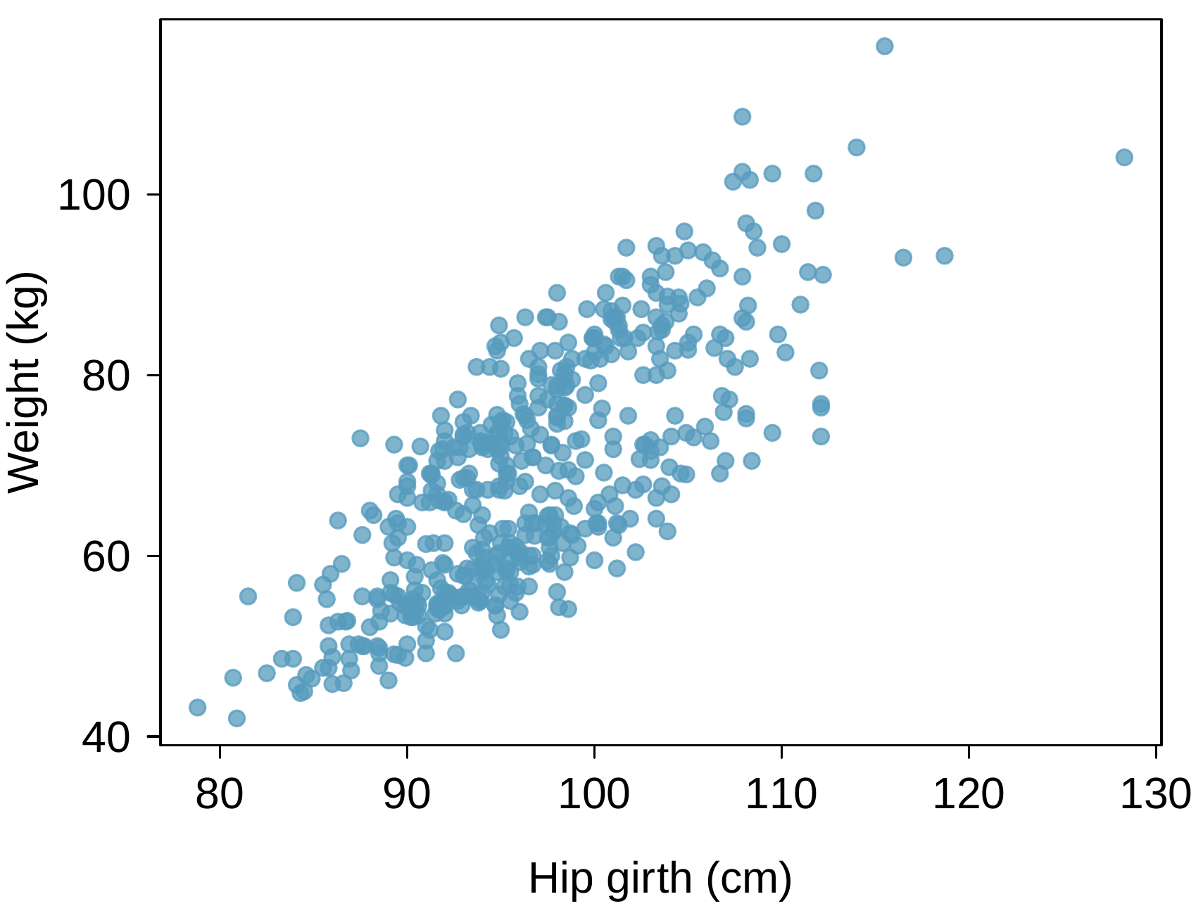
The scatterplot below shows the relationship between weight measured in kilograms and hip girth measured in centimeters from the data described in ExerciseΒ 8.1.5.13.
  1. Describe the relationship between hip girth and weight.
  2. How would the relationship change if weight was measured in pounds while the units for hip girth remained in centimeters?
A scatter plot with several hundred points is shown. The horizontal axis represents "Hip Girth (cm)" with values ranging from about 80 to 115, with about 4 observations with larger hip girth up to about 130 cm. The vertical axis represents "Weight (kg)" with values ranging from about 40 to 105, with a few observations with larger weights up to 120. For points where Hip Girth is smaller than 90, 95% of points have weight between roughly 45 and 60. For points where Hip Girth is between 90 and 100, 95% of points have weight between roughly 50 and 80. For points where Hip Girth is between 100 and 110, 95% of points have weight between roughly 65 and 90. For points where Hip Girth is between 110 and 115, points have weight between roughly 70 and 105. There are four additional points located at about (115, 120), (115, 90), (118, 90), and (128, 105).

15. Correlation, Part I.

What would be the correlation between the ages of husbands and wives if men always married women who were
  1. 3 years younger than themselves?
  2. 2 years older than themselves?
  3. half as old as themselves?

16. Correlation, Part II.

What would be the correlation between the annual salaries of males and females at a company if for a certain type of position men always made
  1. $5,000 more than women?
  2. 25% more than women?
  3. 15% less than women?