Section 3.10 Exploratory Data Analysis
The goal of an exploratory analysis is to examine, or explore the data and find relationships that weren’t previously known. Exploratory analyses explore how different measures might be related to each other but do not confirm that relationship as causal, i.e., one variable causing another. You’ve probably heard the phrase "Correlation does not imply causation," and exploratory analyses lie at the root of this saying. Just because you observe a relationship between two variables during exploratory analysis, it does not mean that one necessarily causes the other.
Because of this, exploratory analyses, while useful for discovering new connections, should not be the final say in answering a question! It can allow you to formulate hypotheses and drive the design of future studies and data collection, but exploratory analysis alone should never be used as the final say on why or how data might be related to each other. In short, exploratory analysis helps us ask better questions, but it does not answer questions. More specifically, we explore data in order to:
-
Understand data properties such as nonlinear relationships, the existence of missing values, the existence of outliers, etc.
-
Find patterns in data such as associations, group differences, confounders, etc.
-
Suggest modeling strategies such as linear vs. nonlinear models, transformation
-
"Debug" analyses
-
Communicate results
Subsection 3.10.1 General Principles of EDA
We can summarize the general principles of exploratory analysis as follows:
-
Look for missing values
-
Look for outlier values
-
Use plots to explore relationships
-
Use tables to explore relationships
-
If necessary, transform variables
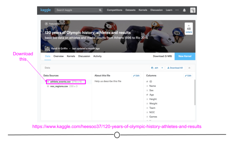
These principles may be more clear in an example. We will use a dataset from Kaggle.com that contains 120 years of Olympics history on athletes and results. If you don’t have an account on Kaggle, create one and go to the link https://www.kaggle.com/heesoo37/120-years-of-olympic-history-athletes-and-results and under "Data Sources" download the
athlete_events.csv to your computer.
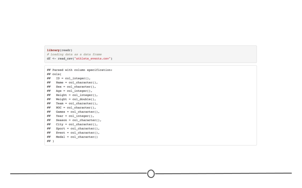
Upload the data in R and import the CSV file using the commands you have learned. Unfortunately, you cannot download the CSV file directly from the web address since downloading datasets on Kaggle requires logging in.
As we learned before, we can use the package
skimr to take a look at the data.
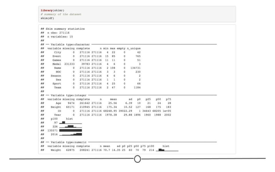
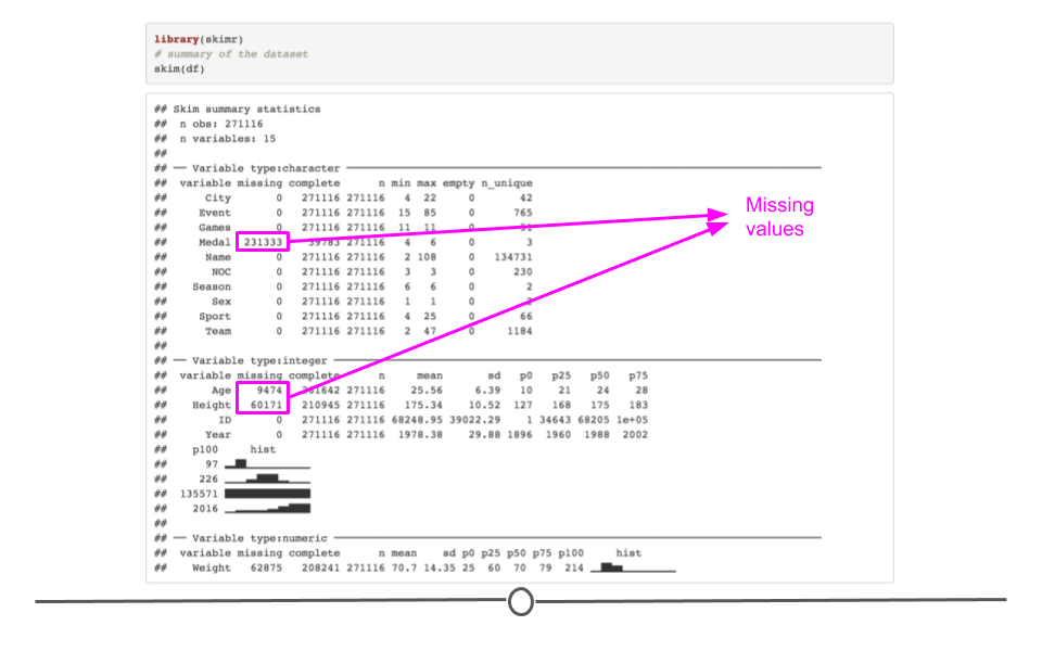
We see that the dataset contains 15 variables and 271,116 observations. Some of the variables are of factor type and others are of integer or numeric type. The dataset includes variables on athletes such as name, sex, the sport played, whether they received a medal, age, and height. We first need to understand the data properties. So let’s start with missing values.
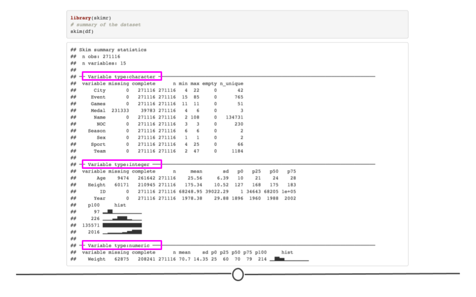
First, the results of the
skim() function indicate that some of our variables have lots of missing values. For instance, the variable Medal has 231,333 missing values. Generally, this is a place for concern since most statistical analyses ignore observations with missing values. However, it is obvious that the missing values for the variable Medal are mainly because the athlete didn’t receive any medals. So this kind of missing value should not be a problem. However, we have missing values in the variables Height and Age. Since we are going to use these variables in our analysis in this lesson, observations with missing values for these two variables will be dropped from our analysis. Remember that NA is the most common character for missing values, but sometimes they are coded as spaces, 999, -1 or "missing". Check for missing values in a variety of ways.
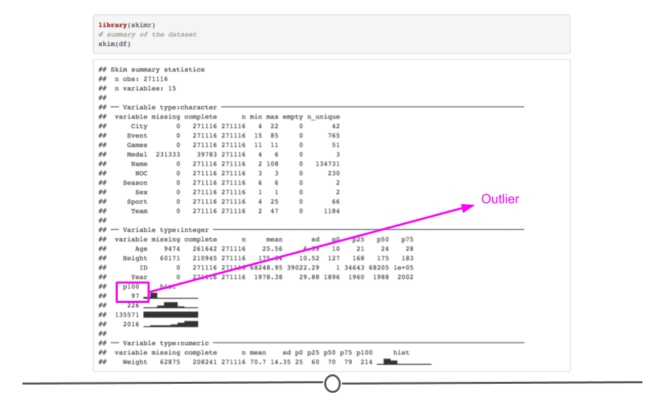
Second, we can see that there are some outliers in some of the numerical variables. For example, look at the summary of the variable
Age. Although the average age among all the athletes is around 25, there is an individual who is 97 years old (fun fact: use the command subset(df, df$Age == 97) to check out the information about this athlete. You will see that the name of the athlete is John Quincy Adams Ward and he competed in the sport(!) Art Competitions Mixed Sculpturing in 1928. This artist is known for his George Washington statue in front of Federal Hall in Wall Street in New York City.) It is always good to know about the existence of outliers in your sample. Outliers can significantly skew the results of your analysis. You can find outliers by looking at the distribution of your variable too.
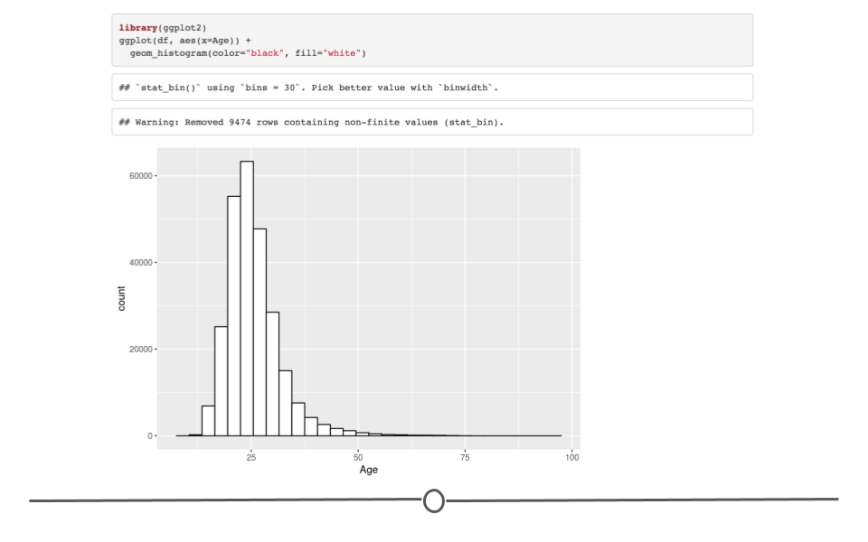
Histograms, in general, are one of the best ways to look at a variable and find abnormalities. You can see that the age of most individuals in the sample are between 18-35.
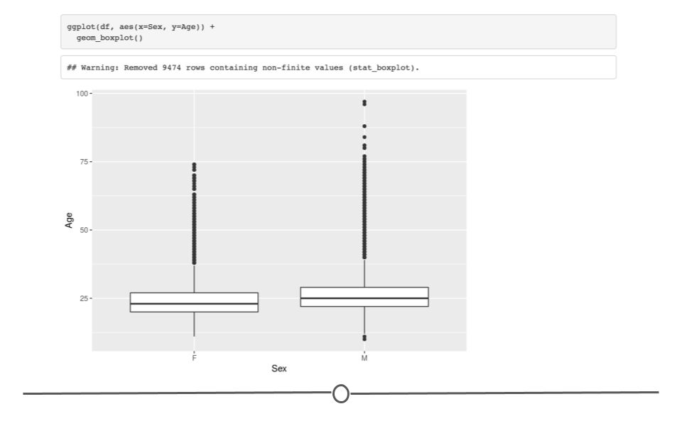
Now, rather than just summarizing the data points within a single variable, we can look at how two or more variables might be related to each other. For instance, we like to know if there is an association between age of athletes and their gender. One of the ways to do this is to look at a boxplot of age grouped by gender, i.e., the distribution of age separated for male and female athletes. Boxplot shows the distribution of the variable age for the gender groups. You can see that the average age is slightly higher for men than for women.
If we are interested in looking at the distribution of male and female athletes over time, we can use frequency tables. Let us first create a frequency table of the share of women in each Olympic event. Tables are good for looking at factor or character variables.
df_ath<-read_csv(file = here::here("data", "raw_data", "athlete_events.csv"))
share <- df_ath %>%
  group_by(Year, Sex) %>%
  summarise(n =n()) %>%
  mutate(freq = n / sum(n)) %>%
  filter(Sex == "F")
share <- df %>%
  group_by(Year, Sex) %>%
  summarise(n =n()) %>%
  mutate(freq = n / sum(n)) %>%
  filter(Sex == "F")
## # A tibble: 34 × 4
## # Groups:   Year [34]
##     Year Sex       n    freq
##    <dbl> <chr> <int>   <dbl>
##  1  1900 F        33 0.0170
##  2  1904 F        16 0.0123
##  3  1906 F        11 0.00635
##  4  1908 F        47 0.0152
##  5  1912 F        87 0.0215
##  6  1920 F       134 0.0312
##  7  1924 F       261 0.0458
##  8  1928 F       437 0.0784
##  9  1932 F       369 0.111
## 10  1936 F       549 0.0742
## # … with 24 more rows
share
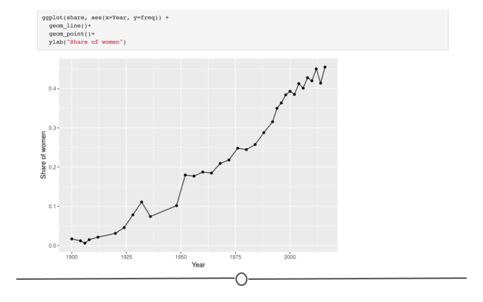
Now, if we want to plot this trend, we can use
geom_line() from ggplot. It’s interesting that the share of women among all athletes that was once at a very low level in the early 1900s has gone up to almost 50% in modern times.
In general, the most important plots in exploratory data analysis are:
-
Scatterplots (
geom_point()) -
Histograms (
geom_histogram()) -
Density plots (
geom_density()) -
Boxplots (
geom_boxplot()) -
Barplots (
geom_bar())
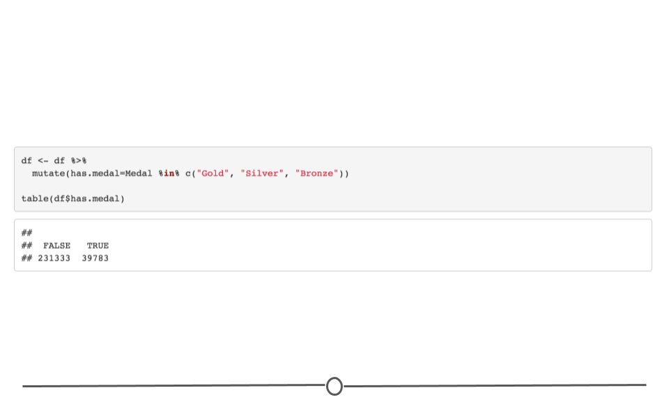
To end our lesson on exploratory analysis, let’s consider a question: are taller athletes more likely to win a medal? To answer this question we can use different methods. We can look at the distribution of height for those who received a medal and those who didn’t. We can use boxplots or barplots. The choice is yours but because boxplots are more informative, we will use them. We can first create a variable that indicates whether the athlete has any medal (the variable
Medal indicates the type of medals). Note that the variable has.medal is a transformation of the variable Medal.
And now, we use the following code to create the boxplot.
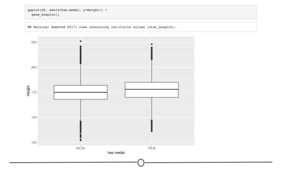
What is obvious is that those who have a medal are taller. Can we say that being tall increases the probability of winning a medal in the Olympics? The answer to this question is that we don’t know. There are some possible scenarios. For instance, it could be true that being tall increase the chances of winning medals. But it could also be that there are more medals awarded in sports such as volleyball or basketball that require taller athletes. In these sports, every member of the winning team gets a medal (even if country counts only one medal is counted for the country). As a result, we may end up having so many tall athletes with a medal in each Olympics. It could also be that there are other confounding factors involved that explain why an athlete wins a medal. We will learn about confounding variables in future lessons. For now, it’s important to know, as we said in the beginning of this lesson, that association or correlation does not mean causation.
In the next module we will cover more methods for visualizing data.
Subsection 3.10.2 Analyzing JSON in R
Above we discussed how to analyze pure text (meaning, text written by humans in their native written and spoken language). Here, we’ll discuss how to briefly how others have wrangled text-based data from the Internet in the JSON format within R. This is possible because of the R package
jsonlite, which was used in the following example:
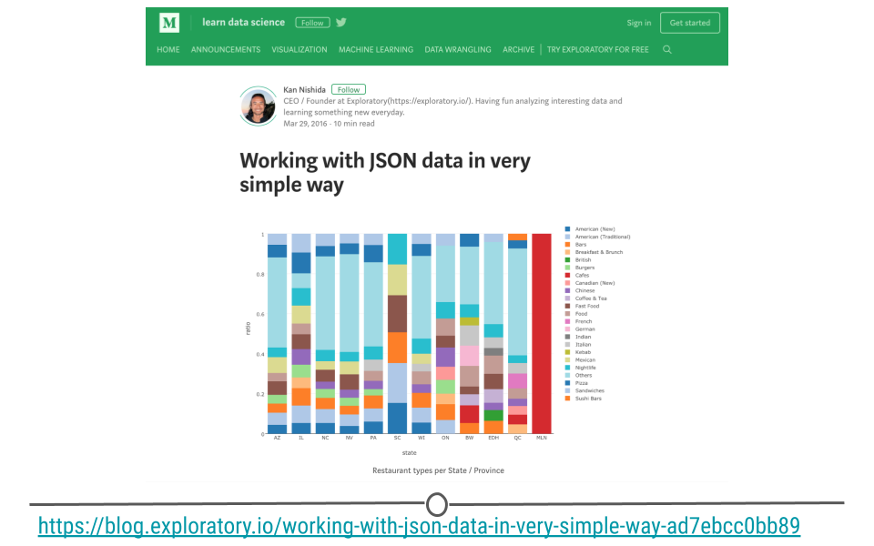
Kan Nishida, a data scientist, was interested in understanding what restaurant types found most frequently in each state or province. To do this, he used JSON data originally released from Yelp. He wrangled the data from JSON format into a tabular format using
jsonlite and other data wrangling packages, such as dplyr, to ultimately determine the types of restaurants found most frequently in a number of different states and provinces.
Subsection 3.10.3 Analyzing XML in R
To see an example of not only using
xml2 to parse XML data, but also another example of using rvest to obtain the XML data, check out this post from José Roberto Ayala Solares where he took the text from a New York Times article called "Trump’s Lies", scraped the data from the web (obtaining it in XML), and then wrangled it into a tidy format using xml2.

In this lesson, our goal is to make you aware that data from the Internet (and APIs in particular) will often come in either JSON or XML format. Thus, the JSON and XML examples provided here only give you a bit of an idea of what JSON and XML data are and how to work with them. Nevertheless, the more frequently you retrieve data from APIs and the Internet, the more comfortable you’ll have to become with both JSON and XML. And,
jsonlite and xml2 will help you as you work with these data in R!

