Section 4.8 Tables
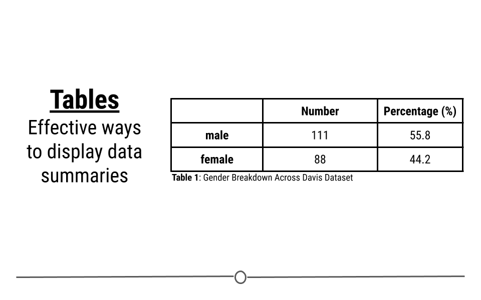
While we have focused on figures here so far, tables can be incredibly informative at a glance too. If you are looking to display summary numbers, a table can also visually display information.
Using this same dataset, we can use a table to get a quick breakdown of how many males and females there are in the dataset and what percentage of each gender there is.
A few things to keep in mind when making tables is that it’s best to:
-
Limit the number of digits in the table
-
Include a caption
-
When possible, keep it simple.
Subsection 4.8.1 Tables in R
Now that we have a good understanding of what to consider when making tables, we can to practice making good tables in R. To do this, we’ll continue to use the diamonds dataset (which is part of the
ggplot2 package). As a reminder, this dataset contains prices and other information about ~54,000 different diamonds. If we want to provide viewers with a summary of these data, we may want to provide information about diamonds broken down by the quality of the diamond’s cut. To get our data in the form we want we will use the dplyr package, which we discussed in a lesson earlier.
Subsection 4.8.2 Getting the Data in Order
To start figuring out how the quality of the cut of the diamond affects the price of that diamond, we first have to get the data in order. To do that we’ll use the
dplyr package. This allows us to group the data by the quality of the cut (cut) before summarizing the data to determine the number of diamonds in each category (N), the minimum price of the diamonds in this category (min), the average price (avg), and the highest price in the category (max).
To get these data in order, you could use the following code. This code groups the data by cut (quality of the diamond) and then calculates the number of diamonds in each group (N), the minimum price across each group (min), the average price of diamonds across each group (avg), and the maximum price within each group (max):
# get summary data for table in order
df <- diamonds %>%
  group_by(cut) %>%
  dplyr::summarize(
    N = n(),
    min = min(price),
    avg = mean(price),
    max = max(price),
    .groups = "drop"
  )
Subsection 4.8.3 An Exploratory Table
# look at data
df
## # A tibble: 5 × 5
##   cut           N   min   avg   max
##   <ord>     <int> <int> <dbl> <int>
## 1 Fair       1610   337 4359. 18574
## 2 Good       4906   327 3929. 18788
## 3 Very Good 12082   336 3982. 18818
## 4 Premium   13791   326 4584. 18823
## 5 Ideal     21551   326 3458. 18806
By getting the data summarized into a single object in R (
df), we’re on our way to making an informative table. However, this is clearly just an exploratory table. The output in R from this code follows some of the good table rules above, but not all of them. At a glance, it will help you to understand the data, but it’s not the finished table you would want to send to your boss.
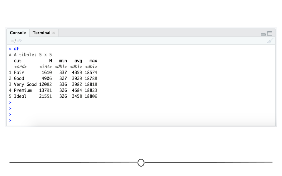
From this output, you, the creator of the table, would be able to see that there are a number of good qualities:
-
there is a reasonable number of rows and columns - There are 5 rows and 5 columns. A viewer can quickly look at this table and determine what’s going on.
-
the first column
cutis organized logically - The lowest quality diamond category is first and then they are ordered vertically until the highest quality cut (ideal)) -
comparisons are made top to bottom - To compare between the groups, your eye only has to travel up and down, rather than from left to right.
There are also things that need to be improved on this table:
-
column headers could be even more clear
-
there’s no caption/title
-
it could be more aesthetically pleasing
Subsection 4.8.4 Improving the Table Output
By-default, R outputs tables in the Console using a monospaced font. However, this limits our ability to format the appearance of the table. To fix the remaining few problems with the table’s format, we’ll use the
kable() function from the R package knitr and the additional formatting capabilities of the R packages kableExtra.
The first step to a prettier table just involves using the
kable() function from the knitr package, which improves the readability of this table. The knitr package is not a core tidyverse package, so you’ll have to be sure it’s installed and loaded.
# install.packages("knitr")
library(knitr)

kable(df)
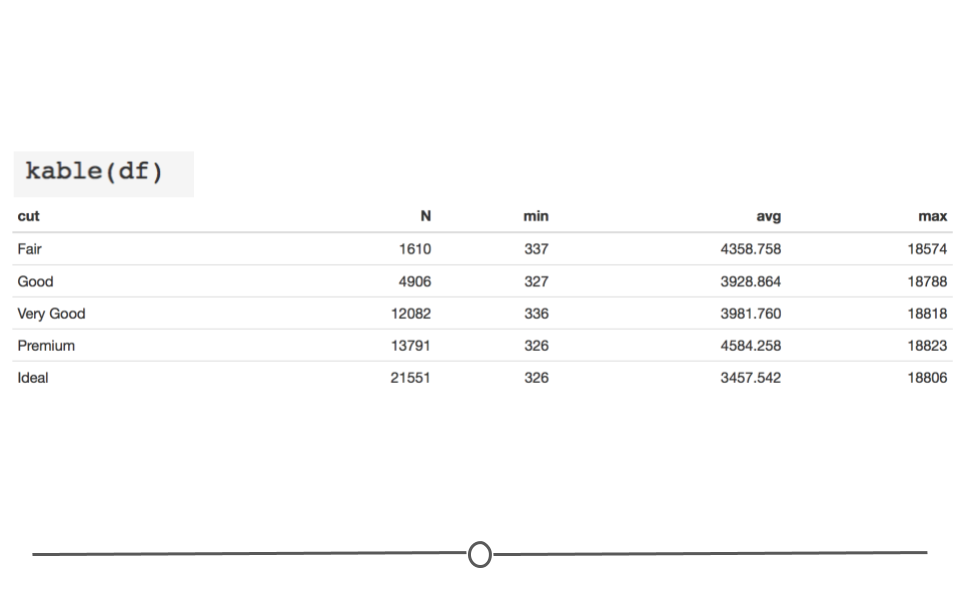
However, there are still a few issues we want to improve upon:
-
column names could be more informative
-
too many digits in the
avgcolumn -
caption/title is missing
-
source of data not included
To begin addressing these issues, we can use the
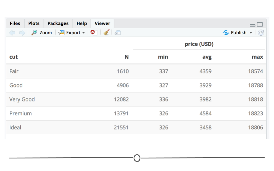
add_header_above function from kableExtra() to specify that the min, avg, and max columns refer to price in US dollars (USD). Additionally, kable() takes a digits argument to specify how many significant digits to display. This takes care of the display of too many digits in the avg column. Finally, we can also style the table so that every other row is shaded, helping our eye to keep each row’s information separate from the other rows using kable_styling() from kableExtra. These few changes really improve the readability of the table.
If you copy this code into your R console, the formatted table will show up in the Viewer tab at the bottom right-hand side of your RStudio console and the HTML code used to generate that table will appear in your console.
# install.packages("kableExtra")
library(kableExtra)

# use kable_styling to control table appearance
kable(df, digits=0, "html") %>%
  kable_styling("striped", "bordered") %>%
  add_header_above(c(" " = 2,  "price (USD)" = 3))
Subsection 4.8.5 Annotating Your Table
We mentioned earlier that captions and sourcing your data are incredibly important. The
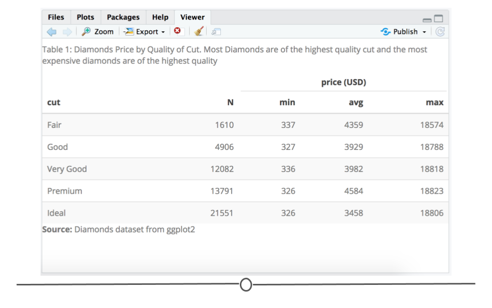
kable package allows for a caption argument. Below, an informative caption has been included. Additionally, kableExtra has a footnote() function. This allows you to include the source of your data at the bottom of the table. With these final additions, you have a table that clearly displays the data and could be confidently shared with your boss.
kable(df, digits=0, "html", caption="Table 1: Diamonds Price by Quality of Cut. Most Diamonds are of the highest quality cut and the most expensive diamonds are of the highest quality") %>%
  kable_styling("striped", "bordered") %>%
  # add headers and footnote
  add_header_above(c(" " = 2,  "price (USD)" = 3)) %>%
  footnote(general = "Diamonds dataset from ggplot2", general_title = "Source:", footnote_as_chunk = T)