Section 5.5 Descriptive and Exploratory Analysis
Descriptive and Exploratory analysis will first and foremost generate simple summaries about the samples and their measurements to describe the data you’re working with and how the variables might relate to one another. There are a number of common descriptive statistics that we’ll discuss in this lesson: measures of central tendency (eg: mean, median, mode) or measures of variability (eg: range, standard deviations, or variance).
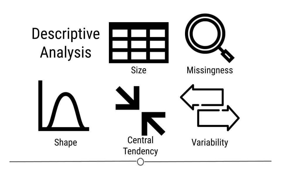
This type of analysis is aimed at summarizing your dataset. Unlike analysis approaches we’ll discuss in later, descriptive and exploratory analysis is not for generalizing the results of the analysis to a larger population nor trying to draw any conclusions. Description of data is separated from interpreting the data. Here, we’re just summarizing what we’re working with.
Some examples of purely descriptive analysis can be seen in censuses. In a census, the government collects a series of measurements on all of the country’s citizens. After collecting these data, they are summarized. From this descriptive analysis, we learn a lot about a country. For example, you can learn the age distribution of the population by looking at U.S. census data.
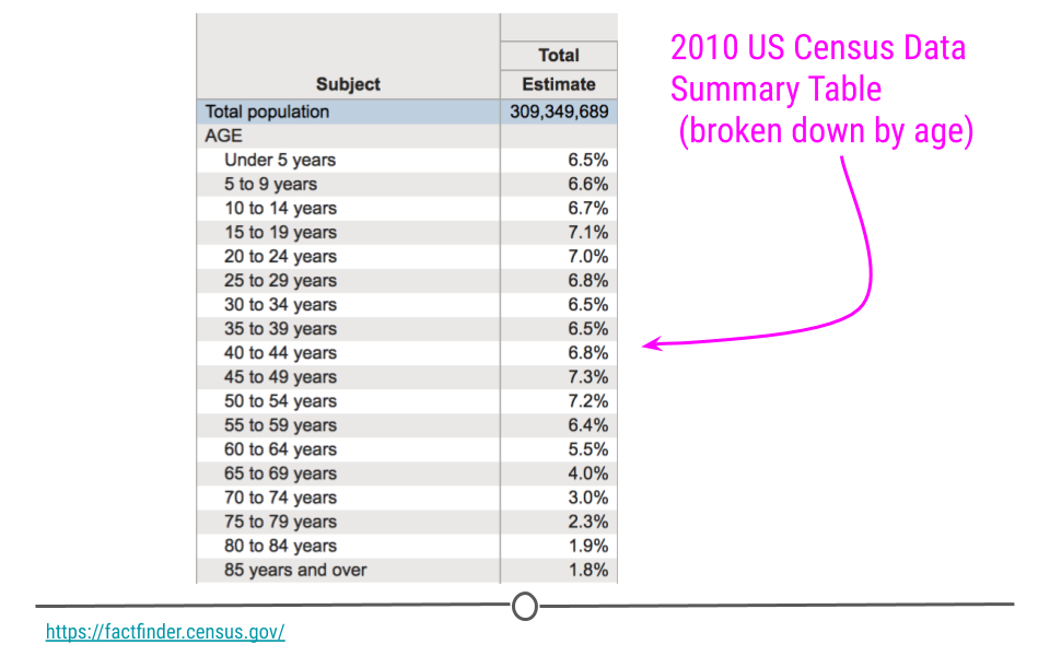
This can be further broken down (or stratified) by sex to describe the age distribution by sex. The goal of these analyses is to describe the population. No inferences are made about what this means nor are predictions made about how the data might trend in the future. The point of this (and every!) descriptive analysis is only to summarize the data collected.

Recall that the
glimpse() function of the dplyr package can help you to see what data you are working with.
## load packages
library(tidyverse)
df <- msleep # this data comes from ggplot2
## get a glimpse of your data
glimpse(df)
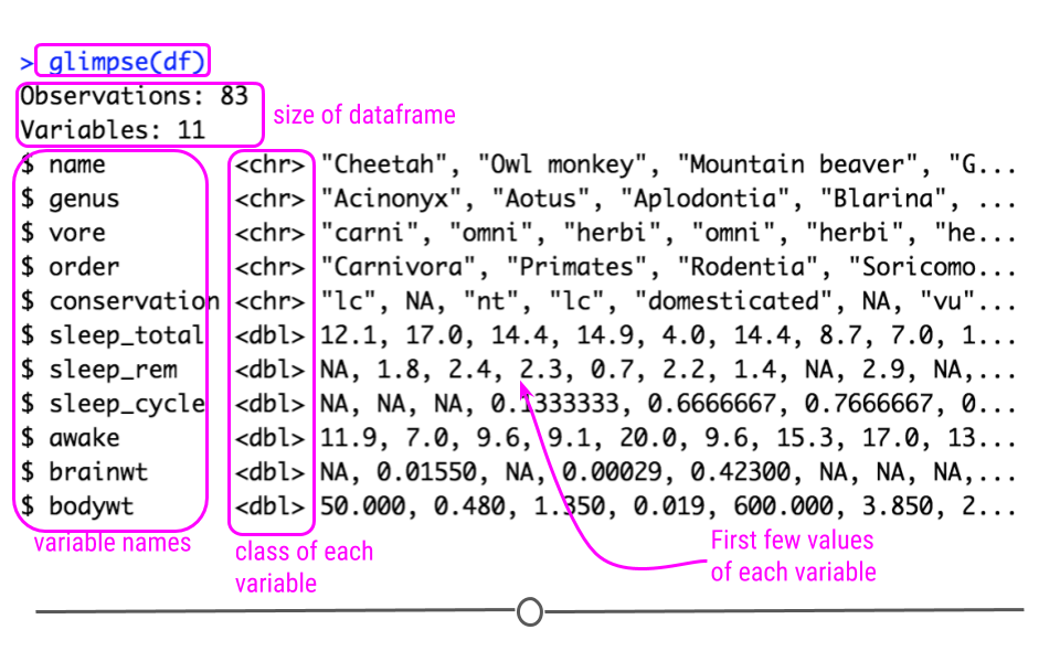
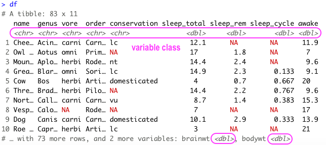
Also because the data is in tibble format, we can gain a lot of information by just viewing the data itself.
library(tidyverse)
df <- msleep
df
Here we also get information about the dimensions of our data object and the name and class of our variables.
Subsection 5.5.1 Missing Values
In any analysis, missing data can cause a problem. Thus, it’s best to get an understanding of missingness in your data right from the start. Missingness refers to observations that are not included for a variable. In R, NA is the preferred way to specify missing data, so if you’re ever generating data, its best to include NA wherever you have a missing value.
However, individuals who are less familiar with R code missingness in a number of different ways in their data: -999, N/A, ., or a blank space. As such, it’s best to check to see how missingness is coded in your dataset. A reminder: sometimes different variables within a single dataset will code missingness differently. This shouldn’t happen, but it does, so always use caution when looking for missingness.
In this dataset, all missing values are coded as
NA, and from the output of str(df) (or glimpse(df)), we see that at least a few variables have NA values. We’ll want to quantify this missingness though to see which variables have missing data and how many observations within each variable have missing data.
To do this, we can write a function that will calculate missingness within each of our variables. To do this we’ll combine a few functions. In the code here,
is.na() returns a logical (TRUE/FALSE) depending upon whether or not the value is missing (TRUE if it is missing). The sum() function then calculates the number of TRUE values there are within an observation. We then use map() to calculate the number of missing values in each variable. The second bit of code does the exact same thing but divides those numbers by the total number of observations (using nrow(df)). For each variable, this returns the proportion of missingness:
library(purrr)
## calculate how many NAs there are in each variable
df %>%
        map(is.na) %>%
        map(sum)

## calculate the proportion of missingness
## for each variable
df %>%
        map(is.na) %>%
        map(sum)%>%
        map(~ . / nrow(df))%>%
        bind_cols()
There are also some useful visualization methods for evaluating missingness. You could manually do this with
ggplot2, but there are two packages called naniar and visdat written by Nicholas Tierney that are very helpful. The visdat package was used previously in one of our case studies.
#install.packages("naniar")
library(naniar)

## visualize missingness
vis_miss(df)
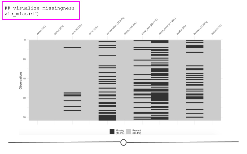
Here, we see the variables listed along the top with percentages summarizing how many observations are missing data for that particular variable. Each row in the visualization is a different observation. Missing data are black. Non-missing values are in grey. Focusing again on
brainwt, we can see the 27 missing values visually. We can also see that sleep_cycle has the most missingness, while many variables have no missing data.
Subsection 5.5.2 Shape
Determining the shape of your variable is essential before any further analysis is done. Statistical methods used for inference often require your data to be distributed in a certain manner before they can be applied to the data. Thus, being able to describe the shape of your variables is necessary during your descriptive analysis.
When talking about the shape of one’s data, we’re discussing how the values (observations) within the variable are distributed. Often, we first determine how spread out the numbers are from one another (do all the observations fall between 1 and 10? 1 and 1000? -1000 and 10?). This is known as the range of the values. The range is described by the minimum and maximum values taken by observations in the variable.
After establishing the range, we determine the shape or distribution of the data. More explicitly, the distribution of the data explains how the data are spread out over this range. Are most of the values all in the center of this range? Or, are they spread out evenly across the range? There are a number of distributions used commonly in data analysis to describe the values within a variable. We’ll cover just a few, but keep in mind this is certainly not an exhaustive list.
Subsubsection 5.5.2.1 Normal Distribution
The Normal distribution (also referred to as the Gaussian distribution) is a very common distribution and is often described as a bell-shaped curve. In this distribution, the values are symmetric around the central value with a high density of the values falling right around the central value. The left hand of the curve mirrors the right hand of the curve.
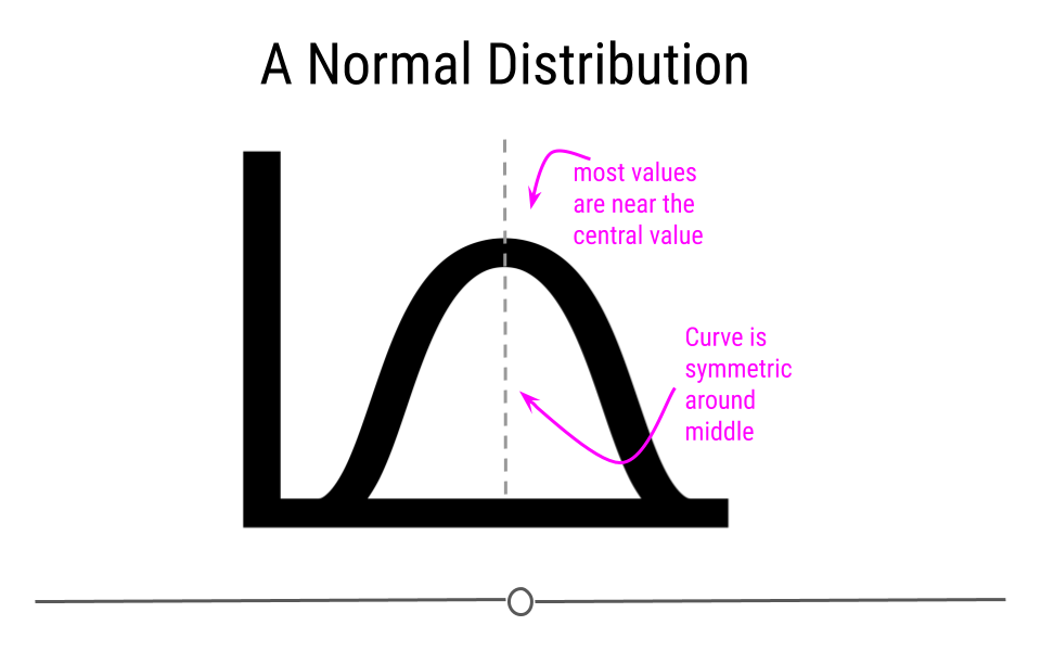
A variable can be described as normally distributed if:
-
There is a strong tendency for data to take a central value - many of the observations are centered around the middle of the range.
-
Deviations away from the central value are equally likely in both directions - the frequency of these deviations away form the central value occurs at the same rate on either side of the central value.
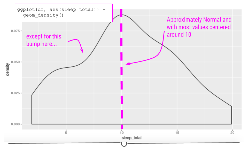
Taking a look at the sleep_total variable within our example dataset, we see that the data are somewhat normal; however, they aren’t entirely symmetric.
ggplot(df, aes(sleep_total)) +
  geom_density()
A variable that is distributed more normally can be seen in the iris dataset, when looking at the
Sepal.Width variable.
iris %>%
  ggplot() +
  geom_density(aes(x=Sepal.Width))
Skewed Distribution
Alternatively, sometimes data follow a skewed distribution. In a skewed distribution, most of the values fall to one end of the range, leaving a tail off to the other side. When the tail is off to the left, the distribution is said to be skewed left. When off to the right, the distribution is said to be skewed right.
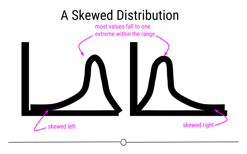
To see an example from the
msleep dataset, we’ll look at the variable sleep_rem. Here we see that the data are skewed right, given the shift in values away from the right, leading to a long right tail. Here, most of the values are at the lower end of the range.
ggplot(df, aes(sleep_rem)) +
  geom_density()
## Warning: Removed 22 rows containing non-finite outside the scale range
## (`stat_density()`).
Uniform Distribution
Finally, in distributions we’ll discuss today, sometimes values for a variable are equally likely to be found along any portion of the distribution. The curve for this distribution looks more like a rectangle, since the likelihood of an observation taking a value is constant across the range of possible values.
Outliers
Now that we’ve discussed distributions, it’s important to discuss outliers in more depth. An outlier is an observation that falls far away from the rest of the observations in the distribution. If you were to look at a density curve, you could visually identify outliers as observations that fall far from the rest of the observations.
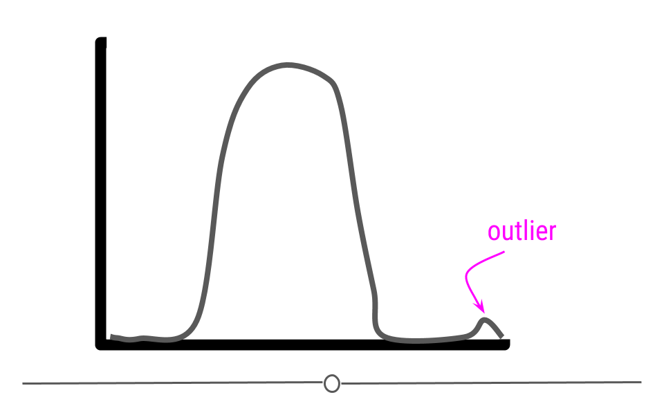
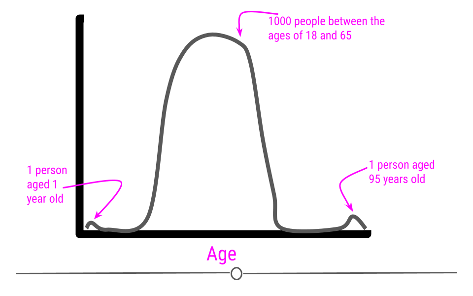
For example, imagine you had a sample where all of the individuals in your sample are between the ages of 18 and 65, but then you have one sample that is 1 year old and another that is 95 years old.

If we were to plot the age data on a density plot, it would look something like this:
It can sometimes be difficult to decide whether or not a sample should be removed from the dataset. In the simplest terms, no observation should be removed from your dataset unless there is a valid reason to do so. For a more extreme example, what if that dataset we just discussed (with all the samples having ages between 18 and 65) had one sample with the age 600? Well, if these are human data, we clearly know that is a data entry error. Maybe it was supposed to be 60 years old, but we may not know for sure. If we can follow up with that individual and double-check, it’s best to do that, correct the error, make a note of it, and continue with the analysis. However, that’s often not possible. In the cases of obvious data entry errors, it’s likely that you’ll have to remove that observation from the dataset. It’s valid to do so in this case since you know that an error occurred and that the observation was not accurate.
Outliers do not only occur due to data entry errors. Maybe you were taking weights of your observations over the course of a few weeks. On one of these days, your scale was improperly calibrated, leading to incorrect measurements. In such a case, you would have to remove these incorrect observations before analysis.
Outliers can occur for a variety of reasons. Outliers can occur due human error during data entry, technical issues with tools used for measurement, as a result of weather changes that affect measurement accuracy, or due to poor sampling procedures. It’s always important to look at the distribution of your observations for a variable to see if any observations are falling far away from the rest of the observations. It’s then important to think about why this occurred and determine whether or not you have a valid reason to remove the observations from the data.
An important note is that observations should never be removed just to make your results look better! Wanting better results is not a valid reason for removing observations from your dataset.
Subsection 5.5.3 Identifying Outliers
To identify outliers visually, density plots and boxplots can be very helpful.
For example, if we returned to the iris dataset and looked at the distribution of
Petal.Length, we would see a bimodal distribution (yet another distribution!). Bimodal distributions can be identified by density plots that have two distinct humps. In these distributions, there are two different modes -- this is where the term "bimodal" comes from. In this plot, the curve suggests there are a number of flowers with petal length less than 2 and many with petal length around 5.
## density plot
library(ggplot2)
iris %>%
  ggplot(aes(Petal.Length)) +
  geom_density()
Since the two humps in the plot are about the same height, this shows that it’s not just one or two flowers with much smaller petal lengths, but rather that there are many. Thus, these observations aren’t likely outliers.
To investigate this further, we’ll look at petal length broken down by flower species:
## box plot
iris %>%
  ggplot(aes(Species, Petal.Length)) +
  geom_boxplot()
In this boxplot, we see in fact that setosa have a shorter petal length while virginica have the longest. Had we simply removed all the shorter petal length flowers from our dataset, we would have lost information about an entire species!
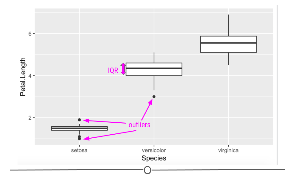
Boxplots are also helpful because they plot "outlier" samples as points outside the box. By default, boxplots define "outliers" as observations as those that are 1.5 x IQR (interquartile range). The IQR is the distance between the first and third quartiles. This is a mathematical way to determine if a sample may be an outlier. It is visually helpful, but then it’s up to the analyst to determine if an observation should be removed. While the boxplot identifies outliers in the setosa and versicolor species, these values are all within a reasonable distance of the rest of the values, and unless I could determine why this occurred, I would not remove these observations from the dataset.
Subsection 5.5.4 Evaluating Variables
Central Tendency
Once you know how large your dataset is, what variables you have information on, how much missing data you’ve got for each variable, and the shape of your data, you’re ready to start understanding the information within the values of each variable.
Some of the simplest and most informative measures you can calculate on a numeric variable are those of central tendency. The two most commonly used measures of central tendency are: mean and median. These measures provide information about the typical or central value in the variable.
mean
The mean (often referred to as the average) is equal to the sum of all the observations in the variable divided by the total number of observations in the variable. The mean takes all the values in your variable and calculates the most common value.
median
The median is the middle observation for a variable after the observations in that variable have been arranged in order of magnitude (from smallest to largest). The median is the middle value.
Variability
In addition to measures of central tendency, measures of variability are key in describing the values within a variable. Two common and helpful measures of variability are: standard deviation and variance. Both of these are measures of how spread out the values in a variable are.
Variance
The variance tells you how spread out the values are. If all the values within your variable are exactly the same, that variable’s variance will be zero. The larger your variance, the more spread out your values are. Take the following vector and calculate its variance in R using the var() function:
## variance of a vector where all values are the same
a <- c(29, 29, 29, 29)
var(a)

## variance of a vector with one very different value
b <-  c(29, 29, 29, 29, 723678)
var(b)
## [1] 0
## [1] 104733575040
The only difference between the two vectors is that the second one has one value that is much larger than "29". The variance for this vector is thus much higher.
Standard Deviation
By definition, the standard deviation is the square root of the variance, thus if we were to calculate the standard deviation in R using the sd() function, we’d see that the sd() function is equal to the square root of the variance:
## calculate standard deviation
sd(b)

## this is the same as the square root of the variance
sqrt(var(b))
## [1] 323625.7
## [1] 323625.7
For both measures of variance, the minimum value is 0. The larger the number, the more spread out the values in the valuable are.
Subsubsection 5.5.4.1 Summarizing Your Data
Often, you’ll want to include tables in your reports summarizing your dataset. These will include the number of observations in your dataset and maybe the mean/median and standard deviation of a few variables. These could be organized into a table using what you learned in the data visualization course about generating tables.
Subsubsection skimr
Alternatively, there is a helpful package that will summarize all the variables within your dataset. The skimr package provides a tidy output with information about your dataset.
To use
skimr, you’ll have to install and load the package before using the helpful function skim() to get a snapshot of your dataset.
#install.packages("skimr")
library(skimr)
skim(df)
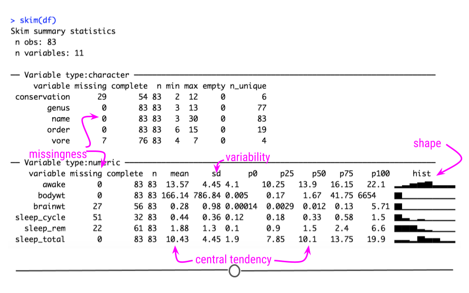
Using this function we can quickly get an idea about missingness, variability, central tendency, and shape, and outliers all at once.
The output from
skim() separately summarizes categorical and continuous variables. For continuous variables you get information about the mean and median (p50) column. You know what the range of the variable is (p0 is the minimum value, p100 is the maximum value for continuous variables). You also get a measure of variability with the standard deviation (sd). It even quantifies the number of missing values (missing) and shows you the distribution or shape of each variable (hist)! Potential outliers can also be identified from the hist column and the p100 and p0 columns. This function can be incredibly useful to get a quick snapshot of what’s going on with your dataset.
If we take a look closer at the
bodywt and brianwt variables, we can see that there may be outliers. The maximum value of the bodywt variable looks very different from the mean value.
dplyr::filter(df, bodywt == 6654)
## # A tibble: 1 × 11
##   name    genus vore  order conservation sleep_total sleep_rem sleep_cycle awake
##   <chr>   <chr> <chr> <chr> <chr>              <dbl>     <dbl>       <dbl> <dbl>
## 1 Africa… Loxo… herbi Prob… vu                   3.3        NA          NA  20.7
## # ℹ 2 more variables: brainwt <dbl>, bodywt <dbl>
Ah! looks like it is an elephant, that makes sense.
Taking a deeper look at the histogram we can see that there are two values that are especially different.
hist(pull(df, bodywt))
dplyr::filter(df, bodywt > 2000)
## # A tibble: 2 × 11
##   name    genus vore  order conservation sleep_total sleep_rem sleep_cycle awake
##   <chr>   <chr> <chr> <chr> <chr>              <dbl>     <dbl>       <dbl> <dbl>
## 1 Asian … Elep… herbi Prob… en                   3.9        NA          NA  20.1
## 2 Africa… Loxo… herbi Prob… vu                   3.3        NA          NA  20.7
## # ℹ 2 more variables: brainwt <dbl>, bodywt <dbl>
Looks like both data points are for elephants.
Therefore, we might consider performing an analysis both with and without the elephant data, to see if it influences the overall result.
Subsection 5.5.5 Evaluating Relationships
Another important aspect of exploratory analysis is looking at relationships between variables.
Again visualizations can be very helpful.
We might want to look at the relationships between all of our continuous variables. A good way to do this is to use a visualization of correlation. As a reminder, correlation is a measure of the relationship or interdependence of two variables. In other words, how much do the values of one variable change with the values of another. Correlation can be either positive or negative and it ranges from -1 to 1, with 1 and -1 indicating perfect correlation (1 being positive and -1 being negative) and 0 indicating no correlation. We will describe this in greater detail when we look at associations.
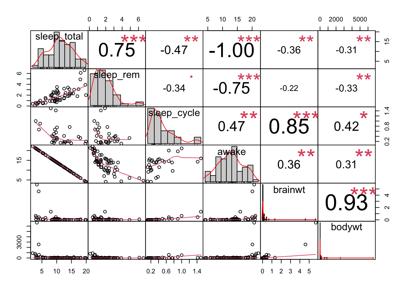
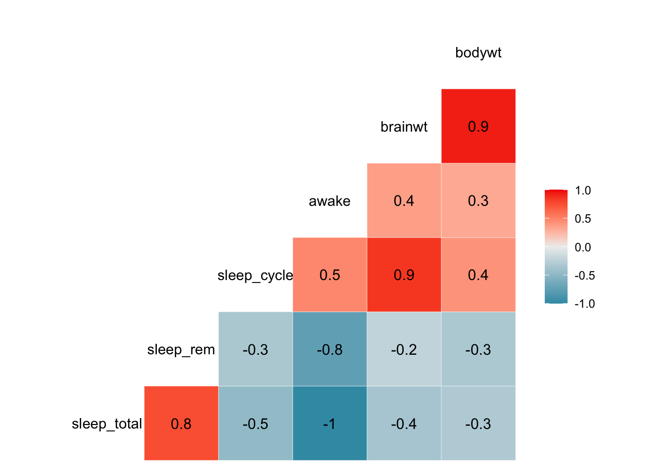
Here are some very useful plots that can be generated using the
GGally package and the PerformanceAnalytics package to examine if variables are correlated.
library(PerformanceAnalytics)
df %>%
dplyr::select_if(is.numeric) %>%
  chart.Correlation()
library(GGally)
df %>%
dplyr::select_if(is.numeric) %>%
    ggcorr(label = TRUE)
## Registered S3 method overwritten by 'GGally':
##   method from
##   +.gg   ggplot2
library(GGally)
df %>%
dplyr::select_if(is.numeric) %>%
    ggpairs()
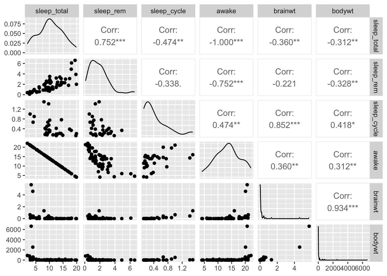
We can see from these plots that the
awake variable and the sleep_total variable are perfectly correlated. This becomes important for choosing what to include in models when we try to perform prediction or inference analyses.
We may be especially interested in how brain weight (
brain_wt) relates to body weight (body_wt). We might assume that these to variables might be related to one another.
Here is a plot of the these two variables including the elephant data:
library(ggplot2)
ggplot(df, aes(x = bodywt, y = brainwt)) +
  geom_point()
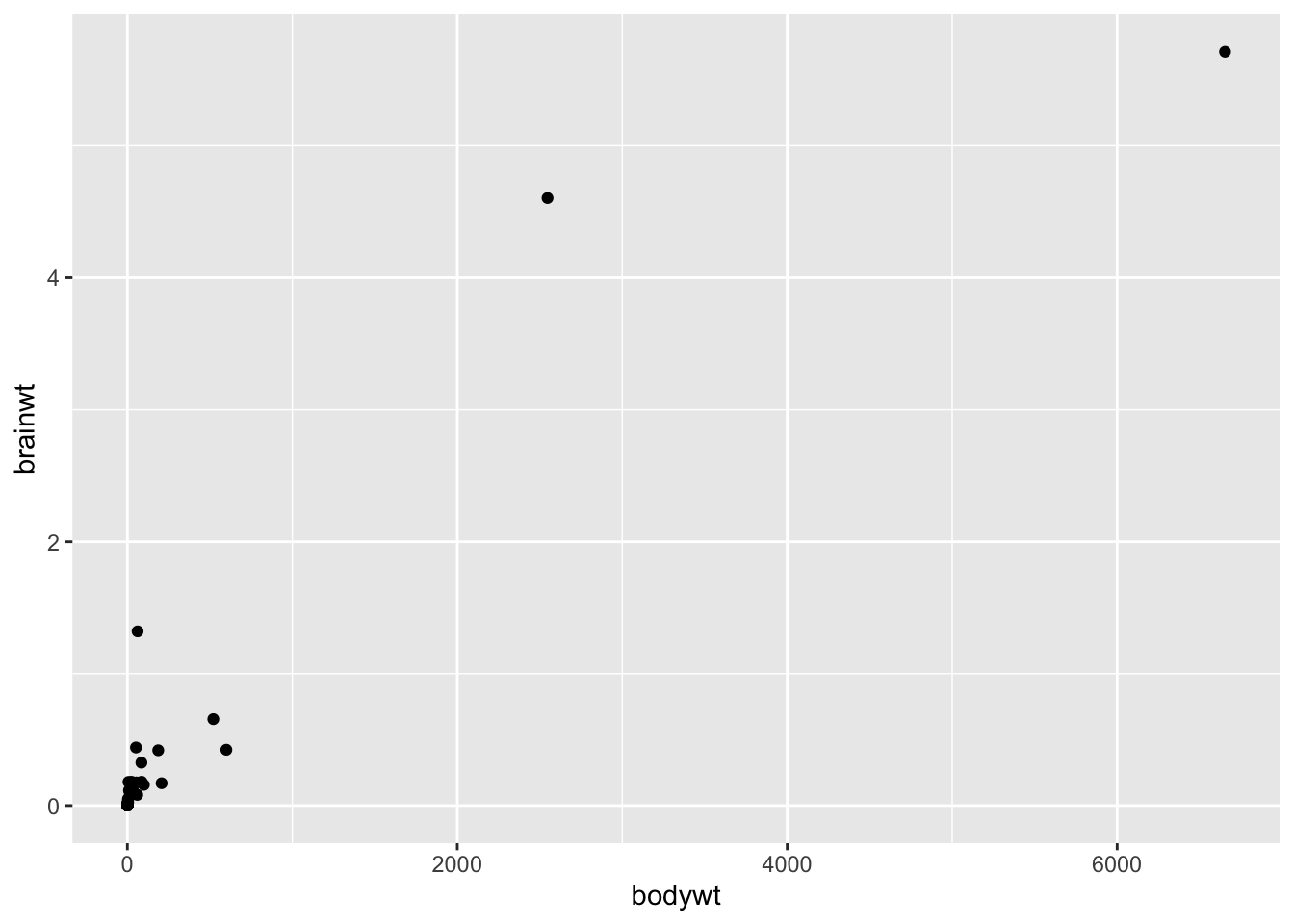
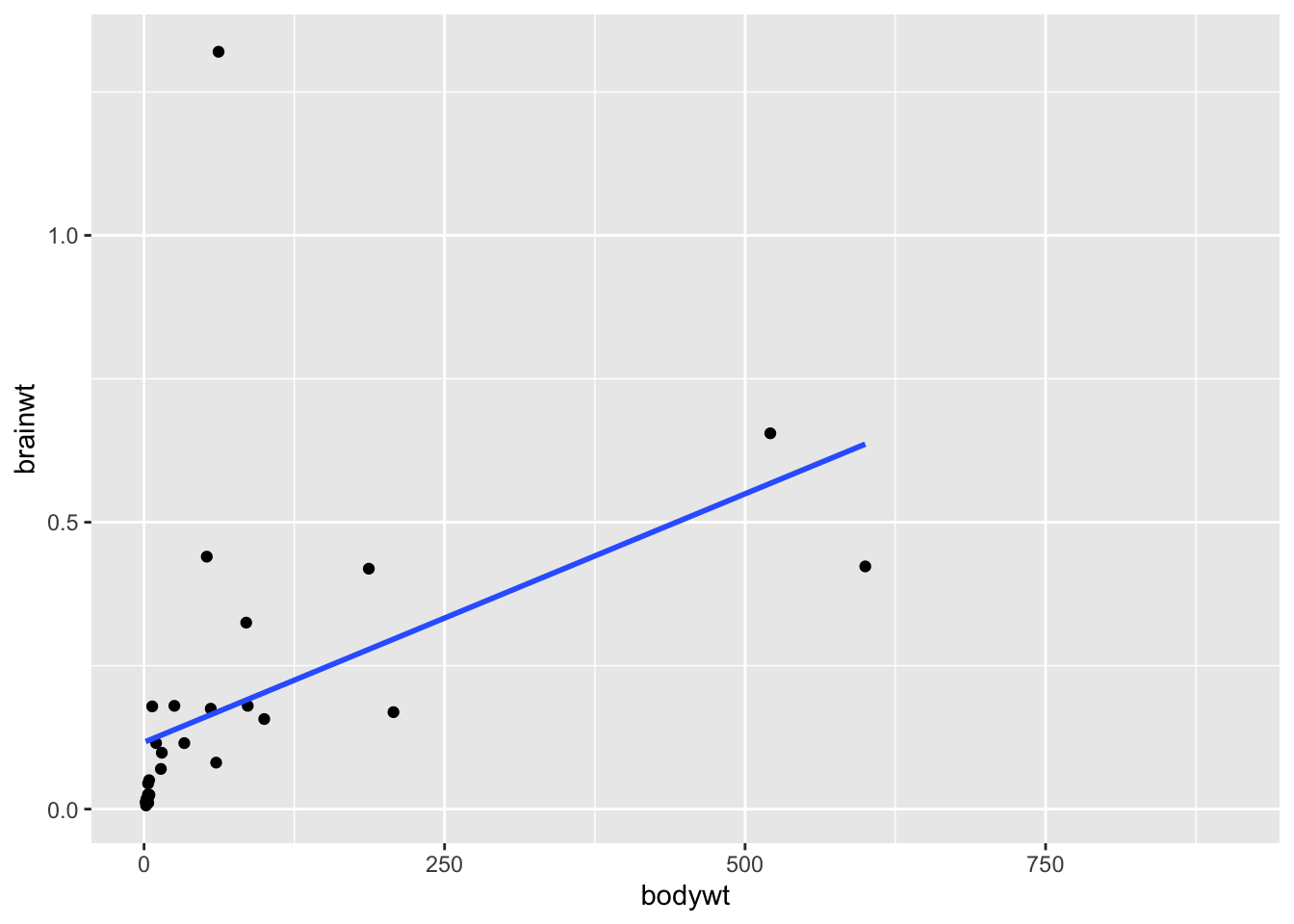
Clearly, including the elephant data points makes it hard to look at the other data points, it is possible that these points are driving the positive correlation that we get when we use all the data. Here is a plot of the relationship between these to variables excluding the elephant data and the very low body weight organisms:
library(ggplot2)

df %>%
  filter(bodywt<2000 & bodywt >1) %>%
  ggplot(aes(x = bodywt, y = brainwt)) +
  geom_point()+
  geom_smooth(method = "lm", se = FALSE)


cor.test(pull(df %>% filter(bodywt<2000 & bodywt >1),bodywt),
         pull(df %>%filter(bodywt<2000 & bodywt >1),brainwt))
## `geom_smooth()` using formula = 'y ~ x'
##
## 	Pearson's product-moment correlation
##
## data:  pull(df %>% filter(bodywt < 2000 & bodywt > 1), bodywt) and pull(df %>% filter(bodywt < 2000 & bodywt > 1), brainwt)
## t = 2.7461, df = 28, p-value = 0.01042
## alternative hypothesis: true correlation is not equal to 0
## 95 percent confidence interval:
##  0.1203262 0.7040582
## sample estimates:
##       cor
## 0.4606273
## `geom_smooth()` using formula = 'y ~ x'
##
## 	Pearson's product-moment correlation
##
## data:  pull(df %>% filter(bodywt < 2000 & bodywt > 1 & brainwt < 1), bodywt) and pull(df %>% filter(bodywt < 2000 & bodywt > 1 & brainwt < 1), brainwt)
## t = 6.6127, df = 27, p-value = 4.283e-07
## alternative hypothesis: true correlation is not equal to 0
## 95 percent confidence interval:
##  0.5897381 0.8949042
## sample estimates:
##       cor
## 0.7862926
We can see from this plot that in general
brainwt is correlated with bodywt. Or in other words, brainwt tends to increase with bodywt.
But it also looks like we have an outlier for our
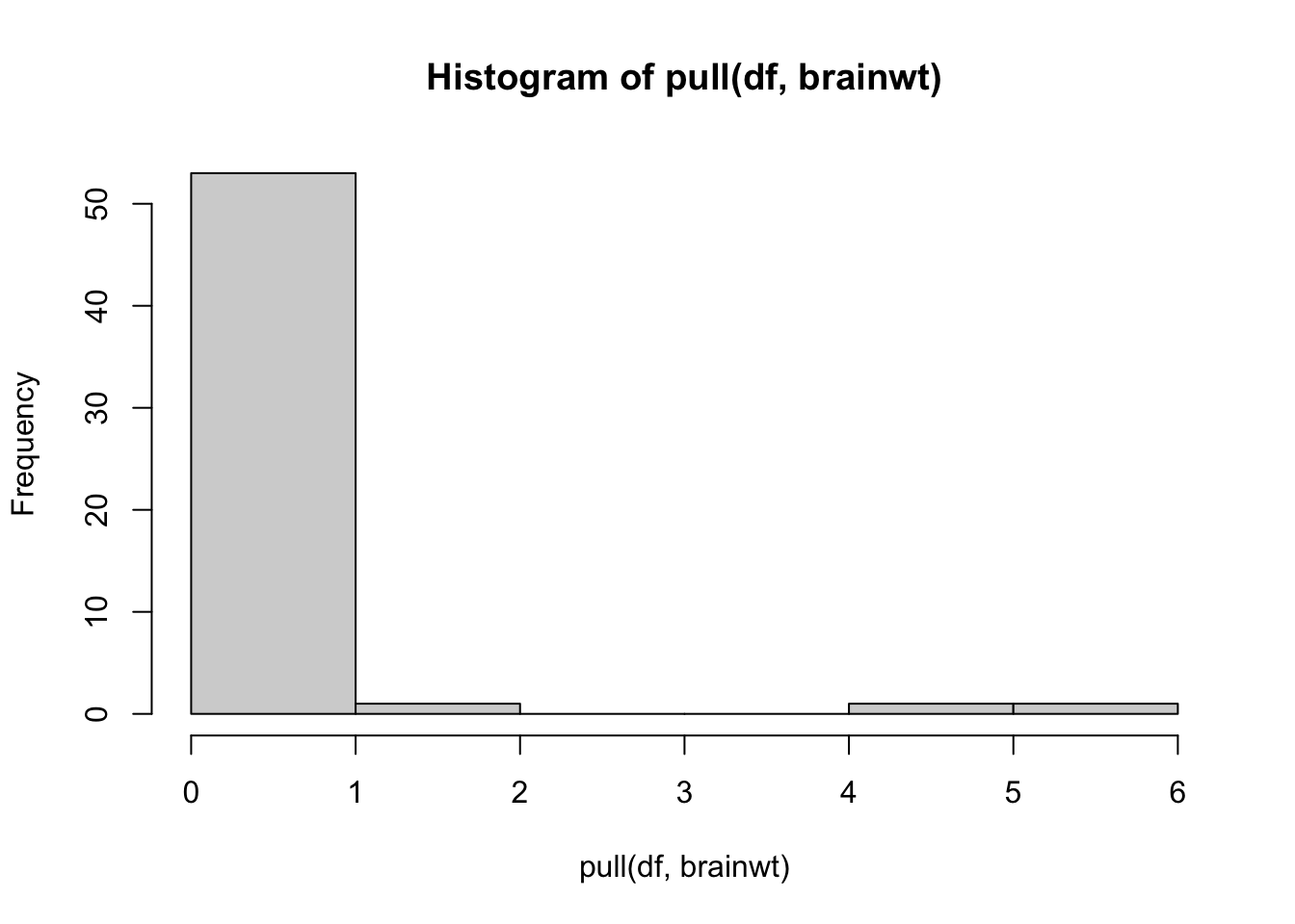
brainwt variable! There is a very high brainwt value that is greater than 1.
We can also see it in our histogram of this variable:
hist(pull(df, brainwt))
Let’s see which organism this is:
df %>%
  filter(brainwt >=1)
## # A tibble: 3 × 11
##   name    genus vore  order conservation sleep_total sleep_rem sleep_cycle awake
##   <chr>   <chr> <chr> <chr> <chr>              <dbl>     <dbl>       <dbl> <dbl>
## 1 Asian … Elep… herbi Prob… en                   3.9      NA          NA    20.1
## 2 Human   Homo  omni  Prim… <NA>                 8         1.9         1.5  16
## 3 Africa… Loxo… herbi Prob… vu                   3.3      NA          NA    20.7
## # ℹ 2 more variables: brainwt <dbl>, bodywt <dbl>
It is humans! Let’s see what the plot looks like without humans:
library(ggplot2)
df %>%
  filter(bodywt<2000 & bodywt >1 & brainwt<1) %>%
  ggplot(aes(x = bodywt, y = brainwt)) +
  geom_point()+
  geom_smooth(method = "lm", se = FALSE)

cor.test(pull(df %>% filter(bodywt<2000 & bodywt >1 & brainwt<1),bodywt),
         pull(df %>%filter(bodywt<2000 & bodywt >1 & brainwt<1),brainwt))
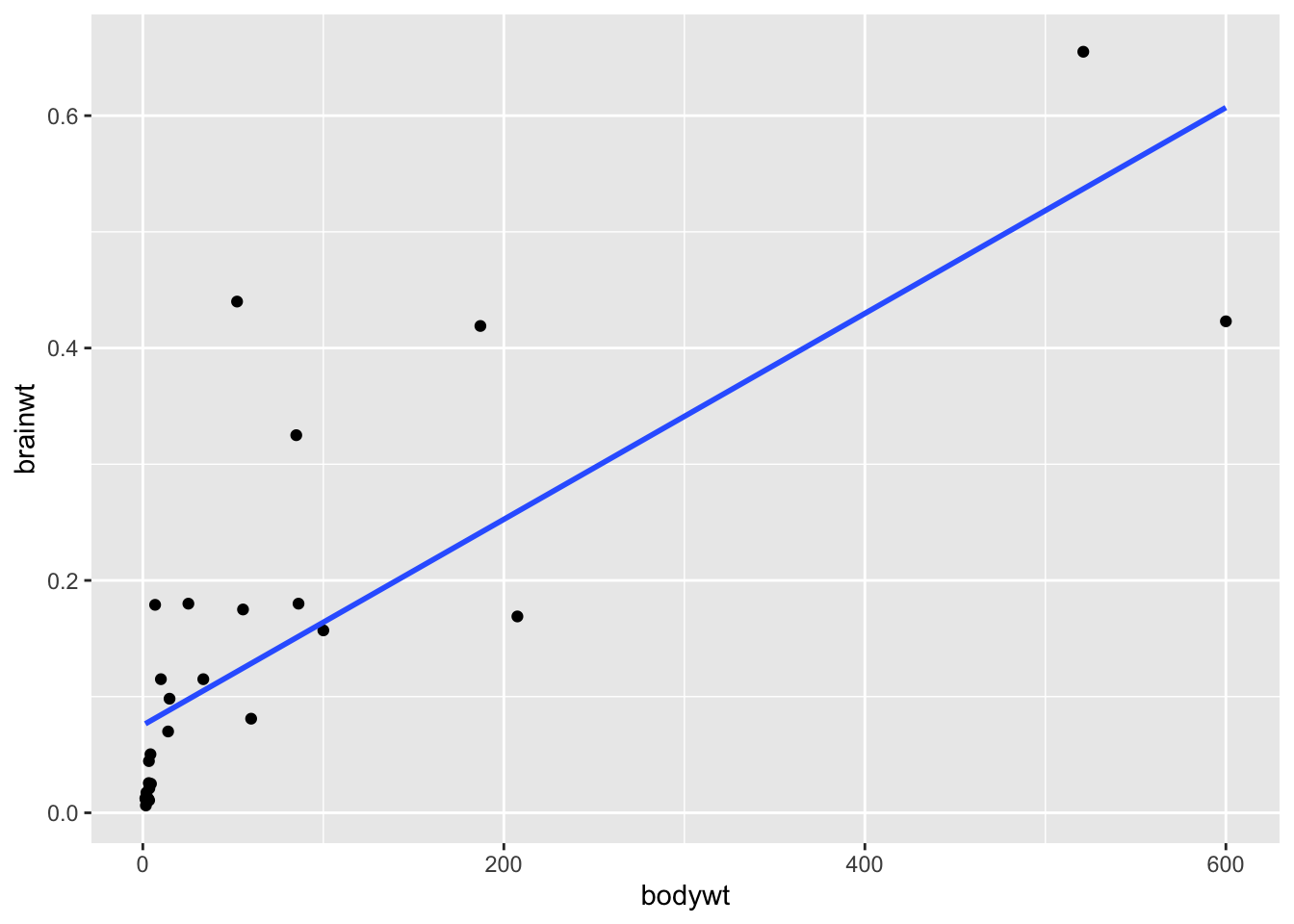
We can see from these plots that the
brainwt variable seems to have a relationship (correlation value = 0.79) with bodywt and it increases with the bodywt variable, however this relationship is less strong when humans are included (correlation value = 0.46). This information would be important to keep in mind when trying to model this data to make inference or predictions about the animals included.

