Section 4.2 Data Visualization Background
At its core, the term ’data visualization’ refers to any visual display of data that helps us understand the underlying data better. This can be a plot or figure of some sort or a table that summarizes the data. Generally, there are a few characteristics of all good plots.
Subsection 4.2.1 General Features of Plots
Good plots have a number of features. While not exhaustive, good plots have:
-
Clearly-labeled axes.
-
Text that are large enough to see.
-
Axes that are not misleading.
-
Data that are displayed appropriately considering the type of data you have.
More specifically, however, there are two general approaches to data visualization: exploratory plots and explanatory plots.
Subsubsection 4.2.1.1 Exploratory Plots
These are data displays to help you better understand and discover hidden patterns in the data you’re working with. These won’t be the prettiest plots, but they will be incredibly helpful. Exploratory visualizations have a number of general characteristics:
-
They are made quickly.
-
You’ll make a large number of them.
-
The axes and legends are cleaned up.
Below we have a graph where the axes are labeled and general pattern can be determined. This is a great example of an exploratory plot. It lets you the analyst know what’s going on in your data, but it isn’t yet ready for a big presentation.
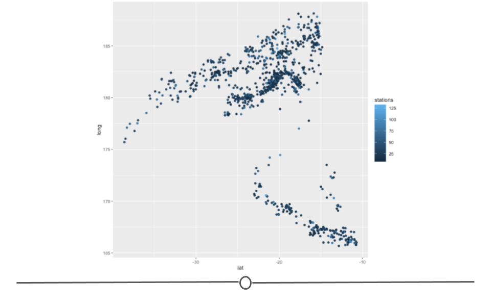
As you’re trying to understand the data you have on hand, you’ll likely make a lot of plots and tables just to figure out to explore and understand the data. Because there are a lot of them and they’re for your use (rather than for communicating with others), you don’t have to spend all your time making them perfect. But, you do have to spend enough time to make sure that you’re drawing the right conclusions from this. Thus, you don’t have to spend a long time considering what colors are perfect on these, but you do want to make sure your axes are not cut off.
Subsubsection 4.2.1.2 Explanatory Plots
These are data displays that aim to communicate insights to others. These are plots that you spend a lot of time making sure they’re easily interpretable by an audience. General characteristics of explanatory plots:
-
They take a while to make.
-
There are only a few of these for each project.
-
You’ve spent a lot of time making sure the colors, labels, and sizes are all perfect for your needs.
Here we see an improvement upon the exploratory plot we looked at previously. Here, the axis labels are more descriptive. All of the text is larger. The legend has been moved onto the plot. The points on the plot are larger. And, there is a title. All of these changes help to improve the plot, making it an explanatory plot that would be presentation-ready.
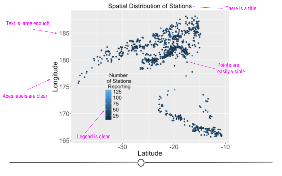
Explanatory plots are made after you’ve done an analysis and once you really understand the data you have. The goal of these plots is to communicate your findings clearly to others. To do so, you want to make sure these plots are made carefully - the axis labels should all be clear, the labels should all be large enough to read, the colors should all be carefully chosen, etc.. As this takes times and because you do not want to overwhelm your audience, you only want to have a few of these for each project. We often refer to these as "publication ready" plots. These are the plots that would make it into an article at the New York Times or in your presentation to your bosses.
Other Explanatory Plotting Examples:

