Section 4.3 Plot Types
Above we saw data displayed as both an exploratory plot and an explanatory plot. That plot was an example of a scatterplot. However, there are many types of plots that are helpful. We’ll discuss a few basic ones below and will include links to a few galleries where you can get a sense of the many different types of plots out there.
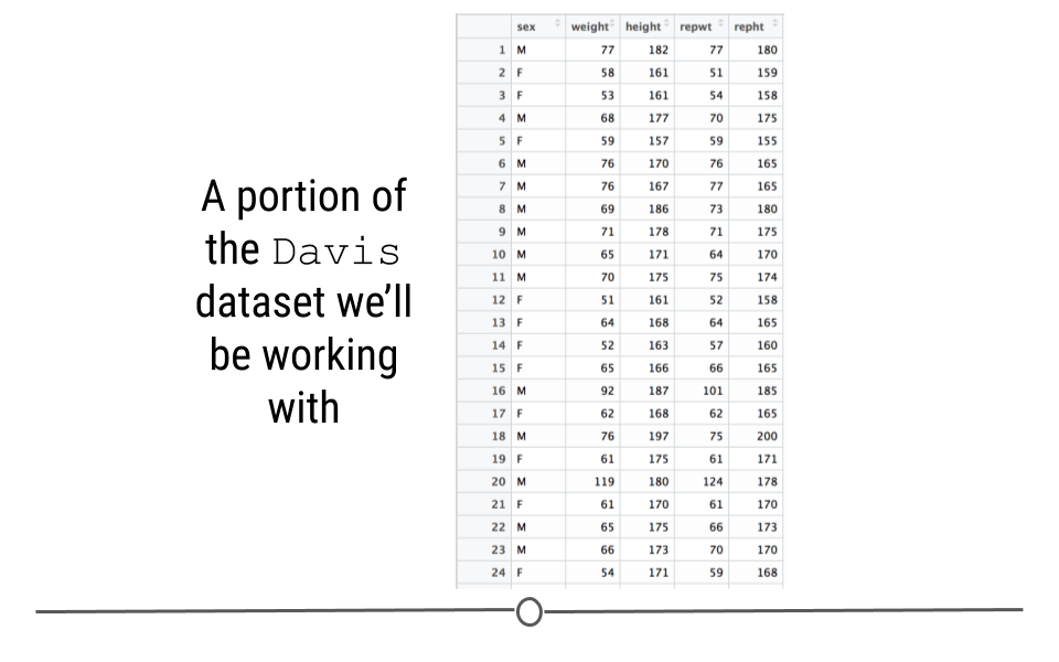
To do this, we’ll use the "Davis" dataset of the
carData package which includes, height and weight information for 200 people.
To use this data first make sure the
carData package is installed and load it.
#install.packages(carData)
library(carData)
Davis <- carData::Davis
Subsection 4.3.1 Histogram
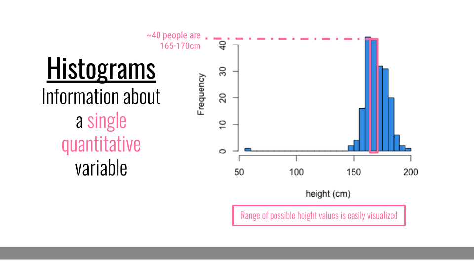
Histograms are helpful when you want to better understand what values you have in your dataset for a single set of numbers. For example, if you had a dataset with information about many people, you may want to know how tall the people in your dataset are. To quickly visualize this, you could use a histogram. Histograms let you know what range of values you have in your dataset. For example, below you can see that in this dataset, the height values range from around 50 to around 200 cm. The shape of the histogram also gives you information about the individuals in your dataset. The number of people at each height are also counted. So, the tallest bars show that there are about 40 people in the dataset whose height is between 165 and 170 cm. Finally, you can quickly tell, at a glance that most people in this dataset are at least 150 cm tall, but that there is at least one individually whose reported height is much lower.
Subsection 4.3.2 Densityplot
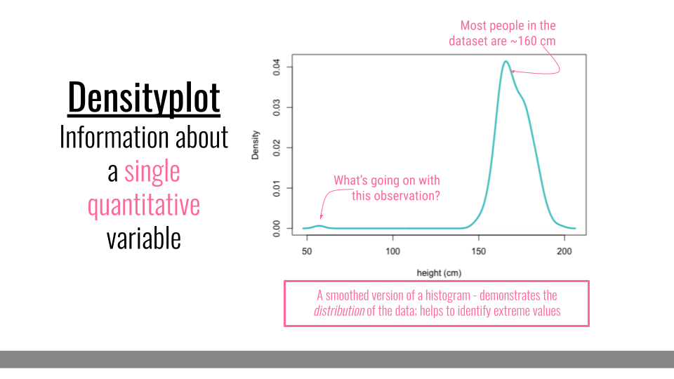
Densityplots are smoothed versions of histograms, visualizing the distribution of a continuous variable. These plots effectively visualize the distribution shape and are, unlike histograms, are not sensitive to the number of bins chosen for visualization.
Subsection 4.3.3 Scatterplot
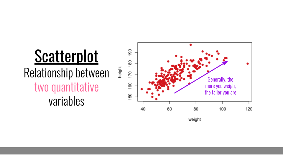
Scatterplots are helpful when you have numerical values for two different pieces of information and you want to understand the relationship between those pieces of information. Here, each dot represents a different person in the dataset. The dot’s position on the graph represents that individual’s height and weight. Overall, in this dataset, we can see that, in general, the more someone weighs, the taller they are. Scatterplots, therefore help us at a glance better understand the relationship between two sets of numbers.
Subsection 4.3.4 Barplot
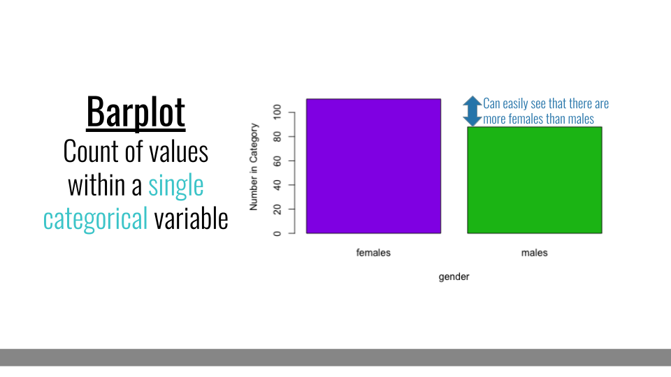
When you only have a single categorical variable that you want broken down and quantified by category, a barplot will be ideal. For example if you wanted to look at how many females and how many males you have in your dataset, you could use a barplot. The comparison in heights between bars clearly demonstrates that there are more females in this dataset than males.
Subsubsection 4.3.4.1 Grouped Barplot
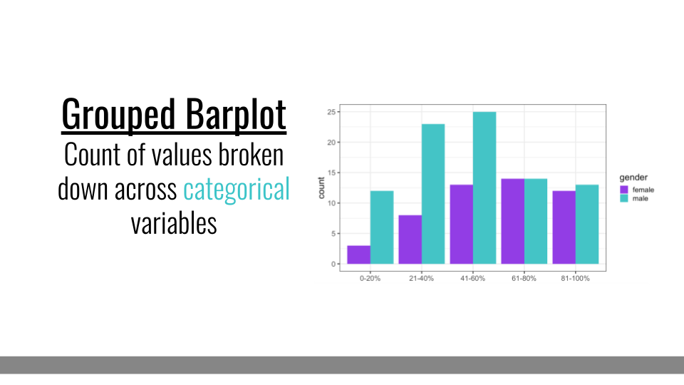
Grouped barplots, like simple barplots, demonstrate the counts for a group; however, they break this down by an additional categorical variable. For example, here we see the number of individuals within each % category along the x-axis. But, these data are further broken down by gender (an additional categorical variable). Comparisons between bars that are side-by-side are made most easily by our visual system. So, it’s important to ensure that the bars you want viewers to be able to compare most easily are next to one another in this plot type.
Subsubsection 4.3.4.2 Stacked Barplot
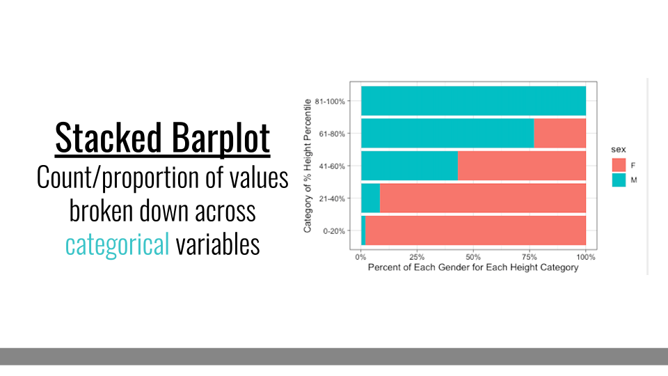
Another common variation on barplots are stacked barplots. Stacked barplots take the information from a grouped barplot but stacks them on top of one another. This is most helpful when the bars add up to 100%, such as in a survey response where you’re measuring percent of respondents within each category. Otherwise, it can be hard to compare between the groups within each bar.
Subsection 4.3.5 Boxplot
Boxplots also summarize numerical values across a category; however, instead of just comparing the heights of the bar, they give us an idea of the range of values that each category can take. For example, if we wanted to compare the heights of men to the heights of women, we could do that with a boxplot.
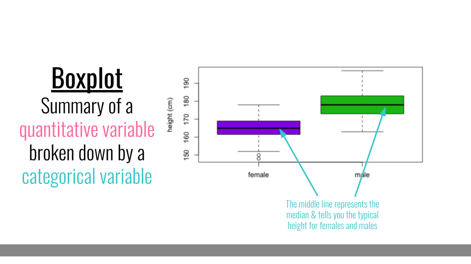
To interpret a boxplot, there are a few places where we’ll want to focus our attention. For each category, the horizontal line through the middle of the box corresponds to the median value for that group. So, here, we can say that the median, or most typical height for females is about 165 cm. For males, this value is higher, just under 180 cm. Outside of the colored boxes, there are dashed lines. The ends of these lines correspond to the typical range of values. Here, we can see that females tend to have heights between 150 and 180cm. Lastly, when individuals have values outside the typical range, a boxplot will show these individuals as circles. These circles are referred to as outliers.
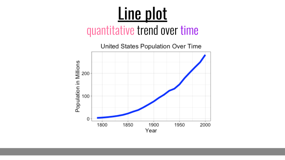
Subsection 4.3.6 Line Plots
The final type of basic plot we’ll discuss here are line plots. Line plots are most effective at showing a quantitative trend over time.