Section 4.6 ggplot2: Basics
R was initially developed for statisticians, who often are interested in generating plots or figures to visualize their data. As such, a few basic plotting features were built in when R was first developed. These are all still available; however, over time, a new approach to graphing in R was developed. This new approach implemented what is known as the grammar of graphics, which allows you to develop elegant graphs flexibly in R. Making plots with this set of rules requires the R package
ggplot2. This package is a core package in the tidyverse. So as along as the tidyverse has been loaded, you’re ready to get started.
# load the tidyverse
library(tidyverse)
Subsection 4.6.1 ggplot2 Background
The grammar of graphics implemented in
ggplot2 is based on the idea that you can build any plot as long as you have a few pieces of information. To start building plots in ggplot2, we’ll need some data and we’ll need to know the type of plot we want to make. The type of plot you want to make in ggplot2 is referred to as a geom. This will get us started, but the idea behind ggplot2 is that every new concept we introduce will be layered on top of the information you’ve already learned. In this way, ggplot2 is layered - layers of information add on top of each other as you build your graph. In code written to generate a ggplot2 figure, you will see each line is separated by a plus sign (+). Think of each line as a different layer of the graph. We’re simply adding one layer on top of the previous layers to generate the graph. You’ll see exactly what we mean by this throughout each section in this lesson.
To get started, we’ll start with the two basics (data and a geom) and build additional layers from there.
As we get started plotting in
ggplot2, plots will take the following general form:
ggplot(data = DATASET) +
  geom_PLOT_TYPE(mapping = aes(VARIABLE(S)))
When using
ggplot2 to generate figures, you will always begin by calling the ggplot() function. You’ll then specify your dataset within the ggplot() function. Then, before making your plot you will also have to specify what geom type you’re interested in plotting. We’ll focus on a few basic geoms in the next section and give examples of each plot type (geom), but for now we’ll just work with a single geom: geom_point.
geom_point is most helpful for creating scatterplots. As a reminder from an earlier lesson, scatterplots are useful when you’re looking at the relationship between two numeric variables. Within geom you will specify the arguments needed to tell ggplot2 how you want your plot to look.
You will map your variables using the aesthetic argument
aes. We’ll walk through examples below to make all of this clear. However, get comfortable with the overall look of the code now.
Subsection 4.6.2 Example Dataset: diamonds
To build your first plot in
ggplot2 we’ll make use of the fact that there are some datasets already available in R. One frequently-used dataset is known as diamonds. This dataset contains prices and other attributes of 53,940 diamonds, with each row containing information about a different diamond. If you look at the first few rows of data, you can get an idea of what data are included in this dataset.
diamonds <- as_tibble(diamonds)
diamonds
## # A tibble: 53,940 × 10
##    carat cut       color clarity depth table price     x     y     z
##    <dbl> <ord>     <ord> <ord>   <dbl> <dbl> <int> <dbl> <dbl> <dbl>
##  1  0.23 Ideal     E     SI2      61.5    55   326  3.95  3.98  2.43
##  2  0.21 Premium   E     SI1      59.8    61   326  3.89  3.84  2.31
##  3  0.23 Good      E     VS1      56.9    65   327  4.05  4.07  2.31
##  4  0.29 Premium   I     VS2      62.4    58   334  4.2   4.23  2.63
##  5  0.31 Good      J     SI2      63.3    58   335  4.34  4.35  2.75
##  6  0.24 Very Good J     VVS2     62.8    57   336  3.94  3.96  2.48
##  7  0.24 Very Good I     VVS1     62.3    57   336  3.95  3.98  2.47
##  8  0.26 Very Good H     SI1      61.9    55   337  4.07  4.11  2.53
##  9  0.22 Fair      E     VS2      65.1    61   337  3.87  3.78  2.49
## 10  0.23 Very Good H     VS1      59.4    61   338  4     4.05  2.39
## # … with 53,930 more rows
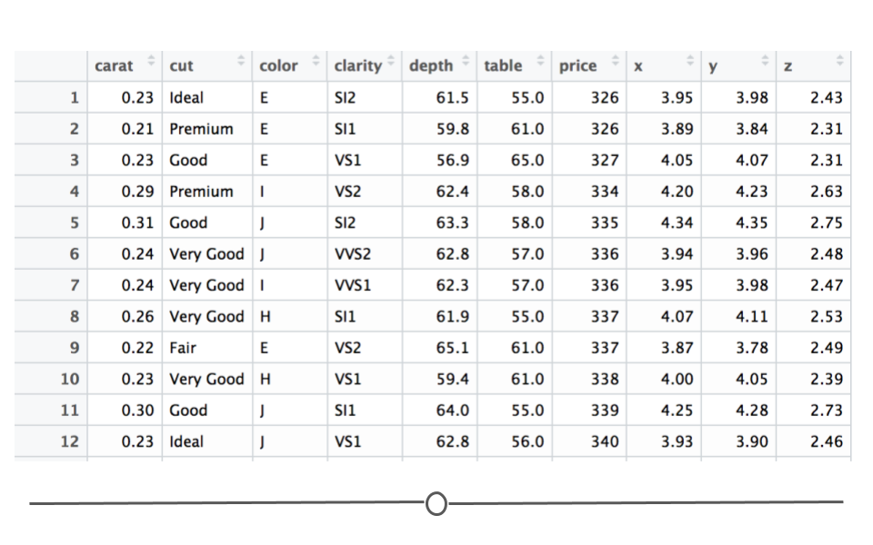
Here you see a lot of numbers and can get an idea of what data are available in this dataset. For example, in looking at the column names across the top, you can see that we have information about how many carats each diamond is (
carat), some information on the quality of the diamond cut (cut), the color of the diamond from J (worst) to D (best) (color), along with a number of other pieces of information about each diamond.
We will use this dataset to better understand how to generate plots in R, using
ggplot2.
Subsection 4.6.3 Scatterplots: geom_point()
In
ggplot2 we specify these by defining x and y within the aes() argument. The x argument defines which variable will be along the bottom of the plot. The y refers to which variable will be along the left side of the plot. If we wanted to understand the relationship between the number of carats in a diamond and that diamond’s price, we may do the following:
# generate scatterplot with geom_point()
ggplot(data = diamonds) +
  geom_point(mapping = aes(x = carat, y = price))
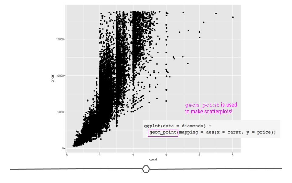
In this plot, we see that, in general, the larger the diamond is (or the more carats it has), the more expensive the diamond is (price), which is probably what we would have expected. However, now, we have a plot that definitively supports this conclusion!
Subsection 4.6.4 Aesthetics
What if we wanted to alter the size, color or shape of the points? Probably unsurprisingly, these can all be changed within the aesthetics argument. After all, something’s aesthetic refers to how something looks. Thus, if you want to change the look of your graph, you’ll want to play around with the plot’s aesthetics.
In fact, in the plots above you’ll notice that we specified what should be on the x and y axis within the
aes() call. These are aesthetic mappings too! We were telling ggplot2 what to put on each axis, which will clearly affect how the plot looks, so it makes sense that these calls have to occur within aes(). Additionally now, we’ll focus on arguments within aes() that change how the points on the plot look.
Subsubsection 4.6.4.1 Point color
In the scatterplot we just generated, we saw that there was a relationship between carat and price, such that the more carats a diamond has, generally, the higher the price. But, it’s not a perfectly linear trend. What we mean by that is that not all diamonds that were 2 carats were exactly the same price. And, not all 3 carat diamonds were exactly the same price. What if we were interested in finding out a little bit more about why this is the case?
Well, we could look at the clarity of the diamonds to see whether or not that affects the price of the diamonds? To add clarity to our plot, we could change the color of our points to differ based on clarity:
# adjusting color within aes
ggplot(data = diamonds) +
  geom_point(mapping = aes(x = carat, y = price, color = clarity))
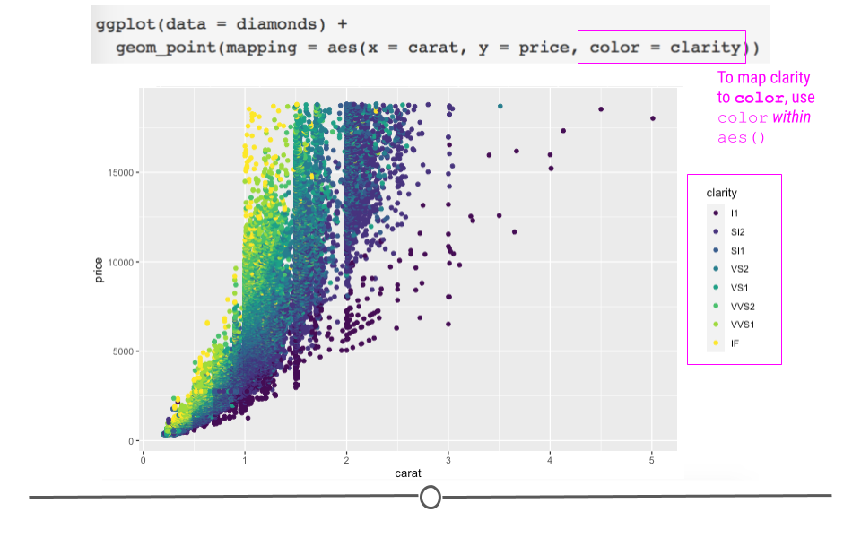
Here, we see that not only are the points now colored by clarity, ggplot2 has also automatically added a legend for us with the various classes and their corresponding point color.
The Help pages of the diamonds dataset (accessed using
?diamonds) state that clarity is "a measurement of how clear the diamond is." The documentation also tells us that I1 is the worst clarity and IF is the best (Full scale: I1, SI1, SI2, VS1, VS2, VVS1, VVS2, IF). This makes sense with what we see in the plot. Small (<1 carat) diamonds that have the best clarity level (IF) are some of the most expensive diamonds. While, relatively large diamonds (diamonds between 2 and 3 carats) of the lowest clarity (I1) tend to cost less.
By coloring our points by a different variable in the dataset, we now understand our dataset better. This is one of the goals of data visualization! And, specifically, what we’re doing here in
ggplot2 is known as mapping a variable to an aesthetic. We took another variable in the dataset, mapped it to a color, and then put those colors on the points in the plot. Well, we only told ggplot2 what variable to map. It took care of the rest!
Of course, we can also manually specify the colors of the points on our graph; however, manually specifying the colors of points happens outside of the
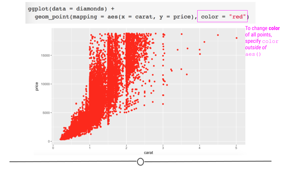
aes() call. This is because ggplot2 does not have to go through the process of mapping the variable to an aesthetic (color in this case). In the code here, ggplot2 doesn’t have to go through the trouble of figuring out which level of the variable is going to be which color on the plot (the mapping to the aesthetic part of the process). Instead, it just colors every point red. Thus, manually specifying the color of your points happens outside of aes():
# manually control color point outside aes
ggplot(data = diamonds) +
  geom_point(mapping = aes(x = carat, y = price), color = "red")
Subsubsection 4.6.4.2 Point size
As above, we can change the point size by mapping another variable to the
size argument within aes:
# adjust point size within aes
ggplot(data = diamonds) +
  geom_point(mapping = aes(x = carat, y = price, size = clarity))
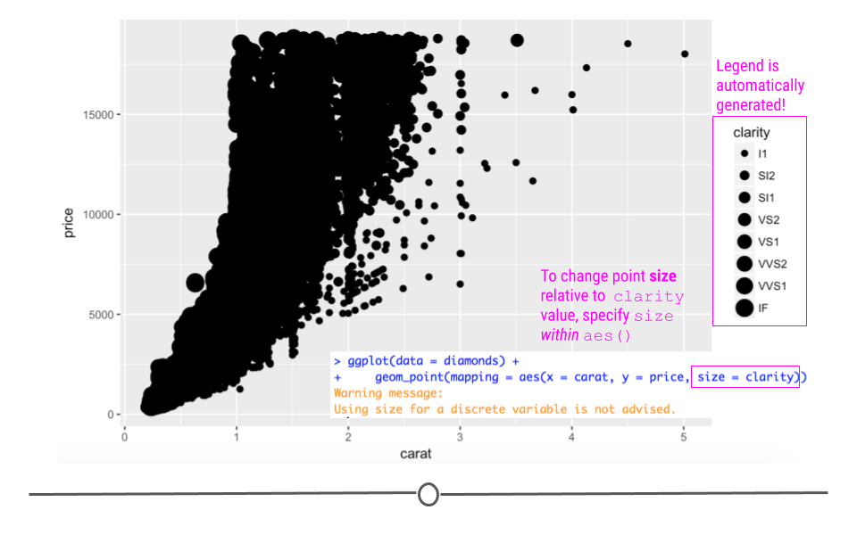
As above,
ggplot2 handles the mapping process. All you have to do is specify what variable you want mapped (clarity) and how you want ggplot2 to handle the mapping (change the point size). With this code, you do get a warning when you run it in R that using a "discrete variable is not advised." This is because mapping to size is usually done for numeric variables, rather than categorical variables like clarity.
This makes sense here too. The relationship between clarity, carat, and price was easier to visualize when clarity was mapped to
color than here where it is mapped to size.
Like the above example with color, the size of every point can be changed by calling
size outside of aes:
# global control of point size
ggplot(data = diamonds) +
  geom_point(mapping = aes(x = carat, y = price), size = 4.5)
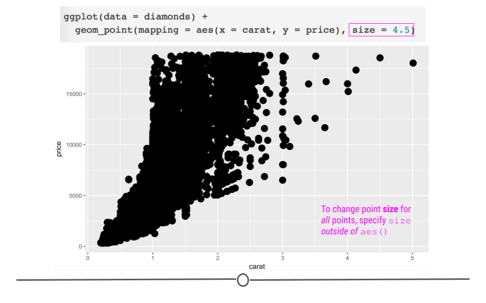
Here, we have manually increased the size of all the points on the plot.
Subsubsection 4.6.4.3 Point Shape
You can also change the shape of the points (
shape). We’ve used solid, filled circles thus far (the default in geom_point), but we could specify a different shape for each clarity.
# map clarity to point shape within aes
ggplot(data = diamonds) +
  geom_point(mapping = aes(x = carat, y = price, shape = clarity))
## Warning: Using shapes for an ordinal variable is not advised
## Warning: The shape palette can deal with a maximum of 6 discrete values because
## more than 6 becomes difficult to discriminate; you have 8. Consider
## specifying shapes manually if you must have them.
## Warning: Removed 5445 rows containing missing values (geom_point).
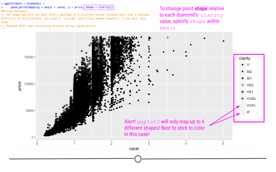
Here, while the mapping occurs correctly within ggplot2, we do get a warning message that discriminating more than six different shapes is difficult for the human eye. Thus, ggplot2 won’t allow more than six different shapes on a plot. This suggests that while you can do something, it’s not always the best to do that thing. Here, with more than six levels of clarity, it’s best to stick to mapping this variable to
color as we did initially.
To manually specify a shape for all the points on your plot, you would specify it outside of
aes using one of the twenty-five different shape options available:
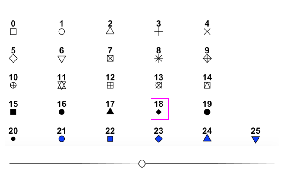
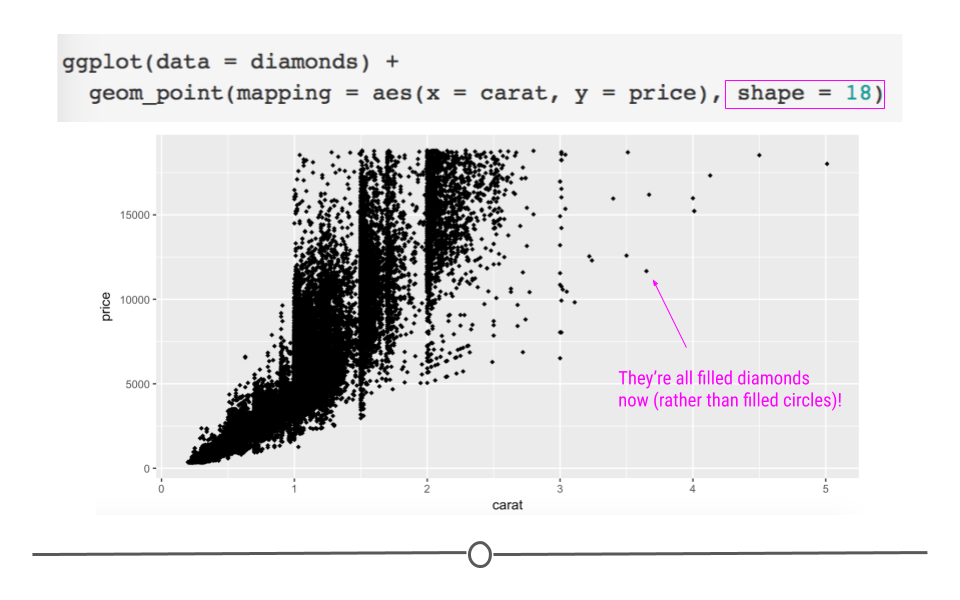
For example, to plot all of the points on the plot as filled diamonds (it is a dataset about diamonds after all...), you would specify shape ’18’:
# global control of point shape outside aes
ggplot(data = diamonds) +
  geom_point(mapping = aes(x = carat, y = price), shape = 18)
Subsection 4.6.5 Facets
In addition to mapping variables to different aesthetics, you can also opt to use facets to help make sense of your data visually. Rather than plotting all the data on a single plot and visually altering the point size or color of a third variable in a scatterplot, you could break each level of that third variable out into a separate subplot. To do this, you would use faceting. Faceting is particularly helpful for looking at categorical variables.
To use faceting, you would add an additional layer (+) to your code and use the
facet_wrap() function. Within facet wrap, you specify the variable by which you want your subplots to be made:
ggplot(data = diamonds) +
  geom_point(mapping = aes(x = carat, y = price)) +
  # facet by clarity
  facet_wrap(~clarity, nrow = 2)
Here, read the tilde as the word "by". Specifically here, we want a scatterplot of the relationship between carat and price and we want it faceted (broken down) by (~) clarity.
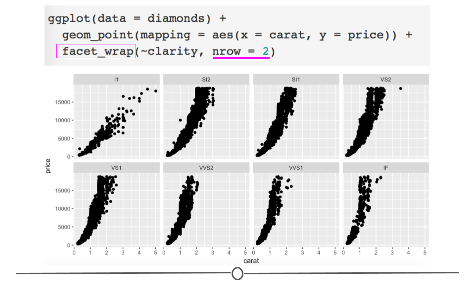
Now, we have eight different plots, one for each level of clarity, where we can see the relationship between diamond carats and price.
You’ll note here we’ve opted to specify that we want 2 rows of subplots (
nrow = 2). You can play around with the number of rows you want in your output to customize how your output plot appears.
Subsection 4.6.6 Geoms
Thus far in this lesson we’ve only looked at scatterplots, which means we’ve only called
geom_point. However, there are many additional geoms that we could call to generate different plots. Simply, a geom is just a shape we use to represent the data. In the case of scatterplots, they don’t really use a geom since each actual point is plotted individually. Other plots, such as the boxplots, barplots, and histograms we described in previous lessons help to summarize or represent the data in a meaningful way, without plotting each individual point. The shapes used in these different types of plots to represent what’s going on in the data is that plot’s geom.
To see exactly what we mean by geoms being "shapes that represent the data", let’s keep using the
diamonds dataset, but instead of looking at the relationship between two numeric variables in a scatterplot, let’s take a step back and take a look at a single numeric variable using a histogram.
Subsubsection 4.6.6.1 Histograms: geom_histogram
To review, histograms allow you to quickly visualize the range of values your variable takes and the shape of your data. (Are all the numbers clustered around center? Or, are they all at the extremes of the range? Somewhere in between? The answers to these questions describe the "shape" of the values of your variable.)
For example, if we wanted to see what the distribution of carats was for these data, we could to the following.
# change geom_ to generate histogram
ggplot(data = diamonds) +
  geom_histogram(mapping =  aes(carat))
## `stat_bin()` using `bins = 30`. Pick better value with `binwidth`.
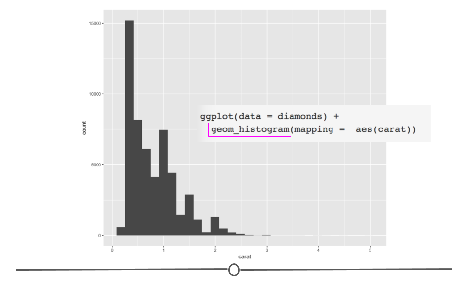
The code follows what we’ve seen so far in this lesson; however, we’ve now called
geom_histogram to specify that we want to plot a histogram rather than a scatterplot.
Here, the rectangular boxes on the plot are geoms (shapes) that represent the number of diamonds that fall into each bin on the plot. Rather than plotting each individual point, histograms use rectangular boxes to summarize the data. This summarization helps us quickly understand what’s going on in our dataset.
Specifically here, we can quickly see that most of the diamonds in the dataset are less than 1 carat. This is not necessarily something we could be sure of from the scatterplots generated previously in this lesson (since some points could have been plotted directly on top of one another). Thus, it’s often helpful to visualize your data in a number of ways when you first get a dataset to ensure that you understand the variables and relationships between variables in your dataset!
Subsubsection 4.6.6.2 Barplots: geom_bar
Barplots show the relationship between a set of numbers and a categorical variable. In the diamonds dataset, we may be interested in knowing how many diamonds there are of each cut of diamonds. There are five categories for cut of diamond. If we make a barplot for this variable, we can see the number of diamonds in each category.
# geom_bar for bar plots
ggplot(data = diamonds) +
  geom_bar(mapping = aes(cut))
Again, the changes to the code are minimal. We are now interested in plotting the categorical variable
cut and state that we want a bar plot, by including geom_bar().
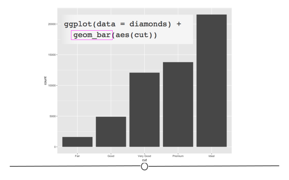
Here, we again use rectangular shapes to represent the data, but we’re not showing the distribution of a single variable (as we were with
geom_histogram). Rather, we’re using rectangles to show the count (number) of diamonds within each category within cut. Thus, we need a different geom: geom_bar!
Subsubsection 4.6.6.3 Boxplots: geom_boxplot
Boxplots provide a summary of a numerical variable across categories. For example, if you were interested to see how the price of a diamond (a numerical variable) changed across different diamond color categories (categorical variable), you may want to use a boxplot. To do so, you would specify that using
geom_boxplot:
# geom_boxplot for boxplots
ggplot(data = diamonds) +
  geom_boxplot(mapping = aes(x = color, y = price))
In the code, we see that again, we only have to change what variables we want to be included in the plot and the type of plot (or geom). We want to use
geom_boxplot() to get a basic boxplot.
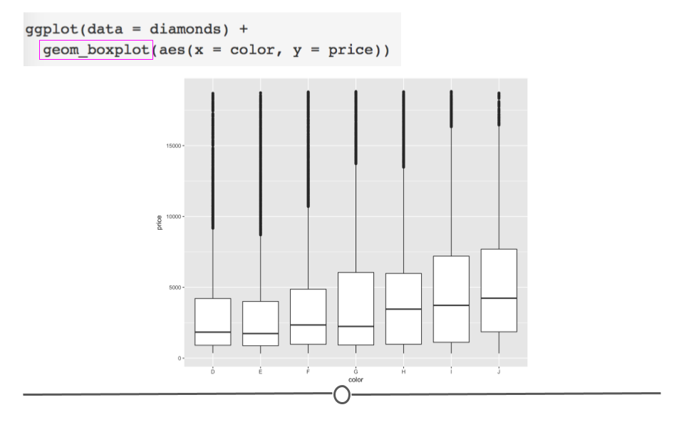
In the figure itself we see that the median price (the black horizontal bar in the middle of each box represents the median for each category) increases as the diamond color increases from the worst category (J) to the best (D).
Now, if you wanted to change the color of this boxplot, it would just take a small addition to the code for the plot you just generated.
# fill globally changes bar color outside aes
ggplot(data = diamonds) +
  geom_boxplot(mapping = aes(x = color, y = price),
               fill = "red")
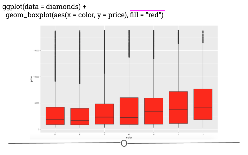
Here, by specifying the color "red" in the
fill argument, you’re able to change the plot’s appearance. In the next lesson, we’ll go deeper into the many ways in which a plot can be customized within ggplot2!
Subsubsection 4.6.6.4 Other plots
While we’ve reviewed basic code to make a few common types of plots, there are a number of other plot types that can be made in
ggplot2. These are listed in the online reference material for ggplot2 or can be accessed through RStudio directly. To do so, you would type ?geom_ into the Console in RStudio. A list of geoms will appear. You can hover your cursor over any one of these to get a short description.
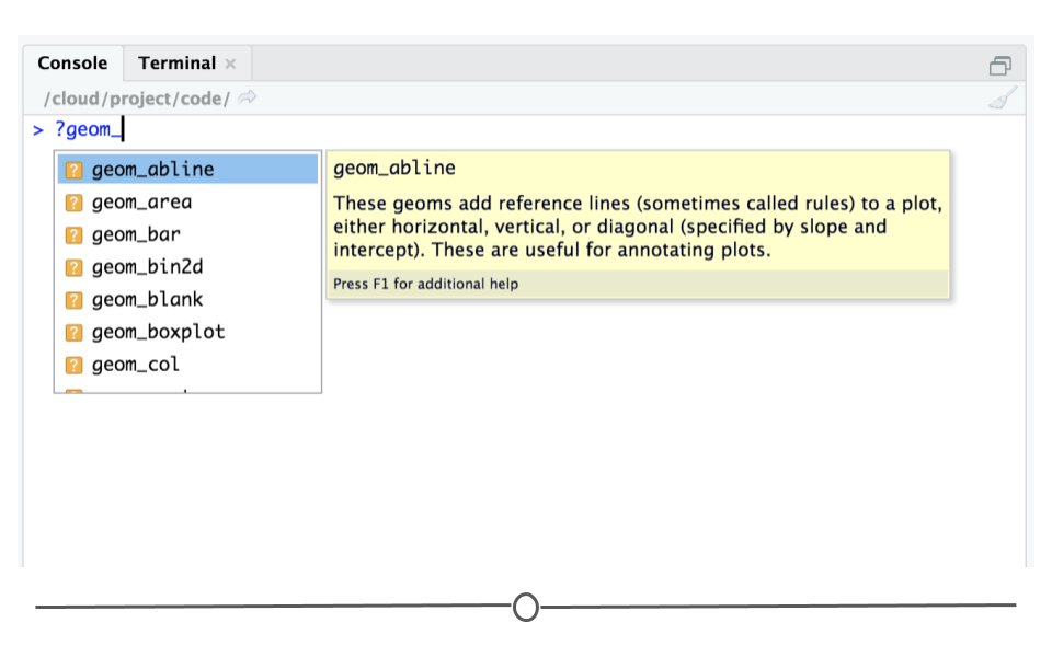
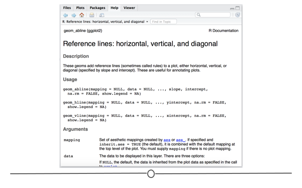
Or, you can select a geom from this list and click enter. After selecting a geom, such as geom_abline and hitting ’Enter,’ the help page for that geom will pop up in the ’Help’ tab at bottom right. Here, you can find more detailed information about the selected geom.
Subsection 4.6.7 EDA Plots
As mentioned previously, an important step after you’ve read your data into R and wrangled it into a tidy format is to carry out Exploratory Data Analysis (EDA). EDA is the process of understanding the data in your dataset fully. To understand your dataset fully, you need a full understanding of the variables stored in your dataset, what information you have and what information you don’t have (missingness!). To gain this understanding, we’ve discussed using packages like
skimr to get a quick idea of what information is stored in your dataset. However, generating plots is another critical step in this process. We encourage you to use ggplot2 to understand the distribution of each single variable as well as the relationship between each variable in your dataset.
In this process, using
ggplot2 defaults is totally fine. These plots do not have to be the most effective visualizations for communication, so you don’t want to spend a ton of time making them visually perfect. Only spend as much time on these as you need to understand your data!

