Section 4.9 ggplot2: Extensions
Beyond the many capabilities of
ggplot2, there are a few additional packages that build on top of ggplot2’s capabilities. We’ll introduce a few packages here so that you can:
-
generate animated plots (
gganimate)
These are referred to as
ggplot2 extensions.
Subsection 4.9.1 ggrepel
To demonstrate the functionality within the
ggrepel package and demonstrate cases where it would be needed, let’s use a dataset available from R - the mtcars dataset:
The data was extracted from the 1974 Motor Trend US magazine, and comprises fuel consumption and 10 aspects of automobile design and performance for 32 automobiles (1973–74 models).
This dataset includes information about 32 different cars. Let’s first convert this from a data.frame to a tibble. Note that we will keep the rownames and make it a new variable called
model.
# see first 6 rows of mtcars
mtcars <- mtcars %>%
as_tibble(rownames = "model")
head(mtcars)
## # A tibble: 6 × 12
##   model          mpg   cyl  disp    hp  drat    wt  qsec    vs    am  gear  carb
##   <chr>        <dbl> <dbl> <dbl> <dbl> <dbl> <dbl> <dbl> <dbl> <dbl> <dbl> <dbl>
## 1 Mazda RX4     21       6   160   110  3.9   2.62  16.5     0     1     4     4
## 2 Mazda RX4 W…  21       6   160   110  3.9   2.88  17.0     0     1     4     4
## 3 Datsun 710    22.8     4   108    93  3.85  2.32  18.6     1     1     4     1
## 4 Hornet 4 Dr…  21.4     6   258   110  3.08  3.22  19.4     1     0     3     1
## 5 Hornet Spor…  18.7     8   360   175  3.15  3.44  17.0     0     0     3     2
## 6 Valiant       18.1     6   225   105  2.76  3.46  20.2     1     0     3     1
What if we were to plot a scatterplot between horsepower (
hp) and weight (wt) of each car and wanted to label each point in that plot with the care model.
If we were to do that with
ggplot2, we’d see the following:
# label points without ggrepel
ggplot(mtcars, aes(wt, hp, label = model)) +
  geom_text() +
  geom_point(color = 'dodgerblue') +
  theme_classic()
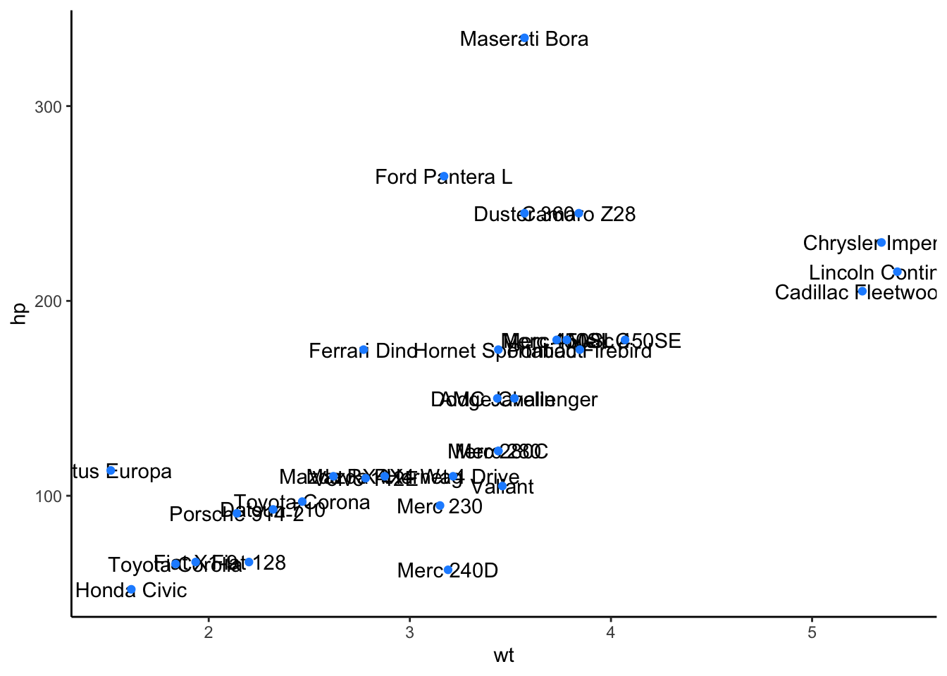
The overall trend is clear here - the more a car weights, the more horsepower it tends to have. However, many of the labels are overlapping and impossible to read - this is where
ggrepel plays a role:
# install and load package
# install.packages("ggrepel")
library(ggrepel)

# label points with ggrepel
ggplot(mtcars, aes(wt, hp, label = model)) +
  geom_text_repel() +
  geom_point(color = 'dodgerblue') +
  theme_classic()
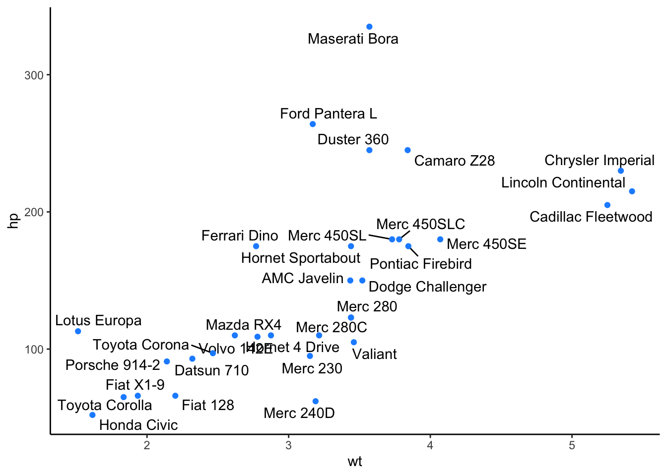
The only bit of code here that changed was that we changed
geom_text() to geom_text_repel(). This, like geom_text() adds text directly to the plot. However, it also helpfully repels overlapping labels away from one another and away from the data points on the plot.
Subsubsection 4.9.1.1 Custom Formatting
Within
geom_text_repel(), there are a number of additional formatting options available. We’ll cover a number of the most important here, but the ggrepel vignettes explore these further.
Highlighting Specific Points
Often, you do not want to highlight all the points on a plot, but want to draw your viewer’s attention to a few specific points. To do this and say highlight only cars that are the make Mercedes, you could use the following approach:
# create a new column "merc" with true or false for Mercedes
# value is true for rows with "Merc" in model column
mtcars <- mtcars%>%
          mutate(merc = str_detect(string = model, pattern = "Merc"))

# Let's just label these items and manually color the points
ggplot(mtcars, aes(wt, hp, label = model)) +
  geom_point(aes(color = merc)) +
  scale_color_manual(values = c("grey50", "dodgerblue")) +
  geom_text_repel(data = filter(mtcars, merc == TRUE),
        nudge_y = 1,
        hjust = 1,
        direction = "y") +
  theme_classic() +
  theme(legend.position = "none")
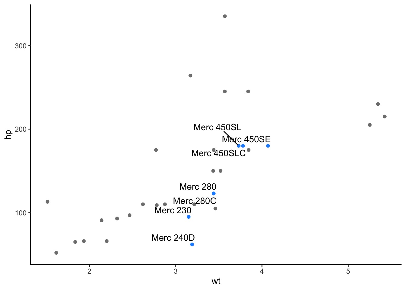
Here, notice that we first create a new column in our dataframe called
merc. Here, we include the model of the car, only if "Merc" is in the model of the car’s name.
We then, specify that only these Mercedes cars should be labeled and that we only want them colored blue if they are Mercedes. This allows us to focus in on those few points we’re interested in. And, we can see that among the cars in this dataset, Mercedes tend to be of average weight but have varying horsepower, depending on the model of the car.
Text Alignment
Other times, you want to ensure that your labels are aligned on the top or bottom edge, relative to one another. This can be controlled using the
hjust and vjust arguments. The values for particular alignment are:
-
hjust = 0| to left-align -
hjust = 0.5| to center -
hjust = 1| to right-align
Additionally, you can adjust the starting position of text vertically with
nudge_y (or horizontally with nudge_x). To use this, you’ll specify the distance from the point to the label you want to use.
You can also allow the labels to move horizontally with
direction = "x" (or vertically with direction = "y". This will put the labels at a right angle from the point. The default here is "both", which allows labels to move in both directions.
For example, what if we wanted to plot the relationship between quarter mile time (
qsec) and miles per gallon (mpg) to identify cars that get the best gas mileage.
To do this, we’re specifying within
geom_text_repel() the following arguments:
-
data| only label those cars with gas mileage > 30 mpg -
nudge_y| position all labels so that they’re vertically aligned -
hjust| center-align the labels -
direction| allow labels to move horizontally
For further customization, we’re also changing the segment color from the default black to a light gray ("gray60").
# customize within geom_text_repel
# first create a new column for mpg > 30 within mtcars and pipe this into ggplot
mtcars %>%
    mutate(mpg_highlight = case_when(mpg > 30 ~ "high", mpg < 30 ~ "low")) %>%
    ggplot(aes(qsec, mpg, label = model)) +
      geom_point(aes(color = mpg_highlight)) +
      scale_color_manual(values = c( "dodgerblue", "black")) +
      theme_minimal() +
      theme(legend.position = "none") +
      geom_text_repel(data = mtcars %>% filter(mpg > 30),
        nudge_y = 3,
        hjust = 0.5,
        direction = "x",
        segment.color = "gray60") +
      scale_x_continuous(expand = c(0.05, 0.05)) +
      scale_y_continuous(limits = c(9, 38))
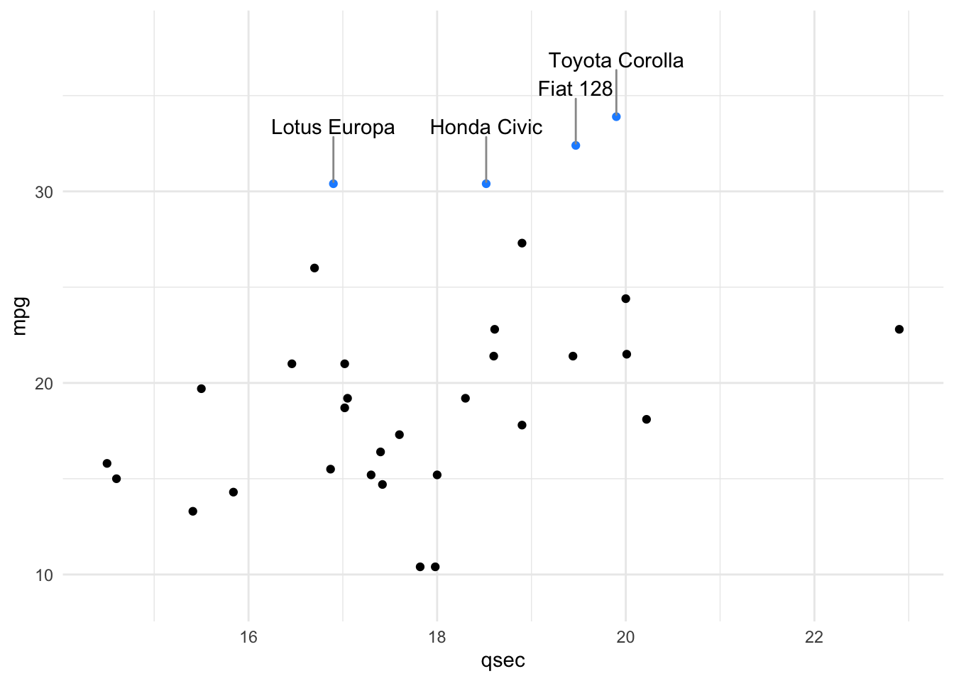
Notice that we’ve also had to provide the plot with more room by customizing the x- and y- axes, using the final two lines of code you see above.
With this plot, it is clear that there are four cars with mpg > 30. And, among these, we now know that the Toyota Corolla has the fastest quarter mile time, all thanks to direct labeling of the points!
Subsection 4.9.2 directlabels
The
directlabels package also helps you to add labels directly to plots. There are functions that allow you to also add labels that generally don’t overlap using less code than ggrepel, however there are less specification options.
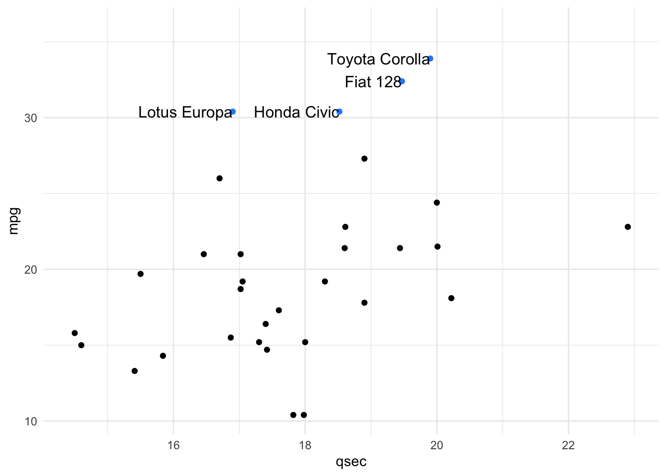
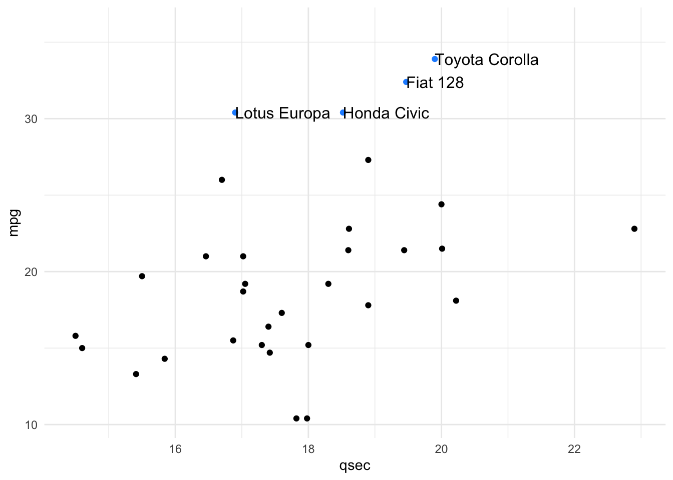
There are several method options for adding direct labels to scatter plots, such as:
first.points (which will place the label on the left in a scatterplot), and last.points (which will place the label on the right in a scatterplot).
#install.packages("directlabels")
library(directlabels)
mtcars %>%
  mutate(mpg_highlight = case_when(mpg > 30 ~ "high", mpg < 30 ~ "low")) %>%
  ggplot(aes(qsec, mpg, label = model)) +
  geom_point(aes(color = mpg_highlight)) +
  scale_color_manual(values = c("dodgerblue", "black")) +
  scale_x_continuous(expand = c(0.05, 0.05)) +
  scale_y_continuous(limits = c(NA, 36)) +
  geom_dl(data = filter(mtcars, mpg > 30), aes(label = model),
          method = list(c("first.points"),
                        cex = 1)) +
  theme_minimal() +
  theme(legend.position = "none")
mtcars %>%
  mutate(mpg_highlight = case_when(mpg > 30 ~ "high", mpg < 30 ~ "low")) %>%
  ggplot(aes(qsec, mpg, label = model)) +
  geom_point(aes(color = mpg_highlight)) +
  scale_color_manual(values = c("dodgerblue", "black")) +
  scale_x_continuous(expand = c(0.05, 0.05)) +
  scale_y_continuous(limits = c(NA, 36)) +
  geom_dl(data = filter(mtcars, mpg > 30), aes(label = model),
          method = list(c("last.points"),
                        cex = 1)) +
  theme_minimal() +
  theme(legend.position = "none")
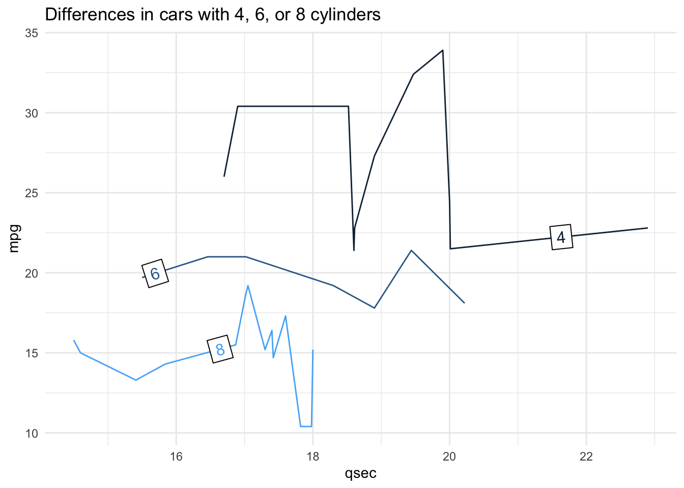
This package is especially useful for labeling lines in a lineplot. There are several methods, one of which is the
angled.boxes method. This often negates the need for a legend.
ggplot(mtcars, aes(qsec, mpg, color = cyl, group = cyl)) +
  geom_line() +
  geom_dl(aes(label = cyl),
          method = list(c("angled.boxes"),
                        cex = 1)) +
  theme_minimal()+
  theme(legend.position = "none") +
  labs(title = "Differences in cars with 4, 6, or 8 cylinders")
Subsection 4.9.3 cowplot
Beyond customization within
ggplot2 and labeling points, there are times you’ll want to arrange multiple plots together in a single grid, applying a standard theme across all plots. This often occurs when you’re ready to present or publish your visualizations. When you’re ready to share and present your work with others, you want to be sure your visualizations are conveying the point you want to convey to your viewer in as simple a plot as possible. And, if you’re presenting multiple plots, you typically want to ensure that they have a consistent theme from one plot to the next. This allows the viewer to focus on the data you’re plotting, rather than changes in theme. The cowplot package assists in this process!
Subsubsection 4.9.3.1 Theme
The standard theme within
cowplot, which works for many types of plots is theme_cowplot(). This theme is very similar to theme_classic(), which removes the background color, removes grid lines, and plots only the x- and y- axis lines (rather than a box around all the data). We’ll use this theme for the examples from this package. However, note that there are a number of additional themes available from the cowplot package. We will use the number 12 within this function to indicate that we want to use a font size of 12.
# install and load package
# install.packages("cowplot")
library(cowplot)
We’ll continue to use the
mtcars dataset for these examples. Here, using the forcats package (which is part of the core tidyverse), we’ll add two new columns: transmission, where we recode the am column to be "automatic" if am == 0 and "manual" if am == 1, and engine, where we recode the vs column to be "v-shaped" if vs == 0 and "straight" if vs == 1.
mtcars <- mtcars %>%
  mutate(transmission = fct_recode(as.factor(am), "automatic" = "0", "manual" = "1"),
         engine = fct_recode(as.factor(vs), "v-shaped" = "0", "straight" = "1"))
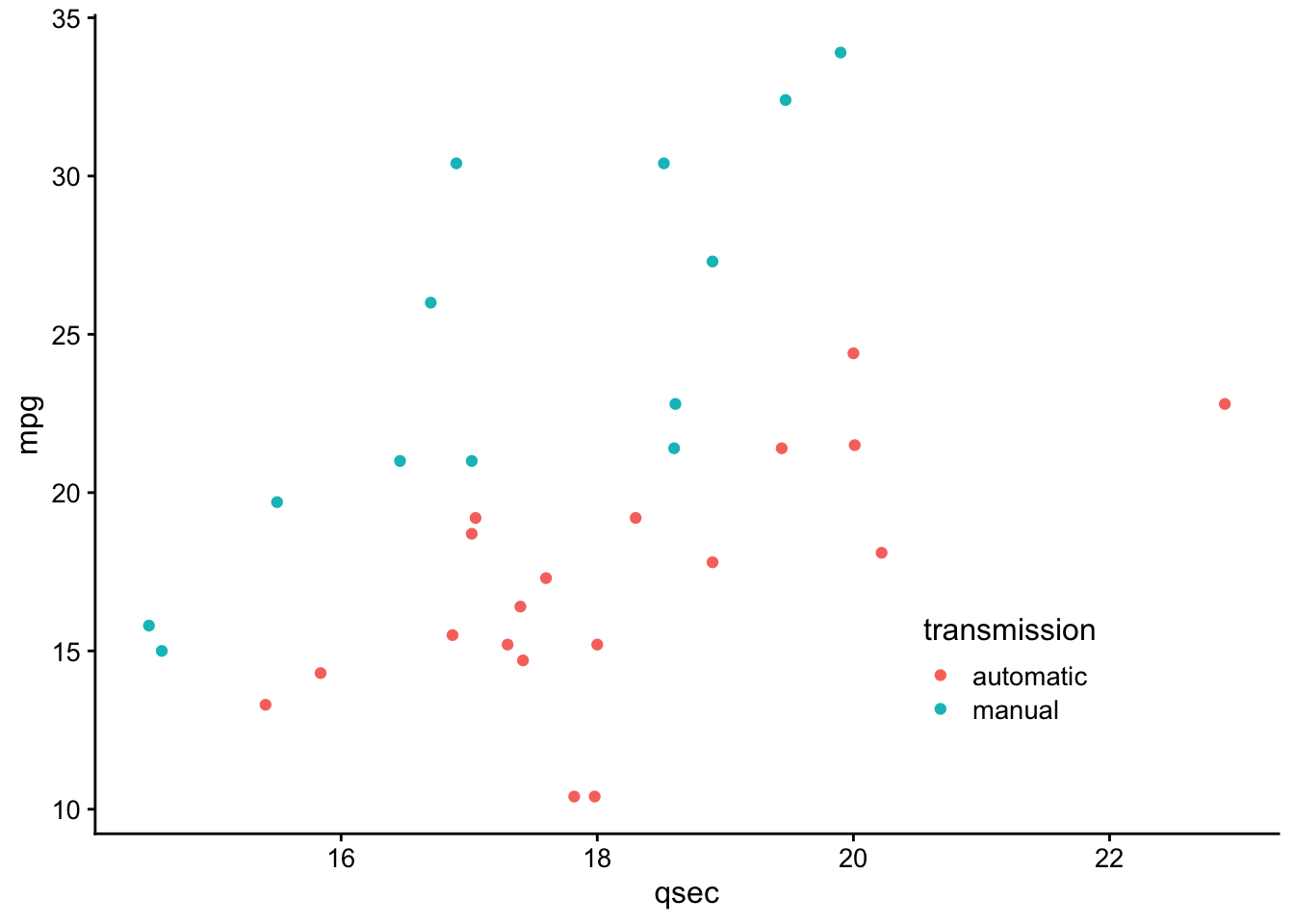
We’ll use these data to generate a scatterplot plotting the relationship between 1/4 mile speed (
qsec) and gas mileage (mpg). We’ll color the points by this new column transmission and apply theme_cowplot. Finally, we’ll assign this to p1, as we’ll ultimately generate a few different plots.
p1 <- ggplot(mtcars, aes(qsec, mpg, color = transmission)) +
  geom_point() +
  theme_cowplot(12) +
  theme(legend.position = c(0.7, 0.2))
p1
Let’s make a similar plot, but color by engine type. We’ll want to manually change the colors here so that we aren’t using the same colors for transmission and engine. We’ll store this in
p2.
p2 <- ggplot(mtcars, aes(qsec, mpg, color = engine)) +
  geom_point() +
  scale_color_manual(values = c("red", "blue")) +
  theme_cowplot(12) +
  theme(legend.position = c(0.7, 0.2))
p2
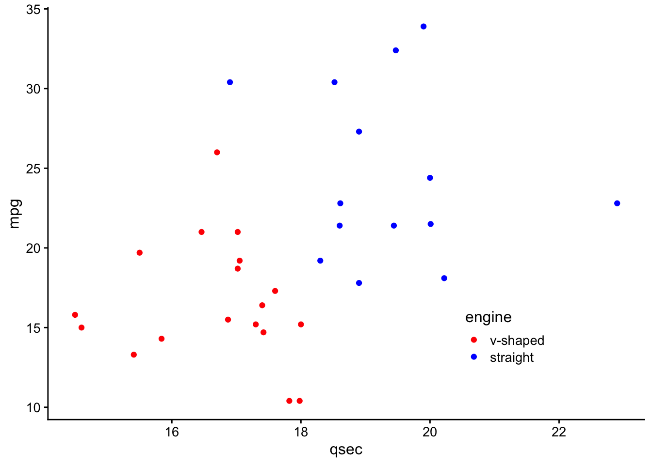
Great - we’ve now got two plots with the same theme and similar appearance. What if we wanted to combine these into a single grid for presentation purposes?
Subsubsection 4.9.3.2 Multiple Plots
# plot side by side
plot_grid(p1, p2, ncol = 2)
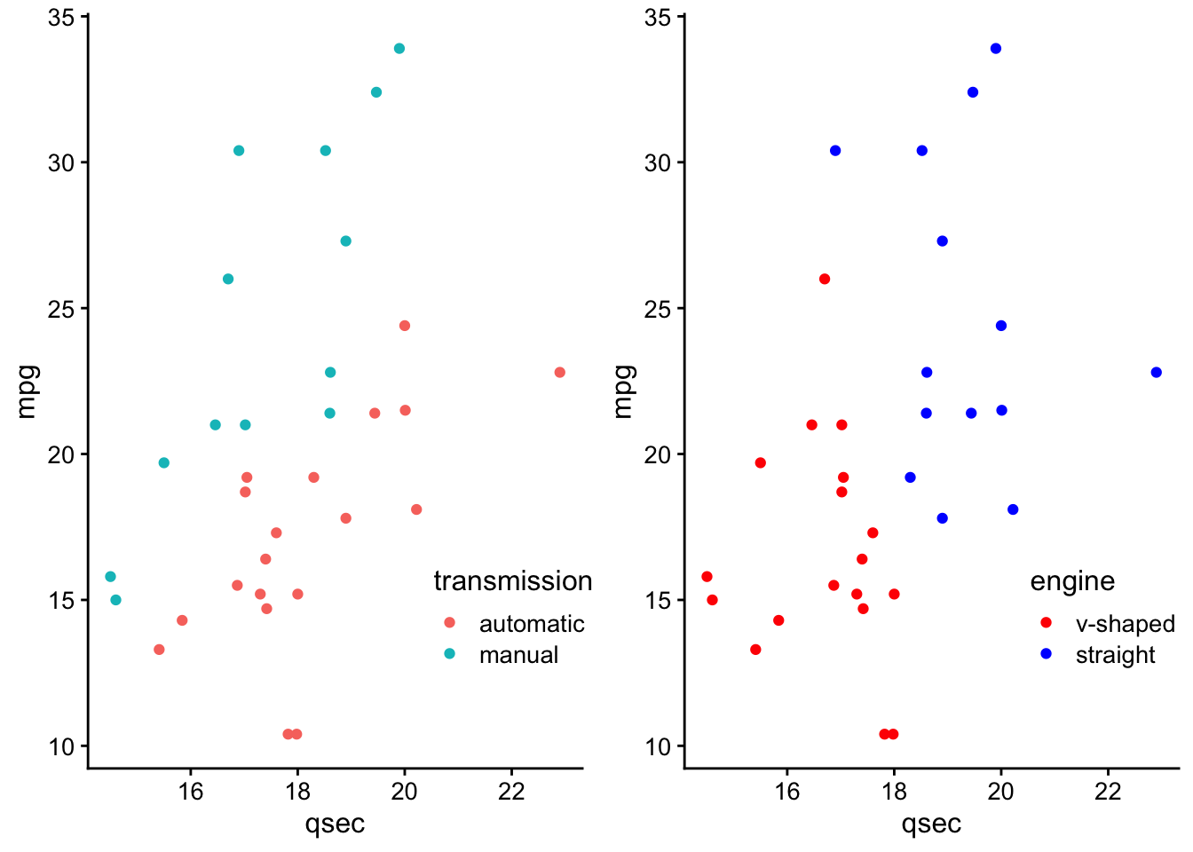
Here, we specify the two plots we’d like to plot on a single grid and we also optionally include how many columns we’d like using the
ncol parameter.
To plot these one on top of the other, you could specify for
plot_grid() to use a single column.
# plot on top of one another
plot_grid(p1, p2, ncol = 1)
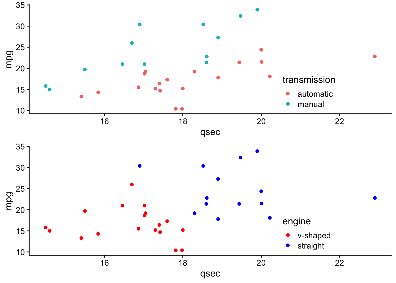
Note that by default, the plots will share the space equally, but it’s also possible to make one larger than the other within the grid using
rel_widths and rel_heights.
For example, if you had a faceted plot summarizing the number of cars by transmission and engine (which we’ll call
p3):
# generate faceted plot
p3 <- ggplot(mtcars, aes(engine)) +
  geom_bar() +
  facet_wrap(~transmission) +
  scale_y_continuous(expand = expand_scale(mult = c(0, 0.1))) +
  theme_minimal_hgrid(12) +
  panel_border(color = "black") +
  theme(strip.background = element_rect(fill = "gray80"))
p3
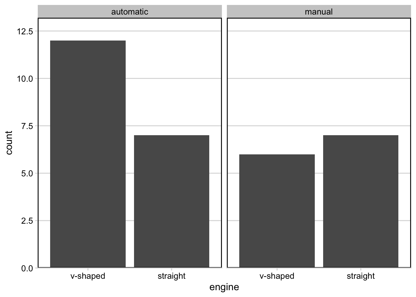
Note that for this plot we’ve chosen a different theme, allowing for horizontal grid lines. This can be helpful when visualizing bar plots.
If we were to plot these next to one another using the defaults, the faceted plot would be squished:
# plot next to one another
plot_grid(p1, p3)
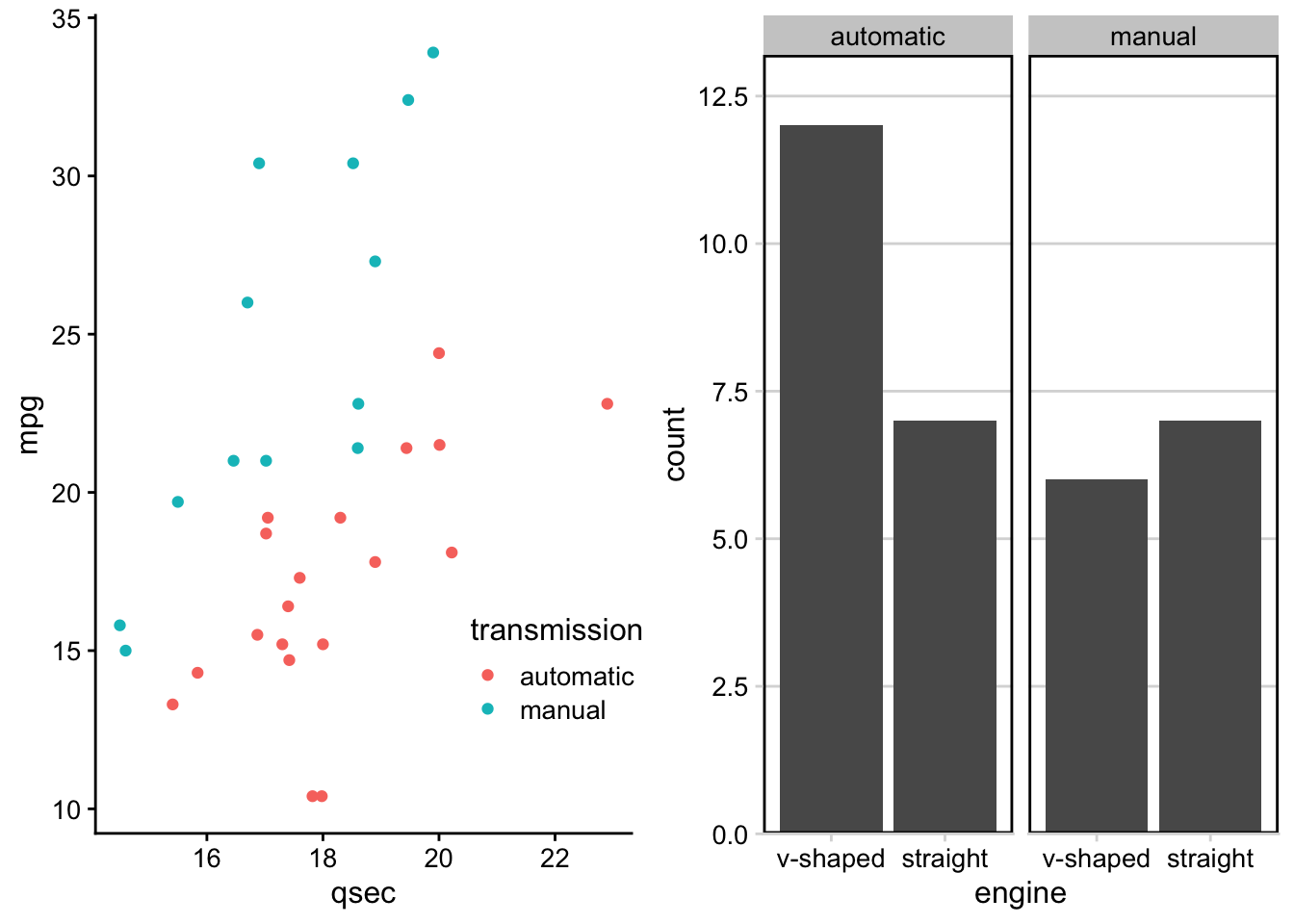
We can use
rel_widths to specify the relative width for the plot on the left relative to the plot on the right:
# control relative spacing within grid
plot_grid(p1, p3, rel_widths = c(1, 1.3))
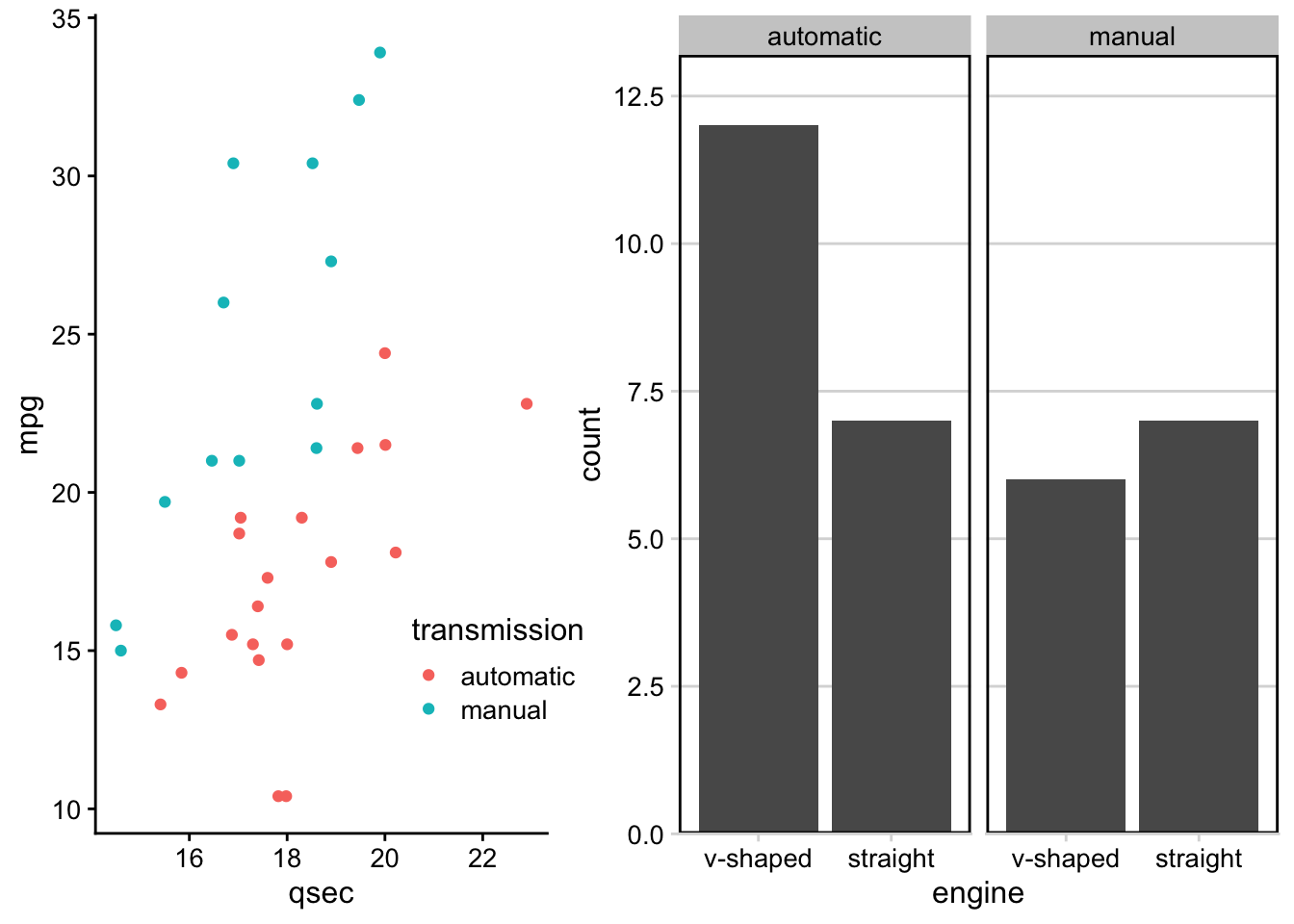
Notice how the plot on the left is now a bit more narrow and the plot on the right is a bit wider.
Adding Labels
Within these grids, you’ll often want to label these plots so that you can refer to them in your report or presentation. This can be done using the
labels parameter within plot_grid():
# add A and B labels to plots
plot_grid(p1, p3, labels = "AUTO", rel_widths = c(1, 1.3))
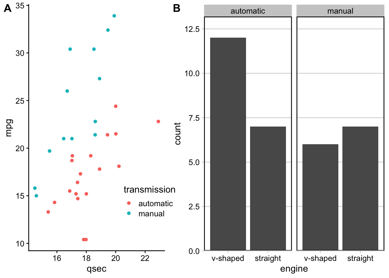
Adding Joint Titles
Finally, when generating grids with multiple plots, at times you’ll often want a single title to explain what’s going on across the plots. Here, the process looks slightly confusing, but this is only because we’re putting all of these
cowplot pieces together.
Generally, there are three steps:
-
Create grid with plots
-
Create title object
-
Piece title and grid of plots together
# use plot_grid to generate plot with 3 plots together
first_col <- plot_grid(p1, p2, nrow = 2, labels = c('A', 'B'))
three_plots <- plot_grid(first_col, p3, ncol = 2, labels = c('', 'C'), rel_widths = c(1, 1.3))

# specify title
title <- ggdraw() +
  # specify title and alignment
  draw_label("Transmission and Engine Type Affect Mileage and 1/4 mile time",
              fontface = 'bold', x = 0, hjust = 0) +
  # add margin on the left of the drawing canvas,
  # so title is aligned with left edge of first plot
  theme(plot.margin = margin(0, 0, 0, 7))

# put title and plots together
plot_grid(title, three_plots, ncol = 1, rel_heights = c(0.1, 1))
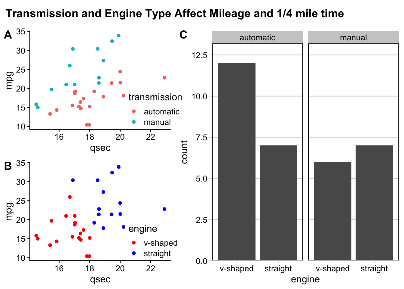
And, just like that we’ve got three plots, labeled, spaced out nicely in a grid, with a shared title, all thanks to the functionality within the
cowplot package.
Subsection 4.9.4 patchwork
The
patchwork package is similar to the cowplot package in that they both are helpful for combining plots together. They each allow for different plot modifications, so it is useful to know about both packages.
With the
patchwork package, plots can be combined using a few operators, such as "+", "/", and "|".
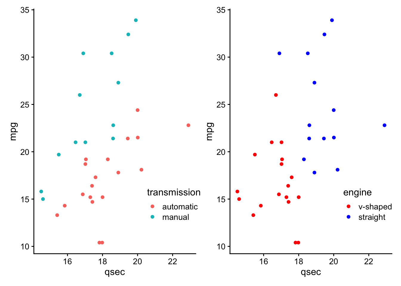
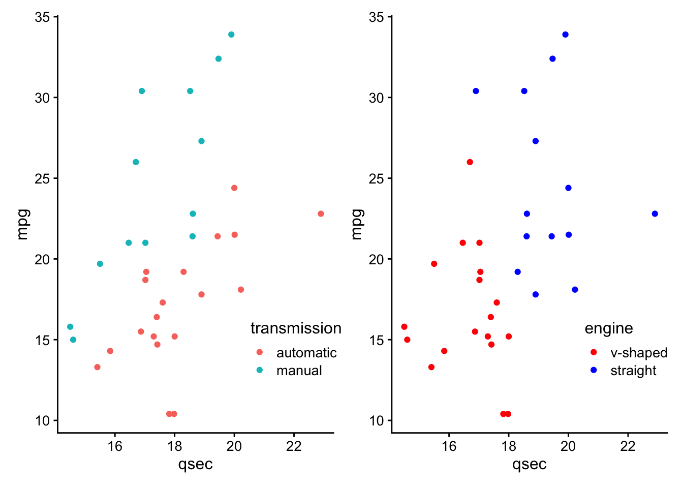
To combine two plots together we can simply add them together with the
+ sign or place them next to one another using the |:
#install.packages(patchwork)
library(patchwork)
p1 + p2
p1 | p2
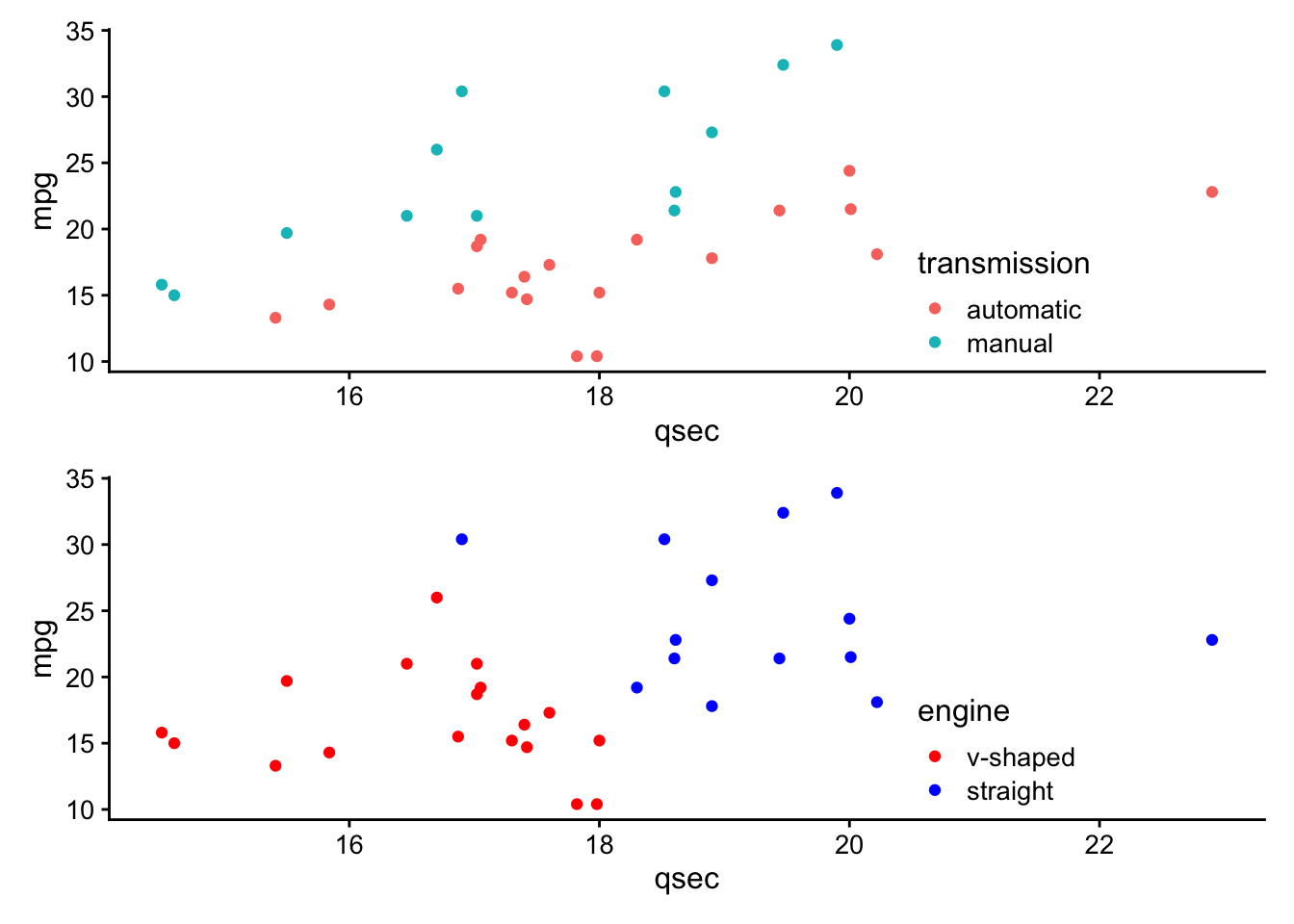
If we want a plot above another plot we can use the "/" symbol:
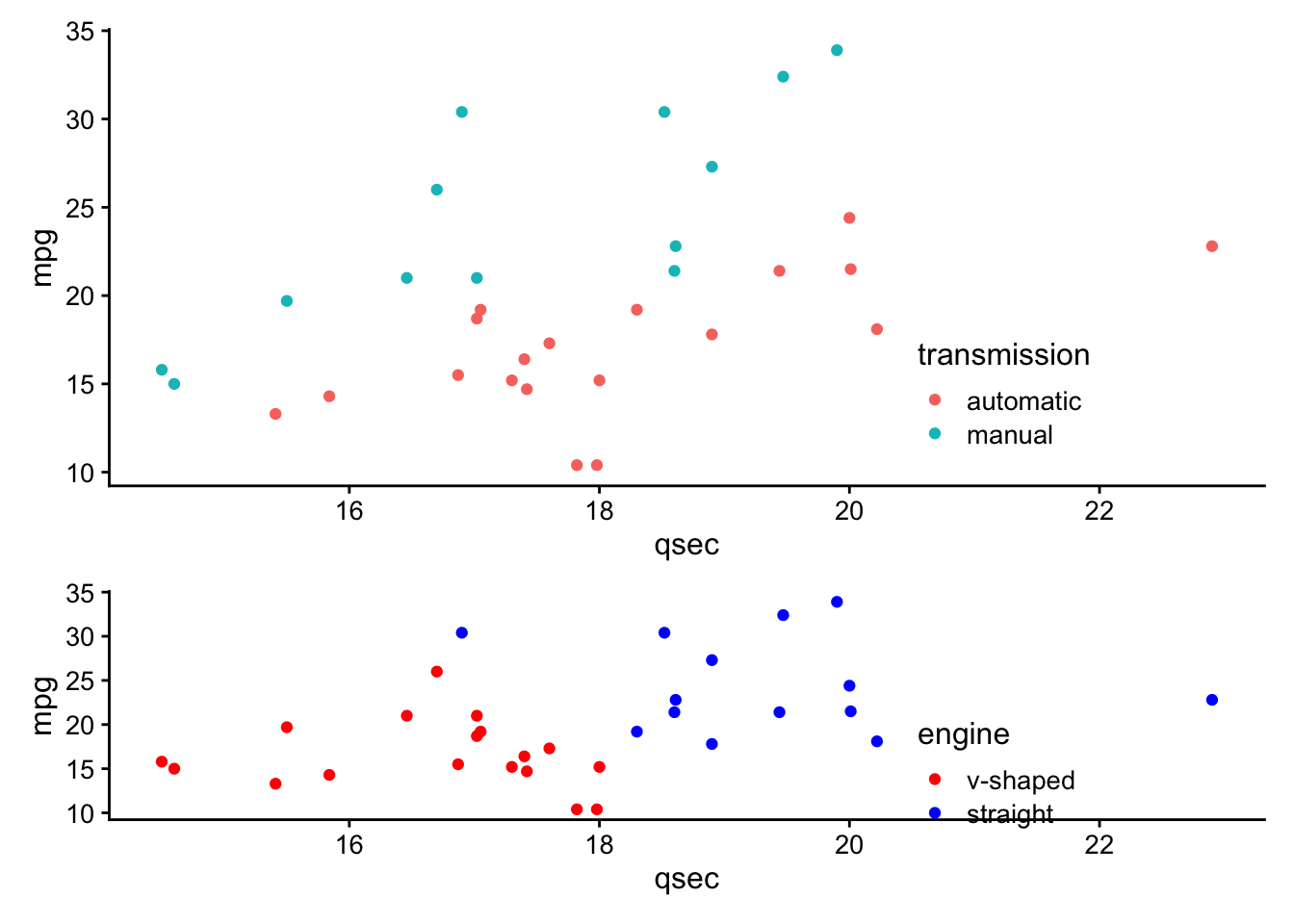
p1 / p2
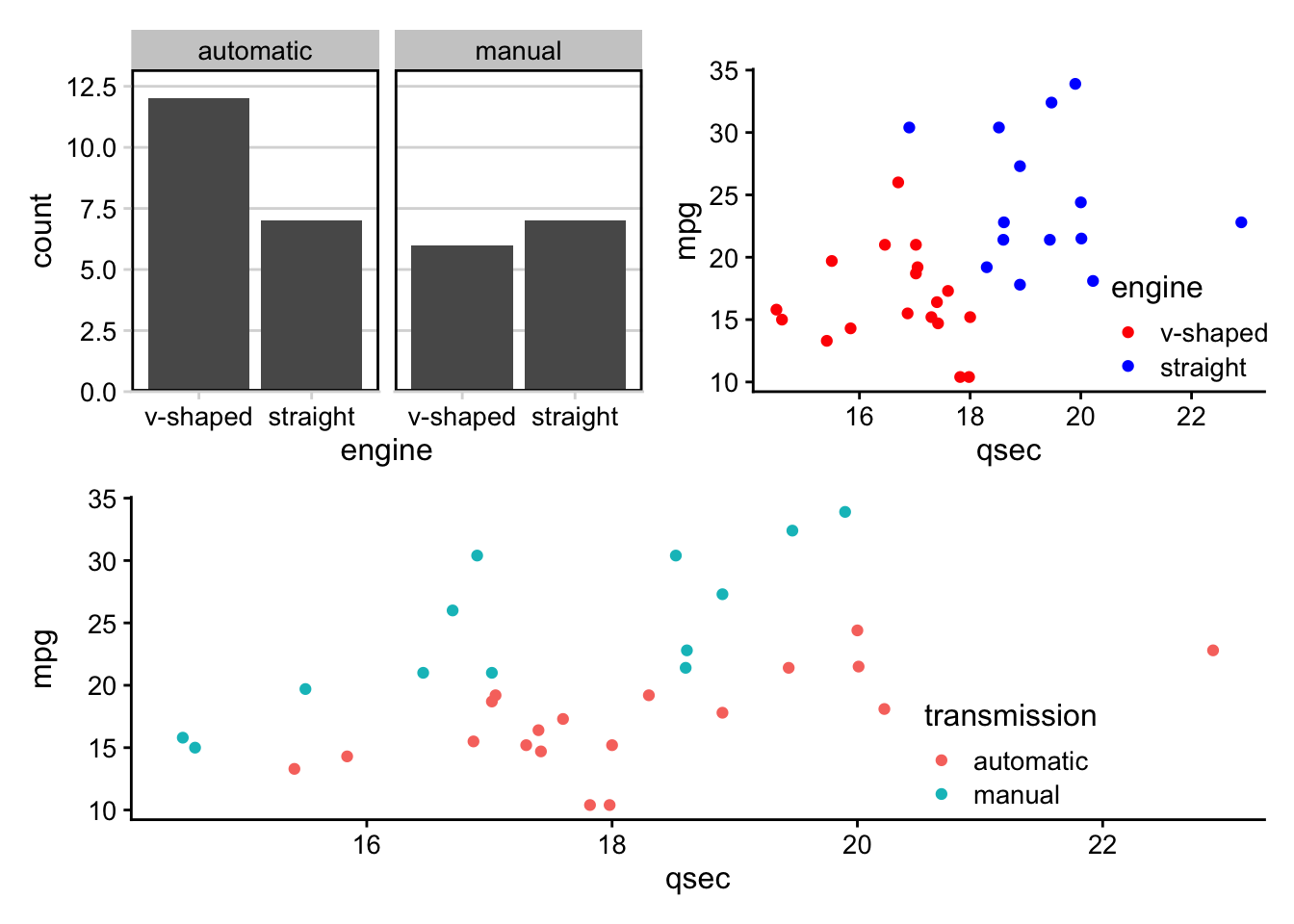
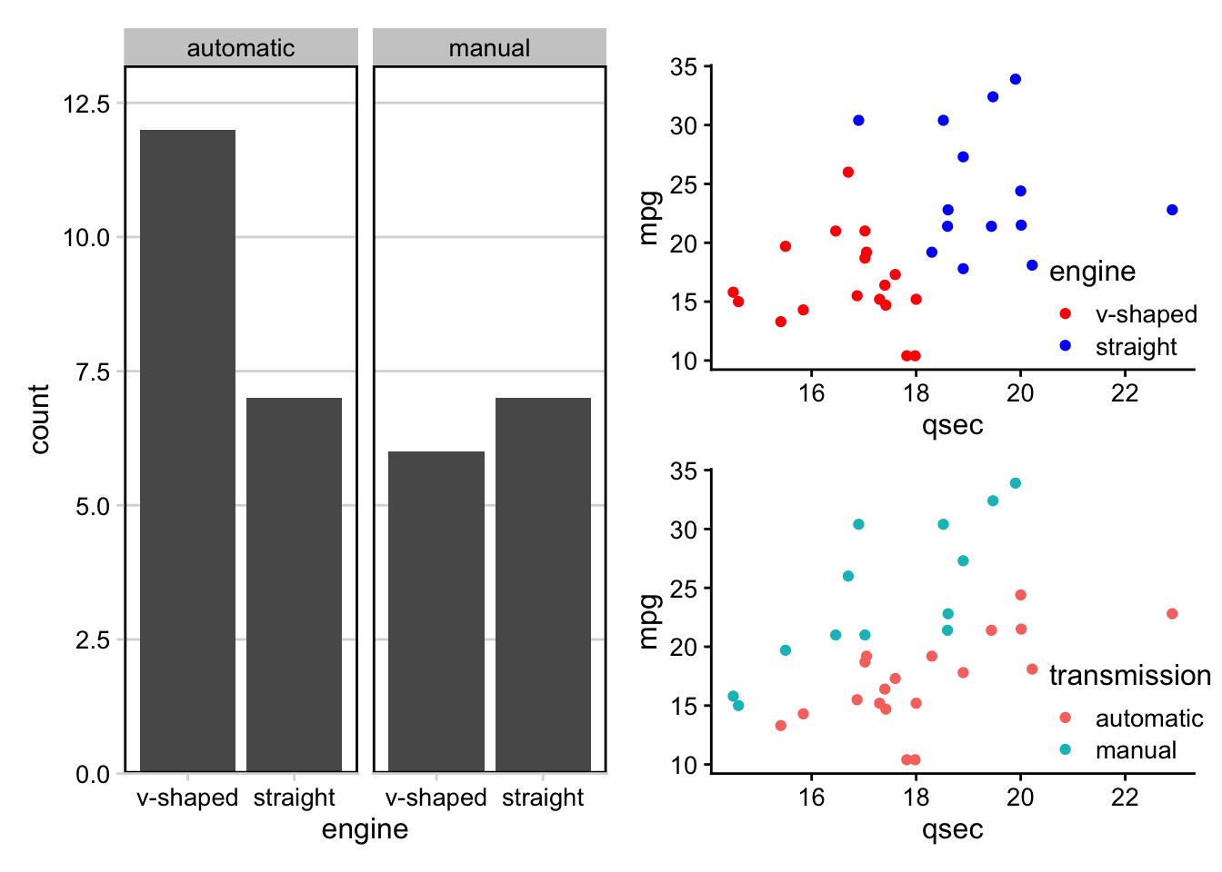
Grouping or nesting plots together using parenthesis can result in two or more plots taking up a single grid space.
Thus, to combine multiple plots in a more complicated layout, one can combine two plots on one row and have a third plot on another row like this:
(p3 + p2) / p1
Without the parentheses we would have the following:
p3 + p2 / p1
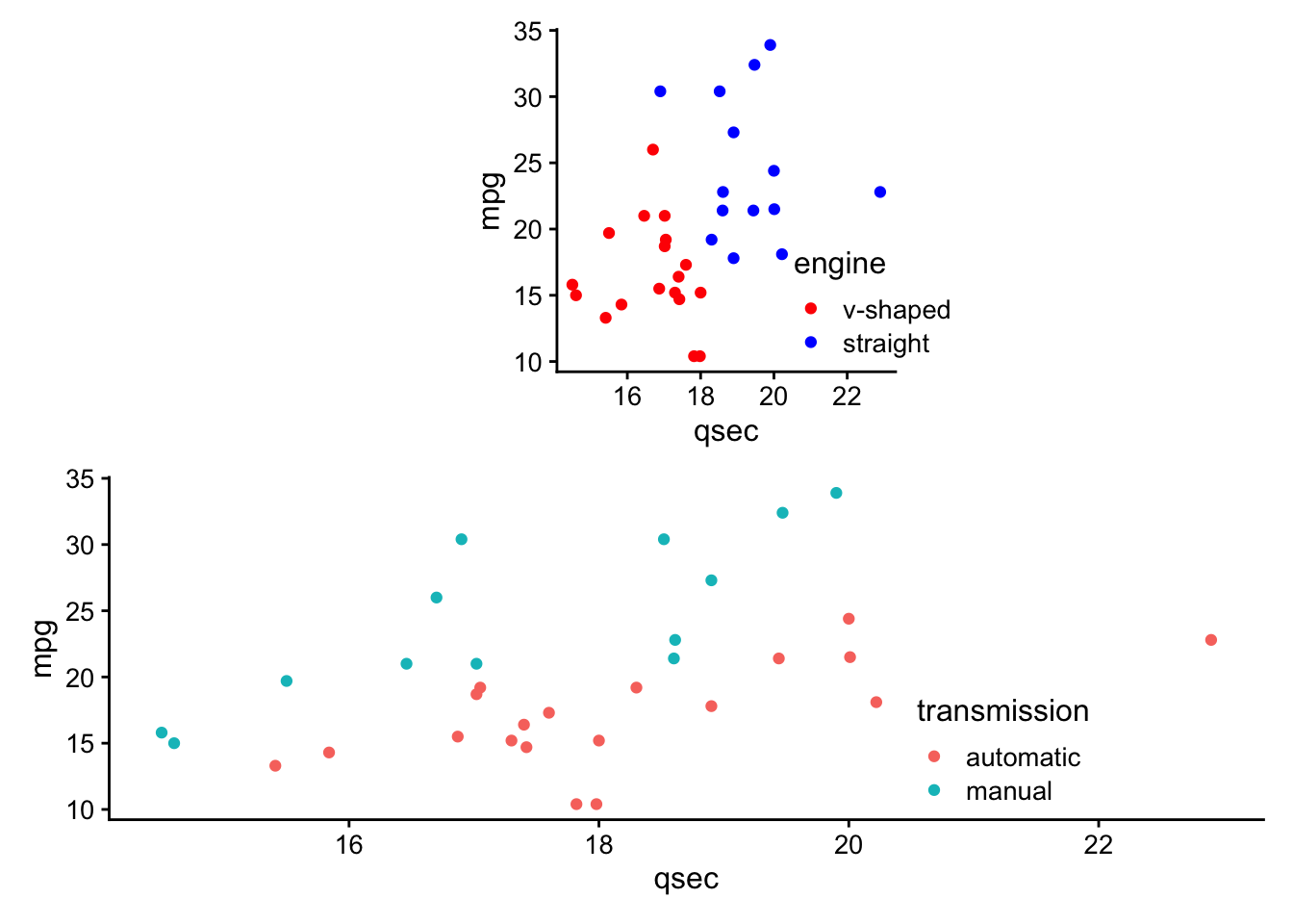
You can also empty plot spacers using the
plotspacer() function like so:
(plot_spacer() + p2 + plot_spacer()) / p1
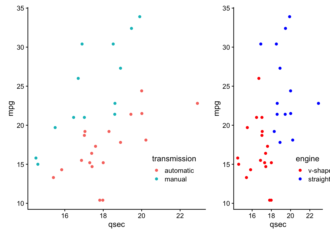
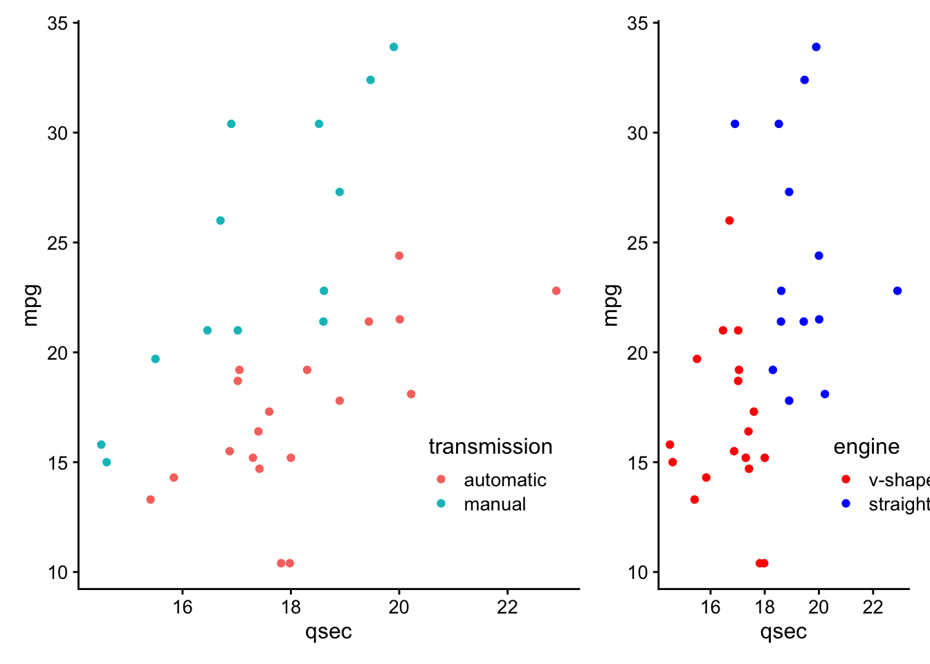
You can modify the widths of the plots using the
widths argument of the plot_layout() function. In the following example we will make the width of the plot on the left 2 times that of the plot on the right. Any numeric values will do, it is the ratio of the numbers that make the difference.
Thus, both
p1 + p2 + plot_layout(widths = c(2, 1)) and p1 + p2 + plot_layout(widths = c(60, 30)) will result in the same relative size difference between p1 and p2.
p1 + p2 + plot_layout(widths = c(2, 1))
p1 + p2 + plot_layout(widths = c(60, 30))
The relative heights of the plots can also be modified using a
heights argument with the same function.
p1 + p2 + plot_layout(heights = c(2, 1))
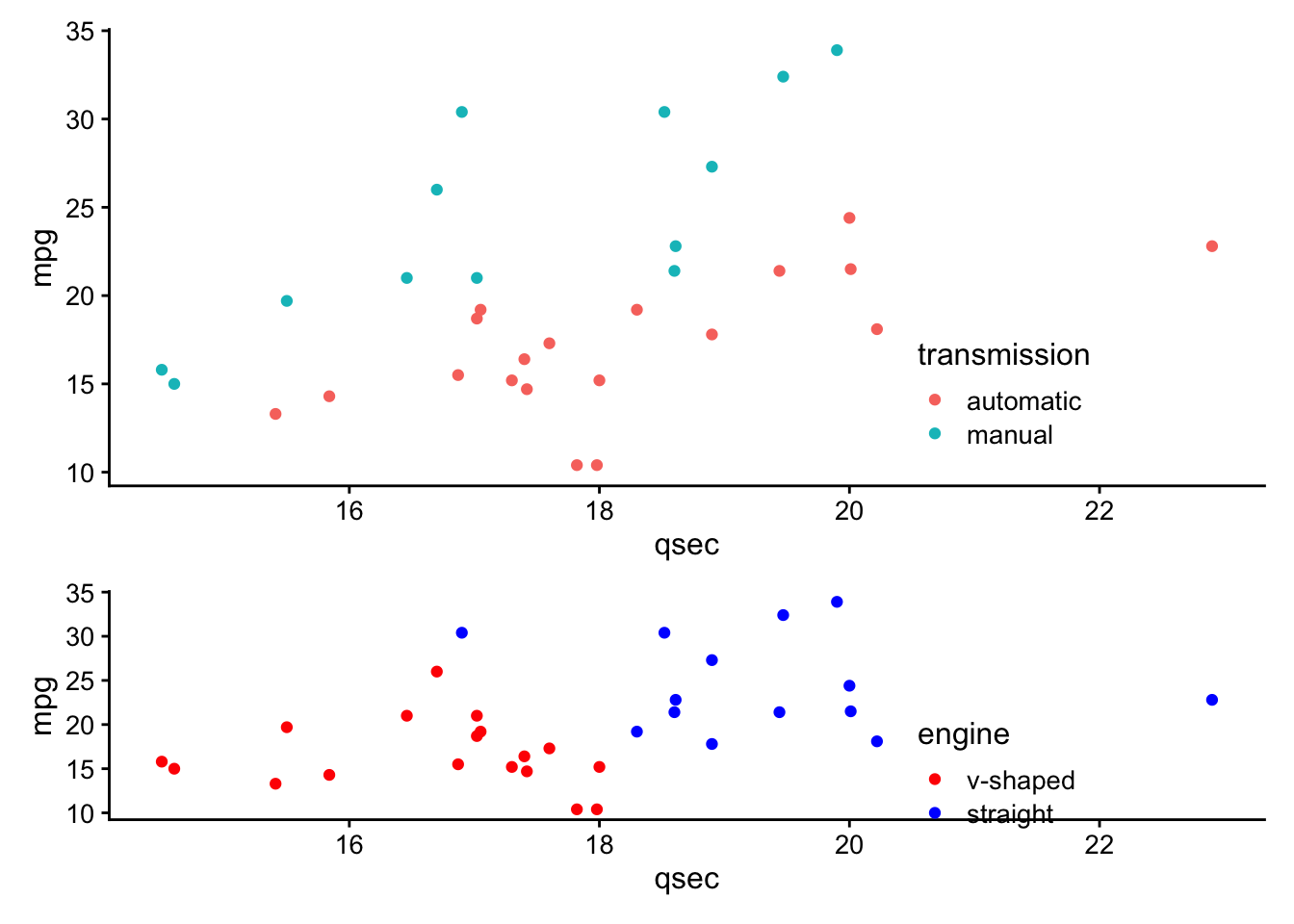
p1 + p2 + plot_layout(heights = c(60, 30))
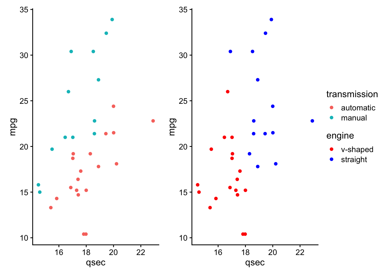
This package also allows for modification of legends. For example, legends can be gathered together to one side of the combined plots using the
guides = 'collect' argument of the plot_layout() function.
p1 + p2 + plot_layout(guides = "collect")
You can also specify the number of columns or rows using this same function with the
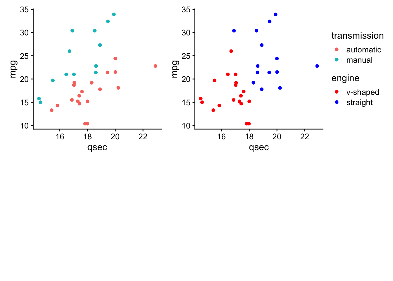
ncol or nrow as you would with facet_wrap() of the ggplot2 package, where plots are added to complete a row before they will be added to a new row. For example, the following will result in an empty 2nd row below the plots.
p1 + p2 + plot_layout(nrow = 2, ncol = 2, guides = "collect")
However, the
byrow = FALSE argument can disrupt this behavior and result in an empty 2nd column:
p1 +p2 + plot_layout(nrow = 2, ncol = 2, byrow = FALSE, guides = "collect")
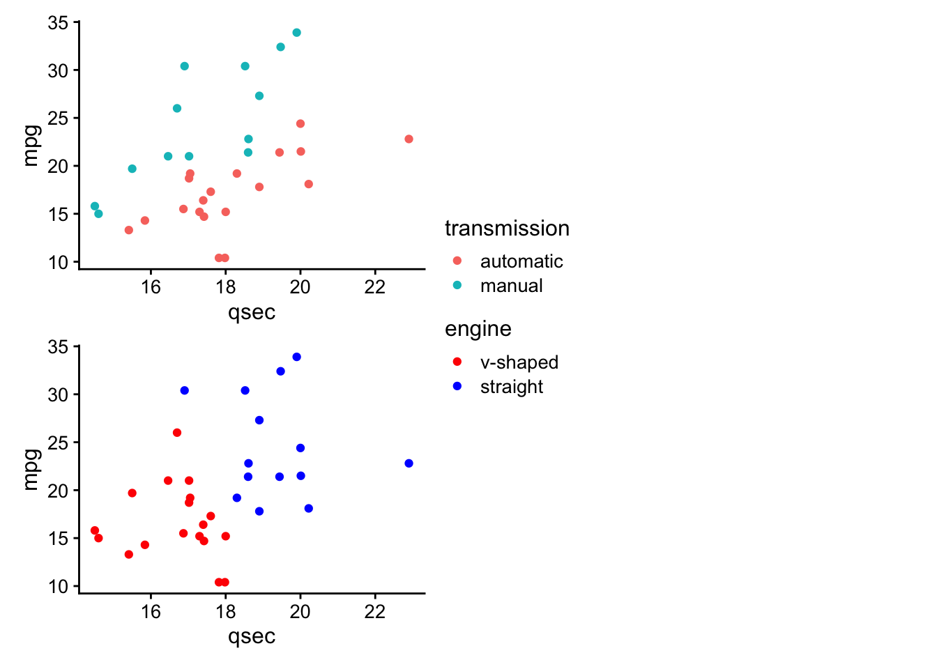
In this case the columns will be preferentially completed before placing a plot in a new column.
We can also use the package to change the theme specifications of specific plots. By default the plot just prior to the
theme() function will be the only plot changed.
p1 + p2 + theme(legend.position = "bottom") + p2
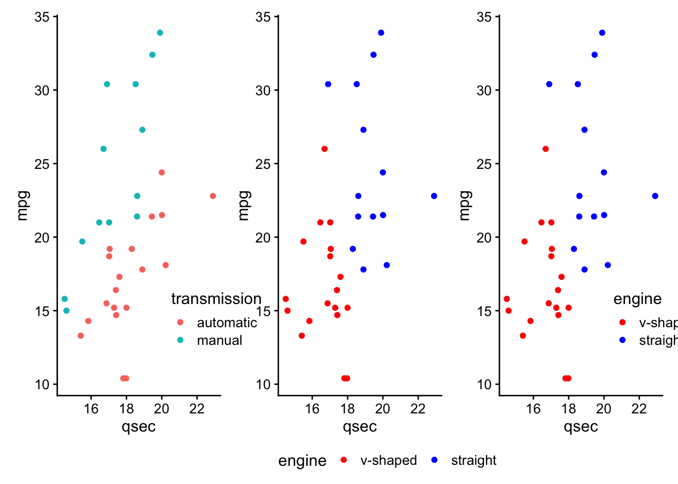
Using the
*, themes can be added to all plots that are nested together.
(p1 + p2) *theme_bw() + p2
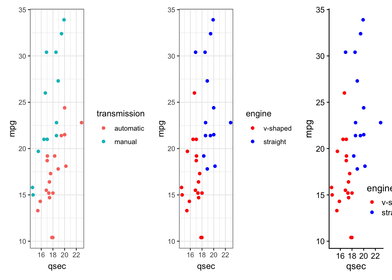
The
& adds themes to all plots.
(p1 + p2) + p2 & theme(axis.title.x = element_text(face = "bold"))
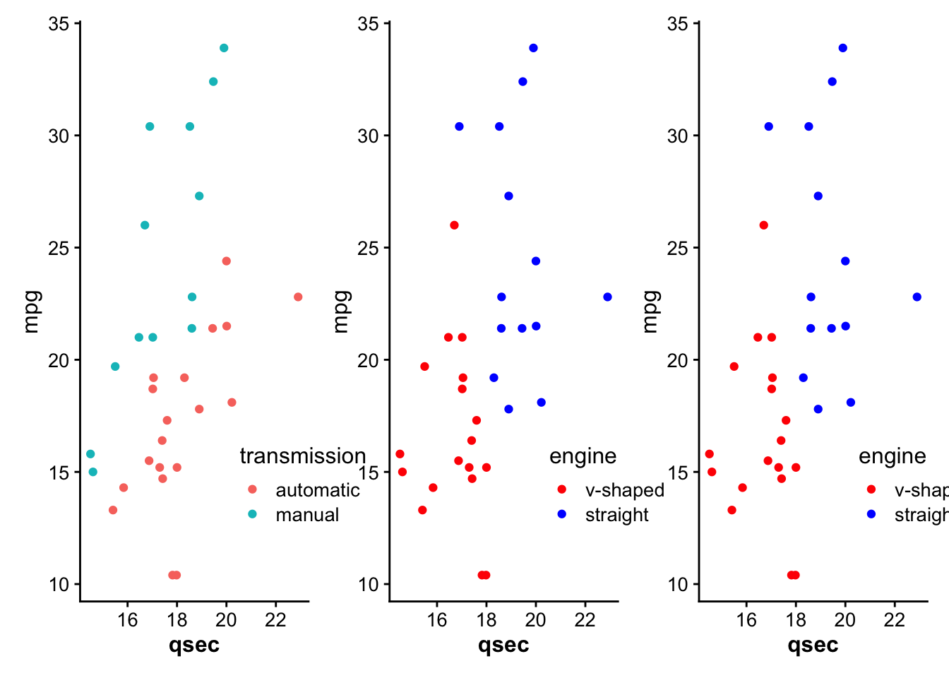
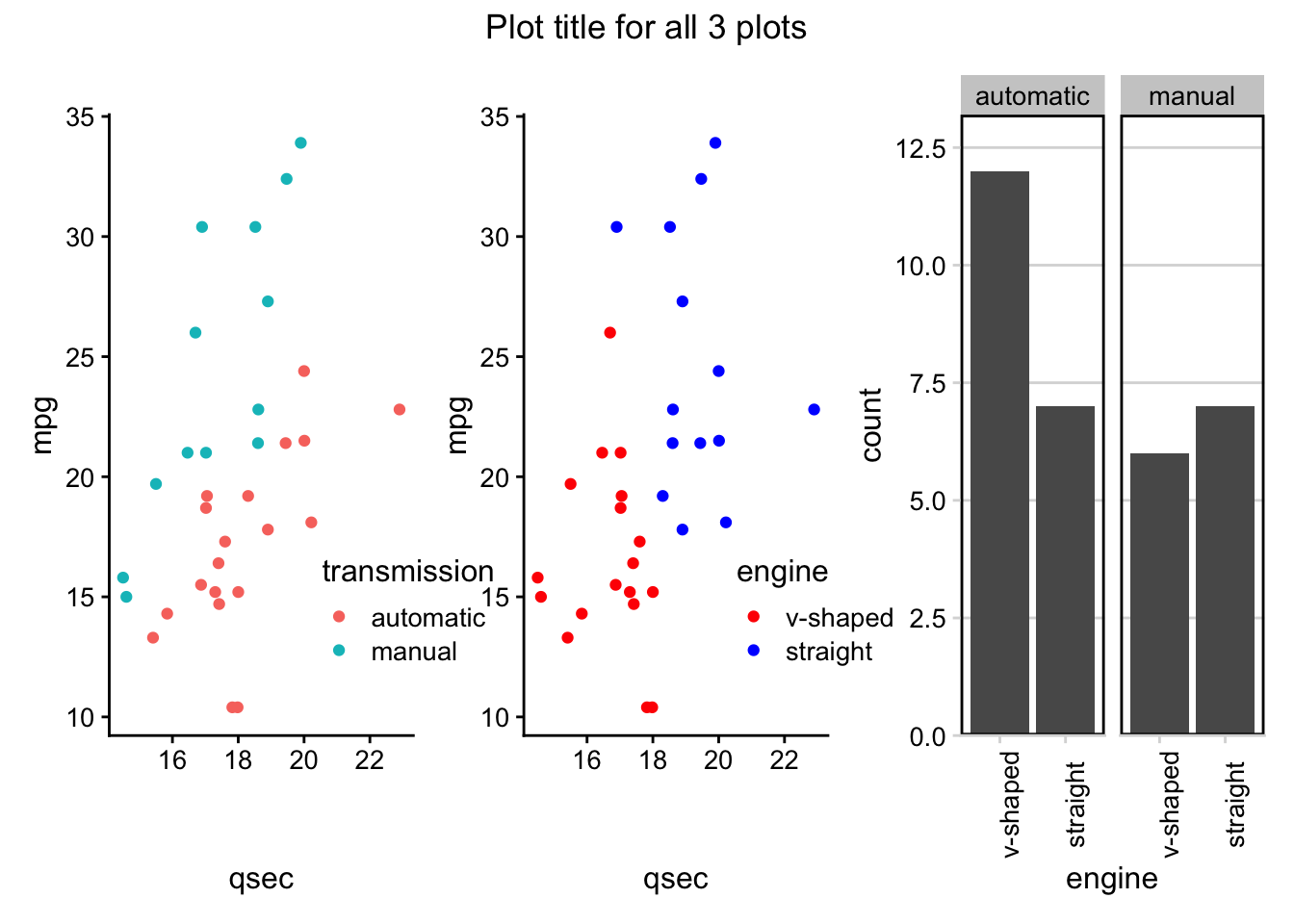
Annotations for all the plots combined can also be added using the
plot_annotation() function, which can also take theme() function specifications with the theme argument.
(p1 + p2) + p3 + theme(axis.text.x = element_text(angle = 90)) +
  plot_annotation(title = "Plot title for all 3 plots",
                  theme = theme(plot.title = element_text(hjust = 0.5)))
Subsection 4.9.5 gganimate
The final
ggplot2 extension we’ll discuss here is gganmiate. This extends the grammar of graphics implemented in the ggplot2 package to work with animated plots. To get started, you’ll need to install and load the package:
library(gganimate)
The
gganimate package adds functionality by providing a number of these grammar classes. Across the animation being generated, the following classes are made available, with each classes’ corresponding functionality:
-
transition_*()| specifies how data should transition -
ease_aes()| specifies how different aesthetics should be eased during transitions -
view_*()| specifies how positional scales should change -
shadow_*()| specifies how points from a previous frame should be displayed in a current frame
We’ll walk through these grammar classes using the
mtcars dataset.
Subsubsection 4.9.5.1 Example: mtcars
As noted,
gganimate builds on top of the functionality within ggplot2, so the code should look pretty familiar by now.
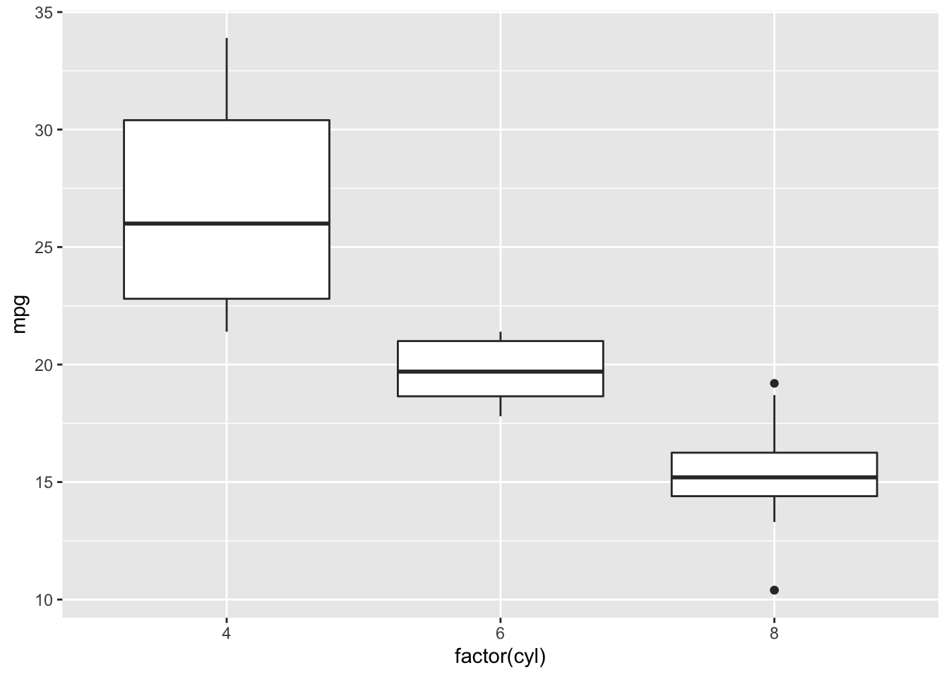
First, using the
mtcars dataset we generate a static boxplot looking at the relationship between the number of cylinders a car has (cyl) and its gas mileage (mpg).
# generate static boxplot
ggplot(mtcars) +
  geom_boxplot(aes(factor(cyl), mpg))
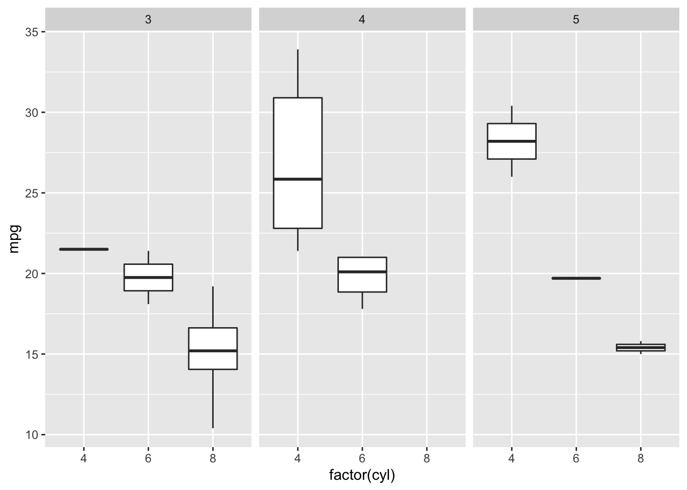
But what if we wanted to understand the relationship between those two variables and the number of gears a car has (
gear)?
One option would be to use faceting:
# facet by gear
ggplot(mtcars) +
  geom_boxplot(aes(factor(cyl), mpg)) +
  facet_wrap(~gear)
Alternatively, we could animate the plot, using
gganimate so that on a single plot we rotate between each of these three plots.
Transitions
We’ll transition in this example between frames by gear:
# animate it!
mtcars %>%
  mutate(gear = factor(gear),
         cyl = factor(cyl)) %>%
  ggplot() +
  geom_boxplot(aes(cyl, mpg)) +
  transition_manual(gear)
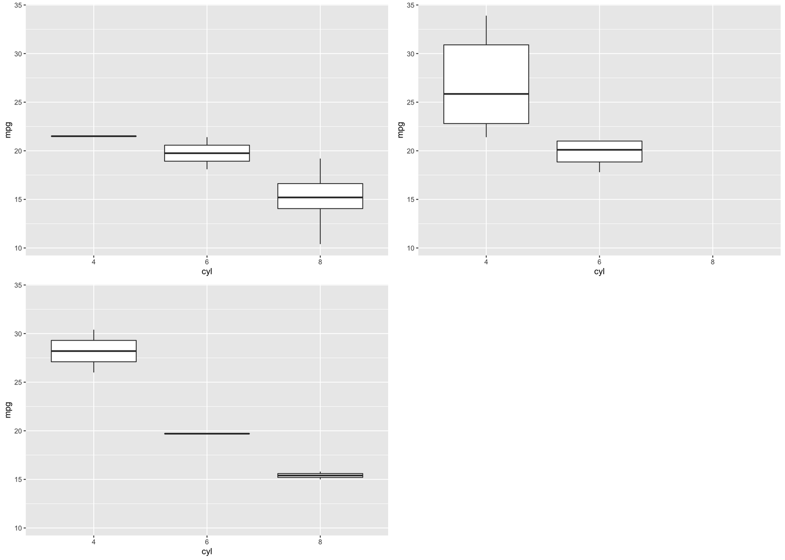
transition_manual(): transitioning by gearNote that here,
transition_manual() is a new grammar class that we add right on top of our ggplot2 plot code! Within this grammar class, we specify the variable upon which we’d like the transition in the animation to occur.
This means that the number of frames in the animation will be the number of levels in the variable by which you’re transitioning. Here, there will be 3 frames, as there are three different levels of
gear in the mtcars dataset.
transition_manual() is not the only option for transition. In fact, there are a number of different transition_* options, depending upon your animation needs. One of the most commonly used is transition_states(). The animation will plot the same information as the example above; however, it allows for finer tune control of the animation
# animate it!
anim <- ggplot(mtcars) +
  geom_boxplot(aes(factor(cyl), mpg)) +
  transition_states(gear,
                    transition_length = 2,
                    state_length = 1)

anim
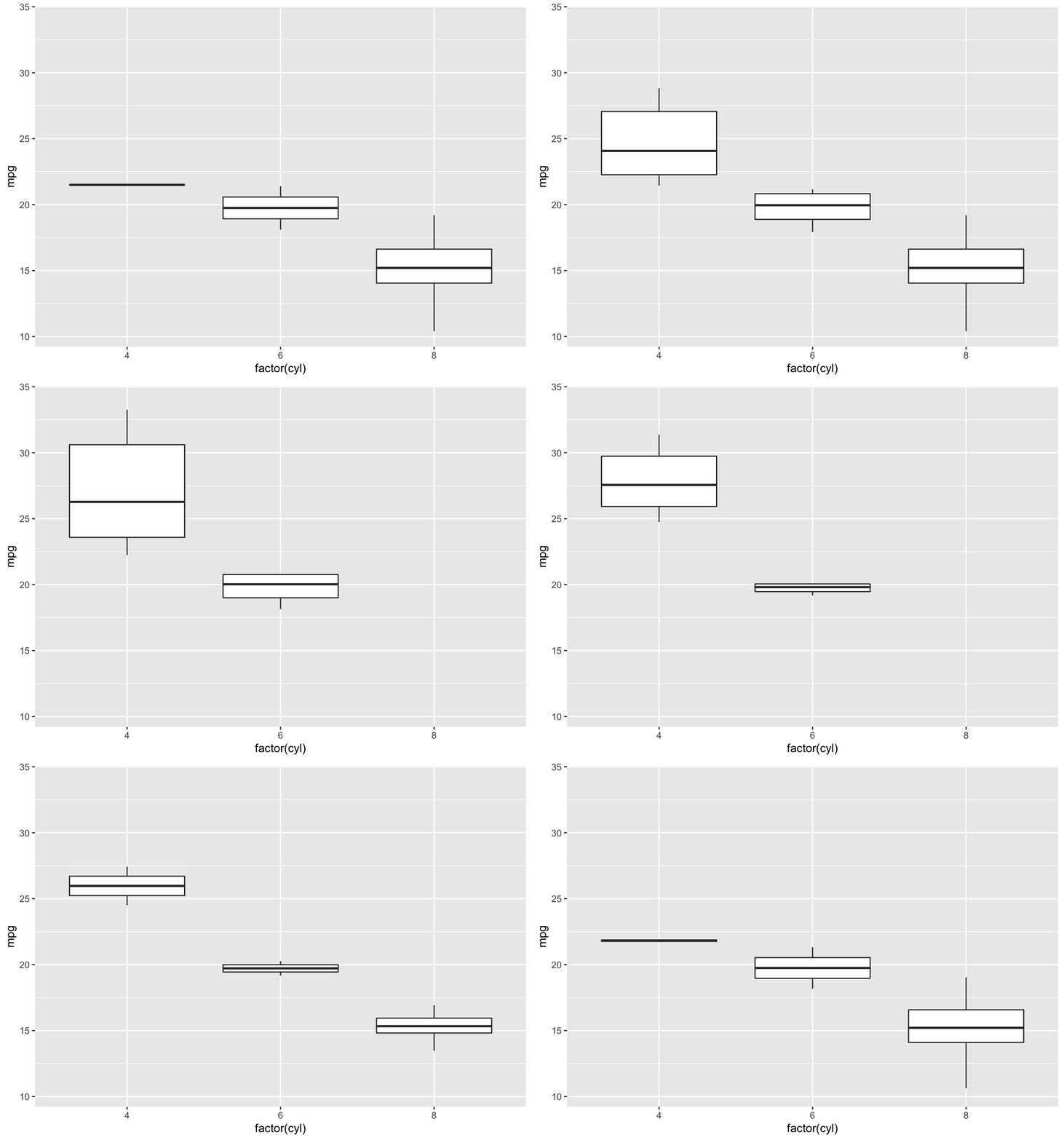
transition_states(): transitioning by gearNote here that we’ve stored the output from
transition_states in the object anim. We’ll build on this object below.
Labeling
Currently, it’s hard to know which frame corresponds to which
gear. To make this easier on the viewer, let’s label our animation:
# animate it!
anim <- anim +
  labs(title = 'Now showing gear: {closest_state}')

anim
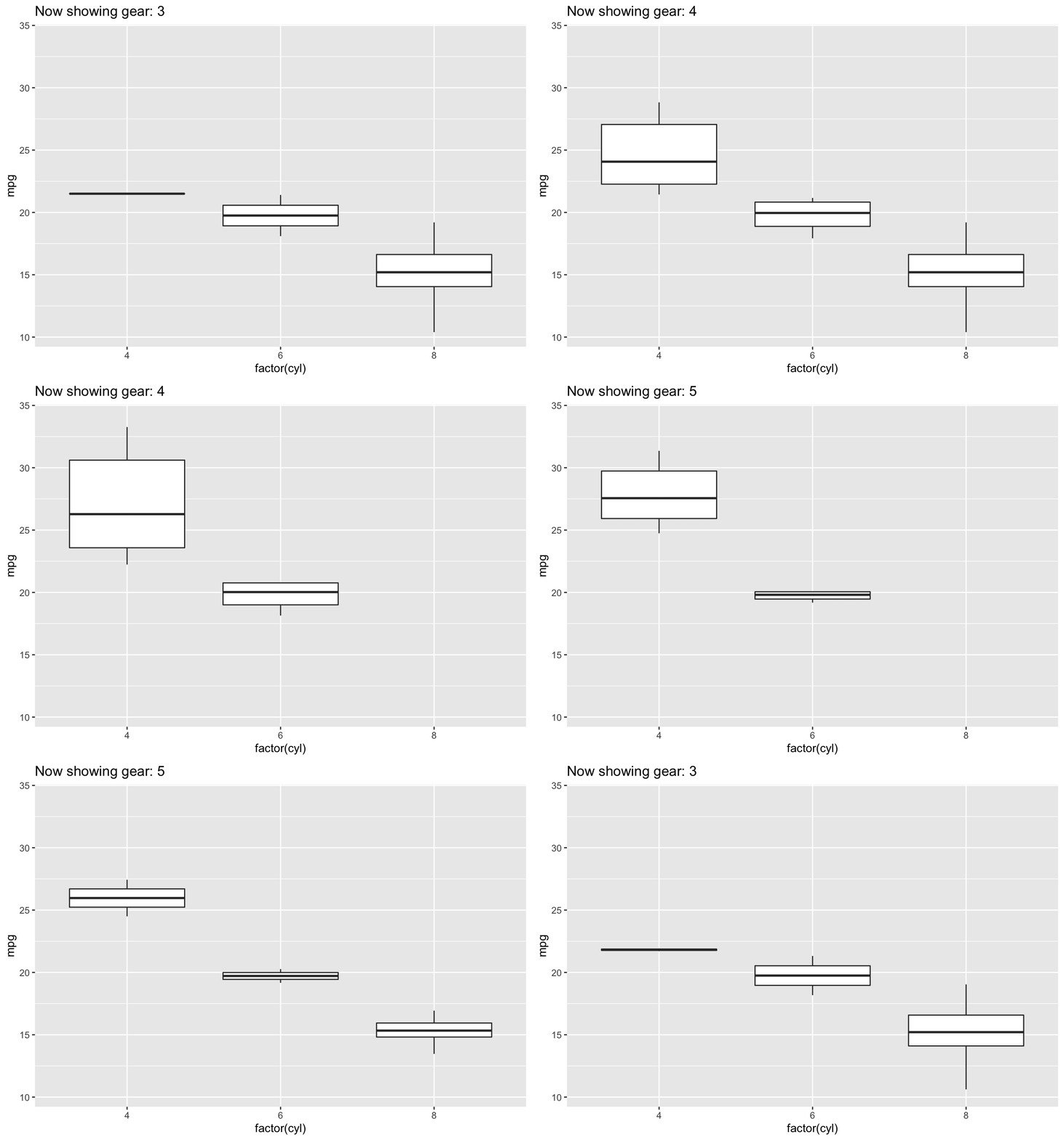
Note that we’re referring to the appropriate gear within the animation frame by specifying
{closest_state}.
Easing
Easing determines how the change from one value to another should occur. The default is linear, but there are other options that will control the appearance of progression in your animation. for example, ’cubic-in-out’ allows for the start and end of the animation to have a smoother look.
anim <- anim +
  # Slow start and end for a smoother look
  ease_aes('cubic-in-out')

anim
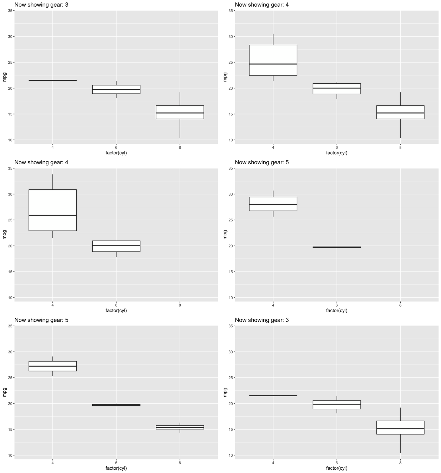
ease_aes('cubic-in-out')There are a number of easing functions, all of which are listed within the documentation, which can be viewed, as always, using the
? help function: ?ease_aes.
Enter & Exit
Building on top of easing, we can also control how the data appears (enters) and disappears (exits), using
enter_* and exit_*:
anim <- anim +
  # fade to enter
  enter_fade() +
  # shrink on exit
  exit_shrink()

anim
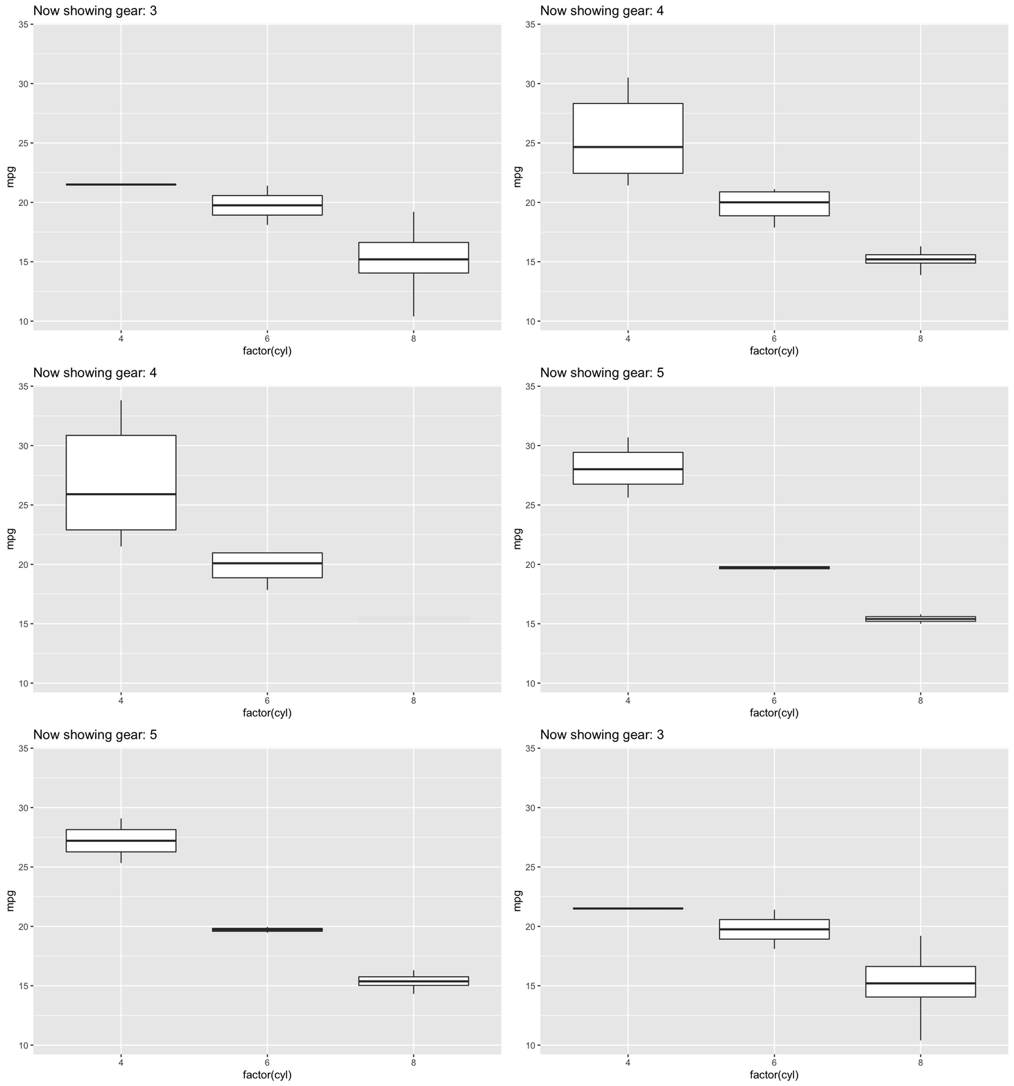
enter_fade() and exit_shrink()The changes are subtle but you’ll notice that on transition the data fades in to appear and shrinks upon exit.
Position Scales
To demonstrate how changing positional scales can be adjusted, let’s take a look at a scatterplot. Here, we’re plotting the relationship between 1/4 mile speed and miles per gallon and we’ll be transitioning between gear.
The static plot would be as follows:
ggplot(mtcars) +
  geom_point(aes(qsec, mpg))
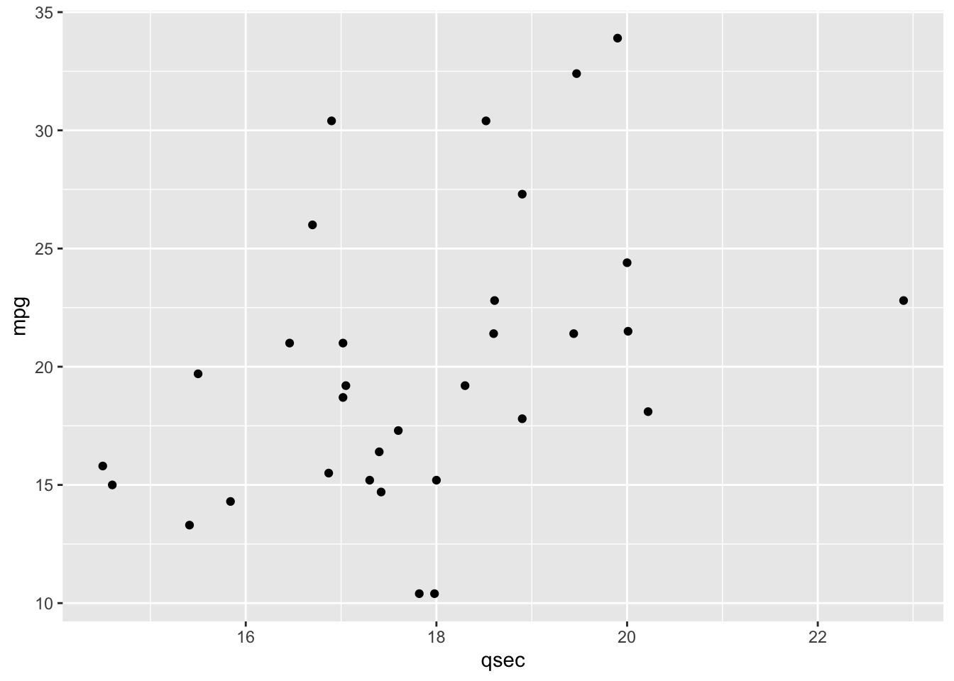
However, upon adding animation, we see how the data changes by gear.
# animate it!
scat <- ggplot(mtcars) +
  geom_point(aes(qsec, mpg)) +
  transition_states(gear,
                    transition_length = 2,
                    state_length = 1) +
    labs(title = 'Now showing gear: {closest_state}')

scat
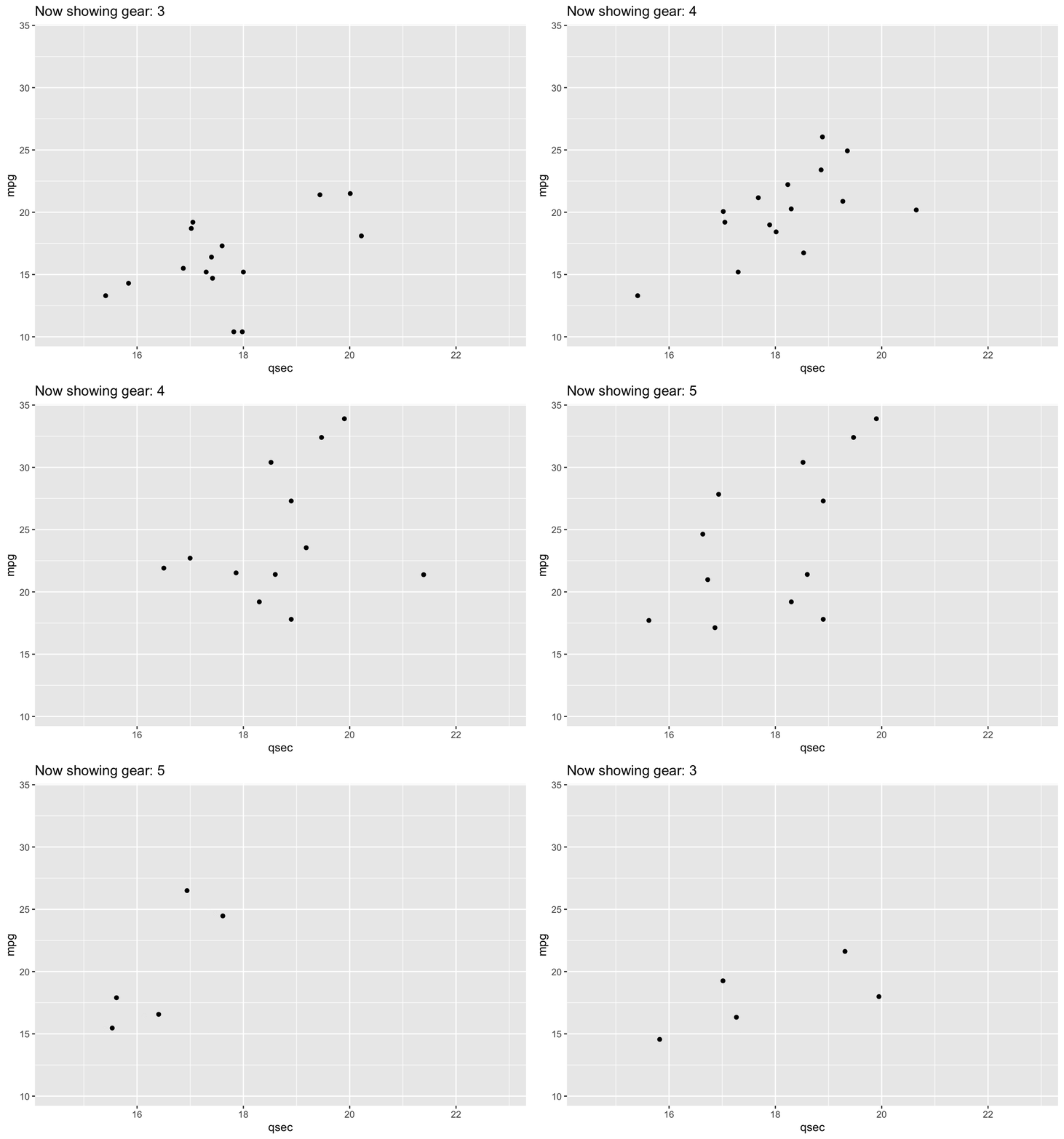
transition_states(): transitioning by gearHowever, the x- and y-axes remain constant throughout the animation.
If you wanted to allow these positional scales to adjust between each gear level, you could use
view_step:
# allow positional scaling for each level in gear
scat +
  view_step(pause_length = 2,
            step_length = 1,
            nsteps = 3,
            include = FALSE)
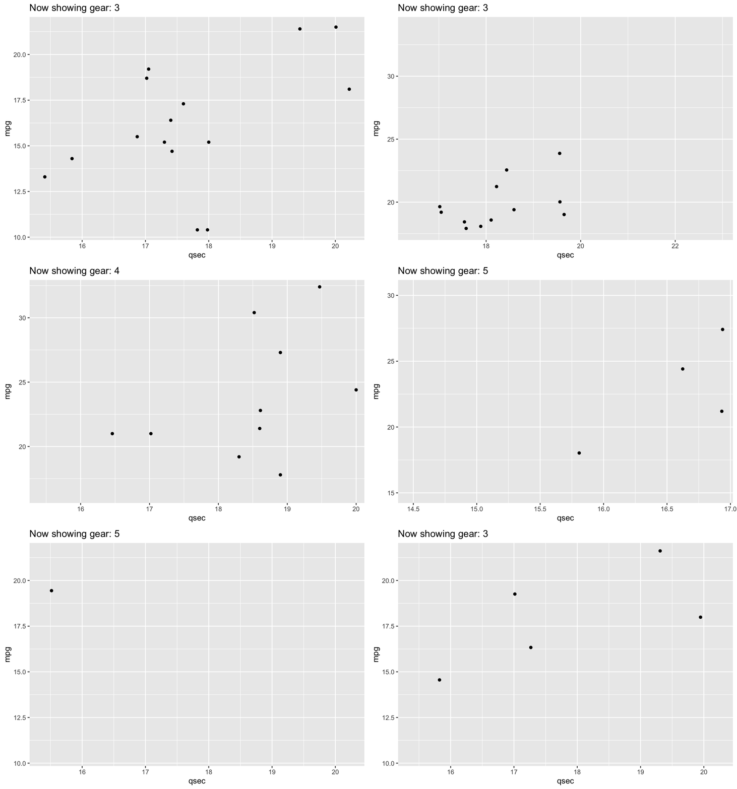
view_step(): adjusting positional scales by gearSubsubsection 4.9.5.2 Example: gapminder
One of the most famous examples of an animated plot uses the gapminder dataset. This dataset includes economic data for countries all over the world. The animated plot here demonstrates the relationship between GDP (per capita) and life expectancy over time, by continent. Note that the year whose data is being displayed is shown at the top left portion of the plot.
# install.packages("gapminder")
library(gapminder)

gap <- ggplot(gapminder, aes(gdpPercap, lifeExp, size = pop, colour = country)) +
  geom_point(alpha = 0.7, show.legend = FALSE) +
  scale_colour_manual(values = country_colors) +
  scale_size(range = c(2, 12)) +
  scale_x_log10() +
  facet_wrap(~continent, ncol = 5) +
  theme_half_open(12) +
  panel_border() +
  # animate it!
  labs(title = 'Year: {frame_time}', x = 'GDP per capita', y = 'life expectancy') +
  transition_time(year)

gap
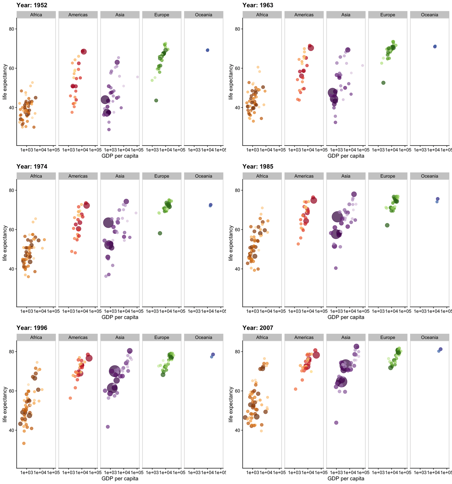
Note that in this example, we’re now using
transition_time() rather than transition_states(). This is a variant of transition_states() that is particularly useful when the states represent points in time, such as the years we’re animating through in the plot above. The transition length is set to correspond to the time difference between the points in the data.
Shadow
However, what if we didn’t want the data to completely disappear from one frame to the next and instead wanted to see the pattern emerge over time? We didn’t demonstrate this using the
mtcars dataset because each observation in that dataset is a different car. However, here, with the gapminder dataset, where we’re looking at a trend over time, it makes more sense to include a trail.
To do this, we would use
shadow_*. Here, we’ll use shadow_trail() to see a trail of the data from one frame to the next:
gap +
 shadow_trail(distance = 0.05,
              alpha = 0.3)
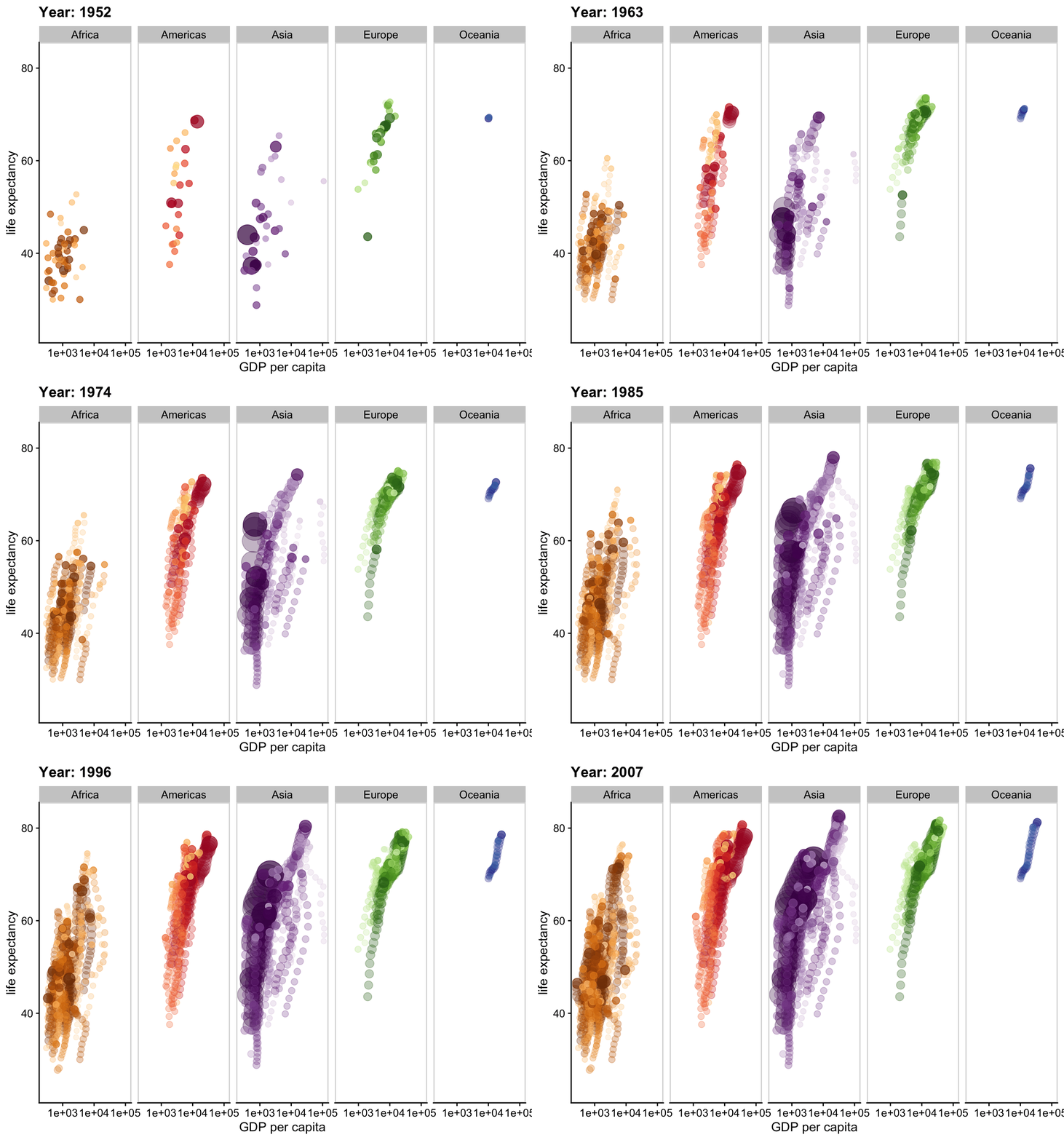
shadow_trail(): showing data trail over timeHere, distance specifies the temporal distance between the frames to show and alpha specifies the transparency of the trail, so that the current frame’s data is always discernible.

