Section 4.4 Making Good Plots
The goal of data visualization in data analysis is to improve understanding of the data. As mentioned in the last lesson, this could mean improving our own understanding of the data or using visualization to improve someone else’s understanding of the data.
We discussed some general characteristics and basic types of plots in the last lesson, but here we will step through a number of general tips for making good plots.
When generating exploratory or explanatory plots, you’ll want to ensure information being displayed is being done so accurately and in a away that best reflects the reality within the dataset. Here, we provide a number of tips to keep in mind when generating plots.
Subsection 4.4.1 Choose the Right Type of Plot
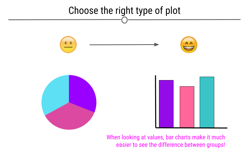
If your goal is to allow the viewer to compare values across groups, pie charts should largely be avoided. This is because it’s easier for the human eye to differentiate between bar heights than it is between similarly-sized slices of a pie. Thinking about the best way to visualize your data before making the plot is an important step in the process of data visualization.
Subsection 4.4.2 Be Mindful When Choosing Colors
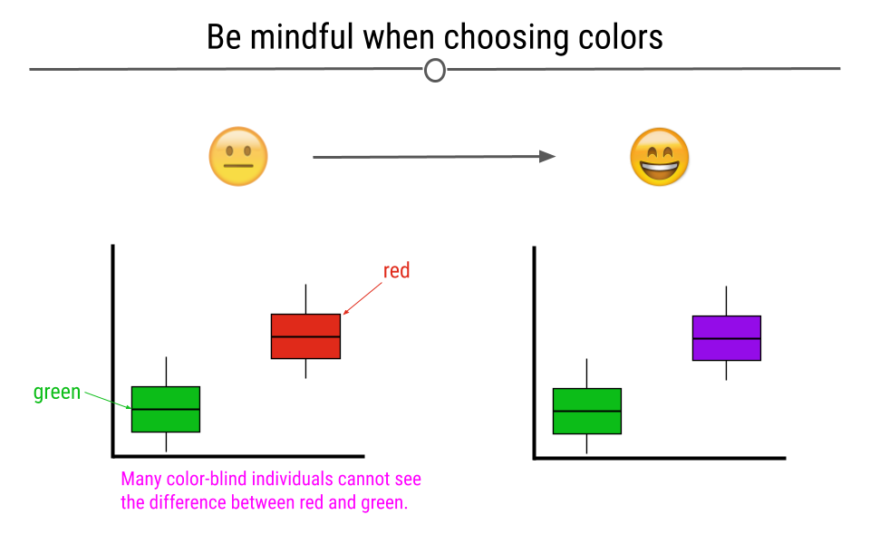
Choosing colors that work for the story you’re trying to convey with your visualization is important. Avoiding colors that are hard to see on a screen or when projected, such as pastels, is a good idea. Additionally, red-green color blindness is common and leads to difficulty in distinguishing reds from greens. Simply avoiding making comparisons between these two colors is a good first step when visualizing data.
Beyond red-green color blindness, there is an entire group of experts out there in color theory.To learn more about available color palettes in R or to read more from a pro named Lisa Charlotte Rost talking about color choices in data visualization, feel free to read more.
Subsection 4.4.3 Label the Axes
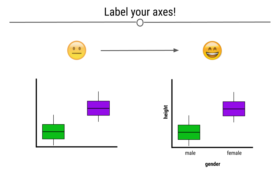
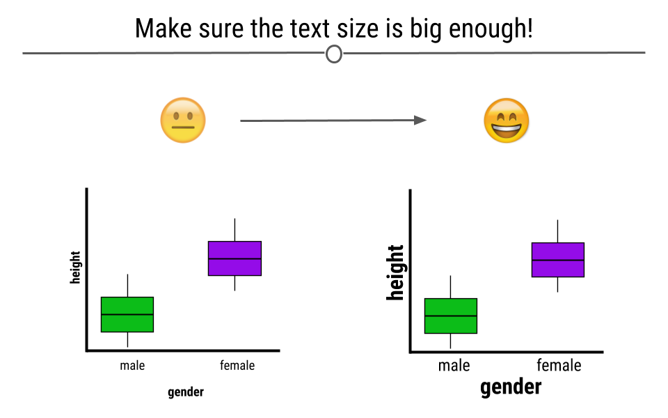
Whether you’re making an exploratory or explanatory visualization, labeled axes are a must. They help tell the story of the figure. Making sure the axes are clearly labeled is also important. Rather than labeling the graph below with "h" and "g," we chose the labels "height" and "gender," making it clear to the viewer exactly what is being plotted.
Subsection 4.4.4 Make Sure the Text is Readable
Often text on plots is too small for viewers to read. By being mindful of the size of the text on your axes, in your legend, and used for your labels, your visualizations will be greatly improved.
Subsection 4.4.5 Make Sure the Numbers Add Up
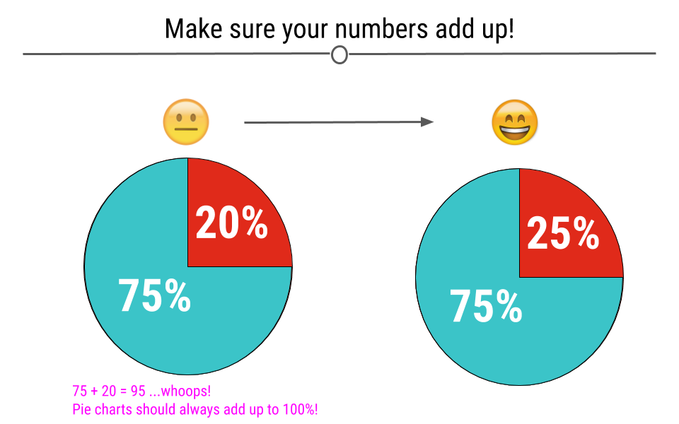
When you’re making a plot that should sum to 100, make sure that it in fact does. Taking a look at visualizations after you make them to ensure that they make sense is an important part of the data visualization process.
Subsection 4.4.6 Make Sure the Numbers and Plots Make Sense Together
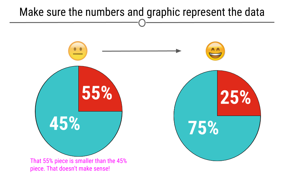
Another common error is having labels that don’t reflect the underlying graphic. For example, here, we can see on the left that the turquoise piece is more than half the graph, and thus the label 45% must be incorrect. At right, we see that the labels match what we see in the figure.
Subsection 4.4.7 Make Comparisons Easy on Viewers
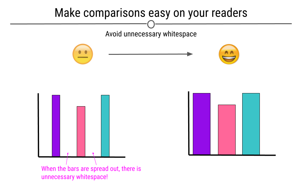
There are many ways in which you can make comparisons easier on the viewer. For example, avoiding unnecessary whitespace between the bars on your graph can help viewers make comparisons between the bars on the barplot.
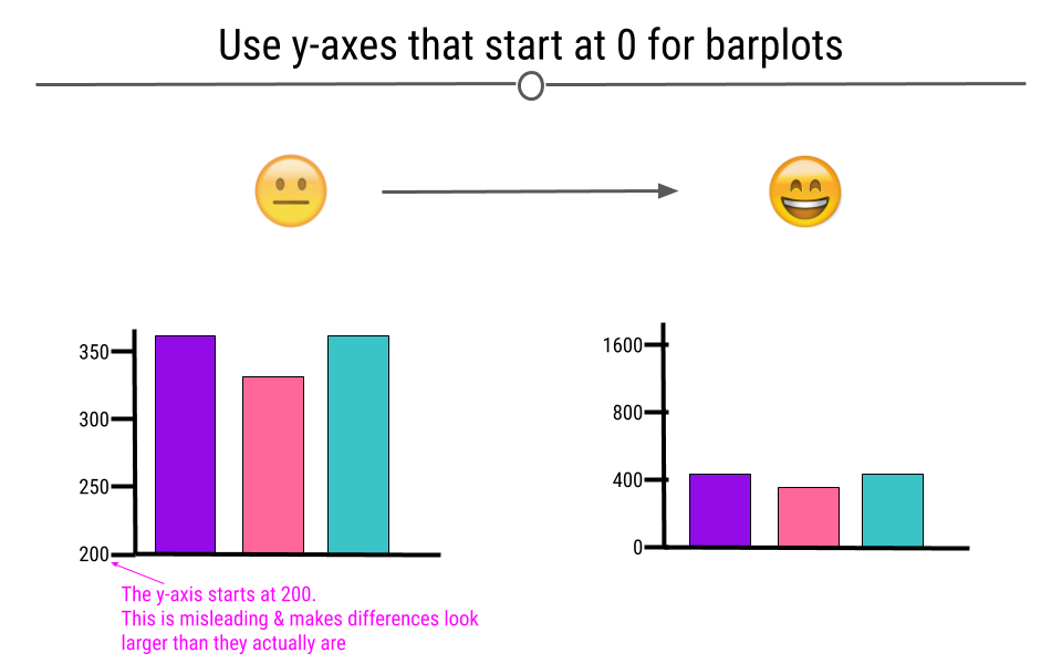
Subsection 4.4.8 Use y-axes That Start at Zero
Often, in an attempt to make differences between groups look larger than they are, y-axis will be started at a value other than zero. This is misleading. Y-axis for numerical information should start at zero.
Subsection 4.4.9 Keep It Simple
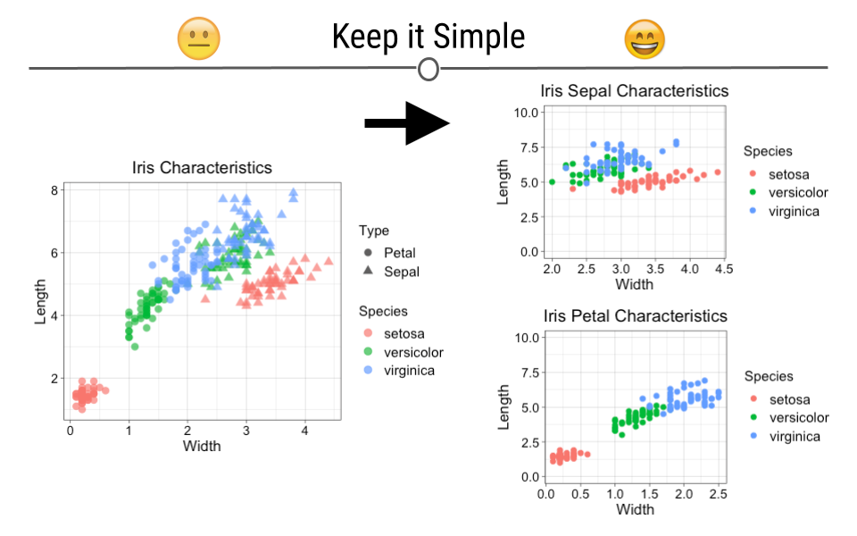
The goal of data visualization is to improve understanding of data. Sometimes complicated visualizations cannot be avoided; however, when possible, keep it simple.
Here, the graphic on the left does not immediately convey a main point. It’s hard to interpret what each point means or what the story of this graphic is supposed to be. In contrast, the graphics on the right are simpler and each show a more obvious story. Make sure that your main point comes through:
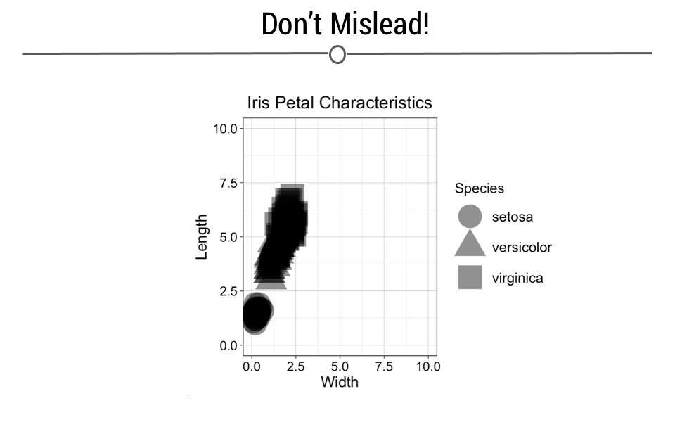
Similarly, the intention of your graphic should never be to mislead or confuse. Be sure that your data visualizations improve viewers’ understanding. Using unusual axes limits or point sizes, or using vague labels can make plots misleading. This plot creates an effective exclamation mark shape which is fun, but it is no longer clear what points correspond to what species. Furthermore, this plot makes it look like petal width is not very distinguishable across the different species (particularly for versicolor and virginica), which is the opposite of what the previous petal plot conveyed.