Section 5.7 Linear Modeling
Subsection 5.7.1 Linear Regression
Inferential analysis is commonly the goal of statistical modeling, where you have a small amount of information to extrapolate and generalize that information to a larger group. One of the most common approaches used in statistical modeling is known as linear regression. Here, we’ll discuss how to recognize when using linear regression is appropriate, how to carry out the analysis in R, and how to interpret the results from this statistical approach.
When discussing linear regression, we’re trying to describe (model) the relationship between a dependent variable and an independent variable.
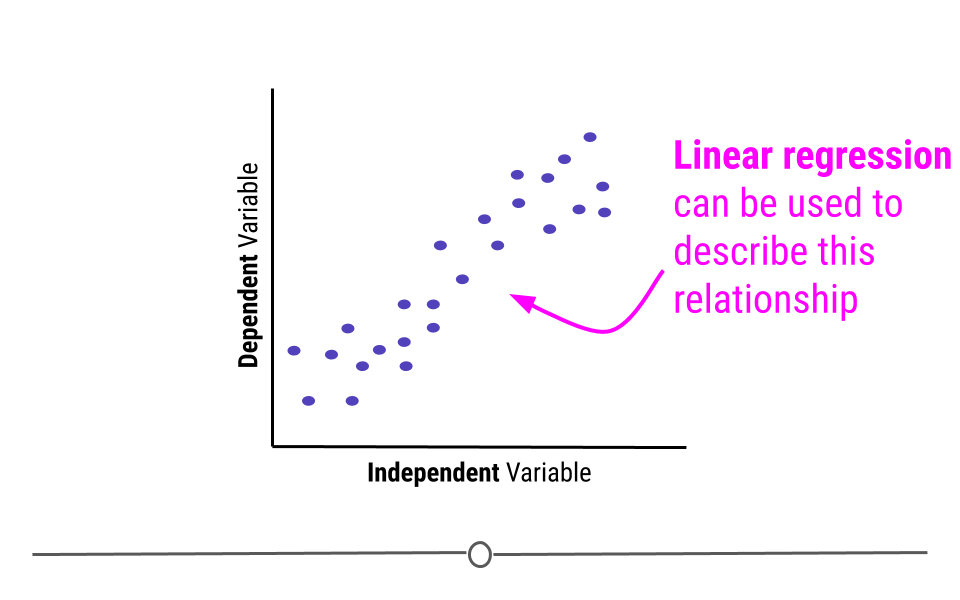
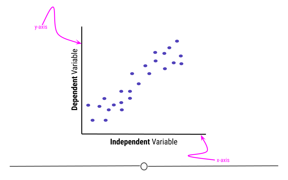
When visualizing a linear relationship, the independent variable is plotted along the bottom of the graph, on the x-axis and the dependent variable is plotted along the side of the plot, on the y-axis.
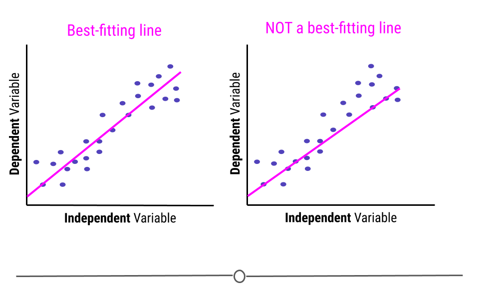
When carrying out linear regression, a best-fitting line is drawn through the data points to describe the relationship between the variables.
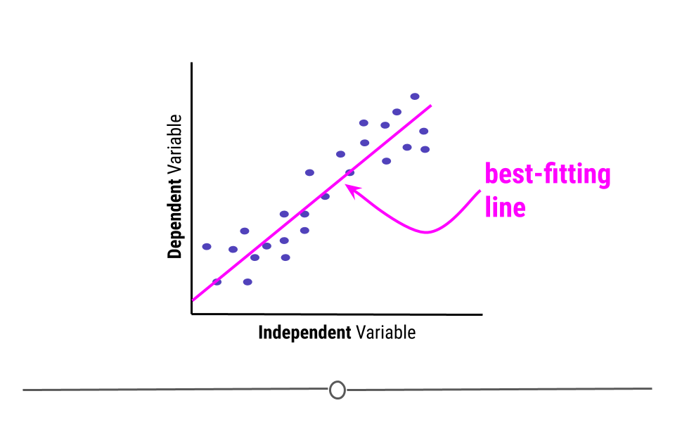
A best-fitting line, technically-speaking, minimizes the sum of the squared errors. In simpler terms, this means that the line that minimizes the distance of all the points from the line is the best-fitting line. Or, most simply, there are about the same number of points above the line as there are below the line. In total, the distance from the line for the points above the line will be the same as the distance from the points to the line below the line.
Note that the best fitting line does not have to go through any points to be the best-fitting line. Here, on the right, we see a line that goes through seven points on the plot (rather than the four the best-fitting line goes through, on the left). However, this is not a best-fitting line, as there are way more points above the line than there are below the line.
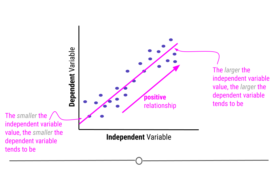
This line describes the relationship between the two variables. If you look at the direction of the line, it will tell you whether there is a positive or a negative relationship between the variables. In this case, the larger the value of the independent variable, the larger the value of the dependent variable. Similarly, the smaller the value of the independent variable, the smaller the value of the dependent variable. When this is the case, there is a positive relationship between the two variables.
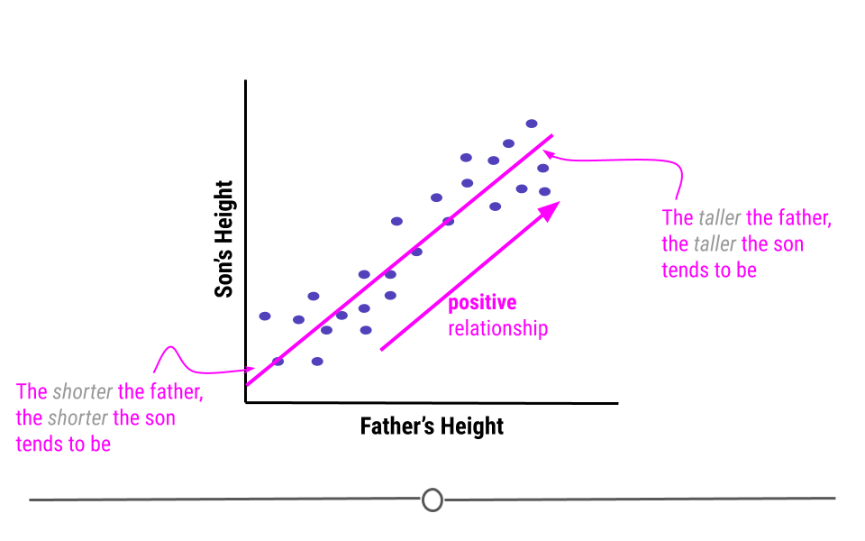
An example of variables that have a positive relationship would be the height of fathers and their sons. In general, the taller a father is, the taller his son will be. And, the shorter a father is the more likely his son is to be short.
Alternatively, when the higher the value of the independent variable, the lower the value of the dependent variable, this is a negative relationship.
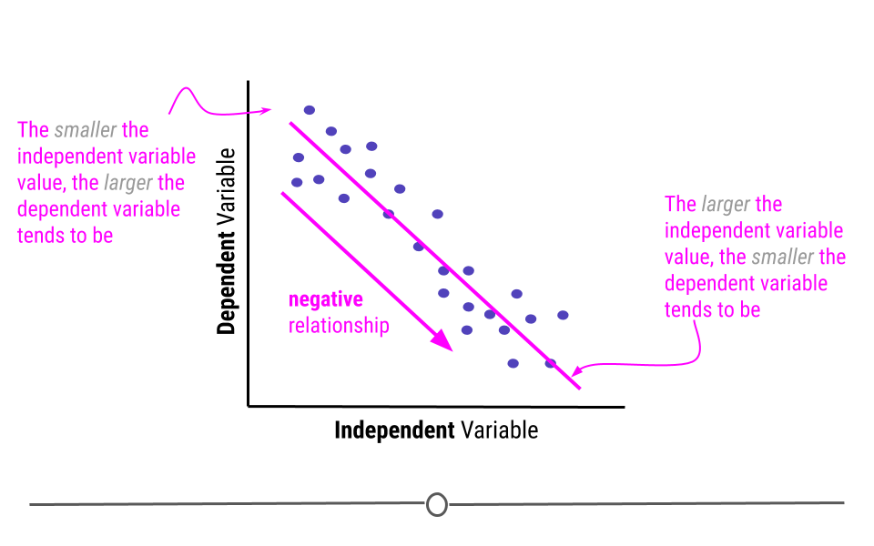
An example of variables that have a negative relationship would be the relationship between a students’ absences and their grades. The more absences a student has, the lower their grades tend to be.
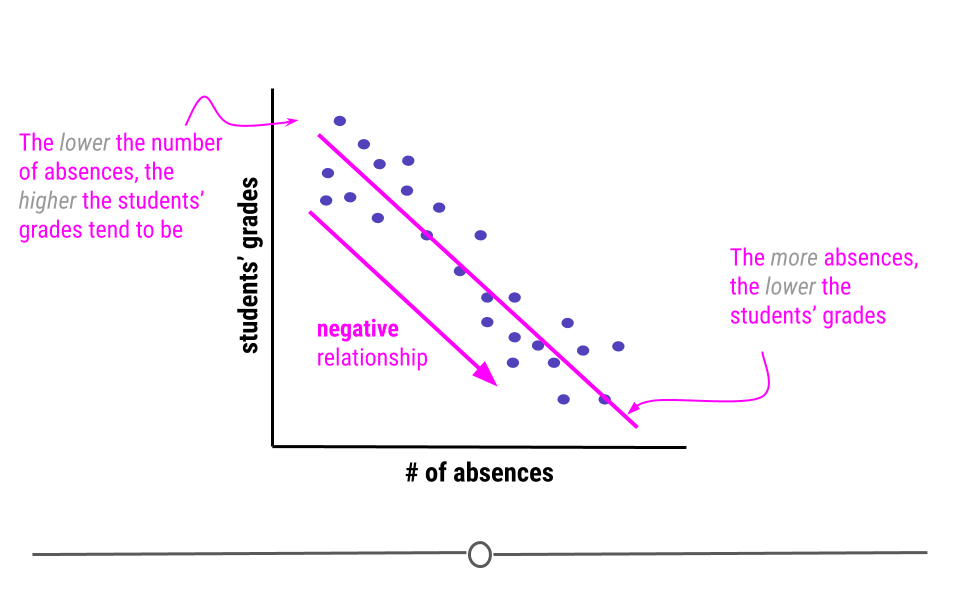
Linear regression, in addition to to describing the direction of the relationship, it can also be used to determine the strength of that relationship.
This is because the assumption with linear regression is that the true relationship is being described by the best-fitting line. Any points that fall away from the line do so due to error. This means that if all the points fall directly on top of the line, there is no error. The further the points fall from the line, the greater the error. When points are further from the best-fitting line, the relationship between the two variables is weaker than when the points fall closer to the line.
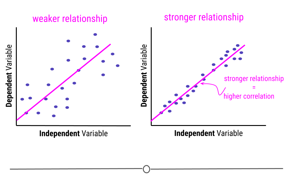
In this example, the pink line is exactly the same best-fitting line in each graph. However, on the left, where the points fall further from the line, the strength of the relationship between these two variables is weaker than on the right, where the points fall closer to the line, where the relationship is stronger. The strength of this relationship is measured using correlation. The closer the points are to the line the more correlated the two variables are, meaning the relationship between the two variables is stronger.
Subsection 5.7.2 Assumptions
Thus far we have focused on drawing linear regression lines. Linear regression lines can be drawn on any plot, but just because you can do something doesn’t mean you actually should. When it comes to linear regression, in order to carry our any inference on the relationship between two variables, there are a few assumptions that must hold before inference from linear regression can be done.
The two assumptions of simple linear regression are linearity and homoscedasticity.
Subsubsection 5.7.2.1 Linearity
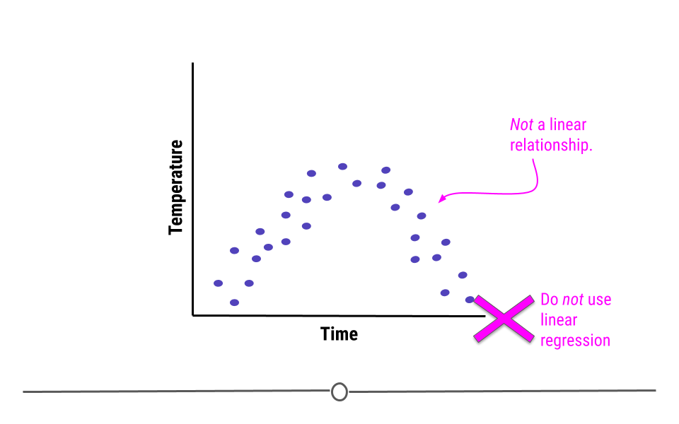
The relationship between the two variables must be linear.
For example, what if we were plotting data from a single day and we were looking at the relationship between temperature and time. Well, we know that generally temperature increases throughout the day and then decreases in the evening. Here, we see some example data reflective of this relationship. The upside-down u-shape of the data suggests that the relationship is not in fact linear. While we could draw a straight line through these data, it would be inappropriate. In cases where the relationship between the variables cannot be well-modeled with a straight line, linear regression should not be used.
Subsubsection 5.7.2.2 Homoscedasticity
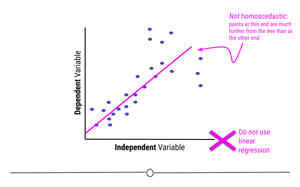
In addition to displaying a linear relationship, the random variables must demonstrate homoscedasticity. In other words, the variance (distance from the line) must be constant throughout the variable.
If points at one end are much closer to the best-fitting line than points are at the other end, homoscedasticity has been violated and linear regression is not appropriate for the data.
Subsubsection 5.7.2.3 Normality of residuals
When we fit a linear regression, typically the data do not fall perfectly along the regression line. Rather, there is some distance from each point to the line. Some points are quite close to the line, while others are further away. Each point’s distance to the regression line can be calculated. This distance is the residual measurement.
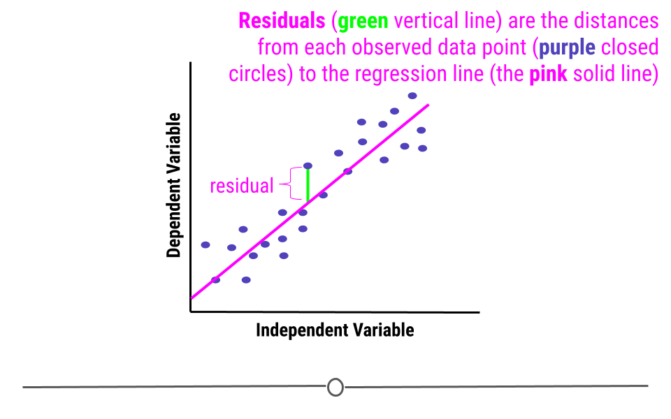
In linear regression, one assumption is that these residuals follow a Normal distribution. This means that if you were to calculate each residual (each point’s distance to the regression line) and then plot a histogram of all of those values - that plot should look like a Normal Distribution.
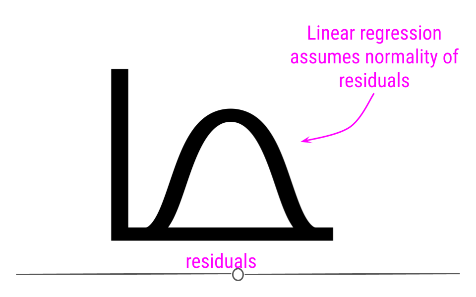
If you do not see normality of residuals, this can suggest that outlier values - observations more extreme than the rest of the data - may exist in your data. This can severely affect you regression results and lead you to conclude something that is untrue about your data.
Thus, it is your job, when running linear regression to check for:
-
Non-linearity
-
Heteroscedasticity
-
Outlier values
-
Normality of residuals
We’ll discuss how to use diagnostic plots below to check that these assumptions have been met and that outlier values are not severely affecting your results.
What can linear regression infer?
Now that we understand what linear regression is and what assumptions must hold for its use, when would you actually use it? Linear regression can be used to answer many different questions about your data. Here we’ll discuss specifically how to make inferences about the relationship between two numeric variables.
Subsection 5.7.3 Association
Often when people are carrying out linear regression, they are looking to better understand the relationship between two variables. When looking at this relationship, analysts are specifically asking "What is the association between these two variables?" Association between variables describes the trend in the relationship (positive, neutral, or negative) and the strength of that relationship (how correlated the two variables are).
After determining that the assumptions of linear regression are met, in order to determine the association between two variables, one would carry out a linear regression. From the linear regression, one would then interpret the Beta estimate and the standard error from the model.
Subsubsection 5.7.3.1 Beta estimate
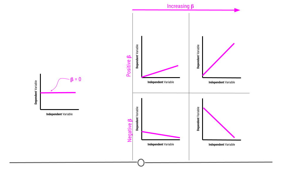
The beta estimate determines the direction and strength of the relationship between the two variables.
A beta of zero suggests there is no association between the two variables. However, if the beta value is positive, the relationship is positive. If the value is negative, the relationship is negative. Further, the larger the number, the bigger the effect is. We’ll discuss effect size and how to interpret the value in more detail later in this lesson.
Subsubsection 5.7.3.2 Standard error
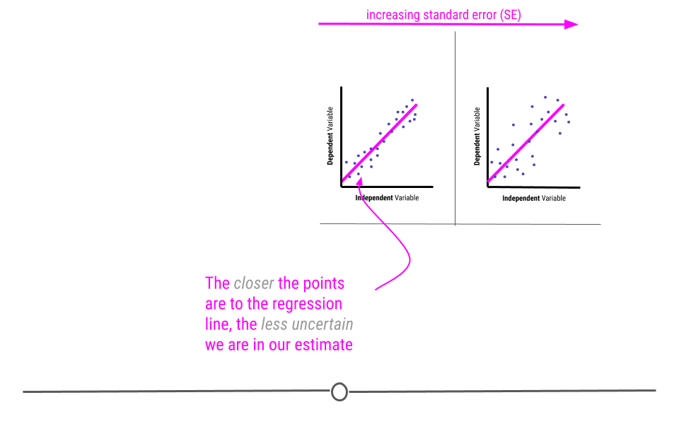
The standard error determines how uncertain the beta estimate is. The larger the standard error, the more uncertain we are in the estimate. The smaller the standard error, the less uncertain we are in the estimate.
Standard errors are calculated based on how well the best-fitting line models the data. The closer the points are to the line, the lower the standard error will be, reflecting our decreased uncertainty. However, as the points are further from the regression line, our uncertainty in the estimate will increase, and the standard error will be larger.
Remember when carrying out inferential data analysis, you will always want to report an estimate and a measure of uncertainty. For linear regression, this will be the beta estimate and the standard error.
You may have heard talk of p-values at some point. People tend to use p-values to describe the strength of their association due to its simplicity. The p-value is a single number that takes into account both the estimate (beta estimate) and the uncertainty in that estimate (SE). The lower a p-value the more significant the association is between two variables. However, while it is a simple value, it doesn’t tell you nearly as much information as reporting the estimates and standard errors directly. Thus, if you’re reporting p-values, it’s best to also include the estimate and standard errors as well.
That said, the general interpretation of a p-value is "the probability of getting the observed results (or results more extreme) by chance alone." Since it’s a probability, the value will always be between 0 and 1. Then, for example, a p-value of 0.05, means that 5 percent of the time (or 1 in 20), you’d observe results this extreme simply by chance.
Subsection 5.7.4 Association Testing in R
Now that we’ve discussed what you can learn from an association test, let’s look at an example in R. For this example we’ll use the
trees dataset available in R, which includes girth, height, and volume measurements for 31 black cherry trees.
With this dataset, we’ll answer the question:
Can we infer the height of a tree given its girth?
Presumably, it’s easier to measure a trees
girth (width around) than it is to measure its height. Thus, here we want to know whether or not height and girth are associated.
In this case, since we’re asking if we can infer
height from girth, girth is the independent variable and height is the dependent variable. In other words, we’re asking does height depend on girth?
First, before carrying out the linear regression to test for association and answer this question, we have to be sure linear regression is appropriate. We’ll test for linearity and homoscedasticity.
To do so, we’ll first use
ggplot2 to generate a scatterplot of the variables of interest.
library(ggplot2)

trees %>%
  ggplot() +
  geom_point(aes(Girth, Height))
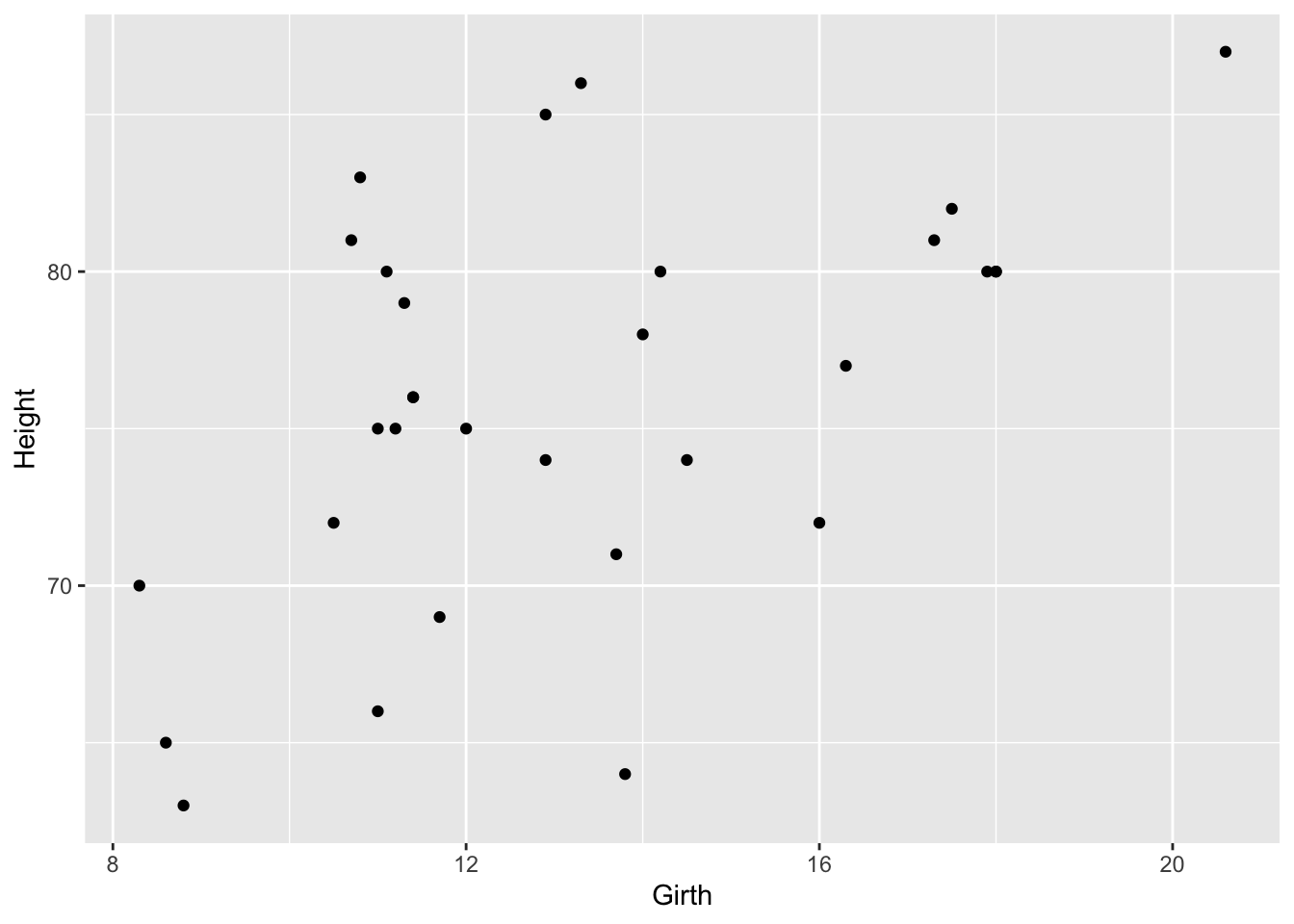
From the looks of this plot, the relationship looks approximately linear, but to visually make this a little easier, we’ll add a line of best first to the plot.
trees %>%
  ggplot(aes(Girth, Height)) +
  geom_point() +
  geom_smooth(method = "lm", se = FALSE)
## `geom_smooth()` using formula = 'y ~ x'
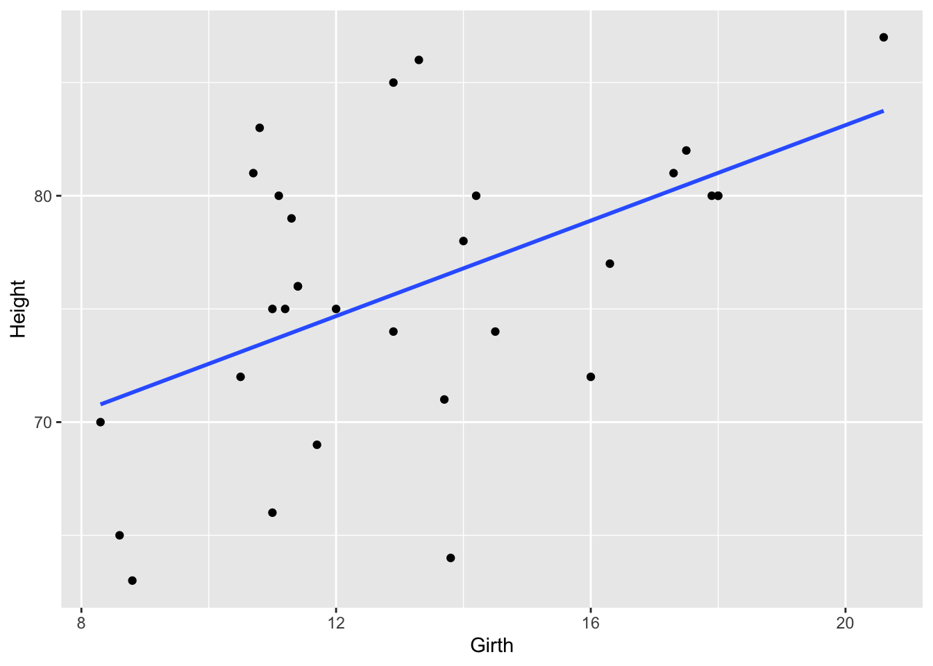
On this graph, the relationship looks approximately linear and the variance (distance from points to the line) is constant across the data. Given this, it’s appropriate to use linear regression for these data.
Subsection 5.7.5 Fitting the Model
Now that that’s established, we can run the linear regression. To do so, we’ll use the
lm() function to fit the model. The syntax for this function is lm(dependent_variable ~ independent_variable, data = dataset).
## run the regression
fit <- lm(Height ~ Girth , data = trees)
Subsection 5.7.6 Model Diagnostics
Above, we discussed a number of assumptions of linear regression. After fitting a model, it’s necessary to check the model to see if the model satisfies the assumptions of linear regression. If the model does not fit the data well (for example, the relationship is nonlinear), then you cannot use and interpret the model.
In order to assess your model, a number of diagnostic plots can be very helpful. Diagnostic plots can be generated using the
plot() function with the fitted model as an argument.
par(mfrow = c(2, 2))
plot(fit)
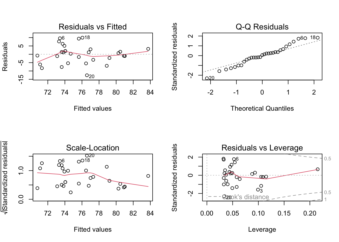
This generates four plots:
-
Residuals vs Fitted - checks linear relationship assumption of linear regression. A linear relationship will demonstrate a horizontal red line here. Deviations from a horizontal line suggest nonlinearity and that a different approach may be necessary.
-
Normal Q-Q - checks whether or not the residuals (the difference between the observed and predicted values) from the model are normally distributed. The best fit models points fall along the dashed line on the plot. Deviation from this line suggests that a different analytical approach may be required.
-
Scale-Location - checks the homoscedasticity of the model. A horizontal red line with points equally spread out indicates a well-fit model. A non-horizontal line or points that cluster together suggests that your data are not homoscedastic.
-
Residuals vs Leverage - helps to identify outlier or extreme values that may disproportionately affect the model’s results. Their inclusion or exclusion from the analysis may affect the results of the analysis. Note that the top three most extreme values are identified with numbers next to the points in all four plots.
Subsection 5.7.7 Tree Girth and Height Example
In our example looking at the relationship between tree girth and height, we can first check linearity of the data by looking at the Residuals vs Fitted plot. Here, we do see a red line that is approximately horizontal, which is what we’re looking for. Additionally, we’re looking to be sure there is no clear pattern in the points on the plot - we want them to be random on this plot. Clustering of a bunch of points together or trends in this plot would indicate that the data do not have a linear relationship.
To check for homogeneity of the variance, we can turn to the Scale-Location plot. Here, we’re again looking for a horizontal red line. In this dataset, there’s a suggestion that there is some heteroscedasticity, with points not being equally far from the regression line across the observations.
While not discussed explicitly here in this lesson, we will note that when the data are nonlinear or the variances are not homogeneous (are not homoscedastic), transformations of the data can often be applied and then linear regression can be used.
QQ Plots are very helpful in assessing the normality of residuals. Normally distributed residuals will fall along the grey dotted line. Deviation from the line suggests the residuals are not normally distributed. Here, in this example, we do not see the points fall perfectly along the dotted line, suggesting that our residuals are not normally distributed.
A histogram (or densityplot) of the residuals can also be used for this portion of regression diagnostics. Here, we’re looking for a Normal distribution of the residuals.
library(ggplot2)
ggplot(fit, aes(fit$residuals)) +
  geom_histogram(bins = 5)
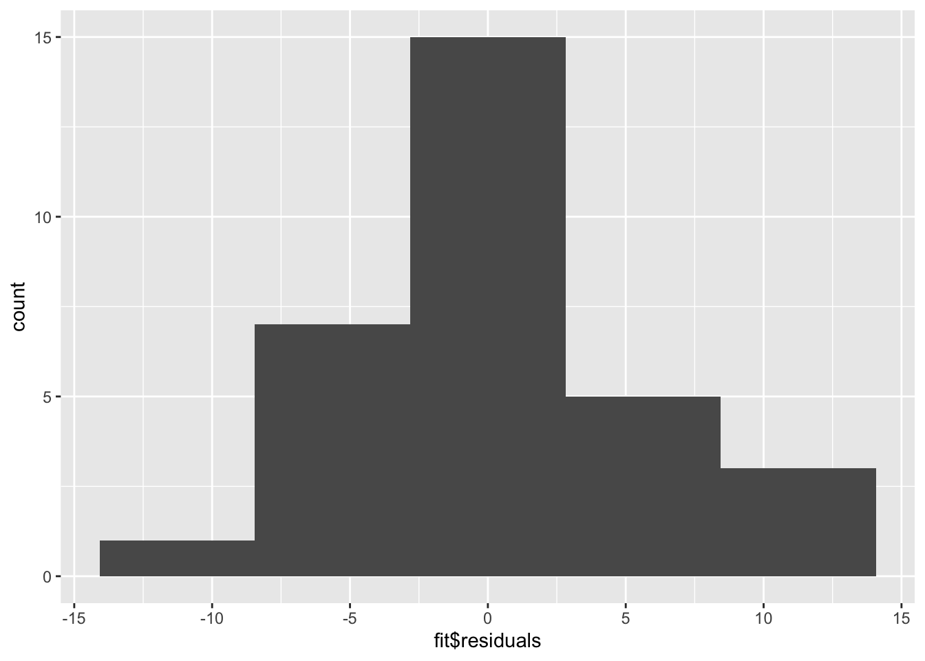
The QQ Plot and the histogram of the residuals will always give the same answer. Here, we see that with our limited sample size, we have fairly good Normally distributed residuals; and, the points do not fall wildly far from the dotted line.
Finally, whether or not outliers (extreme observations) are driving our results can be assessed by looking at the Residuals vs Leverage plot.
Generally speaking, standardized residuals greater than 3 or less than -3 are to be considered as outliers. Here, we do not see any values in that range (by looking at the y-axis), suggesting that there are no extreme outliers driving the results of our analysis.
Subsection 5.7.8 Interpreting the Model
While the relationship in our example appears to be linear, does not indicate being driven by outliers, is approximately homoscedastic and has residuals that are not perfectly Normally distributed, but fall close to the line in the QQ plot, we can discuss how to interpret the results of the model.
## take a look at the output
summary(fit)
The
summary() function summarizes the model as well as the output of the model. We can see the values we’re interested in in this summary, including the beta estimate, the standard error (SE), and the p-value.
Specifically, from the beta estimate, which is positive, we confirm that the relationship is positive (which we could also tell from the scatterplot). We can also interpret this beta estimate explicitly.
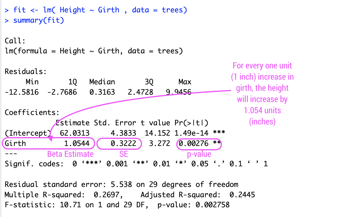
The beta estimate (also known as the beta coefficient or coefficient in the Estimate column) is the amount the dependent variable will change given a one unit increase in the independent variable. In the case of the trees, a beta estimate of 1.054, says that for every inch a tree’s girth increases, its height will increase by 1.054 inches. Thus, we not only know that there’s a positive relationship between the two variables, but we know by precisely how much one variable will change given a single unit increase in the other variable. Note that we’re looking at the second row in the output here, where the row label is "Girth". This row quantifies the relationship between our two variables. The first row quantifies the intercept, or where the line crosses the y-axis.
The standard error and p-value are also included in this output. Error is typically something we want to minimize (in life and statistical analyses), so the smaller the error, the more confident we are in the association between these two variables.
The beta estimate and the standard error are then both considered in the calculation of the p-value (found in the column
Pr[>|t|]). The smaller this value is, the more confident we are that this relationship is not due to random chance alone.
Subsection 5.7.9 Variance Explained
Additionally, the strength of this relationship is summarized using the adjusted R-squared metric. This metric explains how much of the variance this regression line explains. The more variance explained, the closer this value is to 1. And, the closer this value is to 1, the closer the points in your dataset fall to the line of best fit. The further they are from the line, the closer this value will be to zero.
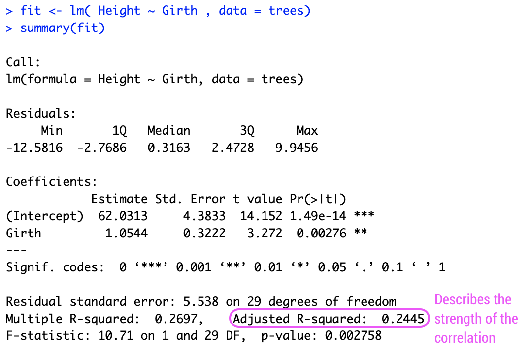
As we saw in the scatterplot, the data are not right up against the regression line, so a value of 0.2445 seems reasonable, suggesting that this model (this regression line) explains 24.45% of the variance in the data.
Subsection 5.7.10 Using broom
Finally, while the
summary() output are visually helpful, if you want to get any of the numbers out from that model, it’s not always straightforward. Thankfully, there is a package to help you with that! The tidy() function from the broom package helps take the summary output from a statistical model and organize it into a tabular output.
#install.packages("broom")
library(broom)
tidy(fit)
## # A tibble: 2 × 5
##   term        estimate std.error statistic  p.value
##   <chr>          <dbl>     <dbl>     <dbl>    <dbl>
## 1 (Intercept)    62.0      4.38      14.2  1.49e-14
## 2 Girth           1.05     0.322      3.27 2.76e- 3
Note that the values haven’t changed. They’re just organized into an easy-to-use table. It’s helpful to keep in mind that this function and package exist as you work with statistical models.
Finally, it’s important to always keep in mind that the interpretation of your inferential data analysis is incredibly important. When you use linear regression to test for association, you’re looking at the relationship between the two variables. While girth can be used to infer a tree’s height, this is just a correlation. It does not mean that an increase in girth causes the tree to grow more. Associations are correlations. They are not causal.
For now, however, in response to our question, can we infer a black cherry tree’s height from its girth, the answer is yes. We would expect, on average, a tree’s height to increase 1.054 inches for every one inch increase in girth.
Subsection 5.7.11 Correlation Is Not Causation
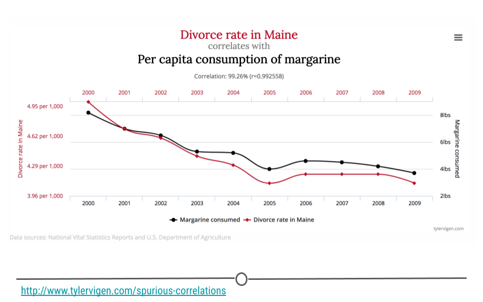
You’ve likely heard someone say before that "correlation is not causation," and it’s true! In fact, there are entire websites dedicated to this concept. Let’s make sure we know exactly what that means before moving on. In the plot you see here, as the divorce rate in Maine decreases, so does per capita consumption of margarine. These two lines are clearly correlated; however, there isn’t really a strong (or any) argument to say that one caused the other. Thus, just because you see two things with the same trend does not mean that one caused the other. These are simply spurious correlations -- things that trend together by chance. Always keep this in mind when you’re doing inferential analysis, and be sure that you never draw causal claims when all you have are associations.
In fact, one could argue that the only time you can make causal claims are when you have carried out a randomized experiment. Randomized experiments are studies that are designed and carried out by randomly assigning certain subjects to one treatment and the rest of the individuals to another treatment. The treatment is then applied and the results are then analyzed. In the case of a randomized experiment, causal claims can start to be made. Short of this, however, be careful with the language you choose and do not overstate your findings.
Subsection 5.7.12 Confounding
Confounding in something to watch out for in any analysis you’re doing that looks at the relationship between two more more variables. So...what is confounding?
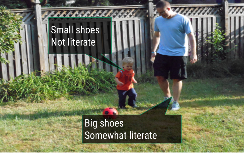
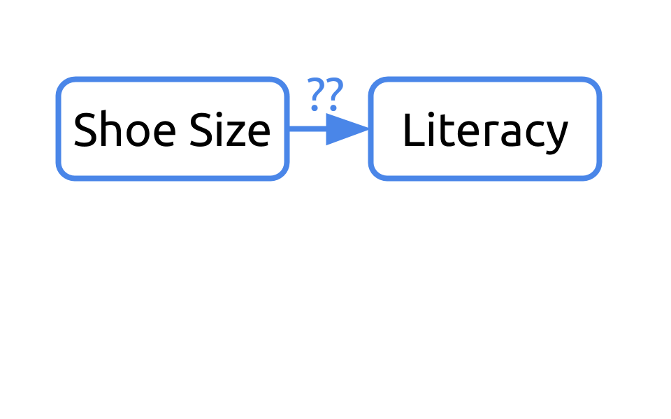
Let’s consider an example. What if we were interested in understanding the relationship between shoe size and literacy. To do so, we took a look at this small sample of two humans, one who wears small shoes and is not literate and one adult who wears big shoes and is literate.
If we were to diagram this question, we may ask "Can we infer literacy rates from shoe size?"
If we return to our sample, it’d be important to note that one of the humans is a young child and the other is an adult.
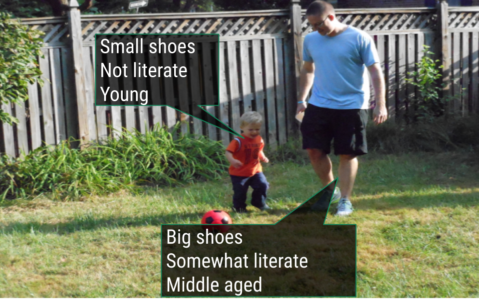
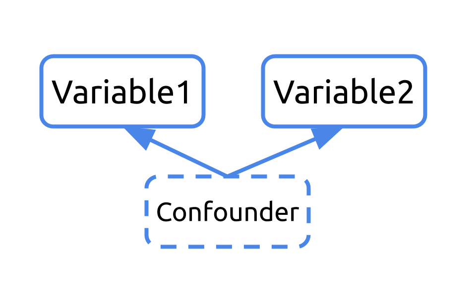
Our initial diagram failed to take into consideration the fact that these humans differed in their age. Age affects their shoe size and their literacy rates. In this example, age is a confounder.
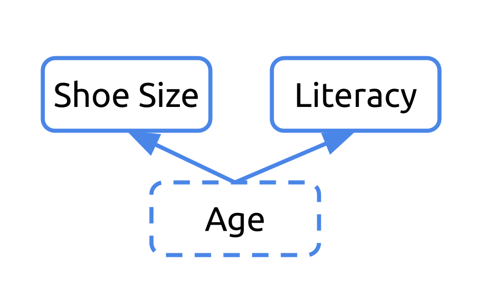
Any time you have a variable that affects both your dependent and independent variables, it’s a confounder. Ignoring confounders is not appropriate when analyzing data. In fact, in this example, you would have concluded that people who wear small shoes have lower literacy rates than those who wear large shoes. That would have been incorrect. In fact, that analysis was confounded by age. Failing to correct for confounding has led to misreporting in the media and retraction of scientific studies. You don’t want to be in that situation. So, always consider and check for confounding among the variables in your dataset.