Section 4.7 ggplot2: Customization
So far, we have walked through the steps of generating a number of different graphs (using different
geoms) in ggplot2. We discussed the basics of mapping variables to your graph to customize its appearance or aesthetic (using size, shape, and color within aes()). Here, we’ll build on what we’ve previously learned to really get down to how to customize your plots so that they’re as clear as possible for communicating your results to others.
The skills learned in this lesson will help take you from generating exploratory plots that help you better understand your data to explanatory plots -- plots that help you communicate your results to others. We’ll cover how to customize the colors, labels, legends, and text used on your graph.
Since we’re already familiar with it, we’ll continue to use the
diamonds dataset that we’ve been using to learn about ggplot2.
Subsection 4.7.1 Colors
To get started, we’ll learn how to control color across plots in
ggplot2. Previously, we discussed using color within aes() on a scatterplot to automatically color points by the clarity of the diamond when looking at the relationship between price and carat.
ggplot(diamonds) +
  geom_point(mapping = aes(x = carat, y = price, color = clarity))
However, what if we wanted to carry this concept over to a bar plot and look at how many diamonds we have of each clarity group?
# generate bar plot
ggplot(diamonds) +
  geom_bar(aes(x = clarity))
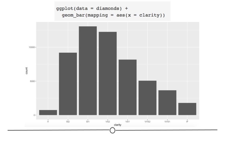
As a general note, we’ve stopped including
data = and mapping = here within our code. We included it so far to be explicit; however, in code you see in the world, the names of the arguments will typically be excluded and we want you to be familiar with code that appears as you see above.
OK, well that’s a start since we see the breakdown, but all the bars are the same color. What if we adjusted color within
aes()?
# color changes outline of bar
ggplot(diamonds) +
  geom_bar(aes(x = clarity, color = clarity))
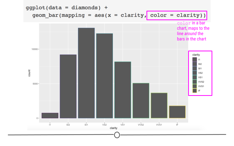
As expected, color added a legend for each level of clarity; however, it colored the lines around the bars on the plot, rather than the bars themselves. In order to color the bars themselves, you want to specify the more helpful argument
fill:
# use fill to color bars
ggplot(diamonds) +
  geom_bar(aes(x = clarity, fill = clarity))
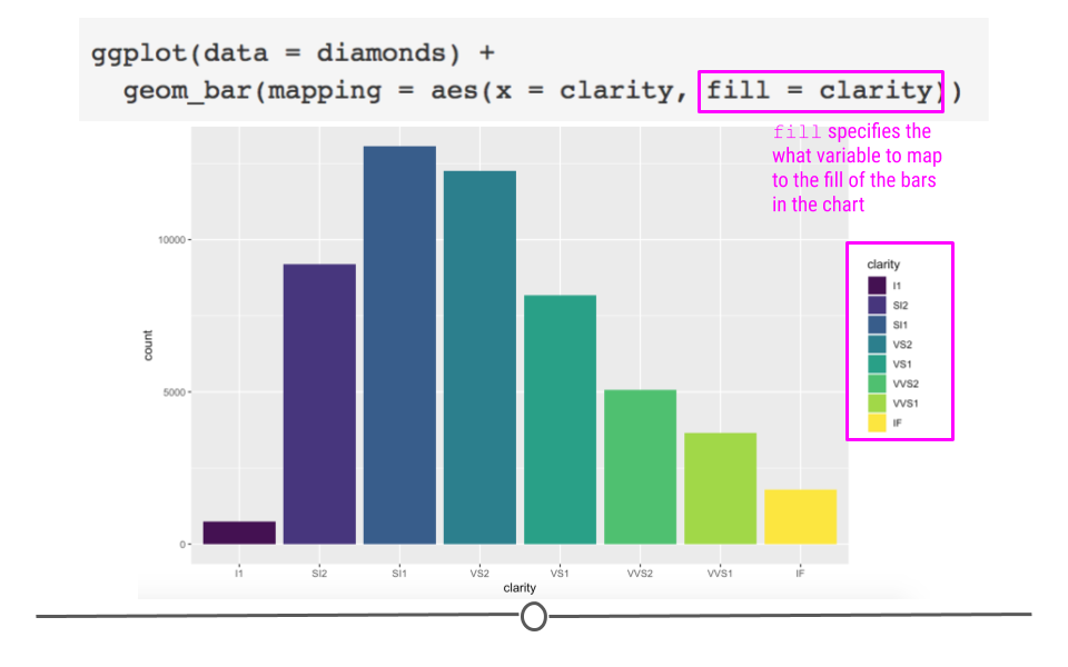
Great! We now have a plot with bars of different colors, which was our first goal! However, adding colors here, while maybe making the plot prettier doesn’t actually give us any more information. We can see the same pattern of which clarity is most frequent among the diamonds in our dataset like we could see in the first plot we made.
Color is particularly helpful here, however, if we wanted to map a different variable onto each bar. For example, what if we wanted to see the breakdown of diamond "cut" within each "clarity" bar?
# fill by separate variable (cut) = stacked bar chart
ggplot(diamonds) +
  geom_bar(aes(x = clarity, fill = cut))
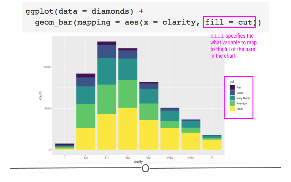
Now we’re getting some new information! We can see that each level in clarity appears to have diamonds of all levels of cut. Color here has really helped us understand more about the data.
But what if we were going to present these data? While there is no comparison between red and green (which is good!), there is a fair amount of yellow in this plot. Some projectors don’t handle projecting yellow well, and it will show up too light on the screen. To avoid this, let’s manually change the colors in this bar chart! To do so we’ll add an additional layer to the plot using
scale_fill_manual.
ggplot(diamonds) +
  geom_bar(aes(x = clarity, fill = cut)) +
  # manually control colors used
  scale_fill_manual(values = c("red", "orange", "darkgreen", "dodgerblue", "purple4"))
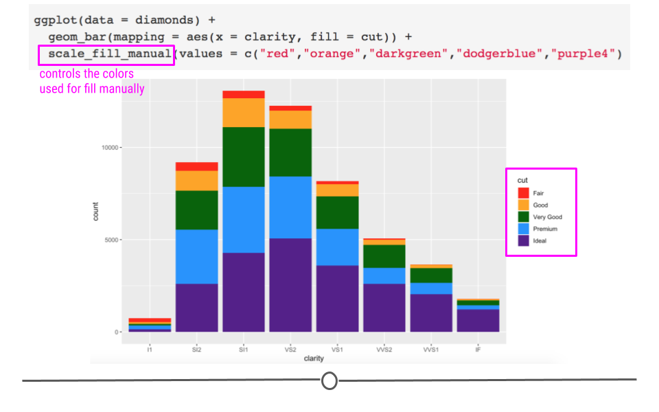
Here, we’ve specified five different colors within the
values argument of scale_fill_manual(), one for each cut of diamond. The names of these colors can be specified using the names explained on the third page of the cheatsheet here. (Note: There are other ways to specify colors within R. Explore the details in that cheatsheet to better understand the various ways!)
Additionally, it’s important to note that here we’ve used
scale_fill_manual() to adjust the color of what was mapped using fill = cut. If we had colored our chart using color within aes(), there is a different function called scale_color_manual. This makes good sense! You use scale_fill_manual() with fill and scale_color_manual() with color. Keep that in mind as you adjust colors in the future!
Now that we have some sense of which clarity is most common in our diamonds dataset and now that we are able to successfully specify the colors we want manually in order to make this plot useful for presentation, what if we wanted to compare the proportion of each cut across the different clarities? Currently, that’s difficult because there is a different number within each clarity. In order to compare the proportion of each cut we have to use position adjustment.
What we’ve just generated is a stacked bar chart. It’s a pretty good name for this type of chart as the bars for cut are all stacked on top of one another. If you don’t want a stacked bar chart you could use one of the other
position options: identity, fill, or dodge.
Returning to our question about proportion of each cut within each clarity group, we’ll want to use
position = "fill" within geom_bar(). Building off of what we’ve already done:
ggplot(diamonds) +
  # fill scales to 100%
  geom_bar(aes(x = clarity, fill = cut), position = "fill") +
  scale_fill_manual(values = c("red", "orange", "darkgreen", "dodgerblue", "purple4"))
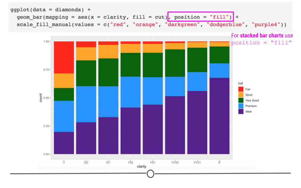
Here, we’ve specified how we want to adjust the position of the bars in the plot. Each bar is now of equal height and we can compare each colored bar across the different clarities. As expected, we see that among the best clarity group (IF), we see more diamonds of the best cut ("Ideal")!
Briefly, we’ll take a quick detour to look at
position = "dodge". This position adjustment places each object next to one another. This will not allow for easy comparison across groups, as we just saw with the last group but will allow values within each clarity group to be visualized.
ggplot(diamonds) +
  # dodge rather than stack produces grouped bar plot
  geom_bar(aes(x = clarity, fill = cut), position = "dodge") +
  scale_fill_manual(values = c("red", "orange", "darkgreen", "dodgerblue", "purple4"))
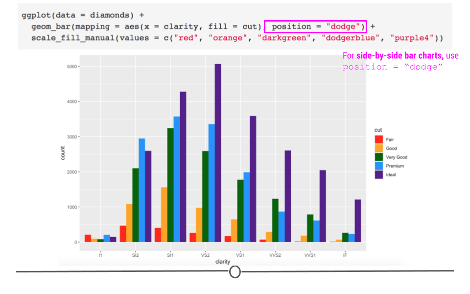
Unlike in the first plot where we specified
fill = cut, we can actually see the relationship between each cut within the lowest clarity group (I1). Before, when the values were stacked on top of one another, we were not able to visually see that there were more "Fair" and "Premium" cut diamonds in this group than the other cuts. Now, with position = "dodge", this information is visually apparent.
Note:
position = "identity" is not very useful for bars, as it places each object exactly where it falls within the graph. For bar charts, this will lead to overlapping bars, which is not visually helpful. However, for scatterplots (and other 2-Dimensional charts), this is the default and is exactly what you want.
Subsection 4.7.2 Labels
Text on plots is incredibly helpful. A good title tells viewers what they should be getting out of the plot. Axis labels are incredibly important to inform viewers of what’s being plotted. Annotations on plots help guide viewers to important points in the plot. We’ll discuss how to control all of these now!
Subsubsection 4.7.2.1 Titles
Now that we have an understanding of how to manually adjust color, let’s improve the clarity of our plots by including helpful labels by adding an additional
labs() layer. We’ll return to the plot where we were comparing proportions of diamond cut across diamond clarity groups.
You can include a
title, subtitle, and/or caption within the labs() function. Each argument, as per usual, will be specified by a comma.
ggplot(diamonds) +
  geom_bar(aes(x = clarity, fill = cut), position = "fill") +
  scale_fill_manual(values = c("red", "orange", "darkgreen", "dodgerblue", "purple4")) +
  # add titles
  labs(title = "Clearer diamonds tend to be of higher quality cut",
       subtitle = "The majority of IF diamonds are an \"Ideal\" cut")
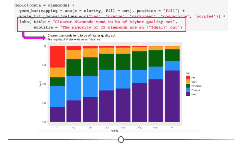
labs() adds helpful tittles, subtitles, and captionslabs() adds helpful tittles, subtitles, and captionsSubsubsection 4.7.2.2 Axis labels
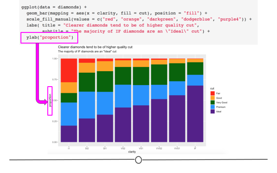
You may have noticed that our y-axis label says "count", but it’s not actually a count anymore. In reality, it’s a proportion. Having appropriately labeled axes is so important. Otherwise, viewers won’t know what’s being plotted. So, we should really fix that now using the
ylab() function. Note: we won’t be changing the x-axis label, but if you were interested in doing so, you would use xlab("label").
ggplot(diamonds) +
  geom_bar(aes(x = clarity, fill = cut), position = "fill") +
  scale_fill_manual(values = c("red", "orange", "darkgreen", "dodgerblue", "purple4")) +
  labs(title = "Clearer diamonds tend to be of higher quality cut",
       subtitle = "The majority of IF diamonds are an \"Ideal\" cut") +
  # add y axis label explicitly
  ylab("proportion")
Note that the x- and y- axis labels can also be changed within
labs(), using the argument (x = and y = respectively).
Subsection 4.7.3 Themes
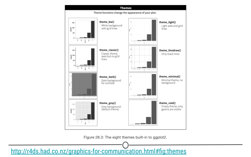
To change the overall aesthetic of your graph, there are 8 themes built into
ggplot2 that can be added as an additional layer in your graph:
For example, if we wanted remove the gridlines and grey background from the chart, we would use
theme_classic(). Building on what we’ve already generated:
ggplot(diamonds) +
  geom_bar(aes(x = clarity, fill = cut), position = "fill") +
  scale_fill_manual(values = c("red", "orange", "darkgreen", "dodgerblue", "purple4")) +
  labs(title = "Clearer diamonds tend to be of higher quality cut",
       subtitle = "The majority of IF diamonds are an \"Ideal\" cut") +
  ylab("proportion") +
  # change plot theme
  theme_classic()
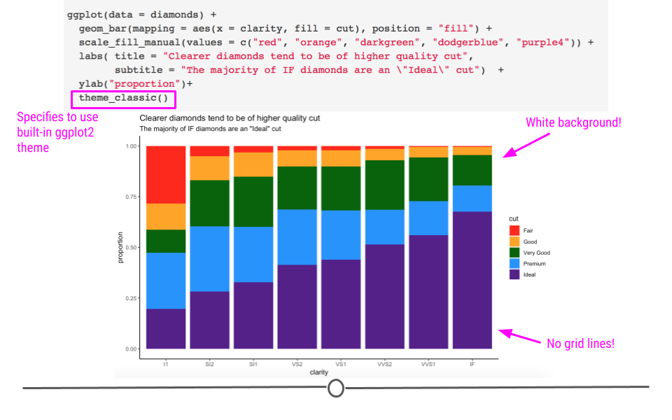
We now have a pretty good looking plot! However, a few additional changes would make this plot even better for communication.
Note: Additional themes are available from the
ggthemes package. Users can also generate their own themes.
Subsection 4.7.4 Custom Theme
In addition to using available themes, we can also adjust parts of the theme of our graph using an additional
theme() layer. There are a lot of options within theme. To see them all, look at the help documentation within RStudio Cloud using: ?theme. We’ll simply go over the syntax for using a few of them here to get you comfortable with adjusting your theme. Later on, you can play around with all the options on your own to become an expert!
Subsubsection 4.7.4.1 Altering text size
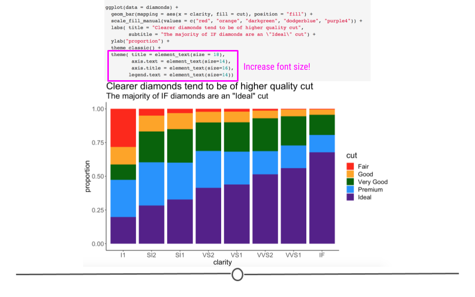
For example, if we want to increase text size to make our plots more easily to view when presenting, we could do that within theme. Notice here that we’re increasing the text size of the
title, axis.text, axis.title, and legend.text all within theme()! The syntax here is important. Within each of the elements of the theme you want to alter, you have to specify what it is you want to change. Here, for all three, we want to alter the text, so we specify element_text(). Within that, we specify that it’s size that we want to adjust.
ggplot(diamonds) +
  geom_bar(aes(x = clarity, fill = cut), position = "fill") +
  scale_fill_manual(values = c("red", "orange", "darkgreen", "dodgerblue", "purple4")) +
  labs(title = "Clearer diamonds tend to be of higher quality cut",
       subtitle = "The majority of IF diamonds are an \"Ideal\" cut") +
  ylab("proportion") +
  theme_classic() +
  # control theme
  theme(title = element_text(size = 16),
        axis.text = element_text(size =14),
        axis.title = element_text(size = 16),
        legend.text = element_text(size = 14))
Subsubsection 4.7.4.2 Additional text alterations
Changing the size of text on your plot is not the only thing you can control within
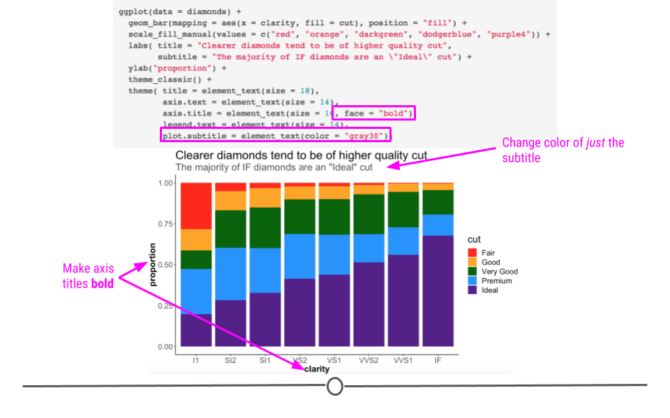
theme(). You can make text bold and change its color within theme(). Note here that multiple changes can be made to a single element. We can change size and make the text bold. All we do is separate each argument with a comma, per usual.
ggplot(diamonds) +
  geom_bar(aes(x = clarity, fill = cut), position = "fill") +
  scale_fill_manual(values = c("red", "orange", "darkgreen", "dodgerblue", "purple4")) +
  labs(title = "Clearer diamonds tend to be of higher quality cut",
       subtitle = "The majority of IF diamonds are an \"Ideal\" cut") +
  ylab("proportion") +
  theme_classic() +
  theme(title = element_text(size = 16),
        axis.text = element_text(size = 14),
        axis.title = element_text(size = 16, face = "bold"),
        legend.text = element_text(size = 14),
        # additional control
        plot.subtitle = element_text(color = "gray30"))
Any alterations to plot spacing/background, title, axis, and legend will all be made within
theme().
Subsection 4.7.5 Legends
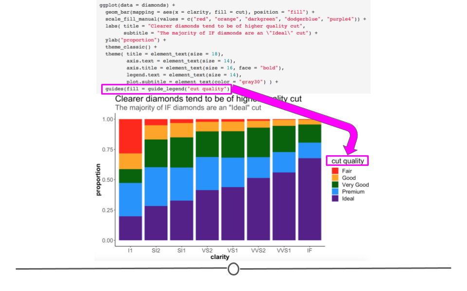
At this point, all the text on the plot is pretty visible! However, there’s one thing that’s still not quite clear to viewers. In daily life, people refer to the "cut" of a diamond by terms like "round cut" or "princess cut" to describe the shape of the diamond. That’s not what we’re talking about here when we’re discussing "cut". In these data, "cut" refers to the quality of the diamond, not the shape. Let’s be sure that’s clear as well! We can change the name of the legend by using an additional layer and the
guides() and guide_legend() functions of the ggplot2 package!
ggplot(diamonds) +
  geom_bar(aes(x = clarity, fill = cut), position = "fill") +
  scale_fill_manual(values = c("red", "orange", "darkgreen", "dodgerblue", "purple4")) +
  labs(title = "Clearer diamonds tend to be of higher quality cut",
       subtitle = "The majority of IF diamonds are an \"Ideal\" cut") +
  ylab("proportion") +
  theme_classic() +
  theme(title = element_text(size = 16),
        axis.text = element_text(size = 14),
        axis.title = element_text(size = 16, face = "bold"),
        legend.text = element_text(size = 14),
        plot.subtitle = element_text(color = "gray30")) +
  # control legend
  guides(fill = guide_legend("cut quality"))
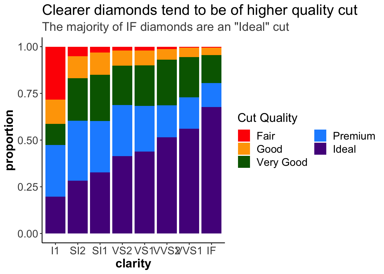
This is especially useful if you have many colors in your legend and you want to control how the legend is displayed in terms of the number of columns and rows using
ncol and nrow respectively.
ggplot(diamonds) +
  geom_bar(aes(x = clarity, fill = cut), position = "fill") +
  scale_fill_manual(values = c("red", "orange", "darkgreen", "dodgerblue", "purple4")) +
  labs(title = "Clearer diamonds tend to be of higher quality cut",
       subtitle = "The majority of IF diamonds are an \"Ideal\" cut") +
  ylab("proportion") +
  theme_classic() +
  theme(title = element_text(size = 16),
        axis.text = element_text(size = 14),
        axis.title = element_text(size = 16, face = "bold"),
        legend.text = element_text(size = 14),
        plot.subtitle = element_text(color = "gray30")) +
  # control legend
  guides(fill = guide_legend("Cut Quality",
                              ncol = 2))
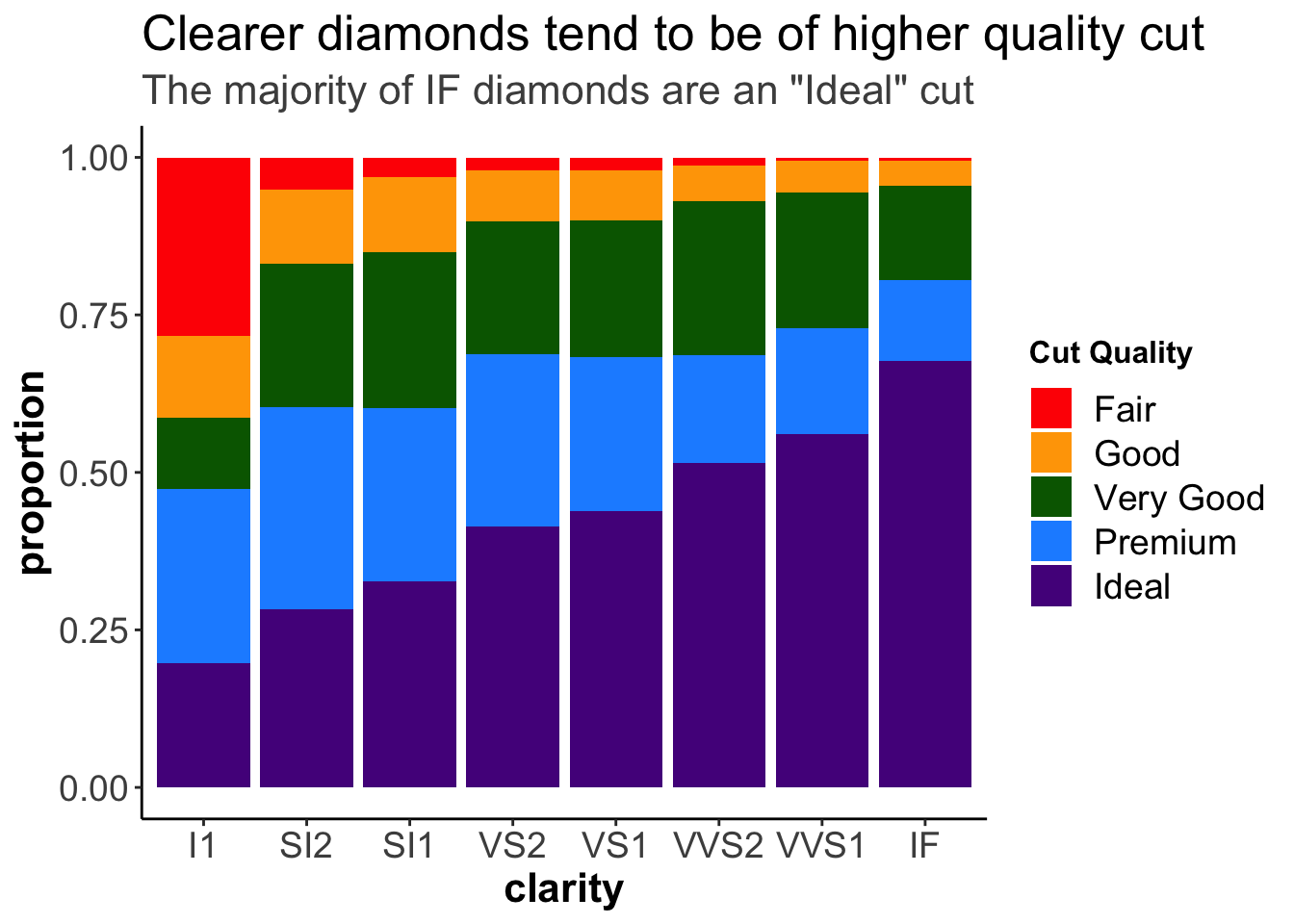
Or, we can modify the font of the legend title using
title.theme().
ggplot(diamonds) +
  geom_bar(aes(x = clarity, fill = cut), position = "fill") +
  scale_fill_manual(values = c("red", "orange", "darkgreen", "dodgerblue", "purple4")) +
  labs(title = "Clearer diamonds tend to be of higher quality cut",
       subtitle = "The majority of IF diamonds are an \"Ideal\" cut") +
  ylab("proportion") +
  theme_classic() +
  theme(title = element_text(size = 16),
        axis.text = element_text(size = 14),
        axis.title = element_text(size = 16, face = "bold"),
        legend.text = element_text(size = 14),
        plot.subtitle = element_text(color = "gray30")) +
  # control legend
  guides(fill = guide_legend("Cut Quality",
                             title.theme = element_text(face = "bold")))
Alternatively, we can do this modification, as well as other legend modifications, like adding a rectangle around the legend, using the
theme() function.
ggplot(diamonds) +
  geom_bar(aes(x = clarity, fill = cut), position = "fill") +
  scale_fill_manual(values = c("red", "orange", "darkgreen", "dodgerblue", "purple4")) +
  labs(title = "Clearer diamonds tend to be of higher quality cut",
       subtitle = "The majority of IF diamonds are an \"Ideal\" cut") +
  ylab("proportion") +
# changing the legend title:
guides(fill = guide_legend("Cut Quality")) +
  theme_classic() +
  theme(title = element_text(size = 16),
        axis.text = element_text(size = 14),
        axis.title = element_text(size = 16, face = "bold"),
        legend.text = element_text(size = 14),
        plot.subtitle = element_text(color = "gray30"),
# changing the legend style:
        legend.title = element_text(face = "bold"),
        legend.background = element_rect(color = "black"))
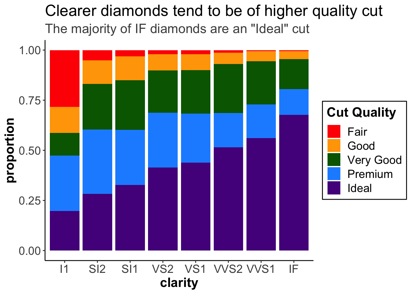
At this point, we have an informative title, clear colors, a well-labeled legend, and text that is large enough throughout the graph. This is certainly a graph that could be used in a presentation. We’ve taken it from a graph that is useful to just ourselves (exploratory) and made it into a plot that can communicate our findings well to others (explanatory)!
We have touched on a number of alterations you can make by adding additional layers to a ggplot. In the rest of this lesson we’ll touch on a few more changes you can make within
ggplot2.
Subsection 4.7.6 Scales
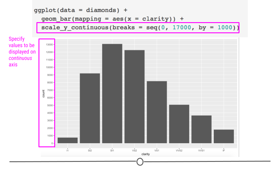
There may be times when you want a different number of values to be displayed on an axis. The scale of your plot for continuous variables (i.e. numeric variables) can be controlled using
scale_x_continuous or scale_y_continuous. Here, we want to increase the number of labels displayed on the y-axis, so we’ll use scale_y_continuous:
ggplot(diamonds) +
  geom_bar(aes(x = clarity)) +
  # control scale for continuous variable
  scale_y_continuous(breaks = seq(0, 17000, by = 1000))
There is very handy argument called
trans for the scale_y_continuous or the scale_x_continuous functions to change the scale of the axes. For example, it can be very useful to show the logarithmic version of the scale if you have very high values with large differences.
According to the documentation for the
trans argument:
Built-in transformations include "asn", "atanh", "boxcox", "date", "exp", "hms", "identity", "log", "log10", "log1p", "log2", "logit", "modulus", "probability", "probit", "pseudo_log", "reciprocal", "reverse", "sqrt" and "time".
ggplot(diamonds) +
  geom_bar(aes(x = clarity)) +
  # control scale for continuous variable
  scale_y_continuous(trans = "log10") +
    labs(y = "Count (log10 scale)",
         x = "Clarity")
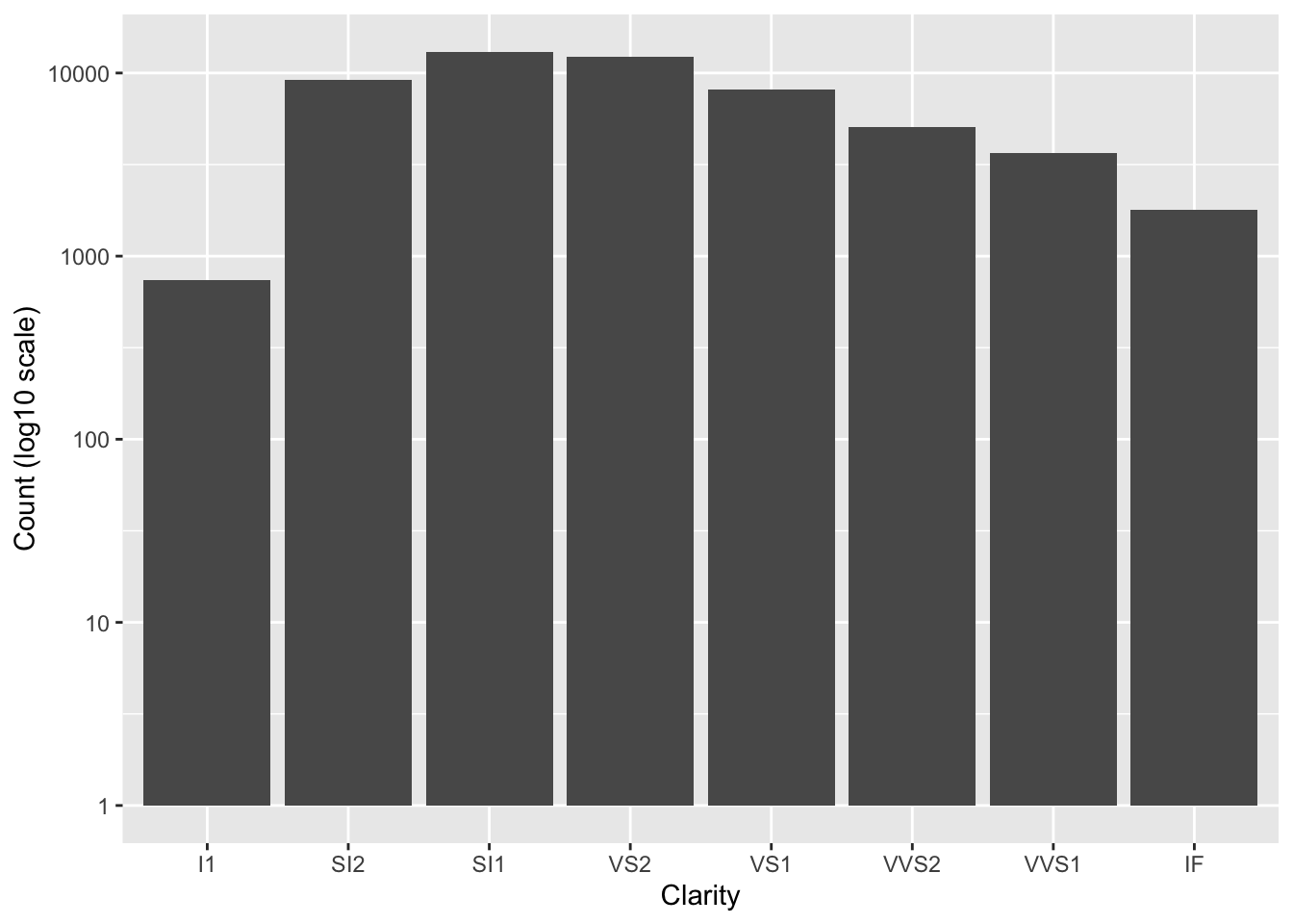
Notice that the values are not changed, just the way they are plotted. Now the y-axis increases by a factor of 10 for each break.
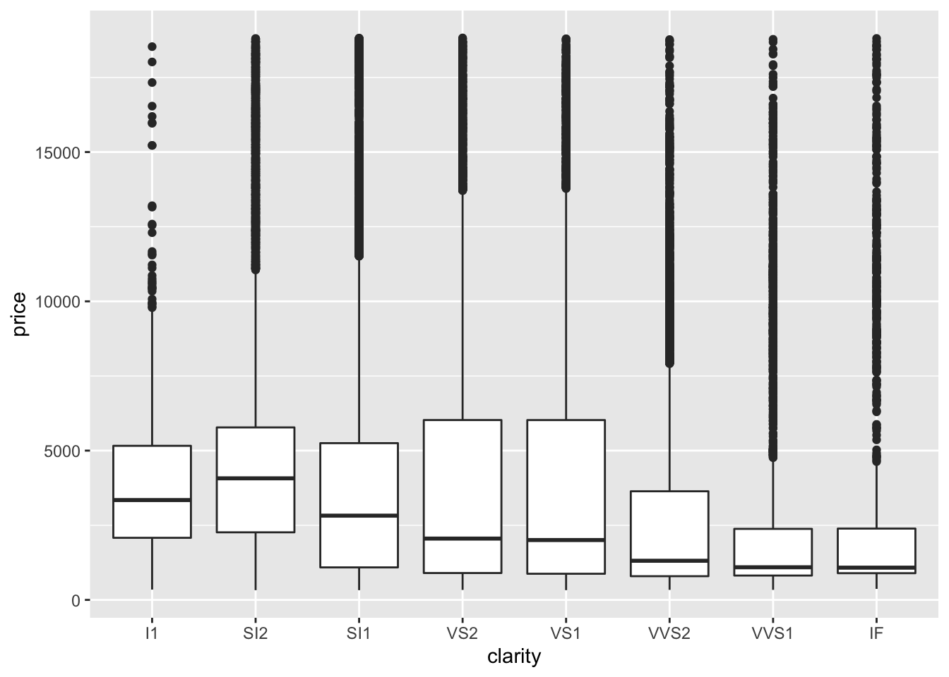
We will create a plot of the price of the diamonds to demonstrate the utility of creating a plot with a log10 scaled y-axis.
ggplot(diamonds) +
  geom_boxplot(aes(y = price, x = clarity))
ggplot(diamonds) +
  geom_boxplot(aes(y = price, x = clarity)) +
  scale_y_continuous(trans = "log10") +
  labs(y = "Price (log10 scale)",
       x = "Diamond Clarity")
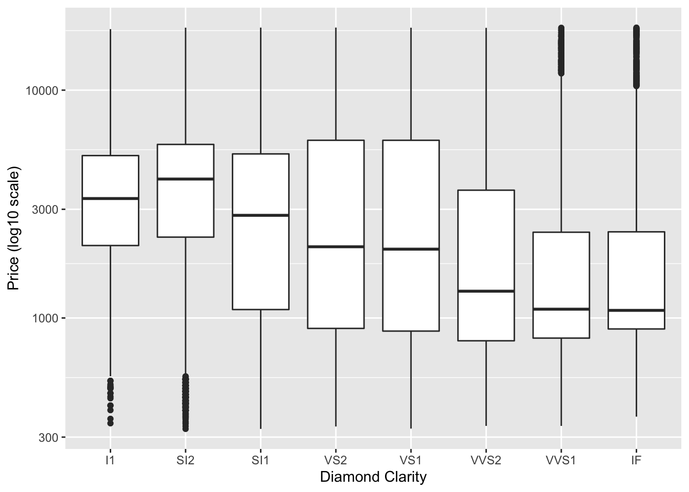
In the first plot, it is difficult to tell what values the boxplots correspond to and it is difficult to compare the boxplots (particularly for the last three clarity categories), however this is greatly improved in the second plot.
We can also use another argument of the
scale_y_continuous() function to add specific labels to our plot. For example, it would be nice to add dollar signs to the y-axis. We can do so using the labels argument. A variety of label_* functions within the scales package can be used to modify axis labels. See here to take a look at the many options.
ggplot(diamonds) +
  geom_boxplot(aes(y = price, x = clarity)) +
  scale_y_continuous(trans = "log10",
                    labels = scales::label_dollar()) +
  labs(y = "Price (log10 scale)",
       x = "Diamond Clarity")
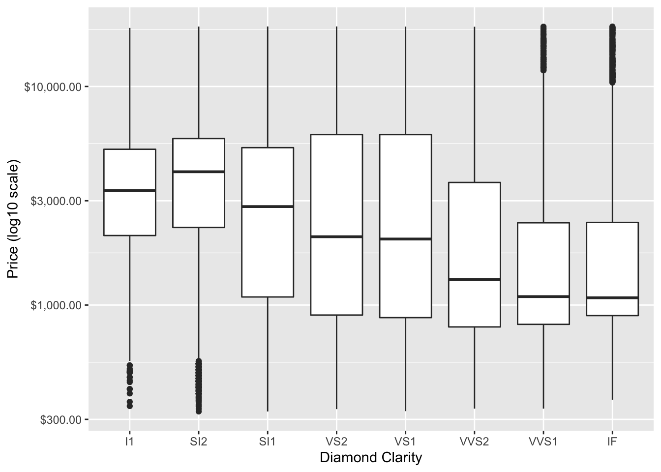
In the above plot, we might also want to order the boxplots by the median price, we can do so using the
fct_reorder function of forcats package to change the order for the clarity levels to be based on the median of the price values.
ggplot(diamonds) +
  geom_boxplot(aes(y = price, x = forcats::fct_reorder(clarity, price, .fun = median))) +
  scale_y_continuous(trans = "log10",
                    labels = scales::label_dollar()) +
  labs(y = "Price (log10 scale)",
       x = "Diamond Clarity")
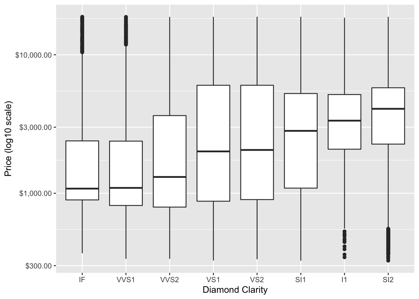
Now we can more easily determine that the
SI2 diamonds are the most expensive.
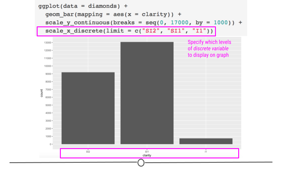
Another way to modify discrete variables (aka factors or categorical variables where there is a limited number of levels), is to use
scale_x_discrete or scale_y_discrete. In this case we will just pick a few of the clarity categories to plot and we will specify the order.
ggplot(diamonds) +
  geom_bar(aes(x = clarity)) +
  # control scale for discrete variable
  scale_x_discrete(limit = c("SI2", "SI1", "I1")) +
  scale_y_continuous(breaks = seq(0, 17000, by = 1000))
Subsection 4.7.7 Coordinate Adjustment
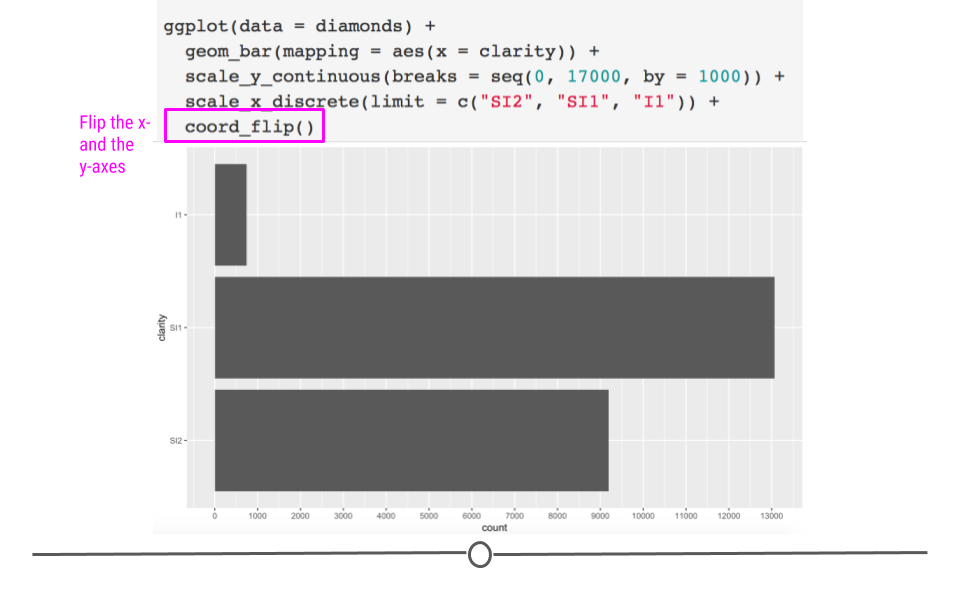
There are times when you’ll want to flip your axis. This can be accomplished using
coord_flip(). Adding an additional layer to the plot we just generated switches our x- and y-axes, allowing for horizontal bar charts, rather than the default vertical bar charts:
ggplot(diamonds) +
  geom_bar(aes(x = clarity)) +
  scale_y_continuous(breaks = seq(0, 17000, by = 1000)) +
  scale_x_discrete(limit = c("SI2", "SI1", "I1")) +
  # flip coordinates
  coord_flip() +
  labs(title = "Clearer diamonds tend to be of higher quality cut",
       subtitle = "The majority of IF diamonds are an \"Ideal\" cut") +
  ylab("proportion") +
  theme_classic() +
  theme(title = element_text(size = 18),
        axis.text = element_text(size = 14),
        axis.title = element_text(size = 16, face = "bold"),
        legend.text = element_text(size = 14),
        plot.subtitle = element_text(color = "gray30")) +
  guides(fill = guide_legend("cut quality"))
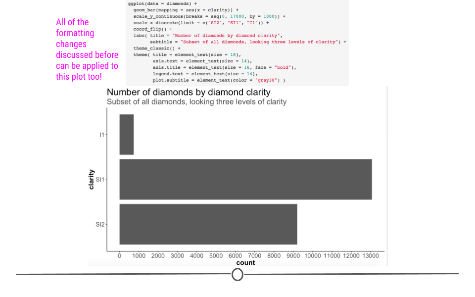
It’s important to remember that all the additional alterations we already discussed can still be applied to this graph, due to the fact that ggplot2 uses layering!
p <- ggplot(diamonds) +
  geom_bar(mapping = aes(x = clarity)) +
  scale_y_continuous(breaks = seq(0, 17000, by = 1000)) +
  scale_x_discrete(limit = c("SI2", "SI1", "I1")) +
  coord_flip() +
  labs(title = "Number of diamonds by diamond clarity",
       subtitle = "Subset of all diamonds, looking three levels of clarity") +
  theme_classic() +
  theme(title = element_text(size = 18),
        axis.text = element_text(size = 14),
        axis.title = element_text(size = 16, face = "bold"),
        legend.text = element_text(size = 14),
        plot.subtitle = element_text(color = "gray30") )
Subsection 4.7.8 Annotation
Finally, there will be times when you’ll want to add text to a plot or to annotate points on your plot. We’ll discuss briefly how to accomplish that here!
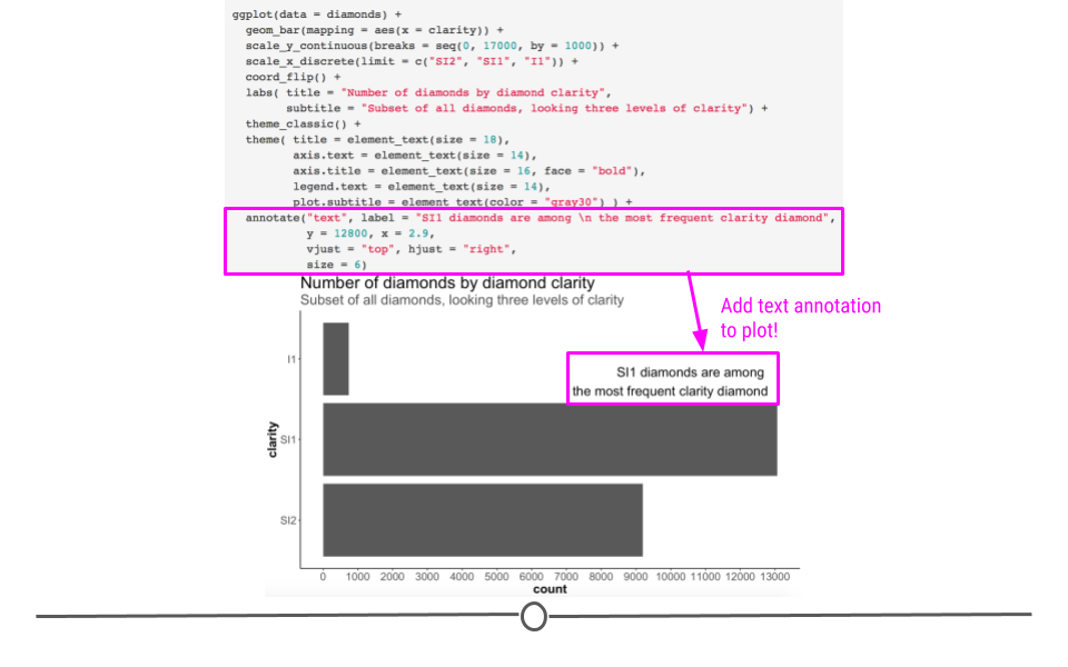
To add text to your plot, we can use the function
annotate. This requires us to specify that we want to annotate here with "text" (rather than say a shape, like a rectangle - "rect" - which you can also do!). Additionally, we have to specify what we’d like that text to say (using the label argument), where on the plot we’d like that text to show up (using x and y for coordinates), how we’d like the text aligned (using hjust for horizontal alignment where the options are "left", "center", or "right" and vjust for vertical alignment where the arguments are "top", "center", or "bottom"), and how big we’d like that text to be (using size):
ggplot(diamonds) +
  geom_bar(aes(x = clarity)) +
  scale_y_continuous(breaks = seq(0, 17000, by = 1000)) +
  scale_x_discrete(limit = c("SI2", "SI1", "I1")) +
  coord_flip() +
  labs(title = "Number of diamonds by diamond clarity",
       subtitle = "Subset of all diamonds, looking three levels of clarity") +
  theme_classic() +
  theme(title = element_text(size = 18),
        axis.text = element_text(size = 14),
        axis.title = element_text(size = 16, face = "bold"),
        legend.text = element_text(size = 14),
        plot.subtitle = element_text(color = "gray30")) +
  # add annotation
  annotate("text", label = "SI1 diamonds are among \n the most frequent clarity diamond",
           y = 12800, x = 2.9,
           vjust = "top", hjust = "right",
           size = 6)
Note: we could have accomplished this by adding an additional
geom: geom_text. However, this requires creating a new dataframe, as explained here. This can also be used to label the points on your plot. Keep this reference in mind in case you have to do that in the future.
Subsection 4.7.9 Vertical and Horizontal Lines
Sometimes it is very useful to add a line to our plot to indicate an important threshold. We can do so by using the
geom_hline() function for a horizontal line and geom_vline() for a vertical line.
In each case, the functions require that a y-axis intercept or x-axis intercept be specified respectively.
For example, it might be useful to add a horizontal line to indicate 50% of the total counts for each of the
clarity categories. We will also use the scale_y_continuous() function to change the y-axis to show percentages.
ggplot(diamonds) +
  # fill scales to 100%
  geom_bar(aes(x = clarity, fill = cut), position = "fill") +
  scale_fill_manual(values = c("red", "orange", "darkgreen", "dodgerblue", "purple4")) +
  scale_y_continuous(labels = scales::percent) +
  labs(y = "Percent of diamonds") +
  geom_hline(yintercept = 0.5, color = "red", size = 1)
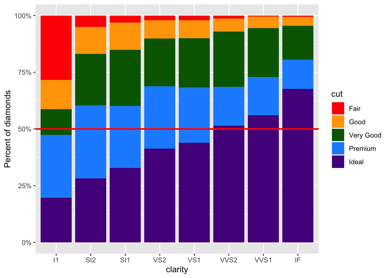
Now, it is easier to tell that slightly over half of the
VVS2 diamonds have an Ideal cut. This would be much more difficult to see without the horizontal line.
To add a vertical line we would instead use the
geom_vline() function and we would specify an x-axis intercept. Since this plot has a discrete x-axis, numeric values specify a categorical value based on the order, thus a value of 4 would create a line down the center of the VS2 bar. However, if we used 5.5 we could add a line offset from the center of a bar, as you can see in the following example:
ggplot(diamonds) +
  # fill scales to 100%
  geom_bar(aes(x = clarity, fill = cut), position = "fill") +
  scale_fill_manual(values = c("red", "orange", "darkgreen", "dodgerblue", "purple4")) +
  scale_y_continuous(labels = scales::percent) +
  labs(y = "Percent of diamonds") +
  geom_hline(yintercept = 0.5, color = "red", size = 1 ) +
  geom_vline(xintercept = 5.5, color = "black", size = .5)
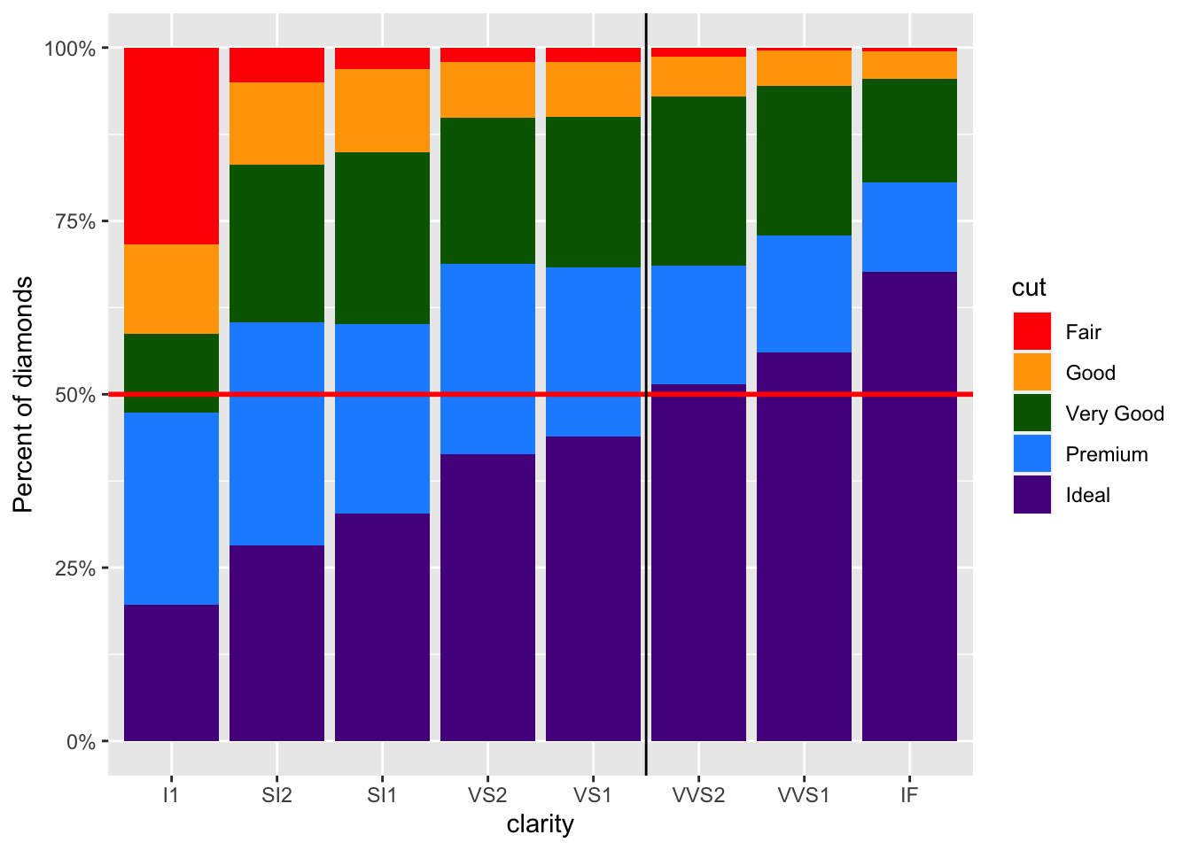
This would be helpful if we wanted to especially point out differences between the last three clarity categories of diamonds compared to the other categories.

