Section 4.10 Case Studies
At this point, we’ve done a lot of work with our case studies. We’ve introduced the case studies, read them into R, and have wrangled the data into a usable format. Now, we get to peak at the data using visualizations to better understand each dataset’s observations and variables!
Let’s start by loading our wrangled tidy data that we previously saved:
load(here::here("data", "tidy_data", "case_study_1_tidy.rda"))

load(here::here("data", "tidy_data", "case_study_2_tidy.rda"))
Subsection 4.10.1 Case Study #1: Health Expenditures
We’ve now got the data in order so that we can start to explore the relationships between the variables contained in the health care dataset (
hc) to answer our questions of interest:
-
Is there a relationship between health care coverage and health care spending in the United States?
-
How does the spending distribution change across geographic regions in the United States?
-
Does the relationship between health care coverage and health care spending in the United States change from 2013 to 2014?
# see health care data
hc
## # A tibble: 612 × 10
##    Location  year type         tot_coverage abb   region tot_spending tot_pop
##    <chr>    <int> <chr>               <int> <chr> <fct>         <dbl>   <int>
##  1 Alabama   2013 Employer          2126500 AL    South         33788 4763900
##  2 Alabama   2013 Non-Group          174200 AL    South         33788 4763900
##  3 Alabama   2013 Medicaid           869700 AL    South         33788 4763900
##  4 Alabama   2013 Medicare           783000 AL    South         33788 4763900
##  5 Alabama   2013 Other Public        85600 AL    South         33788 4763900
##  6 Alabama   2013 Uninsured          724800 AL    South         33788 4763900
##  7 Alabama   2014 Employer          2202800 AL    South         35263 4768000
##  8 Alabama   2014 Non-Group          288900 AL    South         35263 4768000
##  9 Alabama   2014 Medicaid           891900 AL    South         35263 4768000
## 10 Alabama   2014 Medicare           718400 AL    South         35263 4768000
## # … with 602 more rows, and 2 more variables: prop_coverage <dbl>,
## #   spending_capita <dbl>
As a reminder, we have state level data, broken down by year and type of insurance. For each, we have the total number of individuals who have health care coverage (
tot_coverage), the amount spent on coverage (tot_spending), the proportion of individuals covered (prop_coverage), and the amount spent per capita (spending_capita). Additionally, we have the state name (Location), the two letter state abbreviation (abb), and the region of the United States where the state is located (region). Let’s get visualizing!
Subsubsection 4.10.1.1 Exploratory Data Analysis (EDA)
To first get a sense of what information we do and do not have, the
visdat package can be very helpful. This package uses ggplot2 to visualize missingness in a dataframe. For example, vis_dat() takes the dataframe as an input and visualizes the observations on the left and the variables across the top. Solid colors indicate that a value is present. Each type of variable is represented by a different color. Grey lines indicate missing values.
# install.packages("visdat")
library(visdat)

vis_dat(hc)
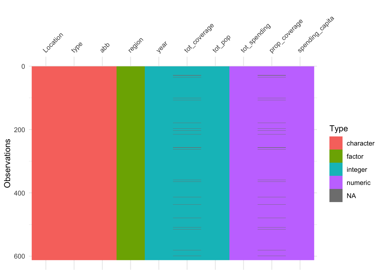
We now have a sense that a few states, for some years are missing coverage data, which also affects the ability to calculate proportion covered.
To see these values highlighted more specifically, we can use the related
vis_miss() function.
vis_miss(hc)
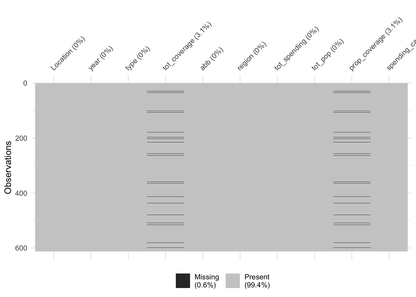
Here we see that missing values only occur 0.6% of the time, with 3.1% of the observations missing entries for
tot_coverage and prop_coverage. So, all in all, there is not a lot of missing data, but we still want to be sure we understand where missingness occurs before answering our questions.
Let’s use
dplyr to see which observations have missing data:
hc %>%
  filter(is.na(tot_coverage))
## # A tibble: 19 × 10
##    Location              year type  tot_coverage abb   region tot_spending tot_pop
##    <chr>                <int> <chr>        <int> <chr> <fct>         <dbl>   <int>
##  1 Arizona               2013 Othe…           NA AZ    West          41481 6603100
##  2 Arizona               2014 Othe…           NA AZ    West          43356 6657200
##  3 District of Columbia  2013 Othe…           NA DC    South          7443  652100
##  4 District of Columbia  2014 Othe…           NA DC    South          7871  656900
##  5 Indiana               2014 Othe…           NA IN    North…        54741 6477500
##  6 Kansas                2013 Othe…           NA KS    North…        21490 2817600
##  7 Kansas                2014 Othe…           NA KS    North…        22183 2853000
##  8 Kentucky              2014 Othe…           NA KY    South         35323 4315700
##  9 Massachusetts         2013 Othe…           NA MA    North…        68899 6647700
## 10 Massachusetts         2014 Othe…           NA MA    North…        71274 6658100
## 11 New Hampshire         2014 Othe…           NA NH    North…        12742 1319700
## 12 New Jersey            2013 Othe…           NA NJ    North…        75148 8807400
## 13 North Dakota          2013 Othe…           NA ND    North…         6795  714500
## 14 Oklahoma              2013 Othe…           NA OK    South         28097 3709400
## 15 Rhode Island          2014 Othe…           NA RI    North…        10071 1048200
## 16 Tennessee             2013 Othe…           NA TN    South         46149 6400200
## 17 Tennessee             2014 Othe…           NA TN    South         48249 6502000
## 18 West Virginia         2013 Othe…           NA WV    South         16622 1822000
## 19 Wisconsin             2014 Othe…           NA WI    North…        50109 5747200
## # … with 2 more variables: prop_coverage <dbl>, spending_capita <dbl>
Ah, so we see that the "Other" type of coverage is missing in both 2013 and 2014 for a subset of states. We’ll be focusing on the non-"Other" types of health care coverage, so this shouldn’t pose a problem, but it is good to know!
Taking this one step further, let’s skim the entire dataset to get a sense of the information stored in each variable:
library(skimr)

# get summary of the data
skim(hc)
At a glance, by looking at the
hist column of the output for our numeric/integer variables, we see that there is a long right tail in tot_coverage and tot_pop.
We see that proportion coverage varies from 0.0054 (
p0) to 0.61 (p100). So, we’ll want to know which states are at each end of the spectrum here.
We also see that for
tot_spending, the mean is 49004 and the median (p50) is slightly lower and that this variable also has a long right tail (hist).
We also know that these data come from two different years, so we can group by
year and again summarize the data:
# group by year
hc %>%
  group_by(year) %>%
  skim()
At a glance, there doesn’t appear to be a huge difference in the variables from one year to the next, but we’ll explore this again in a bit.
With at least some understanding of the data in our dataset, let’s start generating exploratory plots that will help us answer each of our questions of interest.
Subsubsection 4.10.1.2 Q1: Relationship between coverage and spending?
To answer the question:
Is there a relationship between health care coverage and health care spending in the United States?
We’ll have to visualize coverage and spending data across the United States.
And, to understand the relationship between two continuous variables - coverage and spending - a scatterplot will be the most effective visualization.
We’ll first look at a scatterplot:
hc %>%
  filter(type == "Employer",
         year == "2013") %>%
  ggplot(aes(x = spending_capita,
             y = prop_coverage)) +
  geom_point() +
  labs(x = "spending per capita",
       y = "coverage proportion")
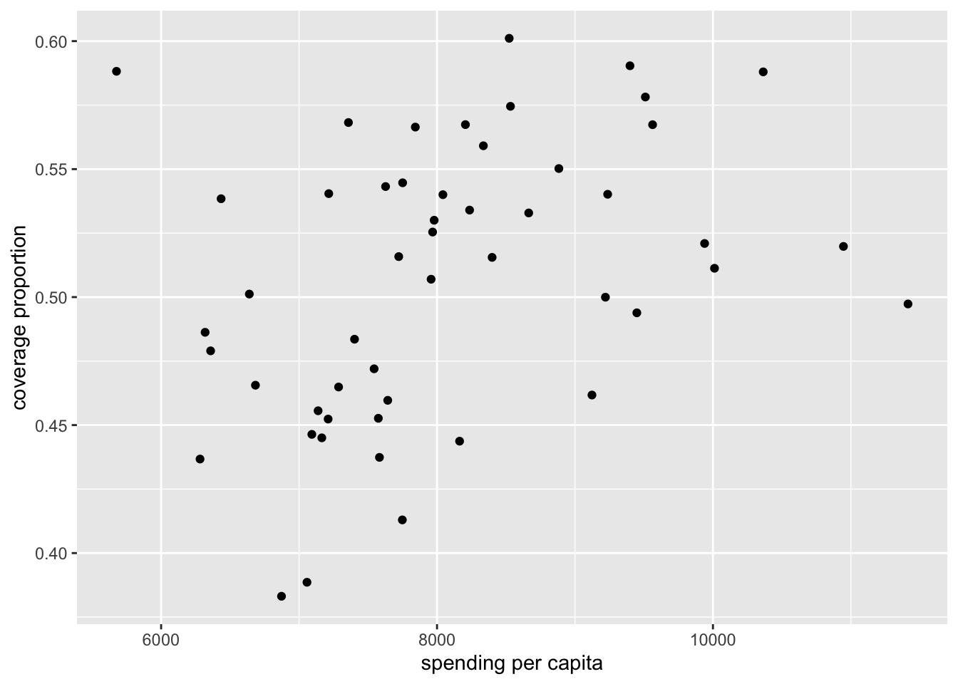
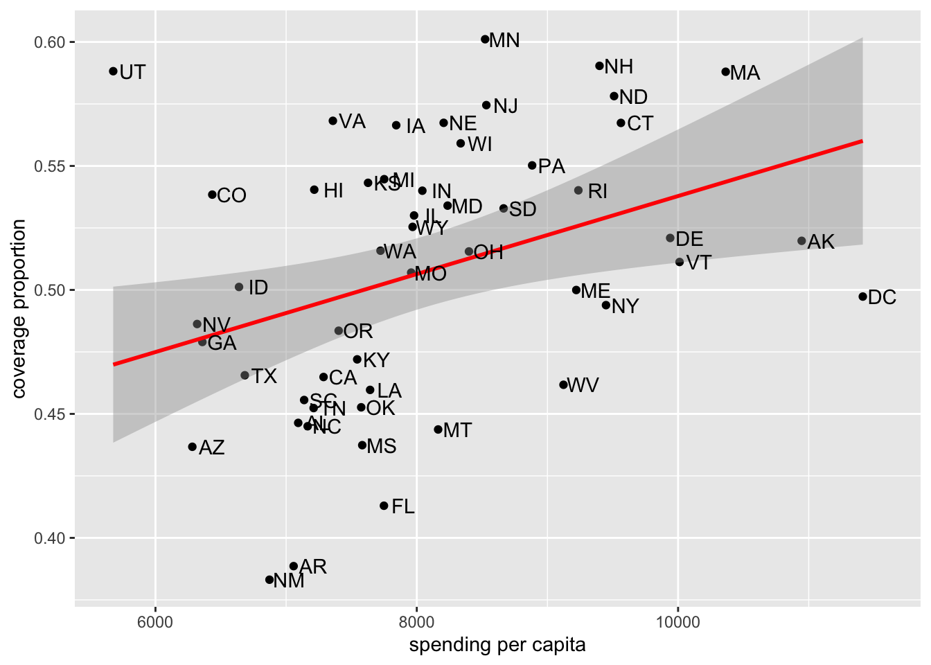
We see that there appears to be some relationship, with those states that spend more per capita also having higher proportions of their population having health care coverage.
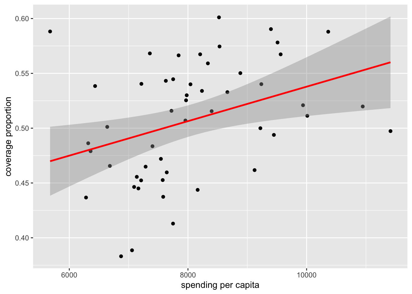
We can continue to improve this plot to better understand the underlying data. For example, we can add a best-fit line using
geom_smooth() to visualize the magnitude of the linear relationship:
# generate scatterplot with fit line
hc %>%
  filter(type == "Employer",
         year == "2013") %>%
  ggplot(aes(x = spending_capita,
             y = prop_coverage)) +
  geom_point() +
  labs(x = "spending per capita",
       y = "coverage proportion") +
  geom_smooth(method = "lm", col = "red")
Beyond that, we likely want to know which point represents which state, so we can add state labels:
# add state abbreviation labels
hc %>%
  filter(type == "Employer",
         year == "2013") %>%
  ggplot(aes(x = spending_capita,
             y = prop_coverage)) +
  geom_point() +
  labs(x = "spending per capita",
       y = "coverage proportion") +
  geom_smooth(method = "lm", col = "red") +
  geom_text(aes(label=abb),
            nudge_x = 150)
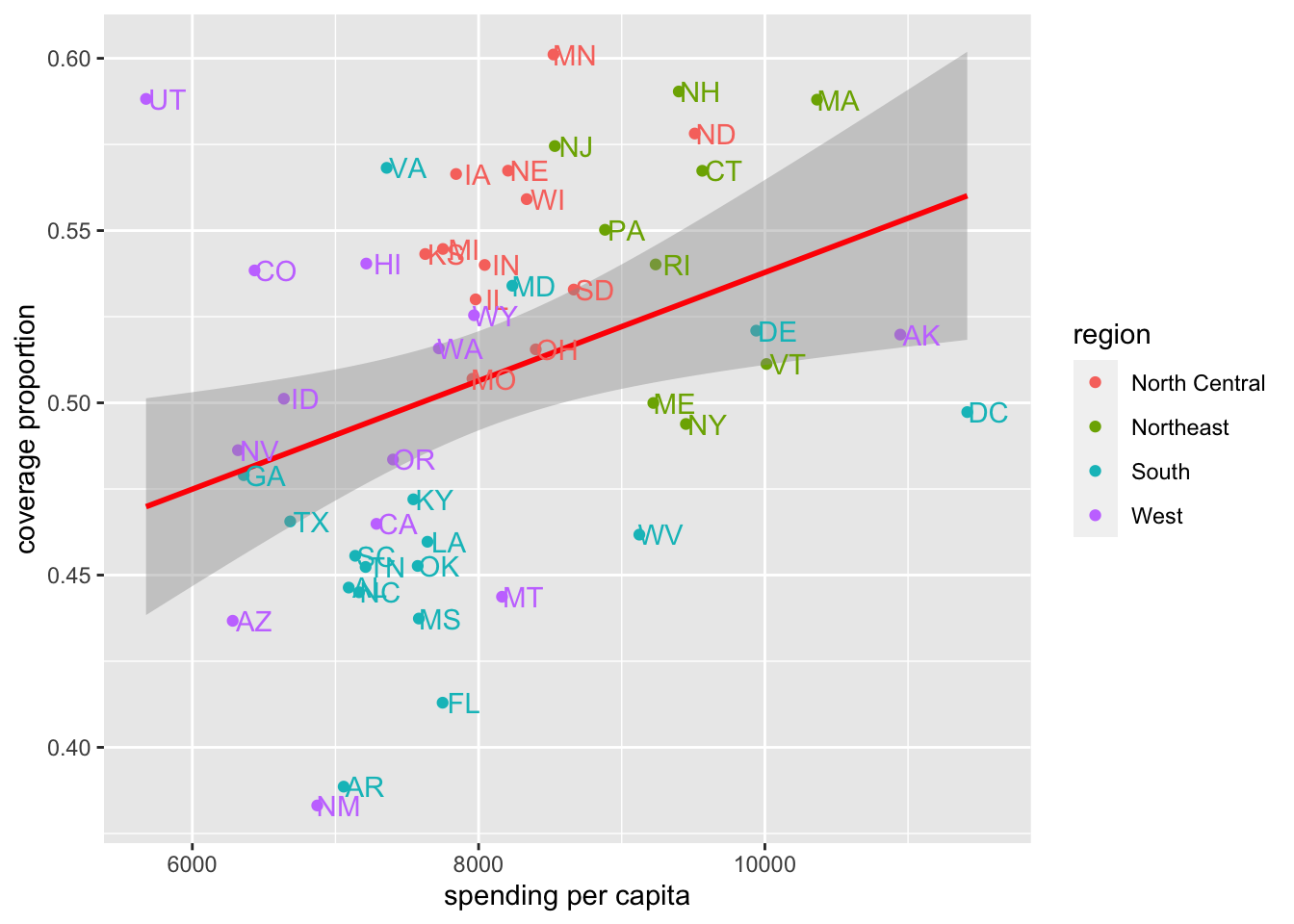
From there, it’d likely be helpful to have information from each region:
# color by region
hc %>%
  filter(type == "Employer",
         year == "2013") %>%
  ggplot(aes(x = spending_capita,
             y = prop_coverage,
             color = region)) +
  geom_point() +
  labs(x = "spending per capita",
       y = "coverage proportion") +
  geom_smooth(method = "lm", col = "red") +
  geom_text(aes(label=abb),
            nudge_x = 150,
            show.legend = FALSE)
So far, we’ve only been focusing on data from 2013. What about looking at data from both 2013 and 2014? We can do that using
facet_wrap():
# color by region
hc %>%
  filter(type == "Employer") %>%
  ggplot(aes(x = spending_capita,
             y = prop_coverage,
             color = region)) +
  geom_point() +
  facet_wrap(~year) +
  labs(x = "spending per capita",
       y = "coverage proportion") +
  geom_smooth(method = "lm", col = "red") +
  geom_text(aes(label=abb),
            nudge_x = 150,
            show.legend = FALSE)
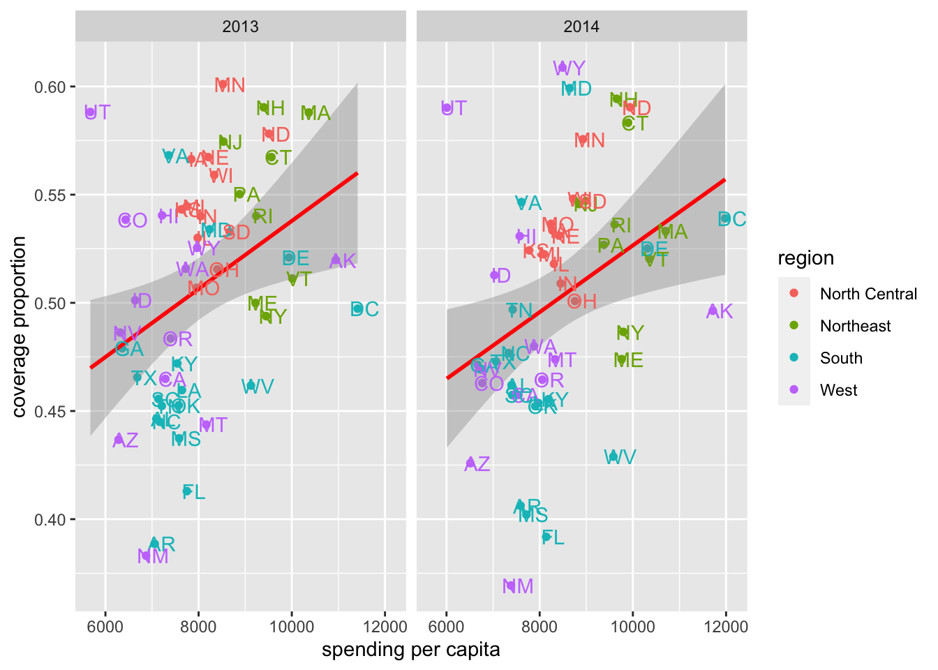
We see that the overall trend holds, but there has been some movement. For example, we see at a glance that DC has a higher proportion of its population covered in 2014 relative to 2013, while MA saw a drop in coverage. UT appears to be an outlier in both years having low spending but a high proportion of individuals covered.
Beyond "Employer"-held health care coverage, let’s look at the other types of coverage data we have. Here, we’ll facet by type, rather than year, again focusing on just data from 2013.
# visualize 2013 data by type
hc %>%
  filter(year == "2013") %>%
  ggplot(aes(x = spending_capita,
             y = prop_coverage,
             color = region)) +
  geom_point() +
  facet_wrap(~type) +
  labs(x = "spending per capita",
       y = "coverage proportion") +
  geom_smooth(method = "lm", col = "red") +
  geom_text(aes(label=abb),
            nudge_x = 150,
            show.legend = FALSE)
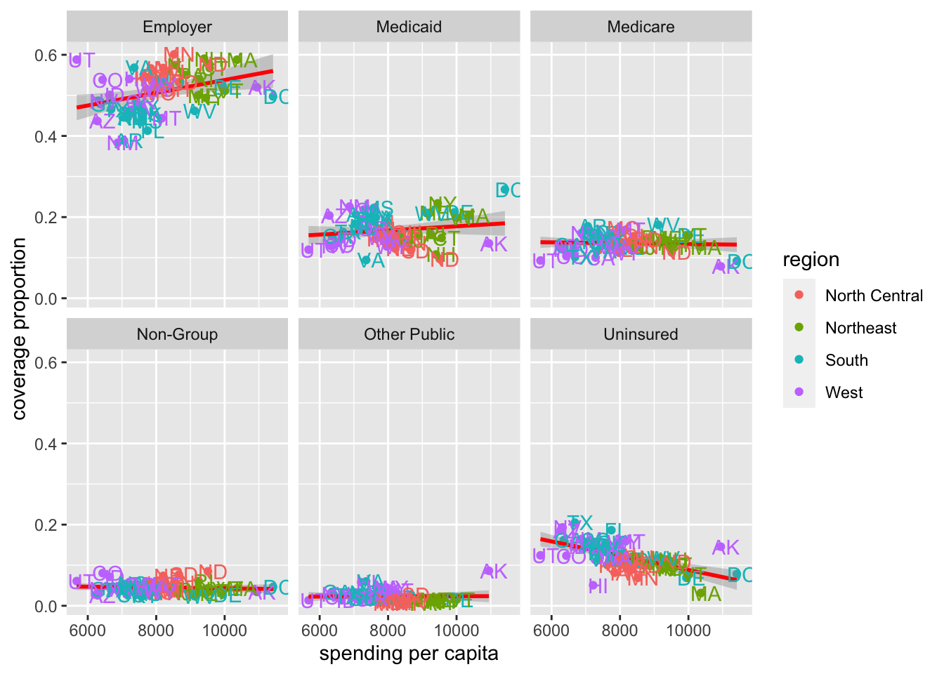
From these data, we see that Employer health care coverage is the most popular way in which individuals receive their health insurance across all states. We also see a flat or positive relationship for all other types of insurance, except for "Uninsured". We see that the more money spent per capita the fewer individuals the state has without insurance, as one might expect.
We can quickly peak at the data from 2014 to be sure the same general patterns hold:
# visualize 2014 data by type
hc %>%
  filter(year == "2014") %>%
  ggplot(aes(x = spending_capita,
             y = prop_coverage,
             color = region)) +
  geom_point() +
  facet_wrap(~type) +
  labs(x = "spending per capita",
       y = "coverage proportion") +
  geom_smooth(method = "lm", col = "red") +
  geom_text(aes(label=abb),
            nudge_x = 150,
            show.legend = FALSE)
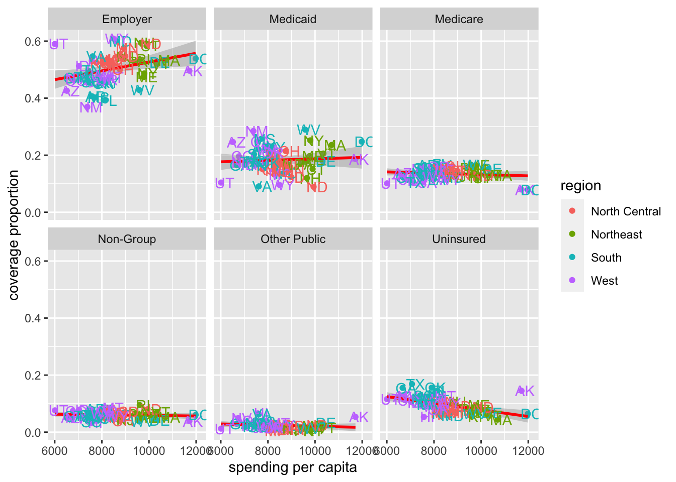
The same general patterns hold in 2014 as we saw in 2013; however, the patterns are not exactly the same.
With these plots we have a pretty good understanding of the relationship between spending and coverage across this country when it comes to health care.
Let’s save some of these plots for later:
pdf(here::here("figures", "exploratory", "2013and2014_spending_and_coverage.pdf"))

hc %>%
  filter(type == "Employer") %>%
  ggplot(aes(x = spending_capita,
             y = prop_coverage,
             color = region)) +
  geom_point() +
  facet_wrap(~year) +
  labs(x = "spending per capita",
       y = "coverage proportion") +
  geom_smooth(method = "lm", col = "red") +
  geom_text(aes(label=abb),
            nudge_x = 150,
            show.legend = FALSE)
dev.off()

pdf(here::here("figures", "exploratory", "2013_coverage_type.pdf"))
hc %>%
  filter(year == "2013") %>%
  ggplot(aes(x = spending_capita,
             y = prop_coverage,
             color = region)) +
  geom_point() +
  facet_wrap(~type) +
  labs(x = "spending per capita",
       y = "coverage proportion") +
  geom_smooth(method = "lm", col = "red") +
  geom_text(aes(label=abb),
            nudge_x = 150,
            show.legend = FALSE)
dev.off()

pdf(here::here("figures", "exploratory", "2014_coverage_type.pdf"))
hc %>%
  filter(year == "2014") %>%
  ggplot(aes(x = spending_capita,
             y = prop_coverage,
             color = region)) +
  geom_point() +
  facet_wrap(~type) +
  labs(x = "spending per capita",
       y = "coverage proportion") +
  geom_smooth(method = "lm", col = "red") +
  geom_text(aes(label=abb),
            nudge_x = 150,
            show.legend = FALSE)
dev.off()
Subsubsection 4.10.1.3 Q2: Spending Across Geographic Regions?
To answer the question:
Which US states spend the most and which spend the least on health care? How does the spending distribution change across geographic regions in the United States?
We’ll want to visualize health care spending across regions of the US.
We saw in the previous plots that there are some regional effects when it comes to spending, as the states from the different regions tended to cluster in the previous plot. But, let’s look at this explicitly now.
We’re looking to visualize a continuous variable (
spending_capita) by a categorical variable (region), so a boxplot is always a good place to start:
# generate boxplot
hc %>%
  ggplot(aes(x = region,
             y = spending_capita)) +
  geom_boxplot() +
  labs(y = "spending per capita")
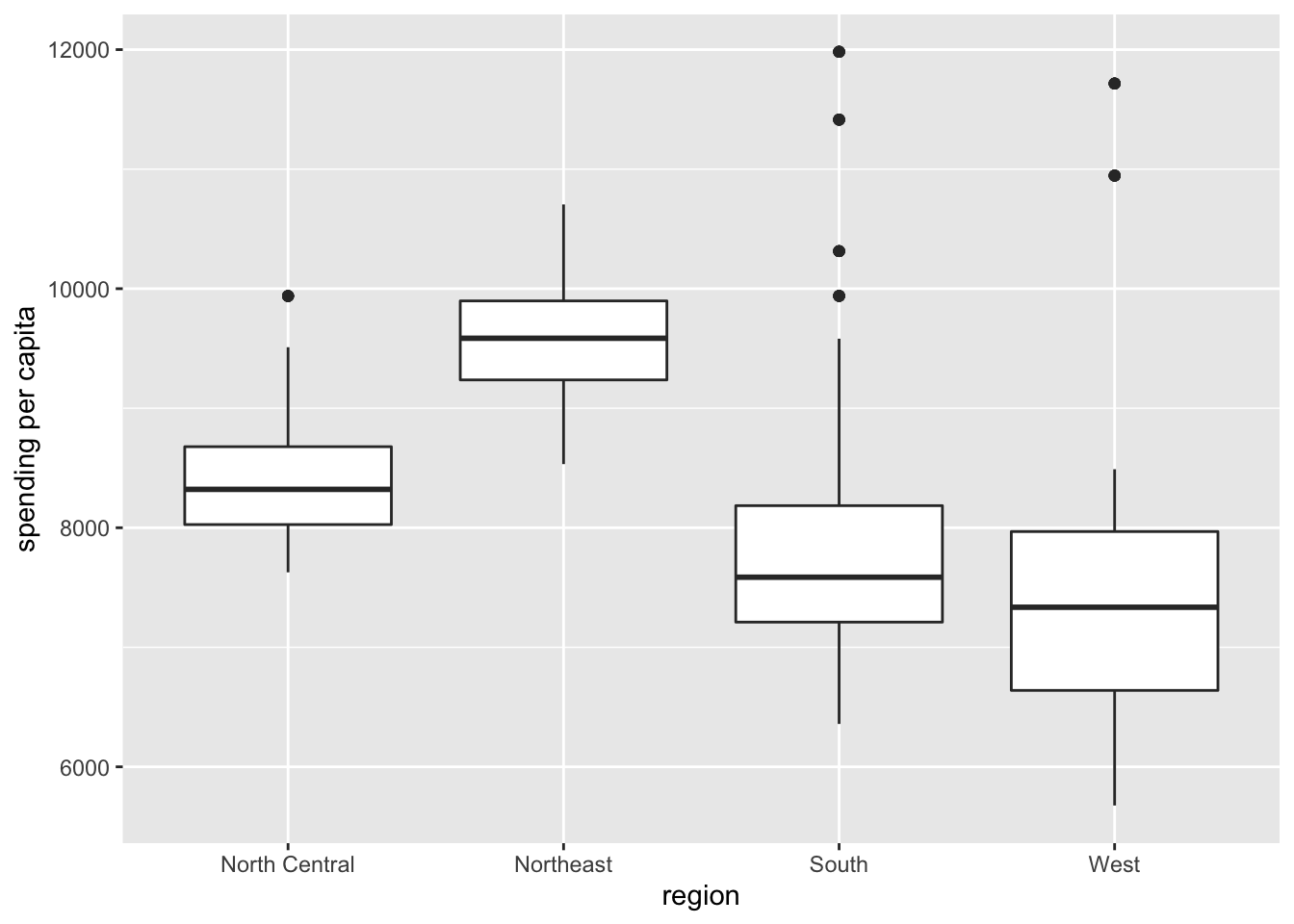
Here, we get a sense of the overall trend, seeing that states in the Northeast tend to spend the most on health care, while states in the West spend the least.
But, sometimes, it can be helpful to see the distribution of points along with the boxplot, so we can add those onto the plot. We’ll use
geom_jitter() rather than geom_point() here so that we can see all the points without overlap. Note that we also use alpha = 0.2 to increase the transparency of the points and outlier.shape = NA to hide the outliers on the boxplot. This way, each observation is only plotted a single time:
# add data points to boxplot
hc %>%
  filter(type == "Employer") %>%
  ggplot(aes(x = region,
             y = spending_capita)) +
  geom_boxplot(outlier.shape = NA) +
  geom_jitter(alpha = 0.2) +
  labs(y = "spending per capita")
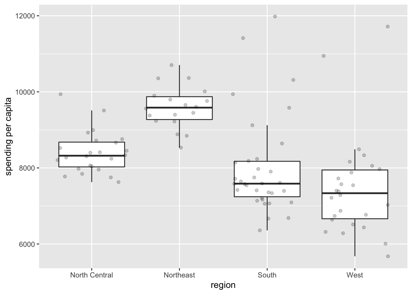
This gives us a sense of the variation in spending for states in each region. Of note, there are more outliers in the South and West, with a few states spending more on health care than even states in the Northeast, where spending tends to be higher.
With this we have a good sense of the regional effects of spending across the United states.
Subsubsection 4.10.1.4 Q3: Coverage and Spending Change Over Time?
To answer the question:
Does the relationship between health care coverage and health care spending in the United States change from 2013 to 2014?
we’ll need to visualize a whole bunch of variables: coverage, spending,
year and type of insurance. We can return to a scatterplot again, but now we’ll put all these pieces we looked at separately in Q1 together at once to answer this temporal question visually.
We won’t filter the dataset but will instead use
facet_grid(), which "forms a matrix of panels defined by row and column faceting variables":
facet_wrap(), which we used previously, typically utilizes screen space better than facet_grid(); however, in this case, where we want 2013 and 2014 to each be in a separate row, facet_grid() is the better visual choice.
# color by region
hc %>%
  ggplot(aes(x = spending_capita,
             y = prop_coverage,
             color = region)) +
  geom_point() +
  labs(x = "spending per capita",
       y = "coverage proportion") +
  geom_smooth(method = "lm", col = "red") +
  facet_grid(year~type)
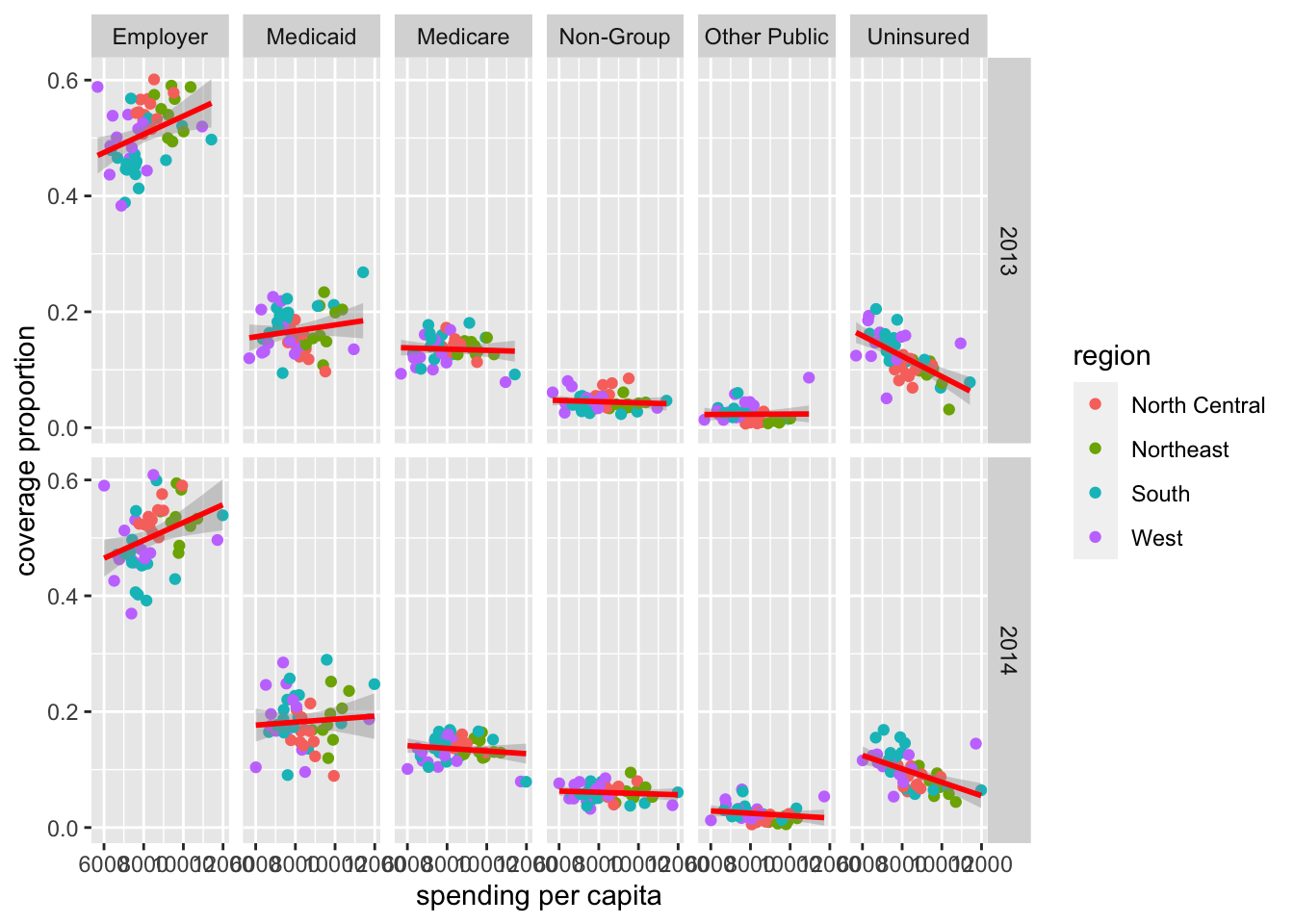
With this output, the top row shows the data from 2013 and the bottom shows the data from 2014. We can then visually compare the top plot to the bottom plot for each time of insurance.
Visually, we can start to get a sense that a few things changed from 2013 to 2014. For example, as we saw previously, individual states changed from one year to the next, but overall patterns seem to hold pretty steady between these two years.
We were able to start answering all our questions of interest with a number of quick plots using
ggplot2.
Now, of course there are many ways in which we could customize each of these plots to be "publication-ready," but for now, we’ll stop with this case study having gained a lot of new insight into these data and answers to our questions we now have, simply from generating a few exploratory plots.
Subsection 4.10.2 Case Study #2: Firearms
For our second case study, we’re interested in the following question:
At the state-level, what is the relationship between firearm legislation strength and annual rate of fatal police shootings?
In the previous course, we wrangled the data into a single, helpful dataframe:
firearms.
# see firearms data
firearms
## # A tibble: 51 × 15
##    NAME                 white black hispanic  male total_pop violent_crime brady_scores
##    <chr>                <dbl> <dbl>    <dbl> <dbl>     <dbl>         <dbl>        <dbl>
##  1 alabama               69.5 26.7      4.13  48.5   4850858          472.        -18
##  2 alaska                66.5  3.67     6.82  52.4    737979          730.        -30
##  3 arizona               83.5  4.80    30.9   49.7   6802262          410.        -39
##  4 arkansas              79.6 15.7      7.18  49.1   2975626          521.        -24
##  5 california            73.0  6.49    38.7   49.7  39032444          426.         76
##  6 colorado              87.6  4.47    21.3   50.3   5440445          321          22
##  7 connecticut           80.9 11.6     15.3   48.8   3593862          218.         73
##  8 delaware              70.3 22.5      8.96  48.4    944107          499          41
##  9 district of columbia  44.1 48.5     10.7   47.4    672736         1269.         NA
## 10 florida               77.7 16.9     24.7   48.9  20268567          462.        -20.5
## # … with 41 more rows, and 7 more variables: gunshot_tally <int>,
## #   gunshot_filtered <int>, gunshot_rate <dbl>, unemployment_rate <dbl>,
## #   unemployment_rank <int>, density <dbl>, ownership <dbl>
This dataset contains state level information about firearm ownership (broken down by ethnicity and gender), the population of each state (
total_pop), the number of violent crimes (violent_crime), the “total state points” from the Brady Scorecard (brady_scores), the number of gunshots (gunshot_tally), the number of gunshots from armed, non-white, male individuals (gunshot_filtered), the annualized rate per 1,000,000 residents (gunshot_rate), the unemployment rate and unemployment_rank, population density (density), and firearm ownership as a percent of firearm suicides to all suicides (ownership).
Subsubsection 4.10.2.1 Exploratory Data Analysis (EDA)
Similar to how we approached the health care case study, let’s get an overall understanding of the data in our dataset, starting with understanding where data are missing in our dataset:
# visualize missingness
vis_dat(firearms)
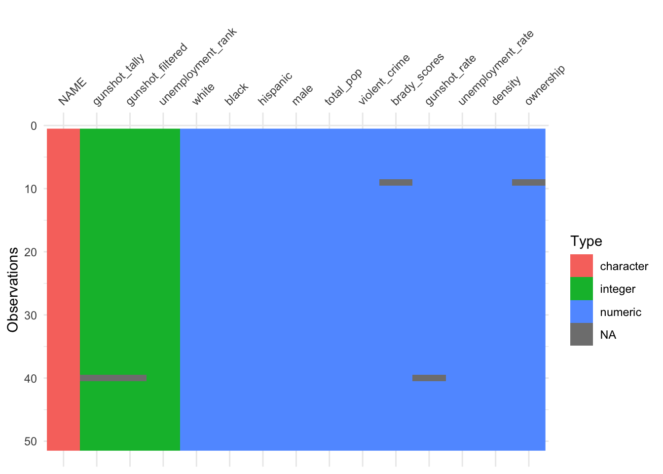
We see that we have data for all 50 states (and Washington, D.C.) for most variables in our dataset; however, we’re missing information for one state when it comes to gunshot information and another state when it comes to Brady scores and ownership by suicide rates.
Additionally, we see that most of our variables are numeric (either integers or numeric) while the state name (
NAME) is a character, confirming what we expect for these data.
We will also again use
skim() to get a better sense of the values in our dataset:
# summarize data
skim(firearms)
Ultimately, we’re interested in firearm legislation and fatal police shootings, which we’ll get to, but let’s explore the relationship between other variables in our dataset first to gain a more complete understanding.
For example, determining if there’s a relationship between the number of violent crimes and the total population in a state is good to know. Outliers in this relationship would be important to note as they would be states with either lower or higher crime by population. Let’s use a scatterplot to better understand this relationship:
# violent crimes
ggplot(firearms,
       aes(x = total_pop,
           y = violent_crime)) +
  geom_point() +
  labs(x = "Total Population",
       y = "Violent Crime") +
  theme_classic() +
  geom_text_repel(aes(label = NAME))
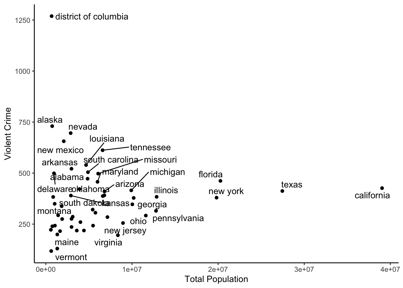
Here we see that the visualization of this relationship is largely dependent upon the state’s population, with large states like Texas and California sticking out. However, we do see that, for its size, Washington D.C had many more violent cries than other states, despite its small population.
It would also be helpful to understand the relationship between unemployment and violent crime:
# violent crimes
ggplot(firearms,
       aes(x = unemployment_rate,
           y = violent_crime)) +
  geom_point() +
  labs(x = "Unemployment Rate",
       y = "Violent Crime") +
  theme_classic()
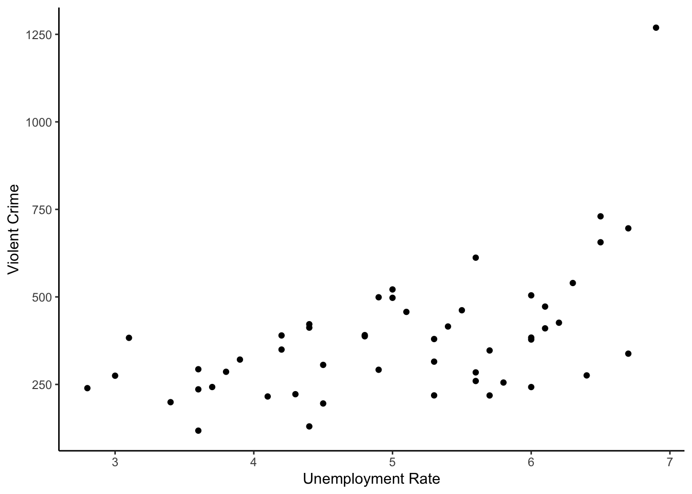
Here, there appears to be some relationship with states that have higher rates of unemployment having slightly more violent crimes, but violent crimes is not adjusted by population, so this is likely not that helpful.
What about the relationship between fatal police shootings and gun
ownership as a percent of firearm suicides to all suicides.
# violent crimes
ggplot(firearms,
       aes(x = gunshot_rate,
           y = ownership)) +
  geom_point() +
  labs(x = "Annualized Rate of Fatal \n Police Shootings per 1,000,000",
       y = "Gun Ownership \n (firearm suicides:all suicides)") +
  theme_classic()
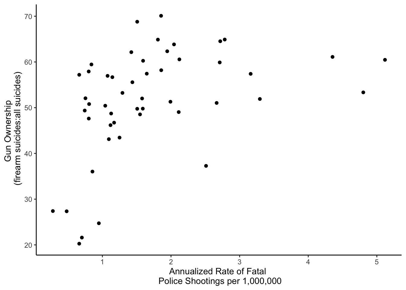
This suggests that states with more fatal police shootings tend to have more firearm suicides relative to non-firearm suicides; however, this relationship is non linear.
With these plots, we’re starting to get an understanding of the data and see that there are patterns and don’t appear to be wild outliers in any one variable (although, we should keep an eye on Washington, D.C. as it appeared as an outlier in a few plots). With that we’re confident we can move on to start looking into our question of interest.
Subsubsection 4.10.2.2 Q: Relationship between Fatal Police Shootings and Legislation?
Ultimately, we’re interested in firearm legislation and fatal police shootings, so let’s focus in on Brady scores here, which measure legislation and
gunshot_tally, a measure of the rate of fatal police shootings.
We see that the average
brady_score (mean) is r round(mean(firearms$brady_scores, na.rm = TRUE), 2), with state values ranging from r round(min(firearms$brady_scores, na.rm = TRUE), 2) to r round(max(firearms$brady_scores, na.rm = TRUE), 2).
When it comes to the rate of police shootings (
gunshot_rate), we see the average number (mean) for a state is is r round(mean(firearms$gunshot_rate, na.rm = TRUE), 2), with state values ranging from r round(min(firearms$gunshot_rate, na.rm = TRUE), 2) to r round(max(firearms$gunshot_rate, na.rm = TRUE), 2), depending on the state.
To start to understand the relationship between the two, we’ll want to visualize this relationship using a scatterplot:
# visualize legistlation and shootings
ggplot(firearms, aes(x = brady_scores,
                     y = gunshot_rate)) +
  geom_point() +
  labs(x = "Firearm Legislative Strength Score",
       y = "Annualized Rate of Fatal \n Police Shootings per 1,000,000") +
  theme_classic()
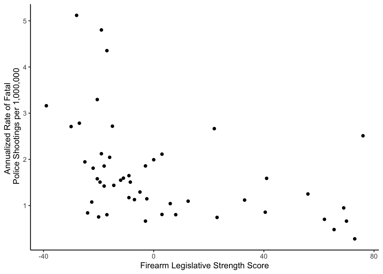
In this plot, we see that there is a relationship, but it is non-linear. Overall, the higher the legislative strength score (
brady_scores), the lower the rate of police shootings; however, this decrease is nonlinear, as all states with a positive Brady Score have a similar police shooting rate.
For now, we won’t explore a model, but we will label the points to better contextualize the information displayed. To see which states are at either end of the distribution, using
geom_text() is a good option:
# label points with state name
ggplot(firearms, aes(x = brady_scores,
                     y = gunshot_rate)) +
  geom_point() +
  labs(x = "Firearm Legislative Strength Score",
       y = "Annualized Rate of Fatal \n Police Shootings per 1,000,000") +
  theme_classic() +
  geom_text(aes(label = NAME),
            nudge_x = 7)
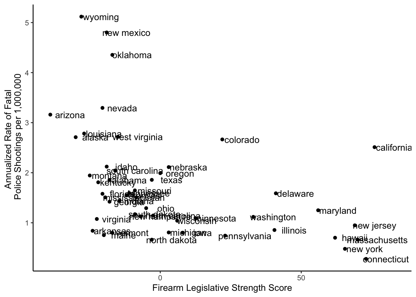
This makes it clear that Wyoming, New Mexico, Oklahoma, Arizona, and Nevada have some of the highest rates of fatal police shootings, while Connecticut, New York, Pennsylvania, and North Dakota are among the lowest.
However, a number of labels overlap there, so it can be helpful to use
ggrepel if you want to be able to match each point to its label:
library(ggrepel)

# repel points with state name
ggplot(firearms, aes(x = brady_scores,
                     y = gunshot_rate)) +
  geom_point() +
  labs(x = "Firearm Legislative Strength Score",
       y = "Annualized Rate of Fatal \n Police Shootings per 1,000,000") +
  theme_classic() +
  geom_text_repel(aes(label = NAME))
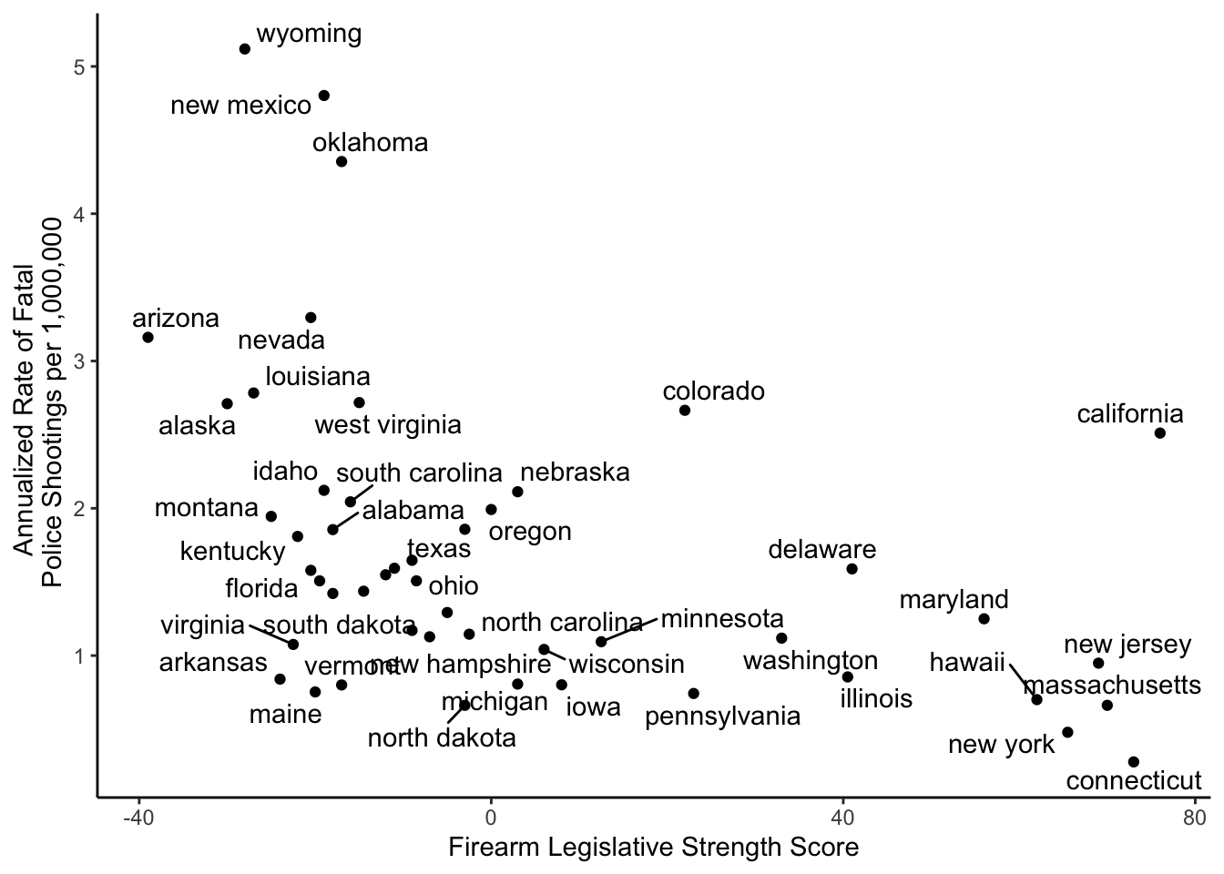
If we wanted to save this particular plot as a pdf, we could do so like this to save the plot in a directory called exploratory within a directory called figures:
pdf(here::here("figures", "exploratory", "Fatal_police_shootings_and_firearm_legislative_strength.pdf"))

ggplot(firearms, aes(x = brady_scores,
                     y = gunshot_rate)) +
  geom_point() +
  labs(x = "Firearm Legislative Strength Score",
       y = "Annualized Rate of Fatal \n Police Shootings per 1,000,000") +
  theme_classic() +
  geom_text_repel(aes(label = NAME))

dev.off()

