Before we introduce the model needed for simple linear regression, we present an example. Why do some countries exhibit high fertility rates while others have significantly lower ones? Are there correlations between fertility rates and life expectancy across different continents and nations? Could underlying socioeconomic factors be influencing these trends?
These are all questions that are of interest to demographers and policy makers, as understanding fertility rates is important for planning and development. By analyzing the dataset of UN member states, which includes variables such as country codes (ISO), fertility rates, and life expectancy for 2022, researchers can uncover patterns and make predictions about fertility rates based on life expectancy.
In this section, we aim to explain differences in fertility rates as a function of one numerical variable: life expectancy. Could it be that countries with higher life expectancy also have lower fertility rates? Could it be instead that countries with higher life expectancy tend to have higher fertility rates? Or could it be that there is no relationship between life expectancy and fertility rates? We answer these questions by modeling the relationship between fertility rates and life expectancy using simple linear regression where we have:
The data on the current UN member states (as of 2024) can be found in the un_member_states_2024 data frame included in the moderndive package. However, to keep things simple we include only those rows that don’t have missing data with na.omit() and select() only the subset of the variables we’ll consider in this chapter, and save this data in a new data frame called UN_data_ch5:
A crucial step before doing any kind of analysis or modeling is performing an exploratory data analysis, or EDA for short. EDA gives you a sense of the distributions of the individual variables in your data, whether any potential relationships exist between variables, whether there are outliers and/or missing values, and (most importantly) how to build your model. Here are three common steps in an EDA:
We perform the first common step in an exploratory data analysis: looking at the raw data values. Because this step seems so trivial, unfortunately many data analysts ignore it. However, getting an early sense of what your raw data looks like can often prevent many larger issues down the road.
Observe that Rows:181 indicates that there are 181 rows/observations in UN_data_ch5 after filtering out the missing values, where each row corresponds to one observed country/member state. It is important to note that the observational unit is an individual country. Recall that the observational unit is the “type of thing” that is being measured by our variables.
A full description of all the variables included in un_member_states_2024 can be found by reading the associated help file (run ?un_member_states_2024 in the console). Let’s describe only the variables we selected in UN_data_ch5:
fert_rate: A numerical variable representing the country’s fertility rate in 2022 corresponding to the expected number of children born per woman in child-bearing years. This is the outcome variable \(y\) of interest.
life_exp: A numerical variable representing the country’s average life expectancy in 2022 in years. This is the primary explanatory variable \(x\) of interest.
obes_rate: A numerical variable representing the country’s obesity rate in 2016. This will be another explanatory variable \(x\) that we use in the Learning check at the end of this subsection.
An alternative way to look at the raw data values is by choosing a random sample of the rows in UN_data_ch5 by piping it into the slice_sample() function from the dplyr package. Here we set the n argument to be 5, indicating that we want a random sample of 5 rows. Note that due to the random nature of the sampling, you will likely end up with a different subset of 5 rows.
We have looked at the raw values in our UN_data_ch5 data frame and got a preliminary sense of the data. We can now compute summary statistics. We start by computing the mean and median of our numerical outcome variable fert_rate and our numerical explanatory variable life_exp. We do this by using the summarize() function from dplyr along with the mean() and median() summary functions.
However, what if we want other summary statistics as well, such as the standard deviation (a measure of spread), the minimum and maximum values, and various percentiles?
Typing all these summary statistic functions in summarize() would be long and tedious. Instead, we use the convenient tidy_summary() function in the moderndive package. This function takes in a data frame, summarizes it, and returns commonly used summary statistics in tidy format. We take our UN_data_ch5 data frame, select() only the outcome and explanatory variables fert_rate and life_exp, and pipe them into the tidy_summary function:
Looking at this output, we can see how the values of both variables distribute. For example, the median fertility rate was 2, whereas the median life expectancy was 75.14 years. The middle 50% of fertility rates was between 1.6 and 3.2 (the first and third quartiles), and the middle 50% of life expectancies was from 69.36 to 78.31.
The tidy_summary() function only returns what are known as univariate summary statistics: functions that take a single variable and return some numerical summary of that variable. However, there also exist bivariate summary statistics: functions that take in two variables and return some summary of those two variables.
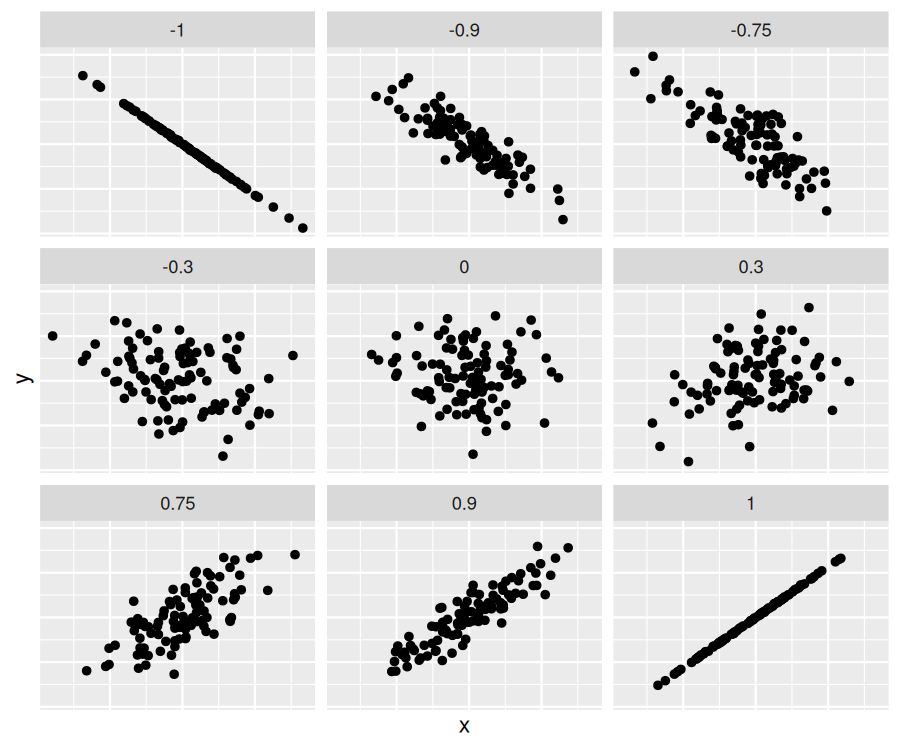
In particular, when the two variables are numerical, we can compute the correlation coefficient. Generally speaking, coefficients are quantitative expressions of a specific phenomenon. A correlation coefficient measures the strength of the linear relationship between two numerical variables. Its value goes from -1 and 1 where:
+1 indicates a perfect positive relationship: As the value of one variable goes up, the value of the other variable tends to go up as well in a linear fashion.
For example, observe in the top right plot that for a correlation coefficient of -0.75 there is a negative linear relationship between \(x\) and \(y\text{,}\) but it is not as strong as the negative linear relationship between \(x\) and \(y\) when the correlation coefficient is -0.9 or -1.
The correlation coefficient can be computed using the get_correlation() function in the moderndive package. In this case, the inputs to the function are the two numerical variables for which we want to calculate the correlation coefficient.
We put the name of the outcome variable on the left-hand side of the ~ “tilde” sign, while putting the name of the explanatory variable on the right-hand side. This is known as R’s formula notation. We will use this same “formula” syntax with regression later in this chapter.
In our case, the correlation coefficient of -0.812 indicates that the relationship between fertility rate and life expectancy is “moderately negative.” There is a certain amount of subjectivity in interpreting correlation coefficients, especially those that are not close to the extreme values of -1, 0, and 1. To develop your intuition about correlation coefficients, play the “Guess the Correlation” 1980’s style video game mentioned in Subsection 5.4.1.
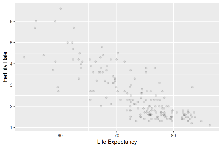
We now perform the last step in EDA: creating data visualizations. Since both the fert_rate and life_exp variables are numerical, a scatterplot is an appropriate graph to visualize this data. We do this using geom_point() and display the result in Figure 5.1.2. Furthermore, we set the alpha value to 0.1 to check for any overplotting.
We do not see much for overplotting due to little to no overlap in the points. Most life expectancy entries appear to fall between 70 and 80 years, while most fertility rate entries fall between 1.5 and 3.5 births. Furthermore, while opinions may vary, it is our opinion that the relationship between fertility rate and life expectancy is “moderately negative.” This is consistent with our earlier computed correlation coefficient of -0.812.
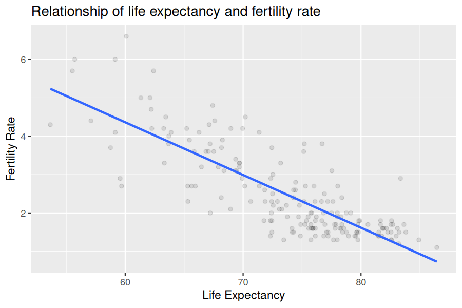
We build on the scatterplot in Figure 5.1.2 by adding a “best-fitting” line: of all possible lines we can draw on this scatterplot, it is the line that “best” fits through the cloud of points. We do this by adding a new geom_smooth(method = "lm", se = FALSE) layer to the ggplot() code that created the scatterplot in Figure 5.1.2. The method = "lm" argument sets the line to be a “linear model.” The se = FALSE argument suppresses standard error uncertainty bars. (We’ll define the concept of standard error later in Subsection 7.3.4.)
The line in the resulting Figure 5.1.3 is called a “regression line.” The regression line is a visual summary of the relationship between two numerical variables, in our case the outcome variable fert_rate and the explanatory variable life_exp. The negative slope of the blue line is consistent with our earlier observed correlation coefficient suggesting that there is a negative relationship between these two variables: as a country’s population has higher life expectancy it tends to have a lower fertility rate. We’ll see later, however, that while the correlation coefficient and the slope of a regression line always have the same sign (positive or negative), they typically do not have the same value.
Furthermore, a regression line is “best-fitting” in that it minimizes some mathematical criteria. We present these mathematical criteria in Subsection 5.3.2, but we suggest you read this subsection only after first reading the rest of this section on regression with one numerical explanatory variable.
Conduct a new exploratory data analysis with the same outcome variable \(y\) being fert_rate but with obes_rate as the new explanatory variable \(x\text{.}\) Remember, this involves three things:
EDA = raw data + summaries + plot. The scatterplot with the regression line and the correlation quantify direction/strength. This data shows a negative association between obesity rate and fertility rate (points slope down; negative correlation): as obesity rate increases, fertility rate tends to decrease.
You may recall from secondary/high school algebra that the equation of a line is \(y = a + b\cdot x\text{.}\) (Note that the \(\cdot\) symbol is equivalent to the \(\times\) “multiply by” mathematical symbol. We’ll use the \(\cdot\) symbol in the rest of this book as it is more succinct.) It is defined by two coefficients \(a\) and \(b\text{.}\) The intercept coefficient \(a\) is the value of \(y\) when \(x = 0\text{.}\) The slope coefficient \(b\) for \(x\) is the increase in \(y\) for every increase of one in \(x\text{.}\) This is also called the “rise over run.”
However, when defining a regression line like the one in Figure 5.1.3, we use slightly different notation: the equation of the regression line is \(\widehat{y} = b_0 + b_1 \cdot x\). The intercept coefficient is \(b_0\text{,}\) so \(b_0\) is the value of \(\widehat{y}\) when \(x = 0\text{.}\) The slope coefficient for \(x\) is \(b_1\text{,}\) i.e., the increase in \(\widehat{y}\) for every increase of one in \(x\text{.}\) Why do we put a “hat” on top of the \(y\text{?}\) It’s a form of notation commonly used in regression to indicate that we have a fitted value, or the value of \(y\) on the regression line for a given \(x\) value as discussed further in Subsection 5.1.3.
We know that the regression line in Figure 5.1.3 has a negative slope \(b_1\) corresponding to our explanatory \(x\) variable life_exp. Why? Because as countries tend to have higher life_exp values, they tend to have lower fert_rate values. However, what is the numerical value of the slope \(b_1\text{?}\) What about the intercept \(b_0\text{?}\) We do not compute these two values by hand, but rather we use a computer!
We can obtain the values of the intercept \(b_0\) and the slope for life_exp\(b_1\) by outputting the linear regression coefficients. This is done in two steps:
# Fit regression model:
demographics_model <- lm(fert_rate ~ life_exp, data = UN_data_ch5)
# Get regression coefficients
coef(demographics_model)
We first focus on interpreting the regression coefficients, and later revisit the code that produced it. The coefficients are the intercept \(b_0\) and the slope \(b_1\) for life_exp. Thus the equation of the regression line in Figure 5.1.3 follows:
The intercept \(b_0 = 12.599\) is the average fertility rate \(\widehat{y} = \widehat{\text{fertility\_rate}}\) for those countries that had a life_exp of 0. Or in graphical terms, where the line intersects the \(y\) axis for \(x = 0\text{.}\) Note, however, that while the intercept of the regression line has a mathematical interpretation, it has no practical interpretation here, since observing a life_exp of 0 is impossible. Furthermore, looking at the scatterplot with the regression line in Figure 5.1.3, no countries had a life expectancy anywhere near 0.
Of greater interest is the slope \(b_{\text{life\_expectancy}}\) for life_exp of \(-0.137\text{.}\) This summarizes the relationship between the fertility rate and life expectancy variables. Note that the sign is negative, suggesting a negative relationship between these two variables. This means countries with higher life expectancies tend to have lower fertility rates. Recall that the correlation coefficient is -0.812. They both have the same negative sign, but have a different value. Recall also that the correlation’s interpretation is the “strength of linear association.” The slope’s interpretation is a little different:
We only state that there is an associated increase and not necessarily a causal increase. Perhaps it may not be that higher life expectancies directly cause lower fertility rates. Instead, wealthier countries could tend to have stronger educational backgrounds, improved health, a higher standard of living, and have lower fertility rates, while at the same time these wealthy countries also tend to have higher life expectancies. Just because two variables are strongly associated, it does not necessarily mean that one causes the other. This is summed up in the often-quoted phrase, “correlation is not necessarily causation.” We discuss this idea further in Subsection 5.3.1.
Furthermore, we say that this associated decrease is on average 0.137 units because you might have two countries whose life_exp values differ by 1 unit, but their difference in fertility rates may not be exactly \(-0.137\text{.}\) What the slope of \(-0.137\) is saying is that across all possible countries, the average difference in fertility rate between two countries whose life expectancies differ by one is \(-0.137\text{.}\)
Now that we have learned how to compute the equation for the regression line in Figure 5.1.3 using the model coefficient values and how to interpret the resulting intercept and slope, we revisit the code that generated these coefficients:
# Fit regression model:
demographics_model <- lm(fert_rate ~ life_exp, data = UN_data_ch5)
# Get regression coefficients:
coef(demographics_model)
First, we “fit” the linear regression model to the data using the lm() function and save this as demographics_model. When we say “fit,” we mean “find the best fitting line to this data.” lm() stands for “linear model” and is used as lm(y ~ x, data = df_name) where:
The combination of y ~ x is called a model formula. (Note the order of y and x.) In our case, the model formula is fert_rate ~ life_exp. We saw such model formulas earlier with the get_correlation() function in Subsection 5.1.1.
Second, we take the saved model in demographics_model and apply the coef() function to it to obtain the regression coefficients. This gives us the components of the regression equation line: the intercept \(b_0\) and the slope \(b_1\text{.}\)
Fit a simple linear regression using lm(fert_rate ~ obes_rate, data = UN_data_ch5) where obes_rate is the new explanatory variable \(x\text{.}\) Learn about the “best-fitting” line from the regression coefficients by applying the coef() function. How do the regression results match up with your earlier exploratory data analysis?
The slope sign should match your EDA: typically negative, meaning higher obesity rate is associated with lower fertility. The magnitude tells how much fertility changes per 1-point increase in obesity (on average). If your plot/correlation looked negative, a negative fitted slope confirms that.
B. \(b_0\) is the predicted response when \(x = 0\). It may be outside the data’s range (so often not substantively meaningful), but that’s the definition.
Subsection5.1.3Observed/fitted values and residuals
We just saw how to get the value of the intercept and the slope of a regression line from the output of the coef() function. Now instead say we want information on individual observations. For example, we focus on the 21st of the countries in the UN_data_ch5 data frame in Table Table 5.1.4. This corresponds to the UN member state of Bosnia and Herzegovina (BIH).
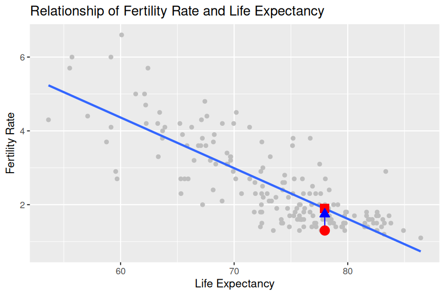
What is the value \(\widehat{y}\) on the regression line corresponding to this country’s life_exp value? In Figure 5.1.5 we mark three values corresponding to these results for Bosnia and Herzegovina and give their statistical names:
Square: The fitted value\(\widehat{y}\) is the value on the regression line for that \(x = \texttt{life\_exp} = 77.98\) value, computed with the intercept and slope in the regression table:
Arrow: The length of this arrow is the residual and is computed by subtracting the fitted value \(\widehat{y}\) from the observed value \(y\text{.}\) The residual can be thought of as a model’s error or “lack of fit” for a particular observation. In the case of this country \(y-\widehat{y} = 1.3 - 1.894 = -0.594\)
Now say we want to compute both the fitted value \(\widehat{y} = b_0 + b_1 \cdot x\) and the residual \(y - \widehat{y}\) for all UN member states with complete data as of 2024. Recall that each country corresponds to one of the rows in the UN_data_ch5 data frame and also one of the points in the regression plot in Figure 5.1.5.
We could repeat the previous calculations we performed by hand for all countries, but that would be tedious and time consuming. Instead, we use a computer with the get_regression_points() function. We apply the get_regression_points() function to demographics_model, which is where we saved our lm() model in the previous section. In Table 5.1.6 we present the results of only the 21st through 24th courses for brevity.
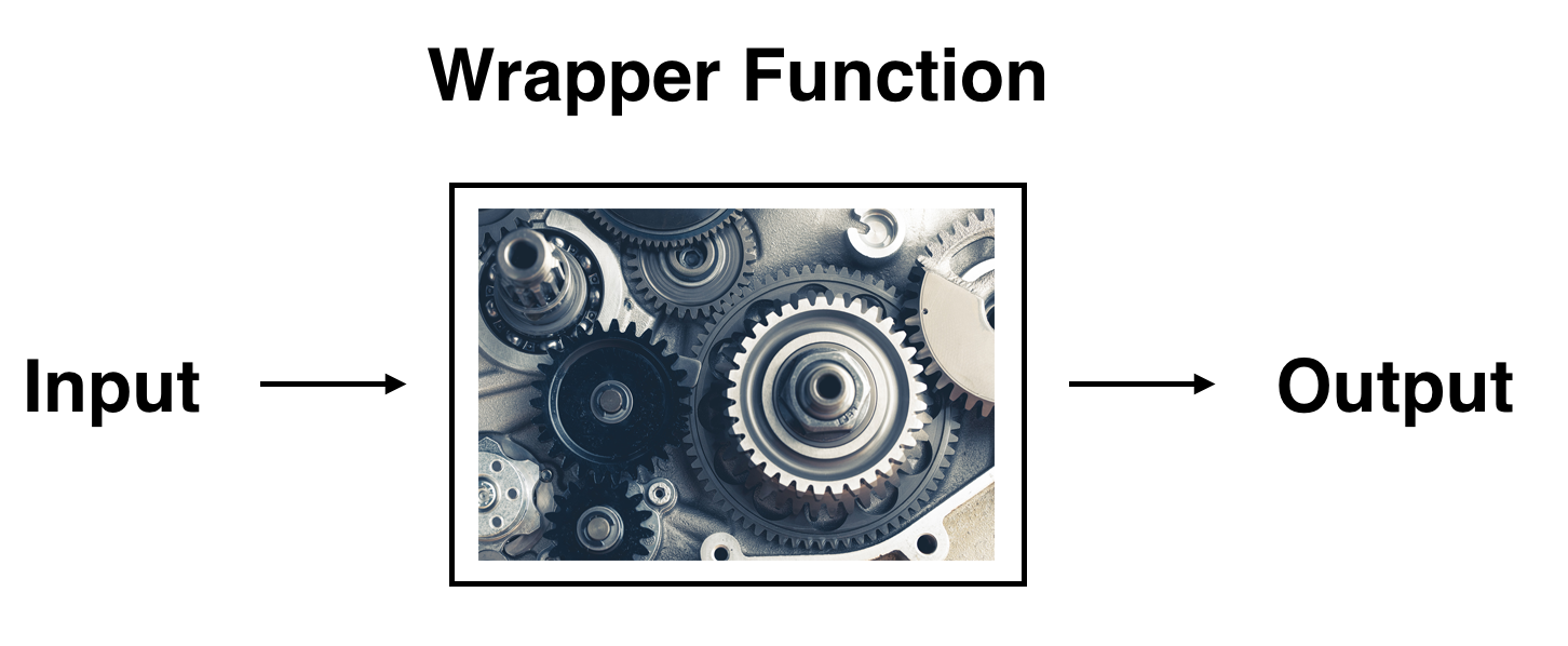
This function is an example of what is known in computer programming as a wrapper function. It takes other pre-existing functions and “wraps” them into a single function that hides its inner workings. This concept is illustrated in Figure 5.1.7.
So all you need to worry about is what the inputs look like and what the outputs look like; you leave all the other details “under the hood of the car.” In our regression modeling example, the get_regression_points() function takes a saved lm() linear regression model as input and returns a data frame of the regression predictions as output. If you are interested in learning more about the get_regression_points() function’s inner workings, check out Subsection 5.3.3.
The fert_rate_hat column represents the fitted values \(\widehat{y}\text{.}\) This is the corresponding value on the regression line for the 181 \(x\) values.
The residual column represents the residuals \(y - \widehat{y}\text{.}\) This is the 181 vertical distances between the 181 black points and the regression line.
Just as we did for the 21st country in the UN_data_ch5 dataset, we repeat the calculations for the 24th country. This corresponds to the country of Brunei (BRN):
residual\(= 0.165 = 1.7 - 1.535\) is the value of the residual for this country. In other words, the model’s fitted value was off by the residual value in fertility rate units for Brunei.
If you like, you can skip ahead to Subsection 5.3.2 to learn about the processes behind what makes “best-fitting” regression lines. As a primer, a “best-fitting” line refers to the line that minimizes the sum of squared residuals out of all possible lines we can draw through the points. In Section 5.2, we’ll discuss another common scenario of having a categorical explanatory variable and a numerical outcome variable.
get_regression_points() returns observed \(y\text{,}\) fitted \(\hat{y}\text{,}\) and residuals \(y - \hat{y}\) in a tidy frame, perfect for diagnostics and sorting.