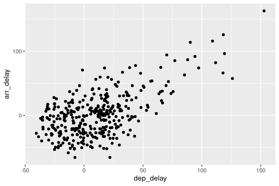
The simplest of the 5NG are scatterplots, also called bivariate plots. They allow you to visualize the relationship between two numerical variables. While you may already be familiar with scatterplots, let’s view them through the lens of the grammar of graphics we presented in Section 2.1. Specifically, we will visualize the relationship between the following two numerical variables in the envoy_flights data frame included in the moderndive package:
for Envoy Airlines flights leaving NYC in 2023. In other words, envoy_flights does not consist of all flights that left NYC in 2023, but rather only those flights where carrier is MQ (which is Envoy Airlines’ carrier code).
Take a look at both the flights data frame from the nycflights23 package and the envoy_flights data frame from the moderndive package by running View(flights) and View(envoy_flights). In what respect do these data frames differ? For example, think about the number of rows in each dataset.
Let’s now go over the code that will create the desired scatterplot, while keeping in mind the grammar of graphics framework we introduced in Section 2.1. Let’s take a look at the code and break it down piece-by-piece.
The aesthetic mapping by setting mapping = aes(x = dep_delay, y = arr_delay). Specifically, the variable dep_delay maps to the x position aesthetic, while the variable arr_delay maps to the y position.
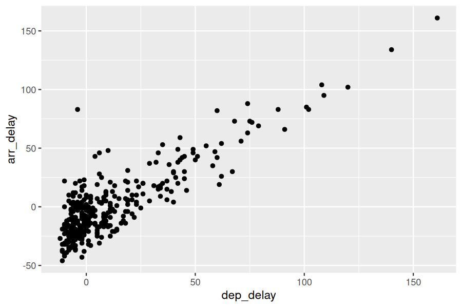
We then add a layer to the ggplot() function call using the + sign. The added layer in question specifies the third component of the grammar: the geometric object. In this case, the geometric object is set to be points by specifying geom_point(). After running these two lines of code in your console, you’ll notice two outputs: a warning message and the graphic shown in Figure 2.3.2.
Let’s first unpack the graphic in Figure 2.3.2. Observe that a positive relationship exists between dep_delay and arr_delay: as departure delays increase, arrival delays tend to also increase. Observe also the large mass of points clustered near (0, 0), the point indicating flights that neither departed nor arrived late.
Let’s turn our attention to the warning message. R is alerting us to the fact that three rows were ignored due to them being missing. For these three rows, either the value for dep_delay or arr_delay or both were missing (recorded in R as NA), and thus these rows were ignored in our plot.
Before we continue, let’s make a few more observations about this code that created the scatterplot. Note that the + sign comes at the end of lines, and not at the beginning. You’ll get an error in R if you put it at the beginning of a line. When adding layers to a plot, you are encouraged to start a new line after the + (by pressing the Return/Enter button on your keyboard) so that the code for each layer is on a new line. As we add more and more layers to plots, you’ll see this will greatly improve the legibility of your code.
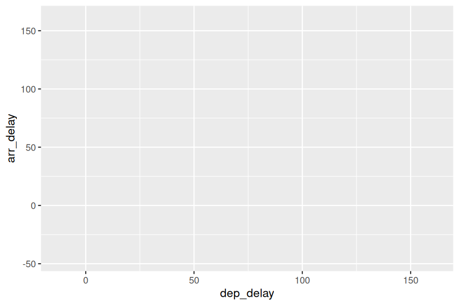
To stress the importance of adding the layer specifying the geometric object, consider Figure 2.3.3 where no layers are added. Because the geometric object was not specified, we have a blank plot that is not very useful!
What variables in the weather data frame would you expect to have a negative correlation (i.e., a negative relationship) with dep_delay? Why? Remember that we are focusing on numerical variables here. Hint: Explore the weather dataset by using the View() function.
The large mass of points near (0, 0) in Figure 2.3.2 can cause some confusion since it is hard to tell the true number of points that are plotted. This is the result of a phenomenon called overplotting. As one may guess, this corresponds to points being plotted on top of each other over and over again. When overplotting occurs, it is difficult to know the number of points being plotted. There are two methods to address the issue of overplotting. Either by
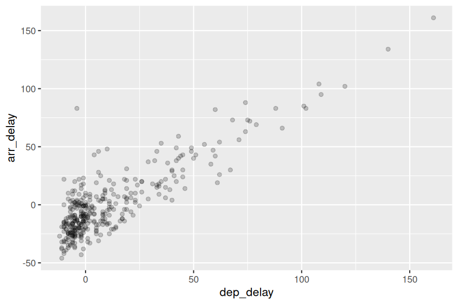
The first way of addressing overplotting is to change the transparency/opacity of the points by setting the alpha argument in geom_point(). We can change the alpha argument to be any value between 0 and 1, where 0 sets the points to be 100% transparent and 1 sets the points to be 100% opaque. By default, alpha is set to 1. In other words, if we don’t explicitly set an alpha value, R will use alpha = 1.
Note how the following code is identical to the code in Section 2.3 that created the scatterplot with overplotting, but with alpha = 0.2 added to the geom_point() function:
The key feature to note in Figure 2.3.9 is that the transparency of the points is cumulative: areas with a high-degree of overplotting are darker, whereas areas with a lower degree are less dark. Note, furthermore, that there is no aes() surrounding alpha = 0.2. This is because we are not mapping a variable to an aesthetic attribute, but rather merely changing the default setting of alpha. In fact, you’ll receive an error if you try to change the second line to read geom_point(aes(alpha = 0.2)).
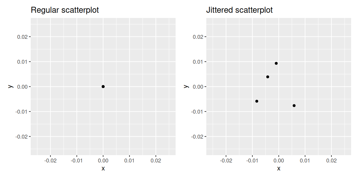
The second way of addressing overplotting is by jittering all the points. This means giving each point a small “nudge” in a random direction. You can think of “jittering” as shaking the points around a bit on the plot. Let’s illustrate using a simple example first. Say we have a data frame with 4 identical rows of x and y values: (0,0), (0,0), (0,0), and (0,0). In Figure 2.3.10, we present both the regular scatterplot of these 4 points (on the left) and its jittered counterpart (on the right).
In the left-hand regular scatterplot, observe that the 4 points are superimposed on top of each other. While we know there are 4 values being plotted, this fact might not be apparent to others. In the right-hand jittered scatterplot, it is now plainly evident that this plot involves four points since each point is given a random “nudge.”
Keep in mind, however, that jittering is strictly a visualization tool; even after creating a jittered scatterplot, the original values saved in the data frame remain unchanged.
To create a jittered scatterplot, instead of using geom_point(), we use geom_jitter(). Observe how the following code is very similar to the code that created the scatterplot with overplotting in Subsection 2.3.1, but with geom_point() replaced with geom_jitter().
In order to specify how much jitter to add, we adjusted the width and height arguments to geom_jitter(). This corresponds to how hard you’d like to shake the plot in horizontal x-axis units and vertical y-axis units, respectively. In this case, both axes are in minutes. How much jitter should we add using the width and height arguments? On the one hand, it is important to add just enough jitter to break any overlap in points, but on the other hand, not so much that we completely alter the original pattern in points.
As can be seen in the resulting Figure 2.3.11, in this case jittering doesn’t really provide much new insight. In this particular case, it can be argued that changing the transparency of the points by setting alpha proved more effective. When would it be better to use a jittered scatterplot? When would it be better to alter the points’ transparency? There is no single right answer that applies to all situations. You need to make a subjective choice and own that choice. At the very least when confronted with overplotting, however, we suggest you make both types of plots and see which one better emphasizes the point you are trying to make.
After viewing Figure 2.3.9, give an approximate range of arrival delays and departure delays that occur most frequently. How has that region changed compared to when you observed the same plot without alpha = 0.2 set in Figure 2.3.2?
Scatterplots display the relationship between two numerical variables. They are among the most commonly used plots because they can provide an immediate way to see the trend in one numerical variable versus another. However, if you try to create a scatterplot where either one of the two variables is not numerical, you might get strange results. Be careful!
With medium to large datasets, you may need to play around with the different modifications to scatterplots we saw such as changing the transparency/opacity of the points or by jittering the points. This tweaking is often a fun part of data visualization, since you’ll have the chance to see different relationships emerge as you tinker with your plots.