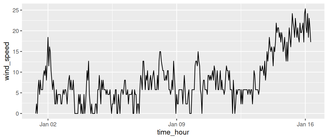
The next of the five named graphs are linegraphs. Linegraphs show the relationship between two numerical variables when the variable on the x-axis, also called the explanatory variable, is of a sequential nature. In other words, there is an inherent ordering to the variable.
The most common examples of linegraphs have some notion of time on the x-axis: hours, days, weeks, years, etc. Since time is sequential, we connect consecutive observations of the variable on the y-axis with a line. Linegraphs that have some notion of time on the x-axis are also called time series plots . Let’s illustrate linegraphs using another dataset in the nycflights23 package: the weather data frame.
Let’s explore the weather data frame from the nycflights23 package by running View(weather) and glimpse(weather). Furthermore, let’s read the associated help file by running ?weather to bring up the help file.
Observe that there is a variable called wind_speed of hourly wind speed recordings in miles per hour at weather stations near all three major airports in New York City: Newark (origin code EWR), John F. Kennedy International (JFK), and LaGuardia (LGA).
However, instead of considering hourly wind speeds for all days in 2023 for all three airports, for simplicity let’s only consider hourly wind speeds at Newark airport for the first 15 days in January. This data is accessible in the early_january_2023_weather data frame included in the moderndive package. In other words, early_january_2023_weather contains hourly weather observations for origin equal to EWR (Newark’s airport code), month equal to 1, and day less than or equal to 15.
Take a look at both the weather data frame from the nycflights23 package and the early_january_2023_weather data frame from the moderndive package by running View(weather) and View(early_january_2023_weather). In what respect do these data frames differ?
View() the flights data frame again. Why does the time_hour variable uniquely identify the hour of the measurement, whereas the hour variable does not?
Let’s create a time series plot (as seen in Figure 2.4.3) of the hourly wind speeds saved in the early_january_2023_weather data frame by using geom_line() to create a linegraph , instead of using geom_point() like we used previously to create scatterplots:
Much as with the ggplot() code that created the scatterplot of departure and arrival delays for Envoy Air flights in Figure 2.3.2, let’s break down this code piece-by-piece in terms of the grammar of graphics:
The aesthetic mapping by setting mapping = aes(x = time_hour, y = wind_speed). Specifically, the variable time_hour maps to the x position aesthetic, while the variable wind_speed maps to the y position aesthetic.
We add a layer to the ggplot() function call using the + sign. The layer in question specifies the third component of the grammar: the geometric object in question. In this case, the geometric object is a line set by specifying geom_line().
Plot a time series of a variable other than wind_speed for Newark Airport in the first 15 days of January 2023. Try to select a variable that doesn’t have a lot of missing (NA) values.
Linegraphs, just like scatterplots, display the relationship between two numerical variables. However, it is preferred to use linegraphs over scatterplots when the variable on the x-axis (i.e., the explanatory variable) has an inherent ordering, such as some notion of time.