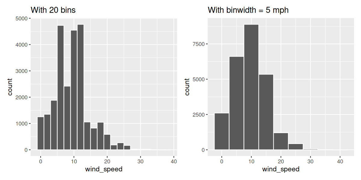
What does changing the number of bins from 30 to 20 tell us about the distribution of wind speeds?
Section 2.5 5NG#3: Histograms
Let’s consider the
wind_speed variable in the weather data frame once again, but unlike with the linegraphs in Section 2.4, let’s say we don’t care about its relationship with time, but rather we only care about how the values of wind_speed distribute. In other words:
-
What are the smallest and largest values?
-
What is the “center” or “most typical” value?
-
How do the values spread out?
-
What are frequent and infrequent values?
One way to visualize this distribution of this single variable
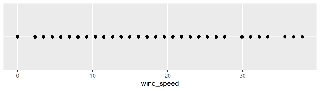
wind_speed is to plot them on a horizontal line as we do in Figure 2.5.1:
This gives us a general idea of how the values of
wind_speed distribute: observe that wind speeds vary from around 0 miles per hour up to around 61 miles per hour (approximately 61 kilometers per hour). There appear to be more recorded wind speeds between 0 and 20 miles per hour (mph) than outside this range. However, because of the high degree of overplotting in the points, it’s hard to get a sense of exactly how many values are between, say, 10 mph and 15 mph.
What is commonly produced instead of Figure 2.5.1 is known as a histogram. A histogram is a plot that visualizes the distribution of a numerical value as follows:
-
We first cut up the x-axis into a series of bins, where each bin represents a range of values.
-
For each bin, we count the number of observations that fall in the range corresponding to that bin.
-
Then for each bin, we draw a bar whose height marks the corresponding count.
Let’s drill-down on an example of a histogram, shown in Figure 2.5.2.
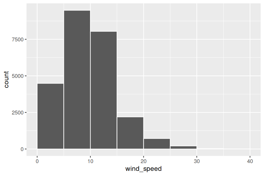
Let’s focus only on wind speeds between 10 mph and 25 mph for now. Observe that there are three bins of equal width between 10 mph and 25 mph. Thus we have three bins of width 5 mph each: one bin for the 10–15 mph range, another bin for the 15–20 mph range, and another bin for the 20–25 mph range. Since:
-
The bin for the 10–15 mph range has a height of around 8000. In other words, around 8000 of the hourly wind speed recordings are between 10 mph and 15 mph.
-
The bin for the 15–20 mph range has a height of around 2400. In other words, around 2400 of the hourly wind speed recordings are between 15 mph and 20 mph.
-
The bin for the 20–25 mph range has a height of around 700. In other words, around 700 of the hourly wind speed recordings are between 20 mph and 25 mph.
All eight bins spanning 0 mph to 40 mph on the x-axis have this interpretation.
Subsection 2.5.1 Histograms via geom_histogram
Let’s now present the
ggplot() code to plot your first histogram! Unlike with scatterplots and linegraphs, there is now only one variable being mapped in aes(): the single numerical variable wind_speed. The y-aesthetic of a histogram, the count of the observations in each bin, gets computed for you automatically. Furthermore, the geometric object layer is now a geom_histogram(). After running the following code, you’ll see the histogram in Figure 2.5.3 as well as warning messages. We’ll discuss the warning messages first.
ggplot(data = weather, mapping = aes(x = wind_speed)) +
  geom_histogram()
`stat_bin()` using `bins=30`. Pick better value with `binwidth`.
Warning: Removed 1033 rows containing non-finite outside the scale range (`stat_bin()`).
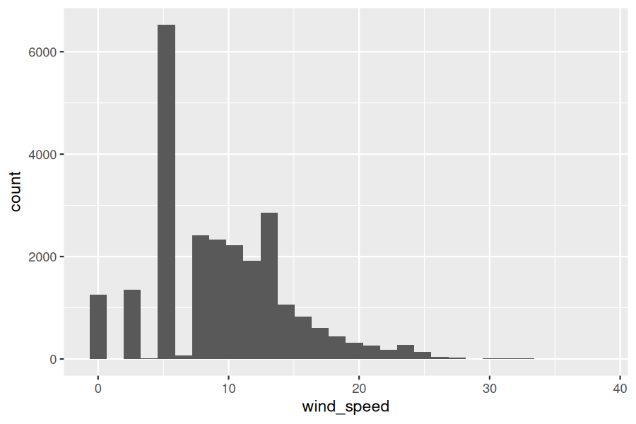
The first message is telling us that the histogram was constructed using
bins = 30 for 30 equally spaced bins. This is known in computer programming as a default value; unless you override this default number of bins with a number you specify, R will choose 30 by default. We’ll see in the next section how to change the number of bins to another value than the default.
The second warning message is telling us something similar to the warning message we received when we ran the code to create a scatterplot of departure and arrival delays for Envoy Air flights in Figure 2.3.2: that because some rows have missing
NA value for wind_speed, they were omitted from the histogram. R is just giving us a friendly heads-up that this was the case.
Now let’s unpack the resulting histogram in Figure 2.5.3. Observe that values above 30 mph are rather rare. However, because of the large number of bins, it’s hard to get a sense for which range of wind speeds is spanned by each bin; everything is one giant amorphous blob. So let’s add white vertical borders demarcating the bins by adding a
color = "white" argument to geom_histogram() and ignore the warning about setting the number of bins to a better value:
ggplot(data = weather, mapping = aes(x = wind_speed)) +
  geom_histogram(color = "white")
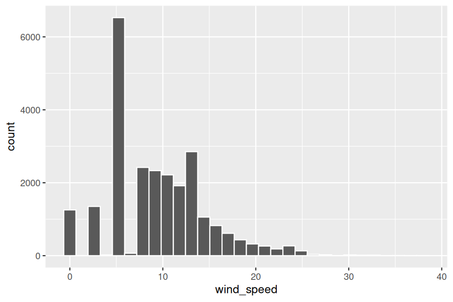
We now have an easier time associating ranges of wind speeds to each of the bins in Figure 2.5.4. We can also vary the color of the bars by setting the
fill argument. For example, you can set the bin colors to be “blue steel” by setting fill = "steelblue":
ggplot(data = weather, mapping = aes(x = wind_speed)) +
  geom_histogram(color = "white", fill = "steelblue")
If you’re curious, run
colors() to see all possible choices of colors in R!
Subsection 2.5.2 Adjusting the bins
Observe in Figure 2.5.4 that in the 10–20 mph range there appear to be roughly 8 bins. Thus each bin has width 10 divided by 8, or 1.125 mph, which is not a very easily interpretable range to work with. Let’s improve this by adjusting the number of bins in our histogram in one of two ways:
-
By adjusting the number of bins via the
binsargument togeom_histogram(). -
By adjusting the width of the bins via the
binwidthargument togeom_histogram().
Using the first method, we have the power to specify how many bins we would like to cut the x-axis up in. As mentioned in the previous section, the default number of bins is 20. We can override this default, to say 20 bins, as follows:
ggplot(data = weather, mapping = aes(x = wind_speed)) +
  geom_histogram(bins = 20, color = "white")
Using the second method, instead of specifying the number of bins, we specify the width of the bins by using the
binwidth argument in the geom_histogram() layer. For example, let’s set the width of each bin to be five mph.
ggplot(data = weather, mapping = aes(x = wind_speed)) +
  geom_histogram(binwidth = 5, color = "white")
We compare both resulting histograms side-by-side in Figure 2.5.5.
Checkpoint 2.5.6. Learning Check 2.14.
Checkpoint 2.5.7. Learning Check 2.15.
Would you classify the distribution of wind speeds as symmetric or skewed in one direction or another?
Checkpoint 2.5.8. Learning Check 2.16.
What would you guess is the “center” value in this distribution? Why did you make that choice?
Checkpoint 2.5.9. Learning Check 2.17.
Is this data spread out greatly from the center or is it close? Why?
Subsection 2.5.3 Summary
Histograms, unlike scatterplots and linegraphs, present information on only a single numerical variable. Specifically, they are visualizations of the distribution of the numerical variable in question.

