Section 2.1 The grammar of graphics
We start with a discussion of a theoretical framework for data visualization known as “the grammar of graphics.” This framework serves as the foundation for the
ggplot2 package which we’ll use extensively in this chapter. Think of how we construct and form sentences in English by combining different elements, like nouns, verbs, articles, subjects, objects, etc. We can’t just combine these elements in any arbitrary order; we must do so following a set of rules known as a linguistic grammar. Similarly to a linguistic grammar, “the grammar of graphics” defines a set of rules for constructing statistical graphics by combining different types of layers. This grammar was created by Leland Wilkinson [2] and has been implemented in a variety of data visualization software platforms like R, but also Plotly and Tableau.
Subsection 2.1.1 Components of the grammar
In short, the grammar tells us that:
A statistical graphic is amappingofdatavariables toaesthetic attributes ofgeometric objects.
Specifically, we can break a graphic into the following three essential components:
-
data: the dataset containing the variables of interest. -
geom: the geometric object in question. This refers to the type of object we can observe in a plot. For example: points, lines, and bars. -
aes: aesthetic attributes of the geometric object. For example, x/y position, color, shape, and size. Aesthetic attributes are mapped to variables in the dataset.
You might be wondering why we wrote the terms
data, geom, and aes in a computer code type font. We’ll see very shortly that we’ll specify the elements of the grammar in R using these terms. However, let’s first break down the grammar with an example.
Subsection 2.1.2 Gapminder data
In February 2006, a Swedish physician and data advocate named Hans Rosling gave a TED talk titled “The best stats you’ve ever seen” where he presented global economic, health, and development data from the website gapminder.org. For example, for data on 142 countries in 2007, let’s consider only a few countries as a peek into the data (see Table 2.1.1).
| Country | Continent | Life Expectancy | Population | GDP per Capita |
|---|---|---|---|---|
| Afghanistan | Asia | 43.83 | 31889923 | 974.58 |
| Albania | Europe | 76.42 | 3600523 | 5937.03 |
| Algeria | Africa | 72.30 | 33333216 | 6223.37 |
Each row in this table corresponds to a country in 2007. For each row, we have 5 columns:
-
Country: Name of country.
-
Continent: Which of the five continents the country is part of. Note that “Americas” includes countries in both North and South America and that Antarctica is excluded.
-
Life Expectancy: Life expectancy in years.
-
Population: Number of people living in the country.
-
GDP per Capita: Gross domestic product (in US dollars).
Now consider Figure 2.1.2, which plots this for all 142 of the data’s countries.
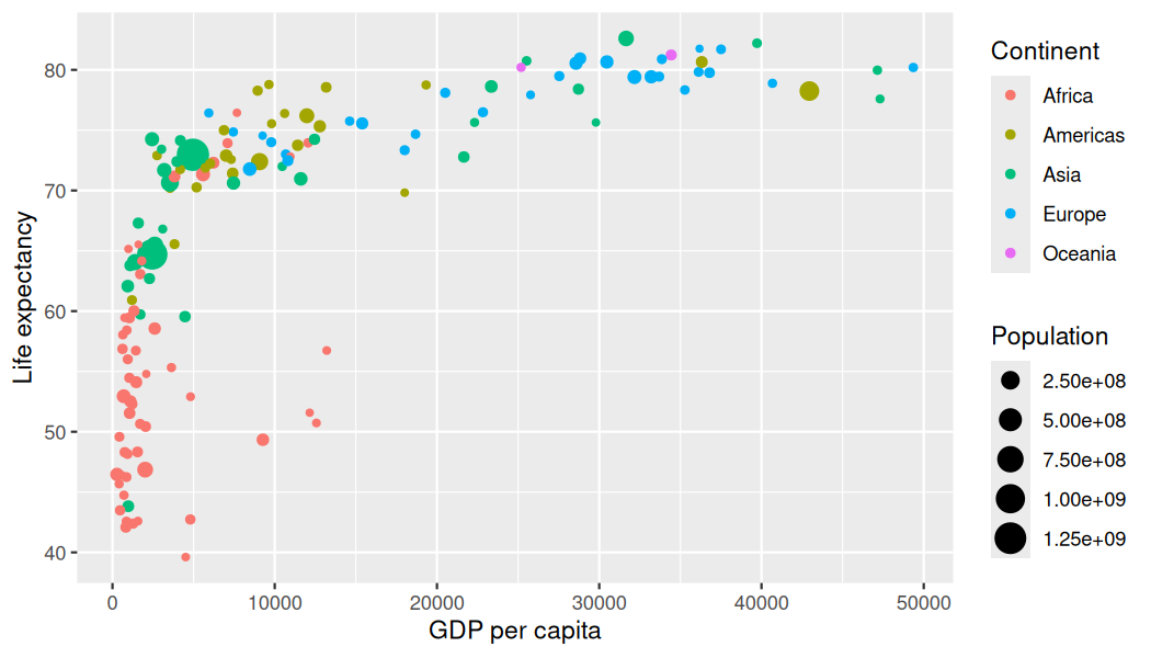
Let’s view this plot through the grammar of graphics:
-
The
datavariable GDP per Capita gets mapped to thex-positionaesthetic of the points. -
The
datavariable Life Expectancy gets mapped to they-positionaesthetic of the points. -
The
datavariable Population gets mapped to thesizeaesthetic of the points. -
The
datavariable Continent gets mapped to thecoloraesthetic of the points.
We’ll see shortly that
data corresponds to the particular data frame where our data is saved and that “data variables” correspond to particular columns in the data frame. Furthermore, the type of geometric object considered in this plot are points. That being said, while in this example we are considering points, graphics are not limited to just points. We can also use lines, bars, and other geometric objects.
Let’s summarize the three essential components of the grammar in Table 2.1.3.
| data variable | aes | geom |
|---|---|---|
| GDP per Capita | x | point |
| Life Expectancy | y | point |
| Population | size | point |
| Continent | color | point |
Subsection 2.1.3 Other components
There are other components of the grammar of graphics we can control as well. As you start to delve deeper into the grammar of graphics, you’ll start to encounter these topics more frequently. In this book, we’ll keep things simple and only work with these two additional components:
-
faceting breaks up a plot into several plots split by the values of another variable (Section 2.6) -
positionadjustments for barplots (Section 2.8)
Other more complex components like
scales and coordinate systems are left for a more advanced text such as R for Data Science [1]. Generally speaking, the grammar of graphics allows for a high degree of customization of plots and also a consistent framework for easily updating and modifying them.
Subsection 2.1.4 ggplot2 package
In this book, we will use the
ggplot2 package for data visualization, which is an implementation of the grammar of graphics for R [14]. As we noted earlier, a lot of the previous section was written in a computer code type font. This is because the various components of the grammar of graphics are specified in the ggplot() function included in the ggplot2 package. For the purposes of this book, we’ll always provide the ggplot() function with the following arguments (i.e., inputs) at a minimum:
-
The data frame where the variables exist: the
dataargument. -
The mapping of the variables to aesthetic attributes: the
mappingargument which specifies theaesthetic attributes involved.
After we’ve specified these components, we then add layers to the plot using the
+ sign. The most essential layer to add to a plot is the layer that specifies which type of geometric object we want the plot to involve: points, lines, bars, and others. Other layers we can add to a plot include the plot title, axes labels, visual themes for the plots, and facets (which we’ll see in Section 2.6).
Let’s now put the theory of the grammar of graphics into practice.

