Why are histograms inappropriate for categorical variables?
Section 2.8 5NG#5: Barplots
Both histograms and boxplots are tools to visualize the distribution of numerical variables. Another commonly desired task is to visualize the distribution of a categorical variable. This is a simpler task, as we are simply counting different categories within a categorical variable, also known as the levels of the categorical variable. Often the best way to visualize these different counts, also known as frequencies, is with barplots (also called barcharts).
One complication, however, is how your data is represented. Is the categorical variable of interest “pre-counted” or not? For example, run the following code that manually creates two data frames representing a collection of fruit: 3 apples and 2 oranges.
fruits <- tibble(fruit = c("apple", "apple", "orange", "apple", "orange"))
fruits_counted <- tibble(
  fruit = c("apple", "orange"),
  number = c(3, 2))
We see both the
fruits and fruits_counted data frames represent the same collection of fruit. Whereas fruits just lists the fruit individually...
fruits
# A tibble: 5 × 1
  fruit
  <chr>
1 apple
2 apple
3 orange
4 apple
5 orange
...
fruits_counted has a variable count which represents the “pre-counted” values of each fruit.
fruits_counted
# A tibble: 2 × 2
  fruit  number
  <chr>  <dbl>
1 apple       3
2 orange      2
Depending on how your categorical data is represented, you’ll need to add a different
geometric layer type to your ggplot() to create a barplot, as we now explore.
Subsection 2.8.1 Barplots via geom_bar or geom_col
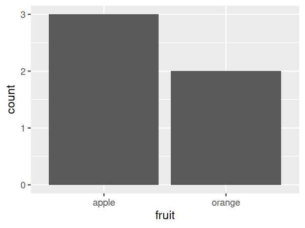
Let’s generate barplots using these two different representations of the same basket of fruit: 3 apples and 2 oranges. Using the
fruits data frame where all 5 fruits are listed individually in 5 rows, we map the fruit variable to the x-position aesthetic and add a geom_bar() layer:
ggplot(data = fruits, mapping = aes(x = fruit)) +
  geom_bar()
However, using the
fruits_counted data frame where the fruits have been “pre-counted,” we once again map the fruit variable to the x-position aesthetic. Here, we also map the count variable to the y-position aesthetic, and add a geom_col() layer instead.
ggplot(data = fruits_counted, mapping = aes(x = fruit, y = number)) +
  geom_col()
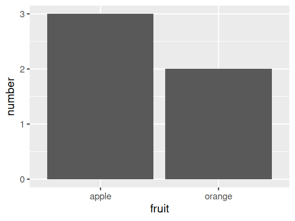
Compare the barplots in Figure 2.8.1 and Figure 2.8.2. They are identical because they reflect counts of the same five fruits. However, depending on how our categorical data is represented, either “pre-counted” or not, we must add a different
geom layer. When the categorical variable whose distribution you want to visualize
-
Is not pre-counted in your data frame, we use
geom_bar(). -
Is pre-counted in your data frame, we use
geom_col()with the y-position aesthetic mapped to the variable that has the counts.
Let’s now go back to the
flights data frame in the nycflights23 package and visualize the distribution of the categorical variable carrier. In other words, let’s visualize the number of domestic flights out of New York City each airline company flew in 2023. Recall from Subsection 1.4.3 when you first explored the flights data frame, you saw that each row corresponds to a flight. In other words, the flights data frame is more like the fruits data frame than the fruits_counted data frame because the flights have not been pre-counted by carrier. Thus we should use geom_bar() instead of geom_col() to create a barplot. Much like a geom_histogram(), there is only one variable in the aes() aesthetic mapping: the variable carrier gets mapped to the x-position. As a difference though, histograms have bars that touch whereas bar graphs have white space between the bars going from left to right.
ggplot(data = flights, mapping = aes(x = carrier)) +
  geom_bar()
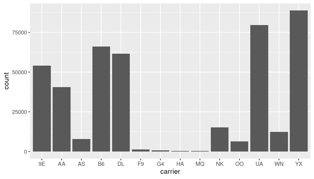
geom_bar().Observe in Figure 2.8.3 that Republic Airline (YX), United Airlines (UA), and JetBlue Airways (B6) had the most flights depart NYC in 2023. If you don’t know which airlines correspond to which carrier codes, then run
View(airlines) to see a directory of airlines. For example, AA is American Airlines Inc. Alternatively, say you had a data frame where the number of flights for each carrier was pre-counted as in Table 2.8.4.
| carrier | number |
|---|---|
| 9E | 54141 |
| AA | 40525 |
| AS | 7843 |
| B6 | 66169 |
| DL | 61562 |
| F9 | 1286 |
| G4 | 671 |
| HA | 366 |
| MQ | 357 |
| NK | 15189 |
| OO | 6432 |
| UA | 79641 |
| WN | 12385 |
| YX | 88785 |
In order to create a barplot visualizing the distribution of the categorical variable
carrier in this case, we would now use geom_col() instead of geom_bar(), with an additional y = number in the aesthetic mapping on top of the x = carrier. The resulting barplot would be identical to Figure 2.8.3.
Checkpoint 2.8.5. Learning Check 2.26.
Checkpoint 2.8.6. Learning Check 2.27.
What is the difference between histograms and barplots?
Checkpoint 2.8.7. Learning Check 2.28.
How many Alaska Air flights departed NYC in 2023?
Checkpoint 2.8.8. Learning Check 2.29.
What was the 7th highest airline for departed flights from NYC in 2023? How could we better present the table to get this answer quickly?
Subsection 2.8.2 Must avoid pie charts!
One of the most common plots used to visualize the distribution of categorical data is the pie chart. While they may seem harmless enough, pie charts actually present a problem in that humans are unable to judge angles well.
As Naomi Robbins describes in her book, Creating More Effective Graphs [3], we overestimate angles greater than 90 degrees and we underestimate angles less than 90 degrees. In other words, it is difficult for us to determine the relative size of one piece of the pie compared to another.
Let’s examine the same data used in our previous barplot of the number of flights departing NYC by airline in Figure 2.8.3, but this time we will use a pie chart in Figure 2.8.9. Try to answer the following questions:
-
How much smaller is the portion of the pie for Hawaiian Airlines Inc. (
HA) compared to United Airlines (UA)? -
What is the third largest carrier in terms of departing flights?
-
How many carriers have fewer flights than Delta Air Lines Inc. (
DL)?
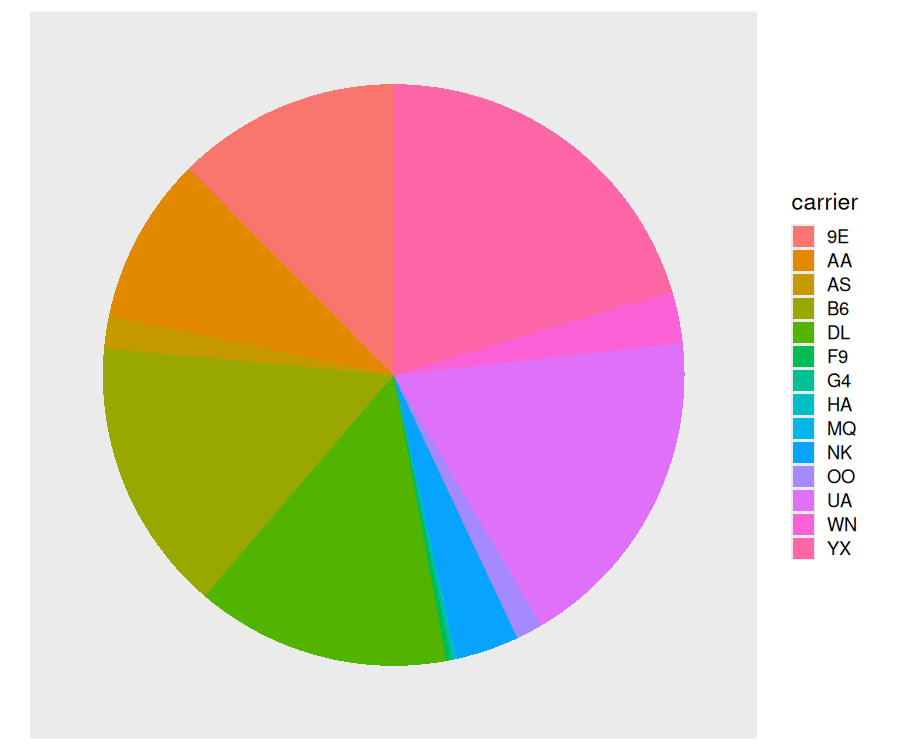
While it is quite difficult to answer these questions when looking at the pie chart in Figure 2.8.9, we can much more easily answer these questions using the barchart in Figure 2.8.3. This is true since barplots present the information in a way such that comparisons between categories can be made with single horizontal lines, whereas pie charts present the information in a way such that comparisons must be made by comparing angles.
Checkpoint 2.8.10. Learning Check 2.30.
Why should pie charts be avoided and replaced by barplots?
Checkpoint 2.8.11. Learning Check 2.31.
Why do you think people continue to use pie charts?
Subsection 2.8.3 Two categorical variables
Barplots are a very common way to visualize the frequency of different categories, or levels, of a single categorical variable. Another use of barplots is to visualize the joint distribution of two categorical variables at the same time.
Let’s examine the joint distribution of outgoing domestic flights from NYC by
carrier as well as origin, in other words, the number of flights for each carrier and origin combination. This corresponds to the number of American Airlines flights from JFK, the number of American Airlines flights from LGA, the number of American Airlines flights from EWR, the number of Endeavor Air flights from JFK, and so on. Recall the ggplot() code that created the barplot of carrier frequency in Figure 2.8.3:
ggplot(data = flights, mapping = aes(x = carrier)) +
  geom_bar()
We can now map the additional variable
origin by adding a fill = origin inside the aes() aesthetic mapping.
ggplot(data = flights, mapping = aes(x = carrier, fill = origin)) +
  geom_bar()
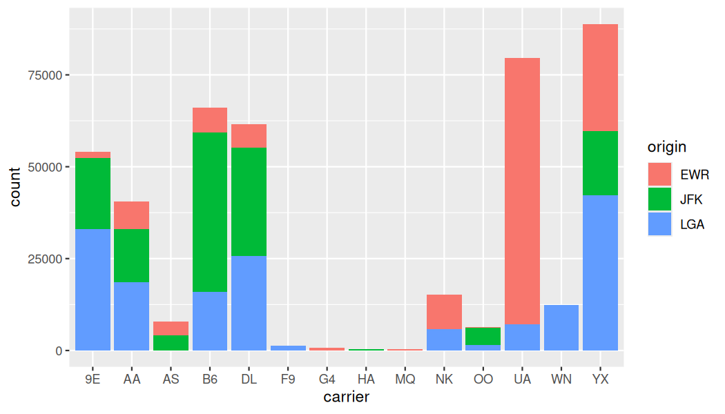
Figure 2.8.12 is an example of a stacked barplot. While simple to make, in certain aspects it is not ideal. For example, it is difficult to compare the heights of the different colors between the bars, corresponding to comparing the number of flights from each
origin airport between the carriers.
Before we continue, let’s address some common points of confusion among new R users. First, the
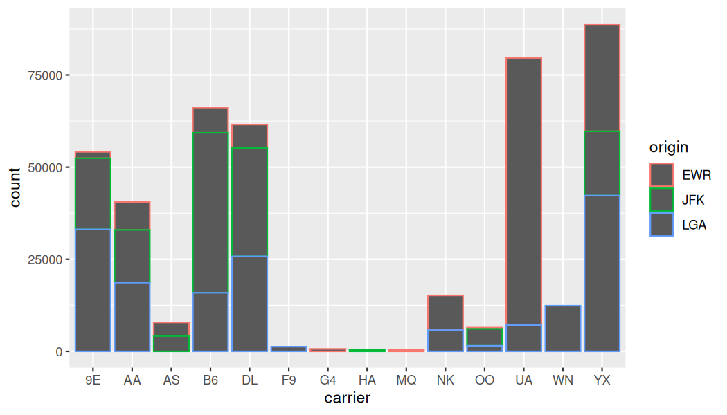
fill aesthetic corresponds to the color used to fill the bars, while the color aesthetic corresponds to the color of the outline of the bars. This is identical to how we added color to our histogram in Subsection 2.5.1: we set the outline of the bars to white by setting color = "white" and the colors of the bars to blue steel by setting fill = "steelblue". Observe in Figure 2.8.13 that mapping origin to color and not fill yields grey bars with different colored outlines.
ggplot(data = flights, mapping = aes(x = carrier, color = origin)) +
  geom_bar()
Second, note that
fill is another aesthetic mapping much like x-position; thus we were careful to include it within the parentheses of the aes() mapping. The following code, where the fill aesthetic is specified outside the aes() mapping will yield an error. This is a fairly common error that new ggplot users make:
ggplot(data = flights, mapping = aes(x = carrier), fill = origin) +
  geom_bar()
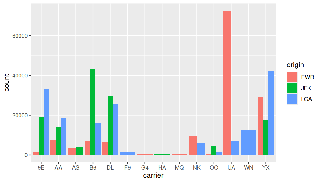
An alternative to stacked barplots are side-by-side barplots, also known as dodged barplots, as seen in Figure 2.8.14. The code to create a side-by-side barplot is identical to the code to create a stacked barplot, but with a
position = "dodge" argument added to geom_bar(). In other words, we are overriding the default barplot type, which is a stacked barplot, and specifying it to be a side-by-side barplot instead.
ggplot(data = flights, mapping = aes(x = carrier, fill = origin)) +
  geom_bar(position = "dodge")
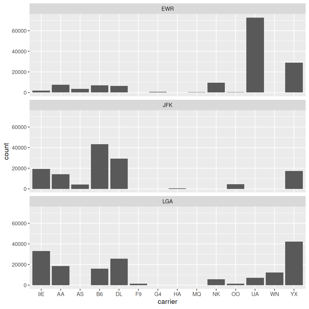
Lastly, another type of barplot is a faceted barplot. Recall in Section 2.6 we visualized the distribution of hourly wind speeds at the 3 NYC airports split by month using facets. We apply the same principle to our barplot visualizing the frequency of
carrier split by origin. Instead of mapping origin to fill we include it as the variable to create small multiples of the plot across the levels of origin in Figure 2.8.15.
ggplot(data = flights, mapping = aes(x = carrier)) +
  geom_bar() +
  facet_wrap(~ origin, ncol = 1)
Checkpoint 2.8.16. Learning Check 2.32.
What kinds of questions are not easily answered by looking at Figure 2.8.12?
Checkpoint 2.8.17. Learning Check 2.33.
What can you say, if anything, about the relationship between airline and airport in NYC in 2023 in regard to the number of departing flights?
Checkpoint 2.8.18. Learning Check 2.34.
Why might the side-by-side barplot be preferable to a stacked barplot in this case?
Checkpoint 2.8.19. Learning Check 2.35.
What are the disadvantages of using a dodged barplot, in general?
Checkpoint 2.8.20. Learning Check 2.36.
Why is the faceted barplot preferred to the side-by-side and stacked barplots in this case?
Checkpoint 2.8.21. Learning Check 2.37.
What information about the different carriers at different airports is more easily seen in the faceted barplot?
Subsection 2.8.4 Summary
Barplots are a common way of displaying the distribution of a categorical variable, or in other words the frequency with which the different categories (also called levels) occur. They are easy to understand and make it easy to make comparisons across levels. Furthermore, when trying to visualize the relationship of two categorical variables, you have many options: stacked barplots, side-by-side barplots, and faceted barplots. Depending on what aspect of the relationship you are trying to emphasize, you will need to make a choice between these three types of barplots and own that choice.

